What is Market Facilitation Index: A Practical Guide to MFI Signals
The Market Facilitation Index, or MFI, is a handy little indicator developed by the legendary trader Bill Williams. Think of it like a tachometer for the market. It doesn't just tell you if the price is moving up or down; it measures the engine power—the volume—behind that price move. This insight is crucial for separating a real, sustainable trend from fleeting market noise.
Decoding The Market Facilitation Index
So, what is the Market Facilitation Index really showing us? At its core, it's a gauge of market conviction. It answers the question: "Does the market actually care about this price move?"
A big price swing on barely any volume is like a whisper—it might be nothing. But when that same price swing is backed by a huge surge in volume, it's more like a roar. That tells you a lot of traders are putting their money where their mouths are, suggesting a widely held belief is driving the action.
Bill Williams developed the MFI to solve a classic trading problem: how do you know if a trend has legs? By forcing you to look at volume alongside price, the MFI adds a critical layer of confirmation. The whole idea is built on a foundational market principle: for a trend to be real, the volume has to back it up.
The Purpose Behind The MFI
The main job of the MFI is to tell you how willing, or "facilitating," the market is to move the price. It helps you get answers to the questions that a simple price chart can't provide on its own:
- Is this trend for real? Are a lot of traders piling in, or is this just a low-liquidity head fake?
- Is the trend running out of gas? A drop-off in the MFI can be an early warning that the current move is losing momentum.
- Is a breakout imminent? Sometimes you'll see a massive spike in volume, but the price barely budges. That often signals a huge battle between buyers and sellers, and the winner of that fight usually sparks a major move.
In a way, the MFI acts as a form of predictive analytics in banking for traders, helping them get a read on what might happen next. Williams introduced it in the late 1990s with a simple formula: divide the bar's range (High - Low) by its trading volume. It’s a beautifully simple way to measure market efficiency. You can find a deeper dive into the formula on LiteFinance.org to discover more insights about the MFI.
Visualizing Market Efficiency
On a chart, the MFI is usually shown as a histogram below the price candles. The real genius is in its use of four distinct colors, each one telling a different story about the market's current state.
This screenshot shows exactly how the MFI’s colored bars give you an instant visual cue about the relationship between price and volume. Getting this interplay right is fundamental to good trading, which is why we dedicated an entire guide to explaining what trading volume is.
Reading The Four Colors Of Market Momentum
The Market Facilitation Index doesn't flash a simple buy or sell signal. Instead, it tells a story through a histogram of four distinct colors. Each color represents a specific combo of MFI and volume changes, painting a clear picture of the market's underlying momentum. Learning to read these colors is like learning the language of the market's real intentions.
This diagram breaks down exactly how the price range and volume feed into the MFI to produce these signals.
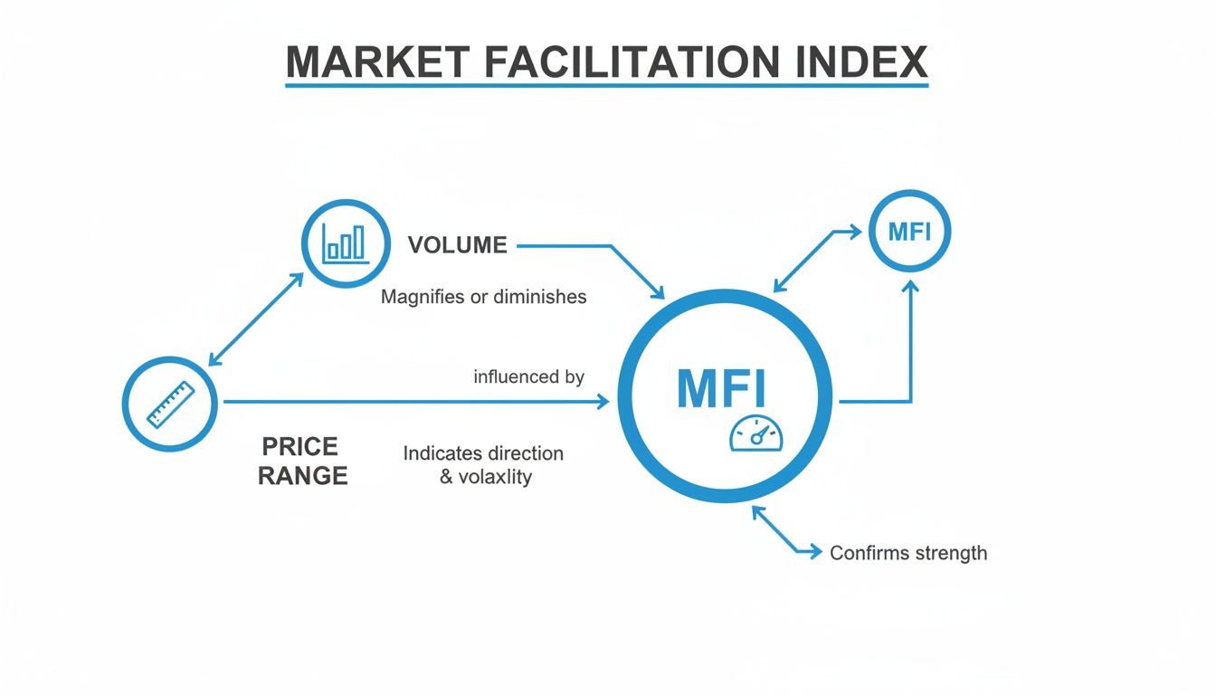
As you can see, the MFI acts as a gauge, turning the raw data of price and volume into a simple, color-coded output that tells you what’s really going on behind the scenes.
Getting a handle on this dynamic is the key to using the MFI effectively. Let's walk through each of the four signals, using some simple analogies to make their meanings stick.
Green: The Accelerator Pedal
A Green bar pops up when both the MFI and volume are on the rise. Think of this as the market putting its foot firmly on the gas. It tells you that new money is flooding in, and traders are enthusiastically pushing the price in the current direction.
When you see a green bar, it's a solid confirmation of a healthy, sustainable trend. The market isn’t just drifting; it's moving with purpose and wide participation.
- MFI Status: Increasing
- Volume Status: Increasing
- Analogy: A car accelerating onto a highway, gaining speed with plenty of fuel in the tank.
- Interpretation: The trend is strong and has a good chance of continuing.
Brown: The Market Yawn
On the flip side, a Brown bar appears when both the MFI and volume are falling. Bill Williams fittingly called this a "fade." It's the market's version of a collective yawn—traders are losing interest, and the energy that was driving the price is fizzling out.
This signal often shows up at the end of a trend, right before the market goes into a sideways chop. It’s a pretty clear warning to stay on the sidelines, as the lack of interest makes the price action unpredictable and messy.
A brown bar signals market apathy. The story is over, at least for now, and the audience is leaving the theater. It's a time for caution, not commitment.
Blue: The Head Fake
A Blue bar is one of the most critical signals to watch out for, as it often points to a trap. It forms when the MFI increases, but volume is actually decreasing. This means the price range is expanding, but fewer and fewer traders are involved.
This is a classic "head fake." The price move might look convincing on the surface, but the dwindling volume shows there’s no real conviction behind it. Often, this is the work of a few big players trying to trigger stop-losses or bait novice traders into a weak move. Blue bars are a frequent sign that a trend is exhausted and a reversal could be just around the corner.
Pink: The Showdown
Finally, a Pink bar, also known as a "squat," represents a high-stakes showdown. This signal happens when volume explodes higher, but the MFI actually decreases. This tells you that a massive amount of trading is taking place, but it's not leading to any significant price movement. Why? Because buyers and sellers are locked in a brutal battle.
Imagine two armies clashing at a single point, with neither side able to gain any ground. That's a squat bar. This intense, high-volume consolidation often sets the stage for a powerful breakout. Once either the buyers or sellers finally exhaust the opposition, the price is likely to explode in the winner's direction.
The indicator’s real power is in its simplicity: green means go with the trend, blue warns of fakeouts, pink signals a potential breakout, and brown tells you to stay out. You can learn more about these MFI signal interpretations to really sharpen your analysis.
Putting MFI Strategies to Work in Your Trading
Alright, let's move past the theory. Knowing what the MFI colors mean is great, but the real test is turning that knowledge into a reliable trading plan. This is where we take the MFI's signals and build concrete, rule-based systems for getting in and out of trades. It’s about being disciplined, not just reactive.
We're going to break down two distinct strategies that play to the MFI's biggest strengths: one for catching trend continuations and another for spotting when a trend is running out of steam. Neither of these strategies uses the MFI in a vacuum; they pair it with classic technical tools to help filter out the market noise and stack the odds a bit more in our favor.
Strategy 1: The Squat and Go Breakout
This is a bread-and-butter trend-following setup. The whole idea is to pinpoint a moment of intense conflict in the market and then jump on board right as a winner emerges and the price takes off.
The setup is a simple, two-step sequence of MFI bars:
- Spot a Pink 'Squat' Bar: This is your heads-up. It tells you a ton of volume is hitting the market, but the price isn't really going anywhere. Think of it as a coiled spring, building up tension right before a big move.
- Wait for a Green 'Go' Bar: When a Green bar prints right after a Pink squat, that's our signal. The battle is over, a direction has been chosen, and the market is now moving with conviction.
- Use a Trend Filter for Context: To make sure you’re not trying to catch a falling knife, it’s smart to use a simple moving average (like a 50-period EMA) to confirm the bigger picture. For a long trade, you want the price above the EMA. For a short, you want it below.
Entry Signal: A long entry could be triggered at the open of the candle after the Green bar, as long as the price is trading above the 50 EMA. For shorts, you'd do the opposite. A common spot for a stop-loss is just below the low of the Pink squat bar that started the whole sequence.
This combination gives you a solid, logical system. The Pink bar flags the opportunity, the Green bar confirms the momentum, and the moving average keeps you trading on the right side of the overall market flow.
Strategy 2: The Blue Fake Reversal
This one is for the counter-trend traders—the ones who love to spot trend exhaustion at critical turning points. The strategy is built around identifying "fake" moves where the price tries to break out but doesn't have the volume to back it up. It's often a trap.
Here's how to structure this kind of reversal trade:
- Identify a Key Level First: Before anything else, mark your major support and resistance zones. These are the locations on the chart where reversals are most likely to happen anyway.
- Look for a Blue 'Fake' Bar: As the price pushes into one of these key levels, keep an eye out for a Blue MFI bar. This is a huge red flag. It shows the price range is expanding, but volume is actually decreasing—a classic sign of a weak, unconvincing push.
- Wait for Price Action to Confirm: The Blue bar is a warning, not a trigger. The final piece of the puzzle is waiting for the next candle to confirm the reversal. Look for something like a bearish engulfing candle at resistance or a bullish pin bar at support.
Putting these pieces together helps you sidestep those frustrating false breakouts. The key level gives you the location, the Blue MFI bar signals the weakness, and a price action pattern provides the final trigger to enter the trade. If you want to dive deeper into forecasting these kinds of patterns, exploring different time series forecasting methods can add another powerful layer to your analysis.
By layering MFI signals with timeless tools like moving averages and support/resistance, you can build a trading plan that’s both logical and easy to follow. Having a rule-based system takes the emotion out of the equation and helps you truly understand what is Market Facilitation Index trading in a practical, repeatable way. As always, make sure you backtest any new strategy before putting real money on the line.
Putting MFI Strategies to Work in ChartsWatcher
Knowing the theory behind the Market Facilitation Index is one thing. Actually using it to make money with speed and precision? That’s a whole different ball game. This is where a platform like ChartsWatcher really shines, letting you go from staring at one chart at a time to building an automated system that finds, tracks, and flags MFI signals for you.
Instead of hunting for setups, you can build screeners that bring the best opportunities right to your screen. Let's walk through exactly how to bake MFI analysis into your ChartsWatcher workflow, from adding the indicator to setting up sophisticated, automated alerts.
Setting Up The MFI Indicator On Your Charts
First things first, let's get the indicator on your screen. This part is easy. Just open up the indicator library in ChartsWatcher, find the Market Facilitation Index, and apply it to your chart. A couple of clicks and you're done.
Once it's loaded, you’ll want to make it your own. The default colors work fine, but I always recommend tweaking them to fit your eyes and your chart's theme—maybe make the greens brighter or the pinks thicker so they really pop. You can dive deeper into this in our guide on how to customize stock charts for smarter trading strategies.
Pro Tip: Try adding a relative volume indicator to your chart right alongside the MFI. This gives you another layer of context, showing you if the volume on a specific bar is high or low compared to its recent average. It's a game-changer for confirming if a Pink "Squat" bar represents a truly significant battle.
Building A Custom MFI Screener
This is where the real power comes in. With ChartsWatcher's screener, you can scan thousands of stocks in real-time for the exact MFI conditions you’re looking for. It turns a ridiculously time-consuming manual chore into an automated process that works for you 24/7.
Let's build a screener for that "Squat and Go" strategy we talked about earlier.
Screener Goal: Find stocks that just printed a Green MFI bar right after a Pink MFI bar, signaling a potential momentum breakout.
Screener Conditions:
- MFI Condition 1: The MFI color for the current bar must be Green. This tells us the market is now moving with conviction.
- MFI Condition 2: The MFI color for the previous bar must be Pink. This pinpoints the high-volume struggle that set the stage for the move.
- Volume Filter: Set a rule that the volume on that Pink bar was at least 150% of its 20-day average volume. This makes sure the "Squat" was caused by a real surge in interest, not just a random blip.
- Trend Filter: Add a final rule that the stock's price is trading above its 50-period Exponential Moving Average (EMA). This ensures we're only looking for long setups within a healthy uptrend.
By stacking these simple rules, you’ve created a highly specific scanner that cuts through all the market noise and only shows you the tickers matching your high-probability setup.
Configuring Real-Time MFI Alerts
Once your screener is ready, the next move is to create alerts. Alerts make sure you never miss an opportunity, even when you step away from your desk. In ChartsWatcher, you can hook an alert directly to your screener.
Set it up to notify you with a pop-up, a sound, or even a push notification to your phone the second a stock meets your criteria. For a day trader, this is absolutely critical. Imagine getting an alert for a "Pink Squat" followed by a "Green Go" on a 5-minute chart—that gives you the chance to analyze and jump on the trade within seconds.
This screenshot gives you a feel for how a trader might set up their ChartsWatcher dashboard, with MFI screener results feeding directly into their charts and watchlists.
Being able to see your scanner results, charts, and key news all in one view is what allows for rapid, confident decision-making when an MFI alert fires. This kind of integrated setup is essential for any trader who needs to process information quickly. By automating your system for what is Market Facilitation Index trading, you free up your mental energy to focus on what really matters: execution and risk management.
How the MFI Behaves in the Wild: Performance During Major Market Events
Any indicator can look good on a quiet, sideways Tuesday. Its real mettle is tested when the market goes haywire. To really get a feel for what the Market Facilitation Index can do, you have to see how it performs under extreme pressure—during full-blown panic and powerful, runaway trends.
This is where the MFI moves beyond theory and becomes a battle-tested tool. By looking at historical events, we get a raw glimpse into the mechanics of fear and greed. In these moments, the relationship between price and volume tells the real story, and the MFI’s colored bars give us a clear, objective narrative of what's happening under the hood.
The 2010 Flash Crash: A Perfect Storm
The May 6, 2010 "Flash Crash" is a classic case study. In just a few minutes, the Dow Jones Industrial Average tanked almost 1,000 points, a staggering 9% intraday drop, only to whip back up almost as fast. If you were just watching price, it was pure, unadulterated chaos. But if you were watching the MFI, you would have seen some critical warnings.
As the market went into a nosedive, the MFI histogram didn't show a clean, trending move. Instead, it started flashing a chaotic mix of Pink (Squat) and Brown (Fade) bars. This combination was telling a very specific story:
- Pink Bars Signaled a Vicious Fight: The Pink bars were crucial. They showed that even as prices were collapsing, a massive battle was raging. Volume was through the roof, but the MFI was falling. This meant that for every panicked seller, a buyer was stepping in, creating a high-volume stalemate even as the indexes cascaded lower.
- Brown Bars Showed a Total Breakdown: The Brown bars popping up in between signaled a complete evaporation of market conviction. Both volume and price movement were drying up simultaneously. This wasn't a healthy, driven trend; it was a sign of a broken, dysfunctional market that lacked any real participation.
This chaotic signaling painted a picture of extreme instability. The MFI was essentially shouting that the brutal down move wasn't a legitimate, institutionally-backed trend. It was a liquidity crisis spiraling out of control.
One analysis of the event highlights this perfectly: while the Dow plummeted, volume surged to 27 billion shares. Yet, price facilitation collapsed, causing the MFI to drop 60% in just 30 minutes. That dynamic was a huge red flag that the price action was deceptive. For a deeper dive, you can read a full analysis of the Flash Crash MFI behavior.
Confirming the Health of Major Commodity Trends
But the MFI isn’t just for navigating chaos; it’s brilliant for confirming the health of long-term trends. Think about the powerful, multi-year bull markets we’ve seen in commodities like crude oil. In the early stages and throughout the core of those massive uptrends, the MFI chart is often dominated by a steady stream of Green bars.
Each Green bar acts as a vote of confidence. It confirms that rising prices are backed by increasing volume and broad market participation. For a trend-following trader, this is invaluable. It provides the conviction needed to hold a position and filter out the noise of minor pullbacks.
When Brown or Blue bars eventually start to appear, they serve as an early warning. They signal that the trend might be losing steam or conviction before the price action makes it obvious, giving traders a heads-up to tighten their stops or consider taking some profits off the table.
Common MFI Mistakes And How To Avoid Them
Even the sharpest tool in the shed is useless if you don't know how to handle it. The Market Facilitation Index is powerful, no doubt, but I've seen plenty of traders get tripped up by a few common pitfalls. If you're not careful, these simple mistakes can lead to some seriously costly errors.
Let's walk through them, because knowing what not to do is just as important as knowing what to do.
Flying Blind: Ignoring The Bigger Picture
This is probably the biggest and most expensive mistake traders make: looking at MFI signals in a total vacuum. A trader will spot a big, beautiful Green bar, their heart starts racing, and they jump into a long position without a second thought. Next thing they know, they're caught in a nasty pullback, fighting against a monster downtrend.
The MFI bar tells you what happened during that one candle. The chart tells you the whole story.
A Green bar in a solid uptrend is a beautiful confirmation signal. But a Green bar in a raging downtrend? That’s usually just a sucker's rally waiting to trap the unwary.
The fix is simple: always start with the bigger picture. Before you even glance at the MFI, figure out the primary trend. Slap a 200-period moving average on your chart—if the price is below it, you should be thinking short, not long. Context is king.
Misreading The Room
Another classic error is getting the market's mood wrong. I see this all the time with Brown bars. A trader gets bored after a string of them, feels the need to "do something," and forces a trade right in the middle of a choppy, lifeless market. A Brown bar is the market literally yawning in your face; it's telling you to go grab a coffee because absolutely nothing is happening.
The same goes for the Pink "Squat" bar. It's not a green light to jump in. It’s a signal that a huge battle is raging between buyers and sellers, but it doesn't tell you who's going to win.
- How to fix it: Learn to respect what the market is telling you. Use those Brown bar periods to step away or scan for other opportunities. When you see a Pink bar, think of it as a "get ready" signal, not a "go" signal. Wait for the dust to settle, then place your entry orders after a clear breakout, not while the fight is still on.
The Liquidity Trap
The MFI is built on volume. If that volume data is garbage, your signals will be, too. In thinly traded penny stocks or obscure forex pairs, the volume can be erratic and completely misleading. A single, tiny transaction can cause a massive MFI spike that looks like a high-conviction move but is really just noise from a shallow order book.
This is especially dangerous with Blue "Fake" bars. In an illiquid market, a price move on low volume might not be a clever institutional trap. It could just be the result of a market so thin that a single order can push the price around.
To avoid this, stick to assets with deep liquidity. We're talking high average daily trading volumes where you know the data is robust. This ensures that the MFI is reflecting genuine market participation, not just random noise. For an extra layer of confirmation, use multi-timeframe analysis. If you see a compelling MFI signal on your trading chart, pop up to a higher timeframe and see if the story matches. This simple cross-check can help you sidestep the traps set by bad data.
Common Questions About The MFI
Let's tackle some of the most common questions traders have when they first start working with the Market Facilitation Index. Getting these fundamentals down will help you use the indicator more effectively.
Is The Market Facilitation Index A Leading Or Lagging Indicator?
This is a great question, and the answer is a bit nuanced. The MFI is best thought of as a coincidental indicator.
It’s not trying to predict where the price will go next, but it gives you a real-time diagnosis of the market's current state. Think of it as a doctor checking the market's pulse right now. Its real power comes from showing you the health and efficiency of a move as it's happening, helping you decide whether the trend has genuine momentum or is just running on fumes.
What Are The Best Timeframes To Use With The MFI?
The MFI is incredibly flexible and can be applied to just about any timeframe you can think of, from a scalper's 1-minute chart all the way up to daily or weekly charts for long-term position traders.
That said, you'll generally find that the signals become more reliable on higher timeframes—think 1-hour and above. This is simply because the longer timeframes filter out a lot of the random, intraday noise. A popular approach is to use the MFI on a daily chart to get a feel for the primary trend and then drop down to a lower timeframe, like the hourly, to pinpoint your exact entries.
How Does MFI Differ From Other Volume Indicators Like OBV?
While both indicators involve volume, they're measuring completely different things and tell different stories. The On-Balance Volume (OBV) is a running total, a cumulative line that shows the long-term flow of money in or out of an asset.
The MFI, on the other hand, is not cumulative at all. It measures the efficiency of price movement for each individual period. In short, the MFI gives you a snapshot of the conviction behind a single candle, while the OBV tracks the broader tide of buying and selling pressure over weeks or months.
Ready to stop manually hunting for MFI setups and start automating your analysis? With ChartsWatcher, you can build powerful screeners and get real-time alerts for the exact MFI conditions you want to trade. Take control of your trading and never miss a high-probability setup again. Visit https://chartswatcher.com to get started.
