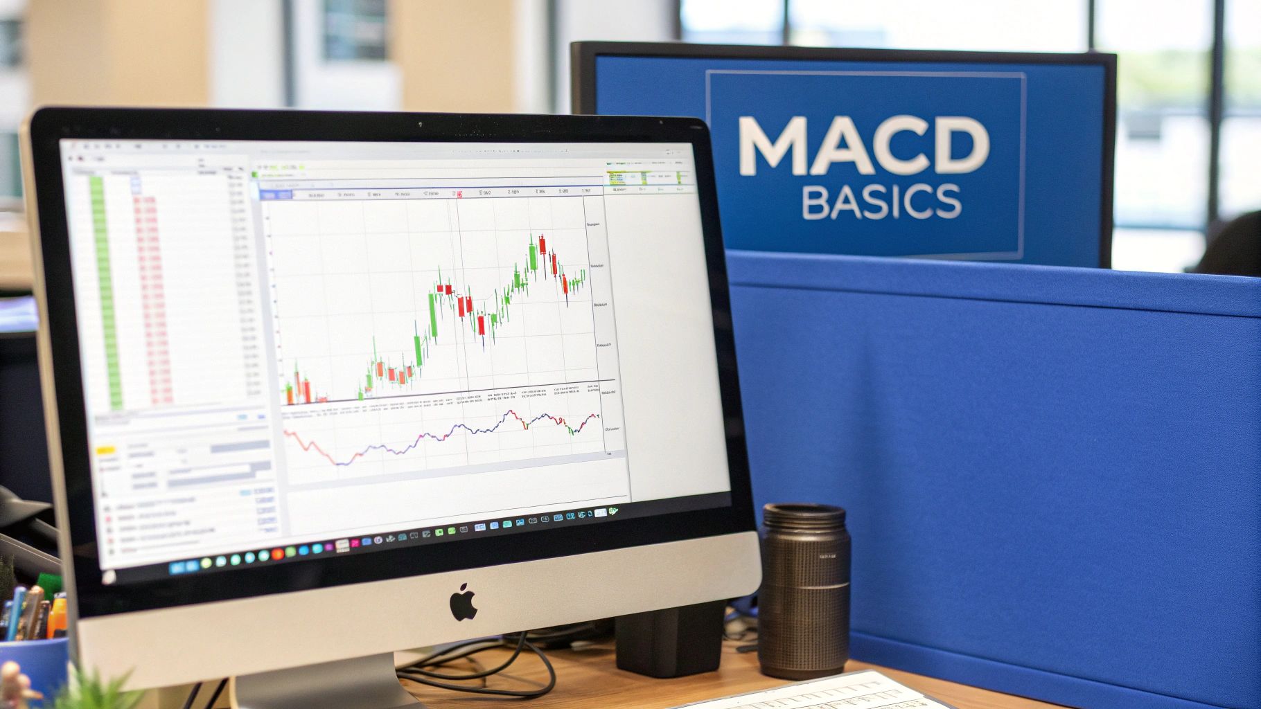
What Is a MACD Indicator and How Does It Work?
The MACD (Moving Average Convergence Divergence) is a classic momentum indicator you’ll find on almost every trading platform. It's designed to reveal a trend's underlying strength, direction, and potential lifespan. At its heart, the MACD helps traders spot potential buy and sell signals by tracking the relationship between two different moving averages.
What the MACD Indicator Really Tells You
Think of the MACD as a momentum compass for your chart. It doesn't just point north or south on a trend; it tells you how fast and how forcefully the price is moving in that direction. This tool cuts through the distracting noise of day-to-day price swings, giving you a much clearer picture of what the market is really doing.
Essentially, the MACD helps you answer a few critical questions at a glance:
- Is the current trend picking up steam or running out of gas?
- Could a trend reversal be right around the corner?
- Is now a good time to think about getting in or out of a trade?
By turning complex price action into a simple, visual format, the MACD gives you signals that are surprisingly easy to interpret, even if you’re new to the world of technical analysis.
The Three Core Components
To truly get what the MACD is saying, you have to know its parts. It's built from three key elements that work in tandem to generate its signature trading signals: the MACD line, the signal line, and the histogram.
The MACD line is the engine of the whole indicator. It's calculated by taking a 26-period Exponential Moving Average (EMA) and subtracting it from a faster 12-period EMA.
Next is the signal line, which is just a 9-period EMA of the MACD line itself. Think of it as a smoothed-out, slower version of the MACD line, which helps confirm significant moves.
Finally, the histogram gives you a brilliant at-a-glance view of momentum. It’s simply a visual representation of the distance between the MACD line and the signal line. As you'll see, this is where some of the most powerful signals come from. For a deeper dive into using MACD for entry and exit points, you can find more great info at Oanda.com.
For a quick reference, here’s a breakdown of what each component does.
MACD Indicator Core Components at a Glance
| Component | What It Is | What It Tells You |
|---|---|---|
| MACD Line | The 12-period EMA minus the 26-period EMA. | Shows the short-term momentum and the relationship between two key moving averages. |
| Signal Line | A 9-period EMA of the MACD line itself. | Acts as a trigger for buy and sell signals when the faster MACD line crosses it. |
| Histogram | The difference between the MACD line and the signal line. | Visually shows the strength of the momentum. Bigger bars mean stronger momentum. |
This table makes it easy to remember the role each part plays. Mastering how these three pieces interact is your first real step toward using this powerful indicator in your own trading.
The real magic of the MACD is how it blends trend-following and momentum into one intuitive package. It’s not just about seeing the trend; it’s about feeling its pulse.
Once you understand how these components dance together, you can start spotting high-probability setups and making more informed trading decisions.
Understanding the Three Parts of the MACD
To really get a feel for what the MACD is telling you, you have to break it down into its three core components. Think of it like a three-person band: each member plays a different instrument, but the real magic happens when they play together.
These parts are the MACD line, the signal line, and the histogram. Each one gives you a unique piece of the puzzle about a market's momentum. Learning how they interact is the key to spotting trends, reversals, and solid trading opportunities. Let's look at each one.
The MACD Line: The Momentum Engine
First up is the MACD line itself. This is the heart of the indicator, the fast-moving lead guitarist of our band. Its job is to track an asset's short-term momentum.
It’s calculated by taking the 26-period EMA and subtracting it from the faster, more responsive 12-period EMA. When that quicker 12-period EMA starts pulling away from the slower 26-period EMA, it tells you upward momentum is picking up, and the MACD line rises. When they get closer, momentum is fading. Simple as that.
The Signal Line: The Smoothed Guide
Next, we have the signal line. If the MACD line is the fast engine, the signal line is the steady hand on the wheel, helping to filter out all the market noise. Think of it as the band's drummer, keeping a steady rhythm.
It’s calculated as a 9-period EMA of the MACD line. This extra layer of smoothing means the signal line reacts more slowly than the MACD line, and that lag is exactly what makes it so useful. The most famous MACD signal—the crossover—happens when the speedy MACD line crosses above or below this slower signal line, suggesting a real shift in momentum is underway.
The real value comes from the relationship between the MACD line and the signal line. One shows raw momentum, while the other confirms it, providing a more reliable basis for trading decisions.
The Histogram: The Visual Storyteller
Finally, there's the histogram. This is the visual frontman of the group, giving you an instant, at-a-glance picture of the momentum story. The histogram is just a simple bar chart that shows the difference between the MACD line and the signal line.
Here’s how to read it:
- Bars Above Zero: When the histogram bars are above the zero line, it means the MACD line is above the signal line. This points to bullish momentum.
- Bars Below Zero: When the bars dip below the zero line, the MACD line is below the signal line, signaling bearish momentum.
The height of the bars is just as important. Growing bars mean momentum is getting stronger. Shrinking bars suggest it's weakening. Watching the histogram grow and shrink can give you one of the earliest clues that a trend might be running out of gas.
How to Read MACD Crossovers and Divergences
Knowing what the MACD is made of is one thing, but the real magic happens when you learn to read the signals it generates. The two most powerful patterns to watch for are crossovers and divergences. Get a handle on these, and you'll start spotting potential entry and exit points with a whole lot more confidence.
Crossovers are the most straightforward signals the MACD gives you. They happen when the quick-moving MACD line slices through its slower partner, the signal line. Think of it as a tip-off that the market's momentum is starting to shift gears.
This visual breakdown shows exactly how the MACD line, signal line, and histogram all work together to create these trade signals.
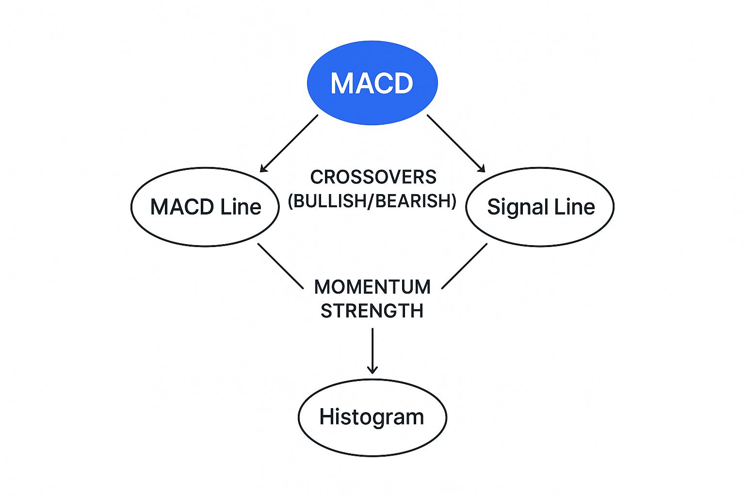
As you can see, the way the two lines interact directly shapes the histogram, giving you a crystal-clear picture of the strength behind the momentum.
Decoding MACD Crossovers
There are a couple of key crossovers you need to keep an eye on. Each one offers a distinct clue about where the market might be headed next.
A bullish crossover is when the MACD line crosses above the signal line. This is your cue that short-term momentum is picking up speed, outpacing its recent average. Many traders see this as a potential buy signal, a sign that upward momentum is building.
On the flip side, a bearish crossover occurs when the MACD line dives below the signal line. This suggests that downward momentum is gaining traction, and it's often read as a signal to sell or get out of a long position.
Then you have the centerline crossover. This is simply when the MACD line crosses over the zero line. A move above zero suggests a broader shift into positive territory, while a dip below indicates momentum is turning negative. For a complete walkthrough, you can master the trading indicator with our detailed guide on how to read the MACD.
The Power of MACD Divergence
While crossovers are great for confirming momentum, divergences can give you an early heads-up that a trend might be running out of gas. This is a more advanced concept, but it's incredibly powerful. Divergence happens when the asset's price is moving in the opposite direction of the MACD indicator.
This mismatch often means the underlying momentum just doesn't support the price action anymore, which can be a major clue that a trend reversal is on the horizon.
Key Insight: Think of divergence as a crack in a trend's foundation. The price might still be chugging along, but the MACD is quietly showing that the strength behind that move is fading.
There are two main types of divergence to spot:
- Bullish Divergence: This happens when the price hits a new low, but the MACD indicator forms a higher low. It suggests that even though the price is down, the selling pressure is easing up. A potential bounce could be coming.
- Bearish Divergence: This is the opposite. The price makes a new high, but the MACD indicator forms a lower high. This is a classic warning sign that buying momentum is sputtering out, and the uptrend might be about to roll over.
Catching these divergences takes a bit of practice, but it can give you a serious edge by helping you see market turns before they become obvious to everyone else. When you combine the insights from both crossovers and divergences, you build a much more complete and robust picture of what the market is doing.
Practical MACD Trading Strategies
Knowing what the MACD lines do is one thing. Knowing how to actually make money with them is a whole different ball game. This is where we move from theory to the trading floor, building reliable systems around the signals we’ve just unpacked. A solid strategy gives you a clear framework for making entry and exit decisions, taking a lot of the guesswork out of the equation.
We’re going to focus on two of the most effective approaches out there: trend-following with crossovers and reversal trading with divergences. Each one leverages a different MACD signal to capitalize on specific market conditions. Think of them as two different tools in your toolkit, perfect for navigating both powerful trends and critical turning points.
A Trend-Following Crossover Strategy
This strategy is all about catching a new trend right as it starts and riding it for as long as the momentum holds up. It’s a beautifully simple approach that hinges on one of the most basic MACD signals: the crossover. You're not trying to be a hero calling the exact top or bottom; you're just trying to ride the wave.
Here’s a basic framework for putting this into action:
- Identify the Primary Trend: Before you even glance at the MACD, zoom out. Look at a higher timeframe chart. Is the asset clearly trending up or down? This strategy works best when you’re swimming with the current, not against it.
- Wait for the Entry Signal: Look for a MACD crossover that confirms the primary trend. If you're in an uptrend, you’re on the hunt for a bullish crossover—where the faster MACD line moves above the slower signal line.
- Set Your Stop-Loss: This is non-negotiable. Place a stop-loss order below a recent swing low. It's your safety net if the trade turns sour.
- Plan Your Exit: The exit signal is just as clear as the entry. A bearish crossover (MACD line dipping below the signal line) tells you the upward momentum is starting to fizzle out. Time to take profits.
Following a rules-based approach like this helps keep your emotions in check, which is half the battle in trading.
A Reversal Strategy Using Divergence
Now for a more advanced move. Spotting a divergence can tip you off to a potential trend reversal before it’s obvious to everyone else on the price chart. This strategy is for traders who want to get in right at the beginning of a new move by catching the old one as it runs out of gas.
Spotting divergence is like hearing a train’s brakes screeching before you see it slow down. The price is still moving, but the momentum that was pushing it is gone.
Let’s walk through how you’d trade a bearish divergence:
- Spot the Signal: You're looking for a disconnect. The price of an asset pushes to a new high, but the MACD indicator makes a lower high. That’s your classic bearish divergence, a huge red flag that the buyers are getting tired.
- Wait for Confirmation: Don't jump the gun. Wait for the price chart to agree with the MACD. This could be a bearish candlestick pattern or a clean break below a nearby support level.
- Enter the Trade: Once you have confirmation, you can enter a short (sell) position. Your stop-loss goes just above the recent price high to protect you from a false alarm.
- Take Profit: You can set a profit target at a key support level down below, or you can simply wait for a bullish MACD crossover to signal that the new downtrend is losing steam.
To really stack the odds in your favor, try combining the MACD with other indicators like the Relative Strength Index (RSI). A bearish MACD divergence that happens while the RSI is in "overbought" territory is a much more powerful signal. If you want to dive deeper, exploring a detailed MACD in stocks strategy can give you even more ways to sharpen these techniques for the stock market.
Common Mistakes to Avoid When Using the MACD

The MACD is an exceptional tool for tracking momentum, but it's not a crystal ball. So many traders, especially when they're just starting out, fall into the same predictable traps that lead to costly mistakes. Honestly, understanding these pitfalls is just as crucial as learning the strategies themselves.
The biggest mistake I see is relying on the MACD in a vacuum. No single indicator should ever be the sole reason for a trade. While the MACD gives you powerful insight into momentum, it doesn’t see the whole picture—things like major support and resistance levels or the broader market trend.
Always, and I mean always, use it as part of a complete trading system. Think about it: a bullish MACD crossover means very little if the price is about to slam its head into a massive resistance level. Context is everything.
Getting Caught in Choppy Markets
The MACD absolutely shines in trending markets. But in sideways or "choppy" conditions? It can be a trader's worst nightmare. When a stock is stuck in a range, the moving averages inside the MACD will crisscross over and over again, generating a storm of false signals known as whipsaws.
These rapid-fire buy and sell signals can easily trick you into over-trading, racking up commissions and a string of small, frustrating losses. The simple fix is to confirm the market is actually trending before you start trusting the MACD signals. Use trend lines or even a longer-term moving average on your price chart to filter out these noisy periods.
A core principle of successful trading is knowing when not to trade. In a sideways market, the MACD's signals are more of a distraction than a guide. Protect your capital and wait for a clear trend to show up.
Other Frequent Missteps
Beyond getting whipsawed, a few other common errors can really undermine your results. Paying attention to these details can make a huge difference in how well you apply what the MACD has to offer.
- Ignoring Divergence: Crossovers are the most obvious signal, but divergence is often far more powerful. Overlooking a clear bearish divergence while the price is busy making new highs is a classic mistake that can leave you totally exposed to a sharp reversal.
- Using the Wrong Timeframe: The standard (12, 26, 9) settings work great for daily charts, but they might not be the best fit for a 5-minute chart. If you don't test and adjust the settings for your specific timeframe, you'll get signals that are either too slow to be useful or way too sensitive.
- Chasing Every Single Signal: Not every crossover is a high-probability trade. Those minor wiggles around the signal line are often just market noise. To get better results, focus on the strong, decisive crossovers and clear divergences that line up with the bigger picture.
Have Questions About the MACD? Let's Clear Them Up.
Even after you get the hang of the MACD, a few common questions always seem to pop up. Let's tackle them head-on so you can trade with more confidence.
What Are the Best Settings for the MACD?
Out of the box, the MACD almost always comes with the standard (12, 26, 9) settings. This combination—a 12-period fast EMA, a 26-period slow EMA, and a 9-period signal line—is the industry default for a reason. It offers a well-balanced look at momentum, especially on daily charts.
But are they the only settings? Absolutely not.
- A short-term trader scalping on a 5-minute chart might find the standard settings too slow. They might experiment with more sensitive parameters (like 5, 35, 5) to get faster signals.
- A long-term investor looking at weekly charts might do the opposite, slowing the settings down to filter out all the minor market noise.
My advice? Stick with the standard (12, 26, 9) settings until you're a seasoned pro. Only think about changing them once you’ve done some serious backtesting to prove that a different combination works better for your specific market and timeframe.
Can I Use the MACD on Any Market or Timeframe?
Yes, one of the best things about the MACD is its incredible versatility. You can slap it on a chart for stocks, forex, crypto, or commodities, and it will work just the same. Its principles of measuring momentum are universal, whether you're looking at a 1-minute chart or a weekly one.
But here's the catch: the MACD thrives in trending markets. When a stock is clearly moving up or down, the indicator gives beautiful, clear signals.
However, in a choppy, sideways market, the MACD can get you into trouble. It's notorious for generating a storm of false signals, or "whipsaws," that can chop up your account.
What's the Biggest Weakness of the MACD?
Every indicator has an Achilles' heel, and for the MACD, it's lag.
Because it's built from moving averages of past prices, its signals will always come after the move has already started. This is the nature of a lagging indicator.
That slight delay means you might get into a trend a little late or exit after the biggest part of the move is already over. This is exactly why you should never, ever rely on the MACD in a vacuum. A signal from the MACD isn't a command to trade; it's a piece of evidence. Always confirm it with other tools—like price action, key support and resistance levels, or another indicator—to build a solid case for your trade.
Take your analysis to the next level with ChartsWatcher. Customize your dashboards, set precise alerts, and scan the market with tools designed for serious traders. Discover how to gain your edge at https://chartswatcher.com.
