W Pattern Stocks A Trader's Guide to the Double Bottom
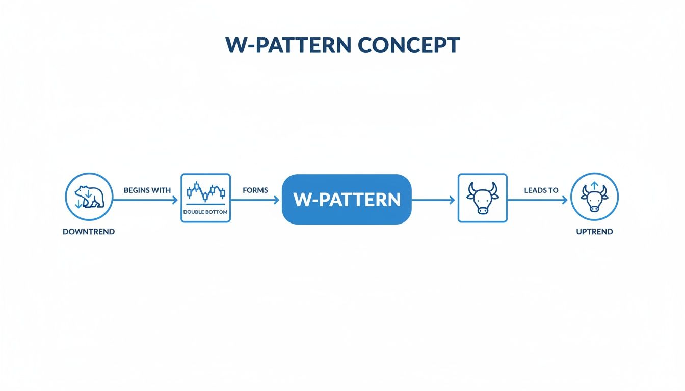
When you hear traders talking about "W pattern stocks," they're referring to a chart that has formed a distinct "W" shape. This is a classic sign that a stock might be done with its downtrend and is getting ready for a new push higher.
The technical name for this setup is a Double Bottom. It’s a powerful signal that the sellers are running out of steam and buyers are stepping up to the plate, often creating a great spot for traders to consider going long.
What Exactly Is a W Pattern in Stock Trading
Ever dropped a tennis ball? It hits the floor, bounces up a bit, then drops back down to almost the same spot before it really takes off. That’s the W pattern in a nutshell. It’s a visual story playing out on a stock chart, signaling the potential end of a long downtrend and the start of something new.
This pattern, the Double Bottom, is one of the most trusted bullish reversal signals out there. It's not just a random shape; it’s a reflection of a critical shift in market psychology—a tug-of-war between sellers who've been in charge and a fresh wave of determined buyers.
The Battle for Price Control
A real W pattern doesn't happen all at once. It unfolds in a few key stages, each one telling you something important about what's going on under the surface:
- First Trough: Sellers push the price down to a new low. But right at the bottom, they start to lose their grip as buyers begin to see a bargain.
- Intermediate Peak: This initial wave of buying creates a temporary rally, forming the middle peak of the "W."
- Second Trough: Sellers give it one last shot, trying to shove the price down again. Crucially, they fail to break below the first low. This successful defense of that support level is a huge tell—it suggests the buyers have finally taken control.
The W pattern is essentially a failed attempt by sellers to continue a downtrend. The second bottom's inability to break below the first is a clear signal that the bearish momentum has been exhausted, paving the way for a bullish reversal.
This isn't just chart folklore. Historical analysis from 1990 to 2020 on major indices like the Nasdaq Composite has shown that W bottoms often appear right before significant rallies, especially during broader market recoveries. You can dig into more insights on these historical patterns over at jpmorgan.com.
Key Landmarks to Identify
To be sure you're looking at a true W pattern, you need to spot its key landmarks. The two distinct lows create a strong support floor. The peak sitting between them forms a resistance level known as the neckline.
This neckline is the final hurdle. The pattern is only confirmed when the stock price rallies and closes decisively above this line. That breakout is the green light traders have been waiting for, signaling that a new uptrend is likely getting started.
The Anatomy of a High-Probability W Pattern
Not every chart that looks vaguely like the letter 'W' qualifies as a high-probability trading setup. Far from it. An experienced trader knows to look for the specific anatomy of a true W pattern, much like a mechanic knows the precise parts of a high-performance engine.
Understanding these components is the key to telling the difference between a genuine reversal signal and just random market noise.
Think of the pattern as a four-part story playing out on the price chart. Each part reveals a crucial piece of the shifting power dynamic between buyers and sellers. When you can identify each element correctly, a simple observation transforms into an actionable trading thesis for finding promising w pattern stocks.
This visual guide breaks down that transition from a downtrend to an uptrend, with the W pattern acting as the critical turning point.
This process isn't just lines on a screen; it's a visual map of market psychology. You're seeing the bears lose their grip, a bottoming process take hold, and the bulls finally seize control.
The First Trough: The Initial Support Floor
The story always begins in an established downtrend. Sellers have been in the driver's seat, pushing the stock price to a new low. This first dip, or first trough, is the initial point of seller exhaustion.
This is where selling pressure starts to dry up, and the first wave of bargain hunters steps in, creating a support level. Volume is often heavy here as the last of the weak hands capitulate, but it's what happens next that really matters. The price bounces off this new support floor, showing the first crack in the bearish armor.
The Intermediate Peak: The Resistance Neckline
As buyers push the price up from that first trough, they inevitably run into a wall of sellers who still believe the downtrend is intact. This clash creates a temporary high point between the two lows, which we call the intermediate peak.
This peak is more than just the middle of the 'W'; it's the most critical resistance level for the entire pattern. Drawing a horizontal line across this high point gives us the neckline. This line becomes the ultimate barrier the stock has to break to prove the reversal is real.
The neckline is the line in the sand. Until the price can decisively break and hold above it, sellers are still considered to have the upper hand. The entire pattern is just a "potential" setup until that level is breached.
The Second Trough: The Moment of Truth
After hitting the resistance at the intermediate peak, sellers make one final push to resume the downtrend. They drive the price back down, aiming to break below the support level created by the first trough. This move forms the second trough of the W pattern.
This is the make-or-break moment. In a strong, valid W pattern, the second low forms at or slightly above the level of the first low. This is a powerful tell—it shows that buyers are getting more aggressive, stepping in earlier to defend the support zone.
A second low that slices significantly below the first is a major red flag. It suggests the sellers are still in control and the pattern is likely to fail.
To help you spot these patterns in real-time, here’s a quick checklist to keep handy.
W Pattern Identification Checklist
This table acts as a quick reference guide. Run through these points to validate whether you're looking at a true W Pattern formation or just a random price swing.
| Component | Ideal Characteristic | What to Avoid |
|---|---|---|
| Prior Trend | A clear, established downtrend must precede the pattern. | A sideways, choppy market or an existing uptrend. |
| First Trough | A significant low marking the initial bottom. | A minor dip that doesn't stand out on the chart. |
| Intermediate Peak | A clear reactionary high that defines the neckline. | A weak bounce that doesn't form a distinct peak. |
| Second Trough | Forms at or, ideally, slightly above the first trough's low. | A second low that significantly undercuts the first low. |
| Volume Pattern | Decreases during the pattern formation, then surges on the breakout. | Consistently high volume throughout or weak volume on the breakout. |
| Neckline Break | A decisive, strong-bodied candle closing well above the neckline. | A weak poke above the neckline that quickly fails. |
Think of this as your pre-flight checklist. If a pattern doesn't tick these boxes, it’s best to stay on the sidelines and wait for a higher-quality setup.
The Critical Role of Trading Volume
Volume is the final piece of the puzzle—it's the pattern's lie detector. A classic, high-probability W pattern has a very specific volume signature that confirms the story the price is telling.
Here’s what you want to see:
- During the Downtrend: Volume is often high as sellers aggressively push the price down into the first trough.
- During Pattern Formation: As the stock carves out its two troughs and the intermediate peak, volume tends to dry up. This is a great sign that selling pressure is fading away.
- On the Breakout: This is the most important part. As the price punches through the neckline, there should be a dramatic surge in volume. This spike confirms that big money—the institutions—is stepping in with conviction, providing the fuel for a new uptrend.
How to Confirm the W Pattern Breakout
Spotting a chart that looks like a 'W' is a great first step, but it's not nearly enough to risk your hard-earned capital. The most critical skill in trading w pattern stocks is learning how to confirm the breakout. This is what separates the high-probability winners from the costly fake-outs that trap unsuspecting traders.
Confirmation is simply your evidence that buyers have wrestled control away from the sellers. Without it, you’re just guessing. The number one signal is a decisive price move—and a strong close—above that neckline resistance. We’re not talking about a quick little poke above the line; we need to see a powerful statement of intent.

The Unmistakable Power of Volume
If price tells you the what, volume tells you the why. A genuine breakout absolutely must be backed by a massive surge in trading volume. This is non-negotiable.
You want to see volume clock in significantly higher than its recent average—ideally 50% or more. This huge spike is your proof that the big players—institutions and other professional traders—are jumping in with conviction. Think of it as the roar of a crowd confirming a game-winning goal. Weak volume is like a silent stadium; it suggests nobody really cares about the move.
A price breakout without a volume surge is a massive red flag. It often signals a lack of institutional firepower, making the stock extremely vulnerable to a quick reversal. This is the classic "false breakout" or "bull trap."
This confirmation signal is so vital that many pros won't even consider a trade without it. Low-volume breakouts often roll over and fail because there just isn't enough buying pressure to absorb all the sellers waiting at higher prices.
Using Indicators for an Extra Layer of Confidence
While price and volume are your primary tools, layering on a couple of technical indicators can add another level of confidence to your analysis. They help validate the bullish momentum you're seeing on the chart. Just remember, they should be used as supporting evidence, not the main reason for the trade.
Here are two of the most effective indicators for confirming a W pattern breakout:
-
Moving Average Convergence Divergence (MACD): Look for a bullish MACD crossover to happen right around the same time as the price breakout. This occurs when the MACD line crosses above the signal line, suggesting short-term momentum is turning positive and getting in sync with the price action.
-
Relative Strength Index (RSI): The RSI can give you an early warning sign through bullish divergence. This happens when the price forms a second bottom that's equal to or slightly lower than the first, but the RSI makes a higher low. This divergence shows that the downside momentum is fizzling out, even as the price retests its lows—a great precursor to a strong move up.
Putting It All Together for a High-Confidence Trade
The goal is to build a compelling case for the trade, like a detective looking for clues that all point to the same conclusion: a bullish reversal is underway. You can find more detail on identifying these setups in our pro trader's guide to stocks about to break out.
Let’s run through the final confirmation checklist:
- Price Action: Did the stock close decisively above the neckline on a strong, convincing candle?
- Volume: Was that breakout powered by a significant surge in trading volume, well above the recent average?
- Indicators (Optional but helpful): Do you see a confirming signal, like a bullish MACD crossover or bullish RSI divergence?
When you can confidently answer "yes" to these questions, you’ve turned a promising pattern into a high-confidence trading opportunity. This methodical approach is what separates consistently profitable traders from those who just chase every pretty-looking chart.
A Practical Framework for Trading W Patterns
Spotting a confirmed W pattern breakout on a chart is like finding the trailhead. It’s a great starting point, but it's not the destination. To actually make money from w pattern stocks, you need a solid framework that dictates every move you make, from the moment you enter to the second you exit. A good plan removes the emotion and guesswork, replacing it with a clear, repeatable process.
Before you even think about placing an order, you need to translate that chart theory into a real-world action plan. Let’s build out a complete playbook covering how to get in, where to set your safety net, and precisely how to cash in when the trade goes your way.
Choosing Your Entry Strategy
Once the price punches through the neckline, you’re at a crossroads. How, and when, do you jump in? There are really two main ways to approach this, and each comes with its own set of trade-offs. The right one for you usually boils down to your personal trading style and how much risk you’re comfortable with.
-
The Aggressive Entry (The Breakout): This is for traders who want to get in on the action immediately. You buy the second the price closes decisively above the neckline, especially if there's a big spike in volume. The huge plus here is that you're guaranteed to be in the trade if it rips higher right away. No FOMO. The downside? You're more likely to get caught in a "false breakout"—that frustrating scenario where the stock pops its head above resistance only to get smacked right back down.
-
The Conservative Entry (The Pullback): A more patient method is to wait for the initial breakout, then let the stock pull back to retest the old neckline. That former ceiling should now act as a new floor of support. You enter the trade once the price bounces cleanly off this retest. This approach often gives you a much better risk-to-reward ratio and serves as extra proof that the breakout is the real deal. Of course, the risk is that the stock never looks back, and you miss the move entirely.
The pullback entry is basically you telling the market, "Prove it to me." When you see former resistance hold firm as new support, you get an extra layer of confidence that the buyers are truly in control.
Setting an Ironclad Stop-Loss Order
Let's be clear: no chart pattern is a sure thing. The W pattern can—and does—fail. This is why a stop-loss order isn't just a good idea; it's your non-negotiable insurance policy against a painful loss. It’s a pre-set order that automatically sells your position if the stock drops to a specific price.
For a W pattern, the most logical place to set your stop-loss is just below the lowest low of the two troughs. Think of this level as the ultimate line in the sand. If the price breaks below this point, the entire bullish story is busted. Placing your stop here gives the trade enough room to wiggle around without exposing you to a catastrophic loss, clearly defining your maximum risk right from the get-go.
Defining Your Profit-Taking Strategy
Knowing when to cut a loser is critical, but knowing when to book your profits on a winner is just as important. A simple and incredibly effective technique for setting a price target is baked right into the pattern’s own geometry.
Here’s how it works, step-by-step:
-
Measure the Height: Calculate the price distance from the pattern's lowest trough up to the neckline. For instance, if the low is at $45 and the neckline is at $50, the pattern's height is $5.
-
Project the Target: Now, take that height and add it to the breakout point at the neckline. Using our example, you'd add the $5 height to the $50 neckline, giving you a minimum price target of $55.
This "measured move" gives you a logical, data-driven target to shoot for. Of course, the stock can run much, much higher, but this gives you a concrete goal. A popular pro-level strategy is to sell a piece of your position at this first target to lock in some gains. Then, you can let the rest of the position run with a trailing stop-loss to capture any bigger upside. It’s a great way to balance taking profits with the potential for a home-run trade.
Seeing the W Pattern in the Wild: Real-World Chart Examples
Theory is great, but nothing cements a concept like seeing it play out on a real stock chart. Studying historical examples—both the big winners and the ugly failures—is how you train your eyes to spot high-probability setups in the heat of a live market. It’s the bridge between knowing the rules and actually being able to apply them when your money is on the line.
We're going to dissect a few charts to see what these patterns look like in action. We’ll look at the price action, the volume signatures, and the key levels that made or broke these trades. This is how you build a mental library of what a fantastic setup looks like… and what a dangerous trap looks like.
This annotated chart shows a classic W pattern, highlighting everything we've talked about, from the initial slide down to the powerful breakout rally that followed.

Look closely at the volume. Notice how it fades as the pattern forms, then absolutely explodes on the breakout. That's the signature of sellers losing control and buyers rushing in. It's exactly what you want to see.
A Successful W Pattern Breakout
Let's walk through a picture-perfect example. Imagine a tech stock that's been bleeding for months, dropping from $150 all the way down to $100. That first bottom at $100 establishes our initial support level—the first trough of the "W."
The stock musters a small rally to $115, forming the middle peak which will soon become our neckline. But sellers aren't done yet, and they manage to push the price back down. This time, however, the selling pressure fizzles out around $101. This second bottom, slightly higher than the first, is a huge clue. It tells us buyers are stepping in earlier and with more conviction.
From there, the stock grinds its way back up to the $115 neckline. The real magic happens when the price slices through $115 and closes decisively above it, all on a massive surge in volume—say, 150% above its 50-day average. That's the green light. The initial price target, using the measured move, would be ($115 - $100) + $115 = $130.
Anatomy of a Failed W Pattern
Learning from failed patterns is just as important—maybe more so. Let's look at a retail stock that looks like it's carving out a W after a long slide. It hits a low at $50, bounces to a neckline at $55, and then successfully retests support with a second low at $50.50.
Everything looks good so far, right? The stock then pushes higher and just barely pokes its head above the $55 neckline. But this is where the red flags pop up. The breakout happens on pitiful, below-average volume. There’s just no conviction.
A breakout on weak volume is one of the most significant red flags in technical analysis. It often indicates that the move is driven by small retail traders rather than powerful institutions, making it highly susceptible to failure.
Instead of accelerating higher, the stock just kind of churns above the neckline for a few days. Soon enough, the weak buying is overwhelmed, sellers take back control, and the price slices right back below $55. This traps all the hopeful breakout buyers and the downtrend resumes. It’s a harsh lesson in why volume confirmation isn't optional; it's a non-negotiable rule.
The W Pattern on a Grand Scale
These patterns aren't just for individual stocks. They can signal major turning points for entire market indices, sometimes appearing as an inverted W, or M-top, signaling a major peak. A famous example is the S&P 500 during the dot-com bubble in mid-2000. The index formed a massive M-top between April and August, with peaks near 1,530 and 1,520 and a crucial neckline at 1,350.
When that neckline broke in September 2000 on heavy volume, it was the start of a brutal bear market, leading to a 49% drop to the 2002 lows. This just goes to show the fractal nature of chart patterns—they work across all timeframes and instruments. If you're interested in digging deeper, platforms like TrendSpider offer powerful tools for analyzing these kinds of large-scale formations.
Finding W Pattern Stocks with ChartsWatcher
Let's be realistic: manually flipping through thousands of charts to find the perfect W-pattern is an impossible chore. This is where modern tools step in, bridging the gap between knowing the theory and actually making money with it. Using a powerful scanner like ChartsWatcher transforms a needle-in-a-haystack hunt into a precise, automated search for high-probability setups.
Instead of spotting a pattern after the big move has already happened, a scanner lets you find emerging w pattern stocks right as they're brewing near a potential breakout. This is a huge shift. You get to be proactive and prepare for a trade, not just chase it after the fact.
Building Your Custom W Pattern Scanner
The real trick to a successful scan is learning to translate the pattern's DNA into a set of specific rules for your software. You're essentially teaching the machine what you, the trader, are looking for. The goal is to find stocks that are coming off a downtrend, have carved out two distinct lows, and are just starting to show signs of life near the neckline.
Here’s a basic scanner recipe you can build in ChartsWatcher to get started:
- Establish the Prior Downtrend: The W-pattern is a reversal, so it has to reverse something. Start by setting a filter for stocks that are trading below their 50-day moving average but have recently crossed back above their 20-day moving average.
- Define the Double Bottom: Next, we need to find stocks that have hit a similar low twice. A good starting point is to use price performance filters to screen for stocks whose 20-day low is nearly identical to its 50-day low.
- Filter for Breakout Proximity: You want to be there before the explosion, not after. Set an alert for stocks trading within 2-3% of their 50-day high, which often serves as a good proxy for the neckline.
- Confirm with Volume: A breakout without volume is like a car without fuel—it won't go far. Add a final filter for volume that is trading at least 150% of its 30-day average.
The screenshot below shows the ChartsWatcher interface, giving you a feel for how you can stack these kinds of rules to create a finely-tuned scan.
By layering these conditions, you methodically chop away thousands of irrelevant charts. All that's left are the most promising candidates that deserve your attention.
A well-configured scanner is like having a team of analysts working for you around the clock. It doesn't replace your judgment, but it does all the heavy lifting of discovery so you can focus your energy on analysis and execution.
Think of this as a starting template. The real power comes when you start tweaking these settings to fit your own trading style and risk tolerance. Maybe you tighten the price proximity for quicker scalp trades, or maybe you demand even higher volume spikes for maximum confirmation.
The whole point is to shift from being a passive student of chart patterns to an active hunter of trading opportunities. To really get under the hood of what scanning software can do, you can learn more by checking out our guide on how to unlock success with our powerful stock market scanner. Using technology this way saves an incredible amount of time and helps you systematically find the best setups the market has to offer.
Got Questions About Trading the W Pattern?
Even when you've got a solid trading plan, the live market always throws a few curveballs. Knowing how to handle the nuances of a pattern is what separates consistently profitable traders from the rest. Let's tackle some of the most common questions that pop up when you're trying to trade W pattern stocks in the wild.
The goal here isn't just to repeat the textbook definition. It's about understanding how this pattern actually behaves on a real chart, complete with its quirks and potential traps.
What's the Difference Between a W Pattern and a V-Bottom?
Think of a V-Bottom as the market's panic button. It’s a sharp, violent reversal that looks exactly like a 'V' on the chart. A stock plummets, hits a floor, and then rockets back up with just as much intensity. It's a sign of a frantic, almost chaotic shift in sentiment that gives you very little time to jump on board.
The W Pattern, or Double Bottom, is a much more thoughtful, structured reversal. It's a story of a battle. The price drops, finds support, rallies, and then comes back down to test that same support level a second time. This second test is crucial—it's the market proving that buyers are serious this time and are ready to defend that price. Many traders, myself included, find the W Pattern far more reliable because that re-test validates buyer strength and gives a crystal-clear entry signal at the neckline.
How Long Should a W Pattern Take to Form?
This really depends on the timeframe you're looking at. A pattern that plays out over a few candles on a 5-minute chart is a different beast entirely from one that builds over several weeks on a daily chart.
For a W Pattern on a daily chart to really mean something, I like to see at least three to four weeks between the two lows. This gives the market enough time to breathe, reset, and truly confirm that the bottoming process is legit and not just a random dead-cat bounce.
The principle holds true on any timeframe. On a 15-minute chart, a solid pattern might take a few hours to develop. The key takeaway is this: the more time between the two troughs (relative to your chart's timeframe), the more powerful the eventual breakout is likely to be.
Can a W Pattern Fail? (And What Are the Warning Signs?)
You bet it can. No chart pattern works 100% of the time, and anyone who tells you otherwise is selling something. W Patterns fail, too. The most gut-wrenching failure is the "false breakout"—the stock pokes its head above the neckline, suckering in eager buyers, only to get slammed back down.
The single biggest red flag to watch for is a breakout on weak or declining volume. This is a huge warning sign. It tells you the big institutions aren't participating, and without their buying power, the move is likely to fizzle out.
Other signs of trouble include:
- The second low drops significantly below the first. This shows that sellers are still pushing prices down and might not be done yet.
- The price breaks out but just goes nowhere, chopping sideways with no real upward thrust.
- The overall market is in a downtrend. It's tough for a single stock to swim against a powerful market tide.
This is exactly why having a disciplined stop-loss is non-negotiable. It's your safety net, the one thing that protects your capital when a pattern inevitably goes wrong.
Tired of staring at charts all day hoping to find the next big setup? ChartsWatcher gives you the powerful, easy-to-use scanning tools you need to find emerging W Pattern stocks before they take off. Stop hunting and start trading. Build your first custom scan today at https://chartswatcher.com.
