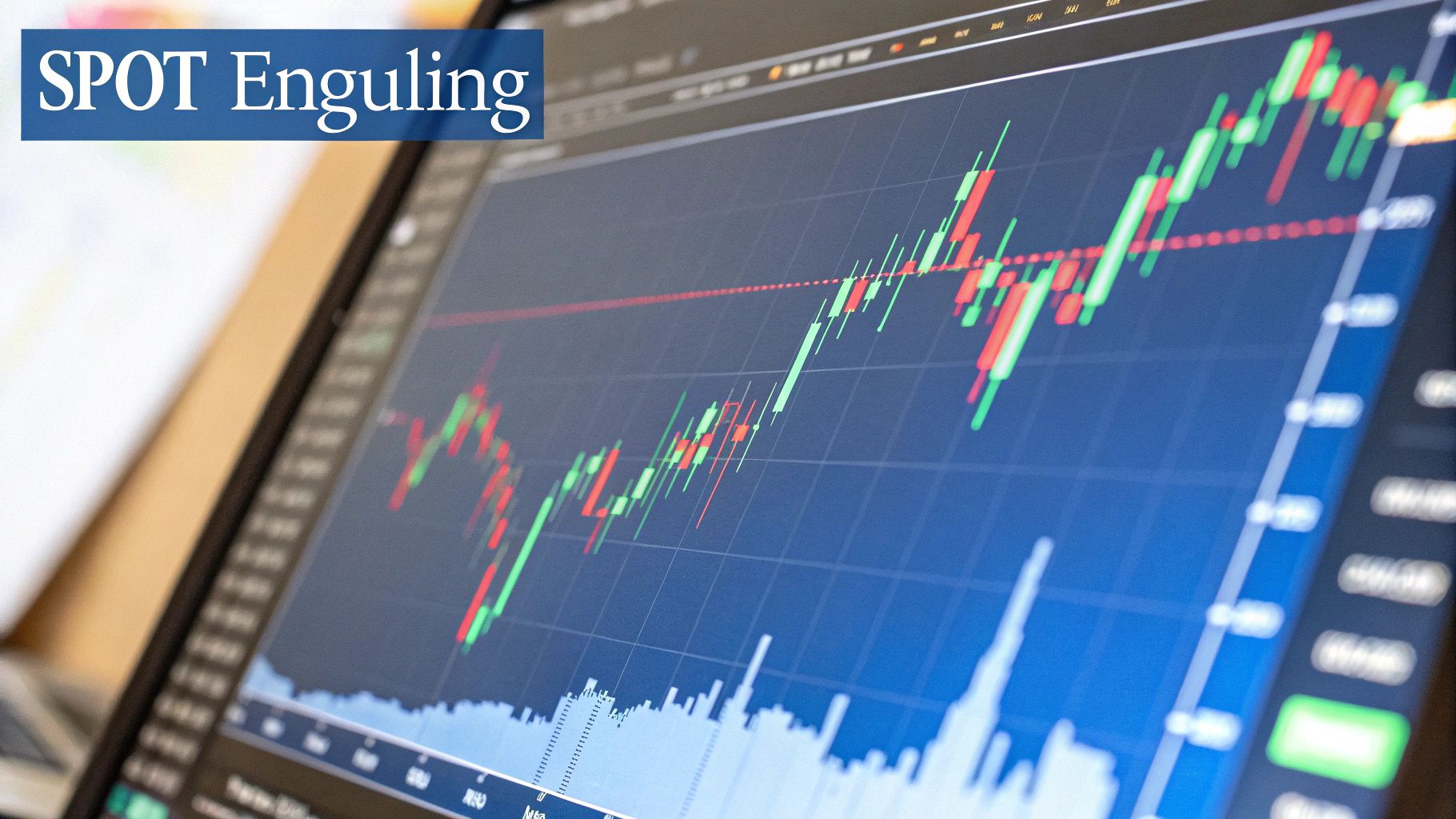
Trading the Engulfing Candle Pattern
The engulfing candle pattern is a fantastic two-candle signal that screams one thing: a sudden, decisive shift in who’s in control of the market. It’s like watching a takeover happen right on your chart, where either the buyers or the sellers completely steamroll the other side. Traders love this pattern because it can flag potential trend reversals right when they matter most.
The Story Behind the Engulfing Candle Pattern
Think of it like a tug-of-war between the bulls (buyers) and the bears (sellers). For a moment, one side has a small advantage, which shows up as a little candle on the chart. Then, out of nowhere, the other team finds a massive burst of strength. They don't just pull the rope back—they yank it so hard they completely "engulf" the other team's previous effort.
That’s exactly the story an engulfing pattern tells. It’s not just some random shape; it’s a clear picture of a dramatic power struggle playing out in real-time.
This pattern is a cornerstone of technical analysis because it gives you a clear, early heads-up that market sentiment might be on the verge of a major change. Getting a grip on its structure is the first step to using this powerful signal. If you're still getting your bearings with charts, nailing the basics is crucial. You can learn how to read candlestick charts in our detailed guide to build that solid foundation.
Two Sides of the Same Coin
The engulfing pattern comes in two flavors, each telling the opposite story but carrying the same weight. Knowing which one you’re looking at is the key to anticipating what the market might do next.
Here’s a quick rundown of what you’ll see and what it means for your trading.
Engulfing Pattern At a Glance
| Pattern Type | Appearance | Market Implication |
|---|---|---|
| Bullish Engulfing | A large green (or white) candle completely covers the body of the previous smaller red (or black) candle. | After a downtrend, this signals that buyers have overwhelmed sellers, potentially starting a new uptrend. |
| Bearish Engulfing | A large red (or black) candle completely covers the body of the previous smaller green (or white) candle. | After an uptrend, this signals that sellers have taken control, suggesting a potential downtrend is on its way. |
Recognizing these two variations helps you quickly assess the balance of power on your charts.
At its core, an engulfing candle is a signal of conviction. It suggests the previous, smaller trend has run out of steam and a new, more powerful force is now in the driver's seat.
By learning to spot this pattern, you’re basically learning to read the market's mood—that exact moment when confidence flips from one side to the other. Now, let's dive deeper into each variation so you can start recognizing these pivotal moments on any chart.
Spotting the Bullish Engulfing Pattern on a Chart
The bullish engulfing pattern is one of the most powerful two-candle signals you can find. It tells a dramatic story of a market takeover, where control flips violently from the sellers to the buyers. You'll typically spot this at the bottom of a downtrend, and it often looks like the moment the tide officially turns.
This pattern is made up of two distinct candles. The first is a small bearish candle (usually red or black), which is just a continuation of the downtrend. Sellers are still technically in charge, but their push is weak, which is why the candle body is so small.
Then comes the second candle—the star of the show. It’s a large bullish candle (green or white) that opens at or even below the first candle’s close, then explodes upward to close significantly higher than the first candle’s open. Its real body completely engulfs the body of the previous candle, signaling an overwhelming flood of buying pressure.
The Psychology Behind the Power Shift
What's really happening here? The story is one of exhaustion followed by pure aggression.
That initial small, bearish candle shows that the sellers are running out of steam. They manage one last, feeble push downward, but it lacks any real conviction. The market is tired of going down.
Then, the next trading period opens, and the buyers storm in with incredible force. They don't just absorb the leftover selling pressure; they completely overwhelm it, driving prices far above the previous day's high. This isn't a gentle reversal—it's a decisive move that shows a powerful new force has entered the market, ready to kick off a new uptrend.
A true bullish engulfing pattern screams capitulation. The bears have thrown in the towel, and the bulls have taken over the field. The bigger that second candle, the more powerful the message.
What the Data Reveals
While the pattern looks compelling on a chart, we always want to know what the numbers say. Thankfully, large-scale studies on candlestick patterns give us some great context. One study found the Bullish Engulfing pattern has a bullish reversal success rate of 63%.
That means in nearly two-thirds of the cases observed, the pattern actually led to a confirmed move higher. However, its overall performance rank was modest, which suggests that while the signal is fairly reliable, the rally that follows might not always be a massive one.
Getting familiar with these details is crucial as you learn to master the engulfing candlestick pattern for profits. This pattern is most potent when it appears after a long, grinding downtrend or near a major support level. That added context gives the reversal signal a lot more weight.
Spotting the Bearish Engulfing Pattern
While a bullish engulfing pattern hints that a market might be bottoming out, its evil twin—the bearish engulfing pattern—is a stark warning that an uptrend is losing steam. Think of it as a bright red flare shooting up at the top of a price chart, signaling a dramatic power shift from the buyers to the sellers. Nailing this pattern can give you a crucial head-start on a potential reversal to the downside.
The structure is a perfect mirror image of its bullish cousin. It’s a two-candle formation that shows up at the peak of an uptrend. The first candle is a small, bullish candle (green or white), representing the last gasp of buying momentum. It tells us buyers are still technically in control, but their push higher lacks any real strength or conviction.
Then comes the second, and much more important, candle: a massive bearish one (red or black). This monster opens at or even above the previous candle's close, then absolutely tanks, closing way below the first candle's open. The key visual is that the body of this second candle completely swallows, or engulfs, the body of the first.
Decoding the Market Narrative
The story this pattern tells is one of buyer exhaustion colliding with an overwhelming wave of selling pressure. Imagine a confident army of buyers marching steadily up a hill, only to be ambushed at the summit by a much larger, more powerful force of sellers.
- The Small Bullish Candle: This first candle signals that the party is winding down. Buyers manage one last push, but the small body shows their effort is feeble. The uptrend is running on fumes.
- The Large Bearish Candle: This candle is a sudden and decisive takeover by the sellers. The market might open with some optimism, but sellers immediately jump in and hammer the price down with so much force that they erase all of the previous day's gains—and then some.
This pattern is a beautiful visual of that precise moment when buyer confidence flips to outright panic. The shocking reversal shows that sellers have not only absorbed every last bit of buying demand but have now seized total control, often kicking off a domino effect of selling as nervous buyers scramble to exit their positions.
Key Criteria for Identification
To avoid getting faked out by false signals, you need to make sure the pattern checks a few specific boxes. A true bearish engulfing pattern will have these characteristics.
- A Clear Uptrend Must Precede It: This is a reversal signal, first and foremost. It means nothing if it doesn't show up after a sustained move higher.
- The First Candle is Bullish: The first of the two candles has to close higher than it opened, carrying on with the existing uptrend.
- The Second Candle is Bearish and Larger: The second candle must close lower than it opened. Critically, its body has to completely overwhelm the body of the first candle. The bigger the second candle is compared to the first, the stronger the signal.
When you see this formation pop up near a known resistance level, its predictive power gets a serious boost. It suggests buyers tried to punch through a price ceiling but were aggressively smacked down by sellers, making a move lower that much more likely.
How to Build a Trading Strategy Around It
Spotting an engulfing candle is a great first step, but it's really just a single piece of a much larger puzzle. A solid trading strategy needs more than just one signal; it requires a clear plan for your entry, risk management, and, most importantly, taking profits.
Think of an engulfing candle as a powerful signal of a momentum shift. But trading on that signal alone is like setting sail based only on the wind's direction without checking the tides or even looking at your map. The best traders always look for confirmation, making sure multiple market factors are lining up in their favor. This extra layer of analysis helps filter out false signals and dramatically increases the odds of a successful trade.
For example, a bullish engulfing pattern that pops up at a major support level is far more powerful than one appearing in the middle of a choppy, directionless market. In the same way, a bearish engulfing pattern that forms right as the Relative Strength Index (RSI) shows an overbought reading carries a ton more weight.
Defining Your Trade Parameters
Once you've found a promising engulfing candle in a favorable spot, it's time to define the exact rules of engagement for your trade. Deciding your entry, stop-loss, and profit targets before you enter a trade is the key to taking emotion out of the equation.
- Entry Point: The most common approach is to enter a trade right after the engulfing candle closes, which confirms the pattern is complete. For a bullish engulfing, you’d place a long (buy) order. For a bearish one, you’d place a short (sell) order.
- Stop-Loss Placement: Your stop-loss is your safety net—don't trade without one. For a bullish engulfing pattern, a logical spot for your stop-loss is just below the low of the engulfing candle. For a bearish setup, you’d place it just above the high.
- Profit Targets: You can set profit targets based on previous support or resistance levels you see on the chart. Another popular method is to use a fixed risk-to-reward ratio, like aiming for a profit that's twice the amount you're risking (a 2:1 ratio).
This simple flowchart breaks down the core steps for executing a trade based on this pattern.
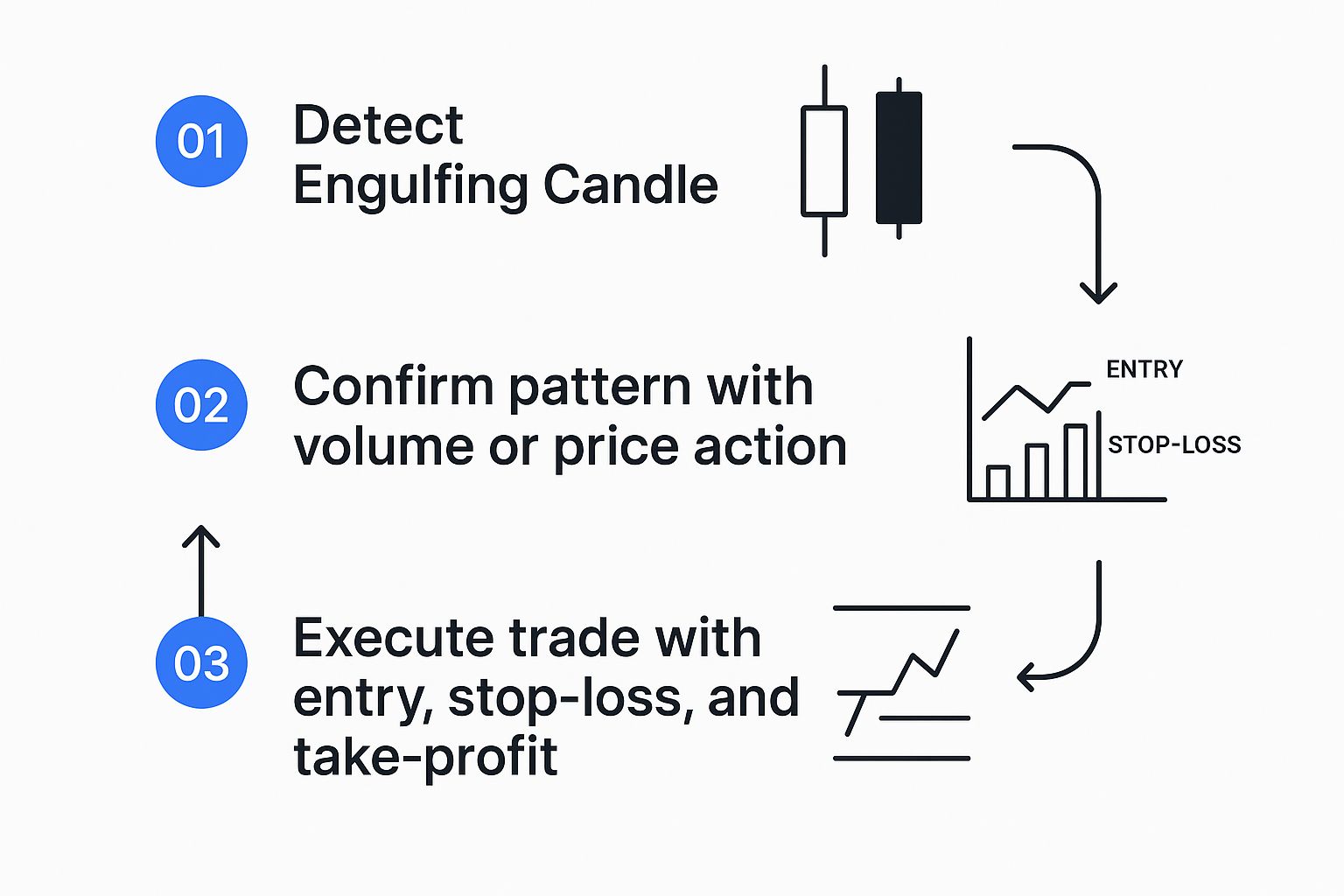
As the visual shows, successful trading isn’t just about spotting a pattern; it’s a systematic process of confirmation, planning, and disciplined execution.
Grounding Strategy in Statistical Reality
Building a strategy that lasts also means you have to be honest about the numbers. Research covering over 4,120 markets found the engulfing candle pattern confirms about 67.3% of the time, meaning the price tends to move in the expected direction within a few candles.
However, when managing trades with a 2:1 reward-to-risk ratio, the profit target was only hit 36.8% of the time. And here's a real eye-opener: nearly all trades (97.1%) retraced back to the entry price at some point, which hammers home the importance of solid risk management. You can find more details on these engulfing pattern findings on patternswizard.com.
Key Takeaway: The engulfing candle is not a magic bullet. It's a powerful signal that, when combined with other indicators and a disciplined trading plan, can significantly improve your ability to identify and act on potential market reversals.
Common Mistakes Traders Make
Spotting an engulfing candle is a great start, but knowing what not to do is what really separates the consistently profitable traders from those who get burned. Even the most textbook-perfect setup can turn into a losing trade if you fall into one of the usual traps. Getting a handle on these errors is a huge step toward long-term success.

The single biggest mistake? Trading the pattern in isolation. An engulfing candle popping up in the middle of a messy, sideways market means almost nothing. It’s just random market noise, not a powerful signal that a reversal is coming.
Another classic blunder is failing to wait for confirmation. Too many eager traders jump the gun, placing a trade the second an engulfing candle starts to form, only to watch the price whip back around before the candle actually closes. Remember, a pattern isn't valid until that period is officially over.
Ignoring Market Context
Where an engulfing pattern shows up is everything. A signal without any supporting evidence is weak and far more likely to fail. You have to have the discipline to look at the bigger picture before putting your capital on the line.
Here are a few contextual mistakes you absolutely want to avoid:
- Ignoring Key Levels: A bullish engulfing pattern forming right on top of a major support level? That's a high-probability setup. One that appears in the middle of nowhere, far from any significant price zone, is much less reliable.
- Disregarding the Trend: Trying to trade a bullish reversal pattern when the market is in a screaming, long-term downtrend is like trying to swim up a waterfall. The odds are just stacked against you.
- Forgetting Volume: A real shift in power—the kind an engulfing candle is supposed to signal—is almost always backed by a big spike in trading volume. If you see an engulfing candle form on low volume, it’s a major red flag that there’s no real conviction behind the move.
A valid engulfing candle pattern is more than just a shape on a chart; it's a story about a shift in market psychology. If that story isn't supported by other evidence like trend, location, and volume, it’s best to stay on the sidelines.
Misinterpreting the Signal
Finally, some traders just misread the pattern itself. A common slip-up is accepting a second candle that barely squeaks past the first one. A truly powerful engulfing candle should be significantly larger, showing that one side has taken undeniable control.
Another mistake is not waiting for the candle to close. Price action can change dramatically in the final moments of a trading period. What looks like a monster engulfing candle mid-session can end up as a pin bar with a long wick and a tiny body, completely torpedoing the signal.
Patience is a trader’s greatest asset. Always, always wait for the candle to close before you even think about acting.
Right, so we've covered what the engulfing pattern looks like and the psychology driving it. But here’s the million-dollar question: does it actually work?
While it’s easy to get excited by a perfect setup on a chart, successful trading is a game of probabilities, not just pretty pictures. We need to step back and look at the hard data to get a reality check.
No trading signal is a crystal ball, and the engulfing pattern is no different. Its effectiveness can swing wildly depending on the market, the asset you’re trading, and the timeframe you're watching.
Gauging the Success Rate
So, how often is it right? A massive study digging into 3,735 trades across 568 years of historical data gives us some real answers. It found that the Bullish Engulfing pattern has a success rate of about 55%. This means it points to a bullish move correctly just over half the time.
You can dive deeper into these bullish engulfing pattern findings on liberatedstocktrader.com.
That number—55%—is critical. It’s better than a coin flip, but it’s a far cry from a sure thing. This stat alone drives home why you should never trade this pattern in isolation and why solid risk management is completely non-negotiable.
The data is pretty clear: while the Bullish Engulfing pattern is a classic signal, its predictive power is modest. Think of it as a strong piece of evidence, not the final verdict. It’s best used to confirm a broader trading idea, not as a standalone entry trigger.
The study also found that the average profit per trade using this pattern was around 0.46%, a bit less than the 0.51% average for candlestick patterns overall. This actually ranks the Bullish Engulfing as the 13th most profitable pattern they tested.
What this tells us is that even when you get a valid signal, squeezing out consistent profits requires a rock-solid plan for your entry, exit, and stop-loss. The pattern gets you in the door, but good trade management is what pays the bills.
Frequently Asked Questions
Let's clear up a few common questions that pop up when traders start working with the engulfing pattern. Getting these details right can make all the difference.
Does the Engulfing Candle Need to Engulf the Wicks?
Not necessarily. The classic definition focuses only on the body of the second candle completely swallowing the body of the first one. That's the core of the pattern.
If you do see a candle that engulfs the wicks (also called shadows) as well, pay attention. This can signal an even more powerful and decisive shift in market sentiment. But it's not a requirement for a valid pattern—the real story is in the battle between the open and close prices.
What Is the Best Time Frame to Trade This Pattern?
You'll spot engulfing patterns on any time frame, but they carry a lot more weight on the higher ones, like the daily or weekly charts.
Think about it: an engulfing candle on a daily chart shows a massive reversal in sentiment that took a full trading day to play out. That's a much more reliable signal than something you'd find on a noisy 5-minute chart, which can get whipsawed by momentary volatility.
Higher time frames filter out much of the market "noise," giving patterns like the engulfing candle greater predictive strength and making them more reliable for strategic decisions.
How Does Volume Confirm an Engulfing Pattern?
Volume is your go-to confirmation tool. A real power shift in the market almost always comes with a surge in trading activity.
For a bullish engulfing pattern, you want to see higher-than-average volume on that big green candle. It validates that strong buying pressure is truly behind the move. For a bearish engulfing, high volume on the red candle confirms the sellers are out in force, making the potential reversal far more credible.
Ready to stop missing these critical market shifts? With ChartsWatcher, you can build custom screeners to automatically detect the engulfing candle pattern across thousands of stocks in real-time. Start your free trial today and trade with a new level of precision.
