Top Financial Data Visualization Techniques for 2025
Unlocking Financial Insights with Powerful Visualizations
In finance, clear data visualization is crucial for effective decision-making. This listicle presents eight essential visualization techniques to help traders, analysts, and investors transform raw financial data into actionable intelligence. Learn how interactive dashboards, heatmaps, candlestick charts, treemaps, annotated time series charts, Sankey diagrams, radar charts, and network graphs can unlock key insights and improve your financial analysis. Master these techniques to better understand market trends, identify opportunities, and manage risk.
1. Interactive Dashboards
Interactive dashboards stand as a cornerstone of modern financial data visualization, offering a powerful way to monitor, analyze, and interpret complex financial data. They consolidate multiple visualizations, key performance indicators (KPIs), and metrics into a single, dynamic interface. Unlike static reports, interactive dashboards empower users – from professional traders and stock market analysts to financial institutions and independent investors – to explore data in real-time, uncovering hidden trends and patterns that inform critical investment decisions.
These dashboards function by integrating data from various sources and presenting it through a combination of charts, graphs, tables, and gauges. The "interactivity" comes from the ability to manipulate these visualizations: users can apply filters, adjust parameters, drill down into specific data points, and customize the layout to focus on their areas of interest. This dynamic exploration allows for a deeper understanding of financial performance than static reports can provide.
Features and Benefits:
Interactive dashboards offer a rich set of features tailored for financial analysis:
- Real-time Data Updates: Stay informed with up-to-the-second data feeds, crucial for day trading and other time-sensitive investment strategies.
- Multiple Visualization Types: Combine different chart types (e.g., line charts for trends, bar charts for comparisons, scatter plots for correlations) to gain a holistic view of performance.
- User-Controlled Filters and Parameters: Focus on specific timeframes, asset classes, or other criteria relevant to your analysis.
- Drill-Down Capabilities: Move from high-level summaries to granular details with a few clicks, enabling in-depth investigation of specific investments or market segments.
- Customizable Layouts and Components: Tailor the dashboard to your specific needs and preferences, creating a personalized workspace for monitoring your portfolio or the broader market.
Pros:
- Comprehensive Overview: Provides a consolidated view of financial performance across multiple metrics.
- Quick Identification of Trends and Anomalies: Interactive visualizations make it easier to spot patterns and outliers that might be missed in static reports.
- Data-Driven Decision Making: Empowers informed investment decisions based on real-time insights.
- Improved Data Accessibility: Presents complex data in a user-friendly format, making it accessible to non-technical stakeholders.
- Centralized Information: Integrates data from various sources into a single platform, streamlining the analytical process.
Cons:
- Clutter and Information Overload: Poorly designed dashboards can become overwhelming with too many visualizations or poorly chosen metrics.
- Initial Setup and Configuration: Creating effective dashboards requires careful planning and configuration.
- Resource Intensive: Real-time updates can strain system resources.
- Risk of Misinterpretation: Users need sufficient understanding of the displayed metrics to avoid drawing incorrect conclusions.
Examples of Successful Implementation:
Several prominent platforms leverage interactive dashboards for financial analysis:
- Bloomberg Terminal: Provides real-time market data, news, and analytics through customizable dashboards.
- Tableau Finance Analytics: Offers pre-built templates and tools for creating interactive financial reports.
- Microsoft Power BI: Enables users to connect to various data sources and build dynamic dashboards for financial reporting.
- Institutional Platforms: Firms like JP Morgan and BlackRock use proprietary dashboards for risk management and investment management.
Tips for Effective Dashboard Design:
- Prioritize KPIs: Focus on the most critical metrics rather than trying to include everything.
- Visual Hierarchy and Consistency: Use consistent color schemes, clear labels, and a logical layout to guide the user's eye.
- Balance Overview and Detail: Provide both high-level summaries and options to drill down for deeper analysis.
- Performance Testing: Test the dashboard with real data volumes to ensure smooth performance before deployment.
- Iterative Design: Gather user feedback and incorporate it into iterative design improvements. Learn more about Interactive Dashboards can provide further insights into dashboard design principles.
Interactive dashboards have become indispensable tools for anyone involved in financial markets. They empower users with real-time insights, facilitate data-driven decision-making, and provide a comprehensive understanding of financial performance. By carefully considering design principles and best practices, traders, analysts, and investors can leverage the power of interactive dashboards to gain a competitive edge in today's dynamic financial landscape. Pioneering work by visualization experts like Stephen Few and Edward Tufte, along with the development of platforms like Tableau and Power BI, have propelled the widespread adoption and evolution of this powerful technique.
2. Heatmaps for Correlation Analysis
Heatmaps are powerful visualization tools that leverage color-coding to represent the relationships between different financial variables. This makes them exceptionally useful for correlation analysis, risk assessment, and identifying patterns within complex datasets. In essence, a heatmap is a graphical representation of data where the individual values contained in a matrix are represented as colors. The color intensity corresponds to the magnitude of the value, allowing for quick visual interpretation of the data. This visual approach simplifies the understanding of complex relationships and allows for faster identification of key insights.
In finance, heatmaps find diverse applications. They can be used to visualize correlation matrices, which are crucial for portfolio diversification and risk management. Traders can utilize heatmaps to analyze trading volume and price movements across different assets, identifying potential opportunities or warning signs. Market analysts can leverage heatmaps to compare the performance of various sectors, providing a bird's-eye view of market trends. Furthermore, risk managers in financial institutions use heatmaps during stress tests to assess risk exposure across different portfolios and scenarios. Examples include: asset correlation heatmaps in portfolio management, trading volume heatmaps in stock market analysis, risk exposure heatmaps in banking stress tests, and sector performance heatmaps. Sites like Finviz provide readily available examples of sector performance heatmaps.
Heatmaps excel at revealing relationships between multiple variables simultaneously through their grid layout and color intensity variations. They condense large datasets into digestible visuals, enabling quick identification of clusters, outliers, and overall patterns. This is particularly valuable for professional traders, analysts, and investors who need to rapidly process and interpret large amounts of data. For portfolio diversification analysis, heatmaps can visually highlight assets that are highly correlated, allowing investors to construct portfolios with optimal risk-return profiles.
Pros:
- Rapid Identification of Relationships: Quickly reveals connections between multiple variables.
- Intuitive Understanding of Complex Data: Makes correlation data easier to grasp visually.
- Effective Pattern Recognition: Facilitates spotting clusters and outliers.
- Data Condensation: Simplifies large datasets into easily digestible visuals.
- Portfolio Diversification: Highly useful for analyzing asset correlations.
Cons:
- Difficulty Extracting Precise Values: Interactive elements, such as tooltips, are often necessary.
- Color Perception Variations: Differences in individual color perception can impact interpretation.
- Limited Time-Series Analysis: Not ideal for analyzing data over extended periods.
- Requires Explanation for Unfamiliar Stakeholders: Education might be needed for those new to heatmaps.
- Clarity Issues with Excessive Variables: Too many variables can lead to a cluttered and less effective visualization.
Tips for Effective Heatmap Usage:
- Appropriate Color Scales: Use diverging color scales for correlation data (e.g., red for negative correlation, blue for positive correlation, and white for zero correlation).
- Clear Legends: Provide a detailed legend explaining the color mapping.
- Interactive Tooltips: Implement interactive tooltips for precise value display on mouse hover.
- Sorting and Clustering: Sort rows and columns or use hierarchical clustering to highlight patterns and relationships.
Heatmaps have become increasingly popular due to tools like Finviz's financial visualizations, Morningstar's portfolio analysis tools, and the availability of libraries like R's corrplot and Python's seaborn. Their effectiveness in condensing complex information and highlighting key relationships makes them a valuable tool for any financial professional, whether a trader, analyst, or investor. They deserve a place in this list because of their ability to simplify complex correlation data, facilitate rapid pattern recognition, and enhance decision-making in various financial applications.
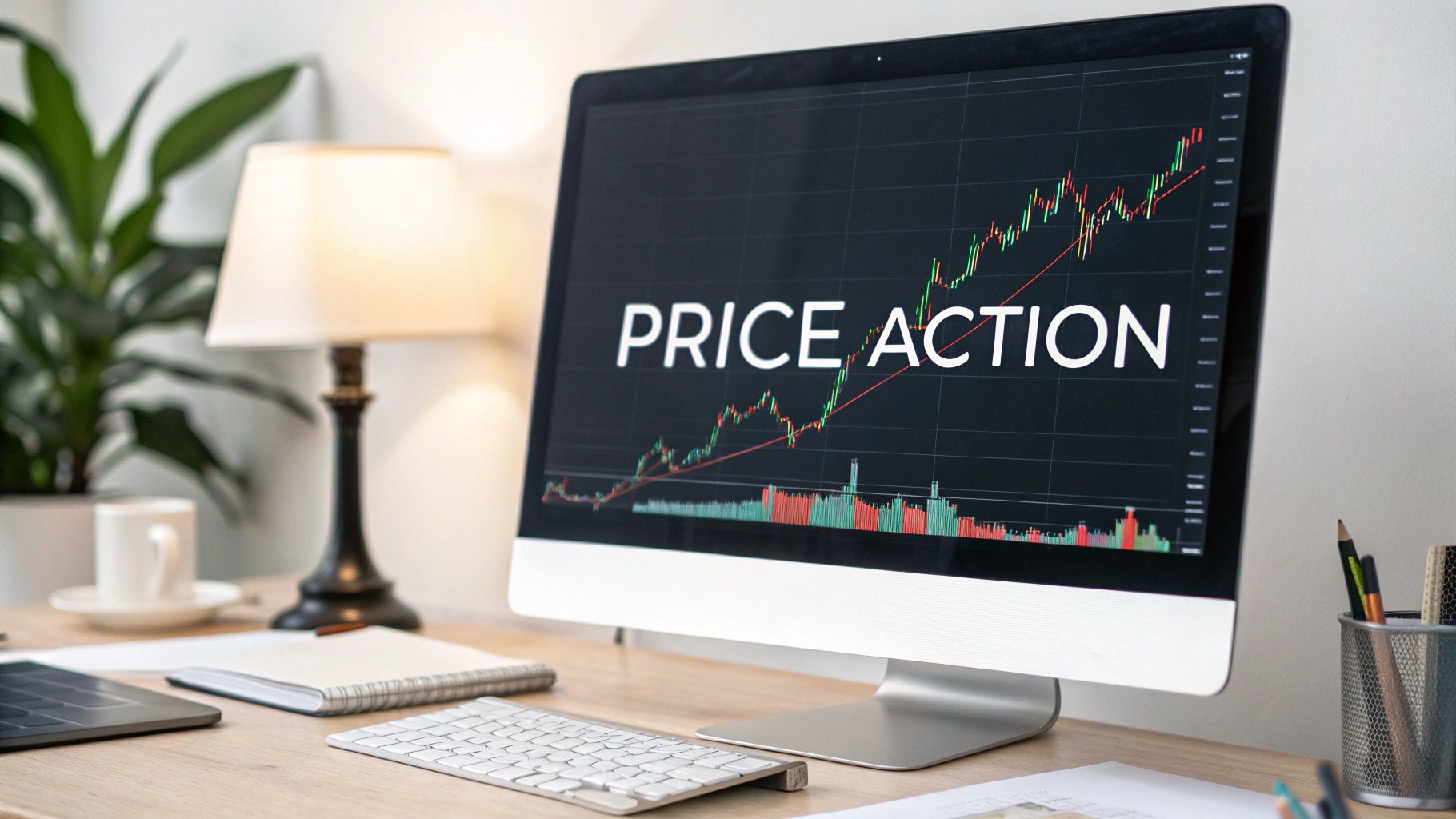
3. Candlestick Charts
Candlestick charts offer a powerful visual representation of price action over specific time intervals. Unlike simple line charts, they provide a more nuanced view by displaying the open, high, low, and close prices for each period. This allows traders and analysts to quickly grasp the range of price movement and the sentiment driving it. Originating in 18th-century Japan for rice trading, candlestick charts have become a cornerstone of technical analysis in modern financial markets. They reveal not just what the price did, but how it did it, offering insights into potential reversals, support/resistance levels, and overall market psychology.

Each "candlestick" represents a specific timeframe (e.g., one minute, one hour, one day). A green/white candlestick typically signifies an uptrend where the closing price is higher than the opening price. Conversely, a red/black candlestick represents a downtrend, with the closing price lower than the open. The "body" of the candlestick visually represents the difference between the open and close. Thin lines extending above and below the body, called "wicks" or "shadows," indicate the high and low prices reached during that period. The unique structure of candlestick charts allows for the formation of recognizable patterns, like "doji," "hammer," "engulfing patterns," and many others, which can provide predictive insights into future price movements.
Examples of Successful Implementation:
- TradingView: This platform extensively utilizes candlestick charts, providing a wide range of drawing tools, indicators, and community-shared analyses centered around candlestick patterns.
- MetaTrader: A popular platform for forex and commodities trading, MetaTrader offers advanced charting capabilities with candlestick analysis tools, allowing traders to identify potential trading opportunities based on candlestick formations.
- Bloomberg Terminal: This professional-grade platform leverages candlestick charts to display historical and real-time price data across various asset classes, providing sophisticated tools for technical analysis.
Actionable Tips for Readers:
- Combine with Volume: Use volume indicators alongside candlestick charts. Increased volume during the formation of a bullish candlestick pattern strengthens its validity, while decreasing volume during a bearish pattern might suggest weakness.
- Multiple Timeframes: Analyze candlestick patterns on multiple timeframes. A bullish pattern on a daily chart gains more weight if confirmed by similar patterns on shorter-term charts (e.g., hourly or 4-hour).
- Moving Averages: Add moving averages to your charts to help identify trends and potential support/resistance levels, adding context to candlestick patterns.
- Focus on Recent Formations: Prioritize recent candlestick formations for trading decisions, as they reflect the most current market sentiment.
When and Why to Use Candlestick Charts:
Candlestick charts are valuable for both short-term traders and long-term investors seeking a deeper understanding of price action and market dynamics. They are particularly useful for:
- Identifying Reversal Points: Candlestick patterns like doji and hammer can signal potential trend reversals, allowing traders to anticipate changes in market direction.
- Assessing Market Sentiment: The color and shape of candlesticks can provide insights into the prevailing market sentiment – whether bullish, bearish, or indecisive.
- Determining Support/Resistance: Candlestick patterns combined with other technical indicators can help pinpoint key support and resistance levels, crucial for setting profit targets and stop-loss orders.
Pros:
- Rich price information in a compact visual format.
- Reveals market psychology and sentiment.
- Enables identification of support/resistance levels.
- Supports pattern recognition for technical analysis.
- Works across multiple timeframes.
Cons:
- Requires training and practice to interpret effectively.
- Can become visually cluttered on longer timeframes.
- Patterns may not always lead to predicted outcomes.
- Limited value for fundamental analysis.
- May encourage overtrading if overly relied upon.
Candlestick charts deserve a prominent place in any technical analyst's toolkit. They bridge the gap between raw price data and actionable insights, providing a powerful means to visualize and interpret market movements. However, remember that like any technical analysis tool, they are not foolproof and should be used in conjunction with other forms of analysis and risk management strategies.
4. Treemap Visualization
Treemap visualization is a powerful technique for representing hierarchical financial data using nested rectangles. Each rectangle within the treemap corresponds to a specific data point within the hierarchy, such as a market sector, an individual asset within a portfolio, or a specific company within a sector. The size of each rectangle is proportional to a chosen quantitative value, for instance, market capitalization, asset allocation percentage, or revenue. Simultaneously, color can be used to encode another dimension of data, like performance (e.g., profit/loss) or growth rate. This combination of size and color allows for rapid visual assessment of both the composition and comparative values of various elements within a complex dataset.

Treemaps earn their place in this list due to their unique ability to display multi-dimensional financial data in a concise and easily interpretable format. They are particularly valuable for identifying concentration risks within portfolios, spotting performance outliers within market sectors, and understanding the overall composition of complex financial instruments. For example, a treemap visualizing a portfolio can instantly reveal if it is overexposed to a particular sector or if specific holdings are significantly underperforming.
Features and Benefits:
- Nested rectangular structure: Clearly depicts hierarchical relationships between different data categories.
- Size encoding: Effectively communicates quantitative values like market capitalization, allocation percentage, or trading volume.
- Color encoding: Adds another layer of information, highlighting performance, volatility, or other relevant metrics.
- Efficient use of space: Allows for the display of numerous categories simultaneously, making it ideal for large datasets.
- Support for multiple levels of hierarchy: Facilitates in-depth analysis of complex financial structures.
Pros:
- Shows both composition and comparative sizes concurrently.
- Reveals patterns and outliers in hierarchical financial data.
- Makes efficient use of screen space, especially useful for dashboards.
- Excellent for portfolio composition and diversification analysis.
- Intuitive for visualizing market sectors and subsectors.
Cons:
- Can be difficult to precisely compare similarly-sized rectangles.
- Limited effectiveness for visualizing time-series data.
- Complex hierarchies can obscure the precise relationships between elements.
- Requires careful color selection to avoid misinterpretations.
- Not ideal for precise numerical comparisons.
Examples of Successful Implementation:
- Finviz Map of the Market: Provides a real-time treemap visualization of the stock market, showcasing sector performance and individual stock movements.
- Morningstar's X-Ray tool: Helps investors analyze their portfolio composition, identifying sector concentration and potential overlaps.
- Bloomberg Terminal: Utilizes treemaps to visualize market movements across various asset classes and geographies.
Tips for Effective Use:
- Consistent Color Scales: Employ intuitive color palettes (e.g., red for negative performance, green for positive) and maintain consistency across different visualizations.
- Interactivity: Incorporate interactive features, such as drill-down functionality, to allow users to explore different levels of the hierarchy.
- Tooltips: Add tooltips that display detailed information about each rectangle upon mouse hover.
- Animation (Considerately): While not ideal for static comparisons, animation can be cautiously used to illustrate changes over time for specific datasets.
- Limit Hierarchy Depth: Keep the hierarchy to 2-3 levels for optimal clarity, as excessive nesting can make the visualization difficult to interpret.
Popularized By:
The treemap visualization technique was invented by Ben Shneiderman in the 1990s. Its application to financial data has been popularized by platforms like Finviz, Morningstar, and Bloomberg, along with influential examples such as Martin Wattenberg's SmartMoney Map of the Market.
For professional traders, analysts, and investors, treemaps provide a rapid and insightful overview of complex financial data. They are particularly useful for portfolio management, market analysis, and identifying potential investment opportunities or risks. By leveraging the features and following the tips outlined above, users can effectively utilize treemaps to gain a deeper understanding of the financial landscape.
5. Time Series Line Charts with Annotations
Time series line charts with annotations represent a powerful tool for visualizing financial data over time, going beyond the capabilities of basic line charts. They allow professionals to track, analyze, and communicate financial narratives by highlighting key events and providing rich context directly on the chart. Instead of just displaying the raw data, annotated time series charts tell a story. They reveal not only what happened but also why it might have happened. This makes them essential for anyone working with financial markets, from professional traders and stock market analysts to independent investors and educators.
This visualization method works by plotting data points on a Cartesian plane, with the x-axis representing time and the y-axis representing the financial metric being tracked (e.g., stock price, trading volume, interest rate). The plotted points are connected by a line, visually depicting the trend over time. The power of this technique comes from the addition of annotations: labels, markers, or shaded regions tied to specific dates that provide context. For example, an annotation might mark an earnings release, a significant news event, a change in monetary policy, or a period of economic recession.
Features and Benefits:
- Temporal Progression of Financial Metrics: Clearly visualizes how financial data evolves over time, allowing for trend identification.
- Annotations for Key Events: Contextualizes the data by directly linking market movements to real-world events like earnings releases, policy changes, or major market events.
- Multiple Data Series Comparison: Supports comparing the performance of multiple securities or metrics simultaneously, facilitating relative performance analysis.
- Interactive Elements: Features like zooming, panning, and time period selection allow users to explore specific periods in detail.
- Customizable Trend Lines, Moving Averages, and Benchmarks: Enhances analysis by incorporating technical indicators and comparative benchmarks directly onto the chart.
Pros:
- Clear Trends and Patterns: Effectively reveals trends and patterns over time.
- Contextualized Data: Annotations provide valuable insights into the factors driving market movements.
- Familiar Format: Widely understood and easily interpretable.
- Performance Tracking: Facilitates performance tracking against benchmarks and other securities.
- Adaptable Time Frames: Can be used for daily, weekly, monthly, quarterly, or annual analysis.
Cons:
- Clutter: Too many data series or annotations can make the chart difficult to read.
- Obscured Volatility: May not clearly show volatility and distribution details.
- Limited Relationship Analysis: Less effective for visualizing complex relationships between multiple variables.
- Misleading Interpretation: Scale choices can potentially distort the perception of changes.
- Ineffective for High-Frequency Data: Not suitable for visualizing tick-by-tick or other high-frequency data.
Examples of Successful Implementation:
- Google Finance: Offers interactive stock charts with annotations for dividends, splits, and news events.
- Federal Reserve Economic Data (FRED): Provides annotated charts for a wide range of economic indicators.
- Financial Times: Utilizes interactive market visualizations with annotations to explain market movements.
- Bank Earnings Reports: Often include annotated charts to showcase performance trends.
- Economic Policy Impact Analysis: Central banks use annotated time series charts to demonstrate the impact of policy changes.
Tips for Effective Use:
- Sparing Annotations: Use annotations judiciously to highlight only the most significant events.
- Logarithmic Scales: Consider logarithmic scales for visualizing long-term financial data, especially when dealing with exponential growth.
- Contextual Period Markers: Include recession shading or other contextual markers to provide broader economic context.
- Data Normalization: Normalize data when comparing multiple series with different scales.
- Percentage Change Option: Provide users with the option to toggle between absolute and percentage changes.
Popularized By:
The effective use of annotated time series charts in financial visualization has been championed by data visualization pioneers like Edward Tufte, along with leading financial news organizations like The Wall Street Journal and Bloomberg. The Federal Reserve and platforms like Yahoo Finance have also contributed to its widespread adoption.
This method deserves its place in the list because it empowers financial professionals to move beyond simply observing data to understanding the underlying narrative. By contextualizing market movements with real-world events, these charts provide invaluable insights for informed decision-making. For day traders, identifying key news events and their impact on price action can be crucial for successful trading strategies. Stock scanners and screeners can incorporate annotated charts to quickly identify stocks with significant price movements correlated with specific events. Financial institutions can leverage these charts to communicate complex market trends to clients and stakeholders. For stock trading educators, they are an indispensable teaching tool to explain market dynamics and the impact of external factors.
6. Sankey Diagrams for Cash Flow
Sankey diagrams are a powerful visualization technique specifically designed to illustrate flow relationships. The defining characteristic of a Sankey diagram is the use of arrows or "streams" where the width is directly proportional to the magnitude of the flow they represent. This makes them exceptionally well-suited for visualizing cash flow within various financial contexts. For traders, analysts, and financial institutions, Sankey diagrams offer a clear and intuitive way to understand the movement of money.
How They Work:
Sankey diagrams consist of nodes and flows. Nodes represent different entities, accounts, or categories within a financial system, while the flows connect these nodes, visually depicting the transfer of funds between them. The wider the flow, the larger the amount of money being transferred. Directional arrows clearly indicate the path of money movement. Color-coding can further enhance the visualization by differentiating between different types of flows (e.g., revenue vs. expenses, inflows vs. outflows). The ability to represent multiple levels of transfers allows for the depiction of complex financial structures.
Use Cases for Financial Professionals:
- Portfolio Analysis: Visualize the flow of funds between different asset classes within an investment portfolio, allowing for quick identification of asset allocation strategies and rebalancing activities.
- Budgeting and Expense Tracking: Track income and expenses, understand budget allocations, and identify areas of overspending or potential savings. This is particularly useful for both personal finance and corporate budgeting.
- Fund Management: Illustrate the movement of capital within a fund, including investments, redemptions, and management fees.
- Corporate Finance: Analyze internal financial flows, such as the allocation of resources across different departments, projects, or investments.
- Trading Analysis: Visualize the flow of capital in and out of different trading strategies or asset classes, offering insights into trading performance and risk management.
- Supply Chain Finance: Map the flow of funds within a supply chain, from procurement to payment, helping to identify bottlenecks and optimize working capital.
Examples of Successful Implementation:
- Visualizing the flow of funds within a complex trading strategy, showing the allocation of capital to different instruments and the resulting profits and losses.
- Mapping the flow of funds between different accounts within a financial institution, helping to identify potential liquidity risks.
- Illustrating the allocation of a national budget across various government departments and programs.
Pros:
- Intuitive Visualization: Clearly shows both the direction and magnitude of financial flows, making complex financial data easier to understand.
- Identification of Inefficiencies: Reveals bottlenecks or inefficiencies in financial processes by highlighting areas with excessive or insufficient flow.
- Budget Allocation Visualization: Excellent for visualizing and communicating budget allocations to stakeholders.
- Tracking Complex Transfers: Effectively tracks fund transfers across multiple entities or accounts.
Cons:
- Complexity with High Volume: Can become cluttered and difficult to interpret if there are too many flows or nodes.
- Limited Time-Series Analysis: Not ideal for showing changes in flows over time.
- Data Requirements: Requires accurate and detailed flow data for accurate representation.
Tips for Effective Use:
- Limit Complexity: Keep the number of nodes and flows to a manageable level to maintain clarity.
- Strategic Color Coding: Use a consistent and intuitive color scheme to differentiate between different types of flows.
- Interactivity: Consider incorporating interactive elements to allow users to explore specific flows or nodes in more detail.
- Strategic Node Placement: Arrange nodes strategically to minimize crossing flows and improve readability.
- Clear Labels and Annotations: Provide clear labels and annotations to give context and explain the diagram's elements.
Why Sankey Diagrams Deserve a Place on This List:
Sankey diagrams provide a unique and valuable perspective on financial flows that traditional charts and graphs often fail to capture. Their ability to visually represent the magnitude and direction of financial transfers makes them an indispensable tool for financial professionals seeking to understand and communicate complex financial data. For traders, analysts, and investors, understanding cash flow is paramount, and Sankey diagrams offer an effective way to achieve this. They empower informed decision-making by providing a clear and concise visualization of how money is moving within a system.
7. Radar/Spider Charts for Multi-metric Comparison
Radar charts, also known as spider or star charts, offer a compelling way to visualize multi-dimensional financial data, making them a valuable tool for anyone from professional traders to individual investors. They achieve this by plotting multiple quantitative variables on axes radiating from a central point, creating a polygon that visually represents the overall profile of the data being analyzed. This distinctive visual representation makes them particularly useful for comparing different investment options, assessing risk profiles, benchmarking performance, and recognizing patterns quickly.
How They Work:
Imagine the center of the radar chart as a zero point for all your chosen metrics. Each axis extending outwards represents a specific financial metric, like return on investment (ROI), volatility, price-to-earnings ratio (P/E), dividend yield, or ESG score. The value of each metric for a particular investment determines how far along its corresponding axis a point is plotted. Connecting these points forms a polygon, the shape and size of which reflect the investment's overall characteristics. Multiple polygons can be overlaid on the same chart to directly compare different investments or entities.
Examples in Finance:
- Fund Fact Sheets: Comparing mutual funds or ETFs based on factors like risk, return, expense ratio, and asset allocation.
- ESG Performance Visualization: Evaluating companies based on their environmental, social, and governance scores.
- Country Economic Indicator Comparisons: Assessing countries based on GDP growth, inflation, unemployment, and trade balance.
- Credit Rating Factor Analysis: Visualizing the key factors influencing a company's creditworthiness.
- Balanced Scorecard Performance Visualization: Tracking performance across financial, customer, internal process, and learning & growth perspectives.
Actionable Tips for Effective Use:
- Limit the Number of Axes: For optimal clarity, stick to 5-8 axes. Too many axes can make the chart cluttered and difficult to interpret.
- Strategic Axis Arrangement: Place related metrics adjacent to each other to highlight correlations and facilitate comparisons. For example, group profitability metrics like ROI and profit margin together.
- Consistent Scales: Use the same scale for all axes to ensure a fair comparison. Inconsistent scales can distort the visual representation and lead to incorrect conclusions.
- Clear Legends: When overlaying multiple entities, use a clear legend to easily distinguish between them. Color-coding and distinct line styles can further enhance readability.
- Normalization: Consider normalizing the values for each metric to a common scale (e.g., 0-100) to ensure a fair comparison, especially when metrics have different units of measurement.
Pros and Cons:
Pros:
- Multi-Dimensional View: Presents a comprehensive view of performance across multiple metrics at a glance.
- Strength/Weakness Identification: Facilitates quick identification of an entity's strengths and weaknesses relative to others.
- Effective Comparison: Enables straightforward visual comparison of multiple investments or entities.
- Pattern Recognition: Creates distinctive visual 'signatures' that aid in pattern recognition and quick assessment.
- Compact Representation: Provides a compact and visually appealing summary of complex multi-dimensional data.
Cons:
- Potential for Misinterpretation: Can be misleading if axes are poorly chosen, ordered, or scaled inconsistently.
- Limited Number of Axes: The effectiveness diminishes with too many overlaid comparisons, making the chart cluttered.
- Area Size Misleading: The area of the polygon can be visually misleading, as it doesn't necessarily correlate directly with overall performance.
- Difficult Quantification: Precisely quantifying differences between entities can be challenging.
Why Radar Charts Deserve a Place in Your Toolkit:
For traders, analysts, and investors, the ability to quickly grasp the multifaceted nature of financial instruments is crucial. Radar charts excel in this area, offering a concise yet informative overview of multiple metrics simultaneously. This allows for efficient comparison of investment options, identification of potential risks and opportunities, and ultimately, more informed decision-making. They offer a powerful visual tool for pattern recognition, which can be particularly valuable in fast-paced trading environments. Whether you're comparing stocks, evaluating portfolio performance, or assessing market trends, radar charts provide a valuable perspective that complements other analytical techniques.
8. Network Graphs for Financial Relationships
Network graphs, also known as force-directed graphs, provide a powerful way to visualize the intricate web of relationships within the financial world. They represent financial entities as nodes and the relationships or transactions between them as edges, offering a unique perspective on complex financial systems that traditional charts and tables often miss. This makes them an invaluable tool for professional traders, analysts, institutions, and individual investors alike.
How They Work:
Network graphs work by applying physics-based algorithms that simulate forces between the nodes. Nodes with stronger connections (represented by thicker edges) are pulled closer together, while those with weaker or no connections drift further apart. This creates a visual representation where clusters and central players naturally emerge, highlighting key relationships and dependencies. Node sizes can also be adjusted to reflect metrics like market capitalization, trading volume, or systemic importance.
Use Cases and Benefits:
Network graphs are particularly useful for understanding:
- Counterparty Risk: Visualizing interconnectedness between financial institutions reveals potential domino effects if one entity fails.
- Investor Relationships: Mapping investment flows and ownership structures can uncover hidden influences and dependencies.
- Corporate Ownership Structures: Unraveling complex corporate hierarchies and subsidiaries through visually clear network maps.
- Financial Contagion Paths: Tracing how shocks propagate through the financial system to anticipate and mitigate systemic risks.
- Trading Networks: Identifying unusual trading patterns, potential market manipulation, and influential players within specific markets.
Features that Drive Insight:
- Variable Node Sizes: Immediately grasp the relative importance or size of entities within the network.
- Edge Thickness: Quickly identify the strength or volume of transactions/relationships.
- Clustering Algorithms: Automatically group related entities, revealing hidden communities and structures.
- Directed Edges: Show the direction of financial flows (e.g., lending, investments).
Pros:
- Uncovers Hidden Structures: Reveals interconnectedness not apparent in traditional data formats.
- Identifies Systemic Risk: Pinpoints central players and potential points of failure.
- Reveals Community Structures: Highlights clusters and subgroups within complex networks.
- Excellent for Risk Analysis: Powerful tool for counterparty risk and contagion path analysis.
- Detects Anomalies: Helps identify unusual relationships or isolated entities.
Cons:
- Visual Overload: Can become difficult to interpret with excessive nodes and connections.
- Requires Interactive Tools: Large networks necessitate sophisticated tools for exploration.
- Needs Domain Expertise: Meaningful interpretation often requires financial knowledge.
- Potential for Misinterpretation: Layout algorithms can sometimes create misleading visual positions.
- Limited Static Utility: Static versions lack the flexibility needed for exploring complex networks.
Examples of Successful Implementation:
- Central banks use network graphs to monitor systemic risk within the banking sector.
- The SEC utilizes network analysis to investigate complex trading networks and potential fraud.
- Financial institutions map inter-bank lending networks to assess their exposure to counterparty risk.
- Investment firms analyze fund flow relationships to identify investment opportunities and manage risk.
Tips for Effective Use:
- Filtering: Focus on the most significant nodes and edges to reduce visual clutter.
- Interactivity: Implement zooming, filtering, and highlighting features for in-depth exploration.
- Clustering: Apply appropriate clustering algorithms to reveal community structures.
- Directed Edges: Use directed edges to visualize the direction of financial flows.
- Visual Encoding: Maintain consistent and intuitive visual encoding for node and edge attributes.
Key Figures and Tools:
The work of Andrew Lo has been pivotal in advancing financial network analysis. Institutions like the Bank for International Settlements and the Financial Stability Board utilize network studies for systemic risk analysis. Open-source tools like Gephi and JavaScript libraries like D3.js provide powerful platforms for creating and interacting with network graphs.
Network graphs are essential for anyone operating within the financial markets who needs to understand the complex relationships between different entities. By visually mapping these connections, they provide invaluable insights into potential risks, opportunities, and the overall structure of the financial landscape. This visualization technique fills a critical gap in traditional financial analysis, offering a powerful lens through which to view the interconnectedness of the modern financial system.
Financial Data Visualization: 8-Point Comparison Matrix
| Title | 🔄 Implementation Complexity | ⚡ Resource Requirements | 📊 Expected Outcomes | 💡 Ideal Use Cases | ⭐ Key Advantages |
|---|---|---|---|---|---|
| Interactive Dashboards | Medium to High setup & configuration | High; real-time data processing | Comprehensive KPI monitoring & data-driven decisions | Real-time performance analysis, interactive exploration | Customizable layout, centralized data, trend detection |
| Heatmaps for Correlation Analysis | Low to Medium; requires careful color scaling | Low; scalable even with large datasets | Intuitive visualization of correlations and patterns | Correlation matrices, risk assessment, portfolio diversification | Clear visual clusters, effective outlier detection |
| Candlestick Charts | Medium; demands technical expertise for accurate interpretation | Low; efficient display of dense price information | Rich visualization of price movements and trend reversals | Technical analysis, market sentiment evaluation | Compact display, multi-timeframe support, pattern recognition |
| Treemap Visualization | Medium; needs thoughtful design and color selection | Medium; optimizes screen real estate | Hierarchical composition with performance and allocation insights | Market sector analysis, portfolio composition | Efficient space use, immediate outlier and pattern identification |
| Time Series Line Charts with Annotations | Low to Medium; requires precise annotation placement | Medium; supports interactive features like zooming and filtering | Clear trend analysis with contextualized events | Performance tracking, historical trend communication | Context-rich visuals, adaptable multi-series comparisons |
| Sankey Diagrams for Cash Flow | High; complex flow mapping and data alignment necessary | High; needs precise, detailed financial data | Visual depiction of cash flow magnitudes and inefficiencies | Budget allocation, fund movement, cash flow analysis | Intuitive flow representation, highlights bottlenecks and inefficiencies |
| Radar/Spider Charts for Multi-metric Comparison | Low to Medium; careful axis selection is key | Low; compact presentation of multiple metrics | Comparative profiling of various financial attributes | Investment comparisons, risk profiling, balanced scorecards | Quick multi-dimensional assessment, distinctive visual signature |
| Network Graphs for Financial Relationships | High; advanced mapping and interactivity required | High; demands sophisticated tools and algorithms | Reveals hidden interconnections and systemic risk insights | Counterparty risk, corporate structure analysis, fraud detection | Detailed connection mapping, effective cluster and anomaly identification |
Elevating Financial Analysis through Visualization
In the fast-paced world of finance, the ability to quickly and effectively analyze data is paramount. This article has explored a range of powerful visualization techniques, from interactive dashboards and heatmaps for correlation analysis to candlestick charts, treemaps, and time series visualizations. We also delved into the utility of Sankey diagrams for visualizing cash flow, radar charts for multi-metric comparisons, and network graphs for illustrating complex financial relationships. Each of these methods offers a unique lens through which to understand complex datasets, transforming raw numbers into actionable insights. Mastering these visualization techniques empowers you to identify trends, uncover hidden patterns, and communicate financial information with clarity and impact. For a deeper dive into the methods behind interpreting financial data, exploring various financial analysis techniques can provide valuable insights and context. This resource from Financial Analysis Techniques from PDF AI offers a comprehensive look at analytical methods to complement your visualization skills.
The key takeaway is this: choosing the right visualization method is crucial, and it depends entirely on the specific data you’re analyzing and the questions you're trying to answer. By understanding the strengths of each technique and applying them strategically, you can unlock a deeper level of understanding and gain a significant competitive edge. Experimentation is key; try different approaches to discover what works best for your particular needs and refine your approach over time.
As you embark on your journey to enhance your financial analysis capabilities, consider the power of dedicated visualization platforms. ChartsWatcher empowers you to harness the full potential of these techniques, providing a dynamic and robust platform for visualizing market movements, tracking performance, and developing winning trading strategies. Ready to transform your data into actionable insights? Visit ChartsWatcher today and experience the difference.
