How to Read Stock Charts: The Complete Guide for Beginner Investors
Understanding Essential Stock Chart Components
Reading stock charts might seem daunting at first, but breaking down the key components makes it much easier to understand. Just like learning any new skill, mastering chart reading takes practice and familiarity with the basic building blocks.
Basic Price Information
When you look at a stock chart, the price information is front and center. Each bar or candlestick shows how a stock performed during a specific time period. The open price is where trading begins each day, while the high and low mark the extremes. The previous close tells you where the stock ended the last trading session.
For example, if you check Apple's stock, you might see an open at $150, reaching a high of $155 and a low of $145, with yesterday's close at $152. This gives you a quick snapshot of the stock's movement. Want to learn more? Check out NerdWallet's guide to stock charts.
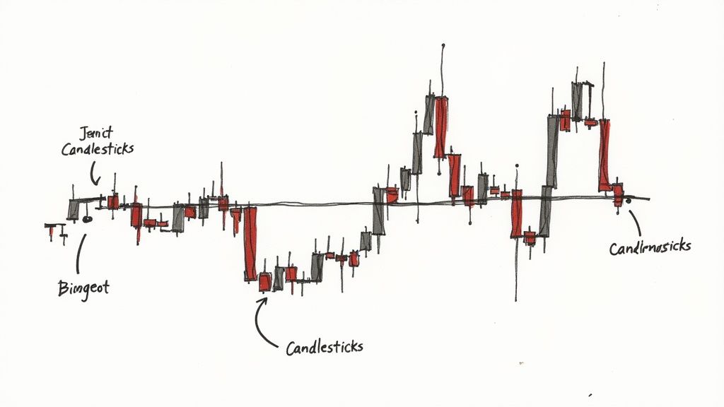
Chart Types: Bars vs. Candlesticks
Most traders use either bar charts or candlestick charts. Bar charts show price data with simple vertical lines and small horizontal ticks. Candlesticks make it easier to spot trends at a glance, using colored bodies (usually green for up moves and red for down moves) with thin lines called "wicks" showing the full price range.
Timeframes: From Minutes to Years
Charts can show different timeframes - from minute-by-minute updates to yearly views. Day traders often watch intraday charts showing price moves every few minutes. Long-term investors might prefer daily, weekly, or monthly charts to spot bigger trends. Each view tells a different story about the stock's behavior.
Check out our detailed timeframe guide to learn which works best for your trading style.
Volume: A Crucial Confirmation Tool
Volume shows how many shares changed hands during each period. Think of it as the force behind price moves - high volume usually means stronger trends, while low volume might signal weaker ones. For instance, when a stock jumps 5% with heavy volume, that's typically more meaningful than the same move on light volume. Volume bars appear below the main price chart, adding important context to price action.
Mastering Volume Analysis and Trading Patterns
After exploring the basic components of stock charts, let's examine how volume analysis can improve your trading decisions. Understanding how volume interacts with price movements helps you spot genuine market trends and make smarter trades.
Why Volume Matters
Volume shows how many shares are traded in a given timeframe. Think of it as a tool that confirms whether price movements are meaningful. When prices move with high volume, it usually means many traders agree with that direction. Low volume often hints that a trend might reverse soon since fewer traders are participating.
You can see this in action when watching real market behavior. A stock climbing higher with strong volume typically continues upward, as it shows many buyers are interested. But if a stock rises on weak volume, it may lack the backing needed to keep going up. For a deeper look at chart analysis basics, check out this helpful guide from Personal Finance Lab.
Volume and Trading Patterns
Volume makes certain chart patterns more reliable. For example, when a stock breaks out of a sideways pattern with heavy volume, it's more likely to keep moving in that direction. Here are key patterns where volume matters:
- Breakouts: Strong volume confirms a genuine breakout
- Head and Shoulders: Dropping volume at the "head" often signals an upcoming reversal
- Triangles: When volume surges as price breaks out of a triangle, the move tends to continue
Using Volume Indicators
Several tools can help you analyze volume data more effectively:
- On-Balance Volume (OBV): Adds up volume based on whether price closed higher or lower - rising OBV suggests buying pressure
- Money Flow Index (MFI): Combines price and volume to show potential market extremes
Understanding volume gives you an edge in reading stock charts. You'll spot stronger trends, catch reversals earlier, and trade with more confidence. This knowledge forms the foundation for the advanced chart analysis techniques we'll cover next.
Identifying Key Technical Indicators That Actually Work
Every trader needs reliable tools to analyze the markets. Rather than guess which of the hundreds of technical indicators will be useful, let's focus on proven tools that consistently help predict price movements.
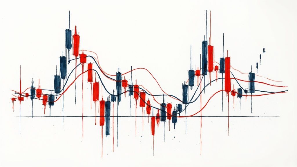
Moving Averages: Smoothing Out the Noise
Moving averages help traders spot clear trends by smoothing out random price fluctuations. The simple moving average (SMA) takes the average price over time - like 50 or 200 days. For faster signals, the exponential moving average (EMA) gives extra weight to recent prices. Many traders watch for when faster moving averages cross slower ones - for example, the 50-day moving above the 200-day can signal an uptrend starting.
Relative Strength Index (RSI): Measuring Momentum
The Relative Strength Index (RSI) shows when a stock may be overbought (above 70) or oversold (below 30). This helps spot potential reversals - an overbought stock might pull back while an oversold one could bounce. But RSI works best combined with other signals rather than alone. Look for confirmation from price action and other indicators.
Bollinger Bands: Gauging Volatility
Bollinger Bands show a middle line (usually 20-day SMA) with outer bands two standard deviations away. When the bands squeeze together, expect low volatility. When they spread apart, volatility is high. Price breaking above the upper band often continues climbing higher. The bands help identify price breakouts and potential reversals.
Combining Indicators for a Comprehensive View
No single indicator tells the whole story. Smart traders look for multiple signals pointing the same way. For example, an uptrend looks stronger when RSI rises while price breaks above the upper Bollinger Band. Take time to test different indicator combinations on ChartsWatcher until you find what matches your trading style. Focus on 2-3 reliable indicators rather than overloading your charts.
Recognizing High-Probability Chart Patterns
After mastering technical indicators, understanding chart patterns is the next key step in reading stock charts effectively. These visual formations in price action can help you spot potential market moves before they happen, giving you an edge in your trading decisions.
Common Chart Patterns and Their Significance
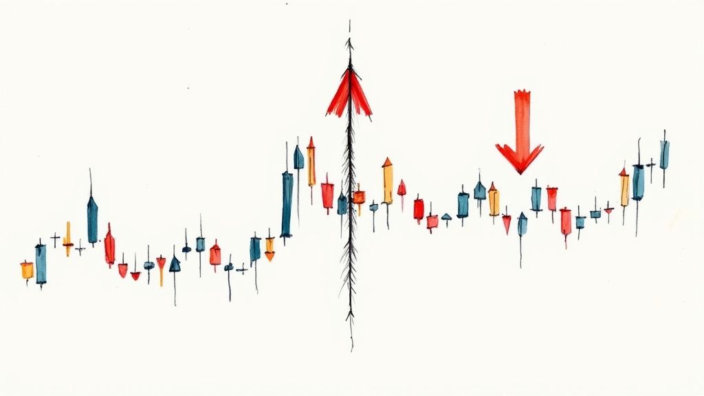
Stock charts frequently display several reliable patterns that smart traders watch closely. The two main categories are continuation patterns, which suggest the current price trend will keep going, and reversal patterns, which hint at an upcoming change in direction.
-
Head and Shoulders: This bearish reversal pattern shows up as three peaks, with the middle peak (head) higher than the two outer peaks (shoulders). Watch for dropping volume at the head - it helps confirm the pattern.
-
Inverse Head and Shoulders: Think of this as the mirror image of the regular head and shoulders. When you spot this after a downtrend, it often signals that prices may start climbing.
-
Triangles: These patterns show prices squeezing into a narrower range over time. When prices finally break out of the triangle with good trading volume, that's often the direction they'll keep moving.
-
Flags and Pennants: These quick patterns appear during strong trends as brief pauses. Once the pause ends, prices typically continue moving in the original direction.
Analyzing Real Market Examples
Let's see how these patterns work in actual trading. Take a head and shoulders pattern - the key is watching what happens at the "neckline" (where the shoulders connect). A price drop through this line with heavy trading volume makes for a stronger signal than a break with low volume. The same goes for triangle patterns - more trading activity during the breakout means a more reliable signal.
Combining Patterns with Other Technical Tools
Smart traders know better than to rely on patterns alone. They check their chart pattern signals against other indicators like moving averages and RSI for confirmation. For instance, finding an inverse head and shoulders pattern right as the RSI turns up and prices cross above the 200-day moving average gives you three good reasons to consider buying. ChartsWatcher helps traders spot these combined signals.
Differentiating Between High-Probability and Risky Setups
Each chart pattern carries different odds of success. A head and shoulders pattern with declining volume at the head and a clean break below the neckline tends to work out better than a triangle breaking out with weak volume. With practice and careful study, you'll learn which setups offer better chances of success. This skill helps you focus on the most promising trades while avoiding riskier ones. Next, we'll explore how using multiple timeframes can improve your chart analysis even further.
How Multiple Time Frames Improve Trading Analysis
After mastering basic chart patterns and technical indicators, the next step is understanding how to analyze multiple time frames. Many successful traders use this approach to get a complete market view and verify trading signals. For real-world examples of price movement analysis, check out the Biggest Gainers from Close.
The Value of Multiple Time Frame Analysis
Looking at just one time frame can give you an incomplete picture. A stock might show an uptrend on a short-term chart but actually be in a downtrend when viewed over a longer period. Multiple time frames help you spot these differences and avoid false signals. For instance, you might see what looks like a breakout on a 5-minute chart, but the daily chart could show strong resistance overhead.
Choosing the Right Time Frame Combination
Most traders analyze three key periods: long-term for overall direction, medium-term for trends, and short-term for timing. A day trader typically watches daily, hourly, and 15-minute charts. Swing traders often prefer weekly, daily, and 4-hour views. Success comes from finding clear agreement between these different time frames.
Managing Mixed Signals
Different time frames sometimes tell different stories. You might get a buy signal on a short-term chart while the long-term view suggests selling. When this happens, trust the longer time frame first. If the weekly chart shows a downtrend, be very careful about buying even if shorter-term charts look positive. This simple rule helps limit losses.
Developing Your Market View
Multiple time frame analysis helps you form a clear market opinion. When the long-term trend points up, focus on finding good buying opportunities. This helps you ignore misleading short-term sell signals. Remember though - even in strong uptrends, normal price dips create good entry points.
Real-World Application Example
Let's look at how this works with Apple stock. Say the weekly chart shows a steady uptrend, while the daily chart has pulled back from recent highs. Meanwhile, the 15-minute chart shows sideways movement. This setup often signals a good buying chance. The weekly uptrend confirms overall strength, the daily pullback offers better prices, and the short-term consolidation suggests the dip might be ending. By checking multiple time frames this way, you can spot better trades and manage risk more effectively.
Avoiding Critical Chart Reading Mistakes
After exploring technical indicators, chart patterns, and multiple time frame analysis, let's look at common mistakes that can hurt your trading results. Learning to spot and avoid these errors will help you read stock charts more effectively.
The Danger of Confirmation Bias
Confirmation bias is one of the most harmful mistakes traders make. When you have a strong opinion about where a stock is headed, it's easy to focus only on information that supports your view while dismissing contrary signals. For example, if you believe a stock will rise, you might ignore clear warning signs of a downtrend. The fix? Actively search for evidence that challenges your trade ideas.
Overcomplicating Your Analysis
Adding too many indicators to your charts is a frequent error. While technical tools can help, using too many leads to analysis paralysis - when conflicting signals make it impossible to make decisions. Keep it simple with 2-3 core indicators that align with your trading approach. Clear analysis often produces better results than complex setups.
Ignoring Risk Management
Good chart reading won't prevent all losses. A critical error is failing to protect your account through proper risk controls. Always use stop-loss orders to limit potential losses. A good practice is risking no more than 1% of your total trading capital on any single position.
Emotional Trading Decisions
Fear and greed can override sound analysis and lead to poor trades. Fear might push you to sell during normal pullbacks, while greed tempts you to hold winning trades too long, even when charts show it's time to exit. Create specific entry and exit rules and follow them consistently.
Not Adapting to Changing Market Conditions
Markets shift between trending, ranging, and volatile phases. Using the same approach regardless of conditions often leads to losses. Stay flexible and adjust your methods based on what the market is doing now, not what worked last month.
Focusing Too Much on Short-Term Noise
Daily price swings can distract you from bigger market moves. Don't get caught up analyzing every small price change. Step back and focus on major trends using multiple time frames to filter out market noise.
Neglecting Fundamental Analysis
While charts are valuable tools, fundamental analysis matters too. Company earnings, industry trends, and economic factors affect stock prices. Combine technical and fundamental approaches to build a complete view of potential trades.
Ready to improve your chart reading skills? ChartsWatcher offers tools to help you avoid these mistakes and make smarter trading choices. Try our advanced charts, custom alerts, and real-time data with a free trial today! Start your free ChartsWatcher trial now!
