Stock Correlation Calculator: Boost Your Portfolio Analysis
Ever heard the old saying, "Don't put all your eggs in one basket?" It's the bedrock of investing, but most people get it wrong. A stock correlation calculator is the tool that shows you why.
It’s a simple but powerful piece of tech that looks at how the prices of different stocks move in relation to one another. You plug in a few tickers, and it spits out a number that tells you if they tend to zig-zag together (positive correlation), move in opposite directions (negative correlation), or just do their own thing entirely. This isn't just a "nice-to-know" metric; it's the key to building a genuinely diversified portfolio that can actually weather a storm.
Why Stock Correlation Is a Game-Changer for Investors

A lot of traders think they're diversified just because they own stocks from different industries. A tech stock here, a consumer brand there, maybe an industrial company for good measure. But when a real market downturn hits, you often see stocks that look completely unrelated all start tanking in unison. That's a painful lesson in hidden correlation.
This is where the real magic happens. Correlation analysis exposes the invisible strings connecting the assets in your portfolio. If two of your biggest holdings have a high positive correlation, you're not diversified—you're just doubling down on the same bet.
Think about it: a luxury EV maker and a high-end travel company might seem like they're in different worlds. But when consumer spending gets tight, both can get hit hard, revealing a much stronger link than their industry labels would suggest.
Moving Beyond Surface-Level Diversification
Relying on sector labels alone is one of the most common—and costly—mistakes I see traders make. A stock correlation calculator cuts through that surface-level noise and gives you a hard number, a quantitative measure of how your investments actually behave together.
This data-driven approach is what separates a fragile portfolio from a resilient one. It’s about building something designed to hold up during market turbulence, not just something that looks good in a bull run. By digging into these relationships, you can spot concentrated risks you didn't even know you had.
A portfolio packed with assets that all move in the same direction isn't diversified—it's just disguised concentration. Correlation analysis is the lens that brings this hidden risk into focus, allowing you to build genuine portfolio resilience.
How the Calculation Works
So, what’s going on under the hood? At its core, a stock correlation calculator is crunching historical price data to generate that one powerful number.
Most tools, like the one offered by DQYDJ.com, analyze the daily percentage returns of stocks using their adjusted closing prices over a specific period. They then apply a statistical formula called the Pearson correlation coefficient to quantify the relationship between any two stocks.
It's good to know the limitations of whatever tool you're using. Some might only support 10 stocks at a time or have specific date range restrictions. The best ones will also compute stability metrics using "rolling correlation windows," which is a fancy way of saying they check to see if the relationship between two stocks is consistent over time or if it's constantly changing.
All this complex math boils down to a single number—the correlation coefficient—which gives you a clear and immediate signal about your portfolio’s internal dynamics.
Decoding Your Correlation Coefficient
This table is a quick reference guide to interpreting correlation values and what they practically mean for your portfolio strategy.
| Coefficient Range | Type of Correlation | What It Means for Your Stocks |
|---|---|---|
| +0.7 to +1.0 | Strong Positive | These stocks move in near-perfect sync. Holding both is like doubling down on the same risk. |
| +0.3 to +0.69 | Moderate Positive | The stocks tend to move in the same direction, but not always. There's some diversification benefit, but they won't protect each other in a major downturn. |
| -0.29 to +0.29 | Weak or No Correlation | Their price movements are largely unrelated. This is the sweet spot for true diversification. |
| -0.3 to -0.69 | Moderate Negative | These stocks have a tendency to move in opposite directions. One often zigs when the other zags, providing a solid hedge. |
| -0.7 to -1.0 | Strong Negative | They move in almost perfect opposition. Excellent for hedging, but a strong negative correlation can be rare and sometimes temporary. |
Ultimately, understanding these values allows you to move from simply owning a collection of stocks to strategically building a portfolio where the individual parts work together to reduce overall risk.
How to Use a Stock Correlation Calculator
Theory is great, but putting a tool into practice is where you really start to see the edge. Let's move from concepts to a hands-on scenario using a stock correlation calculator, like the one built into ChartsWatcher, to see how this works in the real world. This isn’t just about pushing buttons; it’s about asking the right questions and getting actionable answers from the data.
Imagine you're holding two very different companies in your portfolio: NVIDIA (NVDA), a high-growth tech giant, and Procter & Gamble (PG), a classic defensive consumer staples stock. On the surface, they seem completely unrelated. One thrives on innovation and a booming economy, while the other sells toothpaste and paper towels, holding steady through thick and thin.
But how do they actually behave in relation to each other? A stock correlation calculator gives us the precise answer, cutting through the guesswork.
Entering Your Tickers and Setting the Scene
Getting started is usually pretty straightforward. You'll begin by plugging in the stock symbols you want to compare—in our case, that’s ‘NVDA’ and ‘PG’. Most good calculators let you analyze a handful of assets at once, which is perfect for getting a snapshot of your entire portfolio's internal dynamics.
Next, you need to pick a time period. This is a crucial step that a lot of traders overlook. A one-year lookback might show you recent trends, but a five-year or even ten-year window reveals how the relationship holds up through different market cycles. That includes periods of serious stress, like the initial COVID-19 shock back in 2020.
For this example, let's analyze the last five years to get a solid, balanced view.
This simple graphic breaks down the core workflow of using a stock correlation calculator.
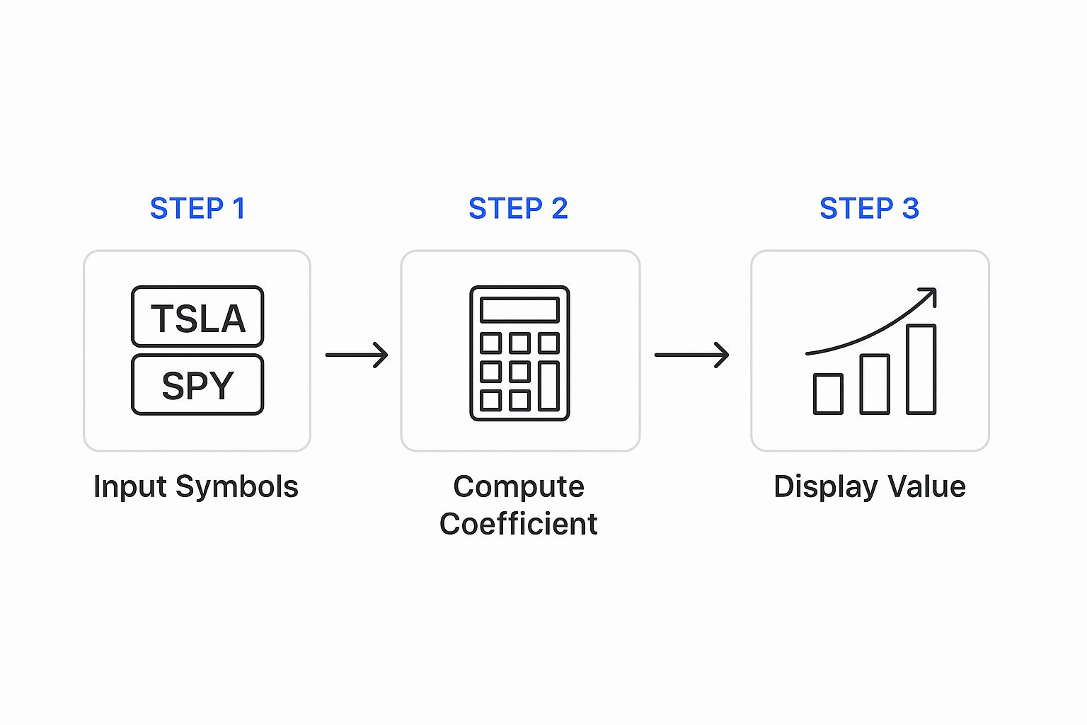
It really boils down to giving the tool the right inputs, letting it crunch the numbers on historical data, and then making sense of the result.
Generating and Interpreting the Results
Once you've entered the tickers and set the date range, you just hit "calculate." The tool will process the historical price data for both stocks and spit out a correlation coefficient. You might find, for instance, that NVDA and PG have a correlation of +0.35 over the last five years.
So, what does that number actually tell you?
It points to a weak, maybe moderate, positive correlation. While they don't move in lockstep, there's a slight tendency for both to rise when the broader market is rallying. But the low coefficient is the real story here. It suggests that PG offers significant diversification benefits against the wild swings you expect from a tech stock like NVDA.
Powerful insights often come from just playing around with the settings. Try adjusting the date ranges. You might discover that during a major market crash, the correlation between your "diversified" assets temporarily spiked towards +1—a critical lesson in risk management.
Of course, to run this kind of analysis yourself, you need access to clean historical price data. For traders looking to do a deeper dive, our guide on how to download historical stock data easily is a great place to start. Thankfully, using a reliable stock correlation calculator automates this entire process, saving you a ton of time and ensuring you're working with accurate numbers.
Reading a Correlation Matrix Like a Pro

Running the numbers is the easy part. The real edge comes from knowing how to instantly translate that grid of numbers—the correlation matrix—into actionable market intelligence. Think of this matrix as your portfolio’s X-ray, revealing the hidden skeletal structure connecting your assets.
At first glance, it can look like a confusing spreadsheet, but it's actually pretty straightforward. The matrix simply plots every stock in your list against every other stock, with the cell where they intersect showing their correlation coefficient.
You'll immediately notice the diagonal line of +1.00 values running from top-left to bottom-right. That's just each stock being compared against itself. Of course, a stock is perfectly correlated with itself. Everything else is a mirror image across this diagonal—the relationship between Stock A and Stock B is the same as between Stock B and Stock A.
Quickly Spotting Key Relationships
Your eyes should immediately scan for the extremes. Where are the dark reds (strong positive correlations) and the cool blues or greens (strong negative correlations)?
A cluster of high positive values, say +0.85 or more, is a major red flag. If you see this among a group of tech stocks like Apple, Microsoft, and Google, it’s confirming what you probably suspected: they tend to move as a pack. Holding all three heavily means you’re not as diversified as you think. You're really just making a concentrated bet on big tech.
Correlation matrices become truly indispensable when you're analyzing more than just a couple of assets. They give you a complete map of your portfolio's diversification. For instance, if you build a 10x10 matrix for major US stocks like Apple, Amazon, JPMorgan, and ExxonMobil, it will reveal both the obvious and the subtle links.
You’d expect to see tech stocks like Apple and Microsoft with correlations exceeding +0.7. But you might also see that the relationship between a company like ExxonMobil and Amazon is frequently below +0.3, highlighting how differently they react to broad economic factors. For more examples of these comparisons, MarketXLS.com has a great in-depth guide on using correlation matrices as a stock comparison tool.
The Pro’s Insight on Market Crashes
Now for a critical piece of wisdom that separates seasoned pros from novices. During normal market conditions, a gold ETF might show a negative correlation to the S&P 500, making it look like a great hedge. Your matrix will reflect this.
But during a major market panic—think the 2008 financial crisis or the March 2020 COVID crash—something dangerous happens. Correlations across almost all asset classes can spike towards +1.0.
In a true market panic, investors don't discriminate; they sell everything. This is when diversification seems to vanish precisely when you need it most, as even historically uncorrelated assets get dragged down together in a wave of fear.
This is why you can't just calculate correlation once and forget about it. It's a dynamic metric, not a static one. A stock correlation calculator is your tool for monitoring these relationships over time, making sure your portfolio's defenses are still intact before the storm hits. It transforms raw data into a vital risk management dashboard.
Building a More Resilient Portfolio with Correlation Data
Once you’ve run the numbers through a stock correlation calculator, the real work begins. This is where you translate that data into smarter, more deliberate investment decisions. It’s the leap from just picking good companies to actually engineering a portfolio that’s built to last and weather market shocks.
Let's say your analysis shows your portfolio is packed with tech stocks, and a few of your biggest holdings are moving together with a strong positive correlation of +0.80 or more. Each company might be a winner on its own, but that high correlation is a red flag. You've essentially built a house of cards. When bad news hits the tech sector, they’re all likely to tumble in unison.
From Data to Diversification
The fix is to strategically add assets with low or even negative correlations to act as a buffer. Think of your correlation matrix as the blueprint for this process.
If you’re overexposed to tech, your data might point you toward assets that march to the beat of a different drum, such as:
- Utility Stocks: Companies that provide power and water are driven by different economic forces than high-flying tech firms. They add a layer of stability.
- Consumer Staples: Think about companies like Procter & Gamble (PG). People buy their products in good times and bad, making them a classic defensive play.
- Bonds or Bond ETFs: During market panic, investors often flee stocks and pile into high-quality government or corporate bonds, which can cause them to move in the opposite direction of your equities.
This data-first approach is really the foundation of a durable investment strategy. Grasping stock correlation is crucial for true diversification. For anyone wanting to learn more, there are some great resources on how to diversify a stock portfolio that lasts.
Advanced Hedging Strategies
Correlation data also unlocks more advanced tactics for protecting your portfolio.
Imagine you're heavily invested in volatile airline stocks, which are notoriously sensitive to things like fuel prices and economic downturns. A quick check with a stock correlation calculator would likely reveal they have a low or even negative correlation with a commodity like gold (which you can easily invest in through an ETF like GLD).
By adding a gold ETF to your portfolio, you're creating a hedge. When economic fears send airline stocks into a nosedive, that same fear often drives investors to the perceived safety of gold, pushing its price up. This can help offset some of the losses from your airline holdings. It’s a proactive move made possible entirely by the insights you gained from a simple correlation analysis.
To explore these portfolio-building techniques in more detail, check out our in-depth guide on how to diversify a stock portfolio for long-term growth.
By actively seeking out and incorporating assets with low or negative correlations, you're not just collecting stocks—you're strategically engineering a more robust portfolio designed to perform across various market conditions.
Common Correlation Mistakes to Avoid

A stock correlation calculator can give you a massive edge, but it's also a tool where a simple misstep in interpretation can lead to some seriously costly errors. The numbers themselves are precise, but the story they tell requires a bit of nuance to understand their limits.
One of the biggest blunders I see traders make is confusing correlation with causation.
Just because two stocks move in the same direction doesn’t mean one is pushing the other. For example, you might see a high positive correlation between an ice cream company and a pool supply manufacturer. But that doesn’t mean Ben & Jerry's sales are driving people to buy chlorine. The real driver is an outside factor—hot summer weather—that boosts demand for both. In the market, that "third factor" is often broad economic sentiment or sector-wide news.
The Myth of Static Correlation
Another major pitfall is treating a correlation score as if it's set in stone. It’s not. Stock relationships are constantly shifting based on market conditions, economic news, and company-specific events. A correlation you calculate today using last year's data might be completely useless in the current environment.
This is exactly why experienced traders lean on rolling correlations. By looking at correlations over shorter, overlapping timeframes (like consecutive 90-day periods), you can spot how relationships strengthen, weaken, or even completely flip over time. A good correlation calculator should let you tweak your date ranges easily to catch these evolving trends.
A correlation coefficient is a snapshot, not a permanent law of physics. Markets are fluid, and relationships between assets can shift dramatically, especially during times of stress. Regularly re-evaluating these connections is essential for effective risk management.
When Diversification Disappears
Perhaps the most dangerous assumption of all is thinking your diversification will protect you when a real crisis hits. History has taught us a brutal lesson here.
During the 2008–2009 financial crisis, correlations between most stocks—even across totally different sectors—spiked toward +1.0. As the panic selling kicked in, assets that were normally uncorrelated suddenly moved in lockstep, all heading straight down.
This phenomenon shows how systemic shocks can completely override normal market behavior, wiping out the benefits of diversification right when you need them most. In that crisis, many correlations jumped toward +0.8 or higher as fear became the single biggest driver of price. These data-driven insights from past meltdowns highlight why you need to be able to adjust your strategy on the fly. You can find more insights on how market crises impact stock correlations and what to look for.
To sidestep these common mistakes, you need a more sophisticated approach. Always question the "why" behind the numbers, never assume a relationship is permanent, and constantly stress-test your portfolio's diversification against historical periods of extreme market volatility. This turns the correlation calculator from a simple number-cruncher into a powerful tool for proactive risk management.
Your Top Stock Correlation Questions Answered
When you first start digging into stock correlations, a few common questions always seem to pop up. It's one thing to understand the concept, but it's another to apply it with confidence. Let's tackle some of the most frequent queries we hear from traders.
What Is a Good Correlation for Diversification?
If your goal is true diversification, you need to find assets that don't zig and zag in perfect unison. That means you should be actively hunting for stocks with low correlation (a coefficient near 0) or, even better, a negative correlation to your biggest holdings.
There's no single magic number here—it really depends on your strategy and how much risk you're comfortable with. But as a general rule, a correlation coefficient between -0.3 and +0.3 is the sweet spot. Assets in this range have very little linear relationship, and adding them can be a powerful way to smooth out your portfolio's overall ride.
How Often Should I Check Stock Correlations?
Here's a common mistake I see all the time: a trader calculates correlations once, builds a portfolio around them, and then assumes that relationship is set in stone. The reality is, correlations are constantly shifting based on market fear, economic cycles, and sector-specific news.
A good habit is to review your portfolio's key correlations at least quarterly or semi-annually. More importantly, you absolutely need to re-run the numbers during periods of high market stress or after a major economic event, like a surprise interest rate hike. That’s when you’ll find out if your diversification strategy is actually working when you need it most.
Key takeaway: Correlation is a rear-view mirror. It tells you how stocks have moved together in the past, giving you fantastic insight for managing risk. It is not a crystal ball for predicting future prices.
Can a Stock Correlation Calculator Predict the Future?
Let's be crystal clear on this one: no, a stock correlation calculator cannot predict the future. It's an analytical tool, not a forecasting machine. Its job is to measure historical relationships using past price data so you can better understand and manage risk.
While history often rhymes, it never repeats exactly. The real power of a correlation calculator is in uncovering hidden risks and confirming just how diversified (or not!) your portfolio truly is. Use it to build a more resilient strategy, not to guess where the market is headed next.
Ready to see the hidden connections in your own portfolio? The ChartsWatcher stock correlation calculator gives you the data-driven insights you need to build a stronger, more diversified strategy. Start analyzing your portfolio today.
