Mastering the DMI Directional Movement Index
The Directional Movement Index (DMI) is a powerful tool in a trader's arsenal, designed to answer two of the most critical questions you'll face: which direction is the market heading, and how strong is that move? It’s made up of three distinct lines—the +DI (Positive Directional Indicator), -DI (Negative Directional Indicator), and the ADX (Average Directional Index)—that work in concert to give you a full read on market momentum.
What Is the DMI and Why Does It Matter
Think of the DMI as a complete navigation system for the markets. It’s not just another squiggly line on your chart; it’s a framework built to help you identify and ride strong trends. Just as importantly, it helps you recognize and steer clear of choppy, sideways markets where profits get chewed up.
At its core, the DMI helps you figure out who is in control of the price action: the buyers or the sellers. It does this by pitting two lines against each other:
- The Positive Directional Indicator (+DI): This line tracks the strength of upward price movement. When the +DI is pushing higher, it’s a sign that the bulls are gaining steam.
- The Negative Directional Indicator (-DI): On the flip side, this line measures the force of downward price movement. A rising -DI tells you the bears are flexing their muscles.
The relationship between these two lines is like a constant tug-of-war. When the +DI line crosses above the -DI, it's a signal that buyers have taken the lead. Conversely, when the -DI climbs above the +DI, sellers are in the driver's seat.
Gauging Trend Strength with the ADX
But knowing the direction is only half the battle. A trend is useless if it doesn't have any real conviction behind it. This is where the third component, the Average Directional Index (ADX), comes into play. The ADX is the engine of the DMI system. It's totally indifferent to whether the trend is up or down; its only job is to measure the strength of the trend.
The ADX line is the DMI's secret weapon. It acts as a filter, preventing traders from jumping on every +DI/-DI crossover. This helps you avoid one of the most common pitfalls in trading: entering a market that looks directional but has no real momentum.
The DMI was developed by the legendary technical analyst J. Welles Wilder Jr. back in 1978 and quickly became a staple for traders. The indicator typically uses a 14-period lookback to calculate the lines. The ADX, which smooths out the directional data, is plotted on a scale from 0 to 100. A reading below 20 suggests a weak or non-existent trend, while a reading above 40 signals a powerful, well-established trend. If you want to dive deeper into ADX-specific tactics, Quantified Strategies has some great resources.
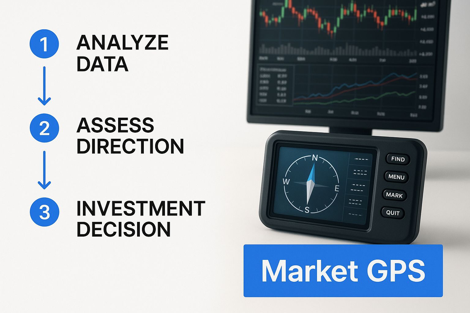
This visual helps tie it all together, showing how the DMI's components guide traders on both direction and momentum.
Ultimately, the DMI provides a clear roadmap, helping you confirm whether a trend is worth trading or if it's best to stay on the sidelines.
To make this even clearer, here is a quick breakdown of what each line in the DMI system does and what it tells you about the market.
The DMI Component Quick Reference Guide
| Component | Primary Function | What It Tells You |
|---|---|---|
| +DI Line | Measures upward buying pressure | "Bulls are getting stronger." A rising +DI shows increasing bullish momentum. |
| -DI Line | Measures downward selling pressure | "Bears are taking control." A rising -DI indicates growing bearish momentum. |
| ADX Line | Measures overall trend strength | "This trend has legs." A rising ADX signals a strengthening trend (either up or down). |
Think of the +DI and -DI lines as telling you who is winning the battle, while the ADX tells you how intense the fight is. When you combine all three, you get a much more complete and reliable picture of the market's behavior.
Understanding the Mechanics of the DMI
To really get a feel for the Directional Movement Index (DMI), you have to look under the hood. While the math might seem a bit much at first glance, the logic behind it is actually pretty clever and straightforward. The DMI is built from a few key pieces that work together to tell you about a trend’s direction and strength, all while filtering out the market’s random noise.
It all starts with calculating Directional Movement (+DM and -DM). Think of this as the raw fuel for the indicator. For every candle on your chart, the DMI compares its high and low to the previous candle's high and low.
- If the current high pushes above the previous high, the difference is your positive directional movement, or +DM.
- If the current low drops below the previous low, that difference is your negative directional movement, or -DM.
These raw numbers give us a quick snapshot of whether buyers or sellers had more punch in that single period. But on their own, they're way too choppy to be useful. They need to be smoothed out and given some context, which is where the next part comes in.
The Role of the Average True Range
The DMI's secret sauce is its built-in volatility filter: the Average True Range (ATR). Markets are never static. Some days are quiet and tight, while others are wild rollercoasters. The ATR is designed to measure the true range of price movement, even accounting for price gaps between candles.
By normalizing the +DM and -DM values using the ATR, the DMI automatically adjusts for volatility. This means a $10 move up during a sleepy market session might give you a strong +DI signal. But that same $10 move during a chaotic, high-volatility day could be seen as just noise. This adaptive quality is what makes the DMI so reliable in different market environments. For a full breakdown, check out our guide on what the Average True Range is and how it works.
The final +DI and -DI lines you see plotted on your chart are simply the smoothed +DM and -DM values, divided by the smoothed ATR, and then multiplied by 100 to turn them into an easy-to-read oscillator.
Why the 14-Period Setting Is Standard
You'll almost always see the DMI’s default setting at 14 periods. This number, chosen by its creator J. Welles Wilder Jr., is the sweet spot. It's responsive enough to catch new trends as they form but stable enough to avoid getting faked out by every minor price wiggle.
A shorter period, like 7 or 10, will make the DMI more sensitive. You’ll get faster signals, but you'll also get more false alarms. A longer period, like 21 or 28, smooths everything out, giving you more reliable signals but getting you into trends a bit later.
The 14-period setting is a time-tested starting point, but traders definitely tweak it. A day trader might shorten it to react to quick intraday moves, while a long-term investor might lengthen it to focus only on major, sustained trends.
It's this mathematical design—calculating raw DM, smoothing it, and then normalizing it with the ATR—that makes the DMI so resilient. The ADX line itself is then calculated by smoothing the difference between +DI and -DI. Studies on major indexes like the S&P 500 have shown that when the ADX rises above 30, the probability of the current trend continuing for the next 10-20 sessions jumps to over 60%. If you want to dive deeper into the formulas, StockCharts has a great breakdown of how ADX is derived.
How to Read DMI Signals on Your Charts

Knowing the theory behind the DMI Directional Movement Index is a great start, but the real magic happens when you can translate that knowledge into clear, actionable signals on a live chart. The DMI tells a story through the interplay of its three lines, and a trader's job is to learn how to read that story.
The two biggest plot twists you’ll be watching for are the crossovers between the +DI and -DI lines. These moments are your primary alerts that the balance of power might be shifting.
- Bullish Crossover: When the +DI line (green) crosses above the -DI line (red), it’s a signal that buying pressure is starting to overwhelm selling pressure. Think of it as a potential green light for a long position.
- Bearish Crossover: On the flip side, when the -DI line crosses above the +DI line, it tells you the sellers are gaining the upper hand. This suggests bearish momentum is building and could be a signal to look for a short entry.
But hold on. A crossover by itself isn't enough. Chasing every single one is a fast track to getting chopped to pieces by market noise. This is where the ADX line steps in as your most critical filter, helping you separate the real opportunities from the dangerous traps.
The ADX: Your Trend Strength Filter
The ADX line is the bouncer at the door of your trading strategy. It doesn’t care about direction—up or down, it’s all the same to the ADX. Its only job is to measure the strength, or conviction, behind a price move.
Think of it this way: the DI lines tell you who is trying to take control (the bulls or the bears), while the ADX tells you if they have enough muscle to actually move the market. Without its confirmation, a DI crossover is just a whisper, not a tradable signal.
A solid rule of thumb is to only consider trading a trend when the ADX is above 25. If the ADX is snoozing below 20, the market is likely stuck in a range or a very weak, listless trend. Crossovers that happen in this low-ADX zone are often false alarms, the kind of "whipsaws" that bleed an account dry.
A rising ADX above 25 is your green light, confirming a trend has enough juice to be worth your time. A flat or falling ADX below 20 is a big red light, warning you to stay on the sidelines and avoid getting caught in the chop.
This simple rule is a lifesaver. It focuses your capital on setups with a higher probability of follow-through and keeps you out of the market during those frustrating, directionless periods.
Decoding High-Probability DMI Setups
Let's walk through what a classic, A-grade bullish setup looks like. You see the +DI line cross decisively above the -DI line. That’s your initial alert. Next, your eyes drop to the ADX. At the moment of the crossover, the ADX is rising and has just pushed above the 25 level.
This is the combination you're looking for. The crossover says the bulls are in charge, and the rising ADX above 25 confirms they have the firepower to keep pushing prices higher.
Conversely, a high-probability short setup is the mirror image: the -DI line crosses above the +DI, and it's backed by an ADX that is also rising and above 25. The story is the same, just with the bears driving the action.
Spotting Low-Probability Traps
Now, let's dissect a common trap. You spot a bullish +DI crossover, but a quick glance at the ADX shows it’s flat and hovering around 15. This is a massive warning sign.
While the bulls might have won a tiny skirmish, the low ADX is screaming that there’s no real conviction behind the move. Taking this trade is like betting on a race where all the horses are just milling around the starting gate. The price is likely to meander sideways, and the DI lines could cross back and forth, generating a ton of confusing signals and stopping you out repeatedly for small losses.
Avoiding these low-probability setups is just as crucial as finding the good ones. The table below offers a simple framework for interpreting ADX values.
ADX Value Interpretation Guide
This quick guide can help you understand what the ADX is telling you about the market's current personality.
| ADX Value Range | Trend Strength | Recommended Trading Approach |
|---|---|---|
| 0-20 | Weak or Non-Existent | Avoid trend-following. Consider range-bound strategies or stay on the sidelines. |
| 20-25 | Emerging Trend | A "gray zone." A trend might be starting, but confirmation is needed. Proceed with caution. |
| 25-50 | Strong Trend | Confirmed trend. This is the ideal zone for executing trend-following strategies. |
| 50+ | Very Strong/Exhaustion | An extremely strong trend. Be cautious, as very high readings can sometimes signal a trend is getting overextended and might soon reverse. |
By learning to read the DI crossover in the context of the ADX's strength reading, you elevate the DMI Directional Movement Index from a simple indicator into a complete, rules-based framework for navigating market trends with much greater confidence.
Actionable Trading Strategies Using the DMI

Knowing what the DMI’s signals mean is one thing. Actually turning that knowledge into a profitable trading plan is a whole different ball game. A solid strategy needs more than just reacting to crossovers—it demands clear, repeatable rules for your entries, exits, and how you manage risk.
So, let's break down a few practical methods you can use to build a systematic approach around the DMI.
These strategies are all about filtering out the market noise and honing in on high-probability setups, whether you're trading stocks, crypto, or forex. By using the ADX as our trend-strength filter, we can make sure we're trading with the market’s momentum, not fighting against it.
Strategy 1: The Breakout Confirmation
This is a classic trend-following play designed to catch new trends just as they start to take off. It combines a directional crossover with a rising ADX to confirm that a breakout has real muscle behind it and isn't just a fake-out.
Here’s how it works, step-by-step:
- Wait for the Crossover: Keep an eye out for the +DI line crossing above the -DI line (for a long trade) or the -DI line crossing above the +DI (for a short trade). This is your initial alert.
- Get Confirmation from ADX: Don't just jump in on the crossover. This is key. Wait for the ADX line to move above 25. This tells you the trend is strong enough to be worth trading.
- Enter the Trade: Once both conditions are met, it’s go-time. Enter a position in the direction of the crossover.
- Manage the Position: Set a stop-loss just below a recent swing low (for a long) or above a recent swing high (for a short). As the trend moves in your favor, you can trail your stop-loss to lock in profits.
This method keeps you from getting lured into weak moves that fizzle out almost immediately. Think of the ADX as a bouncer at a club—it only lets the strong trends in. You can learn more about similar approaches in our complete guide to trend-following strategies that can boost your profits.
Strategy 2: The Trend Exhaustion Exit
Knowing when to take your chips off the table is just as crucial as knowing when to place a bet. A common mistake traders make is riding a winner for too long, only to watch their profits vanish when the trend reverses. This strategy uses an overextended ADX to signal that a trend might be running on fumes.
The goal isn't to perfectly pick the top or bottom. It's to get out while the trend is still strong, before the reversal is obvious. A peaking ADX is one of the earliest warnings that momentum is fading.
Here are the rules for this exit strategy:
- Spot a Peaking ADX: While you’re in a profitable trade, watch the ADX line. When it climbs to an extreme level (usually above 40 or 50) and then starts to flatten out or turn down, that’s your signal. The trend’s momentum is likely at its peak.
- Take Profits: When you see the ADX peak, consider closing some or all of your position. This lets you lock in gains before the inevitable pullback or reversal kicks in.
This technique helps you exit proactively, securing your profits while everyone else is still bullish. It's a disciplined way to manage the end of a trade.
Strategy 3: The Low ADX Range Filter
Not every market is trending. In fact, most assets spend a ton of time chopping around in a consolidation range. The DMI is fantastic for spotting these periods, helping you avoid trend-following strategies that would just get you shredded.
This isn't an entry strategy—it's a market filter.
When the ADX is below 20, it’s screaming that the trend is weak or nonexistent. Trying to trade breakouts in this environment is a recipe for getting whipsawed. Instead, you can switch to a different playbook entirely, like range-trading strategies, or simply sit on your hands and protect your capital.
The DMI's popularity is a testament to how useful it is. A global survey of trading platforms found that the DMI is among the top five most integrated indicators, appearing in over 75% of charting software. Even better, a simple backtest on the EUR/USD pair from 2010 to 2020 showed that going long when +DI crossed above -DI with an ADX above 25 yielded an 8% annualized return.
It’s easy to get excited about a new indicator, but even the best tools can burn through your account if you don't know the classic rookie mistakes. The Directional Movement Index (DMI) is no exception. Its signals look simple on the surface, but a couple of common traps can catch even seasoned traders off guard.
Let's walk through the biggest DMI pitfalls so you can steer clear of them.
Mistake 1: Trading Every Single Crossover
This is, without a doubt, the most common and costly error. A trader sees the +DI line slice above the -DI and immediately hits the "buy" button, only to get chopped up in a sideways market. They get stopped out, confused, and blame the indicator.
The problem? A crossover by itself only hints at a potential shift in directional pressure. It says absolutely nothing about whether there's enough strength behind that shift to create a real trend. It’s like hearing a rumor without knowing if it's credible.
This mistake comes from completely ignoring the DMI's most powerful component: the ADX line. The crossover is just an alert, not a green light.
The Fix: Make this your unbreakable rule: Never take a +DI/-DI crossover signal unless the ADX line is above 20, and ideally, pushing past 25. Think of the ADX as your trend filter. If it's flatlining below 20, the crossover is just market noise. A rising ADX is your confirmation that a real, tradable trend might be starting.
This one habit will save you from countless whipsaw trades and protect your capital from the churn of a ranging market.
Mistake 2: Thinking a High ADX Means "Buy"
The second major blunder is misunderstanding what the ADX line is telling you. A trader sees the ADX value climbing to 45 and thinks, "Wow, the trend is strong, I should go long!" This is a fundamental misinterpretation.
The ADX is direction-neutral. It only measures the strength of the trend, not which way it's going. A high ADX just confirms there's a powerful move happening—but that move could be a screaming uptrend or a terrifying downtrend.
Here's how to get it right every time:
- Step 1: Find the Direction. Look at the +DI and -DI lines first. Is +DI on top? That signals bullish pressure. Is -DI on top? That signals bearish pressure.
- Step 2: Check the Strength. Now, look at the ADX. Is it above 25 and rising? That confirms the direction you identified in Step 1 has some serious momentum behind it.
By separating direction (the DI lines) from strength (the ADX), you start using the DMI Directional Movement Index the way it was designed. This simple, two-step process turns the indicator's potential traps into moments of clarity, helping you make much smarter trading decisions.
Setting Up the DMI in Your Trading Platform
All this theory is great, but the real magic happens when you get the indicator on your own charts. Turning concepts into concrete action is what separates successful traders from the rest.
The good news? Getting the DMI Directional Movement Index up and running is a breeze on pretty much any platform you can name, from TradingView to MetaTrader. Let's walk through how to add it to your workspace and tweak it to fit your personal trading style.
First things first, you need to find it. Every platform has an "Indicators" or "Studies" library. Just pop open that menu, type "Directional Movement Index" or "DMI" into the search bar, and select it. The indicator will almost always appear in its own panel right below your main price chart.
You'll instantly recognize the three lines we've been talking about: the +DI, the -DI, and the ADX. The default colors are usually green for +DI (the bulls), red for -DI (the bears), and a neutral color like white or blue for the ADX. Of course, you can change these to whatever you like.
Customizing the DMI Settings
Now for the most important part: dialing in the settings. The one you'll want to pay closest attention to is the lookback period. The standard setting, straight from J. Welles Wilder Jr. himself, is 14 periods. This is a solid, balanced starting point, especially for swing traders looking at daily charts.
But "standard" doesn't mean it's perfect for everyone.
- Shorter Periods (like 7-10): Using a shorter lookback makes the DMI much more sensitive to recent price swings. This can be a huge advantage for day traders on lower timeframes who need to react quickly. The trade-off? You'll get more false signals from random market noise.
- Longer Periods (like 21-28): A longer period has the opposite effect—it smooths everything out, filtering out the minor, insignificant price jiggles. This setup is far better for long-term position traders who only care about catching the big, sustained moves.
Besides the lookback period, it's a smart move to add a horizontal line right at the 25 level on the ADX. This gives you a clear visual benchmark for when a trend is really starting to cook.
Pro Tip: Don't just watch the DMI—make it work for you. Set up alerts on your platform for key events. You can create an alert for when the ADX crosses above 25 or for when the +DI and -DI lines cross over. This simple step automates your chart-watching and ensures you never miss a high-probability setup just because you stepped away from your screen.
By fine-tuning these settings, you take the DMI from a generic, off-the-shelf indicator and turn it into a powerful tool that's perfectly calibrated to your trading system.
Got Questions About the DMI? We’ve Got Answers.
Once traders start getting their hands dirty with the DMI directional movement index, a few common questions always pop up. Getting the nuances right is the key to using this tool effectively and avoiding some of the classic rookie mistakes. Let’s clear up some of the most frequent ones.
A lot of traders first want to know what timeframe works best. The good news is the DMI is a true workhorse—you can slap it on anything from a one-minute chart for scalping to a weekly chart for your long-term holds. The trick is to tune the period setting to your strategy. A fast-moving scalper might tighten it up to a 10-period setting, whereas a position trader looking to ride major trends might loosen it to 21 to filter out the noise.
Can the DMI Predict Market Tops and Bottoms?
This is a big one. It's tempting to think the DMI can call the exact top or bottom of a move, but that’s not what it was built for. It's crucial to remember that the DMI is a trend-following, lagging indicator. It doesn't have a crystal ball. Its job is to confirm the strength and direction of a trend that's already underway.
Sure, you might see the ADX line peak out above a high level like 50 and think the trend is running out of gas. While that can signal exhaustion, it’s not a reliable buy or sell signal on its own. A much smarter way to use it is to see a weakening ADX as a sign the trend is losing steam, and then look for confirmation from other tools—like a classic price action pattern or a bounce off a major support or resistance level—to spot a potential turn.
DMI vs. RSI: What’s the Difference?
Traders often get the DMI and the Relative Strength Index (RSI) mixed up. They both live in a panel below your price chart, but they’re measuring completely different things and telling you different stories about the market.
Think of it this way: The DMI tells you if there's a trend and how strong it is. The RSI tells you if the recent price move is getting overstretched and might be due for a breather. They’re partners, not rivals.
Here’s an easy way to separate their roles:
- Use the DMI to ask: "Is the market trending hard, and if so, which direction?"
- Use the RSI to ask: "Is this rally or sell-off running out of steam?"
For instance, in a monster uptrend where the ADX is screaming higher, the RSI might stay pinned in "overbought" territory for weeks. That’s not a signal to sell! It’s actually just confirming the incredible bullish momentum that the DMI already flagged for you. Using them together gives you a much richer, more complete picture of what’s really going on.
Ready to put this into practice? ChartsWatcher gives you a powerful platform to track, scan, and analyze the market with pro-level tools. You can customize your dashboards with advanced indicators like the DMI to get the clarity you need. Find your edge at ChartsWatcher.com.
