Mastering Market Cycle Analysis for Smarter Trades
If you've ever felt like the market is an unpredictable beast, you're not alone. But what if I told you it has predictable rhythms, much like the changing of the seasons? This is the core idea behind market cycle analysis.
It’s a way of looking at the big picture, stepping back from the day-to-day noise to see the recurring patterns that have played out time and time again.
Decoding the Rhythms of the Market
At its heart, market cycle analysis is about recognizing that markets don't just move in a straight line. They flow in cycles, driven by the powerful forces of collective human psychology and fundamental economic shifts. Think of it like an ocean tide: it rises (a bull market), hits a high point, recedes (a bear market), and bottoms out before the whole process starts over.
This isn't just some abstract theory. It’s a practical framework for making sense of market behavior. Instead of getting whipsawed by scary headlines or chasing short-term price spikes, you can use this long-term lens to gain a real strategic advantage. Knowing which phase the market is in helps you make smarter, less emotional decisions.
The Four Seasons Analogy
One of the best ways to understand market cycles is to think of them as the four seasons. Each one has a distinct feel and a clear set of conditions.
- Winter (Accumulation): The market is cold, quiet, and frankly, a little depressing. After a major downturn, most people have given up. This is when the smart money starts quietly buying, picking up quality assets at bargain prices when nobody else wants them.
- Spring (Markup): A thaw begins. Optimism slowly returns, prices start to climb, and the public starts to take notice. As more investors jump in, the upward momentum builds on itself.
- Summer (Distribution): The party is in full swing. The market is hot, everyone is euphoric, and you hear stories about easy money being made. This is the peak. But behind the scenes, the early investors who bought in winter are now selling their holdings to the excited newcomers.
- Autumn (Markdown): The mood starts to shift. Fear replaces greed as prices begin to fall. The selling picks up speed as everyone rushes for the exits, trying to get out before winter sets in again.
This seasonal perspective turns complex market data into a story you can actually follow. It helps you shift from being a passenger tossed around by the waves to a strategist who knows how to ride them.
The idea here is that markets have periodic behaviors that can be broken down and understood. By studying major historical events like the Dot-Com Bubble or the 2008 Financial Crisis, analysts can spot the footprints of these repeating bull and bear phases. For those interested in the math behind this, you can learn more about how Fourier series can model market trends at Number Analytics.
By recognizing these natural rhythms, you can stop reacting to the market and start anticipating its next move. It’s the difference between being tossed by the waves and learning how to surf them.
To give you a clearer picture, here’s a quick breakdown of what to look for in each phase.
The Four Key Phases of a Market Cycle
This table summarizes the core characteristics and dominant investor emotions you'll find in each of the four stages.
| Phase | Market Characteristics | Investor Sentiment |
|---|---|---|
| Accumulation | Prices are at their lowest point, volatility is low, and the market appears to be "bottoming out." | High pessimism, disbelief, and general disinterest from the public. |
| Markup | A clear uptrend begins, with rising prices and increasing volume. The economy often shows signs of improvement. | Growing optimism, excitement, and eventually, greed as more people join the rally. |
| Distribution | The uptrend loses steam and prices move sideways in a volatile range. Heavy trading volume without significant price gains. | Euphoria mixed with anxiety. A feeling that "this time is different." |
| Markdown | A distinct downtrend takes hold. Prices fall consistently, and any rallies are short-lived. | Anxiety turns to denial, then fear, and finally panic and capitulation. |
Understanding these phases is the first step toward building a more resilient investment approach—one that’s built to adapt to the ever-changing seasons of the financial world.
The Four Phases of a Market Cycle Explained
If you want to understand market cycles, think of them like the four seasons. Each phase has its own unique character, driven by huge shifts in investor psychology and the underlying economic health. Learning to spot these stages is the key to moving beyond just reacting to scary headlines and starting to anticipate where the market is headed next.
This visual gives you a great overview of how these four phases flow from one to the next, forming a repeatable, continuous cycle.
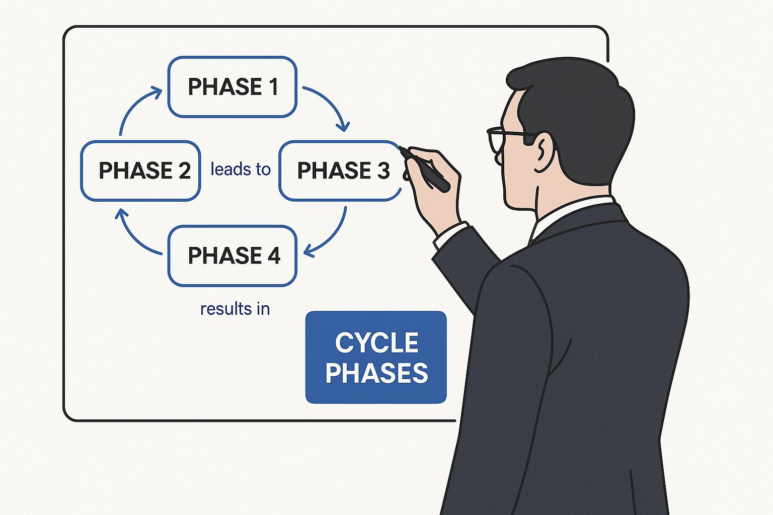
The diagram clearly shows the natural progression from a market bottom (Accumulation) all the way up to the peak (Distribution) and back down again. It's a roadmap for market behavior, with each phase setting the table for the one that follows.
Phase 1: Accumulation — The Quiet Bottom
The Accumulation phase is the absolute bottom of the market. It always comes after a nasty decline, a period where fear and total despair have taken over. Most everyday investors have already sold, sick of watching their portfolios bleed, and have pretty much given up on stocks.
This is the point of maximum pessimism. The news is relentlessly grim, and economic data looks awful. But behind the curtain, the "smart money"—the big institutions and experienced traders—smells a bargain. They see that assets are fundamentally cheap and start quietly buying, or "accumulating," positions without making a lot of noise.
Key Takeaway: Accumulation is defined by sideways price action on low volume. There's no big surge, just a slow, grinding process of building a stable base. Most people are completely uninterested, which is exactly the point.
Think of a construction crew laying the massive foundation for a skyscraper. It's slow, tedious, and completely unglamorous work that happens long before the shiny tower starts to rise. That’s what accumulation is—the groundwork for the next bull run being laid while everyone else is looking away.
Phase 2: Markup — The Bull Run Begins
Once the foundation is set, the Markup phase kicks off. This is the part everyone loves and recognizes as a bull market. The mood gradually shifts from doom-and-gloom to cautious optimism, and eventually, to outright excitement.
As the market starts making a series of higher highs and higher lows, more and more people take notice. Technical trends look healthy, and prices start punching through old resistance levels. The early wave of retail investors, seeing the positive momentum, begins to jump back in.
This creates a powerful, self-feeding loop:
- Rising Prices: Attract more and more buyers.
- Increased Demand: Pushes those prices even higher.
- Positive News: The media finally catches on and starts reporting on the recovery, which draws in the masses.
The markup phase can go on for months or even years. It’s a period of strong, steady growth where "buying the dip" becomes a winning formula. The economy usually improves alongside it, with companies reporting better earnings and positive data becoming the norm.
Phase 3: Distribution — The Crowded Peak
The Distribution phase is the market's topping process. After a long, powerful run-up, the market's personality changes. Prices are still high—maybe even making marginal new highs—but the energetic upward thrust is gone. Instead, the market just churns sideways in a wide, volatile range.
This is where the smart money that bought during accumulation starts to cash out. They "distribute" their shares to the latecomers—the euphoric public investors who are now piling in, driven by pure greed and a fear of missing out (FOMO). The sentiment is one of extreme optimism, often peppered with dangerous phrases like "this time is different."
A classic sign of distribution is huge trading volume that fails to push prices much higher. It's like a party that has gotten way too crowded, and the folks who arrived early are quietly slipping out the back door. Recognizing this phase is critical, as it almost always comes before a major downturn. For traders looking to sharpen their timing, exploring different technical analysis strategies you should know can give you a real edge in spotting these subtle shifts.
Phase 4: Markdown — The Bear Market Takes Hold
Finally, we enter the Markdown phase. Once the intense selling from the distribution phase fully overwhelms the last of the buyers, the floor gives out and the market breaks down. This is your classic bear market, where fear quickly replaces greed as the dominant emotion.
The markdown is a clear and painful downtrend. Any attempt to rally is weak and gets sold into aggressively, as sellers are now completely in charge. Investor psychology flips from denial to fear, and eventually to full-blown panic and capitulation, where people sell everything they own just to make the pain stop.
It's the mirror image of the markup phase. The news cycle turns negative, and a vicious cycle of selling begins to feed on itself. This brutal period grinds on until the selling is finally exhausted, prices find a floor, and the market quietly enters a new accumulation phase to start the whole process all over again.
Learning From Historical Market Cycles
You’ve probably heard the old saying: "History doesn't repeat itself, but it often rhymes." That phrase could have been invented for market cycle analysis. While no two cycles will ever be a perfect carbon copy, the fundamental drivers—human emotions like fear and greed, and key economic shifts—have played out in remarkably similar ways for generations. Looking back gives us the context we need to make sense of what's happening right now.
This isn’t about memorizing the dates of old stock market crashes. It's about building a mental playbook of how different assets respond under pressure. When you’ve seen how stocks, bonds, and commodities reacted during past inflationary spikes or economic slowdowns, you’re far better prepared to handle similar conditions today. Historical perspective is what turns market cycle theory from a dry, academic concept into a practical tool you can actually use.
Uncovering Patterns in Historical Data
The real magic happens when you dig into the data. One groundbreaking study analyzed over 100 years of daily market data, pulling together stocks, bonds, commodities, inflation, and interest rates. By stitching together famous datasets like the Fama & French factors (starting in 1926) with modern ETF data through 2022, researchers could map out asset performance across an entire century.
This deep dive confirmed what many seasoned investors already knew intuitively: asset classes rotate leadership in a somewhat predictable fashion. Certain assets shine when the economy is booming and rates are low, while others become safe havens when things turn sour.
By studying the past, you're not trying to predict the future with perfect accuracy. Instead, you're learning the market's 'rhymes' to build a strategy that is resilient enough to handle whatever comes next.
This kind of knowledge helps you build a solid thesis for your portfolio. Instead of just guessing what might work next, you can make decisions based on decades of hard evidence. That’s a serious edge.
How Different Assets Behave in Market Cycles
Historical data makes one thing crystal clear: no single asset class stays on top forever. Performance is tied directly to the underlying economic climate, which is the engine that drives the entire market cycle.
Here’s a simplified breakdown of how major asset classes have historically performed:
- Stocks (Equities): These are the stars of the Markup phase. When the economy is growing and everyone feels optimistic, stocks are typically the primary engine of wealth creation.
- Bonds (Fixed Income): Often perform well late in the cycle and during the early stages of a downturn. As central banks start cutting interest rates to juice a slowing economy, the value of existing bonds tends to rise.
- Commodities (e.g., Oil, Gold): Their performance can be a mixed bag. Industrial metals like copper do well during economic expansions. In contrast, precious metals like gold often become attractive during times of high inflation or geopolitical turmoil.
Recognizing these relationships is a cornerstone of smart market analysis. It allows you to anticipate which sectors might be gathering strength and which might be losing steam as the cycle unfolds. To get a better handle on interpreting these market moves, check out our guide on the top stock market analysis techniques for savvy traders.
Ultimately, learning from history gives you the foundation for building a truly robust strategy. It helps you tune out the short-term noise, focus on the big picture, and position your portfolio to weather whatever economic season comes next.
Key Indicators for Identifying Market Phases
Moving from theory to your trading dashboard requires a practical toolkit. To really get a handle on market cycles, you need to watch a mix of signals that, together, paint a complete picture of market health. Relying on a single metric is like trying to fly a plane with only one instrument on the dash; you need a multi-dimensional view to see where you truly are.
These indicators fall into three main buckets: the economic fundamentals that power the cycle, technical indicators that measure what price is actually doing, and sentiment gauges that track the all-important investor psychology. The real skill is in seeing how they all move in concert as the market shifts from one phase to the next.
Economic Fundamentals
Think of economic indicators as the engine of the market vehicle. They reflect the real-world health of the economy that ultimately supports asset prices, providing the "why" behind the market's moves.
- Gross Domestic Product (GDP): This is the broadest measure of a country's economic output. During the Markup phase, you'll see GDP growth picking up speed. In contrast, slowing or flatlining GDP is a classic sign of the Markdown phase.
- Inflation Rates: How inflation behaves is a huge tell. Low and stable inflation often goes hand-in-hand with the early Markup phase. But when inflation starts rising fast, it can signal an overheating economy—a key feature of a late-stage bull run and the early Distribution phase.
- Unemployment Data: Falling unemployment shows economic strength and is typical during a healthy Markup. When those unemployment numbers bottom out and start ticking back up, it can be an early warning that the cycle is tilting toward Distribution or Markdown.
For example, we've recently seen divergences where the US economy has shown stronger domestic demand and productivity growth compared to other regions, which naturally impacts its cycle dynamics. Understanding these undercurrents is essential for long-term strategic positioning.
By combining economic data with technical and sentiment analysis, you shift from simply observing prices to understanding the forces that are moving them. This is the foundation of a proactive investment strategy.
Technical Market Indicators
If economic data is the engine, then technical indicators are the gauges on your dashboard telling you how fast you're going and if you're about to overheat. They translate raw price and volume data into actionable insights about momentum and the market's internal strength.
Moving Averages are a cornerstone of this analysis. The relationship between a short-term average (like the 50-day) and a long-term one (like the 200-day) is a simple yet powerful way to help define the market phase:
- Accumulation: The 50-day is below the 200-day, but both are starting to flatten out after a long fall.
- Markup: The 50-day decisively crosses above the 200-day (a "Golden Cross"), and both are trending up.
- Distribution: Price chops around, often crisscrossing a flattening 50-day MA, while the 200-day MA's ascent slows.
- Markdown: The 50-day crosses below the 200-day (a "Death Cross"), and both start pointing down.
Another powerful concept is Market Breadth, which basically asks: how many stocks are actually participating in this rally? If the S&P 500 is hitting new highs but it's only being driven by a handful of mega-cap stocks, breadth is poor. This divergence is a classic warning sign often seen during the Distribution phase, suggesting the rally lacks broad support and is becoming fragile.
Investor Sentiment Gauges
Finally, we have to measure the collective mood of the market—the eternal tug-of-war between fear and greed. Because markets are driven by human emotion, these gauges can be incredible contrary indicators.
The most famous of these is the CBOE Volatility Index (VIX), often called the "fear index." It tracks the market's expectation of volatility over the next 30 days.
- Low VIX: A low and falling VIX suggests complacency and low fear, a common vibe during the Markup phase. Everyone's feeling good.
- High VIX: A spiking VIX indicates high fear and panic, which is the signature of a Markdown phase. Extreme spikes often mark a point of capitulation near the cycle bottom, right before Accumulation begins.
By weaving together these three types of indicators—economic, technical, and sentiment—you create a much more robust framework for cycle analysis. This allows you to identify the market's current phase with greater confidence and, more importantly, anticipate what’s likely to come next.
How Investment Styles Evolve with Market Cycles
Think of market cycles like powerful ocean currents. They have a knack for pulling different investment styles in and out of favor. Growth stocks often love to ride the high tide of a bull market, while value stocks tend to find their footing when the waters get a little calmer. If you stubbornly stick to just one style, you risk getting swept out to sea when the current shifts.

Understanding how these styles rotate is where the real opportunities hide. For instance:
- Growth stocks thrive during the markup phase when everyone is excited about rising earnings.
- Value stocks get their day in the sun when the broader market starts to wobble and pessimism gives way to pragmatism.
- Momentum strategies work best by catching the strong trends that build up toward a cycle's peak.
- Defensive allocations are your life raft, preserving capital when the market enters a markdown retreat.
Recognizing Style Cycles
These style cycles aren't random; they leave clear footprints driven by the big economic forces of the time. Research stretching back to 1979 identifies clear patterns, like the Great Growth Regime (GGR) that dominated the 2010s, where growth stocks completely left their peers in the dust.
Fast forward to early 2024, and analysis using the Russell Style methodology suggests this long-running growth regime is now about 75% complete. This is a massive hint that a major style shift could be just over the horizon. You can dive into the full style cycle research from LSEG to see the data for yourself.
Navigating style cycles is about anticipating the wind changes, not just reading the sails.
Adapting Your Portfolio Strategy
A truly dynamic portfolio doesn't fight the current—it moves with it. Here’s a practical way to think about aligning your strategy with the market's phase:
- Early Markup: Prioritize growth by loading up on sectors with accelerating revenue.
- Distribution: As sentiment peaks, rotate into value to snag stocks with cheaper valuations.
- Markdown: Increase your holdings in dividend payers and defensive stocks to protect your portfolio during a downturn.
- Late Accumulation: Start adding momentum positions to catch the very first signs of a new uptrend.
This is exactly where ChartsWatcher becomes your eyes and ears. You can set up custom alerts for different style indices, compare how sectors are performing in real-time, and even backtest rotation strategies to see what would have worked in the past. By weaving these style signals directly into your watchlist, you get notified the moment the tide starts to turn.
This proactive approach frees you from a static, one-size-fits-all allocation. Instead of clinging to a single style, you learn to ride the cycle’s currents, positioning yourself to capture upside and sidestep downside with much greater confidence.
Implementing Style Rotation in ChartsWatcher
Inside ChartsWatcher, you can build a dedicated style dashboard to track all of this in one place.
- Graph the growth-to-value spread right alongside market cycle indicators.
- Set up email or SMS alerts for when key thresholds are breached, like when the spread hits 1.2x.
- Backtest different rotation triggers against historical market phases to fine-tune your timing.
A recent case study shows this in action. Growth ETFs, for example, went on a tear in 2020–2021 during the peak of the GGR markup phase. But then, Value ETFs outperformed growth by a stunning 15% during the 2022–2023 transition. The screeners in ChartsWatcher were already flagging these sector momentum shifts well ahead of the pivot.
Key Takeaway: Proactively monitoring style shifts has the potential to add 20%+ in risk-adjusted returns over a full market cycle.
By blending these quantitative style signals with your broader cycle awareness, you can sharpen your entry and exit points. ChartsWatcher even has built-in style rotation templates that can automate alerts when the data points to a new phase. It's all about staying flexible, so your portfolio remains aligned with the market's ever-shifting currents.
Actionable Strategies for Navigating Market Cycles
Knowing market cycle theory is one thing. Turning that analysis into a concrete game plan is where you gain a real edge.
When you have a clear strategy for each phase, you can finally take emotion out of the equation. Instead of making knee-jerk reactions, you can confidently and proactively manage your portfolio. This isn't about perfectly timing tops and bottoms—nobody can do that consistently. It's about aligning your actions with the market's most likely direction, helping you build wealth in the good times and protect it when things turn south.
Strategy for the Accumulation Phase
During the Accumulation phase, the air is thick with despair. But for the prepared investor, the strategy is simple: disciplined buying. While most people are still licking their wounds from the crash, this is your time to be a contrarian. The goal here is to hunt for high-quality, undervalued assets that got unfairly hammered in the sell-off.
You'll want to focus on companies with rock-solid balance sheets, consistent cash flow, and a real competitive advantage—all trading at a steep discount. The market is usually quiet and boring at this point, which gives you plenty of time to do your homework without feeling rushed. Start building your positions gradually. Bottoms don't form overnight; it's often a slow, drawn-out process.
Strategy for the Markup Phase
Once the market kicks into the Markup phase, your strategy completely shifts from patient buying to letting your winners run. This is the heart of the bull market, and your primary goal is to maximize gains. The trend is now your best friend, and trying to fight it can be a very expensive mistake.
Here’s what to focus on during the markup:
- Add to Winners: Consider increasing your position size in the assets that are clearly leading the market higher.
- Ride the Trend: Use technical tools like moving averages to keep you in the trend and prevent you from selling out way too early.
- Monitor for Excess: Keep an eye out for tell-tale signs of euphoria or crazy valuations. These are often the first clues that the cycle is getting a bit long in the tooth.
Strategy for the Distribution Phase
The Distribution phase is easily the most challenging. It requires a huge mental shift. The party is still raging, and the headlines are glowing, but the smart money is quietly slipping out the back door. Your strategy here is to start methodically taking profits and dialing down your risk.
This is absolutely not the time to get greedy. Begin trimming your biggest winners, especially the ones that have become household names or are showing signs of wild speculation. Build up your cash reserves. Maybe even start rotating into more defensive assets. Think of it like selling your winter coat during a heatwave—it feels completely wrong at the moment, but you're just getting ready for the season to change.
During Distribution, your goal isn't to squeeze out every last percentage point of the rally. The real objective is to lock in the substantial gains you made during the Markup phase.
Strategy for the Markdown Phase
In the Markdown phase, capital preservation is everything. The market is in a clear downtrend, and the best offense is a good defense. It's time to be patient and disciplined, resisting every urge to "catch a falling knife." Your main job is to protect your portfolio and start scouting for the amazing opportunities that will inevitably pop up when the dust settles.
But just identifying these phases isn't enough. Truly successful navigation of market cycles depends on implementing comprehensive portfolio risk management practices). Things like proper position sizing, diversification, and periodic rebalancing are what separate the amateurs from the pros. This disciplined approach is what allows you to weather the storm and position yourself to fully capitalize on the next accumulation phase when it arrives.
Answering Your Top Questions About Market Cycles
Even with the theory down, putting market cycle analysis into practice brings up some real-world questions. It's one thing to see the phases on a chart, but another to use them when your money is on the line. Let's tackle some of the most common ones I hear from traders to help you build confidence in your approach.
How Long Does a Typical Market Cycle Last?
This is probably the number one question people ask, and the honest answer is: there is no fixed timeline. Anyone who tells you otherwise is selling something.
Historically, we've seen cycles play out over just a few years or stretch for more than a decade. The duration gets pushed and pulled by a whole host of powerful forces—think Federal Reserve policy, game-changing tech, unpredictable global events, and good old-fashioned human greed and fear.
Instead of getting fixated on a calendar, market cycle analysis is all about recognizing the character of the current phase. The goal isn't to predict a date; it's to understand how the market is behaving right now and where it's likely headed next, whether that phase lasts for eighteen months or five years.
Can This Analysis Predict Exact Market Tops and Bottoms?
Nope. And that's a critical point to understand. Market cycle analysis is not a crystal ball for nailing the exact day a market will peak or bottom out. Trying to do that is a surefire way to drive yourself crazy.
Its real power is as a strategic framework. It helps you see when the odds are shifting in or out of your favor, empowering you to make smarter, probability-based decisions instead of just guessing.
Think of it this way: when you start seeing the classic signs of a distribution phase, it’s a clear signal to get more defensive, trim some positions, and protect your profits. That's a far more practical and profitable approach than trying to squeeze out the last penny by selling at the absolute high. It's about being generally right, not precisely perfect.
Is Market Cycle Analysis Just for the Stock Market?
While it’s most famous in the stock market, these principles are universal. You can apply this way of thinking to just about any asset that's traded. The same human emotions and economic pressures that drive stock prices also influence other markets.
This includes:
- Bonds: The bond market has its own cycles, heavily swayed by interest rate policies and inflation fears.
- Commodities: Assets like oil and gold move in powerful cycles driven by global supply, demand, and geopolitical tensions.
- Real Estate: Both commercial and residential real estate markets churn through distinct phases of recovery, expansion, overbuilding (hyper supply), and recession.
- Cryptocurrencies: Even a new asset class like crypto shows clear cyclical behavior, fueled by adoption trends, hype, and waves of investor sentiment.
What's really interesting is that different asset classes can be in completely different phases at the same time. By analyzing them all, you get a much richer, more complete picture of the entire economic landscape. It shows you where risk is building up and where new opportunities are quietly emerging.
Ready to stop guessing and start seeing the cycles? ChartsWatcher provides the advanced charting and alert systems you need to track indicators across multiple markets, helping you identify phase shifts with precision. Build your custom dashboards and gain a strategic edge today at https://chartswatcher.com.
