9 Technical analysis strategies You Should Know
Navigating the financial markets requires more than just intuition; it demands a structured approach to interpreting price action and market sentiment. This is where technical analysis strategies become indispensable tools for traders and investors. By studying historical price charts and market statistics, you can identify patterns, predict future price movements, and make more informed decisions. While no single strategy guarantees success, mastering a select few can significantly enhance your ability to spot opportunities and manage risk effectively.
This guide moves beyond theoretical concepts to provide a practical, in-depth roundup of the most effective technical analysis strategies used by professionals. We will dissect nine distinct methodologies, each offering a unique lens through which to view the market. From momentum indicators like the RSI and MACD to trend-following systems like Moving Average Crossovers and foundational concepts like Support and Resistance, you will gain a comprehensive understanding of how these tools work in real-world scenarios.
For each strategy, we will provide a clear, actionable framework, including:
- Core Principles: A straightforward explanation of the strategy's logic.
- Setup and Confirmation: Specific criteria for identifying high-probability trade setups.
- Practical Implementation: Step-by-step examples showing how to apply the strategy using the ChartsWatcher platform.
Our goal is to equip you with a robust toolkit of proven techniques. You will learn not only what these strategies are but also how to implement them with precision. By the end of this article, you will be better prepared to build a trading system that aligns with your personal style and financial objectives, turning chart data into decisive action.
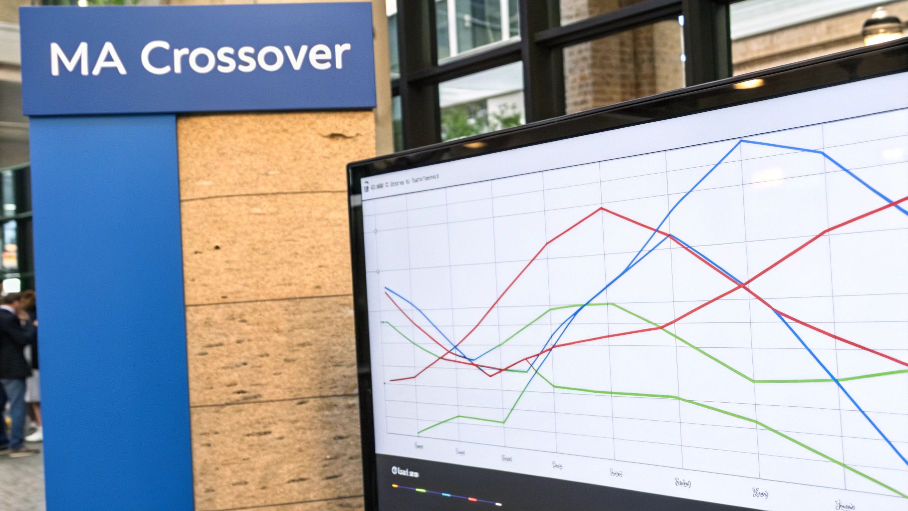
1. Moving Average Crossover Strategy
The Moving Average (MA) Crossover is a cornerstone among trend-following technical analysis strategies. It identifies potential shifts in market momentum by plotting two moving averages of different time periods onto a price chart. A trading signal occurs when the shorter-period MA crosses over or under the longer-period MA, indicating a potential change in the prevailing trend. This method is highly regarded for its simplicity and effectiveness in capturing sustained market movements.
The most famous bullish signal is the “golden cross,” where a shorter-term MA (like the 50-day) crosses above a longer-term MA (like the 200-day), suggesting the start of a long-term uptrend. Conversely, the “death cross” occurs when the 50-day MA falls below the 200-day, signaling a potential long-term downtrend. Pioneered by analysts like Joseph Granville, this strategy provides a clear, visual way to make systematic trading decisions.
Actionable Setup & Implementation
To effectively implement this strategy, focus on selecting the right MA types and periods for your specific asset and timeframe. While the 50/200-day combination is popular for long-term stock investing, day traders might use much shorter periods on intraday charts, such as a 9-period and 21-period EMA.
-
Setup Example (Bitcoin): A classic example is monitoring Bitcoin's 50-day and 200-day simple moving averages (SMA). Historically, golden crosses on its daily chart have preceded significant bull markets, while death crosses have marked the start of extended bear phases.
-
Implementation in ChartsWatcher:
- Open your desired chart, for example, AAPL.
- Add two Moving Average indicators from the studies menu.
- Set the first indicator's period to 50 and the second to 200.
- Create an alert to notify you when the 50 MA value crosses above the 200 MA, signaling a potential long-term entry point.
Key Insight: The primary strength of the MA Crossover strategy is its ability to filter out market noise and confirm sustained trends. However, it is a lagging indicator, meaning it confirms a trend after it has already begun, and it can generate false signals in choppy, range-bound markets. For this reason, always combine it with other indicators for confirmation.
2. Relative Strength Index (RSI) Strategy
The Relative Strength Index (RSI) is a prominent momentum oscillator among technical analysis strategies. It measures the speed and magnitude of recent price changes to evaluate overbought or oversold conditions in the price of an asset. The RSI oscillates between zero and 100, providing clear signals when an asset’s price momentum may be poised for a reversal. This makes it an invaluable tool for identifying potential entry and exit points.
Developed by J. Welles Wilder Jr. in his 1978 book New Concepts in Technical Trading Systems, the RSI is traditionally considered overbought when above 70 and oversold when below 30. A classic example is when Tesla's (TSLA) RSI dipped below 30 in March 2020, correctly identifying an extremely oversold condition just before the stock began its historic rally. Forex traders also heavily rely on it to spot potential reversals in currency pairs like EUR/USD.
Actionable Setup & Implementation
To use the RSI effectively, traders must look beyond simple overbought and oversold readings. The most powerful signals often come from divergences, where the RSI’s movement contradicts the price action, signaling a potential trend reversal. Adjusting the standard 70/30 levels (e.g., to 80/20 in a strong trend) can also improve signal accuracy.
-
Setup Example (Gold Futures): In a prevailing uptrend, a trader might look for the RSI on Gold futures to dip near or below the 30 level. This "oversold" reading within an uptrend can signal a prime buying opportunity, as it suggests a temporary pullback is ending and the primary trend is likely to resume.
-
Implementation in ChartsWatcher:
- Select an asset, for instance, a currency pair like EUR/USD.
- Add the Relative Strength Index (RSI) indicator from the studies menu. The default period is typically 14.
- Set alerts for when the RSI crosses below 30 (potential buy signal) or above 70 (potential sell signal).
- Visually scan for RSI divergence: if the price makes a new high but the RSI makes a lower high, it signals weakening momentum and a potential reversal.
Key Insight: The RSI excels at identifying potential turning points by measuring momentum. Its greatest strength lies in spotting divergences, which are often leading indicators of a price reversal. However, in a strong, sustained trend, the RSI can remain in overbought or oversold territory for extended periods, giving false signals. Always use it in conjunction with trend analysis to confirm signals; for example, only take oversold signals in a confirmed uptrend.
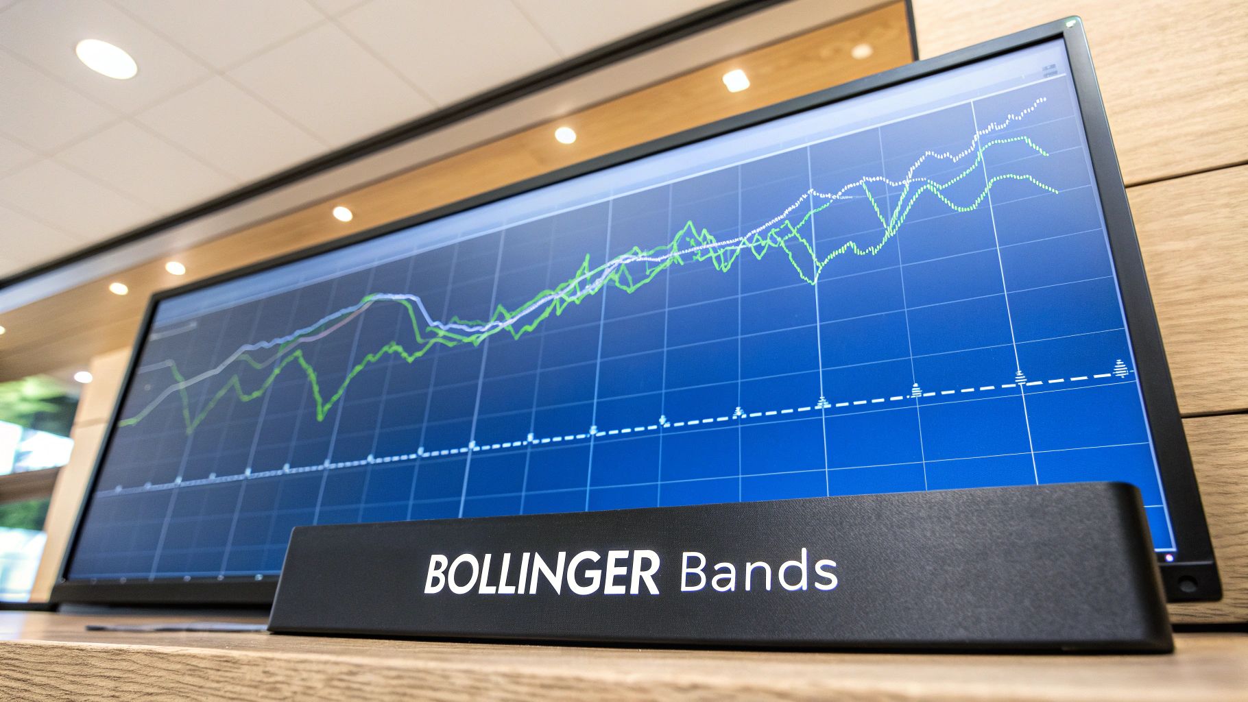
3. Bollinger Bands Strategy
The Bollinger Bands strategy is a powerful volatility-based tool among technical analysis strategies. Developed by John Bollinger in the 1980s, it consists of a simple moving average (the middle band) and two outer bands set at a standard deviation above and below it. These bands dynamically expand when volatility is high and contract when it is low, creating a visual map of the market's current state.
This indicator is exceptionally versatile. Traders use it to identify overbought or oversold conditions, gauge trend strength, and spot potential breakouts. When the price touches the upper band, it may be considered overbought, while a touch of the lower band suggests it could be oversold. A "squeeze," where the bands narrow significantly, often precedes a sharp price move, making it a key signal for breakout traders.
Actionable Setup & Implementation
To implement this strategy, traders must pay close attention to how the price interacts with the bands. Combining Bollinger Bands with other indicators, like the Relative Strength Index (RSI), can provide stronger confirmation for entry and exit signals. For example, a price touch of the lower band combined with an oversold RSI reading presents a higher-probability buy signal.
-
Setup Example (EUR/USD): On the EUR/USD forex pair, traders often watch for the bands to narrow on an hourly chart. This "squeeze" indicates a period of low volatility. A subsequent candlestick closing outside either the upper or lower band can signal the start of a new, powerful trend in that direction.
-
Implementation in ChartsWatcher:
- Open your desired chart, such as AMZN.
- Add the Bollinger Bands indicator from the studies menu. The default settings (20-period SMA, 2 standard deviations) are a good starting point.
- Look for price action touching or piercing the outer bands as potential reversal points in a ranging market.
- Create an alert to notify you when the band width falls below a certain threshold to identify a squeeze and prepare for a potential breakout.
Key Insight: Bollinger Bands are not standalone buy or sell signals. A price touching an outer band is not, by itself, a reason to trade. It is a tag, not a signal. Always use price action and other confirming indicators to validate a trade, especially to distinguish between a reversal and a strong trend continuation (known as "walking the band").
4. MACD (Moving Average Convergence Divergence) Strategy
The MACD (Moving Average Convergence Divergence) is one of the most versatile and widely used technical analysis strategies. It functions as a trend-following momentum indicator that reveals the relationship between two exponential moving averages (EMAs) of a security's price. The indicator generates clear trading signals through line crossovers and divergences, making it a favorite for identifying changes in the strength, direction, momentum, and duration of a trend.
Developed by Gerald Appel in the late 1970s, the MACD consists of three key components: the MACD line (the difference between the 12-period and 26-period EMAs), the signal line (a 9-period EMA of the MACD line), and the histogram (the difference between the MACD and signal lines). A bullish signal occurs when the MACD line crosses above the signal line, while a bearish signal is generated when it crosses below. The histogram’s size reflects the momentum's strength, providing additional context.
Actionable Setup & Implementation
To leverage the MACD strategy, traders should look beyond simple crossovers and incorporate momentum analysis and divergence signals. For instance, oil futures traders often rely on MACD crossovers to confirm the start of a new trend, while NASDAQ index analysts watch for divergences to spot potential market tops or bottoms.
-
Setup Example (Microsoft): On a daily chart of Microsoft (MSFT), a bullish MACD crossover where the MACD line moves above the signal line, especially when both are below the zero line, has historically preceded significant upward price moves. Conversely, bearish crossovers above the zero line have often signaled pullbacks or trend reversals.
-
Implementation in ChartsWatcher:
- Load your chosen asset's chart, such as the NASDAQ 100 index (NDX).
- Add the "MACD" indicator from the studies menu, using the standard (12, 26, 9) settings.
- Set an alert for when the MACD line crosses above the signal line for a potential buy signal, or below for a potential sell signal.
- Visually monitor the histogram; expanding bars indicate strengthening momentum, while shrinking bars suggest it's fading.
Key Insight: The MACD's true power lies in identifying divergences. A bullish divergence (price makes a new low, but MACD makes a higher low) can signal a weakening downtrend and a potential reversal. Always use MACD in conjunction with other tools like support and resistance levels or RSI to confirm signals and improve entry/exit timing.
5. Support and Resistance Strategy
The Support and Resistance Strategy is a foundational element of technical analysis strategies, built on the core principle that security prices often struggle to move beyond certain levels. Support is a price level where an asset tends to stop falling, driven by a concentration of demand or buying interest. Conversely, resistance is a price level where an asset's upward momentum is halted by a concentration of selling pressure. These levels act as psychological barriers that often become self-fulfilling prophecies.
This concept, with roots in Charles Dow's early theories and later refined in Edwards and Magee's "Technical Analysis of Stock Trends," helps traders identify key decision points. When a price approaches a support level, it presents a potential buying opportunity. When it nears resistance, it may signal a time to sell or take profits. A decisive break through one of these levels, especially with high volume, often indicates a new trend is beginning.
Actionable Setup & Implementation
The key to implementing this strategy is accurately identifying significant support and resistance zones. Instead of drawing precise lines, it is often more effective to draw zones or ranges, as price rarely reverses at an exact point. Look for areas where the price has reversed multiple times in the past to confirm a level's strength.
-
Setup Example (Gold): Gold often encounters significant resistance at major psychological round numbers. For instance, the $2,000 per ounce level has acted as a powerful resistance barrier. Traders watch for price to approach this level, and if it fails to break through after several attempts, they might initiate short positions or take profits on long trades.
-
Implementation in ChartsWatcher:
- Open your chosen chart, for example, XAUUSD (Gold).
- Use the "Horizontal Line" drawing tool to mark key price levels where the asset has reversed multiple times.
- Draw at least one support level below the current price and one resistance level above it.
- Set an alert to trigger when the price crosses your defined resistance level, signaling a potential breakout and entry for a long position.
Key Insight: Support and resistance levels are dynamic; once a resistance level is broken, it can become a new support level, and vice versa. This "role reversal" is a powerful confirmation signal. Always use volume analysis alongside these levels. A breakout above resistance on high volume is a much stronger signal than one on low volume.
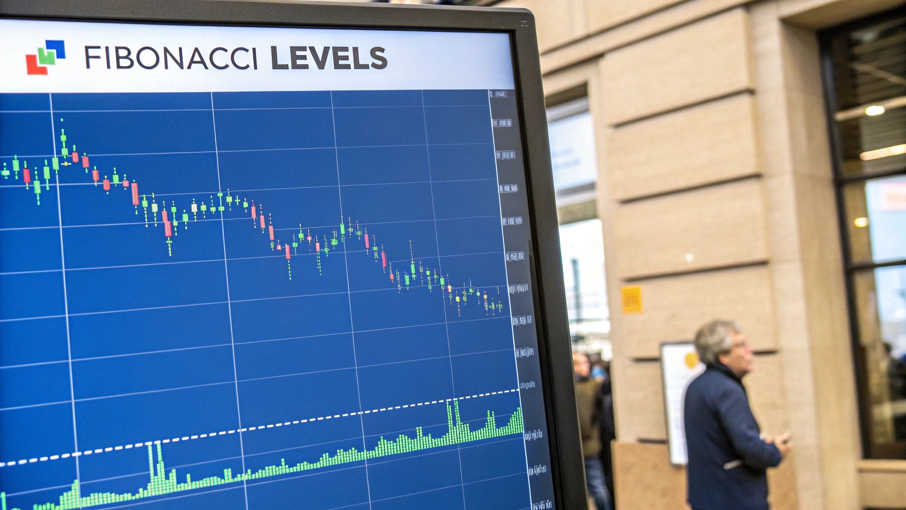
6. Fibonacci Retracement Strategy
The Fibonacci Retracement is a powerful tool among technical analysis strategies used to identify potential support and resistance levels. Based on the famous Fibonacci sequence, this strategy involves drawing horizontal lines at key percentage levels derived from a significant price move (from a major high to a major low, or vice versa). These levels, typically at 23.6%, 38.2%, 50%, 61.8%, and 78.6%, often act as crucial inflection points where a price trend may pause or reverse.
This method, while rooted in mathematics from Leonardo Fibonacci, was popularized in financial markets through the work of Ralph Nelson Elliott in his Elliott Wave Theory. The core idea is that after a significant price move, markets tend to "retrace" a predictable portion of that move before continuing in the original direction. These retracement levels give traders a roadmap for potential entry and exit points.
Actionable Setup & Implementation
To use this strategy effectively, you must first identify a clear, recent swing high and swing low on the chart. The tool is then drawn connecting these two points. The accuracy of the resulting levels is highly dependent on selecting the correct swing points, so focusing on major, confirmed price moves is critical.
-
Setup Example (Tesla): During Tesla's monumental 2020 rally, traders applied Fibonacci retracement tools to subsequent pullbacks. After major upward thrusts, the price frequently found support at the 38.2% and 61.8% levels before resuming its uptrend, offering clear buying opportunities for those monitoring these key ratios.
-
Implementation in ChartsWatcher:
- Select the Fibonacci Retracement tool from the drawing tools panel.
- On a chart like EUR/USD, identify a recent significant price swing (e.g., from a major low to a recent high in an uptrend).
- Click on the swing low and drag your cursor to the swing high, then release. The Fibonacci levels will be automatically drawn on the chart.
- Set alerts near the 38.2% and 61.8% levels to watch for price reactions that could signal a buying opportunity.
Key Insight: The most significant Fibonacci levels are often considered to be the 38.2% and 61.8% (the "golden ratio") zones. The strategy becomes exceptionally powerful when a Fibonacci level converges with another support or resistance indicator, such as a moving average or a previous price high/low. This "confluence" provides a much stronger signal. Always confirm a reversal with price action, like a bullish candlestick pattern, before entering a trade.
7. Candlestick Pattern Strategy
The Candlestick Pattern Strategy is a visual approach to price chart analysis and one of the most immediate technical analysis strategies. Originating from 18th-century Japanese rice traders, this method uses candlestick charts to interpret market sentiment and predict future price movements. Each candle represents a specific time period, visually displaying the open, high, low, and close prices, with patterns like the doji, hammer, engulfing, and shooting star offering clues about potential trend reversals or continuations.
This powerful technique was introduced to the Western world by Steve Nison and has since become indispensable for traders. Patterns are categorized as bullish, bearish, or neutral. A bullish engulfing pattern, for example, signals strong buying pressure that could initiate an uptrend. Conversely, a shooting star at the top of an advance can indicate that sellers are gaining control, suggesting a potential price reversal. The psychology behind these formations is what makes them so effective.
Actionable Setup & Implementation
Success with candlestick patterns relies on context. A pattern's reliability increases significantly when it forms at a key support or resistance level and is confirmed by other factors like trading volume. Traders should first master the foundational patterns before moving to more complex formations. You can learn more about 7 candlestick reversal patterns every trader should know.
-
Setup Example (Amazon): A trader notices a strong bullish engulfing pattern forming on the daily chart of Amazon (AMZN) right at a long-term support trendline. This confluence of a powerful reversal signal at a critical price level provides a high-probability setup for a long entry.
-
Implementation in ChartsWatcher:
- Open the chart for an asset like GOOGL.
- Set the chart type to "Candles."
- Visually scan the chart for key patterns at historical support or resistance zones.
- Use the drawing tools to mark these zones and set an alert for when the price re-tests them, allowing you to watch for pattern formation in real-time.
Key Insight: The main advantage of candlestick analysis is its ability to provide early, visual signals of potential market turning points. However, patterns should never be traded in isolation. Their predictive power is maximized when confirmed by volume, momentum indicators, or significant price levels, which helps filter out false signals and improve trade accuracy.
8. Volume Analysis Strategy
Volume Analysis is one of the most fundamental technical analysis strategies, operating on the principle that trading volume is a crucial confirmation tool for price action. It involves analyzing the number of shares or contracts traded over a specific period to gauge the conviction behind price movements. A price move accompanied by high volume is considered more significant than one with low volume, as it indicates strong participation and interest.
This strategy helps traders validate trends, spot potential reversals, and identify periods of accumulation or distribution. Analysts like Richard Wyckoff and Joe Granville pioneered the concept that volume precedes price. For instance, an unusual spike in volume during a price breakout can confirm the start of a new trend, while declining volume during a rally may signal that the trend is losing momentum and a reversal is imminent. GameStop's historic 2021 surge was a prime example, where massive, unprecedented volume spikes confirmed the immense buying pressure long before the price peaked.
Actionable Setup & Implementation
To effectively use volume analysis, you must look for confirmations or divergences between price and volume. A simple volume bar chart at the bottom of your price chart is the most common setup, but more advanced tools like the Volume Profile can offer deeper insights into institutional activity.
-
Setup Example (Cryptocurrency): Monitor a major cryptocurrency like Ethereum (ETH) on a daily chart. If ETH breaks out above a key resistance level but the volume is below its 20-day average, it could be a false breakout or "bull trap." Conversely, a breakout on significantly higher-than-average volume suggests strong conviction and a higher probability of continuation.
-
Implementation in ChartsWatcher:
- Open your desired chart, for example, NVDA.
- Add the standard "Volume" indicator from the studies menu, which will appear at the bottom of the chart.
- Add a "Moving Average" to the volume indicator itself (not the price chart) and set the period to 20 to easily spot above-average volume days.
- Watch for price breakouts above key levels that coincide with volume bars crossing above the 20-period volume MA for strong confirmation.
Key Insight: The core strength of volume analysis is its ability to measure the "fuel" behind price moves. It serves as a lie detector for the market. While price can be misleading, significant volume confirms genuine institutional interest. For a more advanced approach, you can master the Volume Profile indicator for better trading to identify precise price levels where the most trading activity has occurred.
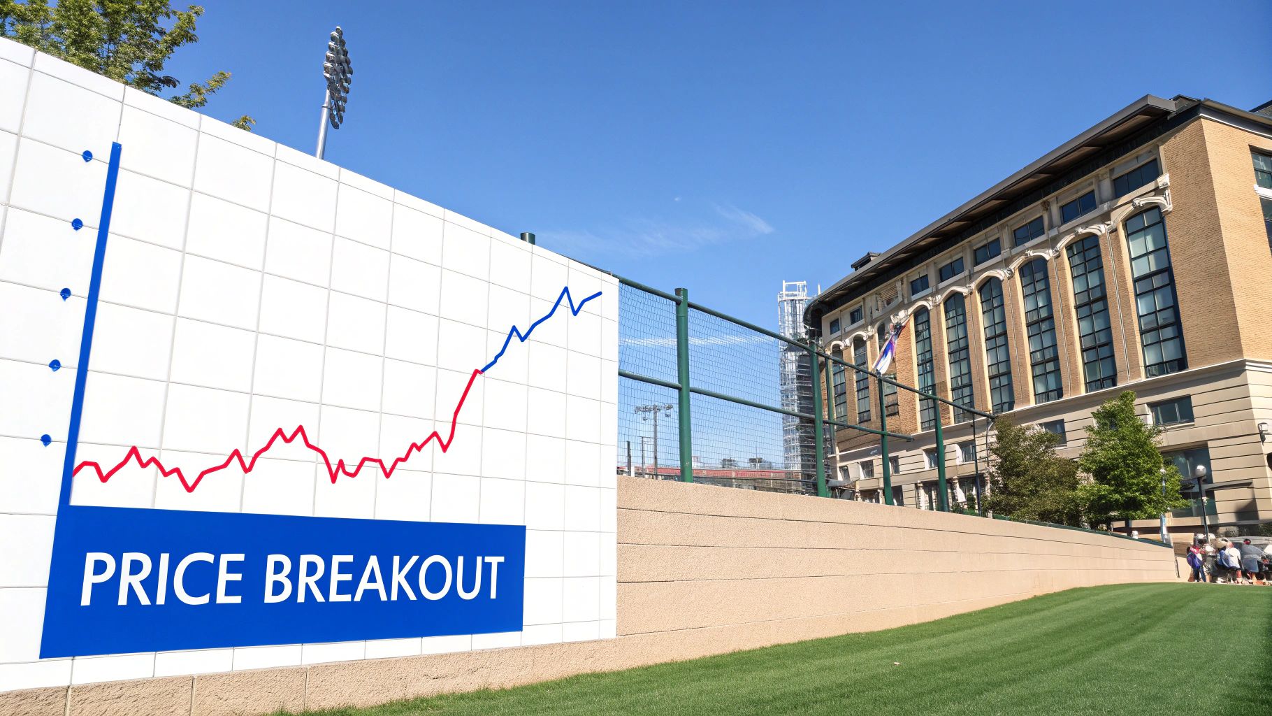
9. Breakout Strategy
The Breakout Strategy is one of the most dynamic technical analysis strategies, focusing on moments when an asset's price moves decisively through a defined level of support or resistance. This "breakout" is often accompanied by a significant increase in trading volume, suggesting strong conviction behind the move. It signals a potential shift from a consolidation phase to a new trending phase, offering traders a chance to enter a position at the very beginning of a substantial price movement.
This method was heavily utilized and refined by legendary traders like William O'Neil, who integrated it into his CAN SLIM system for growth stocks, and Richard Dennis, who famously taught the Turtle Traders to capitalize on breakouts in commodity markets. A bullish breakout occurs when the price pushes above a resistance level, while a bearish breakout happens when it falls below a support level. The core idea is to capture the powerful momentum that typically follows the breach of a well-established price barrier.
Actionable Setup & Implementation
Success with breakout trading hinges on identifying legitimate moves and avoiding "false breakouts," where the price briefly crosses a level only to reverse. Confirming a breakout with high volume is a critical step, as it indicates institutional participation and a higher probability that the new trend will sustain itself.
-
Setup Example (Bitcoin): A historical example is Bitcoin's breakout above the key psychological resistance level of $20,000 in late 2020. This level had capped the market for years. Once breached with surging volume, it triggered a massive bull run, demonstrating the power of a breakout from a long-term, well-defined range.
-
Implementation in ChartsWatcher:
- Identify a key support or resistance level on a chart, for example, NFLX approaching a multi-month high.
- Use the drawing tools to place a horizontal line at this price level.
- Add the Volume indicator to your chart to monitor for a spike during the potential breakout.
- Create a price alert just above the resistance line. When triggered, check for a corresponding volume increase to confirm the breakout before considering an entry.
Key Insight: The primary advantage of the Breakout Strategy is its potential for capturing explosive, high-momentum moves early. However, it's susceptible to false signals, or "fakeouts," which can lead to losses. To mitigate this risk, always use a tight stop-loss order placed just on the other side of the breakout level and wait for candle-close confirmation above or below the level.
Technical Analysis Strategies Comparison
| Strategy | Implementation Complexity 🔄 | Resource Requirements ⚡ | Expected Outcomes 📊 | Ideal Use Cases 💡 | Key Advantages ⭐ |
|---|---|---|---|---|---|
| Moving Average Crossover | Low - simple moving averages | Low - basic data, any timeframe | Effective trend following, lagging | Trending markets, cross-asset application | Easy to implement, emotion-free signals |
| RSI | Moderate - oscillator setup | Low - price data, 14-day period | Identifies reversal points | Ranging markets, momentum reversals | Clear signals, detects divergences |
| Bollinger Bands | Moderate - volatility bands | Moderate - moving average + SD | Volatility-based signals | Mean reversion, breakout identification | Adapts to volatility, signals squeezes |
| MACD | Moderate - multiple EMAs | Moderate - requires EMA calcs | Combines trend and momentum | Trending markets, momentum confirmation | Clear buy/sell signals, identifies divergences |
| Support and Resistance | Low - price level manual | Low - requires chart analysis | Defines entry/exit, risk zones | All markets/timeframes, foundational use | Simple, widely applicable, informs risk |
| Fibonacci Retracement | Moderate - swing identification | Low - price points needed | Potential reversal & profit points | Trending markets, swing analysis | Objective levels, widely followed |
| Candlestick Pattern | Moderate - pattern recognition | Low - price candles data | Early reversal/continuation signals | All timeframes, sentiment analysis | Immediate visual insights, versatile |
| Volume Analysis | Moderate - volume interpretation | Moderate - volume data needed | Confirms trends, detects false moves | All markets, trend validation | Confirms moves, reveals accumulation |
| Breakout | Moderate - level & volume confirmation | Moderate - volume + price data | Captures new trends | Volatile markets, momentum entry points | Objective entries, captures major moves |
Final Thoughts
Navigating the financial markets without a plan is akin to sailing a vast ocean without a compass. The technical analysis strategies we've explored in this guide are your compass, sextant, and charts all rolled into one. They provide a structured framework for interpreting market psychology, identifying potential opportunities, and managing risk with precision. From the trend-following power of Moving Average Crossovers to the momentum insights of the RSI and MACD, each strategy offers a unique lens through which to view price action.
We've delved into the dynamic boundaries of Bollinger Bands, the psychological battlegrounds of Support and Resistance, and the predictive harmony of Fibonacci Retracements. By understanding how to read Candlestick Patterns, analyze trading Volume, and capitalize on powerful Breakouts, you are no longer a passive observer of market whims. Instead, you become an active participant, capable of making informed decisions based on historical data and probabilistic outcomes.
Key Takeaways: From Theory to Tactical Execution
The core message is that no single strategy is a magic bullet. The true art of trading lies in synthesis and context. A powerful breakout, for instance, becomes significantly more compelling when confirmed by a surge in volume and a bullish candlestick pattern. Likewise, an RSI divergence signal is more reliable when it occurs near a major support or resistance level.
Here are the most critical takeaways to carry forward:
- Confluence is King: The most robust trading signals emerge when multiple, non-correlated indicators align. Don’t rely on a single tool; look for confirmation from at least one or two others to increase the probability of a successful trade.
- Context Over Everything: A strategy's effectiveness is dictated by the current market environment. A trend-following system like the MACD will excel in a trending market but may generate false signals in a choppy, range-bound market where Bollinger Bands or RSI might be more suitable.
- Discipline is Your Edge: The best technical analysis strategies in the world are useless without the discipline to follow your rules consistently. This includes setting stop-losses, defining profit targets, and adhering to your risk management plan on every single trade.
- Mastery Through Practice: Reading about these strategies is the first step. The real learning happens through application, backtesting, and live-market practice. Use a demo account or start with small position sizes to build confidence and refine your approach without significant financial risk.
Your Path Forward: Building a Cohesive Trading System
Your journey from here is to transform this knowledge into a personalized trading system. This doesn't mean you need to use all nine strategies at once. On the contrary, it means selecting the two or three that best resonate with your trading style, personality, and the assets you trade.
Start by asking yourself critical questions: Am I a short-term day trader or a long-term position trader? Do I prefer catching trends or trading reversals? Am I more comfortable with objective, mathematical indicators or subjective chart patterns? Your answers will guide you toward the right combination of tools.
Ultimately, mastering these technical analysis strategies is about shifting from guessing to strategizing. It's about developing a repeatable process that gives you a statistical edge over the long run. The market will always be unpredictable, but with a well-honed analytical toolkit, you can navigate its complexities with confidence, precision, and a clear plan for action. Embrace the process of continuous learning, stay disciplined, and let the charts guide your path to more consistent trading.
Ready to put these strategies into practice with professional-grade tools? ChartsWatcher is an advanced stock scanner and charting platform designed to help you implement every strategy discussed in this guide with speed and precision. Stop manually searching for setups and let our powerful screeners and real-time alerts bring the best trading opportunities directly to you at ChartsWatcher.
