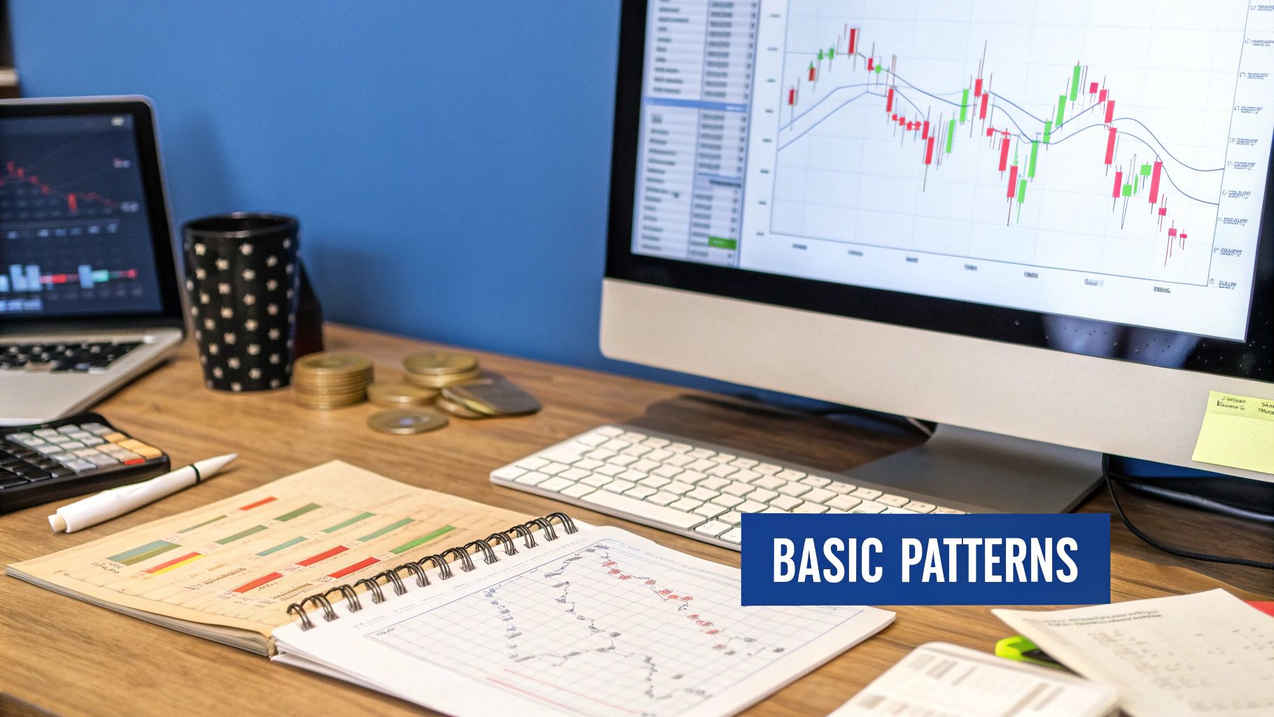
Master Understanding Candlestick Charting for Better Trading
Learning to read candlestick charts is all about understanding the story of price action at a glance. Each and every candle is a visual summary of the battle between buyers and sellers over a set period, making a mountain of complex market data instantly easy to grasp. This is your first step toward reading the market’s emotional pulse.
What Candlestick Charts Reveal About Markets
Imagine trying to understand a fast-paced football game by only looking at the final score. You’d know who won, but you'd have absolutely no idea how the game actually unfolded—the fumbles, the epic plays, the near misses. A traditional line chart is just like that final score; it connects closing prices but completely hides the drama that happened within each trading session.
Candlestick charting, on the other hand, gives you the full play-by-play.
Think of each candlestick as its own miniature story. It doesn't just show you the end result; it reveals the entire plot of the price's journey from open to close. This visual storytelling is precisely what makes candlestick charting such an incredibly powerful tool for traders.
The Anatomy of a Market Story
Every single candlestick is built from four key pieces of data that give it its distinct shape. The two main parts you’ll see are the body and the wicks (which some traders call shadows).
- The Body: This is the thick, rectangular part of the candle. It tells you where the price started (the open) and where it finished (the close) for that time frame. A green or white body means the price closed higher than it opened—a clear win for the buyers. A red or black body means it closed lower, signaling a win for the sellers.
- The Wicks: These are the thin lines sticking out from the top and bottom of the body. They show you the highest and lowest prices the asset hit during the period. A long upper wick reveals that buyers tried to push the price way up but were ultimately beaten back down by sellers. A long lower wick tells the opposite story—sellers attempted to force the price down but were overwhelmed by a surge of buying pressure.
This simple visual structure is incredibly efficient. It packs four crucial pieces of information (open, high, low, and close) into a single shape, allowing you to quickly size up market sentiment without getting bogged down in a sea of numbers.
This efficiency is exactly why candlestick charting has become such a dominant force in technical analysis. In fact, surveys of market professionals consistently show that over 70% of traders rely on candlestick analysis in their strategies, which really highlights its value in making quick, informed decisions. For a deeper dive, you can explore its history and widespread adoption in financial markets on Wikipedia.
Let’s quickly break down what each part of a candle is telling you about the market's behavior.
The Story Inside a Single Candlestick
| Component | What It Represents | Market Implication |
|---|---|---|
| The Body | The range between the open and close price. | A long body shows strong momentum (buying or selling), while a short body suggests consolidation or indecision. |
| The Color | The direction of the price move. | Green/White indicates the close was higher than the open (bullish). Red/Black means the close was lower (bearish). |
| Upper Wick | The session's highest price point. | A long upper wick shows that buyers lost control to sellers, who pushed the price down from its peak. |
| Lower Wick | The session's lowest price point. | A long lower wick indicates sellers tried to drive the price down but were overpowered by buyers. |
By learning to interpret these simple shapes, you stop just looking at prices and start seeing the underlying psychology driving them. Soon, you'll be able to spot signs of strength, weakness, indecision, and potential reversals just by observing the interplay of bodies and wicks.
To dig even deeper into the fundamentals, be sure to check out our complete trader's essential guide to understanding candlestick charts.
The Trader Who Unlocked Market Psychology
To really get a feel for candlestick charting, you have to go back in time—way back, to 18th-century Japan. Forget stock tickers and high-frequency trading; this story starts with something far more essential: rice. It was in the bustling rice exchanges that a legendary trader named Munehisa Homma had an insight that would eventually change technical analysis forever.
While his peers were fixated on the simple mechanics of supply and demand, Homma saw something deeper. He realized that market prices weren't just a reflection of cold, hard numbers. They were driven by raw human emotion—the constant battle between fear, greed, and hope. These powerful forces, he discovered, left a visible footprint on price movements.
So, he developed a way to visualize this market psychology, creating the very first candlestick charts. His breakthrough was understanding that what a price did was far less important than how and why it did it. For example, a price that tried to fall but was aggressively bought back up told a much richer story than one that simply rose.
From Rice Paddies To Wall Street
Homma's methods were so powerful they reportedly earned him a massive fortune and the distinguished title of honorary Samurai. Yet, for over two centuries, his revolutionary techniques remained one of Japan's best-kept secrets. If you want to dive deeper into the fascinating backstory, you can explore the rich history of candlestick charts on TradingView.
It wasn't until the 1990s that this powerful tool finally made its way to the West, thanks to an author and analyst named Steve Nison. He painstakingly translated these Japanese principles for modern traders, opening up a new world of analysis for stocks, futures, and currencies. All of a sudden, traders from New York to London had a visual language that could articulate market sentiment with incredible clarity.
Homma’s core principle remains as relevant today as it was then: Candlesticks are a language for reading the collective mind of the market. They tell a story of conflict, victory, and defeat between buyers and sellers.
This history is more than just a fun fact; it’s fundamental to your success. It reminds us that candlestick charting isn't about memorizing abstract shapes. It’s about interpreting human behavior. Every pattern you'll learn is a direct reflection of that emotional tug-of-war that drives every financial market on earth, from ancient rice exchanges to today’s lightning-fast crypto markets.
Reading The Basic Stories Told By Candlesticks
Now that you know the basic anatomy of a candle, we can start to see them for what they really are: tiny stories of market conflict. Individual candlesticks and small formations aren't just random shapes on a screen. Each one is a snapshot of the tug-of-war between buyers and sellers.
Learning to read these stories is how you start anticipating what might happen next. Forget about memorizing dozens of patterns cold. Instead, focus on the psychology behind each one. Think of it like a language. You don't just learn words; you learn what they mean in context. The goal is to see a pattern and instantly understand who's winning the battle.
The Hammer: A Story Of Rejection
One of the most classic single-candle stories is the Hammer. This pattern shows up after a downtrend and looks exactly like its name suggests: a small body at the top with a long lower wick.
So, what’s the story here? At first, sellers were in complete control, shoving the price way down. But then, the buyers staged a massive counterattack. They stormed back, driving the price all the way up to close near where it opened.
The long lower wick is the most important part of this story. It's a visual scar from the sellers' failed attempt to keep control. A Hammer tells you the market has rejected lower prices and a potential price floor might be in place.
The Engulfing Pattern: A Tale Of Two Armies
Engulfing patterns tell a far more dramatic story of a complete momentum shift over two trading periods. They are powerful reversal signals because they show one side totally overwhelming the other.
- Bullish Engulfing: This story starts with the sellers in charge, forming a red candle. The very next candle, however, is a huge green one that completely "engulfs" the previous red one. This shows that buyers didn't just absorb the selling pressure—they steamrolled right over it.
- Bearish Engulfing: Here's the opposite narrative. A green candle shows buyers feeling confident. But the next candle is a monster red one that swallows the green candle whole. This signals a swift, brutal takeover by the sellers.
This infographic really helps visualize how analysts interpret these crucial signals on a chart.
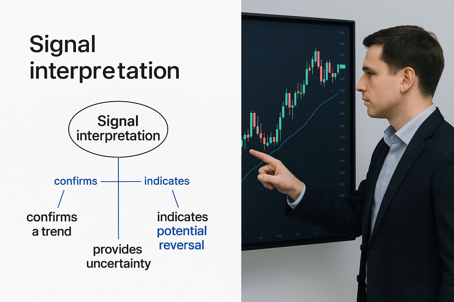
The key takeaway is that the size of the engulfing candle directly shows the strength of the reversal. It turns a simple price chart into a clear story of market power.
The Doji: A Story Of Indecision
Finally, we have the Doji. This candle has a very small, almost non-existent body, meaning the open and close prices were nearly identical. It often looks like a cross or a plus sign.
The story of a Doji is one of pure indecision. For that entire period, buyers and sellers fought to a perfect stalemate. Neither side could gain an edge, resulting in a draw. While a Doji itself is neutral, where it appears is critical. When a Doji shows up after a strong trend, it can be a warning sign that the dominant force is running out of steam, potentially setting the stage for a reversal.
These foundational patterns are just the beginning. To explore more advanced narratives, check out our guide on the top 7 candlestick reversal patterns every trader should know.
Interpreting More Complex Market Narratives
While a single candlestick gives you a powerful snapshot of market sentiment, the real magic of candlestick charting happens when you learn to read how these candles interact. A group of candles forms a much richer conversation, revealing a market narrative that's far more reliable than any lone signal.
Think of it like this: a single candle is one word, but a pattern of candles is a complete sentence. The context changes everything.
These multi-candle patterns tell detailed stories of potential trend reversals or continuations. They take the psychology hinted at by one candle and confirm it, turning a mere possibility into a higher-probability setup. Once you start spotting these sequences, you begin to see the bigger picture of market momentum.
The Story Of A Bullish March
One of the most straightforward visual narratives is the Three White Soldiers pattern. This is a story of sustained, confident buying pressure. It’s made up of three consecutive long, green candles, where each one opens within the body of the previous candle and pushes to close at a new high.
This isn't just a brief flicker of optimism. It’s a clear sign that buyers are firmly in command and marching forward with conviction. Each candle reinforces the bullish sentiment of the last, showing a steady advance that can signal the start of a strong uptrend or its continuation after a pause.
The opposite tale is told by the Three Black Crows. This bearish pattern is just as decisive, featuring three long, red candles that cascade downwards, each closing lower than the one before it. It’s a powerful story of sellers seizing control and driving the market down with force, often marking the beginning of a significant downtrend.
The Narrative Of A Failed Peak
A more complex, but incredibly powerful, story is the Evening Star. This is a classic bearish reversal pattern that unfolds over three candles right at the top of an uptrend.
- The Setup: The story begins with a large, green candle. Bulls are still confidently in control, pushing prices higher.
- The Indecision: The next candle is small-bodied (it can be green, red, or even a Doji). This shows that the buying momentum has stalled out. The bulls are getting tired, and a moment of hesitation enters the market.
- The Takeover: The final candle is a large, red one that closes well into the body of that first green candle. This is the confirmation. The sellers have taken over, turning the previous bullish confidence into a full-blown retreat.
The Evening Star pattern tells a clear story of bullish exhaustion followed by a decisive bearish takeover. It's a much more complete narrative than a single Shooting Star because it shows not just the rejection of higher prices, but the confirmed follow-through of the reversal.
The evolution of candlestick charting itself mirrors the broader advancements in technical analysis. Originally a closely guarded secret among Japanese rice traders, these patterns exploded onto the global stage in the 20th century as computing power made them more accessible to everyone.
Today, sophisticated software used by both massive hedge funds and individual retail traders analyzes these complex narratives in real-time, often backed by AI and big data. You can explore more about this journey in this piece on the history of chart reading on Quantified Strategies.
Using Candlesticks in a Real Trading Strategy
Here's a hard truth: a single candlestick pattern, no matter how picture-perfect, is never a direct order to buy or sell. Think of it as a strong hint from the market—a tap on the shoulder telling you to pay attention. Acting on that hint alone is a rookie mistake and a fast track to frustration.
The pros build confidence by confirming these signals with other tools. They look for a confluence of factors. This multi-layered approach is what separates casual pattern-spotting from a legitimate, risk-managed trading strategy. The goal isn't just to see a pattern; it's to build a "case" for a trade where every piece of evidence points in the same direction.
A Practical Step-By-Step Trading Example
Let's walk through a hypothetical trade to see how this works in the real world. Imagine you're eyeing a stock that’s been in a nasty downtrend, but you suspect it's running out of steam and looking for a bottom. Your plan isn't to just jump in; it's to wait for the market to give you multiple reasons to act.
Here’s how you’d build your case, layer by layer:
-
Spot a Pattern at a Key Level: First, you notice a classic Bullish Engulfing pattern taking shape. Crucially, it's forming right on a major historical support level. This is your initial clue. A powerful reversal pattern appearing at a price floor where buyers have stepped in before is far more significant than one floating in random chart space.
-
Confirm with Volume: Next, you glance at the volume bars at the bottom of your chart. You see that the volume on the day of the Bullish Engulfing candle was way higher than the average of the past few weeks. This volume spike tells you there was real money and conviction behind that upward move. It wasn't just noise; it was a statement.
-
Check Momentum with an Oscillator: Now, you look at an oscillator like the Relative Strength Index (RSI) for a third piece of evidence. You see the RSI was recently deep in "oversold" territory (below 30) and is now starting to hook upwards. This suggests the sellers are exhausted and buying pressure is starting to wake up.
-
Understand the Broader Trend Context: As a final check, you add a 50-day moving average to your chart. You see that while the price is still below it, the slope of that moving average is beginning to flatten out. The downtrend is losing its aggressive momentum.
Only when all these pieces align—the pattern, the support level, the volume spike, and the momentum shift—do you have a truly strong signal. You’ve built a complete story, not just reacted to a single chapter.
This methodical process is what professional trading is all about. It forces you to be patient and prevents you from making impulsive decisions based on a single, isolated event. You learn to wait for the market to prove you right, which dramatically improves your odds over the long run.
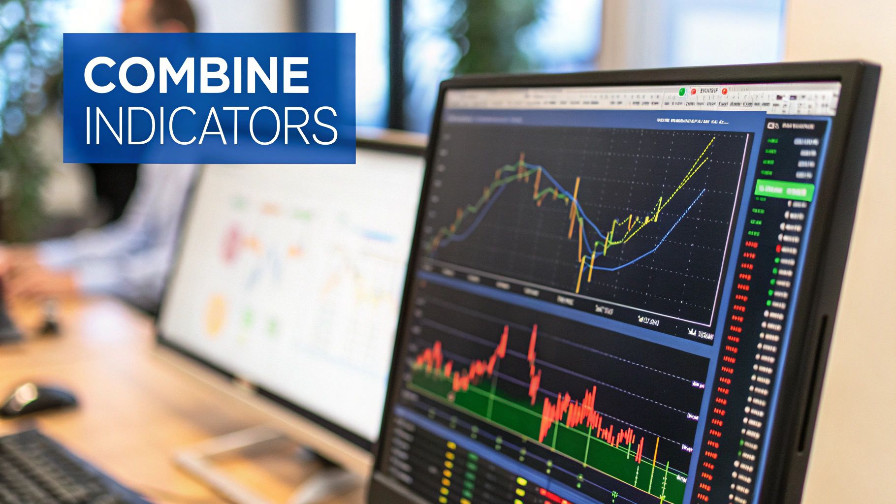
This is where a tool like ChartsWatcher makes life easier. You can have all these tools—support levels, volume, RSI, and moving averages—overlaid on a single chart. It lets you see the entire picture at a glance, turning a complex analytical process into a clear, actionable workflow and helping you apply your understanding of candlestick charting the right way.
Common Questions About Candlestick Charting
As you get your feet wet with candlestick charts, a few questions are bound to surface. It’s a powerful analysis technique, but it’s full of nuance. Let's tackle some of the most common sticking points to help you build confidence and get on the right track.
Are Candlestick Patterns Always Accurate?
The short answer is a hard no. Candlestick patterns aren't crystal balls, and you should never treat them as guaranteed predictions of what’s coming next. It's much healthier to think of them as high-probability signals reflecting market psychology—they show you what’s likely to happen, not what will happen.
Their reliability skyrockets when you consider them in context. For instance, a Bullish Engulfing pattern that pops up in the middle of a choppy, sideways market is interesting, but not much more. But take that same Bullish Engulfing pattern, have it form right at a major support level, and then see it confirmed by a big spike in trading volume? Now that's a powerful signal you can put more faith in. Always look for confirmation from other tools.
Candlestick charting is an art of probabilities, not certainties. Its true power is unlocked when patterns confirm what other technical tools are already suggesting, creating a stronger, unified trading thesis.
What Is The Best Timeframe For Candlestick Charting?
There’s no magic "best" timeframe. The right one for you depends entirely on your trading style and goals. The principles of reading candles are universal, but their meaning changes with the clock.
- Long-Term Investors: You’ll probably live on the daily, weekly, or even monthly charts. You’re looking for the big, overarching trends and major turning points. Patterns on these charts carry serious weight because they represent a market consensus that has formed over a long period.
- Swing Traders: Your sweet spot is often the 4-hour and daily charts. These are perfect for identifying and capturing price moves that play out over several days or a few weeks.
- Day Traders: You're operating in the fast lane. You'll be glued to the 1-minute, 5-minute, or 15-minute charts to capitalize on volatility throughout the trading day.
The key is simple: match your chart's timeframe to your trading horizon.
Where Can I Practice Reading Charts Without Risking Money?
Practice is non-negotiable for success, and the good news is you don't have to risk a single dollar to get your reps in. The best way to build your chart-reading muscle is with a paper trading or demo account.
Most major brokerage platforms and top-tier charting sites like TradingView or Yahoo Finance offer these virtual accounts. You get a chunk of simulated money to trade in a live market with real-time data. It's an invaluable, risk-free sandbox where you can practice spotting candlestick patterns, test out strategies, and just get a feel for the market's rhythm until you're truly confident enough to put real capital on the line.
Take your understanding of candlestick charting to the next level with a tool designed for professionals. ChartsWatcher allows you to customize your dashboards, overlay critical indicators, and see the full market story in real-time. Start analyzing the markets with greater clarity and precision by visiting ChartsWatcher today.
