How to Understand Candlestick Charts: A Trader’s Essential Guide
To truly understand candlestick charts, you need to learn the language of market sentiment. Think of it this way: each candle is a visual story of the battle between buyers and sellers over a specific time. It shows you who's winning, who's losing, and—most importantly—when the momentum might be about to shift.
How to Read the Story in a Candlestick Chart
Forget thinking of a chart as a jumble of random data points. A candlestick chart is a real-time narrative of market psychology. Instead of a simple line connecting closing prices, each candle gives you a rich, multi-dimensional view of the price action within a single period—whether that’s one minute, one day, or one week. That visual depth is exactly what makes them so essential for traders.
The real power of these charts comes from how quickly they communicate four critical pieces of information. Once you get a handle on these core elements, you can start to interpret the market's mood at a glance.
The Four Key Price Points
At the very heart of every single candle are four data points that tell the complete story of that trading session. These are the fundamental building blocks you'll use to spot more complex patterns and make informed trading decisions.
- Open: This is the price of the first trade when the period began. It sets the initial tone for the session.
- Close: This is the price of the final trade. The relationship between the open and close is the most critical piece of the puzzle, as it dictates the candle's color and the primary momentum.
- High: The absolute highest price the asset reached during the period. This point reveals the peak of buying strength or the upper limit of a rally.
- Low: The absolute lowest price the asset hit. This shows you the peak of selling pressure or the bottom of a sell-off.
A candlestick is more than just price data; it's a snapshot of the emotional state of the market. Long green bodies reflect optimism and strong buying, while long red bodies signal fear and aggressive selling.
The table below breaks down these core components for a quick reference, giving you a solid foundation for everything else you'll learn. To dig deeper into how this all comes together, you can also learn more about how to read candlestick charts to master profitable trading in our detailed guide.
The Four Key Data Points of a Candlestick
| Component | What It Represents | Market Implication |
|---|---|---|
| Open Price | The first traded price of the period. | Establishes the starting point for the session's battle between buyers and sellers. |
| High Price | The highest price reached during the period. | Shows the peak of buying pressure and potential resistance levels. |
| Low Price | The lowest price reached during the period. | Indicates the peak of selling pressure and potential support levels. |
| Close Price | The last traded price of the period. | Determines the net outcome, signaling who won the session's fight. |
By understanding these four data points, you're no longer just looking at a chart; you're reading a story. You can see the opening scene (the open), the climax (the high and low), and the resolution (the close). This is the first step toward making sense of market behavior.
The Trader Who Read Market Emotions
To really get a feel for candlestick charts, you have to travel back in time, way before blinking screens and digital stock tickers. Picture the buzzing rice markets of 18th-century Japan. This is where our story starts—not with fancy algorithms, but with one legendary trader’s mission to decode human emotion.
This whole approach to charting didn't come out of a Wall Street firm. It grew from the rich soil of Japan's Edo period, where a rice merchant named Munehisa Homma developed a system to track something far more important than price: the emotional tides of fear and greed that were actually moving the market. He understood that the collective mood of buyers and sellers was the real engine behind it all.
From Rice Grains to Riches
Homma's genius was in creating a visual language for this market sentiment. He didn't just see numbers; he saw the story of the daily struggle between buyers and sellers. Every single candle told him whether optimism or pessimism was winning the day, letting him predict shifts in market momentum with almost spooky accuracy.
His methods were so potent that he became a trading icon, reportedly racking up a fortune equal to over $10 billion in today's currency. He earned the nickname 'the God of Markets' and was even granted the honorary title of Samurai. He was, without a doubt, a master of market psychology. You can get a more detailed look at the history of candlesticks and their creator on TradingView.
This history lesson isn't just trivia; it gets to the very heart of candlestick charting. It was never just about plotting the open, high, low, and close.
From its very beginning, candlestick analysis has been a tool for reading the collective mind of the market—a principle that is just as powerful today.
When Steve Nison finally introduced Homma’s methods to the West centuries later, it completely changed the game for technical analysis. Traders who were stuck with basic line and bar charts suddenly had a much richer, more intuitive way to see what was happening.
The Enduring Legacy of Market Psychology
So what does this origin story mean for you, a modern trader? It means that when you learn to read these charts, you're not just learning a technical skill. You're learning the art of reading market emotions.
- It’s Not Just Data: Each pattern is a snapshot of a real battle between buyers trying to push prices up (greed) and sellers trying to force them down (fear).
- Context is Everything: Just like Homma looked at the rice supply alongside trader sentiment, you have to look at candles within the bigger market picture.
- Human Nature is Constant: The same emotions that drove the Japanese rice markets in the 1700s are driving stocks, crypto, and forex today.
This timeless foundation is exactly why candlestick charting is still one of the most popular and effective tools for traders all over the world. It’s your direct line to the market's heartbeat.
Decoding the Anatomy of a Single Candle
 To really understand candlestick charts, you first have to get familiar with the story told by just one candle. It’s best to think of each one not as some static bar, but as a miniature battlefield summary. It shows you the entire ebb and flow of a fight between buyers and sellers within a specific timeframe.
Every single part of its anatomy gives you a clue about who held the power and how decisively they won. At the heart of every candle are two main elements: the real body and the wicks. By looking at how these parts relate to each other, you can quickly get a read on market sentiment and momentum.
Let's break down each component to see what it's really telling you.
The Real Body: The Engine of Momentum
The thick, central part of the candle is what we call the real body. This is the most important part because it shows the net result of the battle—the raw distance between where the price opened and where it closed for that period.
The color and size of the body are your first and most powerful clues. A green (or white) body tells you the closing price was higher than the opening price. This signals that buyers were in control and successfully pushed the price up, a clear sign of bullish momentum.
On the flip side, a red (or black) body appears when the close is lower than the open. This means sellers dominated the session and drove the price down, which points to bearish momentum.
But the size of the body matters, a lot.
- A long body, whether it's green or red, suggests strong, decisive pressure from one side. It’s like a knockout punch, showing real conviction from either the bulls or the bears.
- A small body, however, points to a stalemate. It signals indecision in the market and a real lack of strong momentum from either camp.
The Wicks: The Story of the Struggle
Sticking out from the top and bottom of the real body are thin lines, often called wicks or shadows. These wicks are critical because they tell the story of the session’s volatility—the failed attempts by both buyers and sellers to push the price to extremes. They mark the highest and lowest prices reached during that period.
The upper wick shows the session's high price. A long upper wick is essentially a failed rally. It shows you that buyers tried to push the price much higher, but sellers came in with force, rejecting those higher prices and shoving the price back down before the session ended.
The lower wick represents the session's low price and tells the opposite story. Here, sellers attempted to drag the price down, but buyers fought back hard, lifting the price up from its lows. It’s a sign of a failed sell-off and shows there's underlying buying support.
A candlestick's anatomy is a visual record of market psychology. The body shows who won the fight, while the wicks reveal the intensity of the struggle and where the key turning points occurred.
Think of it like this: a candle with a tiny body but very long wicks on both sides is a clear signal of intense conflict that ended in a draw. Neither buyers nor sellers could land a definitive blow, resulting in a session full of volatility but very little net change.
In complete contrast, a long green candle with no wicks at all (a pattern called a Marubozu) shows absolute buyer domination from start to finish. The price opened at its low and closed at its high, with sellers putting up no resistance whatsoever. Learning to see these nuances in each candle's anatomy is the first major step to truly understand candlestick charts and the market dynamics they illustrate so clearly.
Recognizing Essential Bullish and Bearish Patterns
Once you've gotten the hang of reading the story of a single candle, you can start to see how groups of them form powerful patterns. These aren't just random shapes; they're recurring formations that capture a real shift in market psychology. Learning to spot these is a huge step toward truly understanding candlestick charts and getting a feel for where prices might be headed next.
Think of it like learning to read. Single candles are the letters, but patterns are the words—they tell a much richer story about what's happening in the market. We'll focus on some of the most reliable patterns traders watch for, splitting them into two main camps: bullish patterns that hint at rising prices and bearish patterns that warn of a potential drop.
This chart breaks down three of the most fundamental patterns—the Bullish Engulfing, Bearish Engulfing, and Doji—and what they signal about market sentiment.
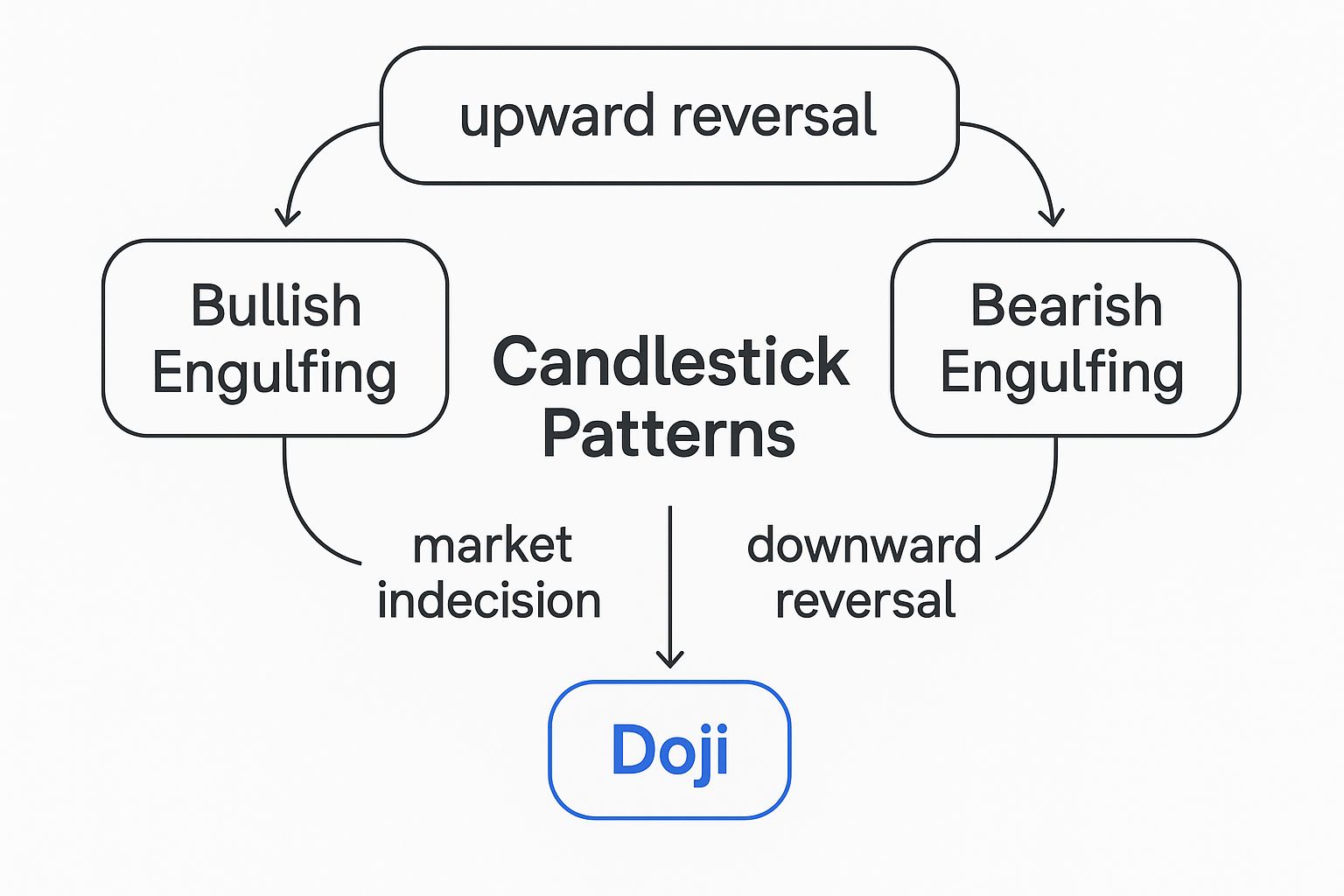
As you can see, each pattern is tied to a specific psychological event, whether it’s a full-blown reversal of momentum or a critical moment of indecision.
Dominant Bullish Patterns
Bullish patterns are your sign that buying pressure is starting to overpower the sellers. They often show up at the bottom of a downtrend, suggesting a price reversal to the upside could be just around the corner. Spotting these early can give you a serious edge.
The Hammer
The Hammer is a classic bullish reversal pattern. It’s easy to recognize: a small real body at the top of the trading range with a very long lower wick. That wick should be at least twice the size of the body, with little to no upper wick.
Imagine a downtrend where sellers are in control, pushing the price way down and creating that long shadow. But then, the buyers come roaring back. They reject those low prices and manage to drive the price all the way back up to close near where it opened. This powerful move "hammers" out a bottom, signaling that sellers have lost their grip and the bulls are stepping in.
Bullish Engulfing Pattern
The Bullish Engulfing pattern is a potent two-candle signal. It happens when a small bearish (red) candle is immediately followed by a large bullish (green) candle whose body completely "engulfs" the body of the candle before it.
This pattern tells a crystal-clear story of a dramatic power shift. On the first day, the sellers look like they have things under control. The next day, buyers take complete command, pushing the price far above the previous day's high. This decisive takeover often kicks off a new uptrend.
These aren't just pretty shapes on a screen; they are graphical stories about supply and demand. A Bullish Engulfing pattern, for instance, shows you the exact moment when demand suddenly and forcefully swamped supply.
To build on this, you can dive deeper into 7 candlestick reversal patterns every trader should know in our other guide. The more of these formations you can recognize, the sharper your market analysis will become.
Dominant Bearish Patterns
Just as bullish patterns hint at a potential rally, bearish patterns are the market's warning shot that selling pressure is building. They typically form at the top of an uptrend and suggest that momentum is about to roll over.
The Shooting Star
The Shooting Star is the bearish twin of the Hammer. It has a small real body at the bottom of the trading range, a long upper wick, and almost no lower wick. It’s a textbook sign of a potential top.
The psychology here is a failed rally. Buyers initially push the price much higher, creating that long upper wick. But they can't hold it. Sellers step in with force, slamming the price back down to close near its open. This sharp rejection of higher prices is a strong warning that the bulls are gassed out and a downturn could be on its way.
Bearish Engulfing Pattern
The Bearish Engulfing pattern is the mirror image of its bullish cousin. It’s a small bullish (green) candle followed by a large bearish (red) candle that completely swallows the prior candle's body.
This pattern signals a potential market top. After a run-up, the session opens higher, giving bulls a false sense of security. But then, sellers take over with such conviction that they not only erase the previous day's gains but push the price significantly lower. This abrupt reversal often marks the start of a new downtrend.
Understanding the Psychology is Key
Learning to understand candlestick charts is about more than just memorizing shapes. The real skill is in understanding the story of market psychology that each pattern tells. A Hammer isn't just a shape; it's the narrative of sellers failing and buyers seizing control.
Always remember, these patterns are about probability, not certainty. Their power increases dramatically when they appear at key levels, like major support or resistance, and are confirmed by other signals like a spike in trading volume. By combining pattern recognition with market context, you build a much stronger foundation for your analysis.
Using Candlestick Patterns in a Real World Context
 Spotting a pattern is one thing, but experienced traders know that a pattern without context is just market noise. This is where the real art of chart reading comes in. Context is everything. A Bullish Engulfing pattern in the middle of a random price chop might be interesting, but that same pattern at a major support level? That's a powerful signal that demands your full attention.
Making this leap—from simply identifying shapes to interpreting their meaning within the bigger market picture—is the most critical step you'll take to truly understand candlestick charts. A pattern’s reliability skyrockets when it's confirmed by other technical clues. This is what separates a high-probability trade from a costly mistake.
Think of it like a detective story. One clue is rarely enough to solve the case. But when you find two or three pieces of evidence that all point in the same direction, the picture becomes crystal clear. Your goal is to build a compelling case for a trade, not to jump on the first hint you see.
Building Your Confirmation Checklist
To trade effectively, you need a system for filtering out the weak signals. Creating a confirmation checklist is how professionals force themselves to size up the situation before pulling the trigger. Instead of getting lured into every pattern that pops up, you learn to wait for the setups that check multiple boxes.
Here are the three pillars of confirmation you should always look for:
- Trading Volume: Volume is the fuel behind a price move. It shows conviction. A powerful candlestick pattern should be backed by a noticeable spike in trading volume. For instance, a Bullish Engulfing pattern on high volume tells you that a ton of market participants are powering that reversal, giving it far more credibility.
- Support and Resistance Levels: These are the historical price zones where the market has turned around before. A bearish pattern like a Shooting Star appearing right at a known resistance level is a much stronger signal. It shows that sellers are actively defending that price point.
- Overall Market Trend: Does the pattern actually fit the bigger picture? A bullish continuation pattern is far more trustworthy inside a strong, established uptrend. On the flip side, trying to trade a bullish reversal pattern when the market is in a nosedive is like swimming against a powerful current. It's a low-probability bet.
A candlestick pattern tells you what might happen. Context tells you how likely it is to happen. The strongest trading opportunities are born when a clear pattern aligns perfectly with volume, key price levels, and the dominant market trend.
By demanding that at least two or three of these elements line up, you stack the odds dramatically in your favor. This disciplined method helps you sidestep the temptation to overtrade and focus only on the A+ setups—a true hallmark of a professional trader.
A Practical Example of Confirmation
Let's walk through a real-world scenario to see how this all comes together. Imagine you’re watching a stock that's been in a clear downtrend for a few days.
The Setup: The price finally drops to a historical support level—a price where you know buyers have stepped in before. Right at this level, a perfect Hammer candlestick forms. That’s your first signal.
The Confirmation: You glance at the volume and see that the volume on that Hammer candle was 50% higher than the average of the last ten days. This is your second, and very powerful, confirmation. It screams that buying interest is strong at this support level.
The Trigger: The very next candle opens higher and keeps climbing, confirming the reversal that the Hammer suggested. You now have a high-probability setup built on three converging factors: a bullish pattern, a key support level, and high volume.
This is a world away from just trading a random Hammer that appears out of nowhere on low volume. This disciplined, context-aware approach is how you effectively understand candlestick charts and use them to make much smarter trading decisions.
Why Traders Rely on Candlestick Charts
If you've ever looked at a line chart, you know where a stock's price has been. It's a simple, historical record. But candlestick charts tell you so much more—they tell you the story behind the price movement. This is why the vast majority of traders use them; they give you a complete picture of a trading period in a single, intuitive shape.
In today's fast-moving markets, whether you're trading stocks, crypto, or forex, speed is everything. Candlestick charts pack four crucial data points—the open, high, low, and close—into one simple form. This efficiency is a game-changer. Instead of wasting precious seconds trying to decipher raw numbers, you can instantly read the market's mood. A long green body screams bullish power, while a long upper wick signals that a rally failed and sellers took control.
The Language of Market Momentum
This direct visual feedback is why candlesticks have become the default language for technical analysis worldwide. Nothing else conveys trend strength and momentum quite so quickly. In fact, research suggests that over 70% of technical traders in major equity and forex markets use candlestick charts as their primary tool. This is especially true in the massive foreign exchange market, which moves around $7.5 trillion in volume every single day. In an environment that big, visual cues from patterns like the Doji, Hammer, and Engulfing aren't just helpful—they're fundamental. You can dig deeper into these findings by exploring the history of candlestick charting on Wikipedia.
The real edge of candlestick charts isn't just the data they show, but how they show it. They turn cold, hard numbers into a living picture of market psychology, letting you see the battle between buyers and sellers as it unfolds.
Versatility Across All Timeframes
Another key reason candlesticks are so popular is their incredible versatility. They aren't just for one type of trader. A day trader glued to a one-minute chart gets just as much value as a long-term investor studying a weekly chart.
- Day Traders use them on short-term charts (like the 1-minute or 5-minute) to spot rapid shifts in momentum and scalp small price moves.
- Swing Traders often focus on hourly or 4-hour charts, looking for patterns that play out over several days to capture bigger market swings.
- Long-Term Investors can pull up daily and weekly charts to understand the broader trend and identify major market turning points.
This scalability means that no matter your strategy, you can understand candlestick charts to analyze price action effectively. Their ability to deliver clear, actionable insights at a glance has made them an indispensable part of any modern trader's toolkit. By learning their language, you're equipping yourself with a powerful method for reading the market's mind.
Got Questions About Candlestick Charts?
As you start getting the hang of candlestick charts, it's totally normal for a bunch of practical questions to pop up. Honestly, working through these is a huge step toward building the confidence you need to actually use this stuff in your trading. Let's tackle some of the most common ones I hear from traders.
One of the biggest questions is always about reliability. Are these patterns really accurate? While no single pattern is a 100% crystal ball, their predictive power gets a massive boost when you see them confirmed by other signals. Think of a Hammer pattern showing up right at a key support level with a big spike in volume—that's a world away from one just appearing randomly in the middle of a chart.
Another point of confusion is picking the right timeframe. This one's simple: it comes down entirely to your trading style.
- Day traders live on the 1-minute to 15-minute charts, looking for quick entry and exit points.
- Swing traders usually hang out on the 1-hour, 4-hour, or daily charts to catch moves that play out over a few days.
- Long-term investors zoom way out, using weekly and monthly charts to get a feel for the major, overarching trend.
How Do the Pros Really Use Candlestick Patterns?
Here’s a secret: professional traders almost never use candlestick patterns in a vacuum. They weave them into a complete trading system, layering them with other forms of analysis to build a much stronger case for a trade.
Professionals treat a candlestick pattern as a critical piece of evidence, not the final verdict. They're always looking for confluence—that sweet spot where a pattern lines up with other signals like a volume spike, a trendline touch, or a major support/resistance zone.
This multi-layered approach is how they filter out all the market noise and zero in on high-probability setups. For instance, a pro might spot a Bearish Engulfing pattern right at a major resistance level. But they won't act yet. They'll wait for another indicator, like the RSI, to confirm overbought conditions before even thinking about a short trade.
This kind of discipline is what separates consistent traders from gamblers. They aren't just hunting for patterns; they're patiently waiting for multiple signals to align in their favor.
Ready to stop just looking at charts and start seeing the opportunities? ChartsWatcher gives you the powerful, customizable scanning and analysis tools to apply your knowledge with precision. You can filter for specific candlestick patterns, backtest your strategies, and build a dashboard that gives you a true market edge.
