Master the Directional Movement Indicator DMI
If you've ever felt like the stock market is a chaotic tug-of-war, you're not wrong. Every single day, buyers (the bulls) are pulling prices up while sellers (the bears) are trying to drag them back down. It’s a constant battle. But how do you know who's actually winning? And more importantly, how strong is their grip on the rope?
That’s exactly what the Directional Movement Indicator (DMI) is designed to tell you.
Understanding the Directional Movement Indicator (DMI)

Developed by the legendary technical analyst J. Welles Wilder Jr., the DMI is much more than just another squiggly line on your chart. It's a full-fledged system that acts as a scorecard for the market's ongoing power struggle.
Think of it this way: the DMI doesn’t predict the future. Instead, it gives you a crystal-clear snapshot of the current momentum. It helps you swap guesswork for informed decisions by showing you who’s in control—buyers or sellers—and just how intense that control really is.
The Three Pillars of the DMI
The real power of the DMI comes from its three core components. Each one tells a different part of the story, and when you put them together, you get a complete picture of a trend's direction and its underlying strength.
- Positive Directional Indicator (+DI): This line is all about the bulls. When the +DI line is rising, it means buying pressure is picking up and the upward price movement is gaining steam.
- Negative Directional Indicator (-DI): You guessed it—this one tracks the bears. A rising -DI line signals that selling pressure is intensifying and the downward price movement is accelerating.
- Average Directional Index (ADX): This is the secret sauce. The ADX doesn’t care whether the market is going up or down. Its only job is to measure the strength of the trend. It's like a referee who tells you how fierce the game is, regardless of which team is in the lead.
When J. Welles Wilder Jr. introduced the DMI back in 1978, it was a game-changer. It gave traders a systematic way to not just spot trends but actually measure them. The combination of +DI, -DI, and ADX provides a powerful, multi-dimensional view of market dynamics that was revolutionary at the time.
By watching the interplay between the +DI, -DI, and ADX lines, a trader can determine not only if a stock is trending but also the conviction behind that trend. This is the key to sidestepping those choppy, sideways markets where most strategies fall apart.
In this guide, we’re going to break down these three lines, moving past the complicated formulas to build a gut-level understanding. You'll learn how they interact to generate clear, actionable signals, turning what looks like a messy chart into a coherent story about market momentum.
For a wider view of how the DMI fits into the bigger picture, you can check out our guide on technical analysis indicators. Getting this foundation right is the first step to effectively using the directional movement indicator dmi in your own trading.
How the DMI Components Work Together
To really get a feel for the Directional Movement Indicator (DMI), you need to look under the hood. This isn’t about memorizing formulas; it’s about understanding how the indicator translates simple price action into the three distinct lines you see on your chart.
Let's break down the logic. The whole system starts with a simple comparison: the indicator looks at today’s price range versus yesterday’s. This little head-to-head matchup determines if we have Positive Directional Movement (+DM) or Negative Directional Movement (-DM).
- If today's high pushes past yesterday's high, that upward stretch is logged as +DM.
- Conversely, if today's low drops below yesterday's low, that downward move is recorded as -DM.
This gives us the raw, unfiltered data on bullish and bearish pressure for a single trading period.
Turning Raw Data into Smooth Indicators
Of course, raw daily movements are way too choppy to be useful for trading signals. This is where the DMI works its magic by smoothing this data, typically over a 14-period timeframe. This process averages out the raw +DM and -DM values to create the two lines you’re most familiar with: the Positive Directional Indicator (+DI) and the Negative Directional Indicator (-DI).
At the same time, the DMI calculates the True Range (TR), which is just a measure of market volatility. This is a critical ingredient because volatility gives context to price moves. A big swing in a quiet market carries a lot more weight than the same swing during a chaotic, volatile session.
The final +DI and -DI lines you see are essentially the smoothed directional movements normalized by the smoothed True Range. This step is what makes the indicator consistent across different stocks and timeframes, giving you a clear visual of who’s in control—buyers or sellers.
This graphic shows how the three pieces of the puzzle—the +DI, the -DI, and the ADX—come together on a chart to paint a complete picture of trend and momentum.
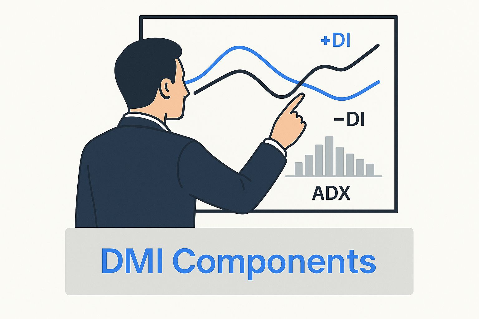
As you can see, the +DI and -DI lines weave around each other, with their crossovers signaling potential shifts in control. Below them, the ADX line acts as the final judge, telling you whether those signals have any real power behind them.
To make this crystal clear, here's a quick summary of what each component does.
DMI Components and Their Roles
| Component | Primary Function | What It Signals |
|---|---|---|
| +DI Line | Measures upward price movement. | When the +DI is above the -DI, it indicates that bullish pressure is stronger. Crossovers can signal a potential uptrend. |
| -DI Line | Measures downward price movement. | When the -DI is above the +DI, it suggests that bearish pressure is in control. Crossovers may signal a potential downtrend. |
| ADX Line | Measures the strength of the trend (regardless of direction). | A rising ADX signifies a strengthening trend (up or down). A falling ADX indicates a weakening trend or a ranging market. |
Thinking of the DMI as a three-part system is the key to using it effectively. The DI lines tell you who is winning, and the ADX tells you by how much.
Introducing the ADX: The Trend Strength Meter
Now for the most important—and most misunderstood—part of the system. The Average Directional Index (ADX) couldn't care less if the market is going up or down. Its only job is to measure the strength of the trend. Think of it as a power meter.
The ADX gets its reading from the distance between the +DI and -DI lines. When those two lines are spread far apart, it means one side (buyers or sellers) is dominating, and the ADX value will climb. When the +DI and -DI are tangled up and close together, it signals a choppy, directionless market, and the ADX value will fall.
This is the critical distinction that trips up so many traders. A rising ADX does not mean the price is going up. It means the current trend—whether it’s bullish or bearish—is gaining steam. A falling ADX doesn't mean a reversal is coming; it just means the trend is losing momentum or hitting a consolidation phase.
Grasping this concept is what separates traders who get frustrated with the DMI from those who use it to their advantage. The ADX is your filter. It helps you decide whether a +DI/-DI crossover signal is the real deal or just market noise.
Here’s a practical way to interpret ADX values:
- Below 20: The market is asleep. There’s little to no trend, so it’s likely chopping sideways. Be cautious with trend-following strategies.
- 20 to 25: Something might be brewing. A trend could be trying to form, so it’s time to start paying attention.
- Above 25: You’ve got a confirmed trend. There's real momentum behind the current price action, and trend strategies are in play.
- Above 50: This is an extremely powerful trend. It's strong, but also a potential sign that things are getting overextended and might be due for a pause.
By putting all three components together, the DMI tells a full story. The +DI and -DI lines show you who’s winning the tug-of-war between buyers and sellers, while the ADX tells you just how hard they’re pulling.
Reading the Signals: How to Interpret the DMI
Knowing what the lines on the Directional Movement Indicator (DMI) represent is the first step. But the real skill is learning to translate that tangled dance of lines into solid trading signals. At its heart, the DMI’s primary signal is the crossover between the Positive Directional Indicator (+DI) and the Negative Directional Indicator (-DI). This is your first clue that the balance of power between buyers and sellers is starting to shift.
Picture the +DI and -DI lines in a constant tug-of-war. When the green +DI line pushes up and crosses above the red -DI line, it’s a sign that buyers are gaining the upper hand. This bullish crossover hints that upward momentum is building, flagging a potential entry for a long position.
On the flip side, when the red -DI line muscles its way above the green +DI line, sellers are clearly taking control. This bearish crossover signals that downward momentum is picking up steam, which could be your cue to look for a short entry or get out of an existing long trade.
The ADX: Your Essential Trend Filter
Here’s the catch, though: acting on every single crossover is a rookie mistake that will get you chopped up in sideways markets. This is where the Average Directional Index (ADX) line becomes your most valuable filter. It’s the gatekeeper that separates the high-conviction setups from the low-probability noise.
Think of the ADX as the volume knob for a trend. A DI crossover is just static until the ADX tells you the volume is turned up.
A crossover only becomes truly meaningful when the ADX is rising and, ideally, above a certain level. Most traders use 25 as the line in the sand—anything above it suggests a strong, legitimate trend is in play.
- High-Probability Buy Signal: The +DI crosses above the -DI, AND the ADX is above 25 (or climbing strongly toward it). This duo confirms that not only are buyers in charge, but the uptrend has real muscle behind it.
- High-Probability Sell Signal: The -DI crosses above the +DI, AND the ADX is above 25 (or climbing). This tells you that sellers have taken over and the downtrend has significant force.
Trading a DI crossover when the ADX is flatlining below 20 is one of the most common ways traders lose money with this indicator. A low ADX screams "no trend." In this environment, the +DI and -DI lines will crisscross constantly, generating a storm of fake signals that leave you whipsawed by meaningless price wiggles.
Distinguishing Strong Setups from Market Noise
Let’s make this practical. Imagine a stock’s +DI line crosses above its -DI. An inexperienced trader might dive right in, going long. But a pro will immediately check the ADX. If the ADX is just sitting there at 15, they know the market is likely just consolidating. That bullish crossover isn't the start of a new rally; it’s just noise inside a trading range.
Now, let's replay that scenario. The same stock gets a +DI crossover, but this time, the ADX has been steadily climbing and just punched through the 25 level. This changes everything. The ADX reading gives the crossover a huge stamp of approval, confirming the new uptrend has the strength to keep going. This is the kind of A+ setup you build a strategy around.
By always using the ADX as your filter, you can learn to tune out the market's static and focus only on the clear signals. This disciplined approach is what separates guessing from trading when using the directional movement indicator dmi.
Practical DMI Trading Strategies
Knowing what the Directional Movement Indicator (DMI) signals mean is one thing. Building a solid trading plan around them is a completely different ballgame. While DMI crossovers are powerful on their own, they become far more reliable when you pair them with other technical analysis tools.
Think of it like adding a second opinion. This approach helps you filter out the market's random noise and gives you more confidence in every single trade you take.
One of the best ways to use the DMI is as a confirmation tool. By combining it with classic trend indicators like moving averages, you add a crucial layer of validation to your signals. It helps ensure that when you spot a potential trend, it actually has the momentum to follow through.
Confirming Trends with Moving Averages
A popular and refreshingly simple strategy is to pair the DMI with a moving average crossover system. Many traders, for instance, watch for a crossover between a short-term moving average (like the 20-period) and a longer-term one (like the 50-period) to spot potential trend shifts. A bullish "golden cross" or a bearish "death cross" gives you that initial heads-up.
But let's be honest, these crossovers can sometimes give you false signals, especially in choppy, sideways markets. This is where the DMI, and specifically the ADX line, becomes your best friend. By adding an ADX filter, you can qualify the strength of the trend that the moving averages are hinting at.
Here’s a clear set of rules for this strategy:
- Bullish Entry Signal: The short-term moving average crosses above the long-term moving average, AND the ADX is above 25. This confirms the new uptrend has genuine power behind it.
- Bearish Entry Signal: The short-term moving average crosses below the long-term moving average, AND the ADX is above 25. This tells you the new downtrend has significant selling pressure.
By simply waiting for the ADX to confirm the trend's strength, you can sidestep many of those frustrating whipsaws that happen when the market can't make up its mind. This simple filter turns a basic moving average strategy into a much more robust, trend-following system.
Spotting Trend Exhaustion with Divergence
Another advanced technique is using the DMI to spot when a strong trend is running out of steam. This is often visible through divergence between the price action and the ADX line. Divergence is a powerful leading signal that can warn you of a potential reversal before it actually happens.
Imagine a stock in a powerful uptrend, consistently making higher highs. You'd expect the ADX to also be making higher highs, reflecting that growing strength. But what if it isn't?
ADX Bearish Divergence: This happens when an asset's price pushes to a new high, but the ADX line fails to do the same, instead making a lower high. This disconnect suggests that the momentum driving the trend is fading, even as the price inches upward.
This divergence is an early warning that bullish momentum is wearing thin and the trend might be nearing exhaustion. It's a signal to tighten your stop-losses, think about taking some profits, or at least hold off on opening any new long positions. The same idea works in a downtrend; if the price makes a new low but the ADX doesn't, it could mean bearish momentum is drying up. For those looking to integrate this kind of technical analysis into more complex systems, the DMI can be a valuable input for machine learning trading algorithms.
Setting Smarter Stop-Losses with ADX
Finally, a strong ADX reading can be a fantastic guide for managing your risk. In a confirmed, high-momentum trend (think ADX well above 25), prices tend to be more volatile. A tight stop-loss in this kind of environment is likely to get triggered by normal price swings, even if the overall trend is perfectly fine.
When the ADX is high, it can be smart to use a wider stop-loss, perhaps one based on a volatility measure like the Average True Range (ATR). This gives your trade more room to breathe within the context of a strong, confirmed trend.
On the flip side, in a low ADX environment (below 20), price action is usually more contained, and a tighter stop-loss might be more appropriate. Using the ADX to adjust your risk management allows you to adapt to the market’s current personality, protecting your capital far more effectively.
Validating Your Strategy with DMI Data
Good traders don't guess; they test. Just knowing how to read the signals from the directional movement indicator dmi isn’t enough to build a profitable system. Before you risk a single dollar of your capital, you have to validate your strategy with historical data.
This process, known as backtesting, is what separates professional, data-driven trading from amateur speculation. It's your strategy's trial run—a way to see how your rules would have held up in the past.
Defining Your DMI Backtesting Rules
To run a meaningful backtest, you have to eliminate all ambiguity. Your system needs precise, mechanical instructions on when to enter, exit, and manage risk.
A basic DMI crossover strategy might have rules like these:
- Entry Rule: Go long when the +DI line crosses above the -DI line AND the ADX is above 25.
- Exit Rule (Profit): Close the position when the -DI line crosses back above the +DI line.
- Exit Rule (Loss): Close the position if the price hits a pre-defined stop-loss, like 2% below the entry price.
These rules create a mechanical system that can be tested over and over. The goal isn't just to see if it makes money, but to understand its personality. Does it work in all market conditions? How deep are the drawdowns? For a full picture of this process, check out our complete playbook on how to backtest a trading strategy.
Once you have your rules, you can start digging into key performance metrics. Forget just looking at the final profit number. The metrics that truly matter reveal the quality and risk of your strategy.
Key Backtesting Metrics
- Profit Factor: This is your gross profit divided by your gross loss. A value above 2.0 is generally considered robust, showing that your winning trades are at least double your losing ones.
- Maximum Drawdown: This is the biggest peak-to-trough drop in your account equity. It’s a critical measure of risk and tells you the worst-case losing streak you might have to survive.
- Win Rate: The percentage of trades that were profitable. While a high win rate feels good, it's far less important than your profit factor. A low win rate can still be very profitable if the wins are huge and the losses are small.
Putting the ADX Filter to the Test
To see the real power of validation, let's look at a sample backtest on the S&P 500 ETF (SPY). We'll compare a simple +DI/-DI crossover strategy without any filter against one that requires the ADX to be above 25 for a trade to be taken.
The results are often dramatic.
The unfiltered strategy might generate hundreds of trades, getting constantly whipsawed in sideways markets. Those small, frequent losses can quietly eat away at your profits. The ADX-filtered strategy, on the other hand, will take far fewer trades, patiently waiting to capture the big, high-momentum moves. Its profit factor and maximum drawdown will almost certainly look much healthier.
This data-driven approach is what proves the DMI’s value. In fact, backtesting on large S&P 500 datasets reveals that combining DMI crossovers with an ADX filter greater than 25 improved risk-adjusted returns by 15% over a simple buy-and-hold approach during trending periods. You can explore more about these statistical findings on TrendSpider.
This highlights a crucial lesson: the DMI shines brightest in trending markets but needs a filter to survive the sideways chop. By testing your rules, you move from just looking at charts to making statistically sound decisions.
Common Mistakes to Avoid When Using the DMI
Mastering the Directional Movement Indicator is as much about knowing what not to do as it is about knowing what to do. Even experienced traders can get tripped up by a few common traps, turning a powerful indicator into a source of headaches.
Steering clear of these mistakes is the key to using the DMI consistently and effectively.
The most common—and most expensive—mistake is jumping on every single +DI and -DI crossover. In a choppy, trendless market, these two lines will whip back and forth like crazy, generating a storm of false signals. If you act on every one, you're guaranteed to get whipsawed, racking up a series of small losses that bleed your account dry.
This first error is almost always tied directly to the second one: ignoring the ADX.
Misinterpreting a Low ADX
Think of the ADX line as your trend-strength filter. Treating it as an afterthought is a recipe for disaster. A DI crossover means next to nothing if the ADX is flatlining below 20. That low reading is the market screaming at you that it's going nowhere fast.
A low ADX isn't a signal to hunt for a reversal. It’s a signal to sit on your hands. It tells you the market is stuck in a range, which is the worst possible environment for a trend-following tool like the DMI.
Instead of trying to force a trade, a low ADX is a call for patience. Wait for the ADX to climb back above 25 before you even think about taking a crossover signal seriously.
Confusing a Falling ADX with a Reversal
Here's another classic mix-up. The ADX has been high, showing a strong trend, and then it starts to fall. Many traders see this and immediately assume the trend is about to reverse.
While a reversal might be coming, a falling ADX usually just means the trend is taking a breather. It’s pausing, not slamming on the brakes. An uptrend might pull back and chop sideways for a bit, causing the ADX to dip as momentum temporarily fades. Jumping into a short trade here is often premature, as the primary trend could easily kick back in and run you over.
Using the DMI in Isolation
Finally, no indicator is a magic bullet, and the DMI is no different. Relying on it completely on its own, without any other context, is a huge mistake. You should always back up DMI signals with other forms of analysis.
- Support and Resistance: Is that bullish DMI crossover happening right underneath a massive resistance level? If so, the odds are stacked against it.
- Price Patterns: Does the DMI signal line up with a classic chart pattern, like a breakout from a bull flag? Now you’re talking.
- Volume Analysis: Did a big spike in volume come in to confirm the DMI signal? That adds a ton of conviction to the move.
By layering on these other clues, you can filter out the weak setups and focus only on the high-probability signals the directional movement indicator dmi is designed to find.
Take your market analysis to the next level by integrating these DMI strategies directly into your workflow. With ChartsWatcher, you can build custom scans and dashboards to spot these high-probability setups in real-time. Explore our powerful tools and start trading smarter today at https://chartswatcher.com.
