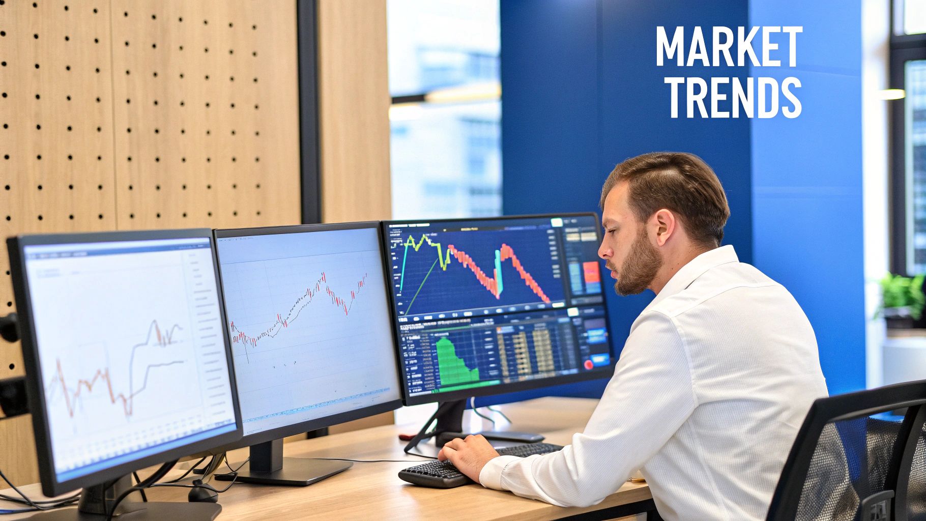
Master Technical Analysis for Traders: Essential Guide
Why Technical Analysis Is Your Trading Compass
Ever tried to sail across the ocean without a compass or a weather report? You’d be completely at the mercy of the currents and storms, with no real way to know what’s coming next. That’s a lot like trading without technical analysis—it’s a journey filled with guesswork and a ton of unnecessary risk.
Technical analysis is that compass. It gives you a framework for reading the market's mood and making sense of its behavior. It operates on a surprisingly simple but powerful idea: every bit of known information, from economic news to company earnings, is already baked into an asset’s price. The chart, then, tells the whole story.
Understanding the Core Idea
Think of a technical analyst as a meteorologist for the financial markets. A meteorologist doesn't just guess if it's going to rain. They study historical weather patterns, air pressure, and other data to forecast tomorrow's conditions with a high degree of probability. They can't be 100% certain, but they can spot the patterns that usually lead to a storm.
In the same way, technical analysis involves digging into historical price action and trading volume to anticipate what the market might do next. It’s a game of probabilities, not certainties. Your goal is to stack the odds in your favor by identifying trends and patterns that have historically led to specific outcomes.
This isn't some new-age concept; it's an approach built on principles that traders have refined for centuries. While figures like Charles Dow helped formalize the theories in the early 20th century, its roots go much deeper. Traders in 17th-century Amsterdam were using early forms of technical analysis, and Japanese rice merchants developed the candlestick charts we still use today back in the 1700s. You can learn more about the extensive history of technical analysis and how these ideas evolved into modern practice.
The Three Core Principles of Technical Analysis
At the very heart of technical analysis are three foundational beliefs. These are the assumptions that every technical trader operates on, and understanding them is your first step toward reading charts like a pro.
Technical analysis is a skill that improves with practice, observation, and a disciplined approach to risk management. It transforms raw price data into actionable intelligence, allowing traders to make informed decisions rather than emotional guesses.
Before we dive into the "how," let's lock in the "why." This table breaks down the three core principles that make technical analysis a valid approach to navigating the markets.
The Three Core Principles of Technical Analysis
| Principle | Explanation |
|---|---|
| The Market Discounts Everything | All available information—from fundamental data and news reports to economic forecasts and political events—is already reflected in the asset's price. This means a thorough analysis of the price action itself is sufficient. |
| Prices Move in Trends | Market prices don't move randomly. They follow discernible trends (up, down, or sideways) that tend to persist. A technical trader's main job is to identify the current trend and trade with it, not against it. |
| History Tends to Repeat Itself | The psychology of the market—driven by human emotions like fear and greed—is remarkably consistent over time. Traders tend to react to similar situations in similar ways, which creates repeatable chart patterns that can help forecast future price movements. |
These principles provide the bedrock for everything else you'll learn. They explain why a simple chart can hold so much valuable information, ready for you to interpret.
Reading the Market with Charts and Trends
To get anywhere with technical analysis, you have to learn to speak the market’s language. And that language is written on price charts. These charts are the canvases where the real-time battle between buyers and sellers is painted for all to see. Your trading toolkit starts with understanding the three primary chart types every analyst relies on.
The simplest of the bunch is the line chart. It just connects a series of closing prices over a specific period, creating a single, flowing line. While it’s fantastic for a quick, clean look at the general price direction, it leaves out crucial details that serious traders need for deeper analysis.
Next up is the bar chart, which adds a lot more color to the story. Each bar represents a single period—like a day or an hour—and shows four key pieces of information: the opening price, the highest price, the lowest price, and the closing price. This gives you a much richer view of the price volatility within each session.
Why Candlesticks Tell the Best Story
For most modern traders, though, the top choice is the candlestick chart. These charts, first imagined by Japanese rice merchants back in the 1700s, show the exact same four data points as a bar chart, but in a way that’s far more visual and intuitive. The thick part, or "body," of the candle shows you the range between the open and close, while the thin "wicks" show the session's high and low.
Here’s the real magic: the color of the body instantly reveals the market’s mood. A green (or white) candle means the price closed higher than it opened, signaling bullish strength. A red (or black) candle means the price closed lower, showing bearish pressure. This immediate visual feedback is why a staggering 90% of experienced traders prefer candlesticks—they make reading price action faster and more instinctual.
A single candlestick tells a four-part story: the open, the high, the low, and the close. A series of candlesticks tells the epic tale of market psychology, revealing fear, greed, and indecision at a glance.
If you're just starting out, learning to read these visual stories is a non-negotiable skill. For a more detailed walkthrough with plenty of examples, check out our essential chart guide on technical analysis for beginners.
Identifying Trends and Key Levels
Once you’ve got your chart set up, your next job is to figure out which way the market is heading. Prices don't just move randomly; they move in trends.
Think of an uptrend like climbing a staircase. The price makes a series of higher highs (taking a step up) and then higher lows (pausing on a higher step). This structure is a clear sign that buyers are in charge.
A downtrend, as you might guess, is like walking down that same staircase. The market carves out a sequence of lower highs and lower lows, which tells you that sellers have the upper hand. Pinpointing the primary trend is one of the most critical tasks in technical analysis because trading with the trend dramatically boosts your odds of success.
Finally, within these trends, you'll spot critical price zones known as support and resistance.
- Support: This is a price level where a downtrend is expected to stall out because of a cluster of buying interest. Think of it as a psychological floor where buyers feel the asset is a good deal and decide to step in.
- Resistance: This is the opposite—a price level where an uptrend might run out of steam due to a concentration of sellers. It acts like a psychological ceiling where traders are motivated to cash in their profits, overwhelming the buyers.
These levels aren't just arbitrary lines; they represent the market's collective memory and psychology. The constant battle between buyers at support and sellers at resistance is what often sets up the market’s next major move. Learning to spot these zones is absolutely crucial for finding smart entry points, setting effective stop-losses, and identifying logical profit targets.
How to Decode Common Chart Patterns
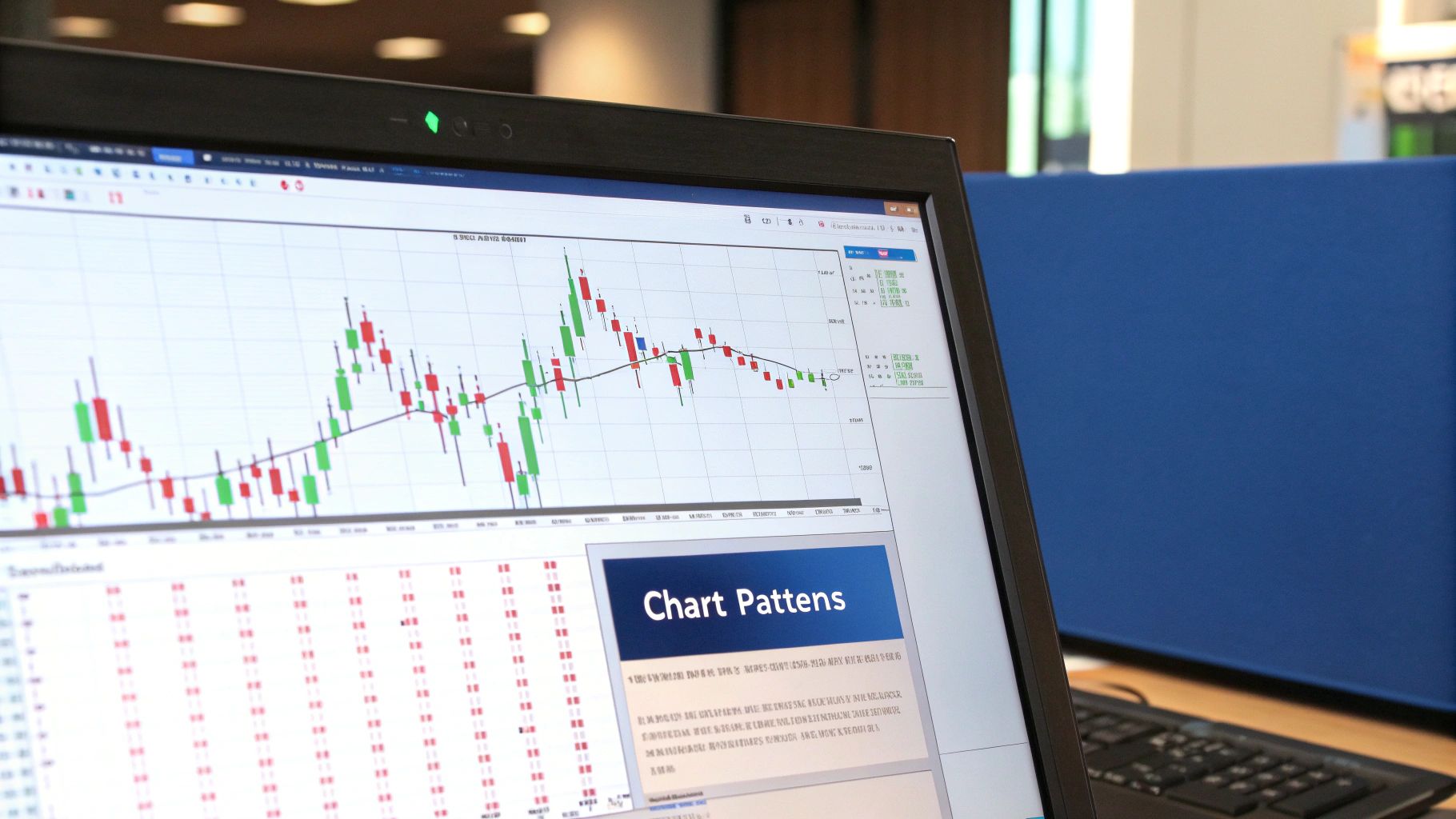
If you think of support and resistance as the market’s floors and ceilings, then chart patterns are its body language. These formations aren't just random squiggles on a screen; they're visual stories of the constant battle between buyers and sellers, hinting at where the price might go next.
Learning to read these patterns is a cornerstone of technical analysis. They fall into two main camps: reversal patterns, which signal a trend might be running out of gas, and continuation patterns, which suggest the market is just taking a breather before resuming its course.
Spotting Trend Reversal Patterns
Reversal patterns are your early warning system. They pop up after a long run-up or sell-off and can be the signal you need to protect your profits or get ready to trade in the other direction.
-
Head and Shoulders: This is probably the most famous bearish reversal pattern out there. It forms after an uptrend and has three distinct peaks: a lower peak (the first shoulder), a higher one (the head), and another lower one (the second shoulder). This formation tells a very clear story. The buyers' initial push (first shoulder) is strong, followed by an even stronger push to a new high (the head). But when they try to rally again, they run out of steam at a lower high (second shoulder), showing that buying power is drying up. A break below the "neckline"—the support level connecting the lows between the peaks—is the classic confirmation that the trend is reversing.
-
Double Top and Double Bottom: Think of these as simpler, but still powerful, reversal signals. A Double Top looks like an "M" and is a bearish pattern where the price hits a resistance level twice but can't break through. It’s like the market knocked on a door, got no answer, tried again, and gave up. Sellers are taking over. A Double Bottom, its bullish counterpart, looks like a "W." Here, the price finds a support level twice and holds, showing that sellers couldn't push it any lower and buyers are stepping in with renewed force.
Identifying Trend Continuation Patterns
Not every pause means the party's over. Sometimes, the market just needs to catch its breath. Continuation patterns help you figure out if you're looking at a temporary consolidation or a real trend change.
Chart patterns are not just shapes on a screen; they are visual records of market sentiment. A Triangle isn't just a geometric shape; it's a story of contracting volatility and indecision, building energy for its next significant move.
These patterns usually form in the middle of a trend and can offer great spots to jump on board.
-
Flags and Pennants: These are short-term patterns that show up after a very sharp move, kind of like a flagpole. A Flag is a rectangular pause that slopes against the main trend. A Pennant is a small, symmetrical triangle. In both cases, they represent a brief pause where some traders are taking profits, but the big players are getting ready to push the trend forward again. A breakout from the pattern in the original direction is the signal to watch for.
-
Triangles (Symmetrical, Ascending, Descending): Triangles show a market where volatility is shrinking as buyers and sellers reach an equilibrium. An Ascending Triangle has a flat top (resistance) and a rising bottom (support), signaling that buyers are getting more aggressive and a bullish breakout is becoming more likely. A Descending Triangle is the opposite, with a flat bottom and a falling top, suggesting bearish pressure is building for a breakdown. Finally, a Symmetrical Triangle, with both a falling top and a rising bottom, shows pure indecision. A breakout could happen in either direction.
It's critical to remember that no pattern is a crystal ball. In fact, rigorous academic studies have put their predictive power to the test. One notable study found that while patterns like the head-and-shoulders did offer a statistically significant edge, the success rate was only around 55–60%—not much better than a coin toss. This underscores why patterns should never be used in isolation. You can explore the detailed findings and see how researchers analyzed the statistical validity of these classic patterns.
Ultimately, good technical analysis is about using these patterns to form a hypothesis, then waiting for price action and other indicators to confirm your theory before you put any capital at risk.
Using Key Indicators to Confirm Your Analysis
If chart patterns are the market’s body language, then technical indicators are the vital signs that confirm its health. These are mathematical calculations plotted right on your chart, giving you the hard data needed to back up your trading ideas. They help you cut through the noise, validate your analysis, and hopefully, keep you from jumping into trades based on a false signal.
Think of it this way: a chart pattern might suggest a trend is reversing, but an indicator can tell you if there’s any real power or momentum behind that move. Using them together is like getting a second opinion before making a big decision. While there are hundreds of indicators out there, you're far better off mastering a select few.
Smoothing the Path With Moving Averages
One of the most foundational tools in any trader's kit is the Moving Average (MA). Its main job is to smooth out all the short-term price chop, giving you a much clearer picture of the underlying trend. It’s like trying to see the shape of a coastline while being tossed around by individual waves; the moving average is your high-flying airplane view, revealing the bigger picture.
You'll run into several types, but two are by far the most common:
- Simple Moving Average (SMA): This is the most basic version—just the average price of an asset over a set number of periods.
- Exponential Moving Average (EMA): This one gives more weight to the most recent prices, which makes it react faster to new information.
A classic strategy is watching for moving average crossovers. For instance, when a shorter-term MA (like the 50-day) crosses above a longer-term MA (like the 200-day), it's often called a "Golden Cross," a powerful bullish signal. The opposite, a cross below, is a "Death Cross," which signals bearish momentum. These events can provide clear, objective entry or exit points that complement what the chart patterns are telling you.
Gauging Momentum With the Relative Strength Index
While moving averages help you nail down the trend's direction, the Relative Strength Index (RSI) helps measure its speed and strength. The RSI is what’s known as a momentum oscillator, and it moves between 0 and 100. It’s basically a speedometer for the market, telling you when a price move might be getting overextended and due for a pullback.
The RSI doesn't measure an asset's price against another asset. Instead, it measures its strength relative to its own past performance. It’s an internal health check on the conviction behind a trend.
Traders primarily use the RSI to spot two key conditions:
- Overbought: An RSI reading above 70 suggests that the bulls are getting exhausted and the asset might be due for a price correction.
- Oversold: A reading below 30 signals that selling pressure has been intense and the asset could be primed for a bounce.
One of the most powerful ways to use the RSI is to look for divergence. If the price is making a new high but the RSI is making a lower high, that's a bearish divergence—a big red flag that the upward momentum is fading. It’s a classic confirmation signal that can add serious weight to a bearish reversal pattern you've spotted on your chart.
Tracking Trend Shifts With the MACD
The Moving Average Convergence Divergence (MACD) indicator is another incredibly versatile tool that helps traders identify both a trend’s direction and its momentum. It’s made up of two lines—the MACD line and a signal line—plus a histogram that shows the distance between them.
The MACD is fantastic for confirming trend changes. When the MACD line crosses above the signal line, it’s a bullish signal, suggesting upward momentum is building. When it crosses below, it’s a bearish signal. The histogram gives you a great visual cue; when the bars get taller, momentum is strengthening, and when they shrink, it’s weakening.
This helpful infographic shows how volume analysis, a key component of many indicators, is visualized on a professional trading desk.
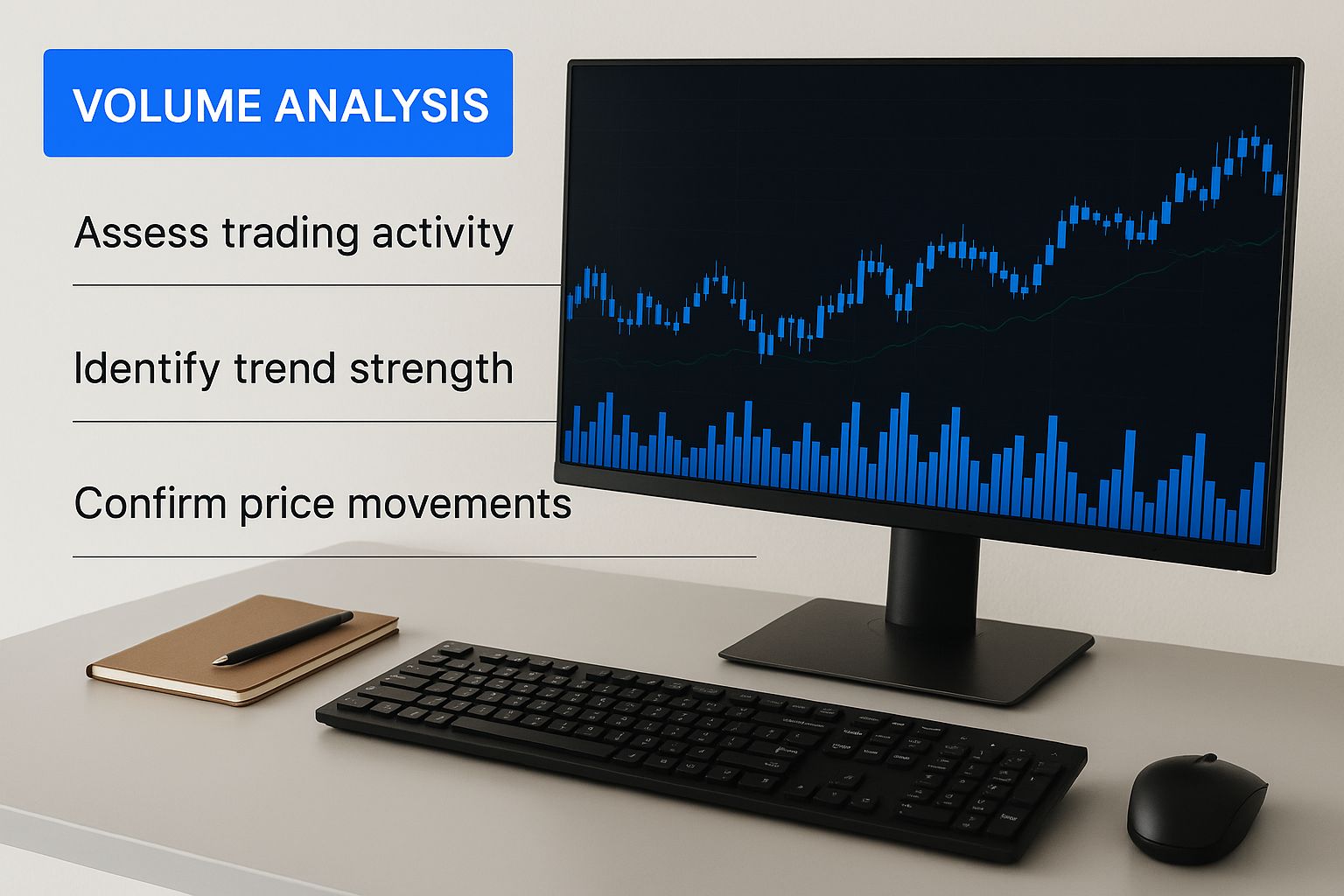
The image highlights the importance of volume bars, which are fundamental to confirming the strength of price moves signaled by indicators like the MACD or RSI. To dive deeper into these powerful tools, you can read our detailed guide where technical analysis indicators are explained to help you unlock market trends.
Building Your Personal Trading Strategy
Knowing your way around chart patterns and indicators is one thing, but that knowledge is purely academic until you put it into a repeatable plan. A real trading edge comes from assembling those individual pieces into a personal, cohesive strategy. This is the moment you stop being a market observer and start being a participant.
Your strategy is your rulebook. It's what keeps you grounded, dictating what you trade, when you pull the trigger, how you manage risk, and when you take profits. Flying without one means you're just reacting to market noise—a surefire way to let emotion, not logic, drive your decisions.
The secret sauce to a great strategy is confluence. It’s the art of finding several, unrelated signals that all point to the same conclusion. A high-quality trade setup isn't built on a single indicator flashing "buy." It's built on a pile of evidence that makes a compelling case.
Assembling a Real-World Trade Setup
Let's walk through how a pro might build a case for a long (buy) trade, pulling together the concepts we've covered.
Picture this: a stock has been grinding down for weeks, but it's finally approaching a major historical support level. That’s our first clue—a potential price floor. As it gets close, it carves out a Double Bottom pattern. Now we have a classic bullish reversal signal in a key area.
But we need more. Our trader checks the RSI, which is crawling up from oversold territory and showing bullish divergence. The price just made a new low, but the RSI made a higher low. This is a huge tell that the sellers are running out of steam. For one last confirmation, they see the MACD is about to make a bullish crossover below the zero line, another textbook sign that the trend is ready to turn.
The goal is not to find a single, perfect signal. The goal is to build a high-probability setup where the chart pattern, key level, and momentum indicators all tell the same story. This is the essence of trading with confluence.
With all this evidence stacked up, the trader can now map out the trade with confidence.
The Non-Negotiable Elements of Your Plan
Every single trading strategy, no matter how simple or complex, needs a clear, written plan. These aren't just suggestions; they are hard-and-fast rules you follow to protect your capital and stay disciplined.
Before you even think about placing an order, every trader needs to define the essential components of their trade. This framework is what separates a disciplined approach from gambling.
| Component | Purpose | Example |
|---|---|---|
| Entry Trigger | Defines the exact event that signals it's time to enter the trade. | "Enter the trade only after a daily candle closes above the Double Bottom's resistance line." |
| Stop-Loss Placement | Your safety net. Defines the exact point where you admit the trade is wrong and exit to prevent further losses. | "Place the stop-loss just below the low of the Double Bottom pattern." |
| Position Sizing | Determines how much capital you will risk on this one trade, ensuring no single loss is catastrophic. | "Risk no more than 1% of my total account balance." |
| Profit Target(s) | Predetermined price levels where you will exit the trade to lock in gains. | "Take half the profit at the next minor resistance level and the rest near the 50-day moving average." |
| Table: Components of a Robust Trading Plan |
Having these elements defined before you enter a trade removes emotion from the equation and forces you to think through the entire process, from start to finish.
Beyond the classic indicators, some traders are looking at how modern tools can add another layer of confirmation. For example, exploring AI-powered financial analysis might offer a fresh perspective to validate a setup.
The final, critical step before risking real money is backtesting. This means you need to go back in time on the charts and see how your strategy would have performed. Platforms like ChartsWatcher have built-in backtesting features that make this process much easier and more systematic.
Backtesting and statistics are now at the heart of modern technical analysis. For example, you might test a simple 50-day moving average crossover on major stock indices and find it has a historical win rate of around 52–58%, but that its risk-adjusted returns are pretty low. This is exactly why you have to customize and prove out your strategy for the specific market you're trading. Building this statistical confidence is what separates professional traders from hopeful amateurs.
Frequently Asked Questions About Technical Analysis
As you start using technical analysis, you're bound to run into questions. That's a good thing. It means you're digging deeper and thinking critically. To help you along, we've tackled some of the most common questions traders have when they're first getting their feet wet.
Is Technical Analysis Better Than Fundamental Analysis?
This question pops up all the time, but it’s a bit like asking if a hammer is better than a screwdriver. They're just different tools for different jobs.
Think of it like this: Fundamental analysis is like being a home inspector. You’re kicking the tires, checking the foundation, the plumbing—all the stuff that determines a house’s long-term, intrinsic value. It helps you figure out what to buy.
Technical analysis, on the other hand, is like being a savvy real estate agent studying the neighborhood. You're looking at recent sales, buyer demand, and how many other houses are for sale. It helps you figure out when to buy or sell.
Many of the smartest people in the market use a blend of both. They might use fundamentals to build a watchlist of solid companies and then bring in technicals to pinpoint the perfect moment to enter or exit a trade. The "better" tool really just depends on your timeline. Long-term investors live and breathe fundamentals, while shorter-term traders lean heavily on their charts.
How Can I Practice Technical Analysis Without Losing Money?
There's one clear answer here: paper trading. This is your personal trading gym, a place to build muscle memory without risking a single dollar.
Most modern trading platforms and tools offer demo accounts funded with virtual cash. It’s the perfect, risk-free sandbox to apply what you're learning in a live market. You can use it to:
- Spot patterns in real-time: See if you can identify a Head and Shoulders or a Triangle as it's actually forming.
- Use your indicators: Practice using tools like the RSI or MACD to see if they confirm what you’re seeing on the chart.
- Execute your strategy: Work on your entry triggers, where you'd place your stop-loss, and how you’d take profits.
The key is to treat it like it's real. Keep a trading journal for every single virtual trade. Write down why you took the trade, what signals you saw, and what happened. This is where the real learning happens, letting you build confidence and work out the kinks before you put your hard-earned money on the line.
Does Technical Analysis Predict the Future With 100 Percent Accuracy?
Not a chance. And the sooner you get that idea out of your head, the better off you'll be. Technical analysis isn't a crystal ball. It’s a game of probability and risk management, not of certainty.
Technical analysis works because it’s based on human psychology. The collective emotions of fear and greed tend to create repeatable patterns on a chart. But it is never, ever foolproof. A surprise news event or a sudden shift in market mood can blow up even the most textbook-perfect setup.
The goal isn't to be right every time—that’s impossible. The real goal is to make sure that when you are right, your wins are bigger than your losses. This is why strict risk management, especially using stop-loss orders on every single trade, is the secret to staying in the game long-term.
What Are the Biggest Mistakes New Traders Make with TA?
When they first get started with technical analysis, most newcomers fall into the same predictable traps. If you know what they are, you can sidestep them.
One of the biggest is analysis paralysis. This is what happens when you cram a dozen different indicators onto one chart. You’re guaranteed to get conflicting signals—one screaming "buy!" while another whispers "sell"—leaving you frozen with indecision. It’s so much better to master two or three indicators that work well together than to dabble with ten.
Another classic mistake is trying to fight the main trend. A bullish pattern has a much lower chance of working out if the entire market is tanking. Always give a little respect to the bigger picture.
Finally, the most dangerous error is thinking any single signal is a sure thing. This leads traders to ignore their stop-loss because they're so sure a pattern will play out. That kind of emotional, hope-based trading is the fastest way to zero out an account. Always remember: managing your risk is more important than being right.
Take your trading analysis to the next level with ChartsWatcher. Our powerful platform allows you to create custom dashboards, backtest your strategies, and scan the market with precision to find high-probability setups based on the very principles discussed here. Start your free trial today and see the difference for yourself.
