Master Technical Analysis for Stock Trends Today
Technical analysis is all about forecasting where a stock's price might go next by looking at where it's been. It’s a method built on studying past market data, mainly price and volume, to spot patterns and predict future movements.
The core idea? Everything you need to know is already baked into the stock's price. It's less about a company's balance sheet and more about the psychology of the market itself. Think of it as reading the market's mood to guess its next move.
Understanding the Core Philosophy of Technical Analysis
Imagine you're trying to figure out if it's going to rain. You could go deep into meteorology, studying atmospheric pressure and complex weather models. That's a lot like fundamental analysis, where you dig into a company's financials.
Or, you could just look outside. See the dark clouds rolling in? Feel the wind pick up? You recognize the signs of an approaching storm from experience. That, right there, is the heart of technical analysis for stock trends. It's about recognizing the patterns the market leaves behind.
Technical analysis isn't concerned with whether a company is "good" or "bad." It's purely focused on the market's opinion of that company. It operates on the belief that the price chart is a perfect record of the battle between buyers and sellers, capturing all their hopes, fears, and expectations.
The Three Foundational Beliefs
To really get what technical analysis is about, you have to buy into its three foundational principles. These are the bedrock ideas behind every trend line, chart pattern, and indicator you'll ever use.
-
The Market Discounts Everything: This is the big one. Technical analysts believe any information that could possibly move a stock's price—earnings reports, industry news, economic data, even a CEO's tweet—is already reflected in its current price. If that's true, then the only thing you need to study is the price action itself.
-
Prices Move in Trends: A stock's price doesn't just bounce around randomly. It tends to move in a direction—up, down, or sideways. The main job of a technical analyst is to spot that trend as early as possible and ride it. Whether it's an uptrend (higher highs and higher lows) or a downtrend (lower highs and lower lows), the goal is to trade with the current, not against it.
-
History Tends to Repeat Itself: This idea is rooted in human psychology. Because emotions like fear and greed drive trading decisions, people tend to react in similar ways to similar situations. This creates recognizable chart patterns that have appeared over and over again throughout market history, giving us clues about what might happen next.
The heart of technical analysis is recognizing that you are not analyzing the stock; you are analyzing how the entire market feels about the stock, and those feelings create predictable footprints.
This whole approach uses historical price and volume data to measure the forces of supply and demand that actually move stocks. It skips the company's fundamentals and instead focuses on interpreting the story told by the charts. The big players—institutions and hedge funds—leave tracks, and analysts follow these footprints to spot where the real buying and selling pressure is.
To build on this, it's worth exploring the various trend analysis methods that put these beliefs into practice. Once you get the why behind this philosophy, the tools and techniques we'll cover later in this guide will make a lot more sense.
Mastering the Essential Tools for Trend Identification
Just like a skilled carpenter has a trusted hammer, saw, and measuring tape, a technical analyst needs a specific set of tools to do their job. This isn't about overly complex algorithms, but about learning to read the market’s own language through charts and simple visual aids.
Getting comfortable with these core components is the first real step in turning theory into practice.
Your Window into the Market: Price Charts
The price chart is your primary window into the market. To really get a feel for technical analysis, you have to know how to interpret all that visual data. For a deeper dive, there are plenty of great resources on how to read stock market charts effectively. At their core, these charts aren't just squiggly lines; they’re a live feed of the constant battle between buyers (the bulls) and sellers (the bears).
Comparing Key Chart Types for Stock Analysis
The type of chart you use acts like a different lens, each offering a unique perspective on price action. Choosing the right one comes down to what you need to see.
| Chart Type | What It Shows | Best Use Case |
|---|---|---|
| Line Chart | A simple line connecting closing prices over time. | Getting a clean, big-picture view of the overall trend without intraday "noise." |
| Bar Chart | Each bar displays the open, high, low, and close (OHLC) for the period. | Seeing a session's volatility and the full trading range at a glance. |
| Candlestick Chart | Shows OHLC data like a bar chart but in a more visual format with a "body" and "wicks." | Quickly identifying bullish or bearish sentiment based on the candle's color and shape. |
Candlestick charts, in particular, are a favorite among traders. While they feel modern, they have a long, validated history. The methodology got a serious scientific boost in the 1990s when a major study tested eight key three-day Japanese candlestick reversal patterns across all S&P 500 stocks. The results were clear: it found overwhelming statistical proof that these patterns had real predictive power.
Drawing the Battle Lines: Support and Resistance
Once you've picked your chart, the next job is to spot the key price levels where the market has turned around before. We call these support and resistance.
- Support: Think of this as a price "floor." It’s a level where buyers have historically stepped in with enough force to stop a downtrend or even reverse it.
- Resistance: This is the opposite—a price "ceiling." It’s a level where sellers have historically taken control, halting an uptrend in its tracks.
These levels exist because of the market's collective memory. When a price nears a previous low (support), buyers who missed out before might jump in, while sellers start taking profits. The exact opposite dynamic plays out at resistance.
Support and resistance levels are not unbreakable walls. They are zones of potential conflict where the trend's strength is tested. A decisive break through one of these levels often signals a powerful continuation of the trend.
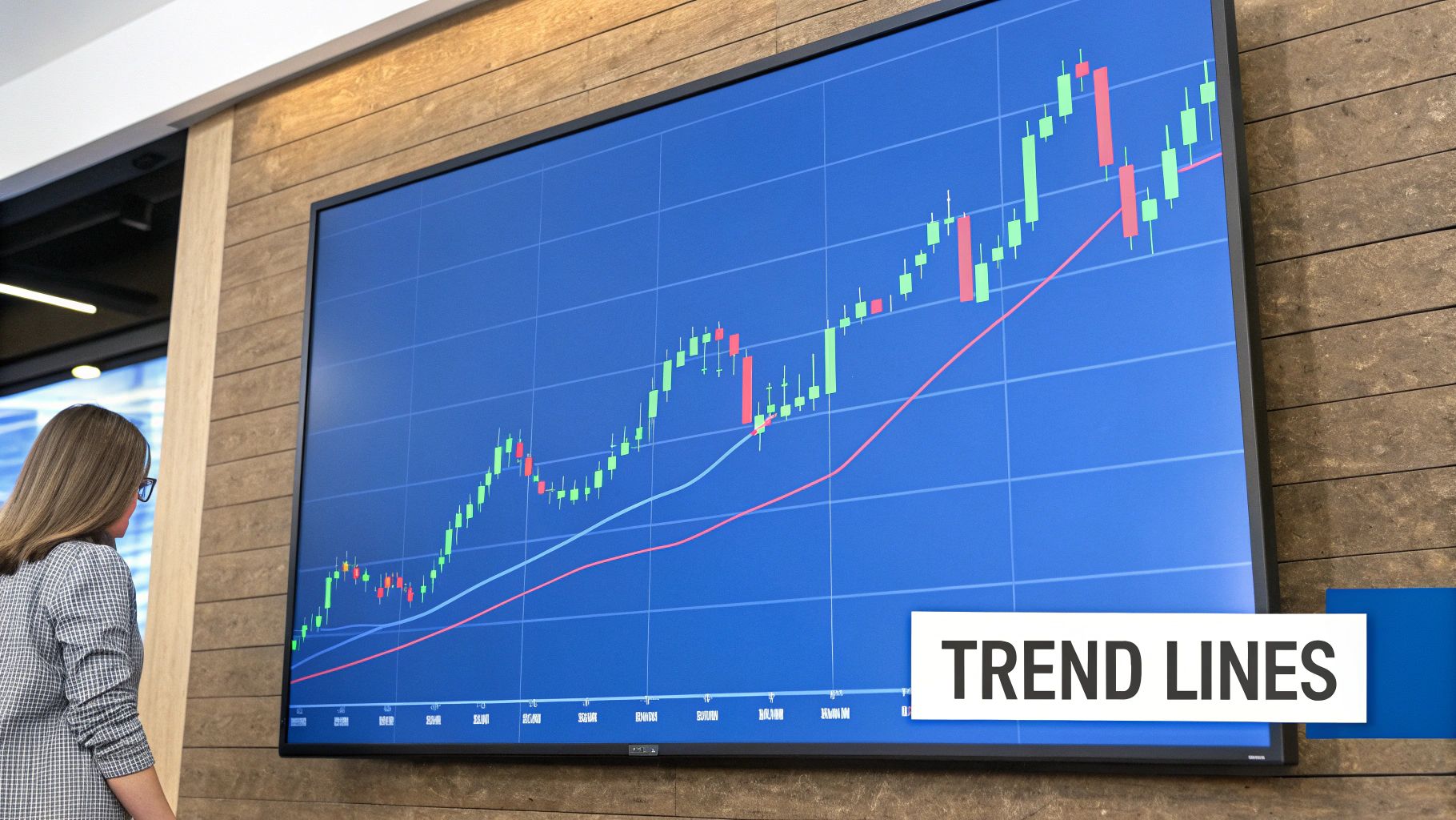
Making Sense of the Noise with Trendlines
The simplest, yet arguably most powerful, tool in your entire kit is the trendline. It’s just a straight line you draw on a chart connecting a series of lows in an uptrend or a series of highs in a downtrend. It gives you an immediate visual guide to the trend's direction and angle.
An uptrend line connects at least two higher lows and acts as a sort of moving support level. A downtrend line connects at least two lower highs, acting as moving resistance. The more times the price tests that trendline and bounces off, the stronger and more valid that trend is considered to be. If you're looking to build this essential skill, check out our guide on how to draw trend lines in our practical trading guide.
Moving averages are another key tool that can help smooth out all the price data, making the underlying trend even easier to spot, as this chart shows.
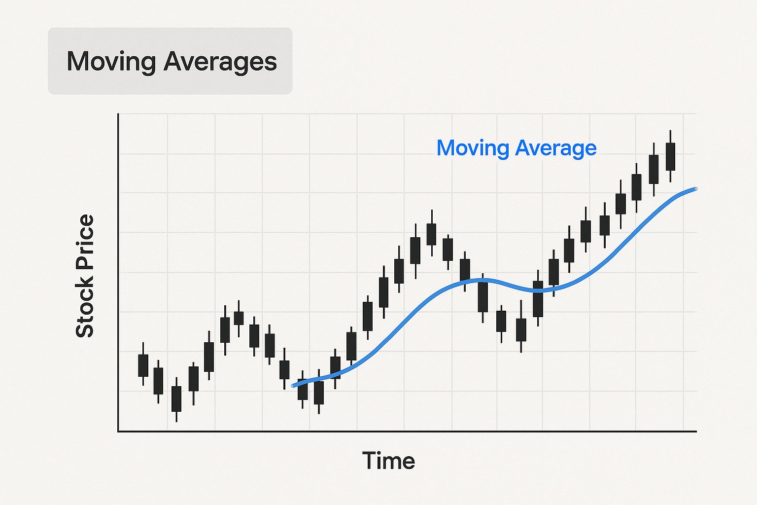
As you can see, the moving average line cuts right through the "noise" of daily price swings, helping you focus on the core upward or downward trajectory.
Decoding Indicators for Trend Strength and Momentum
If a stock's trend is a river flowing through the market, then technical indicators are your instruments for measuring its speed, depth, and force. While you can certainly trade on price action alone, indicators add crucial context. They help answer the big questions, like, "Is this uptrend actually gaining power, or is it about to run out of steam?"
Think of it this way: a trendline shows you the river's direction, but indicators tell you how fast the current is moving and whether the water level is rising or falling. Using them correctly allows you to gauge a trend's health and spot potential changes long before they become obvious on the price chart.
These tools aren't magic; they're simply mathematical formulas that process historical price and volume data to give you a fresh perspective. We can generally sort these powerful tools into two main categories, each serving a distinct purpose in your technical analysis for stock trends.
Gauging the Current with Trend-Following Indicators
Trend-following indicators are designed to smooth out the day-to-day noise of the market, making it easier to see the real, underlying direction of a stock's price. They work brilliantly in trending markets but can give you confusing signals when a stock is just chopping sideways in a range.
The most popular and foundational trend indicator is the Moving Average (MA). An MA simply calculates the average closing price of a stock over a set number of periods, creating a single, smooth line on your chart.
- Simple Moving Average (SMA): The most basic version. It gives equal weight to all prices in the period. A 50-day SMA, for example, is just the average closing price of the last 50 days.
- Exponential Moving Average (EMA): This version gives more weight to the most recent prices, making it react faster to new information. Traders often favor EMAs to spot trend changes a bit quicker than an SMA would.
When a stock's price stays consistently above a key moving average (like the 50-day or 200-day), it helps confirm a bullish uptrend. On the flip side, a price trading below its MA signals a bearish downtrend. Even the angle of the MA line itself tells a story—a steeply rising line suggests strong upward momentum.
Measuring Pressure with Oscillators
While trend indicators show direction, oscillators measure momentum—the speed and strength of price moves. They act like a pressure gauge for buying and selling activity, helping you identify when a trend might be getting overextended and due for a pause or even a reversal.
These indicators are usually plotted on a scale, often between 0 and 100, to identify "overbought" or "oversold" conditions.
An overbought reading doesn't automatically mean "sell," and an oversold reading isn't a blind "buy" signal. Think of them as alerts that the current trend's momentum might be unsustainable, prompting you to look for other clues that a reversal is coming.
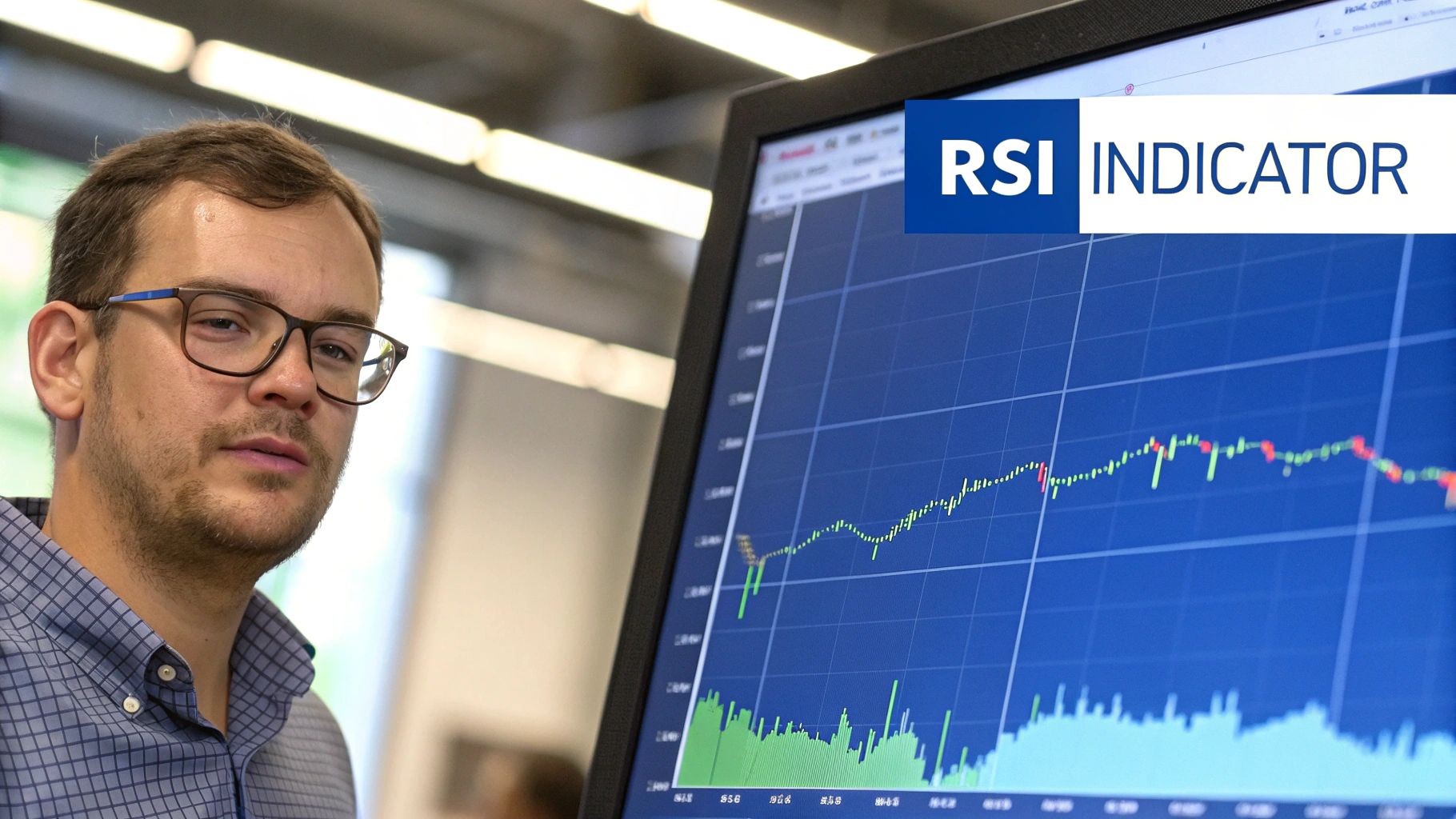
The Relative Strength Index (RSI) is one of the most widely used momentum oscillators out there. It measures the magnitude of recent price gains against recent price losses to see just how aggressively the market is bidding a stock up or down.
- Overbought Condition: An RSI reading above 70 suggests that bullish momentum is extremely high, and the stock might be due for a pullback.
- Oversold Condition: An RSI reading below 30 suggests bearish momentum has been intense, and the stock could be poised for a bounce.
Another crucial concept with oscillators is divergence. This happens when the stock's price makes a new high, but the oscillator makes a lower high. This "bearish divergence" is a powerful warning sign that the underlying momentum of the uptrend is fading, even as the price ticks higher.
Learning to combine these tools is where the real skill comes in. You might use a 200-day moving average to confirm the primary long-term trend, then use the RSI to time your entries during pullbacks within that larger trend. Our detailed guide on how technical analysis indicators explained how to unlock market trends offers more strategies for making these tools work together.
By using trend and momentum indicators in concert, you start to build a much more complete and reliable picture of a stock's behavior.
Recognizing Powerful Chart Patterns
If indicators are the vital signs of a trend, chart patterns are the market’s body language. They’re recognizable shapes that show up on charts again and again because human emotions—fear, greed, and uncertainty—tend to produce predictable behavior. Learning to spot these patterns is like learning to read the story the market is telling.
That story usually has one of two plots. Some patterns signal a brief pause before the trend continues, while others warn that a major plot twist—a reversal—is coming. Getting a handle on the psychology behind these shapes turns them from squiggles on a screen into actionable intel for your technical analysis for stock trends.
A core tenet of technical analysis is that price movements aren't random; they're driven by consistent investor behavior over time. The fact that these patterns repeat is a direct reflection of that principle, giving traders a way to anticipate what might happen next. Experts who explain the fundamentals of technical analysis often dive deep into the history and psychology behind why these patterns work.
Continuation Patterns Signaling a Brief Rest
Continuation patterns are the market’s way of catching its breath. They show up as a temporary standoff between buyers and sellers before the dominant force, whether bullish or bearish, takes over again. Think of it as a pit stop in a long race.
Spotting these patterns is a huge advantage because they can offer a lower-risk opportunity to jump into an established trend during a moment of consolidation.
- Flags and Pennants: These short-term patterns look just like their names suggest. A flag is a small, sloping rectangle that forms after a sharp, nearly vertical price move. A pennant is similar but looks like a small, symmetrical triangle. Both signal that the market is just digesting a big move before continuing.
- Triangles (Ascending, Descending, and Symmetrical): Triangles appear as the trading range gets tighter and tighter. An ascending triangle has a flat top with a rising bottom, which tells you buyers are getting more aggressive. A descending triangle is the opposite—a flat bottom and a falling top, hinting that sellers are gaining control.
With any of these, the key is to wait for the breakout. When the price finally breaks out of the pattern in the direction of the original trend, it’s a strong confirmation that the rest stop is over.
Reversal Patterns Hinting at a Plot Twist
Reversal patterns are where the real drama happens on a stock chart. They signal that the current trend is running out of gas and a change in direction is probably on the horizon. Catching these early can be the difference between locking in a great profit and watching it all disappear.
Chart patterns are not just shapes; they are visual representations of the psychological battle between bulls and bears. A reversal pattern is the moment one side definitively loses its grip.
These patterns are typically larger and take longer to form than their continuation cousins. That makes sense, as it takes a much bigger fight to completely reverse a well-established trend.
- Head and Shoulders: This is the classic bearish reversal pattern. You’ll see three peaks: a central peak (the "head") that is higher than the two on either side (the "shoulders"). It’s a huge red flag that an uptrend is exhausted.
- Inverse Head and Shoulders: Just flip the pattern upside down. This bullish version appears at the bottom of a downtrend, with three troughs instead of three peaks. It signals a potential shift from bearish to bullish control.
- Double Tops and Double Bottoms: These are simpler but just as meaningful. A double top looks like the letter "M" and shows that the price failed twice to break through a key resistance level. A double bottom looks like a "W," showing two failed attempts to push below a support level.
For any pattern, volume is your best friend for confirmation. A true breakout, whether from a continuation or reversal pattern, should happen on a significant spike in trading volume. That surge shows conviction from the market. Without it, a breakout might just be a "head fake" that quickly fails.
Building Your Practical Trend Trading Strategy
Having the right tools is one thing; knowing how to assemble them into a working machine is another. The charts, indicators, and patterns we've explored are the individual parts. A trading strategy is the blueprint that shows you how they all fit together to achieve one specific goal—making consistent, well-reasoned trading decisions.
A solid strategy takes emotion and guesswork completely out of the equation. Instead of just reacting to market noise, you follow a clear, repeatable process for every single trade. This framework is what will let you navigate the world of technical analysis for stock trends with confidence and discipline.
Step 1: Identify the Primary Trend
Before you even think about placing a trade, you have to figure out which way the market is heading. Trading against the primary trend is like trying to swim upstream against a powerful current—it’s exhausting, and it rarely ends well. Your first job is to identify that dominant flow so you can move with it.
Start with a clean daily or weekly chart to get the big picture.
- Draw Your Trendlines: Connect the major swing lows for an uptrend or the major swing highs for a downtrend. Is the line clearly pointing up, down, or just moving sideways?
- Add a Long-Term Moving Average: Throw a 200-day simple moving average (SMA) on your chart. If the price is consistently trading above a rising 200-day SMA, the primary trend is bullish. If the price is stuck below a falling 200-day SMA, the trend is bearish.
Think of this first step as your main filter. If you're looking for buying opportunities, you should only be looking at stocks that are in a confirmed uptrend. Period.
Step 2: Confirm Trend Strength and Momentum
Once you've spotted a trend, the next question is about its health. Is it a strong, vibrant trend with plenty of gas in the tank, or is it weak and starting to lose steam? This is where your indicators come into play, giving you a second layer of confirmation.
A popular and effective combo here is the Moving Average Convergence Divergence (MACD) and the Relative Strength Index (RSI).
- MACD Analysis: In an uptrend, you want to see the MACD line sitting above the signal line, and ideally both should be above the zero line. This tells you that the short-term momentum is aligned with the bigger-picture trend.
- RSI Analysis: For a healthy uptrend, the RSI should be holding above the 50 level, showing that buyers are firmly in control. It can also help you spot good entry points on pullbacks when it dips toward the 40 or 30 level before turning back up.
When both your price action and your indicators are telling the same story, you’ve got a high-probability setup on your hands.
Step 3: Pinpoint Your Entry with Chart Patterns
With the trend confirmed and its strength verified, you now need to find a precise, low-risk spot to get into the market. This is where chart patterns shine, acting as the perfect trigger for your trade. Instead of just buying randomly somewhere in an uptrend, you wait for a specific consolidation pattern to form, which gives you a clear signal to act.
Keep an eye out for continuation patterns like flags, pennants, or ascending triangles. These patterns are really just the market taking a quick breather before the next leg up. Your entry signal is the price breaking out from the pattern’s boundary on strong volume. That breakout is the market's way of telling you the pause is over and the primary trend is kicking back into gear.
Your strategy is your rulebook. It defines what a good trade looks like before you're in the heat of the moment, preventing impulsive decisions driven by fear or greed.
Step 4: Implement Strict Risk Management
This is, without a doubt, the most important step of all. It's the one that separates successful traders from everyone else. No matter how perfect your analysis looks, any trade can go against you. Managing that risk is non-negotiable.
Before you enter any trade, you absolutely must define two price points:
- Your Stop-Loss: This is your eject button if the trade goes wrong. A logical place for a stop-loss is just below the low of the chart pattern you're trading from, or maybe below a recent support level. This keeps your potential loss small and, most importantly, predefined.
- Your Profit Target: You also need a realistic price where you'll take your profits. This could be a previous resistance level or a price that gives you a risk-to-reward ratio of at least 2:1. That simply means your potential profit is at least twice as big as your potential loss.
By combining trend identification, indicator confirmation, pattern-based entries, and disciplined risk management, you turn technical analysis from a collection of interesting ideas into a practical, actionable trading strategy.
Got Questions About Technical Analysis?
As you start digging into technical analysis, you're bound to have some questions. It's a powerful discipline, but it’s also surrounded by a fair share of myths and confusion. Let's tackle some of the most common ones head-on so you can build real confidence and use these tools the right way.
Think of this as your quick-start FAQ. We're cutting through the noise to give you clear, straightforward answers about using technical analysis for stock trends.
Is Technical Analysis Better Than Fundamental Analysis?
This is the classic debate, but it’s the wrong way to look at it. One isn't "better" than the other; they just answer completely different questions. They are two sides of the same coin, each offering a unique lens through which to view a stock.
Fundamental analysis is all about being a business detective. It asks, "Why should I own this company?" You’re digging through financial statements, checking out the management team, and sizing up the competition to figure out what a stock is truly worth.
Technical analysis, on the other hand, is like being a crowd psychologist. It asks, "When is a good time to get in or out?" It completely ignores the 'why' and focuses only on price and volume to read the market's mood and nail down your timing. The sharpest players in the market often use both—they find great companies with fundamentals and then use technicals to pick the perfect moment to act.
How Reliable Are Chart Patterns for Predicting Trends?
Chart patterns aren't crystal balls. Let's get that out of the way. No single pattern is going to predict the future with 100% accuracy. Believing they can is a rookie mistake that can cost you dearly.
So where does their power come from? From a simple, observable fact: human behavior tends to repeat itself. The raw emotions of fear and greed that drive the market create recurring shapes on a price chart.
The real value of a chart pattern isn’t in its perfection, but in its ability to give you a statistical edge. It’s a roadmap of what’s likely to happen next, based on how the market has acted in similar situations before.
The secret to using them well is confirmation. A potential pattern becomes much more reliable when other signals back it up, like a surge in trading volume or a supporting reading from an indicator like the RSI. Always treat patterns as one piece of a bigger puzzle, never as a standalone signal.
Can I Use Technical Analysis for Long-Term Investing?
Absolutely. While it’s often linked to the high-speed world of day trading, technical analysis is an incredibly useful tool for the long-term investor. The core ideas—spotting trends, support, and resistance—work on any timeframe.
For a long-term investor, you just zoom out from the daily charts to the weekly or even monthly ones. This broader view helps you:
- Spot the Big Picture: Looking at multi-year charts helps you see the major, long-term direction of an asset. This way, you can make sure you’re swimming with the market's strongest currents, not against them.
- Dodge Market Tops: A quick glance at a long-term chart can stop you from piling into an asset that's gone vertical and is screaming for a major pullback.
- Time Your Buys on Dips: Technicals are perfect for pinpointing smart entry points during temporary pullbacks within a solid, established uptrend.
Adding technical analysis to a fundamental strategy gives long-term investors a powerful advantage in timing and risk management.
What's the Single Most Important Indicator I Should Use?
Sorry, but that’s a trick question. There’s no magic "best" indicator out there. The single most important thing to watch is always the price itself, with volume coming in a close second. Every indicator you'll ever use is just a mathematical spin on that core price and volume data.
Different indicators are designed to measure different things. A winning strategy almost never leans on just one. It’s about picking a small, complementary toolkit where each tool gives you a different piece of information.
For instance, a solid, basic setup might combine:
- A trend indicator (like the classic 200-day moving average) to tell you the main direction of the market.
- A momentum oscillator (like the RSI) to measure the strength of moves and spot when things are getting overbought or oversold.
The goal isn't to find the one perfect indicator. It's to build a simple system where a few select tools work together to paint a clearer picture of what the market is doing.
Ready to stop guessing and start analyzing? ChartsWatcher provides the advanced scanning and charting tools you need to identify trends, spot patterns, and execute your strategy with precision. Customize your dashboards, set precise alerts, and gain the edge you need in today's market. Explore what's possible at chartswatcher.com.
