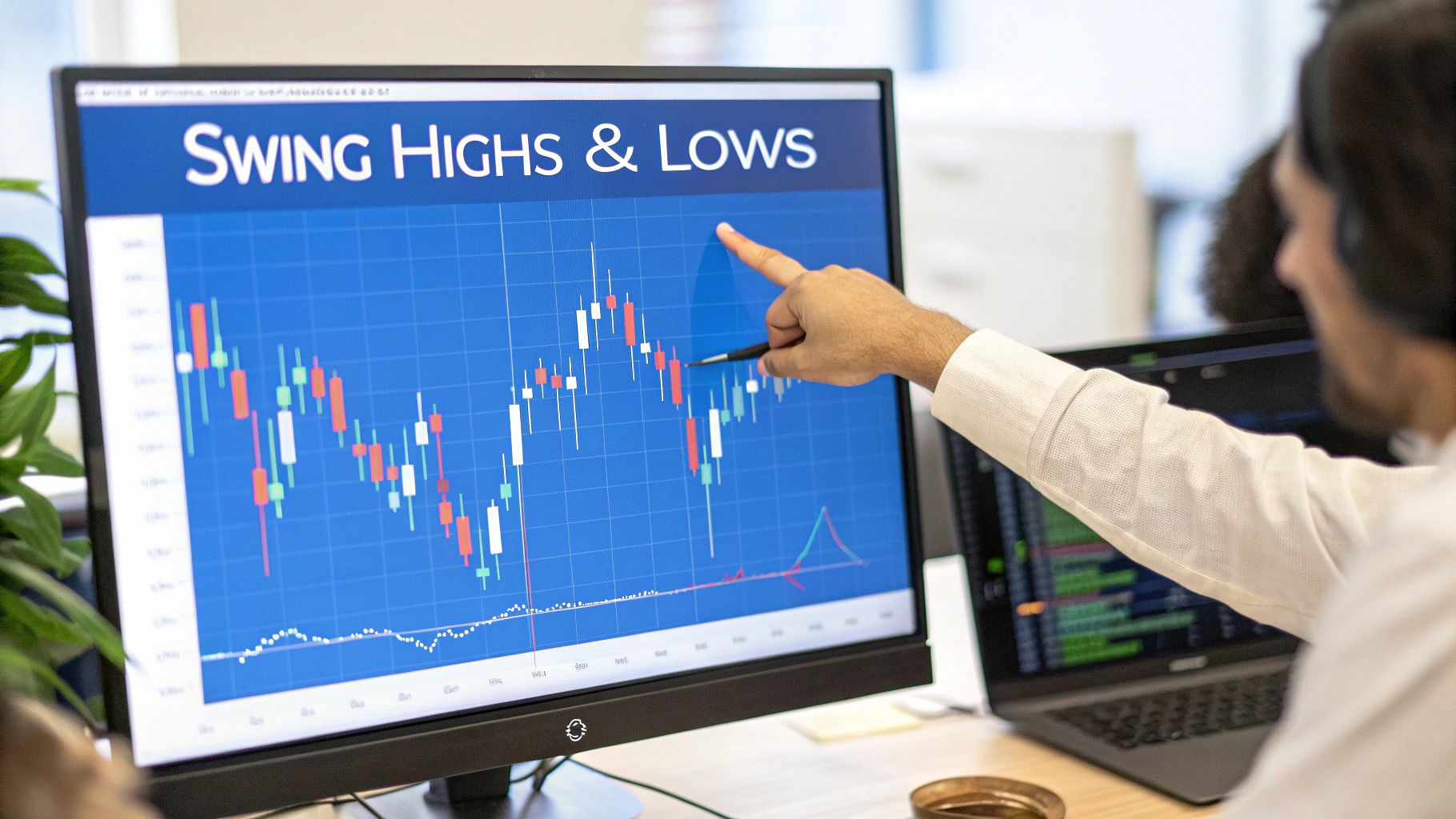
How to Draw Trend Lines: A Practical Trading Guide
At its core, drawing a trend line is simply about connecting the dots on a chart to get a quick visual on the market's direction. For an uptrend, you'll draw a line connecting a series of higher lows. For a downtrend, you'll connect a series of lower highs. That's it. This simple line helps cut through the noise and reveal the underlying momentum.
Why Trend Lines Are Essential for Modern Traders
Financial charts can often look like a chaotic jumble of random price movements. Think of trend lines as your guide through this mess, giving you a clear visual framework to make sense of market sentiment and direction.
These aren't just arbitrary lines; they represent dynamic zones of support and resistance that countless other traders are watching. When a price gets close to a well-established trend line, it’s often a make-or-break moment for the market.
This powerful technique is a fundamental building block of trading. But its value goes far beyond just price charts. For years, trend line analysis has been a cornerstone of business forecasting and financial data interpretation. Companies and economists use it to analyze everything from revenue and production to consumer behavior, drawing lines to pinpoint trajectories. Learning this skill isn't just for trading—it's a widely applicable method for understanding data.
Trend lines are a core component of technical analysis, an approach that many modern traders lean on heavily. Grasping how this differs from fundamental analysis is key to understanding why chart-based tools are so critical in today's markets.
Key Takeaway: A trend line is more than just a line on a chart. It’s a visual map of market psychology, showing the ongoing battle between buyers and sellers. For anyone serious about identifying opportunities and managing risk, mastering this skill is non-negotiable.
Core Principles of Trend Line Analysis
Before we start drawing, it's helpful to understand the basic concepts that make trend lines work. I've put together a quick table that breaks down the foundational principles. This is the stuff you absolutely need to know.
| Principle | Description | What It Tells You |
|---|---|---|
| Uptrend Line | A line connecting two or more higher lows. | Indicates that buyers are in control and demand is increasing at progressively higher prices. |
| Downtrend Line | A line connecting two or more lower highs. | Shows that sellers are dominant and supply is increasing at progressively lower prices. |
| The Third Touch | The first confirmation that a trend line is valid. | Signals that other market participants recognize and are reacting to the same level. |
| Slope (Angle) | The steepness of the trend line. | A steep slope may signal an unsustainable move, while a gentle slope suggests a more stable trend. |
Think of this table as your cheat sheet. These four principles are the bedrock of effective trend line analysis. Once you've got them down, you’ll be ready to start applying them to real charts.
Before you can draw a trend line that actually means something, you need to know what to look for on the chart.Let's move past the theory and get into the practical side of things, focusing on the specific anchor points that will be the foundation of your entire analysis.
The whole process starts by finding significant swing points. These are the obvious peaks (swing highs) and valleys (swing lows) where the price clearly reverses direction.
Think of them as the pillars that will support your trend line. Don't get lost in every tiny wiggle on the chart; we're hunting for the most important turning points on whatever timeframe you're looking at.
The Great Debate: Wicks Versus Bodies
One of the first questions every new trader asks is whether to connect the candle wicks or the candle bodies. The truth is, there's no single right answer—it really depends on the personality of the market you're trading.
-
Candle Wicks: I almost always start by using the wicks, especially in volatile markets like crypto or around big news events. Wicks show you the absolute price extremes, telling you exactly where buying or selling pressure hit its peak before pulling back. Connecting the wicks can give you a much more accurate picture of a trend's outer boundary.
-
Candle Bodies: In steadier, less volatile markets, drawing your lines across the candle bodies (the open and close prices) can help filter out some of the noise. This method focuses more on where the majority of trading activity actually closed for that period.
My advice? Start with the wicks. They capture the full story of the price action. If you notice your line is constantly getting pierced by minor volatility, then try adjusting to the bodies and see if it gives you a cleaner, more respected level. The goal is to figure out what the market is actually paying attention to.
A trend line is only as good as the points it connects. Your main job is to find the most significant swing points that tell the clearest story of supply and demand. Sloppy anchor points lead to sloppy, unreliable analysis.
Why More Touches Mean More Validity
You can draw a line between any two points. Easy. But a trend line only starts to become a powerful trading tool when it gets a third touch. That third point is your first real confirmation that other traders are seeing and reacting to the exact same level.
From there, every subsequent touch just adds more weight to its importance. A line that has held up four, five, or even six times is no longer just some line you drew. It’s a proven zone of dynamic support or resistance that commands the market's attention. A line with more touches is a line that has proven its significance over time.
To really get a feel for these concepts in action, you have to be comfortable with the chart itself. For a deeper look at all the components of a stock chart, check out our complete guide on how to read stock charts. It provides an excellent foundation and will make spotting those crucial swing points a whole lot easier.
Alright, let's get down to the brass tacks—how to actually draw these lines on a chart. Moving from theory to practice is where the rubber meets the road. Drawing a trend line isn't just art; it's a repeatable skill, and having a consistent process is what separates objective analysis from just hoping for the best. To get started, you'll want to be using one of the best charting software for traders to ensure you have the precision tools needed.
I'm going to give you a straightforward framework for tackling both uptrends and downtrends. The goal is for you to be able to pull up any chart—stock, crypto, forex, you name it—and start applying this immediately.
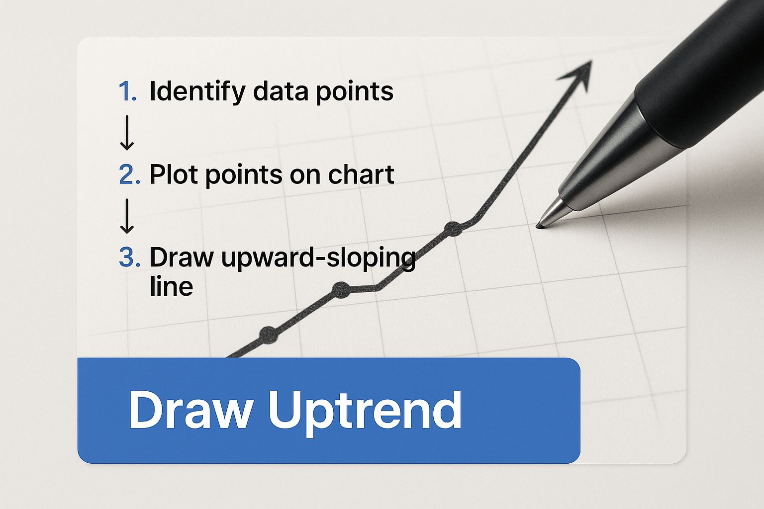
Drawing an Uptrend Line
An uptrend is really just a story of buyers gaining confidence. You'll see a series of higher lows, which tells you that on each pullback, buyers are stepping in sooner and at higher prices. That's the upward momentum in action. To visualize this, your job is to connect those valleys.
Here's how I approach it:
- Find at least two significant swing lows. Look for the obvious points where the price bottomed out and then reversed course. Critically, the second low must be higher than the first.
- Connect the dots. Take your line tool and draw a straight line connecting the lowest points of these two swings. I always use the bottom of the candle wicks for maximum precision.
- Project the line forward. Extend that line out to the right across your chart. This line now becomes your dynamic support level.
When the price eventually drifts back down to touch this line, that's the moment of truth. A bounce off the line is a powerful confirmation that the trend is still healthy. A clean break below it, however, is your first major warning that the tide might be turning.
This chart shows exactly what a clean uptrend line looks like, acting as a floor for the price.
You can see how the line neatly connects the rising lows, providing clear support as the asset moves higher.
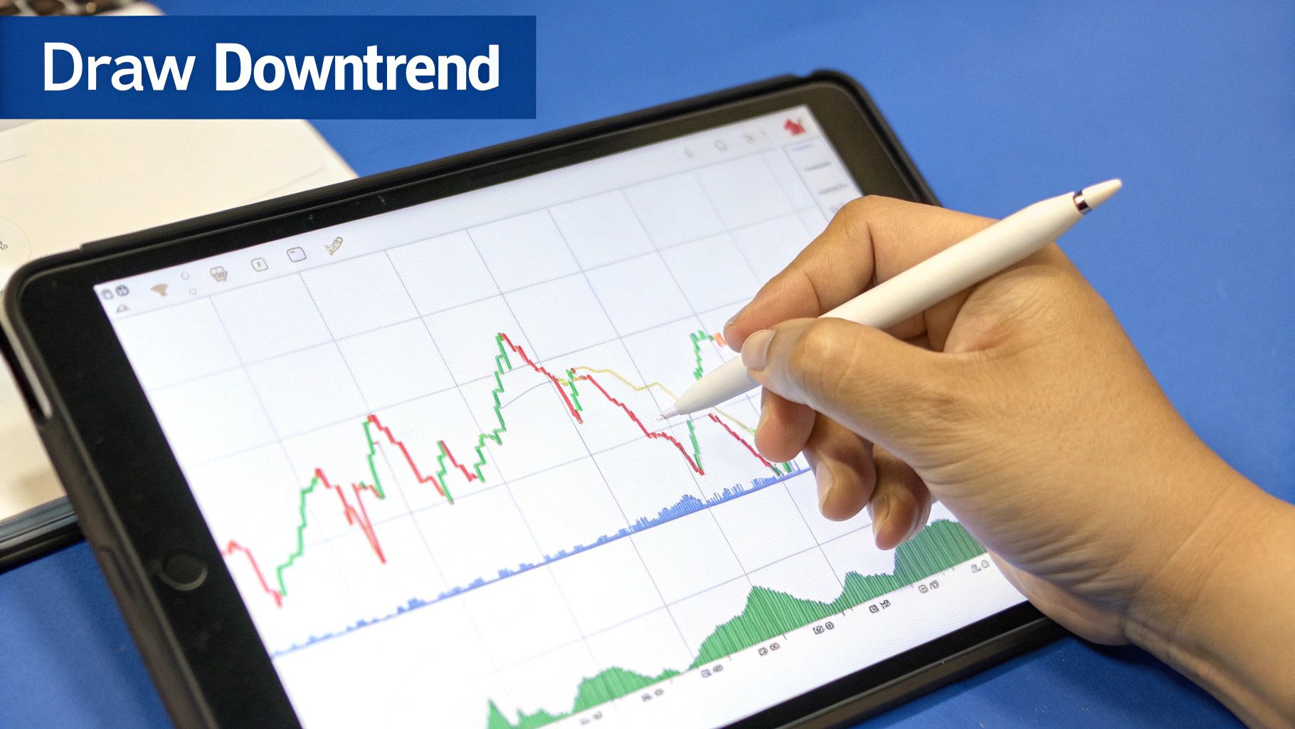
Drawing a Downtrend Line
On the flip side, a downtrend is marked by a series of lower highs. This pattern is a clear signal that sellers are in control, becoming more aggressive and capping any rally at progressively lower levels. Here, you'll be connecting the peaks.
Start by identifying at least two clear swing highs where the price topped out before heading back down. Just like with an uptrend, the second peak has to be lower than the first to confirm the downward pressure. Once you have them, connect the highest points of the wicks with a straight line and extend it out into the future.
This line is now your dynamic resistance—a potential ceiling for the price. Every time the price rallies to this line and gets smacked back down, it validates the sellers' strength and reinforces the downtrend.
ChartsWatcher Tip: Never, ever force a trend line. If the swing points don't line up cleanly and obviously, there probably isn't a valid trend to draw. The most powerful trend lines are the ones that jump right off the chart at you, no fudging required.
What the Slope of the Line Tells You
The angle of your trend line is more than just a geometric feature; it tells a story about the market's psychology. A very steep slope, up or down, often screams panic or euphoria. While these parabolic moves are exciting, they are almost never sustainable and are highly prone to violent corrections.
A healthier, more durable trend usually has a gentler slope, something in the 30- to 45-degree range. This suggests a steady, controlled advance or decline, which is far more likely to persist over time.
This is where historical data becomes invaluable. A well-established trend line with multiple touches becomes a highly reliable analytical tool. In fact, studies show that in major crypto exchanges, properly drawn trend lines can predict price direction correctly 70-80% of the time. This statistical edge is what turns a simple line on a chart into a powerful weapon in a trader's arsenal.
Common Trend Line Mistakes That Hurt Traders
Drawing trend lines seems straightforward, but I’ve seen countless traders sabotage their own analysis by falling into a few common traps. When used incorrectly, this objective tool can quickly become a source of confirmation bias, leading to some very expensive mistakes.
Let's walk through the pitfalls I see most often and, more importantly, how you can sidestep them.
The absolute biggest mistake is forcing a trend line to fit your bias. You want a stock to be in an uptrend, so you conveniently ignore a candle that slices right through your line. Or maybe you connect a couple of insignificant points just to make it work. This isn't technical analysis; it's just wishful thinking with extra steps.
A trend line's power comes from its objectivity. If the major swing points don’t line up cleanly, you have to accept that a valid trend might not exist on that timeframe. Let the price action dictate where the line goes, not the other way around.
Drawing Lines at Unrealistic Angles
Another classic error is drawing lines that are nearly vertical. Sure, it looks exciting, but a trend line with an angle approaching 90 degrees is screaming that the move is parabolic and unsustainable. These trends are incredibly fragile and often end in sharp, painful reversals.
On the flip side, a line that’s almost flat isn’t really showing a trend at all. It’s just highlighting a sideways, ranging market.
- What to aim for: A healthy, sustainable trend usually has a slope somewhere between 30 and 45 degrees.
- The fix: If your line is way too steep, treat it as a warning sign of exhaustion. Instead of blindly trusting it for support, you should probably see it as a signal that the trend is on its last legs.
ChartsWatcher Tip: Objectivity is your greatest asset in trading. A trend line that needs constant adjusting or ignores obvious price action is not a valid tool. The best trend lines are the ones that are obvious to everyone looking at the chart and are clearly being respected by the market.
Ignoring Major Price Pivots
Sometimes traders get so focused on connecting two recent points that they completely miss a much more significant swing high or low that happened a bit earlier. When you're learning how to draw trend lines, it’s critical to scan the entire chart for the most dominant pivot points.
Think about it: a line connecting two minor wiggles is far less meaningful than one anchored by major turning points that everyone else is also watching. These major pivots are often key components of broader day trading chart patterns, giving you much-needed context about what the market is doing. If you want to dive deeper, check out our guide on the top 8 day trading chart patterns every trader should know.
The more significant your anchor points are, the more weight the trend line carries. Always prioritize the major peaks and valleys over minor fluctuations. It's the only way to build your analysis on a solid foundation.
A perfectly drawn trend line is more than just a visual aid; it's a goldmine of actionable trading signals just waiting to be tapped. Once you’ve laid the groundwork, the real magic happens when you translate that analysis into decisive action. This is where you can start turning your charting skills into a tangible trading edge.
In my experience, there are two primary ways I use trend lines to generate trade ideas. Each strategy tackles a different market behavior, but both rely on the line acting as a critical psychological level for buyers and sellers. Let's break down how to read these signals in the real world.
Trading the Bounce for Trend Continuation
The most straightforward way to use a trend line is to simply trade with the prevailing momentum. When an asset is in a clear uptrend, that line you've drawn acts as a kind of dynamic support. Every time the price pulls back to this line and "bounces" off it, it’s a sign that buyers are still in control and actively defending that level.
Imagine a stock is in a healthy, climbing uptrend. You've drawn a clean line connecting three solid higher lows. As the price drifts down and touches this line for a fourth time, that touch becomes your potential entry point for a long position. You’re essentially betting that the established trend has more room to run.
Here's a quick playbook for this setup:
- Entry: Look to enter the trade as the price clearly bounces off the trend line. For confirmation, I like to see a bullish candlestick pattern form, like a hammer or a strong engulfing candle.
- Stop-Loss: Place your stop-loss just below the trend line. A decisive close below the line invalidates the trade idea, and you want to be out.
- Profit Target: I typically aim for the previous swing high or another key resistance level above the current price.
This strategy is powerful because it keeps you aligned with the market's primary direction. You're swimming with the current, not against it. In fact, when a currency price repeatedly respects a drawn trend line, statistical evaluations show a probability often exceeding 75% that the trend will persist in the short term.
Identifying the Break for a Trend Reversal
The second strategy is all about spotting when the party might be over. A trend line break happens when the price decisively closes on the other side of the line. For an uptrend, a break below the line is a major red flag that sellers are starting to overpower buyers. This is often the earliest warning sign that the trend is losing steam and may be about to reverse course.
Crucial Insight: A break is a signal, not a guarantee. The biggest mistake traders make is jumping the gun on the first sign of a break without waiting for confirmation. This is exactly how you get caught in "false breakouts" or what we often call "head fakes."
Confirmation is everything. Don't act on a mere wick piercing through the line; wait for a full candle to close beyond it.
An even stronger signal is the classic break and retest. This is where the price breaks the line, pulls back to retest it from the opposite side (what was support is now resistance), and gets rejected. If you see a spike in trading volume on the initial break, that adds significant weight to the signal.
Ultimately, the goal is to transform what you see on the chart into a smart decision. It's a universal principle that helps you turn data into actionable insights, whether you're trading stocks or analyzing business metrics.
Got Questions About Trend Lines? Let's Get Them Answered
As you start weaving trend lines into your chart analysis, you're bound to run into some questions. That's a good thing. Learning to draw the line is the first part; mastering the little details is what really builds confidence. Here are my answers to the questions I hear most often from traders.
How Many Touch Points Do I Really Need for a Reliable Trend Line?
You can always connect two points to draw a line, but that's just a hypothesis—an idea of what might be happening. The magic really starts with the third touch.
That third validation point is your first real confirmation. It tells you that other traders see the same level you do and are reacting to it. A trend line that gets respected four or five times? That’s no longer just a line; it's a powerful market consensus that you absolutely cannot afford to ignore. The more touches, the stronger the signal.
Think of it this way: A two-point line is a possibility. A three-point line is a confirmed trend. A line with four or more touches is practically screaming at you from the chart.
What’s the Best Timeframe for Drawing Trend Lines?
This is a classic question, but the answer is always personal. The "best" timeframe is the one that fits your trading style. Your holding period is what should guide your chart selection.
- Long-Term Investors: You’ll live on the weekly and monthly charts. This is where you'll spot the massive, multi-year trends that define a stock's story.
- Swing Traders: Your sweet spot is the daily and 4-hour chart. These are perfect for identifying trends that play out over several days or weeks.
- Day Traders: You’re in the trenches. The 1-hour, 15-minute, and even 5-minute charts are your battlefield for catching those quick, intraday momentum shifts.
The most important thing is to stay consistent. If you find your trend on the daily chart, execute your trades based on signals from that same daily chart. Mixing timeframes without a clear strategy is a surefire way to get conflicting signals and analysis paralysis.
Okay, So What Do I Do When a Trend Line Breaks?
A trend line break is a major warning sign, but it is not a guaranteed reversal. Let me repeat that: it is not a signal to immediately jump into a new trade. It’s simply a heads-up that the balance of power might be shifting from buyers to sellers (or vice versa).
This is where patience separates the pros from the amateurs. Always wait for confirmation. This might be a full candle closing decisively beyond the line, not just a wick poking through.
An even better, more reliable confirmation is the classic "break and retest." This is when the price breaks through the line, pulls back to touch it from the other side, and then gets rejected. Trading the initial break without confirmation is one of the fastest ways to get caught in a "fakeout" and lose money.
Ready to stop guessing and start seeing the market with clarity? ChartsWatcher provides the advanced charting and real-time scanning tools you need to identify, draw, and act on trend lines like a professional. Take control of your analysis by visiting https://chartswatcher.com and discover a better way to trade.
