MACD Indicator Explained A Practical Trading Guide
The Moving Average Convergence Divergence, or MACD for short, is one of those classic, must-know tools for any serious trader. It’s a trend-following momentum indicator that cuts through the noise to show the relationship between two moving averages of a security’s price.
Think of it this way: the MACD helps you gauge the strength and direction of a trend. It’s designed to tell you whether the bulls or the bears are gaining the upper hand.
What Is the MACD and Why Does It Matter?

Imagine you’re watching a tug-of-war. The MACD isn’t just telling you which side is winning at that exact moment; it’s measuring which team is pulling harder and gaining ground. It zeroes in on the momentum behind the price action.
This is a game-changer because momentum often leads price. A subtle shift in momentum can be your first heads-up that a trend is running out of gas or that a new one is just getting started. This allows you to be proactive instead of just reacting after the big move has already happened.
Developed by Gerald Appel back in the late 1970s, the MACD was built to quickly size up a trend's power. It does this by taking the difference between two Exponential Moving Averages (EMAs)—typically the 12-period and 26-period—which gives us the main MACD line. A second line, a 9-period EMA of the MACD line itself, is then plotted on top to act as a "signal" or trigger. You can dig deeper into its origins and mechanics over at TrendSpider.
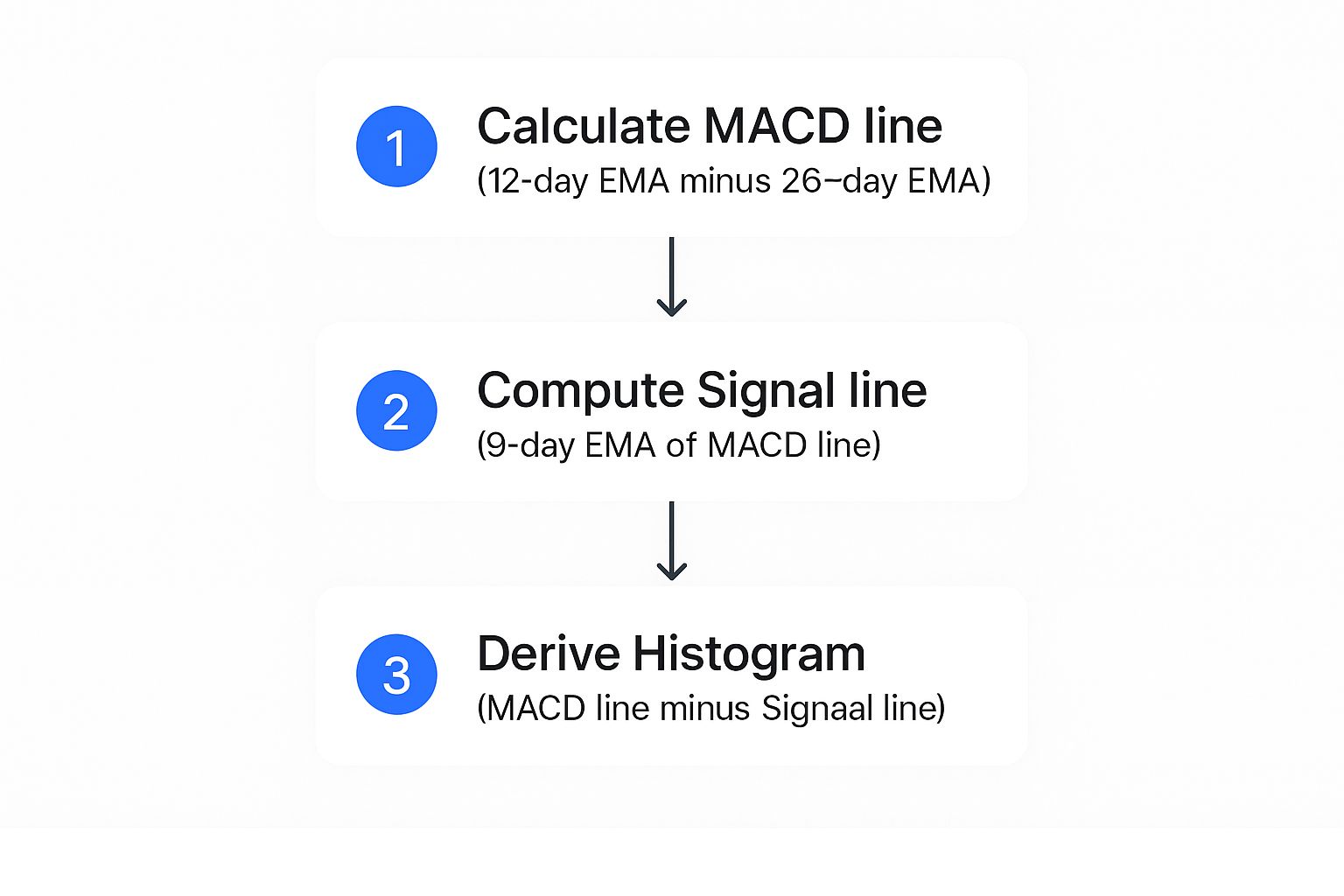
The Three Core Components
To really get how the MACD works, you have to understand its three parts. Each one has a specific job, but they work together to paint a full picture of what's happening with momentum. It's like having a panel of experts, each with their own unique take.
-
The MACD Line: This is the engine of the indicator. It’s calculated by subtracting the 26-period EMA from the 12-period EMA. When this line is heading up, it signals that positive momentum is building. When it's falling, negative momentum is taking over.
-
The Signal Line: This is simply a 9-period EMA of the MACD Line. Since it's an average of the MACD line, it moves a bit slower and smooths things out. Its main purpose is to generate trading signals when the faster MACD Line crosses above or below it.
-
The Histogram: This part was added later, in 1986, by Thomas Aspray. It's a simple but brilliant visual aid that shows the difference between the MACD Line and the Signal Line. When the histogram bars get taller, momentum is accelerating. When they start to shrink, momentum is fading.
The histogram is arguably the most intuitive part of the MACD. It gives you a quick, at-a-glance read on momentum. Often, a shrinking histogram is the very first clue that a strong trend is starting to weaken.
A skilled trader never looks at these three elements in a vacuum. The real insights come from watching how they interact with each other, leading to powerful signals like crossovers and divergences—which we'll break down in just a bit.
The Three Core Components of the MACD Indicator
To put it all together, this table gives a quick summary of the MACD's key parts and their primary function for traders.
| Component | What It Represents | Primary Role |
|---|---|---|
| MACD Line | The difference between the 12-period and 26-period EMAs. | Shows the direction and strength of short-term momentum. |
| Signal Line | A 9-period EMA of the MACD line. | Acts as a slower trigger line for generating crossover signals. |
| Histogram | The difference between the MACD line and the Signal line. | Visually represents the strength or weakness of the current momentum. |
Getting a solid handle on these building blocks is your first step. Each piece tells a part of the story, and learning to read them in concert is what will unlock the MACD's full potential in your trading.
How the MACD Formula Actually Works
To really get a feel for the MACD, you have to pop the hood and see what makes it tick. Don't worry, you don't need a math degree. The formula is just a few simple steps, each one building logically on the last. It’s less about complex equations and more about seeing how different price averages dance with each other to show you momentum.
At its heart, the MACD is all about the relationship between two specific Exponential Moving Averages (EMAs). Unlike a Simple Moving Average (SMA), an EMA gives more weight to the most recent prices. This makes it much more responsive to what's happening in the market right now—and that responsiveness is exactly what the MACD needs to track momentum effectively.
The Core Calculation: The MACD Line
It all starts with calculating two separate EMAs of an asset's price. The standard settings you'll see everywhere are a 12-period EMA and a 26-period EMA. Think of the 12-period EMA as the "fast" line, reacting quickly to price changes. The 26-period EMA is the "slow" one, giving you a smoother, more stable baseline for the longer-term trend.
The MACD line itself is just the difference between these two. Simple as that.
MACD Line = (12-Period EMA) – (26-Period EMA)
When that fast 12-period EMA starts to pull away from the slow 26-period EMA, it tells you short-term momentum is picking up speed. This is when you'll see the MACD line move further away from zero. On the flip side, when the two EMAs get closer together (they converge), it’s a sign that momentum is fading.
Adding the Signal Line for Context
The MACD line is great for spotting momentum, but on its own, it can be a little jumpy. To smooth things out and generate clearer trading signals, we bring in the Signal Line. This is just a 9-period EMA of the MACD line itself.
Basically, the Signal Line is an average of an average. Because it’s smoothed out, it moves slower and acts like a reference point. The classic MACD trading signals—the crossovers—happen when the faster MACD line crosses above or below this slower Signal Line, hinting at a potential shift in momentum.
Visualizing Momentum: The Histogram
The final piece of the puzzle is the Histogram, and it’s my favorite part because it makes momentum instantly visible. The calculation couldn't be easier: it’s just the distance between the MACD line and the Signal Line.
- Histogram = MACD Line – Signal Line
When the MACD line is above the Signal Line, the histogram bars are positive (above the zero line). As the gap between the two lines widens, the bars get taller, showing that bullish momentum is getting stronger. As the lines converge, the bars shrink, warning you that the momentum is dying down. The exact same logic applies in reverse when the MACD is below the Signal Line for bearish momentum.
This quick visual breaks down how each piece is calculated.
You can see how everything flows together, starting with the two core EMAs and finishing with that super-intuitive histogram.
Let's put it into practice. Say a stock has a 12-day EMA of $105 and a 26-day EMA of $103. The MACD line would be $2 ($105 - $103). Now, if the 9-day EMA of that MACD line (our Signal Line) is at $1.50, the histogram would show a value of $0.50 ($2 - $1.50). This tells us momentum is positive and still growing, because the MACD is pulling away from its own average. It's this simple arithmetic that powers every crossover and divergence you see on the chart.
How to Read MACD Trading Signals

Knowing what the MACD components are is one thing, but the real magic happens when you can translate those squiggly lines into actionable trading signals. This is where theory meets the road, where you learn to read the story the MACD is telling you about market momentum.
The MACD doesn't just give you one type of signal; it offers several, each providing a different piece of the puzzle. Think of them as different chapters in the market's story. Some signals might hint at minor plot twists, while others can foreshadow a major shift in the entire narrative. Learning to spot all of them gives you a much richer understanding of what's happening with price.
We're going to break down the three primary signals that are the foundation of nearly every MACD-based strategy. Each one has a unique job, from spotting quick entry points to flagging major, long-term trend reversals.
Signal Line Crossovers: The Classic Entry Trigger
The most common signal you'll see from the MACD is the signal line crossover. This is when the faster MACD line crosses over or under the slower signal line, giving you a heads-up about a potential shift in short-term momentum. It's the indicator's way of tapping you on the shoulder and saying, "Hey, pay attention, something is changing."
These crossovers are pretty straightforward to spot:
-
Bullish Crossover: This happens when the MACD line moves above the signal line. It suggests that the latest momentum has turned positive, and the price might be gearing up for a move higher. Many traders see this as a potential buy signal.
-
Bearish Crossover: This is the opposite, where the MACD line dips below the signal line. This tells you momentum is shifting to the downside and the price could be headed lower. This is often taken as a sell or short-sell signal.
While these signals are frequent, they work best when you trade them in the direction of the overall trend. For instance, a bullish crossover is much more reliable in a market that's already trending up. If you try to trade every crossover in a choppy, sideways market, you'll likely get "whipsawed" with false signals, which is both frustrating and costly.
A great tip for new traders is to watch the histogram. A crossover gets a powerful confirmation when the histogram flips from negative to positive (for a bullish cross) or from positive to negative (for a bearish cross). This visual cue makes the momentum shift impossible to miss.
Centerline Crossovers: The Major Momentum Shift
If a signal line crossover is a whisper about the market's next move, a centerline crossover is a shout. This event occurs when the MACD line itself crosses the zero line, moving from positive to negative territory or the other way around. This is a big deal because it signals a major shift in the balance of power between bulls and bears.
Remember, the MACD line is just the difference between the 12-period and 26-period EMAs. So, a centerline crossover is telling you something fundamental about those moving averages:
-
Bullish Centerline Crossover: When the MACD line moves above the zero line, it means the 12-period EMA has just crossed above the 26-period EMA. This is a clear sign that short-term momentum has officially overtaken long-term momentum, potentially kicking off a new uptrend.
-
Bearish Centerline Crossover: Conversely, when the MACD line drops below the zero line, the 12-period EMA has crossed below the 26-period EMA. This suggests a new downtrend could be getting started as downside momentum takes control.
Because they reflect a more significant change in market dynamics, centerline crossovers are less frequent than signal line crossovers, but they're often far more reliable. They're excellent for confirming the direction of a major trend. For a deeper dive, our guide on how to master trading signals with the MACD indicator provides more detailed examples.
Divergence: The Ultimate Reversal Signal
Divergence is arguably the most powerful—and trickiest—signal the MACD can generate. It happens when the MACD indicator and the price action on the chart are telling two completely different stories. This disagreement is often an early warning that the current trend is running out of gas and a major reversal could be coming.
There are two kinds of divergence you need to be on the lookout for:
-
Bullish Divergence: This forms when the price of an asset makes a new lower low, but at the same time, the MACD indicator forms a higher low. This discrepancy suggests that even though the price is still dropping, the downward momentum is drying up. It's a classic sign that sellers are getting exhausted and a bottom might be forming.
-
Bearish Divergence: This occurs when the price makes a new higher high, but the MACD indicator charts a lower high. This is a big red flag. It tells you that despite the new peak in price, the underlying buying pressure is fading fast. It’s a strong warning that the uptrend is losing steam, and a reversal to the downside could be on the horizon.
Spotting divergence takes a keen eye and a lot of patience; it's not an everyday signal. But when you do see it, you're potentially seeing the first crack in a trend's foundation, giving you an edge before the rest of the market catches on.
Practical MACD Trading Strategies for Any Market
Knowing what the MACD signals mean is just the first step. The real trick is weaving them into a strategy that you can repeat, one that holds up under pressure. That's what really separates the consistently profitable traders from everyone else.
A single MACD crossover, all on its own, can easily send you down the wrong path. The indicator's true power shines when you pair it with other tools. This creates a more complete system that helps filter out market noise and zero in on high-probability setups. Think of it less as a simple signal generator and more as a core piece of your trading puzzle.
Combining MACD With RSI for Confirmation
One of the most effective ways to slash false signals is by pairing the MACD with a complementary indicator like the Relative Strength Index (RSI). The MACD is all about trend and momentum, while the RSI measures the speed and change of price moves, telling you when a market might be overbought or oversold. Using them together is like getting a second opinion before making a big decision.
Here’s how you can make them work together:
- For a Buy Signal: First, wait for a bullish MACD crossover (when the MACD line climbs above the signal line). Before you jump in, glance at the RSI. The signal is much stronger if the RSI is not in overbought territory (typically above 70), which suggests the price still has room to climb.
- For a Sell Signal: Look for a bearish MACD crossover. Then, check the RSI for confirmation. The signal is far more reliable if the RSI is not in oversold territory (below 30), hinting that the downward move still has gas in the tank.
This dual-filter approach helps you avoid the classic mistakes of buying into a rally just as it's running out of steam or selling into a dip right before it reverses. It’s a layer of defense against the MACD’s biggest weakness: its tendency to lag in choppy or fast-moving markets.
The Histogram Momentum Strategy
If you're looking to get ahead of the curve, the MACD histogram offers a much more proactive way to trade. Instead of waiting for the lines to cross, this technique focuses on the acceleration and deceleration of momentum itself. The histogram is just a visual representation of the distance between the MACD and signal lines, so when its bars start to change height, you know momentum is shifting.
The strategy is surprisingly simple:
- Entry Signal: Look to go long when the histogram bars, while still below the zero line, stop getting smaller and start ticking back up toward it. This is your earliest clue that bearish momentum is drying up, often well before the actual bullish crossover happens.
- Exit Signal: Think about taking profits when the histogram bars, while above the zero line, start shrinking. This is your first warning that bullish momentum is fading, giving you a chance to lock in your gains before a potential reversal.
This strategy is all about timing. You enter when momentum starts to turn in your favor and get out as soon as it shows the first signs of weakness. It’s a way to capture the heart of a move without getting caught in the chop.
Adapting MACD Settings for Different Markets
The standard (12, 26, 9) MACD setting is a fantastic starting point, but it's not a magic bullet for every market. Different assets have their own unique rhythm and volatility, which means you might need to adjust the indicator's sensitivity.
There's no rule that says you have to stick to the defaults. In fact, fine-tuning the MACD is common practice among seasoned traders.
Here are a couple of examples:
- High-Volatility Markets (Crypto, Forex): For assets that move quickly, you might want to use faster settings like (5, 13, 5). This makes the indicator more responsive to those sharp, sudden price swings.
- Lower-Volatility Markets (Stocks, Indices): For daily and weekly charts on less volatile assets, the standard (12, 26, 9) is often perfect. It helps smooth out the day-to-day noise so you can focus on the bigger, more meaningful trends.
By tailoring the settings, you can fine-tune the MACD to better match the personality of the market you're trading. To see exactly how these strategies work with stocks, be sure to check out our detailed guide on using MACD in stocks for profitable trading.
Common Pitfalls When Using the MACD Indicator
While the MACD is a powerful tool in any trader's kit, treating it like an infallible crystal ball is a recipe for disaster. No indicator is perfect, and understanding the MACD's weaknesses is just as important as knowing its strengths.
Recognizing these common traps can help you sidestep costly mistakes and use the indicator a whole lot smarter. One of the biggest errors is taking every single signal at face value. A MACD crossover might look like a clear-cut entry, but without seeing the bigger picture, it can easily lead you astray. This is especially true when the market gets messy.
Getting Whipsawed in Choppy Markets
The MACD really shines in trending markets. Long, steady climbs or falls are where it provides the cleanest signals. But when the market just bounces around sideways in a choppy, range-bound pattern, the indicator's usefulness tanks. In these conditions, the two moving averages are constantly crisscrossing, spitting out a dizzying series of buy and sell signals.
This frustrating back-and-forth is known as a "whipsaw." You might buy on a bullish crossover, only to watch the price immediately reverse and trigger a bearish crossover, forcing you to sell for a loss. Acting on these frequent, low-quality signals in a sideways market is one of the fastest ways to bleed an account dry. The lesson here is to first figure out what the market is doing; if it’s not trending, use the MACD with extreme caution, if at all.
The Problem of Lagging Signals
By its very nature, the MACD is a lagging indicator. It's built using historical price data, which means it can only react to what has already happened. While it’s fantastic for confirming a trend once it's in motion, this delay can be a huge problem during sudden, sharp market reversals.
Picture a strong uptrend that hits a brick wall after some bad news. The price might nosedive, but the MACD, still chewing on previous price action, may take several bars to catch up and signal a bearish crossover. By the time it tells you to sell, a huge chunk of the move is already over, and you've missed the best exit.
Because the MACD relies on historical data, it will always be a step behind real-time price. This is why it should be used as a tool for confirmation, not for prediction. Never rely on it in isolation.
Misinterpreting Failed Divergences
Divergence is often praised as the MACD's secret weapon, but it's far from foolproof. A failed divergence happens when the indicator points to a potential reversal that just never shows up. For example, you might spot a textbook bearish divergence where the price hits a new high, but the MACD makes a lower high.
Thinking a reversal is imminent, you short the market. But instead, the price keeps grinding higher, completely ignoring the indicator's warning. The uptrend was simply stronger than the waning momentum suggested by the MACD. This pitfall teaches a critical lesson: divergence is a warning, not a command. It signals a trend might be losing steam, but it needs confirmation from price action—like a break of a key support level—before it’s a tradable signal.
Statistically, the MACD is one of the most popular technical tools out there. Analysis shows its crossovers can correctly anticipate trend shifts about 65-75% of the time in the right market conditions. However, its reliance on EMAs creates that natural lag, which can lead to false signals during quick reversals and reinforces why you should always pair it with other tools. You can dig deeper into its statistical reliability in professional trading systems on TradingView.
Got Questions About the MACD? We've Got Answers.
Even after you’ve got the formulas and signals down, a few practical questions always pop up when it's time to actually put the MACD to work. I’ve put together this section to tackle the most common ones I hear from traders, giving you direct answers so you can use the tool with more confidence.
Let's clear up any lingering confusion, from finding the right settings for your style to seeing how the MACD stacks up against other popular indicators.
What Are the Best Settings for the MACD Indicator?
This is the number one question on everyone's mind, and the honest answer is a bit anticlimactic: there's no single "best" setting that works for everyone, all the time.
The standard (12, 26, 9) configuration is the default for a reason. It’s been battle-tested for decades and offers a great balance for swing trading on daily charts. It’s designed to catch meaningful momentum shifts without getting faked out by every little price twitch.
But your ideal settings really boil down to your personal trading style and the market you're in.
- For Day Traders in Volatile Markets: If you’re trading crypto or forex, the standard settings will feel frustratingly slow. Many short-term traders tighten them up to something like (5, 35, 5) to get signals faster and capitalize on smaller price moves.
- For Long-Term Investors: If you’re looking at weekly or monthly charts, you might want to slow things down to filter out the noise. This helps you focus on the major, overarching trend and ignore the short-term bumps.
The key is to backtest. See what has historically worked for the asset and timeframe you trade. Start with the standard settings as your baseline, but don't be afraid to experiment and find what fits your strategy.
Can I Use the MACD Indicator by Itself for Trading?
While the MACD is a fantastic tool, using it in isolation is like trying to navigate a ship with just a compass. It's a high-risk approach because no single indicator can paint the full picture of the market.
Since it’s a lagging indicator based on past prices, it can—and will—give you false signals, especially when the market is chopping sideways with no clear trend.
A much safer and more reliable method is to always look for confirmation.
Think of the MACD as a trusted advisor on your trading committee, not a dictator. Its input is crucial, but you should always weigh it against other evidence before putting your capital on the line.
Pairing the MACD with other tools is standard practice for a reason. Combining it with the Relative Strength Index (RSI) can help confirm momentum. Using it alongside basic price action analysis, like identifying key support and resistance levels, can validate its signals and dramatically boost your accuracy. The goal is to find a confluence of evidence all pointing in the same direction.
Which Is More Important: The MACD Crossover or the Centerline Crossover?
Both signals are important, but they tell you very different stories about the market’s momentum. One isn't necessarily "better" than the other; they just operate on different timelines and serve different purposes.
A MACD line/Signal line crossover is your short-term alert. It happens more frequently and often gives you an early heads-up that momentum is starting to shift. Traders use these to pinpoint potential entries or exits within an existing trend. The downside? They can create a lot of noise in choppy markets.
In contrast, a centerline crossover (when the MACD line crosses above or below zero) is a much bigger deal. It's a less frequent but far more significant event, signaling that the entire momentum balance has shifted from bullish to bearish, or vice versa. This is often seen as the potential start of a major new trend, making it invaluable for traders with a longer time horizon.
How Is the MACD Different from a Simple Moving Average Crossover?
This is a great question that gets right to the heart of what makes the MACD so powerful. While both involve moving averages crossing paths, the way they're built and the information they give you are worlds apart.
A simple moving average (SMA) crossover just uses two SMAs, where every price point is weighted equally. The MACD, on the other hand, is built from Exponential Moving Averages (EMAs), which give more weight to the most recent price action. This makes the MACD inherently faster and more responsive to what’s happening in the market right now.
But here’s the real kicker: a simple MA crossover just tells you that the trend might be changing direction. The MACD does that and gives you critical insight into the market's momentum. Through its histogram, the MACD visually shows you the strength or weakness of that momentum—is it picking up steam or running out of gas? That extra layer of information is something a basic MA crossover simply can't provide.
Ready to take your analysis to the next level? ChartsWatcher provides a powerful, customizable platform where you can track the MACD indicator across multiple stocks, build custom screeners, and backtest your strategies with precision. Stop guessing and start making data-driven decisions by visiting https://chartswatcher.com to see how our tools can give you a professional edge.
