How to Read Stocks Charts for Beginners
When you first start out, reading a stock chart can feel like trying to decipher a foreign language. It's a jumble of lines, colors, and bars that seems to move without any rhyme or reason. But at its core, learning to read these charts is simply about translating visual information—price, time, and volume—into a clear story about a stock's past and where it might be headed next. It's the foundational skill for understanding what the market is thinking, spotting trends, and ultimately, making smarter trading decisions.
Your First Look at a Stock Chart
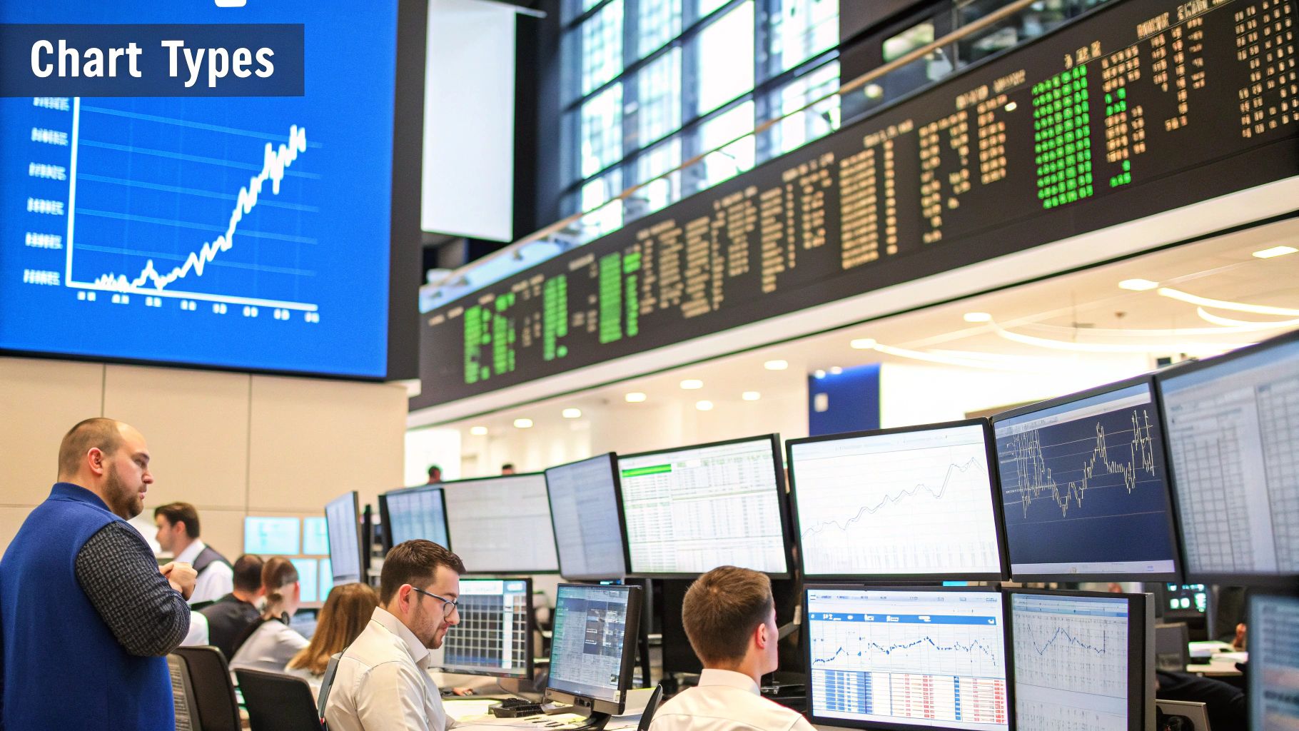
When you pull up a chart for the first time, your eyes are immediately drawn to the price action. Don't worry about all the other indicators and tools just yet. Let's focus on what matters most.
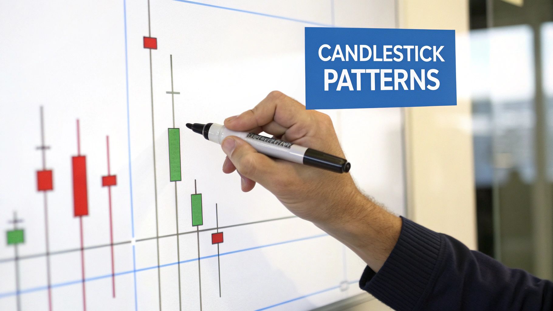
Most modern trading platforms, like the one we use at ChartsWatcher, default to candlestick charts. There's a good reason for this—they pack an incredible amount of information into a very simple shape.
Each "candle" represents a specific timeframe—a day, an hour, or even just one minute—and tells you the complete story of what happened to the price during that period. To get started, you only need to understand its two main parts:
- The Body: This is the thick, rectangular part. It shows you the difference between where the stock's price opened and where it closed for that period.
- The Wicks (or Shadows): These are the thin lines sticking out from the top and bottom of the body. They show the absolute highest and lowest prices the stock hit during that same period.
Decoding a Candlestick
The color of the candle gives you an instant read on the market's mood for that session. While you can often customize these colors, the standard convention is pretty straightforward:
- Green (or White) Candle: The price closed higher than it opened. This tells you that buying pressure was in control, a bullish sign for that period.
- Red (or Black) Candle: The price closed lower than it opened. This means selling pressure dominated, a bearish signal for that period.
I like to think of each candle as a mini-battle between the buyers (bulls) and the sellers (bears). A long green body means the bulls won decisively. A long red body means the bears were clearly in charge. And if you see long wicks? That often signals a lot of volatility and indecision, as the price moved around a lot but couldn't hold onto its highs or lows.
By simply observing the size and color of the candles, you're already starting to read the market psychology that drives price. You can get a feel for the battle between buyers and sellers before you even add a single fancy indicator.
Learning the language of candlesticks is the first, most crucial step. It provides the context for everything else you'll learn about chart analysis. Once you’re comfortable with this, you can move on to more advanced techniques, like those we cover in our 6-step stock chart analysis guide. But mastering this initial skill is what transforms a confusing screen of shapes into a clear story of market action.
Reading Beyond Price with Time and Volume
Price movements alone are just one part of the story. If you really want to understand what a chart is trying to tell you, you need to bring in two other critical elements: time and volume. These two dimensions provide the essential context that helps you separate a genuine trading signal from simple market noise.
Think of it this way: a sudden price jump looks exciting on the surface, but it's pretty meaningless on its own. Was that a brief, one-minute fluke or the start of a multi-week rally? The answer depends entirely on the timeframe you're looking at.
How Timeframes Change Your Perspective
Every chart is built on a horizontal time axis—the x-axis—that lets you zoom in and out on the price action. Any decent trading platform, like the customizable dashboards you can find in ChartsWatcher, will let you switch between different periods with a single click.
- Short-term timeframes: Think of the 1-minute or 5-minute charts as your microscope. These are the playground for day traders who want to get in and out of positions, capturing quick, intraday moves.
- Medium-term timeframes: The daily or weekly charts are the standard view for most people. They show the broader trend and are what swing traders and many investors use to make decisions over days or weeks.
- Long-term timeframes: The monthly or yearly charts are your telescope. They reveal a stock's historical performance over many years, which is absolutely vital for long-term, buy-and-hold investors.
I’ve seen it countless times. A stock looks like it's in a nosedive on a 15-minute chart. But when you zoom out to the daily chart, you realize it’s just a minor, healthy pullback within a powerful, long-term uptrend. This is why context is everything. Simply changing your perspective can completely flip your analysis.
The Critical Role of Volume
If price tells you what happened, volume tells you how much conviction was behind that move. Look at the bottom of most stock charts and you'll see a series of vertical bars. This is your trading volume—it represents the total number of shares that were bought and sold during that specific candle's time period.
A price surge on massive, above-average volume is a powerful signal. It suggests big institutions are buying and there's widespread agreement among traders. It’s a sign of a healthy, sustainable move.
On the flip side, the same price jump on very light, anemic volume is a huge red flag. It could mean there's no real interest behind the move, or worse, it could be a "bull trap" designed to lure in rookie buyers right before the price collapses.
A price trend without volume is like a rumor without a source. You need volume to confirm that the move is legitimate and has enough momentum to continue. High volume gives a price move credibility.
Analyzing volume is a core part of reading market sentiment. You'll often see significant volume spikes right before or during major price moves, which shows a surge in trader interest and participation. For instance, a price climb on high volume is generally more sustainable, whereas the same climb on low volume is immediately suspect. You can even explore years of historical volume data for U.S. equities to see these patterns for yourself and get a feel for what constitutes "normal" vs. "high" volume in different market conditions.
Finding Actionable Trends and Levels

Markets don't just move at random. They ebb and flow in waves, creating patterns that a trained eye can learn to spot. As a trader, your real job is to see these waves, because they reveal the market’s underlying direction. This is where we shift from just looking at a price to actually interpreting it—a core skill in learning how to read stocks charts.
A trendline is your first and most powerful tool. It’s nothing more than a straight line connecting a series of highs or lows, but it instantly cuts through the noise and shows you the big picture. You start to see the forest, not just the individual trees.
- Uptrend: You'll see a series of higher highs and higher lows. Draw this line by connecting at least two major low points.
- Downtrend: The opposite is true here, with a series of lower highs and lower lows. Connect two or more of the major high points to visualize it.
- Consolidation: The price looks stuck, moving sideways in a range. This tells you there's a standoff between buyers and sellers, a period of pure indecision.
Spotting Support and Resistance
Beyond the general trend, the most practical levels on any chart are support and resistance. These aren't just arbitrary lines; they are psychological battlegrounds where the balance between supply and demand has historically shifted.
Think of them as invisible floors and ceilings for the stock price.
Support is that price level where buying pressure in the past was strong enough to halt a decline and push the price back up. It’s the "floor" where traders collectively decide a stock is a good value and start buying again.
Resistance is the opposite—a price level where sellers have historically stepped in with enough force to stop a rally in its tracks. It's a "ceiling" where traders who bought lower cash in their profits, or short-sellers see a prime opportunity to enter.
The more times a price touches one of these levels and reverses, the stronger that level becomes. A floor that has held firm through three separate tests is far more significant than one that's only been touched once.
When you're trying to read stocks charts, finding these zones is everything. They give you a logical map for planning your trades—potential entry points near a support floor, or areas to think about taking profits as the price nears a resistance ceiling.
To really understand the dynamic, it helps to compare them side-by-side.
Support vs. Resistance Levels
| Concept | Description | What It Signals | Trader Action |
|---|---|---|---|
| Support | A price "floor" where demand historically outstrips supply, causing prices to bounce. | A potential bottoming area; buyers are stepping in. | Look for potential buying opportunities or long entries. |
| Resistance | A price "ceiling" where supply historically overwhelms demand, causing prices to stall or fall. | A potential topping area; sellers are taking control. | Consider taking profits or looking for short-selling opportunities. |
Thinking in terms of these floors and ceilings provides a clear framework for anticipating where the next big move might start or stop.
The Significance of a Break
The real fireworks happen when one of these levels finally gives way.
A decisive close above a major resistance level is a powerful signal. It suggests the bulls have finally overwhelmed the sellers, often triggering a strong upward surge. We call this a breakout.
Conversely, a clean break below a key support level means the sellers are now firmly in charge. This is a bearish sign known as a breakdown, which can kick off a significant price drop.
These fundamental concepts of trends, support, and resistance aren't just for stocks. They form the basis of technical analysis across all asset classes, including when analyzing trends in the Sports NFTs market. Mastering them gives you a powerful framework to anticipate price movements, not just react to them.
Using Indicators to Confirm Your Ideas
Think of technical indicators as a second opinion for your chart analysis. After you’ve mapped out your key trendlines and support/resistance levels, indicators can help confirm what you’re seeing, adding a layer of data-driven proof to your initial gut feeling.
They aren't a crystal ball, and they won't make decisions for you. But when used correctly, they can provide powerful validation.
The goal isn't to clutter your screen with a dozen confusing lines. A clean chart is a readable chart. My advice? Start by mastering just one or two reliable indicators that complement your trading style. Let's look at two of the most trusted tools for new and experienced traders alike.
Smoothing Out the Noise with Moving Averages
One of the first indicators most traders learn is the Moving Average (MA). Its job is simple but absolutely essential: it smooths out the chaotic, day-to-day price swings to reveal the true underlying trend. It does this by calculating the average closing price over a specific number of periods.
A very common strategy I see used effectively involves putting two MAs on a chart—one short-term (like a 50-day MA) and one long-term (like a 200-day MA).
When that shorter-term MA crosses above the longer-term MA, it’s known as a "Golden Cross." This is a classic bullish signal that tells you momentum might be shifting upwards. The opposite, a "Death Cross," is a bearish signal you’ll want to watch out for.
Gauging Momentum with the Relative Strength Index
Next up is the Relative Strength Index (RSI), which I like to think of as a momentum gauge for the stock price. It measures the speed and magnitude of price movements on a simple scale from 0 to 100. The RSI is fantastic for spotting potentially overextended conditions.
Here’s how to read it:
- Overbought: A reading above 70 suggests a stock might be getting a little too hot and could be due for a pullback.
- Oversold: A reading below 30 indicates the stock might be undervalued and primed for a bounce.
An indicator's signal is strongest when it confirms what the price action is already telling you. If a stock bounces perfectly off a strong support level and the RSI is simultaneously climbing out of oversold territory, that's a much more reliable signal than either event happening alone.
This approach of using statistical movements to get a read on the market is fundamental. For example, even in a strong bull market, you'll see volatility. When the US500 (S&P 500) was hitting highs over 6,480 points back in August 2025, it still had its ups and downs, despite being up roughly 16.66% over the prior year and 3.57% in the last month. You can find more details on this data on TradingEconomics.com. Traders use indicators to navigate these smaller fluctuations within the larger trend.
Ultimately, indicators should serve your analysis, not lead it. They are confirmation tools that add confidence to the trends and levels you've already identified with your own eyes.
To see how these elements fit into a broader strategy, you might be interested in our guide on how to analyze stock charts with proven techniques.
Let's Put It All Together: A Real-World Chart Walkthrough
Theory is great, but the rubber really meets the road when you apply it to a live chart. That's where the real learning kicks in. Let's walk through a repeatable process you can use for your own analysis, putting all these concepts into action. This is all about building a coherent story from the raw data on your screen, moving you from simply knowing the terms to having a practical skill.
Picture this: you've just pulled up a daily chart for some tech company. The first thing you do isn't to hunt for buy signals or panic about the latest tick. Just observe. What’s the big picture? Over the last six months, is the price generally climbing, falling, or just bouncing around in a defined range? This first glance sets the stage for everything else.
This simple flow gives you a clear, repeatable framework to lean on.
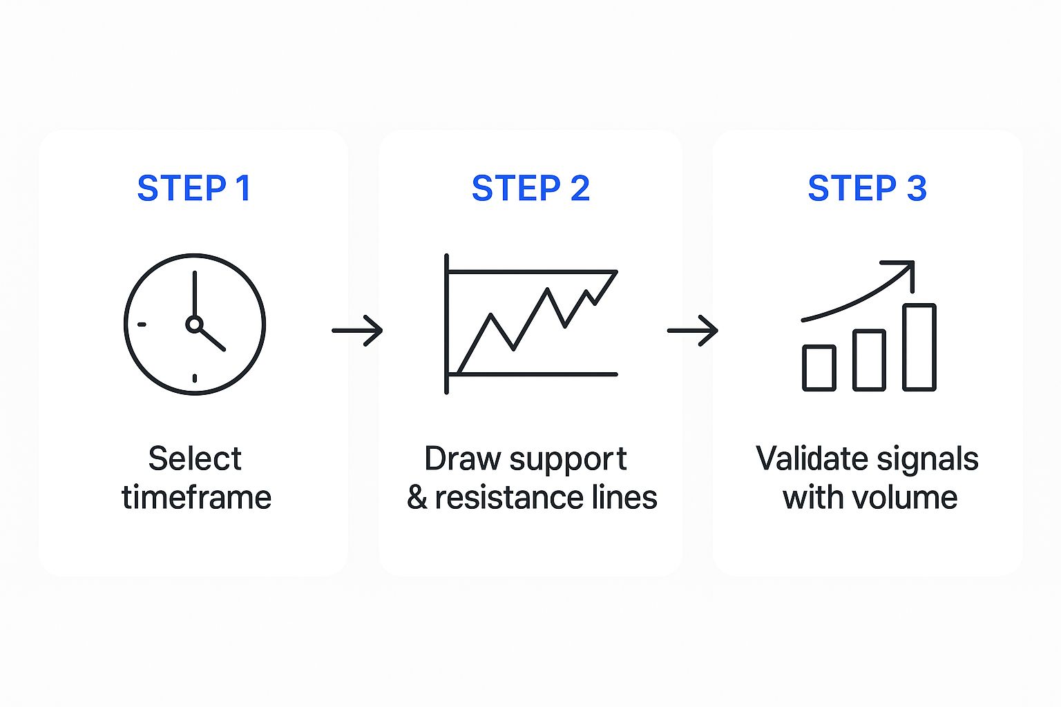
The infographic really breaks it down into a simple, three-part approach. It's a great reminder that having a structured method is what separates disciplined analysis from random guessing.
Defining the Trading Arena
Okay, now we get more specific. Let’s say you’ve spotted a clear uptrend. Your next move is to draw the key support and resistance levels. You're looking for at least two or three obvious spots where the price has previously bounced off a floor (support) or hit a ceiling and turned back down (resistance). These lines are your trading battlefield.
Once your levels are drawn, drop your eyes to the volume bars at the bottom. Are the big green candles (up-days) happening on high, expanding volume? That’s conviction. On the flip side, are the pullbacks happening on light, drying-up volume? That suggests the sellers are losing steam. Price action plus volume tells a much more compelling story than either one alone.
I see it all the time with new traders: "analysis paralysis." They get so bogged down adding dozens of indicators and looking for the perfect signal that they miss the simple story the chart is telling them. Stick to a clean process: trend, levels, and volume.
Adding Confirmation Tools
Finally, it's time to bring in our confirmation tools. Let's start by overlaying a 50-day Moving Average (MA). Is the price consistently staying above it? Is it bouncing off the MA like a dynamic support level? If so, that's a powerful confirmation of the uptrend's strength.
Next, we'll check the Relative Strength Index (RSI). During the recent pullbacks to your support line, did the RSI dip down near the 30 level (oversold territory) before turning back up? When you see these tools align with what you've already found—a bounce off a key support level that's confirmed by an oversold RSI—your confidence in a potential trade can grow immensely.
This systematic approach of layering data points is what separates a hunch from a high-probability setup. Understanding the historical context is also a huge part of effective analysis. For example, long-term investors often look at the Dow Jones Industrial Average’s 100-year inflation-adjusted chart. It tracks the market through massive events like the Great Depression and the 2008 financial crisis. Knowing that each data point represents a month-end closing price adjusted with the Consumer Price Index (CPI) helps you see the difference between nominal price changes and real shifts in value. You can dig deeper into this by exploring the historical context of market trends on Macrotrends.net.
By following this straightforward, repeatable process—identify the trend, draw your levels, check the volume, and confirm with an indicator or two—you build a solid foundation for reading charts and making much more informed decisions.
Of course. Here is the rewritten section, crafted to sound like an experienced human expert and match the provided examples.
Your Most Common Chart Reading Questions, Answered
As you start putting chart reading into practice, you'll find that theory and real-world trading are two different beasts. This is where the real learning begins. Let's tackle some of the questions I hear most often from new traders, so you can build confidence and sidestep a few common hurdles.
One of the first dilemmas everyone faces is picking the right timeframe. What’s the honest answer? There’s no single “best” one. It all comes down to your trading style and what you’re trying to accomplish.
- Day Traders: Your world revolves around the 1-minute to 15-minute charts. This is where you live to catch quick, intraday price swings.
- Swing Traders: The 1-hour, 4-hour, and daily charts are your sweet spot. These timeframes help you pinpoint trends that play out over several days or weeks.
- Long-Term Investors: Stick to the weekly and monthly charts. They filter out all the short-term noise and give you that crucial big-picture view of a stock's history.
My advice? Always start with a daily chart to get a feel for the primary trend. Once you have that context, you can zoom into a shorter timeframe to really nail down your entry and exit points. This "multiple timeframe analysis" is a total game-changer.
Keeping Your Charts Clean and Readable
Another question I get constantly is about indicators. How many is too many? It’s incredibly tempting to plaster your chart with every tool you can find, but this almost always leads to "analysis paralysis." More data doesn't automatically equal more clarity.
I’m a huge believer in the "less is more" approach. Start with a completely clean chart—just price and volume. From there, add one or two indicators that actually complement your strategy. For instance, a Moving Average is great for defining the trend, while an RSI can help you gauge momentum. Anything more is usually just clutter.
The biggest mistake I see beginners make is looking for indicators to give them trading signals. Indicators should only be used to confirm what you're already seeing in the price action and volume. Price is king; indicators are just there for a second opinion.
The Most Common Beginner Mistake
So, what's the number one trap people fall into when they first learn how to read stock charts? Chasing perfection. They sit on their hands, waiting for that "perfect" setup where every candle, indicator, and volume bar aligns flawlessly. In the real world, that almost never happens.
Successful chart reading is a game of probabilities, not certainties. Your goal is to find setups where the evidence stacks in your favor, giving you a statistical edge. Don't let the hunt for an impossible ideal keep you from taking good, high-probability trades.
Ready to move beyond the basics and apply these concepts with powerful, real-time tools? ChartsWatcher provides a dynamic platform where you can build custom dashboards to track alerts, charts, and news, all synced to your analysis. Take control of your trading workflow and start scanning the market with precision. Explore our plans.
