Learn to Read Stock Charts: 6-Step Analysis Guide
Decoding the Language of Stock Charts
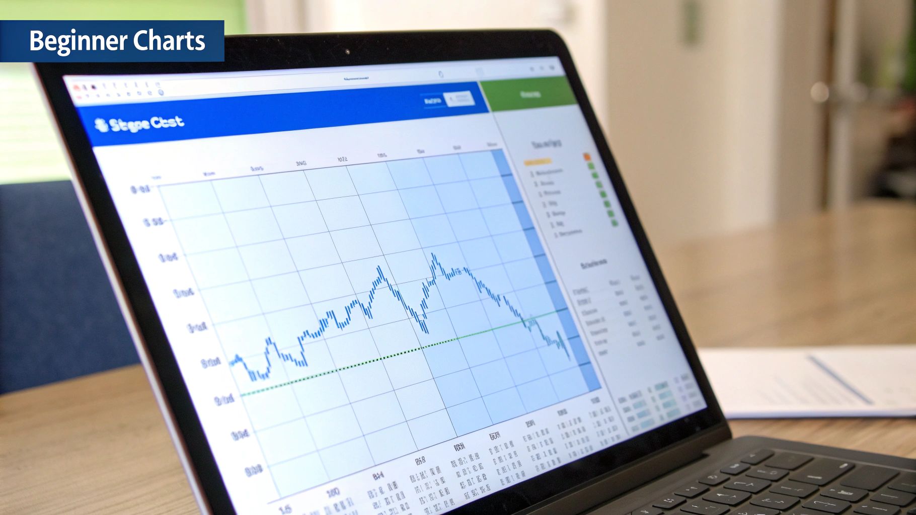
Learning to read stock charts is a crucial skill for any investor. These charts translate a stock's price history, trading volume, and market sentiment into a visual format. This allows investors to spot trends and identify potential buying or selling opportunities.
Ultimately, understanding stock charts empowers investors to make more informed decisions. For example, interpreting chart patterns can help you anticipate future price movements, which is valuable for both short-term traders and long-term investors.
Different Charts for Different Insights
Several types of stock charts exist, each offering unique advantages. Line charts are the simplest, connecting closing prices over time to give a clear picture of long-term trends.
Bar charts offer more detail, showing the opening, high, low, and closing prices for each period. This allows for a deeper understanding of daily or weekly price action.
Candlestick charts use “candle” shapes to represent the same data as bar charts, but they also clearly show whether a stock closed higher or lower than its opening price. This visual representation makes it easier to identify potential reversals and understand market sentiment.
Price and Volume: The Foundation of Chart Analysis
Price and volume are the two core components of stock chart analysis. Price movements indicate the market's direction, while volume shows the strength of that movement.
A large price increase with high volume suggests strong buying pressure. Conversely, a price drop with low volume might suggest a temporary dip, rather than a major reversal. Understanding this relationship is critical for interpreting market dynamics.
Historical stock data provides context beyond daily market fluctuations, which is crucial for long-term investors. Resources like Stock Analysis offer financial statements and dividend data spanning several years. Analyzing historical data can help investors make informed decisions based on long-term trends.
Chart Types Comparison
To effectively read charts, understanding the nuances of each chart type is essential. The table below, "Types of Stock Charts Comparison", summarizes the key differences:
To help you quickly grasp the core differences between the most popular chart types, we've put together this handy comparison table:
| Chart Type | Visual Features | Best For | Limitations |
|---|---|---|---|
| Line Chart | Closing prices connected by a line | Long-term trend identification | Lacks detail on intraday price fluctuations |
| Bar Chart | Vertical bars representing Open, High, Low, and Close (OHLC) data | Analyzing daily or weekly price action | Can be visually cluttered with short timeframes |
| Candlestick Chart | "Candles" showing OHLC data and price direction | Identifying reversals and patterns | Requires practice to interpret patterns accurately |
As you can see, each chart type offers a unique perspective on stock price data. Choosing the right chart often depends on your specific investment goals and trading style. For long-term investors, line charts may suffice. However, short-term traders might prefer the detailed information provided by candlestick charts.
For a more in-depth guide on chart reading, check out this resource: How to master stock chart reading. Mastering stock chart analysis requires continuous learning and practice. By understanding the various chart types, the interplay of price and volume, and the context provided by historical data, you can gain valuable market insights.
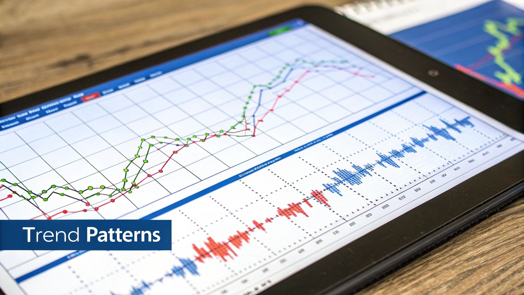
Recognizing Powerful Patterns That Signal Opportunity
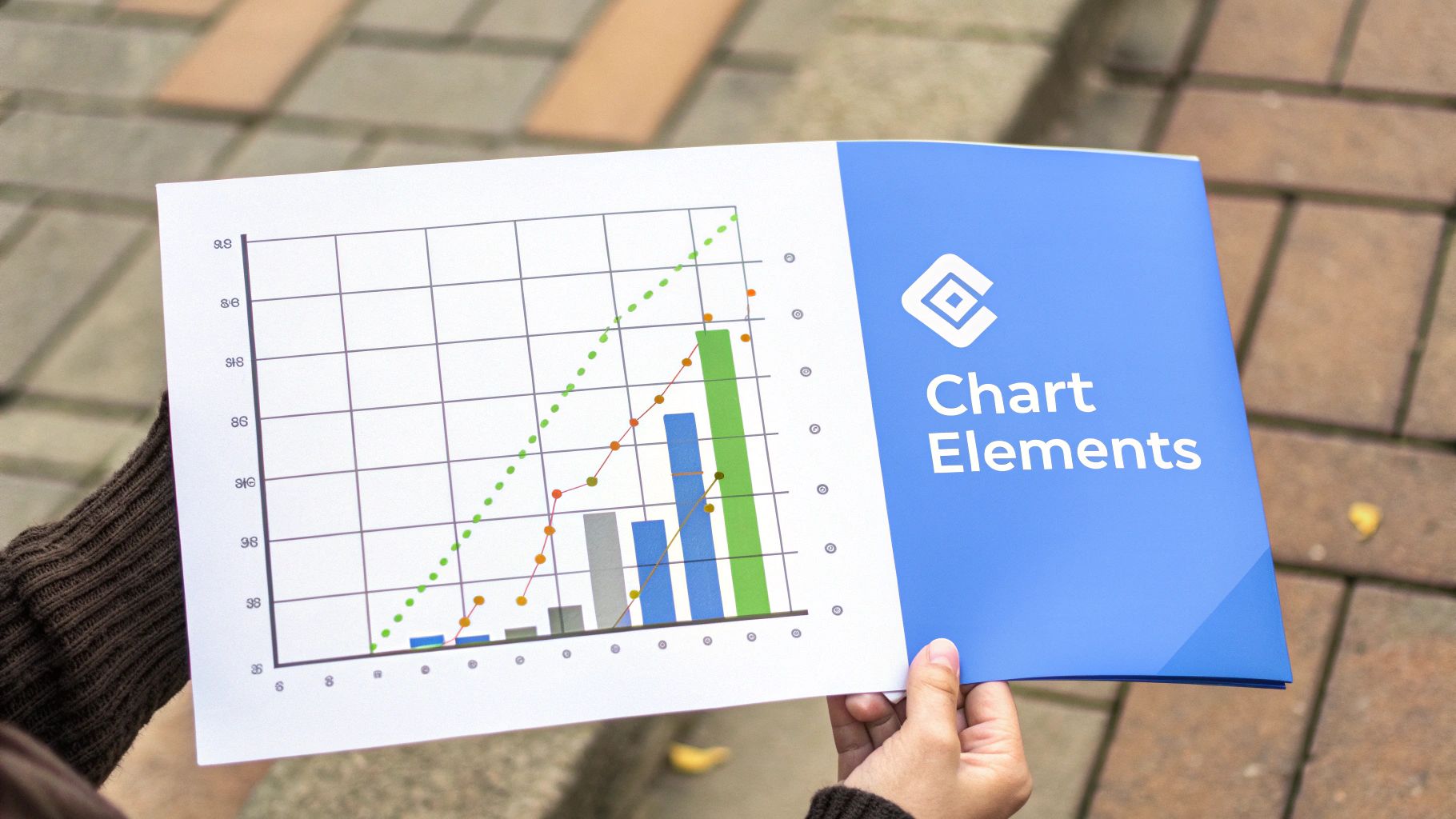
Chart patterns offer traders a unique window into the forces driving market movements, providing insights often missed by fundamental analysis alone. These visual cues on stock charts can help anticipate potential price swings. Understanding these patterns helps traders make smarter decisions about when to enter and exit trades. Let's explore some key chart patterns that can signal exciting trading opportunities.
Classic Chart Patterns and Their Significance
Certain established patterns appear frequently on stock charts, each hinting at future price action. Learning to spot these patterns is a cornerstone of effective stock chart reading. Some common patterns include the Head and Shoulders, Double Tops/Bottoms, and Cup and Handle.
-
Head and Shoulders: This pattern, true to its name, features a high peak (the head) surrounded by two lower peaks (the shoulders). This often signals a trend reversal, suggesting a shift from bullish to bearish sentiment.
-
Double Tops/Bottoms: These patterns also indicate potential trend reversals. A double top emerges when the price hits resistance twice without breaking through, suggesting a possible downturn. Conversely, a double bottom forms when the price touches support twice before bouncing back, hinting at a potential uptrend.
-
Cup and Handle: This bullish continuation pattern looks like a cup with a handle on the right side. It suggests a pause in an upward trend before a potential price surge.
Understanding the Psychology Behind Chart Patterns
These patterns aren't just random shapes. They represent the collective psychology of traders in the market. For instance, a head and shoulders pattern can illustrate the rise and fall of market enthusiasm. The first shoulder shows initial buying, the head represents peak optimism, and the second shoulder shows waning interest before the price falls. Double tops and bottoms demonstrate the tug-of-war between buyers and sellers at crucial support and resistance levels. Understanding the psychology behind these patterns is just as important as recognizing their form.
Validating Patterns and Avoiding False Signals
While chart patterns are valuable, it’s vital to distinguish true signals from false breakouts, which can mislead traders. Confirmation is essential. Increased trading volume during a breakout can strengthen a pattern’s validity. Traders also use technical indicators, like moving averages or the Relative Strength Index (RSI), for further validation. Historical context is also important. The Dow Jones Industrial Average (DJIA) grew significantly from 74.45 to 99.15 between 1915 and 1918, an 81.49% increase. Studying historical trends, like those available from sources like Macrotrends, provides valuable market perspective. By integrating pattern recognition with other tools, traders boost their chances of making winning trades. This approach offers a deeper understanding of market dynamics, providing an edge in trading decisions. Next, we’ll explore the powerful world of technical indicators.
Leveraging Technical Indicators Without Analysis Paralysis
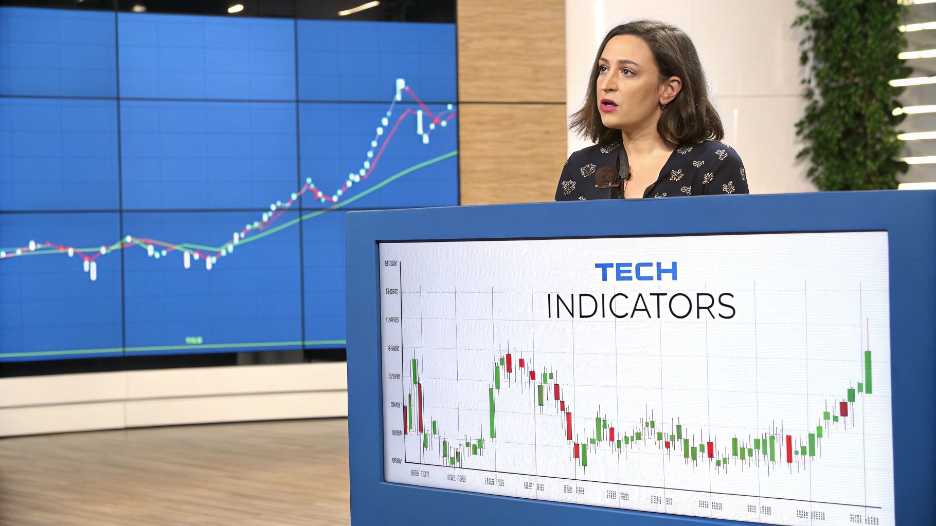
Beyond basic chart patterns, professional traders use technical indicators to understand market dynamics. These tools offer a quantitative lens on price action, momentum, and volatility, revealing hidden trends. Let's explore how these indicators can improve your chart reading.
Momentum Indicators: Spotting Trend Changes
Momentum indicators like Moving Averages, MACD (Moving Average Convergence Divergence), and RSI (Relative Strength Index) are key for anticipating market turns. Moving averages smooth out price fluctuations, clarifying the underlying trend.
For example, a stock crossing its 50-day moving average suggests a bullish shift. MACD compares two moving averages to highlight momentum changes. A bullish signal appears when the MACD line crosses above the signal line. RSI tracks price movement speed and change. An RSI over 70 often signals an overbought condition, hinting at a possible pullback.
Volume Indicators: Unveiling the Force Behind Price
Volume indicators, such as On-Balance Volume (OBV), reveal the strength of price moves. OBV tracks cumulative volume, adding volume on up days and subtracting it on down days. This helps identify large investor activity.
A rising OBV with a rising price suggests strong buying. Conversely, a falling OBV with a rising price might signal a weakening trend. Volume analysis alongside price provides a more complete market picture.
Volatility Indicators: Pinpointing Optimal Entry and Exit Points
Volatility indicators like Bollinger Bands help traders assess price swings and find entry and exit points. Bollinger Bands have a middle band (a moving average) and two outer bands. The band width changes with volatility.
Wider bands indicate rising volatility and potential breakouts. Narrower bands suggest falling volatility and possible consolidation. Traders use Bollinger Bands to spot overbought and oversold conditions, as prices near the outer bands may reverse.
To summarize these key indicators, let's look at the following table:
Popular Technical Indicators Overview A summary of key technical indicators categorized by their primary function and signal interpretation
| Indicator | Category | What It Measures | Bullish Signal | Bearish Signal |
|---|---|---|---|---|
| Moving Average | Momentum | Average price over a set period | Price crossing above the moving average | Price crossing below the moving average |
| MACD | Momentum | Relationship between two moving averages | MACD line crossing above the signal line | MACD line crossing below the signal line |
| RSI | Momentum | Speed and change of price movements | RSI above 70 (overbought) followed by a drop | RSI below 30 (oversold) followed by a rise |
| OBV | Volume | Cumulative volume | Rising OBV alongside rising price | Falling OBV alongside rising price |
| Bollinger Bands | Volatility | Price fluctuations and standard deviations | Price bouncing off the lower band | Price bouncing off the upper band |
This table highlights the diverse ways technical indicators can be used. By understanding these signals, traders can gain valuable market insights.
Avoiding Analysis Paralysis: Choosing the Right Indicators
Many technical indicators exist, but using too many can cause analysis paralysis. Successful traders choose a few indicators that fit their style and the stock being analyzed.
This focused approach allows for clear interpretation and decisive action. Combining indicator categories, like momentum, volume, and volatility, offers a balanced perspective. Choosing indicators wisely helps avoid information overload and improves trading decisions. Learning to read charts becomes more effective with the right tools and understanding.
Mastering Multiple Time Frames for Complete Market Context
Experienced traders often attribute their success to a comprehensive market view. This comes from analyzing charts across multiple time frames. This technique provides a deeper understanding of market context, uncovering hidden opportunities often missed by those focusing solely on one time frame.
Why Multiple Time Frames Matter
Different investment strategies necessitate different time frame combinations. A day trader, for example, might use 5-minute and hourly charts to capitalize on short-term price movements. Meanwhile, a position trader focusing on longer-term trends may use daily and weekly charts to identify key support and resistance areas.
Consider the following scenario: a day trader spots a bullish pattern on a 5-minute chart, but the hourly chart reveals a bearish trend. This contradictory information suggests a short-term bounce within a broader downtrend, signaling a potentially risky trade. Conversely, a position trader observing a bullish weekly trend combined with a consolidating daily chart could identify a favorable buying opportunity.
Time Frame Alignment: A Powerful Technique
Seasoned traders employ a method known as time frame alignment to pinpoint high-probability setups. This involves identifying stocks where trends across various periods complement one another. For example, a stock exhibiting an uptrend on weekly, daily, and hourly charts signifies strong bullish momentum.
This alignment greatly increases the probability of a continued upward movement. This multi-timeframe analysis facilitates more informed trading decisions. Examining historical market performance adds another layer of insight. The U.S. stock market, as an example, hit an all-time high of 6152.87 in February 2025. This achievement suggests a strong recovery from prior market declines. Further statistical details can be found here. Such historical context can influence a trader's interpretation of current chart formations.
Psychological Pitfalls of Different Time Frames
Varying time frames can significantly impact trading psychology. Shorter time intervals, such as 1-minute or 5-minute charts, can lead to overtrading due to the constant price fluctuations. Traders may be inclined to rapidly enter and exit positions, potentially incurring higher transaction costs and making emotionally driven decisions.
On the other hand, longer time frames, like weekly or monthly charts, can cause traders to miss critical market changes. By only focusing on the bigger picture, traders might overlook short-term opportunities or be slow to react to changing conditions.
Finding Your Optimal Time Frame Balance
The optimal blend of time frames depends on individual investment objectives and trading style. Day traders thrive on short-term volatility, while long-term investors prefer the stability of longer trends. The goal is to find a combination that provides enough detail to pinpoint trading opportunities, yet offers sufficient context to avoid psychological traps.
By understanding the interplay of multiple time frames, traders gain a significant edge. They develop a more holistic market perspective, identify high-probability setups, and manage risk more effectively.
Unlocking Price Movements Through Volume Analysis
Price charts tell the story of a stock's journey, but volume reveals the energy propelling that journey. It's the fuel gauge, showing the strength behind the price action. Understanding volume analysis is essential for accurately reading stock charts, offering valuable insights often missed by those fixated solely on price.
Confirming Breakouts and Exposing False Moves With Volume
Volume analysis plays a critical role in validating breakouts. A true breakout is generally accompanied by a surge in volume. This confirms significant buying pressure, increasing the likelihood of sustained movement in the breakout's direction.
On the other hand, low volume during a breakout raises red flags, suggesting a false breakout. These deceptive moves can trap unwary investors. By considering volume, you add a crucial layer of confirmation to breakout trading, helping you avoid potential losses.
Identifying Institutional Footprints
Major institutional investors, such as mutual funds and pension funds, manage massive sums of money. Their trades leave noticeable volume footprints on the market. Learning to identify these patterns can provide a glimpse into upcoming price movements.
High volume during price accumulation (slow and steady upward movement) often signals institutional buying. This suggests growing confidence in the stock. Conversely, high volume with price distribution (slow and steady downward movement) can indicate institutional selling and possible future declines. Recognizing these institutional patterns can offer valuable foresight.
Utilizing Volume Weighted Average Price (VWAP)
The Volume Weighted Average Price (VWAP) is a powerful tool used by seasoned traders to identify optimal entry and exit points. VWAP calculates the average price, weighted by the trading volume during a specific timeframe. It serves as a benchmark for gauging potential overbought or oversold conditions.
A price persistently above the VWAP might signal an overbought situation, suggesting a possible pullback. A price below the VWAP could indicate an oversold scenario, hinting at a potential buying opportunity. You might find this resource helpful: How to master volume spread analysis.
Integrating Volume Analysis for a Trading Edge
Combining volume analysis with price patterns and other technical indicators provides a comprehensive view of market dynamics. This multifaceted approach sets experienced traders apart from those who primarily focus on price.
By understanding the interplay between volume and price, you can confirm breakouts, identify institutional activity, and pinpoint favorable entry and exit points using tools like VWAP. This ultimately equips you to make more informed decisions and gain an edge in the market.
Your Step-by-Step Chart Reading System That Actually Works
Now it's time to translate your chart knowledge into action with a systematic approach. This structured process helps eliminate guesswork and emotional decisions, allowing for a more objective analysis. This section outlines the steps followed by professional traders.
Establishing the Primary Trend: The First Step
The first step is identifying the primary trend. Is the stock generally moving upwards, downwards, or sideways? This sets the stage for your analysis. Look at the sequence of highs and lows. An uptrend is marked by higher highs and higher lows. A downtrend shows lower highs and lower lows. A sideways or consolidating market has relatively level highs and lows.
Identifying Key Support and Resistance Levels
After identifying the primary trend, locate key support and resistance levels. These are price points where a stock's price tends to pause or reverse. Support acts like a floor, preventing further price drops. Resistance acts like a ceiling, hindering further price increases. These levels often align with previous highs, lows, or round numbers. Understanding these levels helps anticipate potential price turning points.
Applying Appropriate Technical Indicators
Technical indicators add precision to your analysis. Choose a few indicators that work well together and suit your trading style. For example, pairing a momentum indicator like the Relative Strength Index (RSI) with a volume indicator like On-Balance Volume (OBV) can offer a comprehensive view of price action and market strength. Remember, the goal is clarity, not data overload.
Creating a Personalized Analysis Checklist
Develop a personalized checklist to ensure consistency in your analysis. This checklist should include the steps outlined above, prompting you to systematically evaluate each stock. This structured approach can help you avoid biases and impulsive decisions, leading to more disciplined trading.
- Determine the Primary Trend (Uptrend, Downtrend, Sideways)
- Identify Key Support and Resistance Levels
- Analyze Trading Volume (Confirmation of breakouts, institutional activity)
- Apply Selected Technical Indicators (Momentum, Volatility, Volume)
Documenting Observations and Predictions: The Feedback Loop
Professional traders carefully document their chart analysis, recording their observations and predictions. This creates a valuable feedback loop, allowing them to review past trades and identify successful strategies. This self-reflection improves skills and refines their approach over time.
Addressing Common Roadblocks
Beginners often face challenges like conflicting signals or information overload. Focus on a few core indicators and prioritize aligning time frames to minimize conflicting data. Begin with simpler indicators and gradually incorporate more complex ones as you gain experience. Patience and practice are crucial for mastering chart reading.
By using this step-by-step system, you can build confidence in your ability to analyze charts effectively. This methodical approach helps you interpret price action objectively, make informed trading decisions, and achieve your investment goals. Ready to elevate your chart reading? ChartsWatcher provides the tools and features you need to analyze markets effectively. Explore the full potential of ChartsWatcher today at https://chartswatcher.com and experience a new dimension in stock market analysis.
