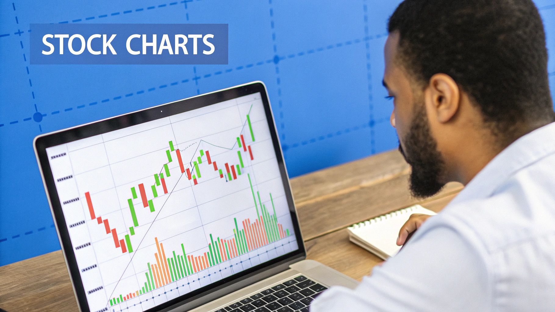
How to Analyze Stock Charts: Proven Techniques for Success
Mastering Stock Chart Fundamentals That Actually Work
Analyzing stock charts effectively relies on understanding the basic building blocks that influence market activity. This means learning about different chart types, understanding timeframes, and recognizing the important link between price and volume. These core elements are essential for developing more advanced analytical skills. Let's explore these fundamentals to give you the necessary tools for successful chart analysis.
Chart Types and Timeframes: A Foundation for Analysis
Knowing how to analyze stock charts begins with choosing the correct chart type. Line charts provide a straightforward look at closing prices, perfect for spotting long-term trends. Bar charts offer more granular detail, displaying the open, high, low, and close (OHLC) prices for each period. Candlestick charts, a popular choice among traders, visually show the same OHLC data but highlight the connection between opening and closing prices. The "body" of the candlestick is colored to indicate whether the stock closed higher (green/white) or lower (red/black) than its opening price.
Selecting the right timeframe is just as important. A daily chart tracks price changes over a single day, which is helpful for short-term traders. Long-term investors, on the other hand, might use weekly or monthly charts for a broader view of market trends. A day trader, for instance, could use a 5-minute chart to identify intraday price swings, whereas a swing trader might prefer a daily or weekly chart to spot trends lasting several days.
Price-Volume Relationship: The Truth Serum of the Market
Experienced traders know that price alone doesn't provide a complete understanding of market activity. Volume, the number of shares traded within a specific timeframe, is a crucial confirming indicator. High volume combined with a rising price indicates strong momentum, while low volume during a price drop can suggest weaker selling pressure. Together, price and volume offer a clearer view of market sentiment. For improving the efficiency of your chart analysis, consider the tips outlined in pull request best practices.
Historical Data: Context is Key
Understanding past price and volume data, particularly for significant market indices, is essential for effective analysis. The Dow Jones Industrial Average (DJIA), for example, offers a wealth of historical information. Technical analysts use this data to plot support and resistance levels, identify trend lines, and calculate moving averages. All of these provide insights into investor sentiment over time. Studying past market activity helps traders anticipate potential future price movements. This historical perspective enables better assessment of opportunities and risks, forming the basis for more informed trading strategies.
Technical Indicators That Actually Predict Price Movements
Analyzing stock charts effectively requires more than just understanding basic price action. To gain a real advantage, you need technical indicators. These tools help interpret price and volume data, providing valuable insights for anticipating potential market moves. Let's explore some powerful technical indicators and how they enhance chart analysis.
Moving Averages: Smoothing Out the Noise
Moving averages (MA) are fundamental to technical analysis. They calculate the average price over a specific period, smoothing out short-term fluctuations and revealing underlying trends. Commonly used MAs include the 50-day MA and the 200-day MA. A "golden cross" occurs when the shorter-term MA crosses above the longer-term MA, often signaling a bullish trend. Conversely, a "death cross" (short-term MA crossing below the long-term MA) can suggest a bearish trend.
To help you understand the different applications of various technical indicators, let's look at the following table:
Common Technical Indicators and Their Applications
| Indicator | Purpose | Best Used For | Reliability in Bull Market | Reliability in Bear Market | Lag Factor |
|---|---|---|---|---|---|
| Moving Average | Smooth out price fluctuations, identify trends | Trend identification, support/resistance | High | High | Moderate |
| Relative Strength Index (RSI) | Measure momentum, identify overbought/oversold conditions | Short-term trading, identifying potential reversals | Moderate | Moderate | Low |
| MACD | Identify trend changes, momentum shifts | Trend confirmation, divergence analysis | High | High | Moderate |
| Bollinger Bands | Measure volatility, identify overbought/oversold conditions | Volatility trading, breakout/pullback identification | Moderate | Moderate | Low |
This table summarizes the key applications and reliability of these indicators in different market conditions. Notice how each indicator provides different insights, making it valuable to combine them for a comprehensive analysis.
Relative Strength Index (RSI): Measuring Momentum
The Relative Strength Index (RSI) measures the speed and change of price movements. RSI oscillates between 0 and 100. Readings above 70 are generally considered overbought, suggesting a potential pullback. Readings below 30 are considered oversold, hinting at a potential rebound. Remember, strong trends can persist in overbought or oversold conditions.
MACD (Moving Average Convergence Divergence): Identifying Trend Changes
The MACD shows the relationship between two moving averages. It includes the MACD line, a signal line, and a histogram. Signal line crossovers, divergences between price and MACD, and centerline crossovers can provide valuable trading signals. A bullish crossover (MACD line crossing above the signal line) can indicate a potential uptrend.
Bollinger Bands: Gauging Volatility
Bollinger Bands plot standard deviations around a simple moving average to measure volatility. Touches of the upper band might signal overbought conditions, while touches of the lower band might signal oversold conditions. Bollinger Bands adjust to market conditions – widening during high volatility and narrowing during low volatility. Stock chart analysis often utilizes these indicators to help anticipate price movements. Platforms like StockCharts.com offer tools and visualizations for using these indicators effectively. You can find more detailed statistics here.
Candlestick Patterns: Visualizing Price Action
Candlestick charts visually represent price action over specific periods. The following infographic illustrates the relationship between candlestick patterns and bullish/bearish trends:
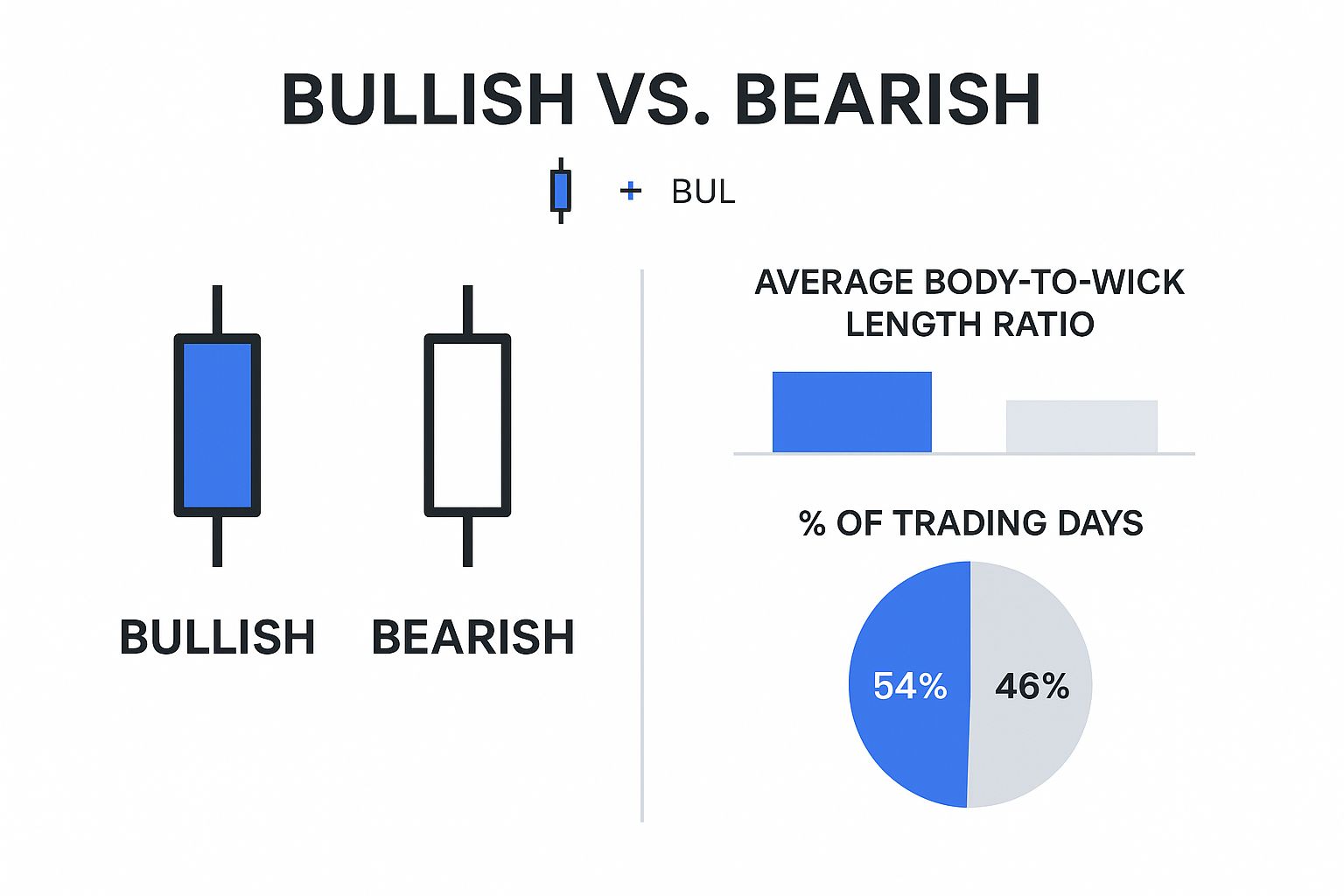
This infographic compares bullish and bearish candlestick patterns. Bullish candles tend to have longer bodies and shorter wicks, reflecting buying pressure. Bearish candles often have shorter bodies and longer wicks, indicating selling pressure. Understanding these visual cues aids effective chart analysis.
By understanding and combining these technical indicators, you can significantly improve your chart analysis and trading decisions. No indicator is perfect. It's crucial to use multiple indicators and other factors, like fundamental analysis and market sentiment, for a comprehensive market view.
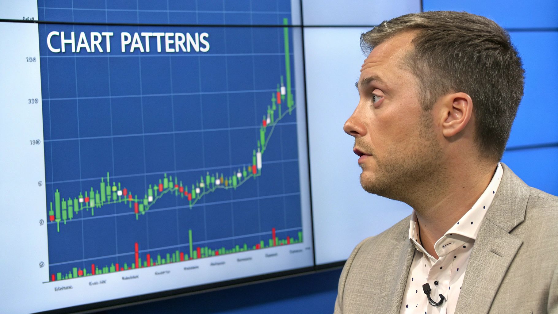
Decoding Chart Patterns That Signal Major Moves
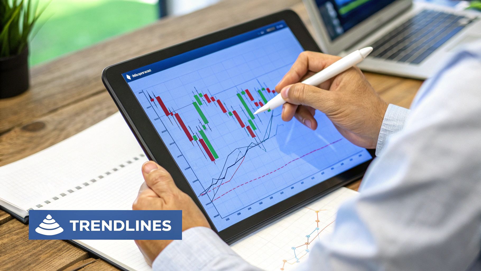
Chart patterns provide valuable insights into market sentiment and potential price action. Understanding these patterns is essential for traders who want to effectively analyze stock charts. This section explores common chart patterns, the psychology driving them, and how to use them to make informed trading decisions. For a deeper dive into technical analysis, check out this resource on mastering technical trading patterns.
Common Chart Patterns and Their Significance
Certain chart patterns frequently appear in various markets and across different timeframes. These recurring patterns reflect shifts in supply and demand, giving us clues about where prices might go next.
Some of the most common chart patterns include:
-
Head and Shoulders: This pattern often signals a reversal from a bullish trend to a bearish one. It features three peaks, with the middle peak (the "head") being the highest.
-
Double Tops and Bottoms: These patterns also suggest potential trend reversals. A double top, formed by two approximately equal highs, hints at a bearish reversal. A double bottom, with two similar lows, suggests a bullish reversal.
-
Triangles: Triangles indicate periods of consolidation, often preceding a breakout. They come in symmetrical, ascending, or descending variations, each with different implications for future price movements.
-
Cup and Handle: This bullish continuation pattern resembles its namesake – a cup with a handle. It indicates a pause in an uptrend before the price potentially continues its upward trajectory.
The Psychology Driving Chart Patterns
Chart patterns reflect the collective psychology of market participants. A head and shoulders pattern, for example, might form as initial bullishness fades, leading to a lower high (the right shoulder) and a subsequent drop below the neckline. Understanding this psychology is key to interpreting patterns accurately. When working with technical indicators, optimizing your information gathering can be beneficial. Exploring resources like these prompt engineering examples might offer valuable insights.
Beyond Identification: Probability, Targets, and Stop Losses
Identifying a pattern is just the first step. Traders also need to assess the probability of the pattern completing. Not all patterns result in the predicted price movement. Setting profit targets and stop losses, informed by volatility analysis, is vital for managing risk. For example, with a double top, a trader might place a profit target near the previous low and a stop loss just above the second peak.
Dealing with Pattern Failures
It's important to recognize that chart patterns can fail. Market conditions shift, potentially invalidating a previously identified pattern. Successful traders anticipate this and employ strategies to protect themselves. This could involve adjusting stop losses, reducing position size, or exiting the trade. By acknowledging the limitations of chart patterns and practicing sound risk management, traders improve their chances of success.
Volume Analysis: The Missing Piece in Your Trading Strategy
Chart patterns and technical indicators are valuable tools for any trader. However, volume analysis provides an additional layer of insight, revealing the true story behind price movements. Professional traders often call volume the market's "truth serum," as it can either validate or invalidate price signals. Let's explore the importance of volume and how it can strengthen your trading strategy.
Why Volume Matters: Confirming Price Action
Volume gives essential context to price changes. A price increase accompanied by high volume is typically a more reliable signal than a similar price increase with low volume. This is because high volume suggests strong conviction behind the move and wider market participation.
On the other hand, a price decrease on low volume might indicate a lack of selling pressure. This could potentially hint at a weakening downtrend. Grasping this price-volume relationship is crucial for effectively analyzing stock charts.
Volume Signatures: Spotting Institutional Activity
Volume analysis can also unveil the actions of institutional investors. These large players often move substantial blocks of shares, significantly impacting market trends. High volume during periods of accumulation (institutional buying) can signal an impending price rise.
Conversely, high volume during distribution (institutional selling) might foreshadow a price decline. Learning to interpret these volume signatures enables traders to anticipate potential market shifts before they appear in price action.
Volume Indicators: Adding Precision to Your Analysis
Specific volume indicators provide even more detailed information. On-Balance Volume (OBV) tracks cumulative volume based on price fluctuations. This helps identify divergences between price and volume, offering valuable clues about market sentiment.
The Volume Price Trend (VPT) weights volume by price changes to assess the strength of price trends. The Accumulation/Distribution Line (ADL) examines the relationship between the high, low, and close prices to evaluate buying and selling pressure. These tools, including those available on platforms like ChartsWatcher, offer unique perspectives beyond price action alone.
Incorporating Volume Analysis into Your Routine
Practical use is key. Begin by observing volume bars or candlesticks alongside price charts. Look for periods of unusually high or low volume and analyze their connection to price movements.
Experiment with volume indicators like OBV, VPT, and ADL. See how they behave under different market conditions. This hands-on approach will help you understand how volume interacts with price.
Debunking Volume Misconceptions
Many misunderstandings surround volume analysis. Some believe high volume always precedes a price surge, or that low volume indicates a weakening trend. However, volume needs to be interpreted alongside price action and other market elements.
For example, high volume during a downtrend could indicate capitulation, the final wave of selling before a potential reversal. Understanding these nuances and avoiding common traps will allow you to leverage volume analysis for smarter trading decisions. A personalized system that considers both price and volume is essential for stock market success.
Reading Charts When News Rocks The Market
Stock charts are dynamic, constantly reflecting real-world events that can significantly shift market sentiment. For successful trading, it's essential to understand how news influences these charts. This means analyzing the relationship between news, chart patterns, and trading volume. This knowledge helps traders interpret short-term price swings and spot emerging trends.
News Catalysts and Chart Patterns
Significant news events, such as economic announcements, unexpected earnings reports, or industry-specific developments, can be major catalysts. These events often create distinct patterns on stock charts. For example, a positive earnings surprise might cause a sudden price jump and higher trading volume, forming a breakout pattern.
Conversely, negative news can trigger a sharp price decline, potentially forming a bearish engulfing pattern. These real-time market reactions, visually represented on stock charts, offer valuable insights for traders. By understanding how news translates into chart patterns, traders can better anticipate potential price movements and make more informed trading decisions.
Let's delve into a real-world example. In early 2025, the US500 index rose by 63 points (+1.07%), reaching a peak of 6,152.87 in February. However, subsequent events, like the U.S. credit rating downgrade and escalating tariff tensions, introduced market volatility. This impacted share prices, as seen with Best Buy's 3% drop. More detailed statistics can be found at Trading Economics.
These events are meticulously plotted on charts, helping pinpoint breakouts or reversals. Combining chart pattern analysis with spikes in volume during these events helps anticipate potential future market movements.
Volatility vs. Trend Changes: The Role of Volume
It's crucial to distinguish between temporary, news-driven volatility and actual trend changes. Volume analysis is key to understanding this difference. A sharp price movement coupled with high volume might indicate a more substantial trend change. However, a similar price swing with low volume might suggest temporary, news-related volatility. Volume acts as a confirmation tool, helping traders filter out noise and identify meaningful market shifts.
Adapting Your Analysis to Market Regimes
Different market conditions require adjusted approaches to chart analysis. In low-volatility periods, markets may exhibit grinding price action, requiring patience and precision when identifying subtle chart patterns.
High-volatility corrections, however, call for a different tactic. Focusing on broader trend lines and support/resistance levels becomes more effective than relying on short-term indicators.
To illustrate the interaction between market events, chart patterns, and related indicators, consider the following table:
Market Event Impact on Chart Patterns
This table presents statistical data demonstrating how different market events typically impact chart patterns and technical indicators.
| Event Type | Typical Chart Pattern | Volume Reaction | Indicator Response | Average Duration of Impact |
|---|---|---|---|---|
| Positive Earnings Surprise | Breakout, Flag | Increase | RSI Increase, MACD Crossover | 1-2 Weeks |
| Negative Earnings Surprise | Bearish Engulfing, Head and Shoulders | Increase | RSI Decrease, MACD Crossover | 2-4 Weeks |
| Major Product Recall | Gap Down, Descending Triangle | Sharp Increase | RSI Decrease, Increased Volatility | 1-3 Months |
| FDA Approval (Pharmaceutical) | Gap Up, Ascending Triangle | Increase | RSI Increase, Positive Momentum | 2-6 Months |
| Merger Announcement | Consolidation, Breakout | Moderate Increase | Increased Volatility, Potential Trend Change | 3-6 Months |
This data highlights how various market events can lead to specific chart patterns and influence technical indicators. The duration of impact varies depending on the event’s significance and market conditions.
Practical Examples: News in Action
Imagine a pharmaceutical company announces FDA approval for a new drug. This positive news could trigger a substantial price jump and increased trading volume, forming a bullish flag pattern. Traders recognizing this pattern might enter long positions, anticipating further gains.
Conversely, negative news, such as a product recall, might lead to a sharp price drop and high volume, potentially creating a head and shoulders pattern. Traders observing this might consider short positions or exiting existing long holdings. These scenarios demonstrate how understanding the link between news and chart patterns can empower traders.
Building Your Personalized Chart Analysis System
The most successful traders understand that a one-size-fits-all approach to chart analysis simply doesn't work. They develop personalized systems tailored to their own trading style, risk tolerance, and the time they can dedicate to the market. This section will guide you through building a system that works for you. You might find this helpful: How to customize stock charts for smarter trading strategies.
Choosing The Right Timeframes
The timeframe you select has a significant impact on your analysis. Day traders, focused on short-term price movements, may use 1-minute or 5-minute charts. Swing traders, who hold positions for several days or weeks, might opt for daily or weekly charts. Finally, position traders, aiming for long-term trends, might use weekly or monthly charts. The key is to select a timeframe that aligns with your trading goals.
Selecting Indicators That Complement Your Style
Different indicators provide different insights. The Relative Strength Index (RSI), for example, is excellent for measuring momentum. Bollinger Bands are better suited for understanding volatility. Experiment to find the indicators that best suit your trading style. You can also combine indicators. A day trader, for example, might combine the RSI and the Moving Average Convergence Divergence (MACD) to identify entry and exit points.
Establishing A Consistent Routine
Emotional decisions can be detrimental to trading success. A consistent routine helps remove impulsive actions. This includes setting aside dedicated time for analysis, following a pre-defined checklist, and sticking to your trading plan. This discipline helps ensure objective market analysis and strategy-based trades.
Examples of Complete Chart Analysis Systems
Let's look at a few examples of how these principles can be applied:
-
Day Trader System: A day trader might use a 5-minute chart with the RSI and MACD indicators, focusing on short-term price swings within the day's trading session. Their primary goal is capturing quick profits.
-
Swing Trader System: A swing trader might use a daily chart with moving averages and Bollinger Bands, looking for trends that last several days or weeks. Their focus is identifying breakouts or pullbacks within those trends.
-
Position Trader System: A position trader might analyze a weekly chart using long-term moving averages and fundamental analysis. Their goal is to capitalize on major trend shifts lasting months or even years.
These examples demonstrate the diverse ways chart analysis systems can be constructed. The underlying principle is aligning your tools and techniques with your trading objectives.
Backtesting and Refinement
Backtesting your system is essential for evaluating its historical performance. It’s important to avoid statistical biases that can lead to overconfidence. Use a large dataset and account for various market conditions.
Continuous refinement is crucial. Regularly review your system's performance and adjust your indicators, timeframes, or trading rules based on your findings. Market conditions are constantly changing. A dynamic approach is essential for sustained success. Honest self-assessment and a willingness to adapt are vital for any trader.
Start building your personalized chart analysis system today for more informed trading decisions. Unlock the potential of real-time data and customizable charts with ChartsWatcher. Explore ChartsWatcher and elevate your trading game.
