How to Read Stock Market Charts: A Quick Guide
Decoding the Language of Stock Market Charts
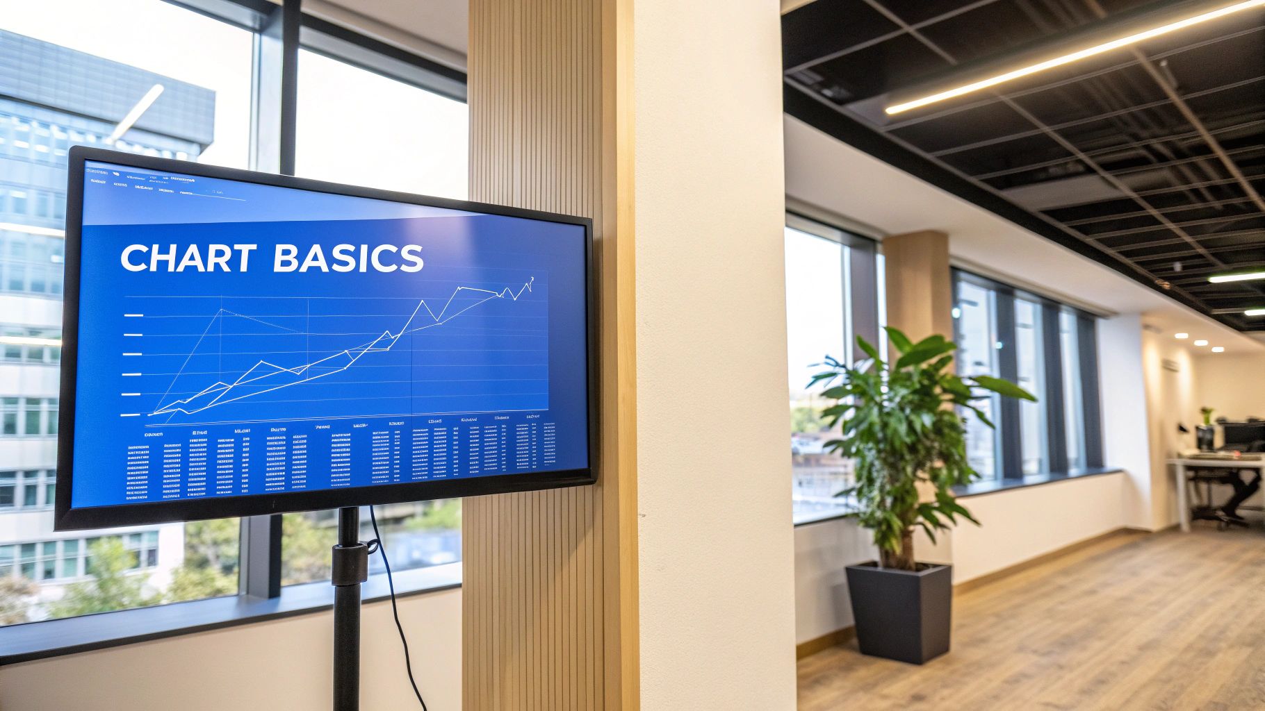
Learning to read stock market charts is a vital skill for every investor. These charts aren't just random lines; they visually represent a stock's price history and trading activity. This data helps investors make informed choices, anticipate future price changes, and manage investments strategically. Understanding these charts provides insights into market sentiment and potential investment opportunities.
Types of Stock Charts
Investors use various chart types to analyze stock market data. Three common types are line charts, bar charts, and candlestick charts. Each offers a unique view of price fluctuations.
A line chart connects the closing prices over time, providing a clear picture of overall trends.
Bar charts display the opening, closing, high, and low prices for each period. This lets traders see the price range within a specific timeframe.
Candlestick charts visually represent the same data as bar charts, but use colors to show if the closing price was higher or lower than the opening price. This helps quickly spot potential price reversals.
Understanding Chart Timeframes and Scales
Understanding different timeframes and scales is crucial for reading stock charts. The timeframe is the length of time each data point represents, ranging from minutes to years.
Shorter timeframes, such as intraday charts, show detailed price action, beneficial for day traders. Longer timeframes, like weekly or monthly charts, are better for long-term investors. Each timeframe helps identify short-term momentum versus long-term trends.
The price scale also matters. A linear scale displays price changes in equal increments, while a logarithmic scale displays percentage changes. Logarithmic scales are helpful for viewing large price swings over extended periods. The right scale helps identify patterns and trends. You might be interested in: How to master stock charts.
The Importance of Volume
Volume, the number of shares traded during a given time, is key to understanding stock charts. High volume often confirms price movements, showing strong interest in a stock. Low volume may mean a price move isn't sustainable.
To effectively read stock charts, understanding key patterns like the Golden Cross and Death Cross is vital. The Golden Cross, where the 50-day moving average crosses above the 200-day moving average, often signals a bullish trend. The Death Cross, the opposite, suggests a bearish outlook.
For example, if Apple shows a Golden Cross, it could lead to a sustained uptrend. Apple's late 2019 surge after a Golden Cross, with an 85% increase over the following year, illustrates this. This pattern is especially helpful for investors. Learn more about interpreting stock charts here: NerdWallet's guide to stock charts.
To further illustrate the differences between various stock chart types, let's examine the following comparison:
Comparison of Stock Chart Types This table compares different types of stock charts and their specific use cases for investors.
| Chart Type | Best Used For | Level of Detail | Beginner Friendly |
|---|---|---|---|
| Line Chart | Identifying long-term trends | Low | Yes |
| Bar Chart | Analyzing daily or weekly price changes | Medium | Yes |
| Candlestick Chart | Spotting potential reversals and patterns | High | No |
As shown in the table, line charts offer a simple, beginner-friendly way to visualize trends. Bar charts provide more detail, suitable for shorter-term analysis. Candlestick charts, with their complex patterns, are best for experienced traders. Choosing the right chart depends on your investment style and goals.
Mastering Support and Resistance: Where Smart Money Acts
Understanding stock market charts relies heavily on grasping support and resistance levels. These aren't simply lines; they represent vital price points where supply and demand clash. Think of them as psychological battlegrounds where buying and selling pressure meet, influencing how prices move. Mastering these levels can significantly improve your ability to interpret market dynamics and make smarter investment choices.
Identifying Key Support and Resistance Levels
Pinpointing significant support and resistance levels is crucial for successful chart analysis. Strong support indicates where many buyers are willing to purchase a stock, preventing further price drops. Conversely, strong resistance shows where numerous sellers are likely to enter the market, stopping further price increases.
-
Horizontal Levels: Look for horizontal lines where the price has bounced multiple times, either up (support) or down (resistance). The more often the price respects these lines, the stronger the support or resistance.
-
Trendlines: In an uptrend, a trendline connecting rising lows acts as support. In a downtrend, a trendline connecting falling highs acts as resistance.
-
Round Numbers: Prices often pause or reverse at round numbers like $10, $50, or $100 because of their psychological impact. Traders often place orders at these levels, creating natural barriers.
Why Volume Matters at Support and Resistance
Identifying these levels is key, but the volume traded at these points is equally important. High volume during a bounce off support confirms strong buying pressure. High volume at resistance indicates strong selling pressure. Volume shows the conviction behind price changes.
For example, consider a stock approaching resistance. If volume is low as the price stalls, it suggests weak selling pressure and a greater chance of a breakout. Conversely, high volume at resistance indicates strong selling pressure, making a breakout less likely.
Support Becomes Resistance, and Vice Versa
A key concept is the role reversal of support and resistance. A broken significant support level often becomes a resistance level. Similarly, a broken resistance level often transforms into support. This happens because traders who bought at the previous support now see the broken level as a point to exit losing positions, creating selling pressure.
Using Support and Resistance for Trading Decisions
Support and resistance levels offer valuable insights for trading decisions. Traders often use these levels to:
- Identify Entry Points: Buy near support with high volume confirmation, anticipating a price bounce.
- Set Stop-Loss Orders: Place stop-loss orders just below support to limit potential losses if the price falls.
- Determine Profit Targets: Set profit targets near resistance, expecting the price to stall or reverse.
Understanding stock market charts through support and resistance helps identify trading opportunities and manage risk. These levels provide a framework for understanding price action and making more informed investment decisions. They help anticipate potential turning points and identify levels where the risk-reward ratio is favorable. Explore this further: Schwab's guide on support and resistance.
Spotting High-Probability Chart Patterns That Actually Work
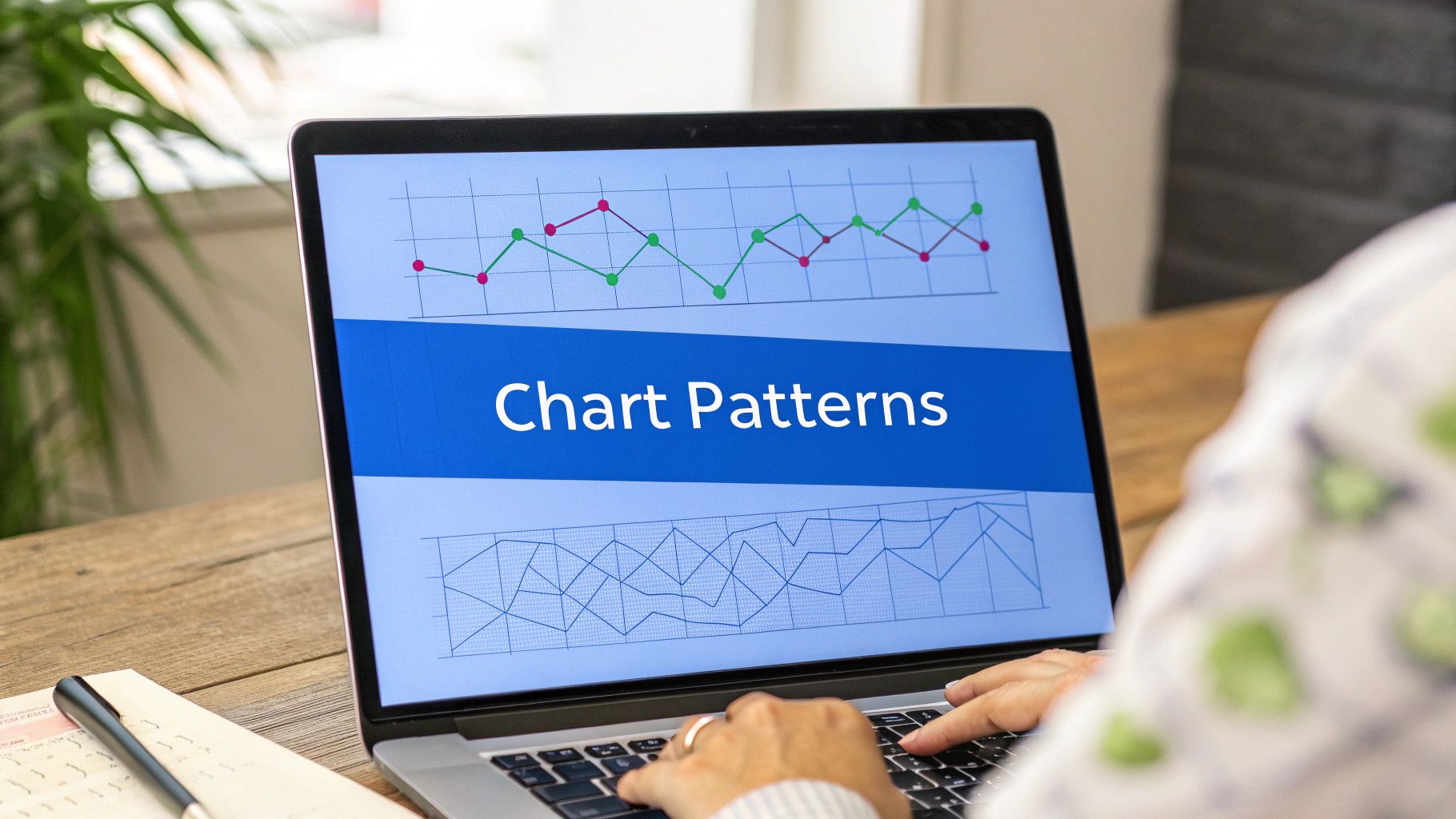
Not all chart patterns offer the same potential. This section focuses on high-probability patterns that can give you a real advantage in the stock market. We'll delve into reading stock charts, recognizing key patterns, and understanding what they mean for your trading strategies.
Head and Shoulders, Double Tops and Bottoms
The head and shoulders pattern, true to its name, often signals a shift in trend. The "head" is a high point, exceeding the two surrounding "shoulders." A drop below the "neckline" (the line connecting the lows between the head and shoulders) confirms this bearish reversal.
Conversely, an inverse head and shoulders pattern, where the head is a low point beneath the two shoulders, suggests a bullish reversal.
Double tops and bottoms are also strong indicators of potential trend changes. A double top, formed when the price hits resistance twice at roughly the same level, suggests a bearish turn. A double bottom, with two similar lows, often signals a bullish turn. These patterns reveal a weakening of the previous trend.
Flag Patterns and Their Significance
Flag patterns represent short-term continuation patterns. Visually, they resemble flags on poles, signifying a brief pause in a strong trend. Bullish flags appear in uptrends, while bearish flags appear in downtrends.
These patterns often provide excellent entry points for traders looking to capitalize on an established trend.
Measuring Pattern Reliability and Setting Price Targets
For successful trading, understanding pattern reliability and setting price targets is essential. Several factors influence a pattern's reliability:
- Clear pattern formation: Well-defined peaks and troughs lend credibility to the pattern.
- High trading volume: Strong volume during pattern formation and breakout reinforces the signal.
- Confirmation from other indicators: Alignment with other technical indicators, such as the Relative Strength Index (RSI), strengthens the signal.
For instance, a head and shoulders pattern with strong volume during the head's formation and a significant break below the neckline (accompanied by increased volume) is considered highly reliable. Bearish divergence in the RSI further validates this pattern.
Traders frequently use the distance between the head and neckline in a head and shoulders pattern to project potential price targets. This distance is projected downwards from the neckline breakout point. Similar methods apply to other patterns.
Stop-Loss Levels and Market Conditions
Stop-loss levels are crucial for managing risk. Traders generally place stop-loss orders just outside the pattern to limit potential losses if the anticipated move doesn't materialize. In a head and shoulders pattern, the stop-loss would be positioned just above the neckline.
Market conditions greatly influence pattern reliability. High volatility can reduce pattern reliability due to increased price fluctuations or "noise." Therefore, understanding the overall market context strengthens chart pattern analysis.
To further illustrate the concepts discussed, let's examine a table summarizing common chart patterns:
Common Chart Patterns and Their Signals
This table summarizes the most important chart patterns, what they indicate, and their reliability levels.
| Pattern Name | Market Signal | Success Rate | Best Timeframe |
|---|---|---|---|
| Head and Shoulders | Bearish Reversal | 70-80% | Daily/Weekly |
| Inverse Head and Shoulders | Bullish Reversal | 70-80% | Daily/Weekly |
| Double Top | Bearish Reversal | 60-70% | Daily/Weekly |
| Double Bottom | Bullish Reversal | 60-70% | Daily/Weekly |
| Bullish Flag | Continuation (Uptrend) | 70-80% | Hourly/Daily |
| Bearish Flag | Continuation (Downtrend) | 70-80% | Hourly/Daily |
The success rates presented are estimates and can vary based on market conditions and individual trading setups. However, these patterns offer valuable insights into potential market direction.
Finally, pattern effectiveness varies across sectors and timeframes. For example, flag patterns are more prevalent in volatile sectors like technology, while head and shoulders patterns might be more common in established sectors like utilities. By grasping these patterns and their nuances, you can significantly improve your ability to interpret stock charts and identify high-probability trading opportunities. These patterns offer valuable insights into market sentiment, potential price direction, and favorable risk-reward scenarios, leading to more informed trading decisions.
Trading With Moving Averages: Beyond Basic Crossovers
Moving averages are essential tools for anyone learning how to read stock market charts. They smooth out the daily ups and downs of price action, helping to reveal the underlying trends and momentum of a stock. Many traders rely solely on basic moving average crossovers for their signals. However, experienced traders understand that moving averages can offer much more. They use them as dynamic support and resistance levels. Let's explore how you can incorporate this approach into your own trading.
Different Types of Moving Averages
There are three primary types of moving averages: simple, exponential, and weighted. A simple moving average (SMA) calculates the average price over a specified period. An exponential moving average (EMA) gives more weight to recent prices, making it more responsive to current market activity. A weighted moving average (WMA) assigns varying weights to each period, typically emphasizing the most recent prices. The type of moving average you choose depends on your individual trading style and the specific market conditions.
Choosing the Right Timeframe
The timeframe you select for your moving average significantly impacts the signals it generates. Shorter timeframes, like the 5-day or 10-day moving average, are very sensitive to short-term price fluctuations, making them suitable for day traders or swing traders. Longer timeframes, such as the 50-day, 100-day, or 200-day moving averages, are better suited for identifying longer-term trends and are generally preferred by long-term investors. The ideal timeframe will depend on your trading strategy and the specific stock you are analyzing.
Avoiding the Lag Problem
One common challenge with moving averages is lag. Since they are based on past price data, they react to price changes rather than predicting them. To address this issue, traders often use a combination of moving averages. For example, pairing a shorter-term moving average with a longer-term moving average can help confirm trend changes and potentially reduce the impact of lag.
Advanced Moving Average Strategies
Beyond simple crossovers, traders employ more sophisticated strategies to interpret stock market charts using moving averages. One such strategy is using moving average ribbons. This involves plotting multiple moving averages with different timeframes on the same chart, creating a visual representation of momentum. When the ribbons fan out, it suggests increasing momentum. Convergence, on the other hand, signals decreasing momentum and a possible trend change.
Another useful technique is identifying reversal zones. These are areas where multiple moving averages converge. These zones often represent high-probability areas for price reversals because they indicate a confluence of support or resistance.
Moving Averages as Dynamic Support and Resistance
Moving averages can function as dynamic support and resistance levels. During an uptrend, a rising moving average can act as support, while in a downtrend, a falling moving average can act as resistance. A break below a rising moving average might signal a weakening uptrend or a potential reversal. For example, if a stock breaks below its 200-day moving average on high volume, it could indicate a significant shift in market sentiment. Understanding this dynamic behavior of moving averages can be instrumental in improving your entry and exit strategies. By mastering these techniques, traders can move beyond simply identifying trends and begin pinpointing high-probability trading opportunities while managing risk. This ultimately strengthens their ability to effectively analyze and interpret stock market charts.
Unlocking the Truth Behind Price Movements With Volume
Volume is much more than just a number on a stock chart. It provides crucial insights, confirming the strength of price movements. Understanding volume alongside price action is key to accurately interpreting the market. It helps you determine if significant investors are involved or if price changes lack real support.
Professional traders rely heavily on volume confirmation before making important investment decisions. This section explores how to use volume analysis effectively.
Volume Divergences and Climactic Spikes
Volume divergences offer valuable clues. A bullish divergence forms when the price hits a lower low, but volume increases. This suggests growing buying pressure and a potential reversal. Conversely, a bearish divergence occurs when the price reaches a higher high, but volume decreases, indicating weakening demand.
Climactic volume spikes often signal exhaustion points in a trend. Exceptionally high volume with a significant price move can mean the move is ending. This occurs because most potential buyers or sellers have already acted.
Identifying Healthy Volume Patterns
Recognizing healthy volume patterns is essential for identifying sustainable trends. In an uptrend, volume should ideally increase on up days and decrease on down days, showing sustained buying interest.
The opposite is true for a downtrend. Increased volume on down days and decreased volume on up days confirms selling pressure and a strong downward trend.
Powerful Volume Indicators: On-Balance Volume and Volume Profile
Specific indicators offer even deeper insights. On-Balance Volume (OBV), a momentum indicator, tracks cumulative volume based on price changes. A rising OBV confirms a price uptrend, while a falling OBV confirms a downtrend. Divergences between OBV and price can also suggest reversals.
Volume Profile visually shows trading activity at various price levels. This reveals areas of high and low volume, pinpointing potential support and resistance. These patterns can indicate where large investors are accumulating or distributing shares, information not visible on standard charts.
Volume Behavior at Breakouts and Breakdowns
Volume patterns at breakouts and breakdowns are also telling. A breakout above resistance should ideally be on high volume, validating the move. A breakdown below support on high volume confirms the decline's strength.
Lower volume breakouts or breakdowns might signal false breakouts or false breakdowns, increasing the likelihood of a reversal.
Decreasing Volume During Price Advances: An Early Warning System
Declining volume during rising prices can be a warning sign. This often signals a weakening uptrend, meaning buying interest is waning. Even if the price continues upwards, lower volume raises doubts about its sustainability. Analyzing volume, not just price, is critical for effective chart interpretation.
Genuine Market Moves Versus Head-Fakes
By analyzing volume, traders can distinguish real moves from head-fakes, temporary price movements that appear like breakouts or breakdowns. Lack of volume often reveals these moves are not supported by strong conviction.
Experienced traders use this knowledge to avoid such traps and improve their accuracy. Filtering out false signals using volume is crucial for successful stock market navigation. Consider ChartsWatcher for advanced volume analysis and other key metrics. Explore their powerful tools to improve your chart reading and stay ahead of the market.
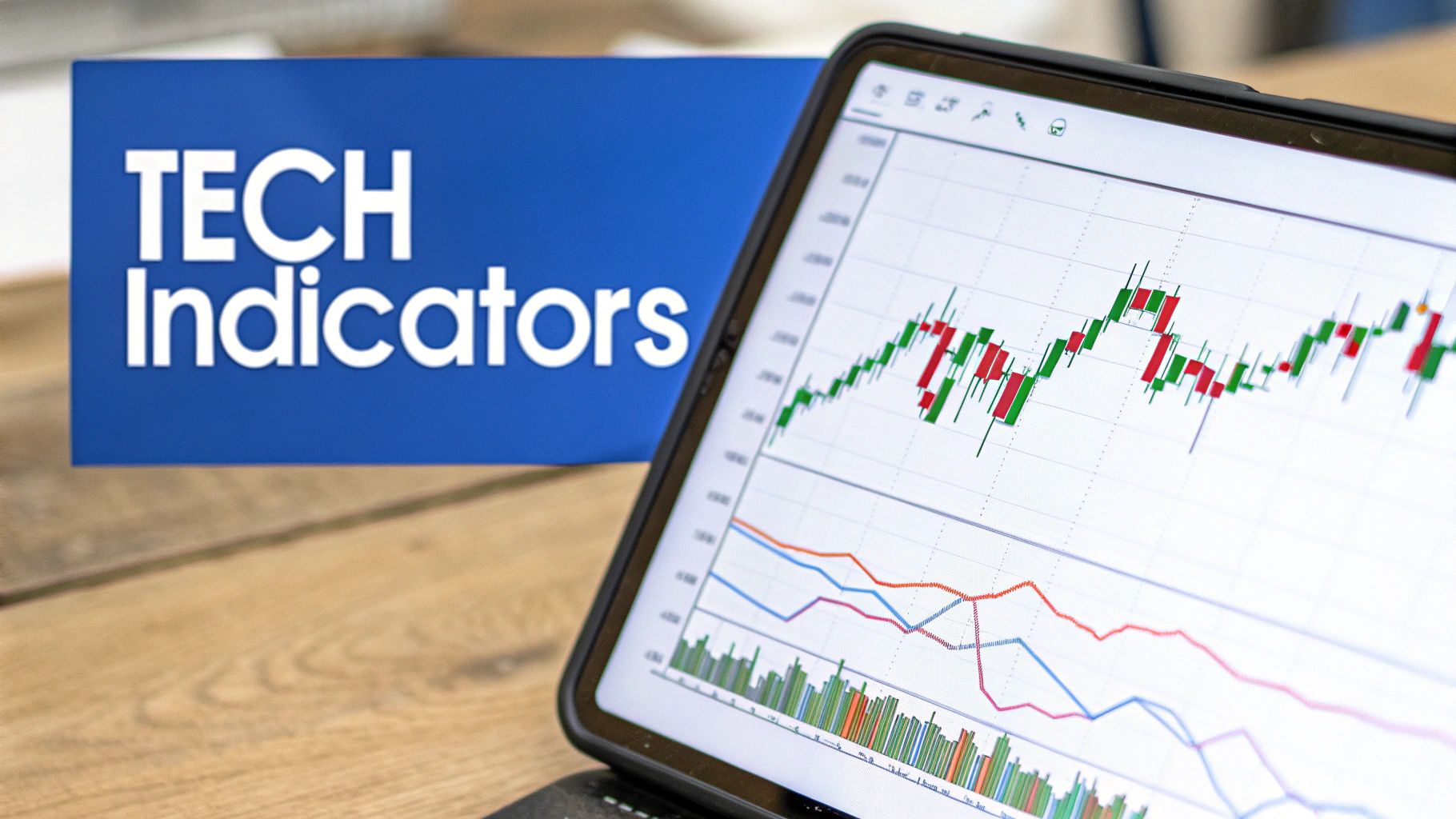
Selecting the Right Technical Indicators for Your Strategy
Technical indicators are tools that help traders and investors analyze stock market charts and predict future price movements. Using too many indicators, however, can be overwhelming. This section focuses on choosing the right technical indicators for your strategy, helping you interpret stock charts effectively without information overload.
Momentum Indicators: RSI and Stochastic
Momentum indicators help identify overbought and oversold conditions. The Relative Strength Index (RSI) and Stochastic Oscillator are two popular examples. Both oscillate between 0 and 100. Readings above 70 generally suggest an asset is overbought, while readings below 30 indicate it’s oversold. This could signal a price reversal.
Keep in mind that during strong trends, these indicators can remain in overbought or oversold territory for extended periods. Considering the broader market context is vital. For example, during a strong uptrend, the RSI might stay above 70 for several days or weeks without a significant price correction.
Divergences: A Powerful Warning Sign
Divergences between price and indicators can warn of major reversals. A bearish divergence forms when the price reaches a higher high, but the indicator makes a lower high. This suggests weakening momentum, potentially leading to a downtrend. A bullish divergence is the opposite: a lower low in price, but a higher low in the indicator, hinting at upward momentum. These divergences offer valuable insights into a trend’s strength.
Combining Leading and Lagging Indicators
Leading indicators attempt to predict future price action. Lagging indicators confirm established trends. Using both types can improve trading accuracy. For example, a leading indicator might suggest a price increase. A lagging indicator, like a moving average crossover, can confirm the trend once it begins. Learn more about this with resources like How to master technical analysis indicators.
Customizing Indicator Settings
Standard indicator settings, like the default 14-period RSI, aren’t always ideal. Customizing indicator settings can improve their effectiveness. A shorter-period RSI (e.g., 7-period) is more sensitive to short-term fluctuations. A longer-period RSI (e.g., 21-period) is better for identifying longer-term trends. Experiment to find what works best for your trading style.
Avoiding Analysis Paralysis: A Streamlined Approach
While indicators are powerful, too many can lead to analysis paralysis. A streamlined approach with a few key, non-redundant indicators is often more effective. Choose indicators that complement each other and provide distinct market perspectives. For example, pairing the RSI with a volume indicator like On-Balance Volume (OBV) offers a more complete view of market momentum and participation. Focusing on quality over quantity clarifies the market picture, leading to more informed trading decisions.
Building Your Chart Analysis System: From Theory to Action

This section helps you transition from understanding individual chart components to using them systematically. We'll build a practical, step-by-step framework for reading stock market charts, a process employed by successful traders to interpret market data.
Assessing Multiple Timeframes Systematically
Analyzing across different timeframes offers a more comprehensive market view. Start with a longer-term chart, such as weekly or monthly, to determine the overall dominant trend. This sets the stage for your analysis.
Then, shift to a shorter-term chart, like daily or hourly, to pinpoint entry and exit points. For example, if the weekly chart indicates an uptrend, concentrate on buying opportunities on the daily chart during pullbacks to support levels.
Identifying the Dominant Trend
Recognizing the dominant trend is key for successful trading. This involves connecting higher highs and higher lows in an uptrend, or lower highs and lower lows in a downtrend. Trendlines are frequently used to visualize this movement.
The dominant trend on the higher timeframe chart should guide your shorter-term decisions. This keeps your trades aligned with the broader market direction.
Locating Key Support and Resistance
Finding support and resistance levels is vital for identifying potential entry and exit points. These levels act as price barriers. They can be identified with horizontal lines, trendlines, or even psychological levels like round numbers.
For instance, past highs and lows often function as resistance and support, respectively. This provides a structure for anticipating price action.
Recognizing Actionable Patterns
Understanding chart patterns greatly improves your ability to read stock market charts. These patterns, such as head and shoulders, double tops/bottoms, and flags, offer clues about potential future price movements.
Recognizing these patterns helps you anticipate reversals or continuations, allowing you to enter trades with a statistical advantage.
Confirming Analysis With Indicators
Technical indicators, like the Relative Strength Index (RSI), Moving Average Convergence Divergence (MACD), or moving averages, can validate your analysis. These indicators should not be used alone, but as confirmation tools.
For example, if you see a bullish pattern, look for supporting signals like a rising RSI or a bullish moving average crossover. This reinforces your analysis.
Developing a Pre-Trade Checklist
A pre-trade checklist encourages discipline and consistency. Your checklist should include questions about:
- Dominant trend
- Support/resistance levels
- Pattern identification
- Indicator confirmation
- Risk management parameters
This methodical approach minimizes emotional decision-making and promotes rational trades based on your analysis.
Prioritizing Conflicting Signals
Occasionally, you'll encounter conflicting signals. It's crucial to prioritize them effectively. The higher timeframe trend typically carries more weight.
Also, consider the strength and confluence of various indicators. For example, multiple indicators pointing in the same direction are more significant than a single conflicting indicator. This helps filter noise and focus on the strongest signals.
Translating Analysis into Trade Parameters
Chart analysis ultimately informs trade decisions. This includes defining entry and exit points, setting stop-loss levels, and calculating position size based on your risk tolerance.
For instance, if buying near support, your stop-loss might be placed just below that support level, while your target price could be near a resistance level. This aligns your trade management with your analysis.
By applying this structured approach, you can transform your knowledge of chart components into a robust process for making informed trading decisions. This fosters consistency, minimizes emotional bias, and strengthens your ability to read stock market charts effectively.
Ready to improve your stock market analysis? ChartsWatcher offers a comprehensive suite of tools to help you master chart reading and identify profitable opportunities. Visit ChartsWatcher today and explore the potential of dynamic chart analysis.
