How to Read Stock Charts for Beginners: A Simple Guide
When you pull up a stock chart for the very first time, it can look like an intimidating mess of lines and colors. But don't worry. Learning how to read stock charts is really just about understanding two simple things: price movement over a specific time.
Every chart, at its heart, tells a story about the constant battle between buyers and sellers. The different chart styles are just different ways of visualizing that story.
Your First Look at Stock Charts
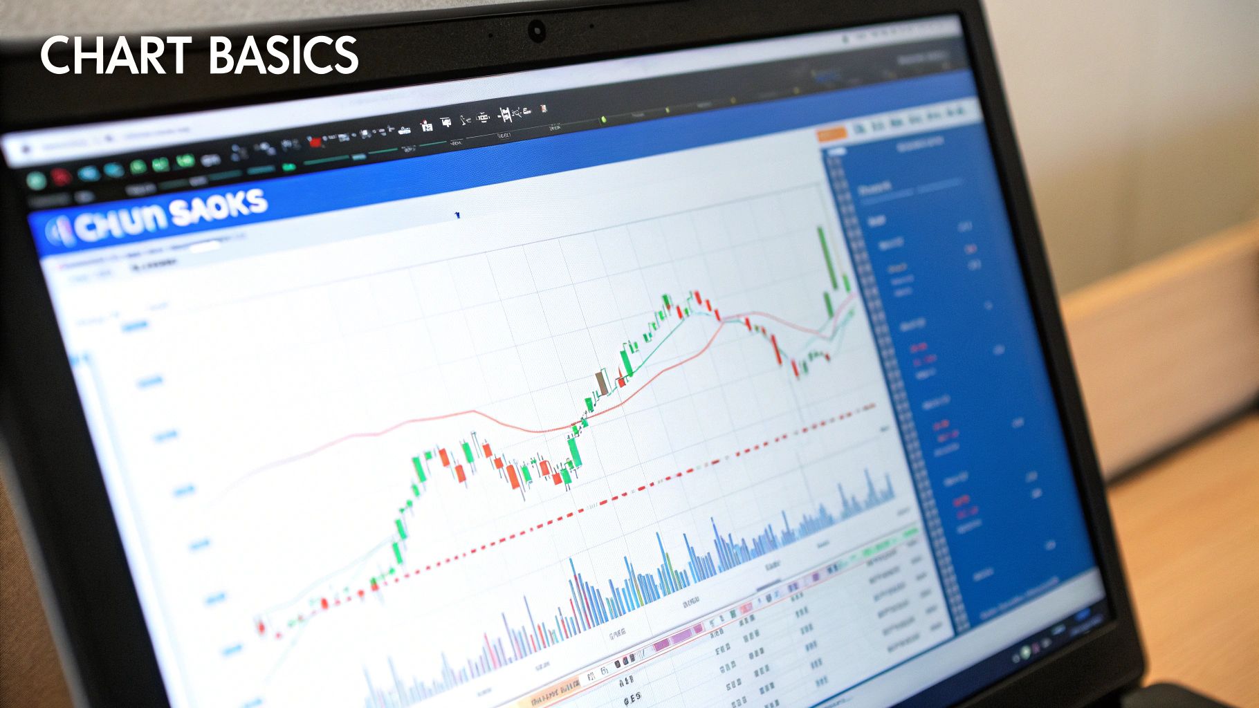
Think of a stock chart like a basic map. The vertical line (y-axis) shows the stock's price, while the horizontal line (x-axis) shows time. That timeframe can be as short as one minute for a day trader or stretch across decades for a long-term investor.
Your first step is to get comfortable with the most common ways this price-and-time data is shown. While countless chart types exist, nearly everyone starts with three fundamental styles. Each one tells a slightly different story, and knowing which one to use is a crucial skill for any new investor.
The Three Main Chart Types
For new investors, the most important thing is to grasp what each chart type shows and when to use it. The three you'll see everywhere are line charts, bar charts, and candlestick charts. Each builds on the last, adding more detail and context to the price action.
To help you get started, here's a quick comparison of what makes each chart type unique.
| Comparing Common Chart Types for Beginners | | :--- | :--- | :--- | | Chart Type | What It Shows | Best For | | Line Chart | A single line connecting the closing prices over a period. | Getting a quick, big-picture view of the overall trend. Simple and clean. | | Bar Chart (OHLC) | Four key prices for each period: the open, high, low, and close. | Assessing a period's price range and volatility at a glance. | | Candlestick Chart | The same OHLC data as a bar chart, but with a color-coded "body." | Quickly seeing the battle between buyers (bulls) and sellers (bears). The most popular choice for active traders. |
Let's use an analogy to make these concepts stick.
- Line Chart: This is like the simple route on a GPS map. It just connects the dots (the closing prices) to give you the most direct overview of where a stock's price has gone. It's perfect for a quick check on the general trend.
- Bar Chart (OHLC): This is more like looking at a full weather report for the day. It doesn’t just tell you the temperature when you went to bed; it shows the day's high, the low, and where the temperature started and finished. This gives you a much better sense of the day's volatility.
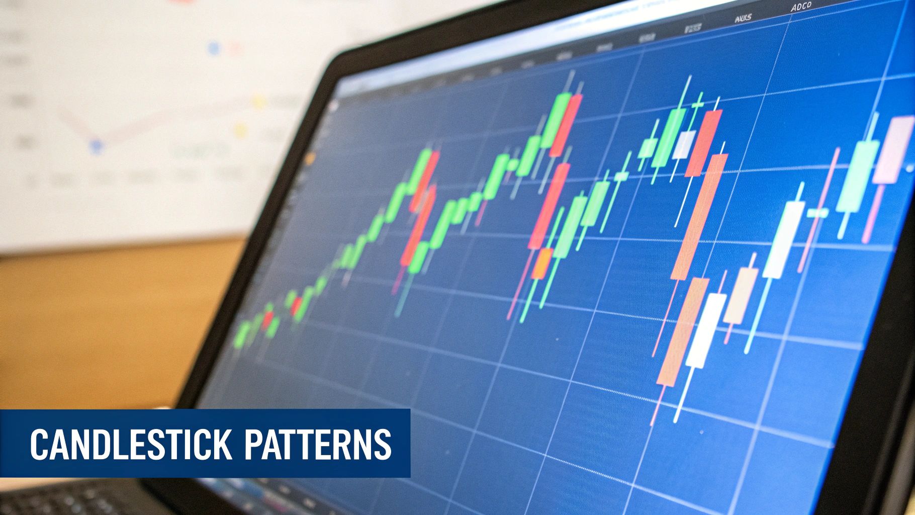
- Candlestick Chart: This is the most popular style for a reason. It’s like a short, dramatic story about the trading day. The color and shape of the "candle" instantly show you the power struggle between buyers (bulls) and sellers (bears). A green candle usually means buyers won the day, while a red one means sellers were in control.
Key Takeaway: You don't need to master every chart type right away. Start with the line chart to see the big picture. Once you're comfortable, move on to candlestick charts, which we'll cover in more detail later. They provide the most information in the most easily digestible format.
Right now, don't get bogged down with complex indicators or drawing tools. The goal is to build a solid foundation by simply understanding what each chart is telling you. Once you have these basics down, you are well on your way. For a deeper look at these fundamentals, you can check out our complete guide for beginner investors.
Decoding the Language of Candlestick Charts
While line charts give you a basic, birds-eye view of price movement, most active traders I know live and breathe by candlestick charts. There's a good reason for this: each candle tells a rich, visual story about the battle between buyers and sellers in a specific time frame.
Honestly, learning to analyze stock charts with proven techniques for success really starts here. Mastering the language of candles is a foundational skill.
Think of every candle as a quick snapshot of market sentiment. Its shape and color instantly tell you who was in control—the buyers (bulls) pushing prices up, or the sellers (bears) driving them down. When you understand what each part means, you stop just seeing prices and start interpreting market psychology.
Anatomy of a Single Candlestick
Every single candlestick has two main parts: the body and the wicks (some people call them shadows). Together, these parts show you four critical pieces of information for any period: the open, high, low, and close prices (OHLC).
-
The Body: This is the thick, rectangular part. It shows you the price range between where the stock opened and where it closed. The color is the most important clue. Typically, green means the close was higher than the open (a win for the bulls). Red means the close was lower than the open (a win for the bears). A long body means there was strong, decisive pressure in one direction.
-
The Wicks: These are the thin lines that stick out from the top and bottom of the body. The very top of the upper wick marks the highest price the stock hit during that period, and the bottom of the lower wick shows the lowest price. Long wicks are a big tell for volatility and indecision, showing that the price traveled a long way from where it opened and closed.
Let me paint a picture. Imagine you see a long green candle with tiny wicks. The story is simple: buyers took control right from the start and barely let go, closing near the high. Now, picture a small red body with long wicks sticking out both ways. That’s the story of a fierce but messy battle that ended in a stalemate.
Key Insight: The real story is in the relationship between the body and the wicks. A small body with long wicks screams indecision. A long body with small wicks signals a clear victory for either the buyers or sellers.
Foundational Candlestick Patterns for Beginners
You don’t need to go out and memorize hundreds of patterns with weird names. Seriously, don't. A better approach is to understand the psychology behind a few core patterns that often pop up at important moments.
These patterns are powerful because they can signal a potential reversal in the current trend. Let's look at two of the most common single-candle patterns.
The Hammer (Bullish Reversal)
- Appearance: It looks just like a hammer—a small body at the top with a long lower wick and almost no upper wick.
- Psychology: This pattern shows up during a downtrend. It tells us that sellers tried their best to push the price way down (creating that long lower wick). But then, the buyers came storming back with enough force to push the price all the way back up to close near where it opened. This sudden shift in power shows that buying pressure is building and the downtrend might be running out of gas.
The Shooting Star (Bearish Reversal)
- Appearance: This is the exact opposite of a Hammer. It has a small body at the bottom, a long upper wick, and little to no lower wick.
- Psychology: This pattern tends to form during an uptrend. It’s a story of buyers trying to push the price higher (creating the long upper wick), only to get completely overpowered by sellers who slammed the price back down to close near the open. This is a clear warning sign that sellers are gaining strength and the uptrend could be in trouble.
Learning to spot these patterns is a great first step, but remember that context is everything. A Hammer pattern appearing right at a major support level is far more meaningful than one showing up in the middle of a choppy, random price range.
Your goal isn't to become a walking encyclopedia of candlestick patterns. It's to learn how to read the story of supply and demand that each candle tells. This skill is absolutely fundamental to making sense of market behavior and making better, more informed trading decisions.
Identifying Trends, Support, and Resistance
Once you've got a handle on what individual candlesticks are telling you, it's time to zoom out and look at the bigger picture. Prices almost never move in a straight line. They flow in waves, creating trends that you can actually see on a chart. Learning to spot these trends is like checking which way the river is flowing before you put your boat in the water—it's that fundamental.
This isn't some new-age idea. The concept goes back over a century to Charles Dow, the founder of the Dow Jones Industrial Average. He was one of the first to argue that price movements weren't just random noise but followed distinct patterns. Modern technical analysis builds directly on his work, though now we have powerful tools like Yahoo Finance that let us analyze charts across any timeframe imaginable. To get a deeper dive into the history and application of technical analysis, this YouTube video is a great resource.
On just about any stock chart you pull up, you’ll find one of three primary trends playing out:
- Uptrend: This is what you see when a stock is making a series of “higher highs” and “higher lows.” Every peak is higher than the last one, and every dip (or trough) is also higher than the one before it. It’s a clear signal that buyers are in the driver's seat.
- Downtrend: The polar opposite. Here, the chart shows a pattern of “lower highs” and “lower lows.” Each rally fails to reach the previous peak, and each sell-off pushes the price to a new low. This is a sign of seller dominance.
- Sideways Trend (Consolidation): The price just bounces around in a defined range, not making significant progress up or down. The highs and lows are roughly at the same levels. This shows a market in balance, where neither buyers nor sellers have the upper hand.
Drawing Your First Trendlines
The easiest way to make these trends pop off the screen is by drawing trendlines. For an uptrend, you simply connect at least two of the major "higher lows" with a line. For a downtrend, you connect at least two of the "lower highs."
Think of these lines as guardrails for the price. As long as the stock price stays above an uptrend line or below a downtrend line, that trend is considered active. When the price breaks through one of these lines, it can be a huge clue that the trend is about to change course.
The Psychology of Support and Resistance
Nested within these broader trends are two of the most critical concepts in all of trading: support and resistance. These aren't just random lines on a chart; they are psychological battlegrounds created by the collective memory and actions of everyone in the market.
-
Support: This is a price level where selling pressure tends to dry up and buyers step in, causing a falling price to pause or reverse. Think of it as a floor that the stock has a hard time breaking through. When the price nears a support level, traders who missed the last move see it as a bargain, while sellers get nervous and hold off. This influx of demand often causes the price to bounce.
-
Resistance: This is the ceiling—a price level where an uptrend often stalls out as sellers emerge in force. As the price approaches a resistance zone, traders who bought lower start taking profits, and new buyers become hesitant to chase it higher. This wave of supply can stop a rally in its tracks and push the price back down.
Trader's Tip: Think of support and resistance as zones, not exact price points. A stock might dip a little below a support level or poke its head above resistance before turning around. Don't get fixated on a single number; always look at the entire area.
Imagine a stock has dropped to around $50 multiple times, only to bounce back up each time. That $50 level has now become a psychological floor—a support level. Traders remember this. The next time the price approaches $50, they’ll be ready to buy, reinforcing that level. The more times a level is tested and holds, the stronger it becomes.
What’s really fascinating is what happens when these levels break. Once a strong support level is decisively broken, it often flips and becomes the new resistance level. The same is true in reverse: a broken resistance level frequently becomes the new support. This role reversal is pure market psychology. The price level that was once seen as a floor to buy at is now viewed as a ceiling to sell at.
Using Volume and Indicators to Confirm Your Ideas
So, you've spotted a trend or a promising candlestick pattern. That's a great first step, but the best traders I know never stop there. They always hunt for confirmation.
A price move on its own is just one piece of the puzzle. To really trust what you’re seeing on the chart, you need to layer in other tools that measure the conviction behind that move. Is there real money and momentum driving it, or is it just market noise?
This is where you bring in volume and technical indicators. Think of them as your expert second opinion. They help you separate a real market shift from a deceptive blip, giving you a much stronger foundation for your trading decisions.
Volume: The Fuel Behind the Trend
Picture this: volume is the fuel in a car's engine. The price is the car, but volume is what gives it the power to move with purpose. It’s simply the total number of shares traded over a set time and usually appears as vertical bars at the bottom of your chart.
A price breakout from a key level is interesting. But a breakout on high volume? Now that's compelling.
High volume tells you that a ton of traders are piling in, showing strong agreement and interest in the new price. On the flip side, a big price move on weak, low volume is a huge red flag. It’s often a sign of a "fakeout" that's likely to reverse. This is especially true when major corporate news or market events are happening—strong volume shows genuine interest and liquidity. You can find more tips on this from resources like Nerdwallet.com's guide to interpreting stock data.
A Trader's Rule of Thumb: Be extremely skeptical of any big price move that isn't backed by a big spike in volume. It’s one of the clearest signs that the move might not have the legs to continue.
Introducing Your First Two Indicators
Walk into the world of indicators, and you'll find hundreds of them. Don't worry, you absolutely do not need to learn them all. In my experience, using too many just leads to "analysis paralysis," where you're frozen by conflicting signals.
Let's start with two of the most popular and effective indicators for new traders:
- Moving Averages (MA): These smooth out all the choppy price action to give you a clean look at the underlying trend. A 50-day moving average, for instance, shows the average closing price over the last 50 days as a single line on your chart.
- Relative Strength Index (RSI): This is a momentum indicator. Think of it as a speedometer for price changes. It ranges from 0 to 100 and is mainly used to spot overbought and oversold conditions.
How to Use Moving Averages
Moving Averages (MAs) are fantastic for cutting through the market's daily noise. They provide a clear, simplified view of which direction the trend is heading.
A classic strategy for beginners is to use the 50-day MA. If the stock's price is trading above its 50-day MA, the general consensus is that it's in an uptrend. If it's trading below the 50-day MA, it's considered to be in a downtrend. Experienced traders also watch to see if the price treats the MA line as a dynamic area of support or resistance.
Using the Relative Strength Index (RSI)
The RSI acts like the tachometer on a car, telling you if the market's engine is running too hot or too cold. It’s all about gauging whether a trend is becoming exhausted.
Here's the most common way to read it, focusing on two key levels:
- Overbought (RSI above 70): This is a warning that a stock has shot up too far, too fast. It suggests the buying pressure might be fading, and a pullback or pause could be coming. It's a signal for buyers to be cautious.
- Oversold (RSI below 30): This indicates a stock has dropped sharply and might be due for a bounce. It's a cue for sellers to maybe take their foot off the gas and for buyers to start paying close attention for a potential entry.
When you start combining these indicators with your analysis of price and volume, you’re no longer just taking a shot in the dark. You're building a layered case, giving you a much richer and more reliable view of what the market is actually doing.
Putting It All Together: A Practical Reading Routine
You've got the building blocks down: trends, candlesticks, and indicators. Now it's time to put them to work. Knowing the individual parts of an engine is one thing; knowing how to start the car and drive it is another.
This is where we connect all the dots with a repeatable, layered analysis routine. Think of it like building a case. A systematic approach ensures you don't miss crucial information and helps you build a cohesive story about what a stock is actually doing.
Let’s walk through how a seasoned trader would do this, layering one piece of analysis on top of the next.
Start with the Big Picture: The Primary Trend
Before you even think about looking at a single candlestick or indicator, you have to zoom out. The daily or weekly chart tells the primary story. Is the stock in a clear uptrend, a downtrend, or is it just chopping around going nowhere?
This first step sets the context for everything that follows. A bullish candlestick pattern, for instance, is far more powerful when it pops up within a strong, established uptrend. That same bullish pattern appearing in a steep downtrend? It might just be a brief pause before the next leg down.
Never trade against the dominant trend without overwhelming evidence. It's like trying to swim against a strong current—you might make some headway, but it's an exhausting and unnecessarily difficult fight.
Pinpoint Significant Support and Resistance Zones
With the primary trend in mind, your next job is to mark the battlegrounds. Where has the price repeatedly stalled out or bounced in the past? These are your support and resistance zones.
Look for areas with multiple price "touches." A level that has been tested three or four times holds much more psychological weight than one touched only once. And remember, these are zones, not exact lines. A stock might dip to $99.50 on one occasion and $100.25 on the next, but it's the $100 area that’s the key psychological zone of support.
Drawing these levels on your chart provides a map. It shows you the key price areas where you need to pay extremely close attention because a significant reaction is more likely to happen there.
Zoom In for Specific Price Action
Now that you have your map, it's time to zoom in and look for specific signals at these key levels. This is where your knowledge of candlestick patterns becomes invaluable.
Is the price running up to a major resistance level? Start looking for bearish reversal patterns like a Shooting Star or a Bearish Engulfing candle. When these patterns appear right at a pre-identified resistance zone, it’s a strong signal that the rally might be running out of gas.
Conversely, if the price is pulling back to a major support level within a larger uptrend, watch for bullish patterns. A Hammer or a Bullish Engulfing pattern at support suggests buyers are stepping in exactly where you'd expect them to. This could signal the end of the pullback and the start of the next move up.
Trader's Insight: The most powerful trade setups happen when a clear candlestick pattern forms at a pre-identified support or resistance level. This perfect alignment of price action and location significantly increases the odds of a predictable move.
Confirm Your Findings with Volume and RSI
The final layer is confirmation. A great pattern at a great level is a good start, but is it backed by conviction? This is where you bring in your secondary tools like Volume and the RSI.
The simple flow below visualizes this layered process, moving from a broad overview down to specific confirmation signals.
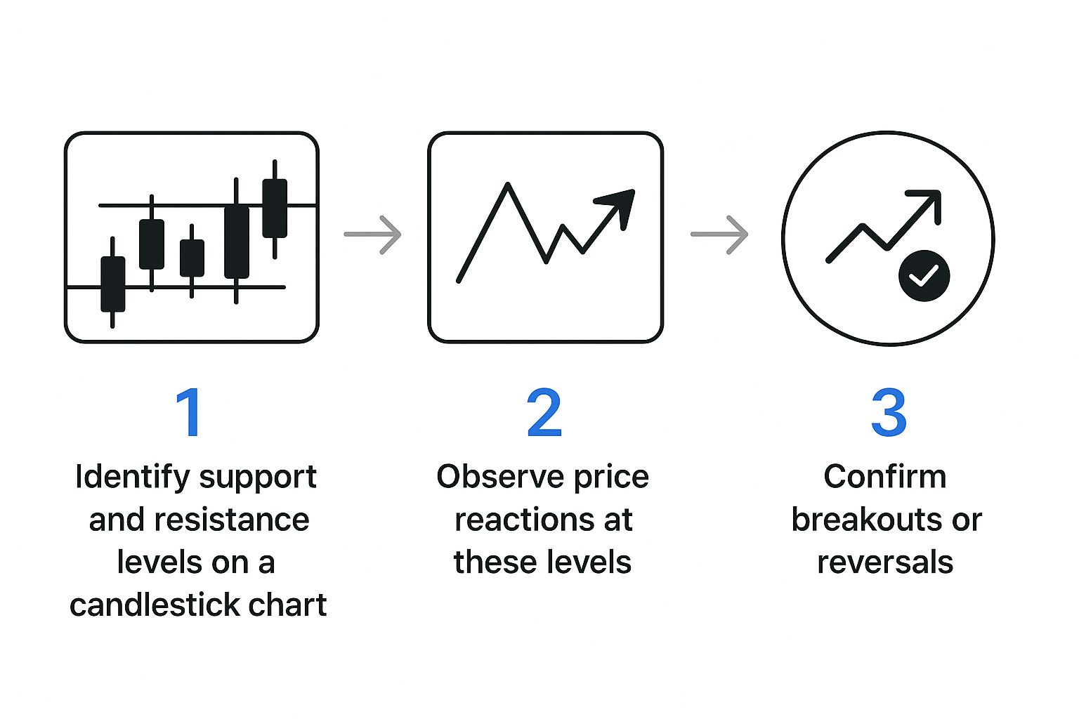
This structured approach ensures you're confirming price action with underlying market conviction before you make a move.
Let's apply this. Imagine a stock breaks above a key resistance level.
-
Check Volume: Was that breakout accompanied by a massive spike in trading volume? A high-volume breakout shows strong participation and belief in the new price, making it far more likely to stick. A breakout on low, anemic volume is suspicious and has a much higher chance of failing.
-
Check RSI: Was the RSI trending upwards but not yet in "overbought" territory (above 70)? This would suggest the stock has strong momentum with more room to run. If the RSI was already screaming above 80 when the breakout happened, it could be a sign of exhaustion, warning you that the move might be short-lived.
By layering your analysis—from the big-picture trend down to specific confirmation signals—you build a much stronger, evidence-based case for any potential trade. This routine transforms chart reading from a guessing game into a structured, repeatable skill. It's how you learn to read the story the market is telling you, chapter by chapter.
Common Questions About Reading Stock Charts

Once you start staring at real, live charts, you’re bound to have questions pop up. That’s a great sign. It means you’re making the leap from theory to the trading floor. Let's walk through some of the most common hurdles new traders face. Getting these sorted out will give you a major confidence boost right from the start.
What Is the Best Time Frame to Use?
This is one of the first questions everyone asks, and the answer is always the same: it completely depends on your trading style. There's no magic "best" setting. You need to match the chart's view to your own strategy and goals.
- Long-Term Investors: If you're holding for months or years, you’ll probably live on the weekly or even monthly charts. This big-picture view smooths out the day-to-day market “noise,” letting you focus on the primary, multi-year trend.
- Swing Traders: Holding for a few days to a few weeks? The daily chart will be your best friend. From there, you might zoom into a 4-hour chart to nail down your entry and exit points with a bit more precision.
- Day Traders: If you're in and out within the same day, you'll be on the fast-paced intraday charts. Think 15-minute, 5-minute, or for the truly brave, the 1-minute chart.
For anyone just starting to learn how to read stock charts, my advice is simple: begin with the daily chart. It gives you a fantastic, balanced perspective and helps you master core concepts like trend and support/resistance without the overwhelming speed of lower timeframes.
How Many Indicators Should I Use?
It's so easy to fall into the trap of plastering your chart with every indicator you find. This is a classic rookie mistake that leads straight to "analysis paralysis"—a state where you're so overwhelmed by conflicting signals that you can't make a decision.
Key Takeaway: When it comes to indicators, less is almost always more. A cluttered chart is a confusing chart. Your goal is clarity, not complexity.
A simple yet powerful setup uses just three tools that work in harmony:
- Trend: A moving average (like the 50-day MA) to define the main direction.
- Momentum: The Relative Strength Index (RSI) to see if a move is getting stronger or running out of steam.
- Conviction: Volume to confirm that real money and belief are driving the price action.
Get a feel for how these three interact before you even think of adding another layer. This trifecta gives you a clean read on trend, strength, and potential turning points without the noise.
Can Reading Charts Really Predict Prices?
This question gets to the heart of what we do. The honest answer is that technical analysis is not about predicting the future with 100% certainty. Nobody can do that. It's about stacking probabilities in your favor and managing your risk.
When you read a chart, you're really analyzing market psychology on a massive scale. You’re looking for historical patterns that repeat because human emotions—specifically fear and greed—are timeless. This gives you an edge by helping you make an educated guess about where the price is most likely to go.
Even more important, it gives you a concrete system for risk management. Your chart tells you where to get in, where to take profits, and—crucially—where to place a stop-loss to get you out if you're wrong. Think of it as your strategic map, not a crystal ball.
What Candlestick Patterns Should I Learn First?
Don't get bogged down trying to memorize dozens of patterns with crazy names like "Three Black Crows" or "Abandoned Baby." You'll go nuts. Instead, focus on understanding the story a few key patterns tell about the battle between buyers and sellers.
For beginners, I always suggest starting with these two foundational types:
- Powerful Reversal Candles: Begin with the Hammer and the Shooting Star. These are single candles that are easy to spot and tell a dramatic story of one side trying to push the price, failing, and the other side taking complete control.
- Decisive Two-Candle Shifts: Next up, learn the Bullish and Bearish Engulfing patterns. These are incredibly powerful because they show a total reversal of sentiment where one candle’s body completely swallows the previous one. It’s a clear signal that the market's mood has changed.
If you can master the psychology behind just these few patterns, you'll have a massive head start on interpreting almost any price action you encounter.
Ready to move beyond basic charts and use professional-grade tools to find your edge? ChartsWatcher provides an advanced stock scanning and analysis platform designed for traders who demand precision and control. Customize your dashboards, set detailed alerts, and analyze the market with real-time data to build and test your strategies. Explore our plans and see how our tools can elevate your trading by visiting https://chartswatcher.com today.
