How to Read a Cryptocurrency Chart for Beginners
When you first pull up a cryptocurrency chart, it can look like an intimidating mess of lines, colors, and bars. It’s chaotic, I get it. But once you learn the basic layout, you’ll find it’s just telling a story about a crypto's performance, and the core elements are surprisingly simple.
Think of it like a map. The vertical line on the right (Y-axis) shows the price, while the horizontal line at the bottom (X-axis) represents time. This simple grid lets you see exactly how a crypto's price has moved over any period you select—minutes, hours, days, or even years.
The Building Blocks of a Chart
So, what are those red and green rectangles all over the chart? Those are called candlesticks, and they are the absolute heart of technical analysis. Each candlestick shows you the complete price action for one specific time interval.
Here’s the simple breakdown:
- Green Candlesticks: These are good news for buyers. They mean the price went up during that period. The closing price was higher than where it started.
- Red Candlesticks: These signal a price drop. The closing price ended up lower than the opening price.
This color-coded language gives you an instant read on market sentiment. A sea of green suggests strong buying pressure, while a lot of red points to a sell-off. For example, the chart below shows daily price action, with each candle representing a full day of trading.
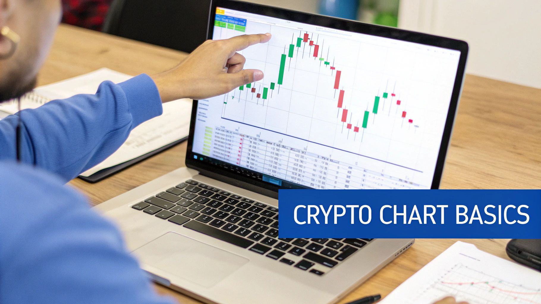
You can clearly see the mix of green (upward) and red (downward) days, which gives you a quick visual summary of the market's back-and-forth battle.
To get comfortable, it's a good idea to start with a user-friendly platform. I always recommend beginners check out TradingView, as it’s the industry standard and makes it easy to get your bearings.
Here’s a quick rundown of the essential parts of any chart you’ll encounter.
Key Chart Components at a Glance
| Component | What It Shows | Why It Matters |
|---|---|---|
| Price Axis (Y-Axis) | The price of the cryptocurrency, usually in USD or another fiat currency. | Instantly shows you the asset's current value and historical price levels. |
| Time Axis (X-Axis) | The timeframe you are viewing, broken down into intervals (e.g., minutes, hours, days). | Puts price movements into context over a specific period. |
| Candlesticks | The open, high, low, and close prices for each time interval. | Reveals the direction and volatility of price action at a glance. |
| Volume Bars | The amount of the asset traded during a specific period. | Helps confirm the strength of a price trend. High volume often signals conviction. |
Mastering these four components is the first and most important step. They form the foundation upon which all other analysis—like indicators and trend lines—is built.
What Every Candlestick Is Telling You
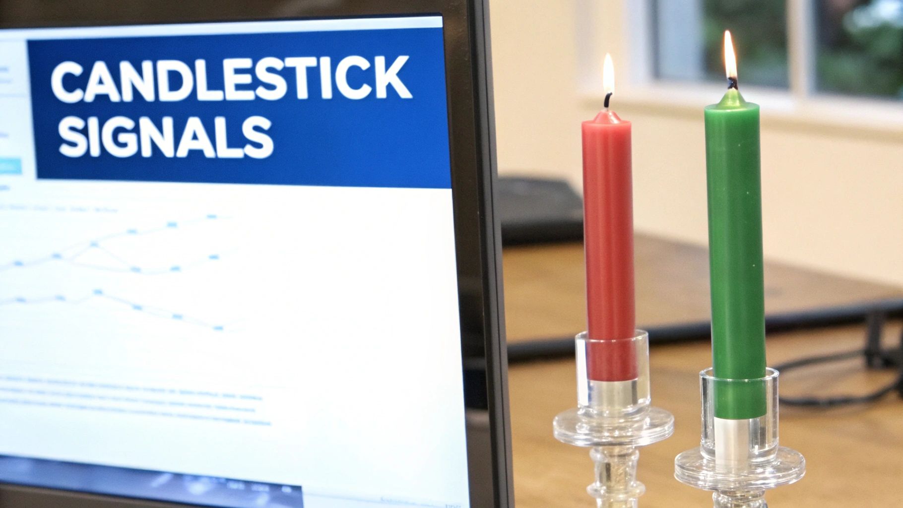
While the colors give you a quick, high-level view of market direction, the real story is baked into the shape of each candlestick. Think of every single candle as a detailed snapshot of the intense tug-of-war between buyers (the bulls) and sellers (the bears) over a set period.
To really get what's going on, you need to look at its two main parts.
First is the thick, solid part of the candle, known as the body. This shows you the price range between where the asset opened and where it closed for that period. A long body signals a decisive move with strong momentum, while a short body suggests traders are hesitant or the market is consolidating.
Then you have the thin lines sticking out from the top and bottom. These are called wicks (or shadows), and they are critical. They reveal the full trading range—the highest and lowest prices hit before the period ended. Long wicks tell a story of volatility and a fierce struggle.
Reading the Story of the Wicks
Let's break that down. Imagine you see a green candle, but it has a long upper wick. This tells you that buyers tried to push the price way up, but sellers fought back hard and knocked it down before the period closed. It’s a subtle hint that buying pressure might be running out of steam.
On the flip side, a red candle with a long lower wick shows that sellers managed to drag the price down, but buyers jumped in and pushed it back up. This often signals that there's strong support at that lower price level.
A candlestick is more than just data; it's a visual record of market psychology. Its shape reveals fear, greed, and uncertainty, offering clues about where the price might head next.
Understanding these shapes helps you read market sentiment far beyond a simple "up" or "down." This isn't a new concept; these patterns have been used for centuries to visualize major market shifts. For instance, if you look at Bitcoin's explosive 2017 bull run, the daily candlesticks clearly show the dramatic price swings and intense investor emotion that drove it from around $1,000 to nearly $20,000.
Certain patterns have specific names and can signal potential reversals or continuations in the trend. To really master these formations, you’ll want to check out our detailed guide on understanding candlestick graphs.
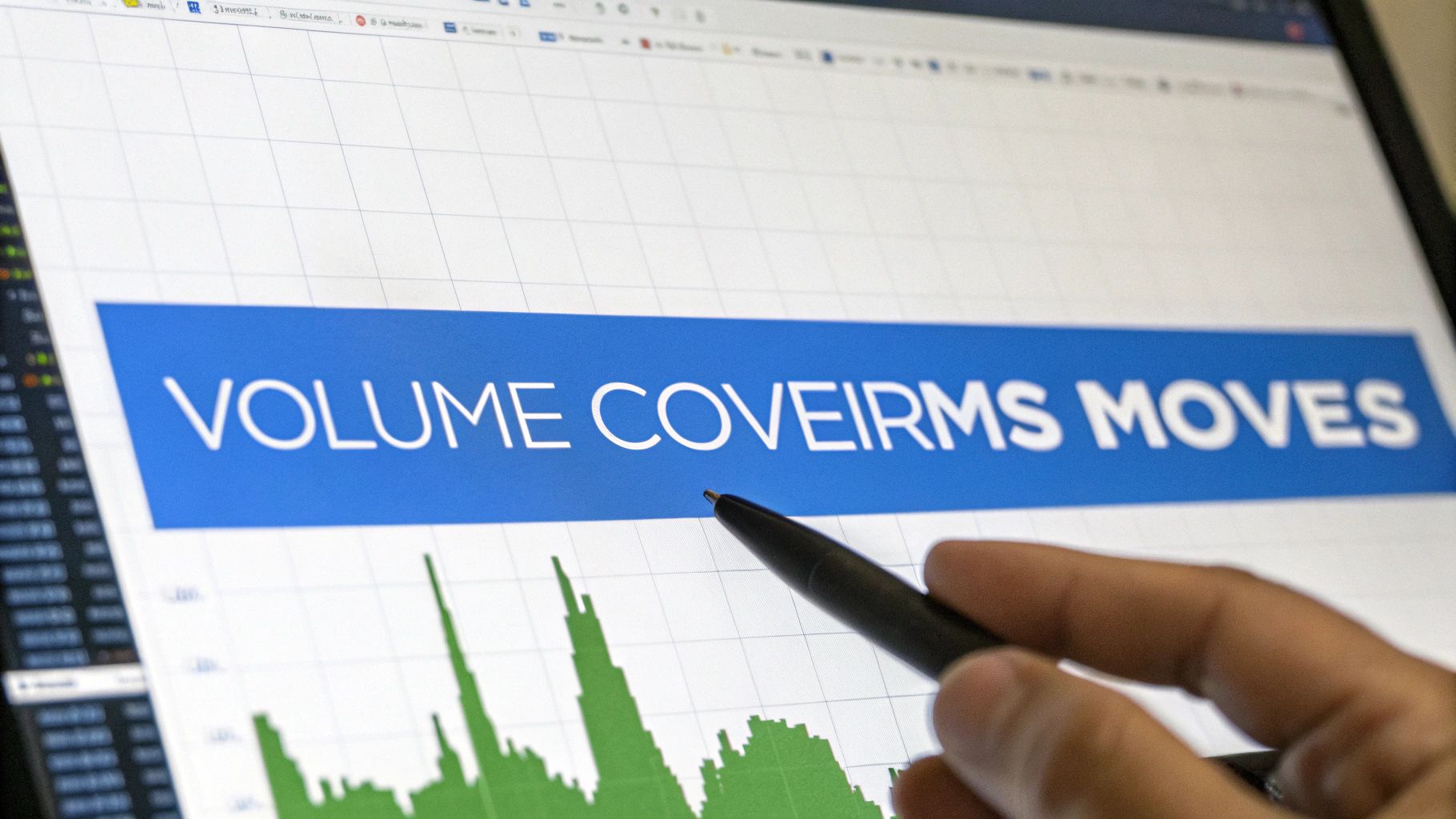
Reading the Market's True Voice: Volume
Price action tells you what happened, but volume tells you the story behind the move.
You’ll find volume displayed as vertical bars at the bottom of your chart. These bars represent the total amount of an asset traded during a specific period—be it an hour, a day, or a week. Think of it as the ultimate confirmation tool. It helps you tell the difference between a strong market move backed by conviction and one that's just hot air.
Let’s say Bitcoin’s price shoots up 5% in an hour. If a massive green volume bar appears at the same time, it’s a sign that a huge number of traders are jumping in. This high volume validates the price increase, suggesting real buying pressure and confidence in the move.
But what if that same 5% jump happens on a tiny volume bar? That’s suspicious. It could mean only a handful of traders were involved, and the price could easily snap back. This is a classic sign of a potential “fakeout” designed to trap unsuspecting traders.
How Volume Confirms Trends
Where volume really shines is in confirming the strength of an existing trend. A healthy, sustainable trend—whether it's going up or down—needs to be supported by consistent or, even better, increasing volume.
Here’s a quick way to read the signals:
- Rising Price + Rising Volume: This is a classic bullish signal. It shows that more and more people are buying into the uptrend, giving it fuel to keep going.
- Rising Price + Falling Volume: This is a major red flag. It suggests that interest is drying up. The momentum could be running out of steam, often right before a reversal.
Volume is like the engine of the market. A price trend without volume is like a car rolling downhill—it looks like it’s moving with purpose, but it has no power to continue once it hits flat ground.
By getting a feel for these volume dynamics, you’ll gain a much deeper understanding of what the market is really thinking. For a more detailed breakdown, check out our post on what trading volume is and why it matters.
And if you want to go even deeper to see what's happening on-chain, exploring blockchain data analysis is a great next step. It's one of the most effective ways to see the "true voice" of the market, beyond just the charts.
Using Indicators to Find Trading Opportunities
While price and volume tell you what’s happening right now, technical indicators are the tools that help you forecast what might happen next. Think of them as analytical overlays you place on a chart. They crunch the price data to reveal underlying trends, momentum, and potential reversal points that aren't obvious just by looking at candles.
You could spend months learning dozens of indicators, but it's much better to master a few of the most effective ones first. Let's start with two of the most popular and reliable indicators in any trader's toolkit.
See the Trend with Moving Averages
The Moving Average (MA) is one of the most fundamental indicators out there, and for good reason. Its job is simple: it smooths out the chaotic, day-to-day price action to give you a much clearer view of the underlying trend. It does this by calculating the average price over a set period—like 20 or 50 days—and plotting it as a single, flowing line on your chart.
- When the price is consistently trading above the MA line, it’s a good sign of a healthy uptrend.
- When the price is consistently falling below the MA line, it suggests a downtrend is in control.
A classic strategy is to watch for crossovers. For example, when a shorter-term MA (like the 20-day) crosses above a longer-term MA (like the 50-day), many traders see this as a bullish signal that momentum is shifting to the upside.
Pro Tip: Never trust a single indicator in isolation. The best signals come from confluence—when multiple signs point to the same conclusion. A moving average crossover becomes much more powerful if it’s backed up by a surge in trading volume.
Gauge Market Sentiment with the RSI
Next up is the Relative Strength Index (RSI). This is a momentum indicator that measures the speed and magnitude of recent price changes. It's an oscillator, which just means it’s a line graph that moves between two extremes, and its main job is to help you spot overbought or oversold conditions.
The RSI scale runs from 0 to 100:
- A reading above 70 often suggests an asset is "overbought"—meaning the buying pressure has been intense, and the price might be due for a cooldown or correction.
- A reading below 30 indicates an asset may be "oversold"—meaning selling has been aggressive, and it could be primed for a bounce.
Imagine you see Bitcoin’s price rocketing up for days, and then you notice its RSI has climbed to 85. That’s a huge red flag. It tells you the buying frenzy might be getting out of hand, giving you a heads-up that a pullback could be right around the corner. Combining candlestick charts with overlays like moving averages and the RSI is essential for spotting these types of conditions. For more on this, you can dig into some of the broader cryptocurrency market analysis from Statista.com.
Drawing the Battle Lines: How to Spot Support and Resistance
Okay, so you're getting the hang of reading the price action. Now it's time to start mapping out the battlefield. Great trading isn't just about reacting to one or two candles; it's about seeing the bigger picture—the key zones where the market has fought major battles before. We call these zones support and resistance.
Think of support as a price floor. It's a level where a downtrend runs out of steam, usually because buyers waiting on the sidelines decide the price is too good to pass up. Their buying power overwhelms the sellers, and the price bounces. When you see a crypto repeatedly dip to a certain price and then recover, you've probably found a support level.
Resistance, on the other hand, is a price ceiling. This is where an uptrend hits a wall. Sellers see the price as overvalued and start cashing out, their pressure overpowering the buyers. If an asset struggles to break past a specific high point again and again, it's hitting resistance.
Putting Lines on Your Chart
Spotting these levels is one of the most practical skills you can learn, and it’s way easier than it sounds. The best way to start is by zooming out. Pull up a chart on a higher timeframe, like the daily view, and look for the most obvious peaks and valleys—the swing highs and lows.
-
To find support: Look for at least two major price bottoms that line up at roughly the same level. Then, draw a horizontal line connecting them. The more times the price has tagged this line and bounced, the stronger that support is.
-
To find resistance: Just do the opposite. Find two or more significant price peaks at a similar height and connect them with a horizontal line. That's your ceiling.
These lines aren't just random marks on a chart. They represent powerful areas of market psychology.
Support and resistance levels are basically the market's memory. They show us where traders made big decisions in the past, and it's a good bet they'll react at those same prices again.
Here's a pro tip: once a strong resistance level is finally broken, it often flips and becomes the new support level. This is called a support-resistance flip, and it’s a massive signal that the market's attitude has changed. It gives you a brand-new, reliable floor to plan your future trades around.
Putting It All Together with a Trading Plan
Knowing what a candlestick or volume bar means is one thing. Actually weaving those individual clues into a solid trading idea is where the real skill comes in.
The goal is to stop reacting to the market and start building a repeatable process—a checklist, really. This keeps your emotions in check and forces you to build a logical case for every single trade you take.
What you're hunting for isn't one perfect signal. It's confluence. That’s just a fancy word for seeing multiple elements on the chart all telling you the same story. A single bullish candlestick pattern is interesting, sure. But seeing that same bullish pattern pop up right at a key support level, backed by a surge in buying volume? Now that’s a high-probability setup.
You’re not trying to find some magic formula that works every time. Instead, you're building a disciplined way of gathering and weighing the evidence from your chart. A simple, effective trading plan might start like this:
- Find the Macro Trend: First things first, what's the big picture? Is the price generally trending above or below a key indicator like the 50-day moving average?
- Map Your Key Levels: Get your lines on the chart. Draw the major support and resistance zones where the price has reacted in the past. These are your battlegrounds.
- Analyze the Recent Action: Now zoom in. What are the latest candlesticks and volume bars telling you? Is there conviction and momentum, or does it look like the market can't make up its mind?
The image below shows exactly what I mean by mapping out those key levels. It's the first step to creating a framework for your entire analysis.
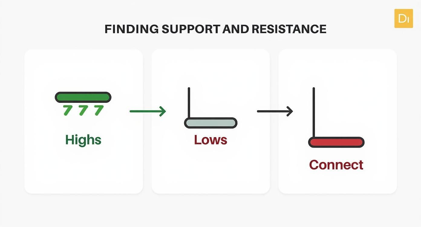
By connecting the historical price ceilings and floors, you’re basically drawing the lines where you expect buyers and sellers to show up. This makes it so much easier to anticipate where the price might turn next.
Common Questions I Hear About Crypto Charts
Once you get the hang of the basics, a few questions always seem to trip people up. Let's tackle some of the most common sticking points I see new traders struggle with when they're trying to make sense of a crypto chart.
What Timeframe Should I Use?
This is a big one. Should you be looking at the 1-hour, the 4-hour, or the daily chart? There’s no secret answer here—it all comes down to your trading style. Day traders might live on the 5-minute charts, catching tiny moves, while long-term investors are better off zooming out to the daily or weekly views to see the big picture.
My Advice: I always tell people to start with the daily chart to get a feel for the major trend. Is the market going up, down, or sideways? Once you know that, you can zoom into a 4-hour chart to pinpoint better entry and exit points. This top-down approach helps you avoid getting shaken out by meaningless short-term noise.
What Is the Best Indicator to Use?
That’s like asking a mechanic for the single "best" tool in their toolbox. It just doesn't work that way. While fundamentals like Moving Averages and the RSI are fantastic places to start, no indicator is a magic bullet. The real goal is to find a small combination of tools that clicks for you and helps confirm what you're already seeing on the chart.
Lots of traders I know find success with simple, effective pairings like these:
- Moving Averages + Volume: This is a classic combo for confirming the strength of a trend. A rising price on high volume is a much stronger signal than one on weak volume.
- RSI + Support/Resistance: Perfect for finding potential reversal points. When the RSI shows an overbought reading right as the price hits a known resistance level, that’s a powerful signal to pay attention.
Ultimately, the best indicator is the one you actually understand inside and out and can use consistently. Resist the urge to clutter your screen with a dozen different lines and oscillators; focus on mastering just two or three that work for you.
Ready to stop guessing and start analyzing with professional-grade tools? ChartsWatcher provides the advanced scanning and charting features you need to build a winning strategy. Explore our powerful platform today.
