A Guide to Understanding Candlestick Graphs
If you want to understand the market, you have to learn its language. Candlestick charts are the most fluent dialect you can find. They take a firehose of complex price data and turn it into a simple, visual story about the constant tug-of-war between buyers (bulls) and sellers (bears).
With a single glance, each candle tells you a chapter of that story.
Why Candlestick Charts Tell the Market's Story
Think of it this way: a basic line chart is like reading the summary on a book's back cover. It connects the closing prices and gives you the gist. A candlestick chart, on the other hand, is like reading the book itself. Each candle gives you a rich, four-dimensional look at what really happened during a specific period.
This visual language cuts right to the heart of market psychology. Instead of staring at dry data tables, you see the struggle. Was it a decisive victory for the buyers? A total rout by the sellers? Or just an indecisive stalemate? The answer is all right there in the candle's shape, size, and color.
A Method Forged in History
This isn't some new-fangled technique. Candlestick charts go all the way back to 18th-century Japan, where they were developed by a legendary rice trader named Munehisa Homma. He figured out something that’s just as true today: market psychology—raw emotions like fear and greed—is a massive driver of price.
His methods were eventually introduced to the West and have since become an absolute staple for modern traders. If you're curious about the deep history, TradingView has a great primer on the origins of candlestick charting.
The Core Benefits of Candlestick Analysis
For traders using a platform like ChartsWatcher, getting comfortable with candlesticks provides a serious edge. Here’s why they're so essential:
- Immediate Visual Cues: Candlesticks give you an instant read on price action. It's far easier to spot trends and potential reversals compared to staring at a traditional bar chart.
- Reveals Market Sentiment: The relationship between the open and close, combined with the length of the wicks, paints a vivid picture of the market's mood and momentum.
- Pattern Recognition: Over time, candles form recognizable patterns that can hint at future price moves, giving you a solid framework for building out trading strategies.
By learning to interpret these "chapters," you stop being a passive observer of market data and become an active reader of the market's narrative. That's how you build the confidence to make more informed decisions.
How to Read a Single Candlestick
To make sense of candlestick charts, we have to start with the most basic building block: a single candle. Think of a chart as a story; each candlestick is a single word. You can't understand the narrative until you know what the words mean.
Every candle is a visual snapshot of the battle between buyers and sellers over a specific timeframe. It packs four crucial pieces of data into one simple shape: the open, close, high, and low prices. This is what makes them so powerful.
The Anatomy of a Candle Body and Wicks
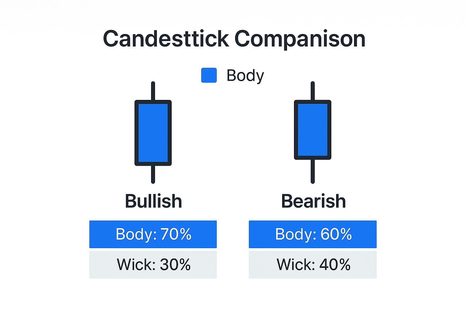
The thick, main part of the candle is called the real body. It tells you the most important part of the story: who won the fight for that period.
- A green (or white) body means the closing price was higher than the opening price. Buyers, or "bulls," were in control and pushed the price up.
- A red (or black) body means the closing price was lower than the opening price. Sellers, or "bears," won that round, driving the price down.
The thin lines poking out from the top and bottom are the wicks (you’ll also hear them called shadows). These show the drama—the highest and lowest points the price hit during the session before it finally settled. Long wicks tell a tale of volatility and indecision, showing that prices ventured far but were ultimately pushed back.
This quick visual breaks down how the anatomy of a candle tells you whether the market moved up or down.
A candlestick's body shows the outcome of the battle between buyers and sellers, while its wicks reveal the full extent of the fight.
For a quick reference, here's how to tell the difference between a bullish and bearish candle at a glance.
Bullish vs Bearish Candlestick Anatomy
| Component | Bullish Candle (Price Up) | Bearish Candle (Price Down) |
|---|---|---|
| Color | Typically Green or White | Typically Red or Black |
| Real Body | Close price is above the Open price | Close price is below the Open price |
| Upper Wick | Shows the session's highest price | Shows the session's highest price |
| Lower Wick | Shows the session's lowest price | Shows the session's lowest price |
This table helps you instantly recognize who was in control during a trading period—the buyers (bulls) or the sellers (bears).
Mastering the story of just one candle is the critical first step. Without this foundation, trying to spot larger patterns is like trying to read a sentence without knowing the alphabet. For a broader look at chart analysis, check out our complete guide on how to read stock charts for beginner investors.
Once you get this, you can see the market's psychology at a glance, setting you up to interpret the more complex stories that groups of candles tell together.
Spotting Bullish Patterns That Signal Opportunity
 If a single candle shows you who won a small skirmish, a pattern of candles reveals the shifting tide of the entire battle. When you learn to spot bullish formations, you can pinpoint the exact moments when buyers are starting to overwhelm sellers—a clear signal of a potential upward move.
These patterns aren't just abstract shapes on a screen; they are visual stories of market psychology in action.
Typically, you'll find bullish patterns popping up after a downtrend, acting as clues that the downward momentum is running out of steam. They suggest that sellers are getting exhausted and buyers are stepping in with fresh confidence. Recognizing these signals early gives you a strategic edge.
Let's break down three of the most common and reliable bullish patterns. The key to using them effectively is understanding the "why" behind each one.
The Hammer: A Sign of Rejection From the Bottom
Imagine a stock that's been falling hard. Sellers are in complete control, pushing the price to new lows during the day. But then, something shifts. Buyers suddenly rush in, reject those low prices, and drive the price all the way back up to close near its opening level.
That dramatic turnaround creates what we call a Hammer pattern. It has a small body at the top and a long lower wick that's at least twice the size of the body.
- The Story It Tells: That long lower wick is a powerful visual. It shows buyers aggressively defending a price level and signals that despite intense selling pressure, the market ultimately refused to go any lower.
The Bullish Engulfing: A Power Shift
The Bullish Engulfing is a two-candle pattern that tells a crystal-clear story of a power reversal. The first candle is bearish (red), a continuation of the downtrend. But the second candle is a massive bullish (green) one that completely "engulfs" the entire body of the previous red candle.
This pattern signifies a dramatic and decisive shift in market sentiment. The buying pressure on the second day was so intense that it not only wiped out all of the previous day's losses but also pushed the price significantly higher. This is one of the most powerful signs that buyers have seized control.
If you want to dive deeper, you can master the engulfing candlestick pattern for profits with our detailed guide.
Think of it like this: one army doesn't just stop an opponent's advance but completely overwhelms their position in a single, decisive move. The change in momentum is impossible to ignore.
The Morning Star: A Glimmer of Hope
The Morning Star is a three-candle pattern that signals a potential bottom after a downtrend. It’s a story of hope emerging from a period of despair.
- First Candle: A long red candle shows sellers are still firmly in charge, continuing the downtrend.
- Second Candle: A small-bodied candle (or even a Doji) appears, signaling indecision. The selling pressure has stalled.
- Third Candle: A strong green candle confirms that buyers have taken over, often recovering a large portion of the first candle's losses.
This sequence shows a gradual but confirmed transition from bearish control to bullish dominance, making it a reliable reversal signal for many traders.
Spotting Bearish Patterns That Scream "Watch Out!"
Just as bullish patterns can signal a green light, bearish patterns are the market's bright red warning signs. Getting a feel for these formations is absolutely critical for managing risk. They’re your heads-up that the sellers, or "bears," are starting to wrestle control away from the buyers.
These patterns usually pop up after a solid run-up in price, hinting that the buying frenzy is running out of gas. Don't think of them as a crystal ball predicting a crash. Instead, see them for what they are: valuable red flags. They visually capture the story of buyers getting exhausted and the balance of power shifting.
Catching these signals early can be the difference between locking in your profits and watching them evaporate. Let's dig into three of the most important bearish patterns you'll see on the charts.
The Shooting Star: A Warning Shot From the Top
Picture this: an asset has been on a nice tear, climbing higher and higher. The day opens, and optimistic buyers push the price up even more, continuing the trend. But that new peak doesn't last long. Sellers storm in, aggressively rejecting the higher prices and shoving the asset all the way back down to close near where it opened.
That dramatic price action creates a Shooting Star. It’s defined by a small body at the bottom of the trading range and a long upper wick that’s at least double the size of the body.
- What it’s telling you: That long upper wick is the ghost of a failed rally. It’s a clear sign that even though buyers gave it their best shot, the sellers completely overpowered them and slammed the door shut. It screams "potential peak."
The Bearish Engulfing: A Decisive Power Shift
The Bearish Engulfing pattern is one of the most straightforward and powerful reversal signals you can find. It’s a two-candle formation that tells an unmistakable story of sellers seizing total control.
It starts with a green candle that keeps the uptrend going. No surprises there. But then comes the second candle—a massive red candle that completely "engulfs" the entire body of the green one before it. This shows that the selling pressure was so intense it didn't just stop the rally; it completely erased the previous day's gains and then some.
This pattern is a powerful visual of a dramatic shift in market psychology. The bears didn't just halt the uptrend; they forcefully reversed it.
The Evening Star: Twilight for an Uptrend
The Evening Star is a three-candle pattern that often marks the top of an uptrend. It's a bit more subtle than the engulfing pattern, showing a more gradual handover from bullish optimism to bearish control.
- First Candle: A strong, confident green candle. The uptrend looks healthy, and buyers are still in the driver's seat.
- Second Candle: A small-bodied candle (or even a Doji) gaps up, showing a sudden pause. The momentum has stalled, and indecision creeps in.
- Third Candle: A big red candle confirms the reversal. It closes well into the body of the first green candle, showing that sellers have taken over and are now pushing the price down with conviction.
This sequence paints a clear picture: the buying momentum faded, the market hesitated, and then the bears confirmed their takeover. It’s a classic warning sign that traders take very seriously.
Decoding Market Indecision and Trend Continuation
Not every pattern on your chart is a screaming signal for a massive reversal. In fact, some of the most useful formations are the quiet ones—the patterns that show a market wrestling with indecision or just catching its breath before continuing a trend.
Learning to read these moments is what separates novice traders from seasoned pros. They represent a temporary truce where neither buyers nor sellers have the upper hand. Think of it as a pause in the action. Ignoring these signals is a huge mistake, as they often give you a heads-up about where the next big move is headed.
The Classic Sign of a Market Stalemate: The Doji
When it comes to indecision, the Doji is the quintessential pattern. It’s easy to spot—it looks like a cross or a plus sign. This happens because the opening and closing prices are practically identical, leaving it with a super thin (or even nonexistent) body.
A Doji is the market literally telling you, "We don't know where to go next." Buyers tried to push the price up (that’s the upper wick), and sellers tried to shove it down (the lower wick), but by the end of the period, they fought to a draw.
A Doji isn't a command to jump into a trade. It's a warning shot—a signal to pay very close attention. The tension built up during this stalemate often gets resolved with a powerful breakout, and you want to be ready for it.
Patterns That Confirm the Trend Is Still Your Friend
While everyone loves the drama of a reversal, continuation patterns are your bread and butter for staying in profitable trades. These patterns signal that a brief pause is over and the original trend is kicking back into gear. They’re your confirmation that the underlying bullish or bearish sentiment is still very much alive.
Catching these patterns helps you ride a trend with confidence instead of second-guessing every little pullback. Here are two of the most fundamental ones to know:
- Rising Three Methods (Bullish): You’ll find this pattern during a solid uptrend. It kicks off with a long green candle, followed by three smaller red candles that meander downwards but stay within the range of that first big green candle. The finale is another strong green candle that closes above the high of the first one. It’s a clear sign that buyers weathered the small sell-off and are back in control.
- Falling Three Methods (Bearish): This is the mirror image in a downtrend. It starts with a long, decisive red candle. What follows are three small green candles that try to rally but can’t break out of the first candle's range. The pattern completes when another powerful red candle closes below the low of the first one, signaling sellers have crushed the rebellion and the downtrend is set to continue.
Think of these patterns as a story of a battle. They show that despite a minor counter-attack, the dominant force in the market successfully defended its territory and is ready to push forward again.
Putting It All Together: A Practical Framework for Analysis
Spotting individual candlestick patterns is a great first step, but it’s only that—a first step. A lone Hammer pattern floating in the middle of a chart doesn't tell you much. To really understand what the market is trying to say, you have to look at the bigger picture. This is where you go from just knowing patterns to actually using them effectively.
Think of a single pattern like one clue in a detective story. It’s interesting, but it won’t solve the case by itself. You need to gather more evidence to build a strong theory. It’s the exact same with trading; a pattern’s real power comes out when other market signals back it up.
Building Your Analytical Case
A disciplined trader never acts on a single signal. Instead, they build a case by checking a pattern against other key factors before even thinking about making a move. This confirmation process helps you weed out the weak signals and avoid getting faked out by false alarms. The strongest signals are the ones that fit neatly into the broader market story.
Here are the essential contextual clues you need to integrate into your analysis:
- The Prevailing Trend: First, zoom out. Is the market in a clear uptrend or downtrend? A bullish reversal pattern, like a Bullish Engulfing, is a huge deal at the bottom of a long downtrend. But that same pattern in a choppy, sideways market? Not nearly as convincing.
- Support and Resistance Levels: Where is the pattern happening? These are the historical price zones where the market has turned around before. A bullish pattern forming right on a known support level adds a powerful layer of confirmation. It’s a sign that buyers are stepping in to defend that price, just like they have in the past.
- Trading Volume: Volume tells you about the conviction behind a move. A big reversal pattern that happens on low volume is suspicious. But a reversal accompanied by a huge spike in trading volume? That suggests a lot of money is behind the move, making the signal far more reliable.
A candlestick pattern without context is just noise. A pattern confirmed by trend, location, and volume is a high-probability signal that demands your attention.
By layering these elements, you stop being a simple pattern-spotter and start thinking like a strategist. You begin building a cohesive narrative for why a price move might be about to happen, creating a much smarter and more disciplined way to read the charts.
Of course. Here is the rewritten section, designed to sound natural and human-written, following the style of the provided examples.
Got Questions About Candlestick Charts?
When you first start digging into candlestick charts, a few questions always pop up. It’s totally normal. Let’s tackle some of the most common ones right now to clear up any confusion and get you analyzing charts with more confidence.
A big one is always about timeframes. Do these patterns actually work on a 5-minute chart just like they do on a weekly chart? The answer is a clear and simple yes. The market psychology driving these patterns doesn’t care if you're a day trader or a long-term investor. The stories the candles tell are the same, whether you're looking at stocks, forex, or crypto.
What's the Single Most Important Thing to Remember?
If I could drill one rule into every trader’s head, it would be this: context is everything. A single candlestick pattern, no matter how textbook-perfect it looks, is pretty much useless on its own. Its real power comes from where it shows up on the chart.
Think about it. A classic bullish Hammer pattern is a massive signal if it forms right on a major historical support level after a long, painful downtrend. But that exact same pattern popping up in the middle of a choppy, sideways market? It’s just noise. Always zoom out and look at the bigger picture before you even think about making a move.
A pattern without context is just a random shape. But a pattern that's confirmed by the overall trend, key price levels, and trading volume? That’s a high-probability signal you need to pay attention to.
How Long Does It Take to Get Good at This?
You can probably learn the basic shapes of the most common patterns in just a few days of focused work. But getting to the point of true mastery—where you can instinctively read the story of the market through these patterns—that’s a different ball game. It comes from one thing: practice.
Realistically, it takes months, maybe even years, of staring at live charts and seeing how these patterns actually play out. The key is to not overwhelm yourself. Start small. Pick just a few key patterns, get really good at spotting them, and then slowly add more to your arsenal as your confidence grows. It's a skill you build over time, not overnight.
Ready to stop just looking at charts and start actually understanding them? ChartsWatcher gives you the powerful scanning and analysis tools to put what you've learned into practice. Start your analysis with ChartsWatcher today.
