How to draw fibonacci retracement: Learn Like a Pro
Before you even think about dropping a line on your chart, let’s get one thing straight: understanding why Fibonacci retracement works is just as important as knowing how to draw it. This isn't just about connecting a couple of dots. It’s about tapping into the market's underlying psychology—the ebb and flow that traders have been watching for decades.
The tool itself is simple. In an uptrend, you draw it from the swing low to the swing high. In a downtrend, you flip it, going from the swing high to the swing low. This projects key levels onto your chart, showing you potential spots where a price pullback might stall out or completely reverse.
Why These Fibonacci Levels Actually Work

So, what’s the big deal with these lines? They often act as invisible zones of support and resistance, but it's not magic. The power behind Fibonacci retracement comes from two places: its deep mathematical roots and its sheer popularity among traders.
The Mathematical Foundation
At its core, the tool is built on the famous Fibonacci sequence, where each number is the sum of the two before it (0, 1, 1, 2, 3, 5, 8, and so on). The key retracement ratios you see on your chart—23.6%, 38.2%, 50%, and 61.8%—are all derived from mathematical relationships within this sequence.
For instance, if you divide any number in the sequence by the one that follows it, the ratio gets closer and closer to 61.8%, also known as the "golden ratio." This mathematical consistency gives us a logical framework for anticipating where price corrections might find their footing.
A Self-Fulfilling Prophecy in the Markets
Just as crucial, though, is the psychological side of things. Think about it: millions of traders, from big-shot institutional analysts to retail investors like us, are all watching and using the exact same levels.
This creates a powerful self-fulfilling prophecy. When a price dips toward a key level like 61.8%, a massive number of traders anticipate a bounce. They place their buy orders right around that zone, which creates a surge of buying pressure that can actually cause the reversal they were all expecting.
It's a fundamental shift in perspective. You stop just drawing lines and start strategically identifying zones where price is most likely to have a reaction. This gives you the confidence to make Fibonacci a core part of your analysis.
Grasping this foundation is the first real step to mastering the tool. For a deeper dive into what these levels mean in practice, our guide on https://chartswatcher.com/pages/blog/what-are-fibonacci-retracements-key-trading-levels-explained is the perfect next step. This knowledge turns the tool from a simple drawing into a powerful lens for reading the market's behavior.
Pinpointing the Right Swing High and Swing Low
The accuracy of your Fibonacci levels is only as good as the points you anchor them to. Your entire analysis hinges on correctly identifying the swing high and swing low that define a major price move. This is far more of an art than a science; it’s about reading the market’s story, not just spotting random peaks and valleys on a chart.
Before you even think about selecting the Fibonacci tool, zoom out. Take a look at the bigger picture. Is the asset in a clear, defined trend? The tool works best when you’re measuring a primary impulse wave within a broader uptrend or downtrend. Trying to force it onto a choppy, sideways market is a recipe for frustration and a chart full of meaningless lines.
What Makes a Swing "Meaningful"?
A true swing high isn't just a minor blip; it's the highest point price reached before a real, significant pullback. Likewise, a swing low is the absolute bottom just before a proper rally kicks off. Your mission is to capture that entire, primary move from start to finish.
Think of it like measuring a wave at the beach. You wouldn't measure from a tiny ripple near the top. You’d measure from where the wave began to swell all the way to its crest. Trading is the same—ignore the small, distracting "noise" and focus on the major swings that define the trend's structure.
The most common mistake traders make is anchoring their Fibonacci tool to insignificant, minor swings. This just clutters the chart with irrelevant levels. Always prioritize the major, obvious price leg that's driving the current trend.
Practical Tips for Finding Your Anchor Points
Learning how to draw Fibonacci retracements properly means getting good at filtering out the minor price action. Here are a few things I look for to improve my selection process:
- Look for Decisive Candlesticks: Often, a true swing point is marked by a powerful candle, like a bullish or bearish engulfing pattern or a long-wicked pin bar. These patterns signal a sharp, emotional reversal.
- Check the Volume: A significant price move that creates a swing high or low is usually backed by a spike in trading volume. This tells you there was real conviction and participation behind that move.
- Jump to a Higher Timeframe: If you're struggling to identify the main swing on a 15-minute chart, pop over to the 1-hour or 4-hour. Higher timeframes naturally filter out the noise, making the primary trend and its major swing points much clearer to see.
For example, in a strong uptrend, you’ll click first on the very bottom of the initial rally (the swing low) and drag your cursor up to the absolute peak of that move (the swing high). It’s a simple action, but when you apply it to the correct points, it lays the foundation for some incredibly effective analysis.
Drawing Retracement Levels on Your Chart
Once you've zeroed in on your significant swing points, it's time to actually apply the Fibonacci retracement tool to your chart. This part is pretty straightforward, but precision is key.
The direction you draw the lines is everything—it depends entirely on whether you've identified an uptrend or a downtrend. Mess this up, and you'll get garbage levels and your analysis will be flawed from the start.
This quick flowchart breaks down the basic thinking process for finding your anchor points.
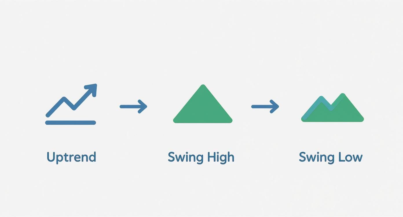
As you can see, it all begins with recognizing a clear trend. Don't even think about picking your swing high and low until that piece of the puzzle is locked in.
Drawing Levels in an Uptrend
In a solid uptrend, your main goal is to find potential support levels where a pullback might run out of steam. To do this, you’ll draw the tool from the bottom up—think "low to high."
Here’s the simple sequence:
- Grab the Fibonacci tool from your drawing menu in ChartsWatcher.
- Your first click goes on the absolute bottom of the main upward move—the swing low.
- Then, drag your cursor up and make your second click on the absolute peak of that same move—the swing high.
The platform instantly projects the key retracement levels (23.6%, 38.2%, 50%, and 61.8%) between those two anchors. These horizontal lines are now your potential support zones where buyers might be waiting.
My Personal Tip: Always, always double-check that your lines are anchored to the very tips of the candle wicks, not the candle bodies. Wicks show the true price extremes of the move and give you the most accurate levels to work with.
Drawing Levels in a Downtrend
For a downtrend, you just flip the logic. Here, you're on the hunt for potential resistance levels—ceilings where a temporary bounce might die out and reverse.
The process is a mirror image of what you do in an uptrend.
- Starting Point: Click on the swing high (the peak right before the big drop).
- Ending Point: Drag your cursor down and click on the swing low (the bottom of that move).
The levels that appear now represent potential resistance zones where sellers might jump back in and shove the price back down, keeping the bearish trend alive.
Getting the direction right is non-negotiable for accurate analysis. Here's a simple table to keep it straight.
Drawing Fibonacci Levels in Uptrends vs Downtrends
| Market Trend | Starting Point (Click 1) | Ending Point (Click 2) | Purpose |
|---|---|---|---|
| Uptrend | Swing Low | Swing High | Identify potential support levels for pullbacks. |
| Downtrend | Swing High | Swing Low | Identify potential resistance levels for bounces. |
Ultimately, whether you're drawing from low-to-high or high-to-low, the goal is the same: to find those hidden levels where the market might pause or turn. Once drawn, you can watch how price behaves as it approaches these critical lines.
Using Fibonacci Levels in Your Trading Strategy
Just dropping Fibonacci levels onto your chart is only half the battle. The real magic happens when you weave them into a solid, repeatable trading plan.
A classic rookie mistake is seeing a Fib level and treating it like a green light to buy or sell. The pros know better. These levels are most powerful when they act as a confirmation tool, not a crystal ball.
What you're really hunting for are confluence zones—spots on the chart where a key Fibonacci level lines up perfectly with another technical signal. That's where high-probability trades are born.
Think about it. A price pulling back to the 61.8% level in a strong uptrend is interesting. But what if that exact same 61.8% level also happens to be where the 50-day moving average is sitting, and it's a previous support zone? Now that's a setup you can trade with confidence.
Building Confluence and Managing Risk
Think of each technical tool as another piece of evidence. When Fibonacci levels align with other indicators, you build a much stronger case for taking a trade.
Here are a few classic combinations I look for:
- Moving Averages: When a pullback hits the 38.2% or 50% retracement and bounces right off a major moving average (like the 50 or 100 EMA), that's often a powerful dynamic support or resistance area.
- Candlestick Patterns: Seeing a bullish engulfing pattern or a hammer form right on the 61.8% support level? That's a loud and clear signal that buyers are stepping in with force.
- RSI Indicator: If the price hits a key Fib level while the Relative Strength Index (RSI) is screaming "oversold" (below 30), it's a strong hint that the pullback is running out of steam.
A critical part of any successful Fibonacci trading strategy is using these levels to manage your risk. They give you logical, non-emotional places to set your stop-loss (just below a key support level) and define your profit targets.
This approach turns a simple drawing tool into the backbone of your entire risk management framework.
And it's not just theory—these levels are statistically significant. One study on the Indian stock market found that a staggering 60% of significant price reversals happened right at the 61.8% level, underscoring just how important that particular line can be. Understanding the historical success rate of Fibonacci retracements really helps build the confidence you need to act on these signals.
Common Mistakes to Avoid When Drawing Fibonacci Levels
Even seasoned traders can completely invalidate their analysis by making a few classic mistakes. If you want your Fibonacci levels to actually mean something, you have to get the basics right. One of the biggest blunders I see is trying to force the tool onto a market that's just chopping sideways.
Fibonacci levels thrive in clear, trending environments. When there's no real trend to speak of, the lines you draw are just noise. They have no predictive power at all.
Another rookie error is anchoring your points to minor, insignificant price wiggles. You have to identify the primary impulse wave that defines the trend. If you latch onto a tiny fluctuation instead, the resulting levels will be totally unreliable. Always zoom out to see the bigger picture first.
Forgetting to Redraw Your Levels
Markets move. Your analysis needs to move with them. A surprisingly common oversight is leaving old Fibonacci levels on your chart long after the market has established a new, more significant swing high or low.
Once the price breaks past the original swing high (in an uptrend) or swing low (in a downtrend), your previous Fibonacci drawing is officially useless. You need to delete it and redraw a new one based on the current market structure.
It's also important to remember that this tool isn't a magic crystal ball. Some academic backtests suggest its reputation for accuracy has more to do with market psychology than any inherent mathematical truth. In fact, some studies on financial analysis have found that key levels don't appear any more often than random values would.
This just reinforces a core principle of trading: always use Fibonacci levels as a confirmation tool, never as a standalone signal to buy or sell.
Common Questions on Drawing Fibonacci Levels
When you're first getting the hang of drawing Fibonacci retracement levels, a few questions always seem to pop up. Let's tackle some of the most common ones so you can build your confidence and apply the tool the right way from the get-go.
Which Timeframe Is Best for Drawing Fibonacci Retracement?
While the tool works on any timeframe you throw at it, you'll generally find it's more reliable on higher ones—think the 4-hour, daily, or even weekly charts. Looking at the bigger picture like this helps filter out a lot of the market noise, making those major trends and significant swing points much easier to spot.
That said, the "best" timeframe always comes back to your personal trading style. If you're a day trader, you might live on the 15-minute chart. A long-term swing trader, on the other hand, will get far more value from a daily or weekly view.
Should I Draw From the Wicks or the Candle Bodies?
This is a classic debate, but the most consistent and widely accepted approach is to draw your levels from the absolute price extremes. That means you should anchor your tool to the very tips of the candle wicks.
The wicks show you the full story—the absolute highest high and lowest low of that price swing. Using them ensures you’re feeding the most complete data into your retracement calculations.
What If the Price Goes Past the 100% Level?
If the price blows right past the 100% level of your retracement (which is the point where the original move started), it's a clear signal. Your Fibonacci drawing for that particular swing is now invalid. This usually means the trend you were tracking is over, and a new, stronger trend is taking hold in the opposite direction.
When this happens, it’s time to clean up your chart and remove the old drawing. It no longer tells a relevant story. Your job now is to start hunting for a new swing high and swing low to analyze the market’s current structure.
Ready to take your analysis to the next level? ChartsWatcher provides the powerful scanning and charting tools you need to apply strategies like Fibonacci retracement with precision. Explore our features and see the difference for yourself.
