How to Draw a Trendline: Easy Tips for Accurate Results
To draw a trendline, you simply connect at least two significant price points on a chart—either swing lows for an uptrend or swing highs for a downtrend. This simple action creates a powerful visual guide for market direction and potential support or resistance. Learning how to draw a trendline properly is one of the most fundamental skills you can develop to cut through the market noise.
Why Trendlines Are a Trader's Most Essential Tool
Before we jump into the "how," it’s crucial to understand why this classic tool is still so indispensable for traders. Trendlines are much more than just diagonal lines on a screen. They're a visual representation of market psychology—the ongoing battle between buyers and sellers over a specific timeframe. They help bring a sense of order to what can often look like chaotic price action.
At its core, a trendline helps you identify and confirm the primary direction of a market. In an uptrend, the line acts as a dynamic floor (support), showing you exactly where buyers are consistently stepping in to push prices higher. In a downtrend, it acts as a ceiling (resistance), highlighting where sellers are overpowering buyers and driving the price down.
The Foundation of Technical Analysis
Using trendlines isn't some new-age trading fad; it's a time-tested technique with deep roots. The method became popular in the early 20th century when analysts like Charles Dow were pioneering the theories that became the bedrock of modern technical analysis. They figured out that connecting key price points could reveal the underlying momentum of the market, a principle that’s just as relevant today.
In fact, research suggests that in strong bull markets, a well-drawn upward trendline can act as a support level in as many as 70-80% of pullbacks before the trend resumes. That statistic alone shows their enduring value.
By learning how to draw trendlines effectively, you gain a powerful edge. You can:
- Filter out market noise: Stay focused on the dominant trend instead of getting sidetracked by minor, insignificant price wiggles.
- Identify entry and exit points: Use the trendline as a clear guide for timing your trades with much greater precision.
- Manage risk effectively: A trendline gives you a logical place to set your stop-loss orders—just below an uptrend line or just above a downtrend line.
A well-drawn trendline is a roadmap. It doesn't predict the future with 100% certainty, but it provides a clear, objective framework for making informed decisions based on what the market is doing right now.
To give you a clearer picture, let's break down the two main types of trendlines you'll be working with.
Core Trendline Types at a Glance
This table summarizes the two primary trendlines and their function in market analysis.
| Trendline Type | How to Draw It | What It Indicates |
|---|---|---|
| Uptrend Line | Connect at least two consecutive swing lows (higher lows). | Acts as a dynamic support level, showing where buying pressure is consistently found. |
| Downtrend Line | Connect at least two consecutive swing highs (lower highs). | Acts as a dynamic resistance level, showing where selling pressure is consistently found. |
Each of these lines tells a different story about the market's behavior and helps you anticipate potential turning points.
This foundational skill is a prerequisite for just about every advanced trading strategy out there. If you're serious about your trading journey, we have a comprehensive resource to help you build a solid analytical foundation. Check out our guide to mastering technical analysis for traders. Ultimately, understanding why trendlines work is the first step toward using them to your advantage.
How to Identify Key Swing Points for Accurate Trendlines
Any trendline you draw is only as good as the points you connect. Seriously. If you connect a couple of minor price flickers, you've just drawn a line over market noise. But if you connect the right points—the major pivots where the market truly turned—you've got a powerful analytical tool on your hands.
This is why learning to spot swing points is a non-negotiable skill for any trader. These are the obvious peaks and valleys on your chart, the structural pillars holding up the trend. A swing high is where bullish momentum dies and sellers take over. A swing low is the opposite; it's the floor where selling pressure evaporates and buyers step in.
Your first job is to train your eye to see these turning points and ignore the insignificant, momentary jitters.
Finding Significant Swings
So, what makes a swing point "significant"? Forget complex math for a second. It really comes down to visual prominence. When you glance at a chart, these points should just pop out at you. They're the obvious mountain peaks (inverted "V" shapes) and deep valleys (upright "V" shapes).
A simple trick I use is to look for a specific candle pattern. A classic swing high is often just a single high candle with lower highs on either side of it. Likewise, a swing low is typically a low candle flanked by higher lows. It’s that simple.
You're hunting for points that represent a real, decisive shift in market psychology, not just random blips on the screen.
Key Takeaway: The most reliable swing points are visually obvious. If you have to squint and second-guess whether a point is a true peak or trough, it probably isn't strong enough to anchor a valid trendline.
The Critical Role of Timeframes
Now, here’s a crucial detail: not all swing points are created equal. The timeframe you're looking at completely changes a swing point's importance. A pivot on a daily chart carries immensely more weight than one on a 5-minute chart.
Think about it. A swing low on a daily chart means that for an entire day, buyers successfully defended a price level and forced a reversal. That involves a massive amount of capital and market participants. A 5-minute swing point? That could be caused by a single large order or a fleeting algorithm. It's just not the same.
Here’s a practical hierarchy I keep in mind:
- Monthly/Weekly Charts: Swing points here are the absolute bedrock of long-term market structure. A trendline connecting these can stay relevant for years.
- Daily Charts: This is the sweet spot for most traders. Daily swings are significant enough to define major trends but aren't so long-term that they lose relevance for swing or position trading.
- Intraday Charts (e.g., 4-hour, 1-hour): Swings on these charts are great for fine-tuning entries and exits on shorter-term trades, but they are far more prone to false signals and noise.
My process always starts on a higher timeframe, like the daily or weekly chart, to identify the primary swing points first. This gives me the big picture. Only then do I zoom in to a lower timeframe to refine my plan, but that higher-timeframe trendline remains my guide.
The Practical Mechanics of Drawing Trendlines
Alright, you’ve pinpointed your key swing points. Now for the fun part: actually plotting the trendline. This is where the art of chart reading meets a repeatable, mechanical skill. You’re not just connecting dots here; you're trying to draw a "line of best fit" that genuinely captures the market's underlying momentum.
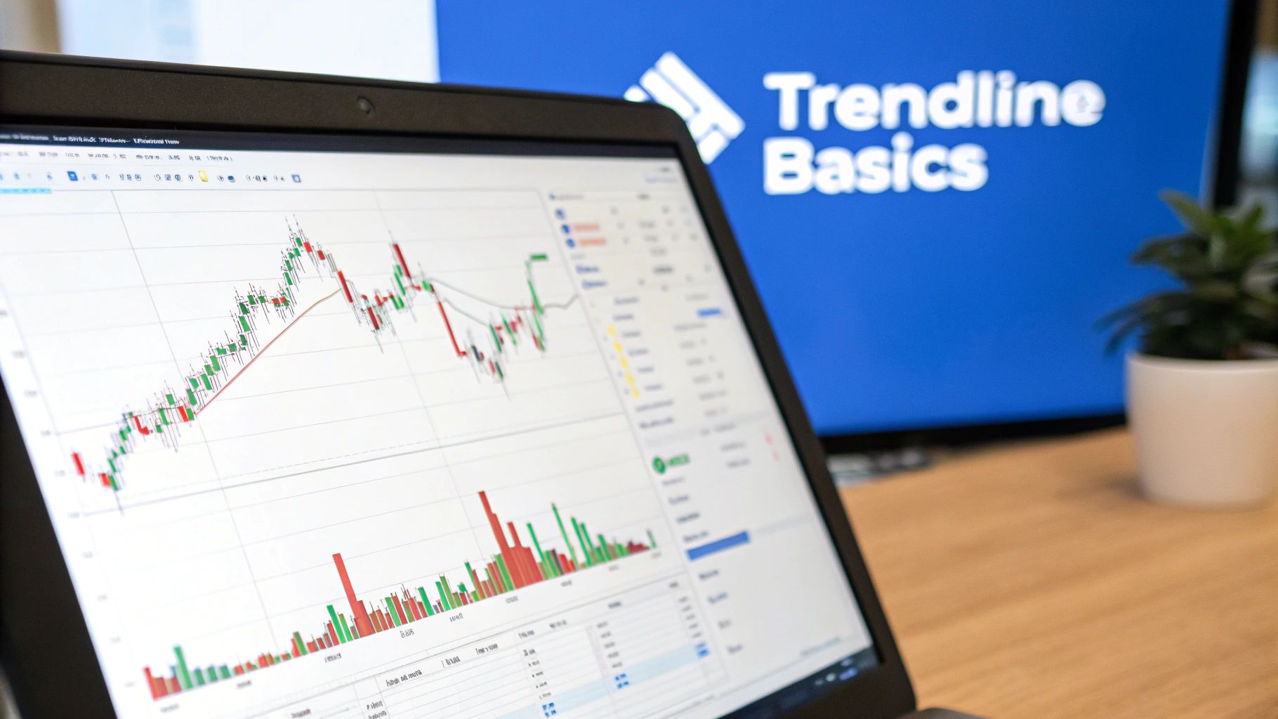
For a clear uptrend, your goal is to connect two or more of those significant swing lows. If you're looking at a downtrend, you'll be connecting two or more of the big swing highs. Your charting software, like ChartsWatcher, makes this easy—just grab the line tool and click on the points you've identified.
It's a pretty straightforward process, as you can see below.
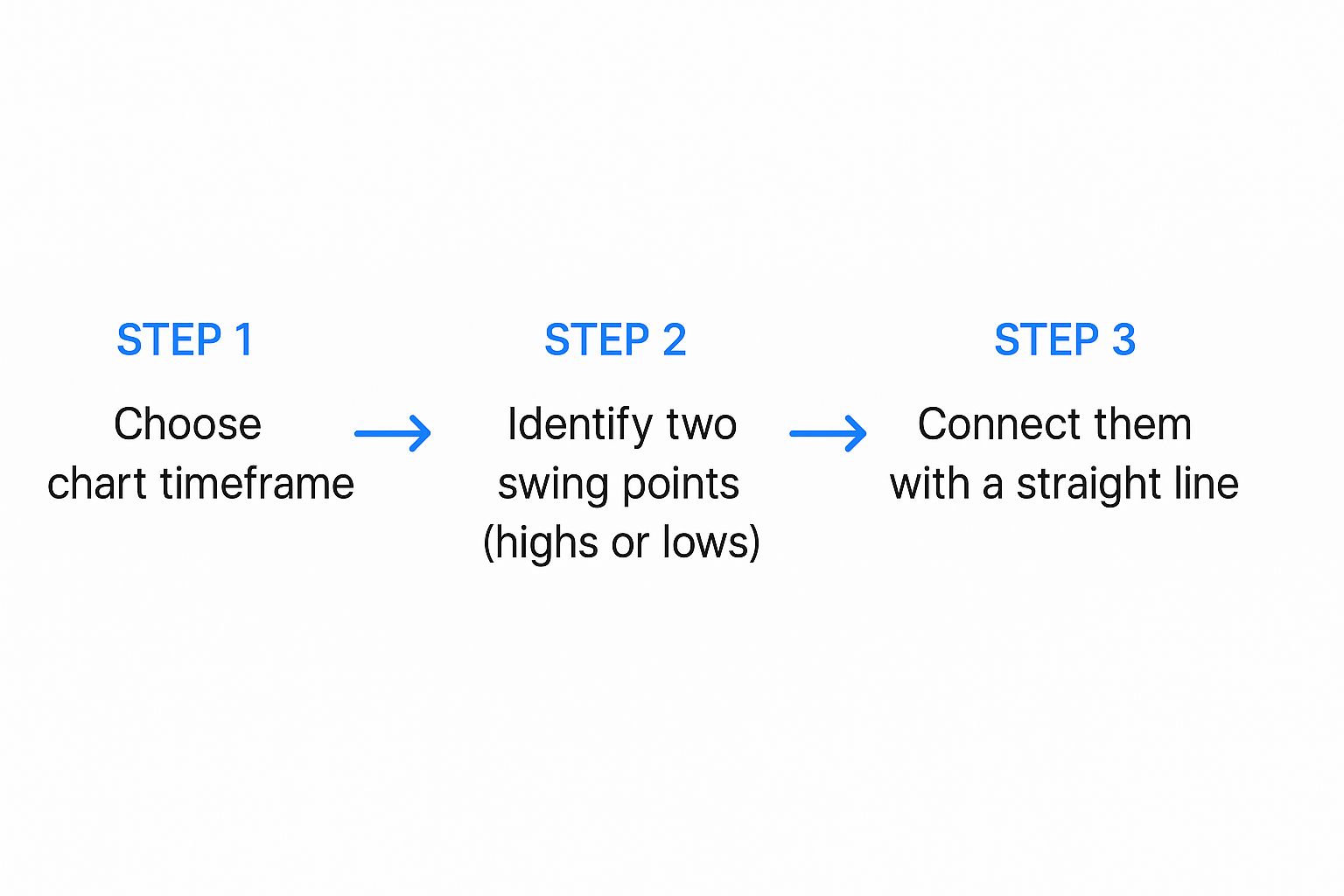
This just breaks it down visually: pick your timeframe, find your key swing points, and connect them to create your trendline. Simple enough.
Candle Wicks Versus Bodies
One of the first debates every trader runs into is whether to connect the candle wicks (the thin lines showing price extremes) or the bodies (the thick part showing the open and close). Honestly, there's no single "right" answer. It often comes down to the specific market and your own trading style, but here’s a good rule of thumb to start with.
- Using Wicks: I usually start here. Connecting the absolute highs or lows (the wicks) captures the full extent of price rejection. A long wick at a swing point is a powerful signal that the market tried to push to a level and was forcefully rejected.
- Using Bodies: Sometimes, you’ll get a chart that’s just plain messy, with long, erratic wicks all over the place due to high volatility. In those cases, connecting the candle bodies can give you a much cleaner line that better reflects where the price actually spent most of its time.
My personal method is to always begin by connecting the wicks. If the resulting line looks chaotic and cuts through a bunch of candle bodies, I'll adjust it to get a cleaner "best fit" line. The most critical rule is consistency. Whatever method you choose, stick with it for your entire analysis of that specific chart.
A trendline isn't about getting it perfect down to the last penny. It’s about creating a visual zone of support or resistance. The best trendline is the one the market clearly respects over and over again.
Drawing With Precision
Let’s put this into practice. Open up a chart in ChartsWatcher and find a clear trend. For an uptrend, grab your line tool and click on the first major swing low. Now, extend that line to the next significant higher low. The key is to make sure your line doesn't slice through the bodies of the candles sitting between those two points.
This isn't some niche technique, by the way. Trendlines are a cornerstone of technical analysis. Market surveys from 2023 showed that over 85% of active traders rely on them. What’s more, backtesting on major indices like the S&P 500 has suggested that well-drawn trendlines can help predict reversals with 60% to 75% accuracy, particularly when confirmed by a spike in trading volume.
Once you have your initial line drawn from two points, the next step is to extend it out to the right into "empty" space on your chart. A truly strong trendline will often get a third, fourth, or even a fifth touch, which is something we'll dive into when we cover validation.
If you're looking for more hands-on examples, you might want to check out our dedicated practical trading guide on this very topic.
How to Validate Your Trendline for Higher Accuracy

Anyone can connect two dots on a chart. But that doesn’t make the line meaningful or, more importantly, predictive. A line drawn between just two points is really just a potential trendline—a hypothesis. Experienced traders know the real magic happens during validation. This is the process of confirming that the market actually sees and respects the line you’ve drawn, turning it from a random line into a high-probability trading tool.
The very first test for any trendline is what I call the three-touch rule. Sure, you need two points to draw the line in the first place, but it’s that third touch that gives it any real legitimacy. Think of it this way: the first two points establish your theory, but the third touch is the first piece of hard evidence that other traders are watching and reacting to the same level.
The Power of the Third Touch
A two-point trendline is pure speculation. It's when the price comes back to that line a third time and bounces off that it graduates from a simple drawing to a confirmed level of support or resistance. This third touch dramatically increases the line’s reliability because it signals a consensus building among market participants.
It shows that a critical mass of buyers (in an uptrend) or sellers (in a downtrend) have all independently identified this diagonal level as a key decision point. Every touch after that just adds more weight and validity to the trendline, making it an even more dependable guide for your trading.
The gold standard for trendline validation is a minimum of three distinct touches. A line with only two touches is just a possibility; a line with three or more is a confirmed area of interest that you can build a strategy around.
Looking for Confirmation Signals
Beyond just counting touches, you need to look for other clues that confirm your trendline’s strength. The most powerful confirmation signal, by far, is trading volume. A truly valid trendline will interact with volume in a very predictable way.
For example, when the price pulls back to an uptrend line and then bounces higher, you want to see a spike in buying volume on that bounce. This shows conviction. It tells you that a wave of buyers stepped in precisely at your trendline, reinforcing its importance. On the flip side, a weak bounce on low volume suggests a lack of interest and a much higher chance the line will eventually fail.
Here’s what to look for:
- Bounces: On a successful test of a trendline, you should see increasing volume as the price moves away from the line.
- Breakouts: If the price smashes through your trendline, you want to see that break happen on high volume. This signals a powerful, decisive shift in momentum.
Another subtle but important validation factor is the angle, or slope, of your trendline. A sustainable, healthy trend usually has a moderate slope, typically somewhere around 30 to 45 degrees. A super steep trendline (over 60 degrees) is often a sign of unsustainable buying or selling hysteria and is much more likely to break. On the other hand, a very flat trendline indicates a weak, barely-there trend that might not have enough momentum to be worth your time.
Common Trendline Drawing Mistakes to Avoid
Even seasoned traders can fall into bad habits that wreck their analysis. Drawing a trendline seems simple on the surface, but a few common pitfalls can turn this powerful tool into a source of false signals and frustration. Honestly, learning to spot and correct these mistakes is just as important as knowing how to draw the line in the first place.
One of the biggest blunders I see is forcing the trendline. This is what happens when you've already decided where the market is going, and you start dragging the line around to fit that story. You might conveniently ignore a major swing point or slice right through a bunch of candle bodies just to make the line "prove" your trade idea.
A valid trendline needs to be obvious and objective. If you have to squint, contort the line, and hope it fits, it's not a real trendline—it’s just confirmation bias staring back at you from the chart. You have to let the price action dictate where the line goes, not the other way around.
Connecting Insignificant Price Points
Here's another classic mistake: connecting minor, insignificant price wiggles instead of major swing points. A trendline anchored by weak pivots is just tracking market noise, not the real underlying trend. This usually happens when traders get sucked into the super-low timeframes, like the 1-minute or 5-minute charts, where every little fluctuation looks like a big deal.
The fix is simple. Always start your analysis on a higher timeframe. Zoom out to the daily or 4-hour chart to identify the structurally significant swing highs and lows that are actually defining the trend. Those are the only anchor points strong enough to build a reliable trendline on.
Pro Tip: Not sure if a swing point is significant? Ask yourself this: "Did the market make a decisive and sustained reversal from this point?" If the answer is "not really," then it's probably just noise.
Redrawing and Over-Adjusting Your Lines
Markets are always in motion, so of course, trendlines aren't set in stone forever. But constantly redrawing your line every time a new candle forms is a recipe for chaos. This "over-adjusting" kicks in when a price briefly pokes through a line, causing a trader to panic and immediately redraw it to fit the new price action.
Think of a trendline as a zone, not a laser-precise barrier. You have to give the market room to breathe. A minor breach, especially if the candle closes back on the "correct" side of the line, often doesn't invalidate the trend at all. Stick to your original line—the one based on major swing points—until there is a clear and decisive break, which should be confirmed by a strong candle close and, ideally, a spike in volume. That discipline is what separates flimsy analysis from a trendline strategy that actually works.
To help you stay on track, I've put together a quick troubleshooting guide for the most common errors.
Troubleshooting Common Trendline Errors
This table is a simple reference to help you catch and correct mistakes before they lead to bad trades. Think of it as a mental checklist to run through when you're plotting your lines.
| Common Mistake | Why It's a Problem | How to Fix It |
|---|---|---|
| Forcing the Line | It creates a biased and unreliable signal based on hope, not what the chart is actually telling you. | Let the swing points dictate the line. If it doesn't fit neatly and obviously, there is no valid trendline there. |
| Using Weak Pivots | This anchors your analysis to market noise, which will lead to one false breakout after another. | Zoom out. Start on a higher timeframe (like the daily or 4-hour) to find the structurally significant swing points. |
| Constant Redrawing | This leads to confusion and completely erodes discipline. You end up chasing price instead of analyzing it. | Stick to your original line until a clear, high-volume breakout confirms the trend has actually changed. |
By keeping these points in mind, you'll build the habit of drawing clean, objective, and—most importantly—useful trendlines that genuinely support your trading decisions.
When you first start drawing trendlines, you'll find a few questions pop up over and over. It's totally normal. Getting these fundamentals straight is how you build the confidence to use trendlines in your day-to-day analysis.
Let's walk through some of the most common sticking points traders run into.
How Many Touches Make a Trendline "Real"?
You can technically draw a line between any two points on a chart. But is it a trendline yet? Not really. Those first two points are just your initial hypothesis.
The trendline doesn't get truly confirmed until you see a third touch. That third point is the market's way of validating your line. It tells you that other traders see the same level and are reacting to it, turning your simple line into a meaningful area of support or resistance. Every touch after that just adds more weight and reliability.
Should I Draw on the Wicks or the Bodies?
This is a classic debate, and the honest answer is: it depends. I always start by trying to connect the wicks—the absolute highs or lows of the candles. Wicks show you the full extent of where the price was pushed back, so it’s a great starting point.
If that gives you a clean line that the price is clearly respecting, perfect. Stick with it. But sometimes, especially in volatile markets, the wicks can be all over the place. In that case, try connecting the candle bodies. This can sometimes give you a better "line of best fit" that reflects where the real battles were won and lost (the closes).
The most important rule here is consistency. Whichever method you choose for a specific chart, stick with it. Don't mix and match on the same trendline.
Remember, a trendline isn’t a laser-precise barrier. It’s more like a zone of interest. A small poke through the line (a wick) is often just noise. A full candle body closing on the other side? That’s a much bigger deal.
What Happens When a Trendline Breaks?
A decisive break of a trendline is a major signal that the underlying dynamic of the market has probably changed.
When an uptrend line breaks, it suggests that the sellers have finally wrestled control from the buyers who were holding that level up. Conversely, when a downtrend line is broken to the upside, it means buyers are stepping in with force.
A confirmed break—especially one with a surge in volume—is your cue to pay attention. It often signals one of two things: a potential trend reversal is starting, or the market is shifting into a sideways consolidation period. Either way, it’s time to reassess your trade, consider taking profits, or look for a new setup in the direction of the break.
Should I Draw Trendlines Myself or Use an Automated Tool?
Learning to draw trendlines by hand is an essential skill. It forces you to study price action and truly understand market structure. There's no substitute for training your eye.
That said, modern tools have come a long way. Algorithm-supported trendline tools can draw lines with pure objectivity, removing your personal bias from the equation. For instance, a 2024 study on historical Dow Jones data found that algorithmically drawn lines identified key reversal points 68% of the time, slightly better than the 60% accuracy from manual drawing. If you're interested in the impact of technology on markets, you can find more data on global market analysis here.
So, what's the best approach? A hybrid one. Master the manual skill first. Then, use automated tools to confirm your analysis, find setups you might have missed, and save a ton of time.
Ready to stop guessing and start analyzing with precision? ChartsWatcher provides the advanced charting and alert features you need to identify, draw, and validate trendlines like a professional. Take control of your analysis by customizing your workspace with our powerful tools. Explore ChartsWatcher today.
