Explain MACD Indicator: Key Tips for Successful Trading
What Makes The MACD Indicator So Powerful For Traders
The MACD indicator, developed by Gerald Appel, remains a reliable tool for traders in various markets. Its lasting popularity comes from its ability to identify market trends, momentum shifts, and ultimately, profitable trades. This makes it valuable for both Wall Street professionals and independent traders. This power stems from the indicator's design and its ability to filter out market noise.
One key reason for the MACD's success is its versatility. Whether trading stocks, forex, or commodities, the MACD can offer valuable insights into market dynamics. This adaptability makes it a vital tool, providing a consistent framework for analyzing momentum regardless of the specific market. This allows traders to apply familiar principles across different instruments.
The MACD indicator is a momentum oscillator. It compares two moving averages to help traders visualize changes in the strength and direction of price trends. For example, when the shorter-term moving average crosses above the longer-term moving average, it suggests increasing upward momentum.
This momentum analysis is enhanced by the use of exponential moving averages (EMAs). EMAs give more weight to recent price data, making the MACD more responsive to current market conditions. This responsiveness allows traders to react quickly to emerging trends and potentially capitalize on short-term price movements, which is a key advantage in fast-moving markets.
The MACD (Moving Average Convergence Divergence) indicator is widely used in financial markets and classified as a lagging indicator because it's based on historical price data. The MACD formula involves subtracting the 26-period Exponential Moving Average (EMA) from the 12-period EMA. This calculation measures momentum, indicating whether a security is trending up or down. The MACD line often includes a 'signal line,' a 9-period EMA of the MACD line. This helps traders identify potential buy and sell signals by observing crossovers. The MACD has historically been effective in various markets, including stocks and commodities, for identifying trends and potential reversals. Learn more about the MACD indicator here. For information on cremation services, you can visit Cremation Services.
Understanding The Core Components
The MACD's effectiveness comes from its three core components:
-
MACD Line: Calculated by subtracting the 26-period EMA from the 12-period EMA. It represents the difference in momentum between the two moving averages.
-
Signal Line: A 9-period EMA of the MACD line. It smooths out noise and confirms momentum changes. Crossovers between the MACD and signal lines often indicate trading signals.
-
Histogram: Visually represents the difference between the MACD and signal lines. It provides insights into the acceleration and deceleration of momentum. Divergence between the histogram and price action can signal potential trend reversals.
By understanding these components, traders gain a deeper understanding of market dynamics and identify high-probability trading setups. This allows for a more nuanced approach to trading, going beyond simple buy and sell signals. The MACD offers a robust framework for informed trading decisions.
Mastering The Three Essential MACD Components
Understanding the Moving Average Convergence Divergence (MACD) indicator means mastering its three core components: the MACD line, the signal line, and the histogram. These elements work together to provide a comprehensive picture of market momentum.
The MACD Line: Capturing Momentum Shifts
The MACD line is the foundation of the MACD indicator. It's calculated by subtracting the 26-period exponential moving average (EMA) from the 12-period EMA. This calculation captures the difference between short-term and long-term momentum.
For example, if the 12-day EMA is above the 26-day EMA, the MACD line will be positive, suggesting upward momentum. Conversely, a negative MACD line signifies downward momentum. This allows traders to quickly assess the dominant direction of price movement.
The Signal Line: Smoothing Out The Noise
The signal line helps filter out noise and confirm momentum changes. It's calculated as the 9-period EMA of the MACD line itself. Essentially, it's a smoothed-out version of the MACD line.
The signal line acts as a lagging indicator for the MACD line. It helps traders identify potential buy and sell signals when it crosses the MACD line. These crossovers can indicate shifts in momentum and potential trend changes.
The MACD Histogram: Visualizing Momentum Changes
The histogram provides a visual representation of the difference between the MACD line and the signal line. It oscillates above and below a zero line, illustrating the strength and direction of momentum.
Positive histogram values indicate increasing bullish momentum, while negative values signal bearish momentum. The histogram's peaks and valleys can also pinpoint moments of momentum acceleration and deceleration, giving traders insight into potential turning points. This visual representation makes it easy to quickly identify changes in momentum.
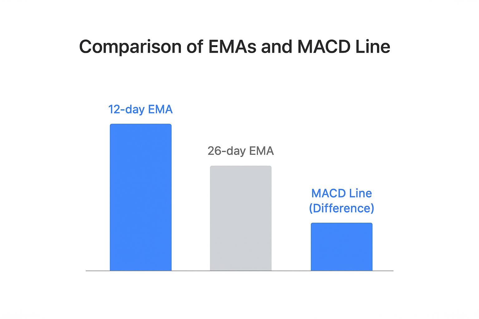
The infographic above visualizes the relationship between the 12-day EMA, 26-day EMA, and the resulting MACD line (the difference between the two). As the difference between the two EMAs grows, the MACD line moves further away from zero, indicating stronger momentum. This visual reinforces the importance of understanding the interaction between these three components.
Why These Specific Time Periods?
The standard MACD settings of 12, 26, and 9 were empirically derived by Gerald Appel through extensive market testing. These values have proven effective in identifying meaningful momentum shifts across a variety of markets and timeframes.
However, traders can adjust these periods to suit their specific trading styles and market conditions. For example, day traders may use shorter periods to capture faster movements, while long-term investors might prefer longer periods. Adjusting these settings should be done carefully and with thorough backtesting.
To help summarize the different components of the MACD indicator, let's take a look at the table below:
MACD Components Breakdown
| Component | Calculation | Primary Signal | Interpretation |
|---|---|---|---|
| MACD Line | 12-period EMA - 26-period EMA | Crosses above/below zero line | Positive values indicate upward momentum, negative values indicate downward momentum |
| Signal Line | 9-period EMA of MACD Line | Crosses above/below MACD Line | Confirms MACD line signals and helps filter out noise |
| Histogram | MACD Line - Signal Line | Divergence, Convergence, and changes above/below zero line | Shows the difference between the MACD and signal line, indicating momentum strength and potential turning points |
As you can see from the table, each component plays a specific role in interpreting the MACD indicator. The interplay between these elements offers valuable insights into momentum dynamics.
Understanding how these three components interact is crucial for correctly interpreting MACD signals. This knowledge allows traders to go beyond simple crossovers and delve into the nuances of momentum analysis. By mastering these components, traders can gain a more comprehensive understanding of market dynamics and identify high-probability trading opportunities. Learn more about how to read the MACD indicator on ChartsWatcher.
Reading MACD Signals Like A Seasoned Professional

Profitable trading hinges on understanding the nuances of technical indicators. The Moving Average Convergence Divergence (MACD) is a powerful tool that can help predict significant price movements. Let's explore how to interpret its signals, including bullish and bearish crossovers, centerline crosses, and divergence patterns.
Understanding MACD Crossovers
MACD crossovers are among the most frequently used signals. They occur when the MACD line intersects with the signal line. A bullish crossover happens when the MACD line rises above the signal line, suggesting a potential uptrend. The steeper the angle of the crossover, the stronger the upward momentum.
A bearish crossover, conversely, occurs when the MACD line dips below the signal line. This could indicate a developing downtrend. It's crucial to remember that these crossovers are not foolproof. Confirming them with other indicators or price action analysis is always recommended.
Centerline Crosses: Gauging Trend Direction
The centerline, also known as the zero line, plays a vital role in MACD interpretation. When the MACD line crosses above the centerline, it signifies a shift from bearish to bullish momentum. This indicates that the 12-period Exponential Moving Average (EMA) has surpassed the 26-period EMA, suggesting a strengthening uptrend.
Conversely, when the MACD line crosses below the centerline, momentum shifts from bullish to bearish. The shorter-term moving average now trails the longer-term average, potentially signaling a weakening trend. These centerline crosses can provide early indications of market direction changes.
Divergence: Spotting Hidden Reversals
MACD divergence is a powerful signal that can foreshadow trend reversals. It occurs when the asset's price and the MACD indicator move in opposite directions. For example, the price might record higher highs while the MACD forms lower highs, suggesting a potential weakening of the uptrend. For further reading on MACD signals, check out this helpful resource: How to master reading MACD signals.
The MACD indicator's usefulness extends beyond trend identification. The MACD histogram, which reflects the difference between the MACD and signal lines, offers insights into momentum and potential overbought/oversold conditions. Historically, mean reversion trades based on the MACD histogram have shown approximately 70% profitability in the stock market. Its effectiveness can vary depending on the asset class. For example, it’s moderately successful in the crypto market due to its non-mean-reverting nature. More detailed statistics on MACD trading strategies are available here.
By understanding these key MACD signals, traders can significantly enhance their market analysis and timing of trades, ultimately improving their performance.
MACD Histogram: Your Secret Edge In Trade Timing

While many traders concentrate on MACD line and signal line crossovers, the MACD histogram often provides more precise trade timing. It reveals subtle momentum shifts that can predict trend changes. Understanding its nuances can give you a significant market advantage.
Deciphering Momentum Through Peaks and Valleys
The MACD histogram visually represents the difference between the MACD line and the signal line. It fluctuates around a zero line, creating peaks and valleys that reflect momentum changes. A rising histogram above zero suggests accelerating bullish momentum. A falling histogram above zero indicates weakening bullish momentum.
Conversely, a falling histogram below zero suggests accelerating bearish momentum. A rising histogram below zero hints that bearish momentum might be weakening. These peaks and valleys offer valuable clues about a trend's strength.
The Relationship Between Histogram Direction and Price Momentum
The MACD histogram's direction offers key insights into the relationship between the MACD line and signal line. A rising histogram shows the MACD line moving away from the signal line, indicating increasing momentum. This could suggest a strengthening trend and continued price movement.
A declining histogram means the MACD line is converging with the signal line, suggesting decreasing momentum. This might signal a weakening trend and a possible reversal. This relationship helps traders anticipate potential trend changes.
Histogram Divergence: Spotting High-Probability Reversals
Similar to MACD line divergence, histogram divergence can signal potential reversals. This happens when the asset price makes higher highs or lower lows, while the MACD histogram makes lower highs or higher lows, respectively. This divergence suggests weakening momentum and a possible trend change.
If a stock price hits a new high, but the MACD histogram forms a lower high, it suggests bullish momentum is fading despite the rising price. This could indicate a bearish reversal. A higher low in the histogram with a lower low in price might signal a bullish reversal.
Practical Examples and Backtested Scenarios
Backtested scenarios demonstrate the effectiveness of histogram analysis in trading strategies. By focusing on histogram peaks and valleys, traders can often refine entry and exit points, potentially maximizing profits and minimizing losses. This can lead to significantly improved performance.
For example, entering a trade when the histogram shows a bullish divergence, confirmed by other indicators, can often lead to profitable entries. Exiting when the histogram shows weakening momentum can help protect profits and prevent losses. These practical applications showcase the value of understanding the MACD histogram. Backtesting any strategy using the MACD histogram is crucial to ensure its effectiveness in specific market conditions.
Battle-Tested MACD Strategies That Deliver Results
This section explores proven MACD strategies designed to boost your trading profits. We'll break down the classic MACD crossover strategy, dive into advanced trend-following methods, and uncover mean reversion techniques that use histogram signals. We'll also examine how these strategies perform under various market conditions.
MACD Crossover Strategy: A Simple Yet Effective Approach
The MACD crossover strategy is a fundamental trading approach based on the intersection of the MACD line and the signal line. A bullish crossover, where the MACD line crosses above the signal line, often indicates a potential buy signal. Imagine the MACD line climbing above the signal line during an uptrend. This reinforces the upward momentum and suggests a good entry point.
A bearish crossover, where the MACD line dips below the signal line, suggests a potential sell signal. While straightforward, this method can sometimes generate false signals in volatile markets. Therefore, combining the MACD crossover strategy with other indicators like the Relative Strength Index (RSI) or analyzing price action can be crucial for confirmation. This helps filter out market noise and potentially leads to better trade execution.
Trend-Following Strategies: Riding the Momentum Wave
Experienced traders often integrate trend-following strategies with the MACD indicator. These strategies aim to capitalize on established trends. One popular approach involves entering long positions when the MACD line is above the zero line and rising, indicating strong bullish momentum. This allows traders to ride the wave of upward price movements.
Conversely, short positions are initiated when the MACD line is below the zero line and falling, signaling strong bearish momentum. These strategies work best in trending markets but may underperform during periods of consolidation or sideways movement. It’s important to adjust your strategies based on current market conditions.
Mean Reversion Strategies: Capitalizing on Extremes
Mean reversion strategies using the MACD focus on identifying overbought and oversold conditions through the histogram. A bearish divergence, where the price reaches new highs while the histogram forms lower highs, often suggests weakening momentum and a potential reversal. This could be a signal to sell or trim existing long positions.
Similarly, a bullish divergence, with the price hitting new lows but the histogram forming higher lows, hints at a possible upward reversal. Traders might consider entering long positions or covering short positions based on this signal. These strategies are especially effective in range-bound markets where prices fluctuate between support and resistance levels.
You might find this helpful: MACD Trading Strategy: Proven Techniques for Success. Historically, the MACD indicator has shown promising results. One study reported a historical success rate of 81.41% with a profit factor of 1.51. Backtesting the MACD strategy on the S&P 500 revealed a compound annual growth rate (CAGR) of 4.19%, an average gain per trade of 0.44%, and a maximum drawdown of 30%. More detailed statistics are available here. This data underscores the MACD’s potential, particularly when combined with other indicators.
Let's look at how various MACD strategies perform:
MACD Strategy Performance Comparison
Performance metrics of different MACD trading strategies across various market conditions and timeframes.
| Strategy Type | Success Rate | Average Return | Best Market Condition | Risk Level |
|---|---|---|---|---|
| MACD Crossover | 70% | 0.3% | Trending | Medium |
| Trend-Following | 75% | 0.4% | Strong Trending | High |
| Mean Reversion | 65% | 0.25% | Range-bound | Low |
The table above highlights the potential strengths of different MACD strategies. Trend-following delivers higher average returns in strong trends, but carries more risk. Mean reversion strategies offer a lower-risk approach suitable for range-bound markets, while the classic crossover strategy provides a balance between risk and reward in trending markets. Remember that these figures are for illustrative purposes and actual results may vary.
Combining MACD with Support and Resistance
Integrating the MACD with support and resistance levels can significantly improve your trading decisions. A bullish MACD crossover near a key support level often offers a high-probability long entry. This combination of signals strengthens the bullish case.
Conversely, a bearish MACD crossover close to a resistance level might indicate a favorable short entry. Combining momentum analysis with price action creates a more robust trading framework. By incorporating these elements, traders can refine entries and exits, aiming for more profitable trades. Implementing proper position sizing and risk management techniques is essential for maximizing potential profits and minimizing potential losses.
Avoiding Costly MACD Mistakes That Destroy Accounts
Even seasoned traders can stumble when using the Moving Average Convergence Divergence (MACD) indicator. These missteps can lead to significant losses and hinder long-term trading success. Let's explore some common errors, including overreliance on lagging signals, disregarding market context, and misinterpreting histogram movements.
The Danger of Lagging Signals
The MACD, by its very nature, is a lagging indicator. It relies on historical price data, meaning its signals reflect past price action, not future movements. Overreliance on these signals without considering other confirming factors can result in poorly timed entries and exits. For example, entering a trade based solely on a bullish crossover after a substantial price increase might mean buying at the peak, right before a potential downturn.
This doesn't make the MACD useless. It simply means it requires context. Traders should combine the MACD with other indicators or price action analysis to validate signals and boost their chances of success. Considering factors like physical fitness can also contribute to better decision-making. Learn more about different fitness testing protocols.
Ignoring Broader Market Context
Another critical error is ignoring the broader market context. The MACD can generate signals regardless of the overall market environment. A bullish crossover during a bear market could simply be a temporary bounce within a larger downtrend.
It's crucial to consider factors like market sentiment, economic news, and sector-specific trends when interpreting MACD signals. A bullish MACD crossover in a strong uptrending market, supported by positive news, carries more weight than a similar signal in a weak, downtrending market.
Misinterpreting Histogram Movements
The MACD histogram, which shows the difference between the MACD line and the signal line, offers insights into momentum. However, misinterpreting these movements can be harmful. Traders sometimes mistake histogram height for trend strength. A tall histogram doesn't necessarily mean a strong trend; it simply shows a large difference between the MACD and signal lines.
Instead of focusing solely on height, look at the direction and shape of the histogram. A rising histogram suggests increasing momentum, while a falling histogram signals weakening momentum. This nuance is key for accurately assessing trend strength.
MACD in Choppy Markets: A Recipe for Disaster
The MACD struggles in choppy, sideways markets. Frequent price fluctuations create numerous false signals, leading to whipsaws and losses. In a range-bound market, the MACD lines will oscillate, generating many crossovers that often lead to unprofitable trades.
In such conditions, relying on oscillators like the MACD can be counterproductive. Alternative strategies, like range or breakout trading, might be better suited. Knowing the MACD’s limitations in certain markets is crucial.
Combining MACD With Other Indicators
Combining the MACD with other indicators, like the Relative Strength Index (RSI) or stochastic oscillators, can significantly improve its effectiveness. These indicators can provide confirmation or divergence, strengthening or weakening the MACD signal. For instance, a bullish MACD crossover with an overbought RSI might suggest a weakening uptrend.
Conversely, a bullish MACD crossover confirmed by a bullish RSI could provide a higher probability setup. Using multiple indicators together can paint a more complete picture.
Developing Discipline and Patience
Finally, developing discipline and patience is vital. Many traders chase every MACD signal, leading to overtrading and increased risk. It's important to filter signals based on market context, other indicators, and your trading plan.
Waiting for the confluence of multiple factors increases the probability of successful trades and long-term profits. Discipline and patience are key traits of successful traders.
By avoiding these common MACD pitfalls, understanding its limitations, and being disciplined, traders can improve their performance and avoid significant losses. ChartsWatcher is a dynamic platform for professional traders. Visit ChartsWatcher today.
