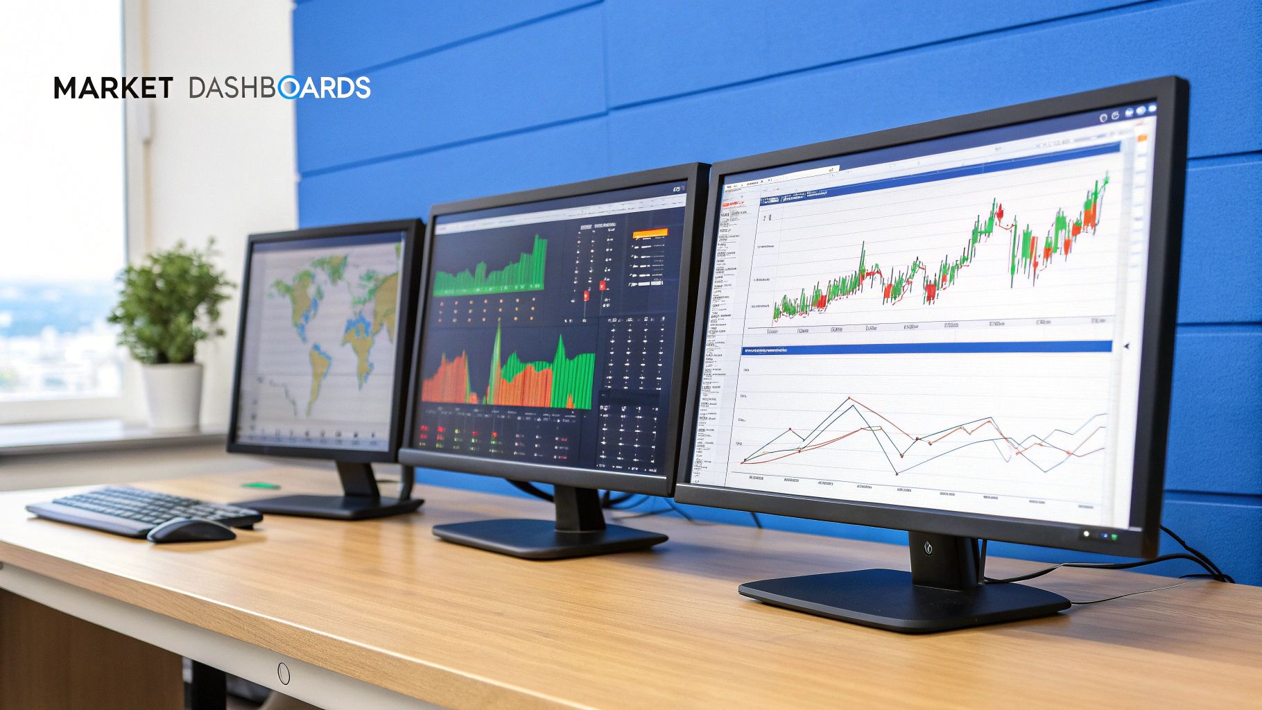
Build Your Own Stock Market Dashboards
Forget the chaos of generic financial websites. A personalized stock market dashboard is your command center for smarter investing. It cuts through the cluttered data to give you clear, actionable insights at a glance. Imagine seeing major index performance, sector trends, and your own portfolio's health all in one place.
Why a Custom Dashboard Is Your Secret Weapon
In the world of investing, information is power—but only if it’s the right information. Standard financial news sites throw a tidal wave of data at you, most of which is irrelevant to your specific goals. A custom dashboard is how you cut through that noise. It transforms you from a passive data consumer into a strategic analyst.
The real game-changer here is personalization. You decide what metrics and tickers deserve your attention. This means you stop sifting through noise and start building a view that perfectly mirrors your investment strategy, risk tolerance, and financial goals.
Taking Control of Your Financial Data
A well-designed dashboard is your mission control, bringing all your critical data points into a single, cohesive view. This is absolutely essential for making timely, informed decisions instead of reacting to old news.
For instance, tracking real-time index performance is fundamental. Recently, major U.S. indices saw a significant rally, with the Nasdaq climbing 3.7% and the S&P 500 gaining 2.4% in just one week. On a focused dashboard, these are the kinds of vital, top-line numbers you see instantly, giving you immediate context for the day. You can get a feel for this kind of high-level overview on platforms like E-Trade's market page.
The true advantage isn't just seeing the data; it's seeing the right data at the right time. A custom dashboard connects your portfolio's performance directly to the market forces influencing it.
To give you a clearer picture, I've outlined the must-have elements every investor should consider for their dashboard. These are the building blocks for a comprehensive view of the market.
Core Components of a High-Impact Dashboard
| Component | What It Tracks | Why It Matters to You |
|---|---|---|
| Major Index Performance | S&P 500, Nasdaq, Dow Jones | Gives you an immediate pulse on the overall market direction and sentiment. |
| Portfolio Holdings | Your individual stocks, ETFs, and funds | Tracks the real-time profit and loss of your actual investments. No guessing. |
| Watchlist | Companies you're monitoring | Keeps potential opportunities on your radar without cluttering your main view. |
| Sector Performance | Technology, Healthcare, Energy, etc. | Helps you spot rotational trends and identify which parts of the economy are heating up or cooling down. |
| Economic Calendar | CPI reports, Fed meetings, jobs data | Alerts you to upcoming events that could trigger major market volatility. |
Putting these pieces together is what gives you a truly strategic edge, moving you beyond simply owning stocks to actively managing your financial future.
From Reactive to Proactive Investing
A custom setup helps you spot connections you would otherwise miss. Think about these advantages:
- A Holistic View: See exactly how macroeconomic news, like an interest rate hike, is impacting your specific technology stocks versus your industrial holdings.
- Serious Efficiency: Stop wasting time and mental energy toggling between ten different browser tabs. Everything from your watchlist to your sector charts is right there.
- Deeper Insights: When you curate your own data feeds, you start to see patterns. Maybe one sector is consistently outperforming another, or a specific stock on your watchlist always dips before earnings. These are the insights that guide smart money moves.
This shift from scattered information to a centralized intelligence hub is what separates casual market observers from decisive, data-driven investors. To get started building your own, check out our guide on how to master your stock market dashboard in simple steps. It’s the first step toward taking real command of your investments.
Picking Your Data Sources and Tools
Any good stock market dashboard comes down to two key ingredients: trustworthy data and the right software to make sense of it all. The quality of your dashboard is a direct reflection of these two choices. Get them right, and you've built a foundation for clear insights, not just more confusing noise.
First up, you need to decide where your data will come from. This is usually a classic trade-off between cost, speed, and how deep you need to go. For most individual investors, free Application Programming Interfaces (APIs) from financial platforms are a great place to start. They'll typically give you end-of-day prices, company fundamentals, and sometimes delayed real-time data—more than enough for tracking a long-term portfolio.
But if you're an active trader or someone who needs to see every price tick the moment it happens, you'll have to look at premium data sources. These paid services deliver true real-time data streams, historical data that can go back decades, and access to more obscure financial metrics. The trick is to be honest about what you actually need. Paying for real-time data you never use is just lighting money on fire.
Selecting Your Dashboard Builder
Once you've got a handle on your data source, it's time to choose the software to bring your dashboard to life. Your technical comfort level is the biggest deciding factor here. The good news is there are excellent options for every skill set, from simple drag-and-drop interfaces to powerful coding libraries.
Here’s a quick rundown of the most common types of tools:
- No-Code Platforms: If you're just starting out, tools like Google Looker Studio (what used to be Data Studio) or Tableau are perfect. They can connect to tons of data sources (including Google Sheets, which is a simple way to log API data) and let you build charts and graphs with a user-friendly, visual interface.
- Coding Libraries: For those who want total control, Python libraries like Plotly and its web app framework Dash are the way to go. This route gives you complete command over every pixel—the look, feel, and functionality of your dashboard can be customized down to the smallest detail, allowing for truly unique analytics.
The best tool is one that not only fits your needs today but can also grow with you. It's smart to start simple, but try to pick a platform that offers more advanced features you can dig into later as your skills and strategies evolve.
This is exactly the kind of setup we're talking about—a clean, focused view of the metrics that matter most to you.
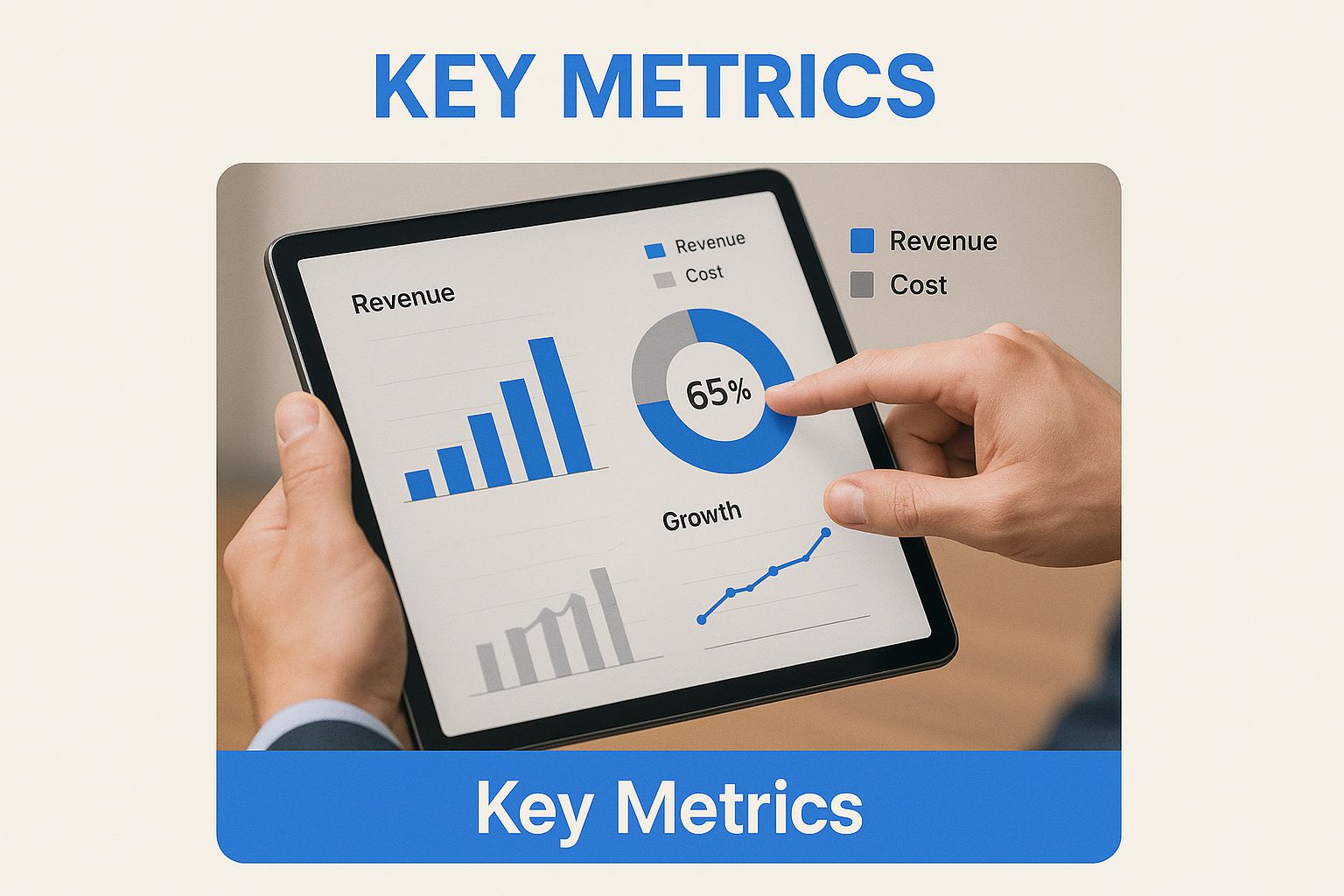
Visualizing your key numbers like this is what turns a spreadsheet full of raw data into a powerful decision-making tool.
Dashboard Tools: A Head-to-Head Comparison
To help you find the right fit, here’s a side-by-side look at some of the most popular options out there. Think about which one lines up best with your technical skills and how you approach investing.
| Tool | Best For | Key Feature | Learning Curve |
|---|---|---|---|
| Google Looker Studio | Beginners and budget-conscious investors | Free to use and integrates seamlessly with Google Sheets and other data sources. | Low |
| Tableau | Data analysts who want powerful visualizations | Industry-leading data visualization and robust analytical capabilities. | Medium |
| Python (Plotly/Dash) | Developers and traders needing full control | Complete customization and the ability to integrate complex, proprietary algorithms. | High |
In the end, it doesn’t matter if you pick a simple no-code tool or a sophisticated programming library. The goal is always the same: to create a personalized stock market dashboard that brings clarity to your decisions and supports your unique financial journey.
Building Your Core Market Overview
Alright, let's get our hands dirty. The very first thing you need to build, and arguably the most important, is your core market overview. Think of it like your morning ritual—a quick, high-level pulse check on the market's mood before you even think about placing a trade or digging into your own portfolio. This section must instantly answer one simple question: "What's the market doing right now?"
The foundation for this view is always the major indices. These are the essential barometers for the market's overall performance. At an absolute minimum, your dashboard needs prominent, easy-to-read widgets for these three:
- The S&P 500: Your best snapshot of the overall U.S. economy, representing the 500 largest companies.
- The NASDAQ Composite: This tells you how the tech-heavy, innovative, and growth-focused part of the market is behaving.
- The Dow Jones Industrial Average (DJIA): Tracks 30 massive, established "blue-chip" companies, giving you a read on the more traditional and industrial sectors.
For each of these, don't just show the current price. Your goal is to see performance at a glance. Make sure your widgets clearly display the daily percentage change. A sea of green or red tells you the story of the day's sentiment in a split second.
Visualizing Performance and Market Health
Daily noise is one thing, but you need context to make sense of it. This is where tracking longer-term performance becomes mission-critical. One of the most powerful metrics here is the year-to-date (YTD) performance. Simply adding a YTD percentage gain or loss next to each index puts the day’s action into a much broader perspective.
For instance, seeing the S&P 500 up nearly 14.80% over the last 12 months, with a YTD gain of around 7.78%, immediately signals a strong bullish trend. This kind of data, which you can explore further in this deep dive into U.S. equities market attributes, helps you differentiate between a minor dip and a real problem.
A truly useful stock market dashboard doesn't just throw numbers at you; it tells a story. When you combine daily changes with year-to-date trends, you can instantly tell if a red day is just a blip in a bigger uptrend or the potential start of a painful correction.
Now, let's add another crucial layer: market breadth. This metric answers a simple but incredibly profound question: Are today's gains (or losses) being driven by just a handful of giant stocks, or is the whole market moving together?
Gauging Market Breadth
The classic way to visualize market breadth is with an advancers vs. decliners chart. It’s a simple bar or pie chart showing how many stocks on an exchange (like the NYSE or NASDAQ) are up for the day versus down.
Here's why that's so powerful.
Imagine the S&P 500 is up a solid 1%. Looks great on the surface, right? But then you glance at your market breadth widget and see that declining stocks are outpacing advancing stocks 2-to-1. That’s an immediate red flag. It tells you the index's gains are likely being propped up by a few mega-cap tech giants, while most other companies are actually in the red. This is a classic symptom of poor market health and a warning sign of a potential reversal.
By combining these three elements—the major indices, their YTD performance, and market breadth—you create a powerful, multi-dimensional overview. In just a few seconds, you get a solid read on market health, sentiment, and momentum.
Alright, you've got the big picture of the market sorted. Now it's time to zoom in on what really matters: your own money. This is where we shift from a generic market monitor to your personalized trading command center. By plugging in your portfolio and a hand-picked watchlist, all that data suddenly becomes directly relevant to your trades and financial goals.
First things first, let's get your current holdings into the dashboard. Most tools give you two ways to do this: the old-fashioned manual way or a slick API integration.
Going manual is simple enough—you just punch in your tickers, what you paid for them, and how many shares you own. If you're more of a buy-and-hold investor with a portfolio that doesn't change much, this works perfectly fine.
But if you're an active trader, or you just value your time, linking your brokerage account via an API is the way to go. This sets up a live feed that automatically syncs your dashboard every time you make a trade. No more forgetting to log a position, and your P/L will always be spot-on.
Tracking Your Performance Metrics
With your holdings loaded, we can build out the most critical part of this section: performance tracking. This is about more than just watching the current stock price tick up and down. A truly useful portfolio widget needs to give you the vital stats at a glance, for each stock and for your portfolio as a whole.
Make sure you're tracking these essentials:
- Total Portfolio Value: The live, real-time value of all your investments combined.
- Daily P/L (Profit & Loss): How your portfolio has performed in both dollar and percentage terms since yesterday's close.
- Total P/L: The big-picture profit or loss on each position since the day you bought it.
- Asset Allocation: A visual breakdown, usually a pie chart, showing where your capital is parked. Are you heavy in tech? Overweight in one "meme stock"? This tells you instantly.
Your portfolio module isn't just for seeing green or red. It's a critical risk management tool. A quick look at your asset allocation chart might reveal you've accidentally become 70% concentrated in a single stock after a big run-up, a clear signal that it might be time to take some profits and rebalance.
Building a Dynamic Watchlist
Think of a watchlist as your forward-looking radar. It's where you keep tabs on stocks you're researching, waiting for that perfect entry point, or just want to monitor. But a simple list of tickers isn't enough. Your watchlist should be dynamic and work for you.
Set up custom alerts that ping you when a stock on your list hits a specific price, breaks through a key moving average, or sees a massive volume spike. This turns your dashboard from a passive screen into an active trading assistant.
Of course, finding stocks worth watching is the first step. For day traders and active investors, a powerful scanner is indispensable for digging up these opportunities. Our guide on the 12 best stock scanners for day trading is a great place to start looking for tickers to populate your list.
By combining a live snapshot of your portfolio with a smart, alert-driven watchlist, you've created a complete command center. You have a crystal-clear view of where you stand right now, while also actively scanning the horizon for your next move. That's the strategic edge every trader is looking for.
Taking a Deeper Look With Advanced Analytics
A basic dashboard is great for keeping an eye on what's happening right now, but a truly powerful one helps you understand why it's happening. When you start layering in advanced analytics and a broader market perspective, your dashboard evolves from a simple price tracker into a serious analytical tool. This is how you start to spot hidden trends and make more sophisticated, forward-looking decisions.
The first step is to bring technical indicators directly into your charts. These are simply mathematical calculations based on a stock's historical price, volume, or open interest. Instead of just seeing a line representing price, you can overlay key indicators to gauge momentum and identify potential entry or exit points.
Layering in Technical Indicators
You don't need to clutter your charts with dozens of indicators. In fact, that often leads to analysis paralysis. A couple of well-chosen tools can offer profound insights when you're just starting out.
Consider adding these two fundamentals to your main stock charts:
- Moving Averages (MAs): Plot both a 50-day and a 200-day moving average. When the shorter-term 50-day MA crosses above the longer-term 200-day one (a "golden cross"), it's often a signal of bullish momentum. The opposite, known as a "death cross," can signal a bearish trend ahead.
- Relative Strength Index (RSI): This is a momentum oscillator that measures the speed and change of price movements. An RSI reading above 70 is often considered overbought, while a value below 30 is considered oversold, flagging potential reversal points.
By visualizing the RSI directly below a stock's price chart, you can instantly spot divergences. For example, if a stock hits a new high but the RSI doesn't, it might indicate that the upward momentum is fading—a valuable heads-up for any trader.
Adopting a Global Market Perspective
Your investments don't exist in a vacuum. A U.S.-based tech company can be heavily influenced by supply chain issues in Asia or a dip in consumer demand from Europe. Adding a global view to your stock market dashboards is essential for seeing the complete economic picture.
A simple way to start is by adding widgets for major international indices. This helps you get a quick feel for how different regions are performing and where capital might be flowing.
- FTSE 100 (UK): A snapshot of the UK's largest companies.
- Nikkei 225 (Japan): The leading index for the Japanese stock market.
- DAX (Germany): Tracks 40 major German blue-chip companies.
- SSE Composite (China): The most-watched index for China's massive stock market.
This global context is crucial. The world's stock market landscape shows vast differences in capitalization. For instance, in 2025, the United States represented about half of the global total, with China a distant but significant second. You can explore more data on global markets at Statista. Dashboards that feature regional performance help you build strategies with a truly worldwide view.
Finally, incorporating analytics is becoming easier than ever. For those looking to bring AI-driven insights into their financial analysis, exploring tools like Microsoft Copilot for Finance can automate parts of this process, helping you find connections in the data you might have otherwise missed.
By combining technical, sector, and global views, your dashboard transforms into a powerful command center for identifying opportunities and managing risk on a whole new level.
Questions I Hear All the Time About Building Dashboards
Once you start using your new dashboard, you'll inevitably run into a few practical questions. It happens to everyone. Getting good, straight-to-the-point answers is how you turn a collection of charts into a tool you can’t live without. Let's dig into some of the most common ones I get asked.
How Often Should I Actually Update My Data?
This boils down entirely to your trading or investing style. There's no single right answer.
If you're an active day trader, you absolutely need real-time data. It's non-negotiable. But for the vast majority of us who are long-term investors, an update every 15 minutes or even just once at the end of the day is more than enough to make informed decisions.
Many free APIs come with a 15-minute data delay, which honestly hits a sweet spot. It’s frequent enough to alert you to major market shifts but keeps you from paying for a premium real-time subscription. A great starting point is to set your main indices and portfolio value to refresh every 5 to 15 minutes. This keeps you in the loop without the stress of watching every tiny price tick.
What Are the Most Critical Metrics for a Beginner's Dashboard?
It is incredibly easy to get lost in a sea of data. My advice? Start small and master the essentials before you add anything else. Seriously, don't overcomplicate it at first.
Get comfortable with these five core components, and you'll have a fantastic foundation:
- Major Index Performance: Keep an eye on the S&P 500 and NASDAQ. This is your quickest way to check the market's overall mood.
- Your Portfolio Value & Daily Change: This is your personal scorecard. It tells you where you stand at a glance.
- A Focused Watchlist: Track 5-10 companies you're actively researching. Any more than that, and it just becomes noise.
- Sector Performance Chart: A simple chart that shows which industries are leading and which are lagging. It’s great for spotting trends.
- A Curated News Feed: Make sure this is linked directly to the tickers in your portfolio and watchlist for relevant, actionable headlines.
Can I Really Build a Dashboard for Free?
Yes, absolutely. You can build an incredibly powerful and effective stock market dashboard without spending a single dollar. Tools like Google Looker Studio or even a smartly organized Google Sheet work perfectly as an interface.
For the data, the free tiers from API services like Alpha Vantage or IEX Cloud provide plenty of firepower for a personal dashboard. You’ll get daily prices, fundamental company data, and all the key metrics you need. The only trade-offs are usually slightly delayed data and a cap on how many requests you can make—things the average individual investor will rarely, if ever, run into.
The secret to avoiding information overload is to be relentlessly intentional. Before adding any new chart or metric, ask yourself a simple question: "Does this visualization help me make a better or faster decision?" If the answer is no, it's just noise.
Your dashboard's main job is to create clarity, not chaos. Use visual hierarchy to your advantage. Make your most critical number—like your total portfolio value—the biggest and boldest thing on the screen. Group related metrics together so your eyes can follow a logical path. This deliberate design is what transforms a random collection of charts into a focused decision-making machine.
At ChartsWatcher, we specialize in providing the tools you need to build a truly professional-grade trading dashboard. Our platform allows you to customize every window, from alerts and charts to newsfeeds and watchlists, giving you the control to create a setup that perfectly matches your strategy. Take command of your market analysis by visiting https://chartswatcher.com to learn more.
