Master Your Stock Market Dashboard in Simple Steps
Why Your Current Approach Is Sabotaging Your Returns
Imagine piloting a spacecraft with only a compass, a star chart, and sticky notes. Feeling overwhelmed? That's how many traders approach the stock market, juggling different platforms and spreadsheets, struggling to get a clear picture of their investments. This fragmented approach, while common, often leads to emotional decisions and missed opportunities.
Successful traders, on the other hand, know that a well-designed stock market dashboard is their mission control. It's the base for every strategic decision, providing a real-time view of their financial world.
This image shows NASA's Mission Control Center, a hub of organized data and real-time monitoring. Look at the clear displays, the organized layout, and the focused team. Just like mission control gives a central view for critical decisions in space, a stock market dashboard offers the same advantage for navigating the complex financial markets. A good dashboard consolidates key data, presenting it clearly for smart, strategic decisions.
A well-designed dashboard helps you avoid costly mistakes from information overload and spot opportunities others miss.
Think about a trader using separate platforms for news, charts, and portfolio tracking. By the time they gather all the info, a perfect entry or exit point could be gone. A consolidated stock market dashboard shows this data in real time, letting traders react quickly and decisively.
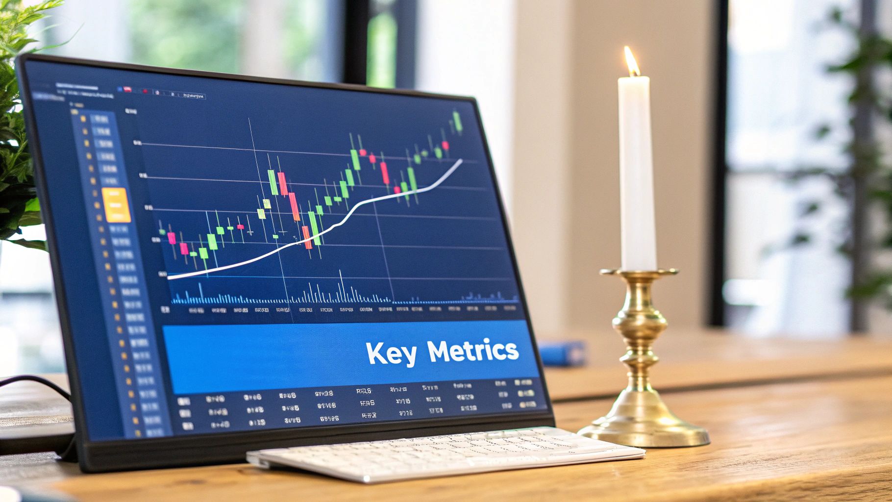
A central view of risk, performance, and market trends allows for proactive risk management. Instead of reacting to losses, traders can see potential problems early and adjust their strategy. This proactive approach is a sign of successful investors and a key benefit of a complete stock market dashboard like ChartsWatcher.
A strong dashboard isn't just about convenience; it's about gaining a vital edge in the market.
What Separates Winning Dashboards From Digital Clutter
The difference between a truly effective stock market dashboard and a confusing mess of information comes down to one core principle: focus. Imagine the cockpit of a fighter jet. The pilot needs critical information immediately accessible, not hidden among countless dials and switches. Similarly, a winning dashboard prioritizes actionable insights over a flood of irrelevant data.
Essential Elements of a Winning Dashboard
This means concentrating on key elements that transform raw market data into usable knowledge. Real-time position tracking is paramount. Knowing your exact holdings at any given moment is the foundation of informed decisions. Like a captain needing to know their ship's location, you need a clear view of your portfolio's current state.
Risk exposure alerts are your personal market sentinels. They notify you when your portfolio drifts outside your predetermined risk tolerance, allowing for adjustments before small losses snowball. Think of it like a car's check engine light – an early warning system preventing major damage.
This screenshot from Yahoo Finance shows a snapshot of market data. Notice how key indices, trending stocks, and news headlines are clearly presented. While helpful for a broad overview, a truly effective dashboard tailors this data to your specific portfolio and investment strategy.
Performance attribution answers the crucial question: why is my portfolio performing this way? Is it due to particular sectors, individual stocks, or overall market trends? This knowledge helps you refine your approach over time. It's like reviewing game footage to identify strengths and weaknesses.
Speaking of market trends, integrated trend recognition systems provide valuable context. Recognizing larger market movements can significantly impact both short-term and long-term strategies. It's about seeing the forest and the trees. For example, the S&P 500, a common benchmark in investment dashboards, has a strong long-term track record. Since 1957, it has averaged an annual return of about 10.33%, although adjusting for inflation brings the real return closer to 6.47%. Discover more insights.
Separating the Essential From the Superfluous
The real skill lies in discerning the metrics that truly matter versus those that just look impressive. A day trader, for instance, might prioritize real-time Level 2 data, while a long-term investor might focus on fundamental analysis indicators. 7 Top Financial Dashboard Examples for 2025 Success provides further insight. This understanding is what differentiates powerful tools from simple stock tickers. Building an effective stock market dashboard requires careful consideration of your individual needs and investment style. It's about creating a personalized command center, empowering you to make informed decisions and not just react to market fluctuations.
The Psychology Behind Dashboard Design That Actually Works
Creating a reliable stock market dashboard, especially during market volatility, hinges on understanding how we process information under pressure. When your portfolio takes a hit, you need clear data to encourage rational decisions, not panic. Think of how crucial clarity is in aviation or medicine – that's the level of design thinking we need.
Cognitive Load and Decision Making
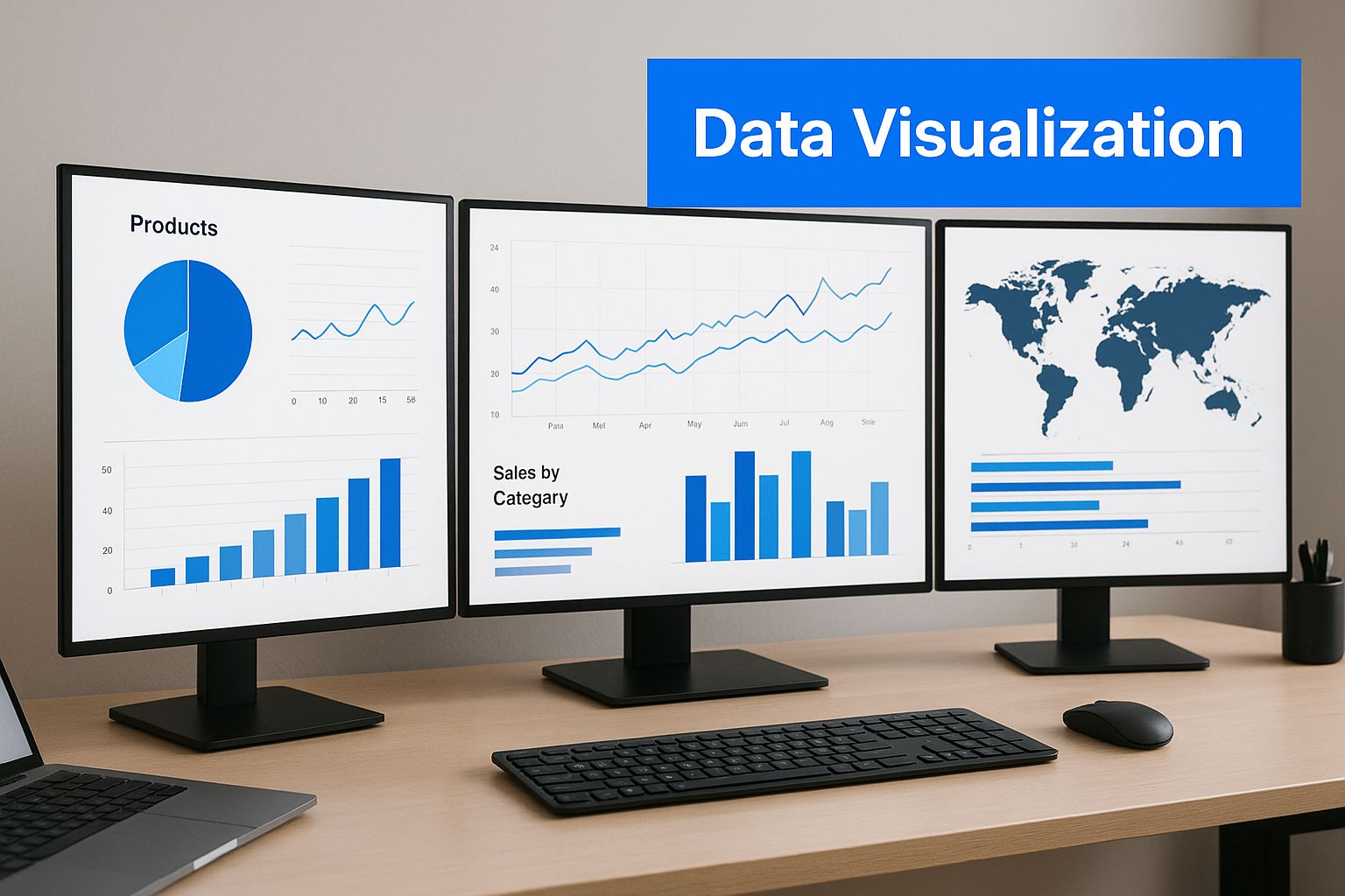
Imagine an airplane cockpit or an ER monitor. Critical data is instantly visible, organized hierarchically. A stock market dashboard should work the same way. Your most important metrics—portfolio value, major positions, and key market indicators—should jump out at you. This minimizes cognitive load, letting you focus on strategy, not searching. Designing a great stock market dashboard requires understanding what makes dashboards effective. Check out these business intelligence dashboards for inspiration.
Color Psychology for Clarity
Color is key for quick communication. Green for gains, red for losses, amber for caution – it's intuitive. But color psychology is more nuanced than that. A rainbow of bright colors can be overwhelming, especially when you're stressed. Subtle shades and strong contrast are more effective. They enhance, not hinder, decision-making.
This infographic shows how to prioritize data within a stock market dashboard. Key metrics need to be prominent. This visual hierarchy makes sure you see the most crucial information first, allowing for faster assessment and response.
Layout and Information Flow
A good layout guides your eye through the information logically. Group related data points. Use visual separators. Prioritize key charts and graphs. Think about how financial news sites present headlines next to relevant charts. This helps you instantly connect events and market reactions, empowering strategic responses.
This TradingView screenshot shows a well-structured stock market dashboard. Notice the clear sections, the use of color, and the readable charts. This kind of structure makes accessing and interpreting information much faster.
Minimalism and Performance
Studies show minimalist designs outperform cluttered ones, especially under pressure. A clean stock market dashboard keeps you focused and prevents distraction. This leads to better trading because decisions are based on clear analysis, not visual overload. In dashboard design, less is definitely more.
To help you understand the best practices, let's take a look at the following table which compares effective dashboard design principles with common mistakes.
Dashboard Design Principles vs. Common Mistakes A comparison of effective dashboard design practices against typical pitfalls that reduce usability
| Design Principle | Why It Works | Common Mistake | Impact on Decision Making |
|---|---|---|---|
| Visual Hierarchy | Prioritizes key information for immediate attention | Cluttered layout, no clear focal points | Difficulty finding critical data, leading to delayed reactions and potential missed opportunities |
| Minimalist Design | Reduces cognitive load, promotes focus | Excessive data, unnecessary widgets | Distraction, information overload, difficulty discerning important trends |
| Strategic Use of Color | Quickly conveys meaning, highlights important changes | Inconsistent or overwhelming color palettes | Misinterpretation of data, visual fatigue, difficulty focusing |
| Logical Information Flow | Guides users through data efficiently | Disorganized layout, unrelated data grouped together | Confusion, inefficient analysis, inability to see the "big picture" |
This table highlights how crucial design is for effective decision-making. By following the design principles and avoiding common mistakes, you can create a dashboard that truly empowers you.
Global Market Intelligence That Actually Matters
Your investment universe isn't limited to your local stock exchange. It's a global web of interconnected markets. Just like a doctor needs a patient's complete medical history, not just a snapshot of their current symptoms, a smart investor needs global context. Your stock market dashboard should reflect this without overwhelming you with unnecessary information.
Beyond Your Borders: Why Global Data Matters
Imagine you're analyzing Apple stock. Knowing their latest iPhone sales figures is important, but what about the global chip shortage affecting production? Or currency fluctuations impacting international sales? A true understanding requires a wider lens than just your domestic market.
This MarketWatch screenshot offers a peek into how global markets are linked. The various indices and news highlights demonstrate the constant flow of information that influences asset prices worldwide. Keeping track of these global trends can reveal valuable insights into potential risks and opportunities.
For example, a sudden dip in the Chinese market could trigger a ripple effect across global supply chains. This kind of information, easily accessible on a global stock market dashboard, empowers investors to make well-informed decisions, even about holdings seemingly unrelated to the initial event.
Incorporating Global Data: Practical Approaches
So how do you integrate meaningful global data into your dashboard? Start by pinpointing the key international markets that affect your investments. Do you have holdings in companies with significant European operations? Then tracking the Euro Stoxx 50 index becomes crucial.
Next, think about adding currency impact visualizations. How does a strong dollar impact your investments in foreign companies? A well-designed dashboard can illustrate these connections clearly.
Understanding correlation patterns is also essential. Do emerging markets always follow the lead of developed economies? Or do they sometimes diverge? Visualizing these correlations can make or break your diversification strategy. Consider this: international stock market performance has varied significantly compared to the U.S. market – a crucial factor for any globally diversified stock market dashboard. Over the past decade, the S&P 500 has outperformed many of its global counterparts, averaging 13.8% in annualized returns, while global stocks excluding the U.S. have averaged around 4.9% annually. Learn more about international market performance.
Intelligent Alerts for a Globalized World
Finally, make the most of intelligent alerts. Imagine receiving a notification that overnight volatility in the Japanese market might impact your semiconductor holdings. This proactive approach allows you to respond strategically, not just react.
Building a global perspective isn't about adding more data to your dashboard. It's about filtering out the important information from the noise. It's about understanding the global forces at play and making informed decisions based on the complete picture.
Reading Market History Like A Seasoned Pro
Markets ebb and flow, much like the ocean's tides. Understanding these cyclical patterns is crucial for improving your timing and managing risk effectively. Think of historical market data as layers of earth in a geological cross-section – each period reveals a story of economic shifts, investor sentiment, and underlying structural changes. And these stories, surprisingly, often echo familiar patterns. This section explores how to weave this historical context into your stock market dashboard, all while avoiding the pitfalls of information overload.
Discerning Patterns From Randomness
How do we separate genuine market patterns from mere chance occurrences? Seasoned investors use historical comparisons to maintain perspective. It’s like having an anchor in a storm, providing stability during both exhilarating bull markets and nerve-wracking bear markets. The dot-com bubble of the late 1990s and the 2008 financial crisis, for example, offer invaluable lessons about the dangers of speculative excess and systemic risk. By studying these periods, we build a framework for interpreting current market behavior.
Leveraging Historical Data in Your Dashboard
Imagine a powerful telescope that can peer back in time, revealing the financial universe's past. That's what an AI-powered dashboard can be. Similar to how AI is reshaping the fashion industry, it can analyze immense historical datasets, identifying recurring patterns and potential future trends in the stock market.
At the heart of these financial dashboards lies historical return data from major asset classes like U.S. stocks, Treasury bonds, and Treasury bills. This data allows investors to visualize long-term trends, such as the historical outperformance of stocks compared to fixed income (the equities premium). It also highlights periods when bonds unexpectedly took the lead. These insights can inform your long-term investment strategy and shape your risk management decisions. You can explore more about historical asset class returns.
To illustrate this, let's look at real market data. The table below shows how different asset classes performed during various market conditions.
Asset Class Performance Across Market Cycles
Historical performance comparison of major asset classes during different market conditions.
| Time Period | S&P 500 Return | Treasury Bonds | Treasury Bills | Market Condition |
|---|---|---|---|---|
| 1970-1980 | Example: Inflationary Period | |||
| 1980-1990 | Example: Bull Market | |||
| 1990-2000 | Example: Tech Bubble | |||
| 2000-2010 | Example: Dot-com Bust & Financial Crisis | |||
| 2010-2020 | Example: Post-Crisis Recovery |
This table needs to be populated with real data. Notice how different asset classes react to different market environments. This underscores the importance of diversification and understanding historical trends.
This screenshot from Yahoo Finance showcases the historical performance of the S&P 500 ETF (SPY). The chart visually depicts price swings over time, highlighting periods of growth and decline. Studying this kind of historical data is crucial for understanding market volatility and forming informed predictions.
Applying Historical Context to Current Decisions
By setting up your stock market dashboard to flag when current market conditions resemble past environments, you can base your decisions on data and precedent, not on emotions. Imagine your dashboard flashing a warning signal because certain economic indicators start to look like those preceding a previous recession. This empowers you to adjust your portfolio proactively, potentially minimizing losses and even capitalizing on emerging opportunities.
With the added dimension of historical context, your dashboard becomes more than just a monitoring tool. It transforms into a predictive instrument, helping you anticipate market movements, make more strategic asset allocations, and ultimately, navigate the complex financial world with increased confidence and success.
Building Your Connected Investment Ecosystem
The most powerful stock market dashboards aren't isolated tools. They're more like the central nervous system of your entire investment strategy. Think of your dashboard as the main control hub, connecting your brokerage accounts, research platforms like TradingView, news feeds, and analytical software into one cohesive, powerful unit. This interconnectedness transforms a static display of information into an active, insightful investment assistant.
The Power of Integration
Modern APIs and seamless data integration are the keys to this transformation. These technologies allow your dashboard to automatically refresh with the latest data, quietly working in the background. Imagine never having to manually update your spreadsheet with the day's closing prices or the latest news headlines – that's the power of a connected investment ecosystem.
-
Seamless Connections: Your dashboard should integrate with popular trading platforms, letting you execute trades directly from your central command center. Think of it as managing everything from one screen, saving you precious time and streamlining your workflow.
-
Automated Data Synchronization: Say goodbye to manual data entry and the potential for human error. Automated synchronization ensures your dashboard always reflects the most up-to-date information, from your account balances to real-time market movements.
-
Workflow Efficiency: Imagine automating tasks like performance reporting or rebalancing your portfolio. A well-connected ecosystem can shave hours off of tedious, repetitive work, allowing you to focus on the big picture – your investment strategy.
This screenshot from ChartsWatcher demonstrates a clear, intuitive interface. The clean design and customizable windows empower traders to see all of their essential information at a glance. This level of personalization and real-time data presentation perfectly illustrates the power of a thoughtfully designed stock market dashboard.
ChartsWatcher: The Foundation of Your Investment Ecosystem
Platforms like ChartsWatcher are built to be the core of this integrated approach. They provide not only the raw market data you need, but also the analytical tools to transform that data into actionable insights. For more information on effectively utilizing these tools, explore our guide on how to use a stock screener.
-
Real-Time Data and Analysis: ChartsWatcher provides up-to-the-second market information, paired with robust charting and analytical tools. This empowers you to make well-informed decisions based on the freshest data available.
-
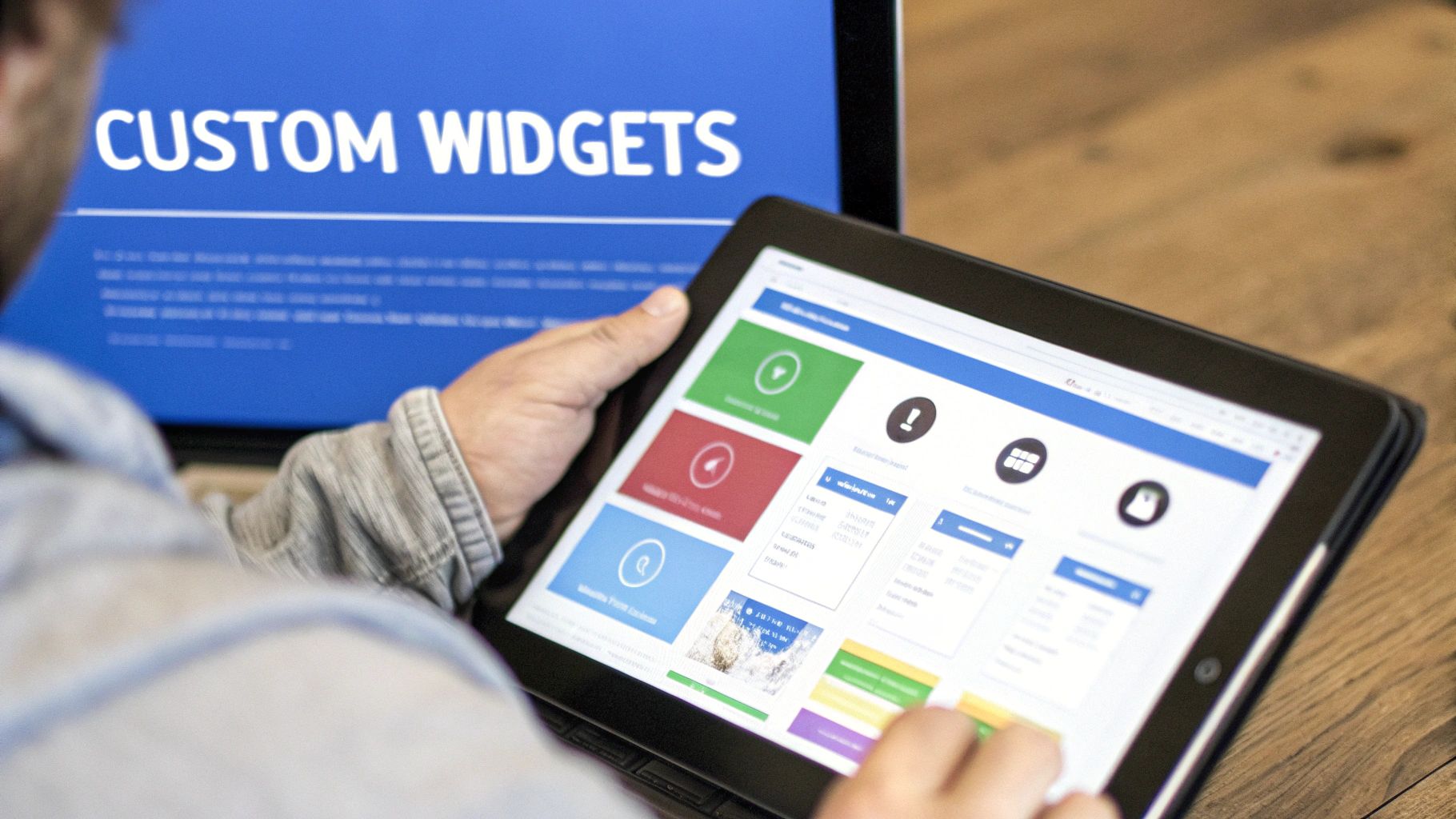
Customizable Dashboards: Tailor your dashboard to reflect your individual investment style and preferences. Whether you're a day trader or focused on long-term growth, ChartsWatcher adapts to your unique needs.
-
Integrated Alerts and Notifications: Stay ahead of the curve with customizable alerts. Receive instant notifications about important price changes, relevant news events, or any other metric you define as critical to your strategy.
Building a Competitive Edge Through Integration
By connecting all your investment tools and resources through a central stock market dashboard, you gain a significant edge. This comprehensive view of your investments, coupled with automated data updates and in-depth analysis, allows you to make quicker, more informed decisions. This efficiency compounds over time, leading to improved performance and greater control over your financial goals. It's like having a dedicated team of analysts working around the clock, constantly monitoring the market and alerting you to potential opportunities and risks. This frees you to concentrate on what truly matters – making smart, strategic investment decisions.
Your Path From Setup To Trading Success
Imagine building a stock market dashboard is like constructing your own personalized control center for navigating the financial markets. It’s not about throwing every possible gauge and dial onto the panel; it's about carefully selecting the tools that empower your specific trading style. Just as a pilot wouldn't overload their cockpit, you want a dashboard that provides clarity, not confusion.
Starting With the Essentials
Begin with the core information you need to make informed decisions. Think of it as laying the foundation of your trading command center. What are the absolutely essential metrics that drive your investment strategy? Your portfolio's value, the performance of key holdings, and relevant market indices are excellent starting points. This creates a clear, concise snapshot of your current financial position.
For example, if your focus is the tech sector, the NASDAQ Composite should be front and center. Supplement this with the performance of individual tech stocks you own and relevant news feeds. This provides a focused, efficient view, preventing information overload from the start.
Progressive Enhancement: Adding Complexity as You Grow
As your trading experience expands, so should your dashboard’s capabilities. Start incorporating more advanced tools as you refine your strategies and understanding of the market. Perhaps you're diving into technical analysis. Adding indicators like moving averages or relative strength index (RSI) can be incredibly valuable. Think of these additions as specialized instruments in your cockpit, allowing you to navigate more nuanced market conditions.
Maybe you want to broaden your horizons. Integrating global market data, economic calendars, and news sentiment analysis can reveal emerging trends and potential risks. For long-term investors, incorporating fundamental analysis data, such as earnings reports and company financials, becomes increasingly crucial.
Avoiding Common Pitfalls: Realistic Expectations and Maintenance
Just as a pilot performs regular aircraft maintenance, your dashboard requires ongoing attention. Data accuracy and system reliability are paramount. No system is perfect, so set realistic expectations. Regularly review your data sources for accuracy and timeliness. This routine maintenance ensures your dashboard stays sharp and relevant, providing the reliable insights you need to make informed decisions.
Develop habits that transform your dashboard from a potential source of information overload into a profit-generating machine. Begin and end your trading day with a structured review. Identify key takeaways, honestly assess performance, and adjust your strategy accordingly. This disciplined approach fosters focus and mitigates emotional decision-making.
Measuring Success: Is Your Dashboard Improving Your Results?
Ultimately, the effectiveness of your stock market dashboard boils down to its impact on your investment performance. Are you making smarter decisions? Are you managing risk more effectively? Are your returns improving? These are the metrics that truly matter.
If your dashboard isn't contributing to your trading success, it's time to re-evaluate its design and functionality. The objective isn't to build the most complex dashboard, but the most effective one for you.
Ready to create a personalized, high-performance trading dashboard tailored to your specific needs? Explore the power of ChartsWatcher and begin building your connected investment ecosystem today.
