7 Top Financial Dashboard Examples for 2025 Success
Visualizing Success: Key Financial Dashboard Examples
Transform your financial data into strategic assets. This guide unveils powerful financial dashboard examples, demonstrating how clear visualizations drive better decisions and highlight growth opportunities. You will explore practical designs for key areas, including Executive Financial Summaries, Real-Time Cash Flow, Budget vs. Actual Variance, Profitability Analysis, Financial KPI Scorecards, Accounts Receivable Management, and Investment Portfolio Performance. Discover how these financial dashboard examples make numbers talk, empowering your strategic approach.
1. Executive Financial Summary Dashboard
In the realm of corporate finance and strategic oversight, few tools are as pivotal as the Executive Financial Summary Dashboard. This type of dashboard serves as a command center for C-suite executives, board members, and key decision-makers, offering a consolidated, high-level view of an organization's financial health. Its primary function is to distill vast amounts of complex financial data into an easily digestible format, enabling quick assessment and informed strategic action. This makes it an indispensable component in any discussion about impactful financial dashboard examples.
The Executive Financial Summary Dashboard operates by aggregating and presenting the most critical Key Performance Indicators (KPIs). These typically include headline figures such as total revenue, gross and net profit margins, operating expenses, cash flow status, and key financial ratios like current ratio or debt-to-equity. The design philosophy behind these dashboards emphasizes clarity and impact, featuring a clean, minimalist layout that avoids clutter. Visualizations are paramount, with trends often depicted through line charts, key figures highlighted in scorecards, and comparisons (e.g., budget vs. actual, year-over-year) made readily apparent.
Why it Deserves its Place: This dashboard earns its top spot due to its critical role in strategic decision-making at the highest levels of an organization. It bridges the gap between raw financial data and executive insight, providing a common, understandable language for leaders, even those without deep financial backgrounds. Its focus on the "big picture" ensures that strategic discussions remain centered on what truly matters for the company's trajectory.
Key Features & Benefits: The power of an Executive Financial Summary Dashboard lies in its specific features and the consequent benefits:
- High-Level KPI Summaries: Presents the most crucial metrics upfront for immediate understanding.
- Revenue and Profit Trend Visualizations: Allows executives to quickly grasp growth patterns and profitability trends.
- Cash Flow Indicators: Provides vital insights into liquidity and the company's ability to meet short-term obligations.
- Year-Over-Year (YoY) Comparisons: Offers context by showing performance relative to previous periods.
- Key Financial Ratios: Summarizes financial health and operational efficiency in standardized terms.
- Budget vs. Actual Performance: Highlights variances and helps in assessing financial discipline and forecasting accuracy.
- Clean, Minimalist Design: Ensures information is absorbed quickly without overwhelming the user.
These features translate into significant advantages:
- Pros:
- Supports quick and agile decision-making.
- Easily understood by non-financial executives, fostering broader alignment.
- Keeps the focus strictly on strategic, high-impact metrics.
- Excellent for concise and compelling board presentations and investor updates.
However, its high-level nature also comes with certain limitations:
- Cons:
- Lacks the detailed operational data needed for granular analysis by departmental managers.
- May oversimplify complex financial situations if not complemented by detailed reports when necessary.
- Typically offers limited drill-down capabilities into underlying data.
To illustrate the conciseness an executive dashboard aims for, the following infographic visualizes three common cornerstone metrics: Revenue Growth, Profit Margin, and overall Cash Flow Status.
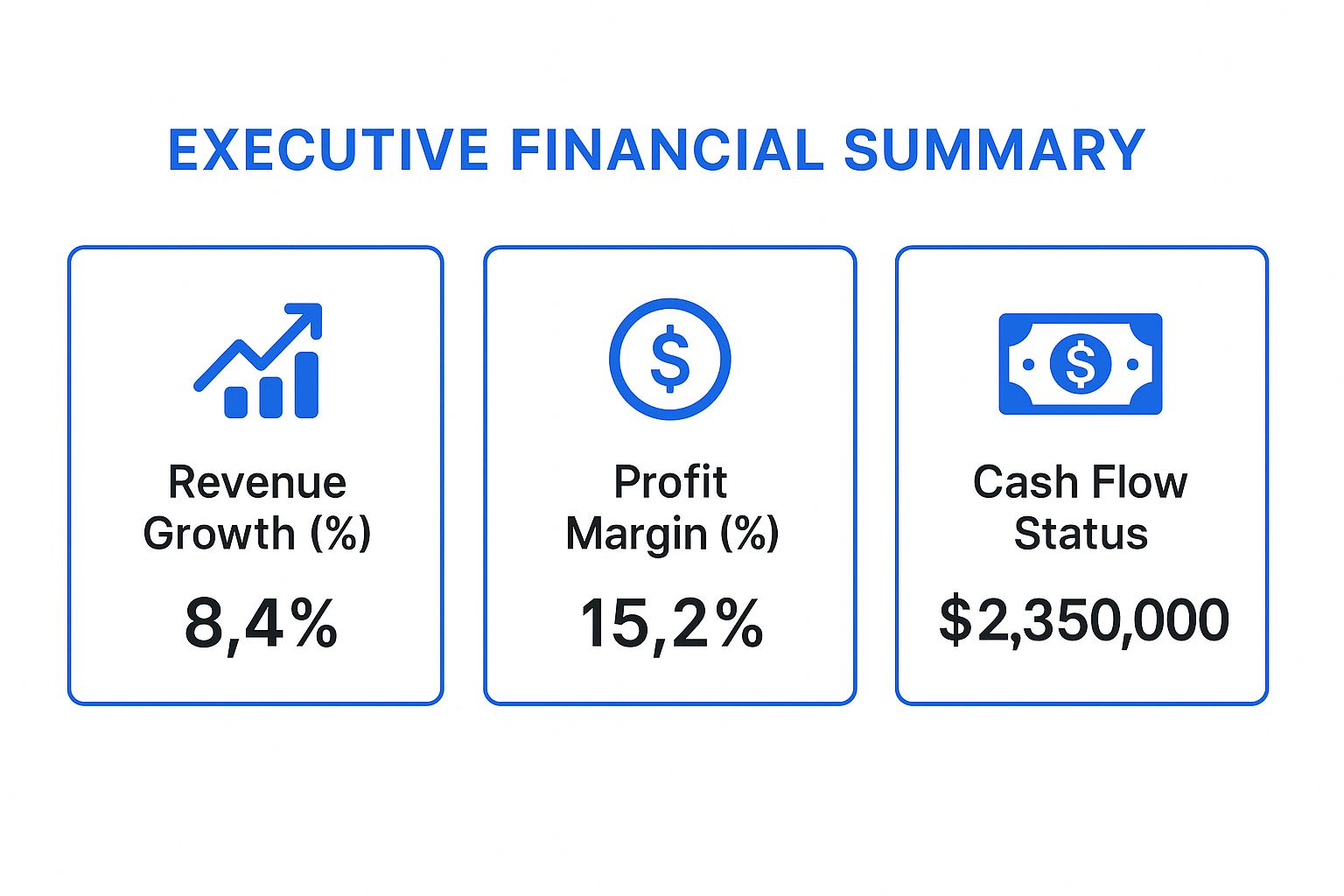
This visualization instantly communicates critical performance indicators: a positive revenue growth percentage signals market expansion or increased sales effectiveness, a healthy profit margin demonstrates efficient operations and pricing power, and a robust cash flow figure underscores the company's liquidity and financial stability.
The core principles of an effective Executive Financial Summary Dashboard can be distilled into a few key takeaways:
Executive Dashboard: Key Takeaways
- Strategic Focus: Prioritizes a limited set of high-level KPIs directly tied to overall business strategy and objectives.
- Rapid Comprehension: Employs clear visualizations and a minimalist design for quick understanding by busy executives, regardless of their financial expertise.
- Decision Support: Serves as a crucial tool for data-driven strategic decision-making, performance monitoring, and effective board communication.
- Performance Snapshot: Offers a consolidated, at-a-glance view of the company's financial health against targets and historical performance.
When and Why to Use This Approach: The Executive Financial Summary Dashboard is indispensable during regular leadership meetings, board reporting cycles, strategic planning sessions, and when providing updates to investors. It's used when a quick, clear, and unified understanding of the company's financial standing is paramount. For professionals like stock market analysts or institutional investors, understanding the structure and typical content of such dashboards can provide insights into how a company's leadership perceives its own performance and what metrics they prioritize.
Actionable Tips for Readers: For those tasked with creating or utilizing such dashboards, consider these tips:
- Limit Metrics: Focus on a maximum of 6-8 truly key metrics to avoid information overload.
- Consistent Color Coding: Use standard colors (e.g., green for positive, red for negative) consistently for trends and variances.
- Contextual Explanations: Include brief, clear explanations or annotations for more complex ratios or unexpected changes.
- Match Update Frequency: Ensure data is refreshed in line with executive meeting schedules (e.g., monthly, quarterly).
- Emphasize Trends: Beyond static numbers, highlight trends over time to provide a dynamic view of performance. Learn more about Executive Financial Summary Dashboard and the visualization techniques that make them effective.
Successful Implementations and Origins: Examples of platforms that facilitate the creation of these dashboards include Microsoft Power BI (with its executive templates), Tableau's executive dashboard examples, and Oracle NetSuite's built-in executive dashboards. These tools often provide pre-built templates that embody the principles of clarity and conciseness. The concept itself has been widely popularized and refined through the strategic frameworks developed by consulting firms like McKinsey & Company and has become a staple in Fortune 500 corporate reporting standards.
In conclusion, the Executive Financial Summary Dashboard is a cornerstone among financial dashboard examples because it effectively translates complex financial data into strategic intelligence, empowering leadership to navigate the business landscape with clarity and confidence.
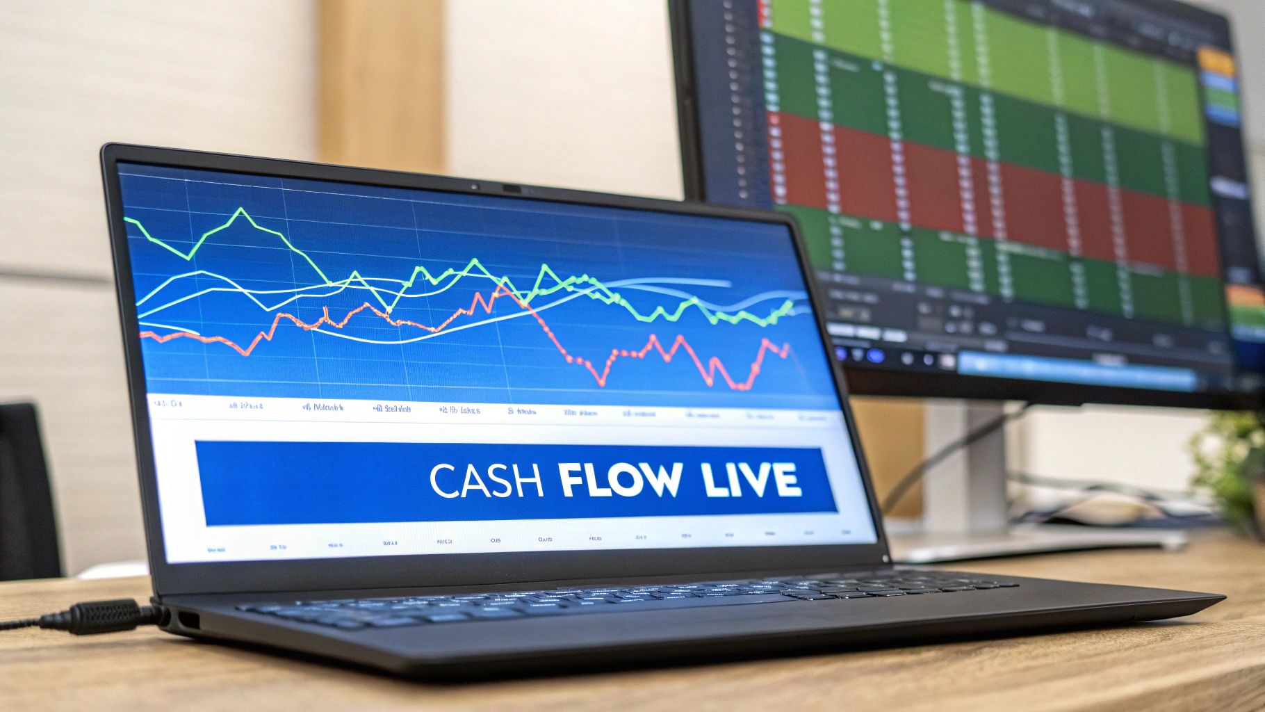
2. Real-Time Cash Flow Dashboard
In the fast-paced world of finance, where market conditions can shift in an instant, maintaining a clear and current understanding of liquidity is paramount. For professional traders, stock market analysts, financial institutions, and even astute independent investors, the Real-Time Cash Flow Dashboard stands out as one of the most crucial financial dashboard examples. It offers an unparalleled, up-to-the-minute view of cash inflows and outflows, transforming how businesses and financial professionals manage their monetary resources and assess financial health.
A Real-Time Cash Flow Dashboard is a dynamic, visual interface that provides live, consolidated updates on all cash movements within an organization or even a sophisticated trading operation. Unlike traditional cash flow statements that are often retrospective, this dashboard focuses on the present and near future. It works by integrating data from various financial sources, such as bank accounts (often via secure APIs), accounting software, payment gateways, and invoicing systems. This raw data is then processed and categorized in real-time, presenting users with an immediate snapshot of their current cash position, recent transactions, and projected cash flows. For analysts, understanding how a company utilizes such a dashboard can provide insights into its operational efficiency and short-term financial stability.
This type of financial dashboard is critical for any entity that needs to meticulously monitor its cash position to make swift, informed decisions regarding investments, operational expenses, and overall working capital management. In today's volatile markets, the ability to anticipate and react to liquidity changes instantly can be the difference between capitalizing on an opportunity and facing a financial shortfall. For financial institutions, it's a key tool for risk management and ensuring operational liquidity. For traders analyzing companies, evidence of robust real-time cash flow management can be a strong positive indicator of a company's operational discipline.
Key Features and Their Significance:
The power of a Real-Time Cash Flow Dashboard lies in its comprehensive feature set:
- Real-Time Cash Position Tracking: Provides an exact figure of available cash across all integrated accounts at any given moment. This is fundamental for traders managing margin accounts or businesses meeting immediate obligations.
- Inflow and Outflow Categorization: Automatically segments cash movements (e.g., sales revenue, loan receipts, operational expenses, supplier payments, payroll). This granular view helps identify key drivers of cash flow.
- Cash Flow Forecasting: Utilizes historical data and current trends to project future cash positions, often on a rolling basis (e.g., 7-day, 30-day, or the popular 13-week forecast). This is invaluable for anticipating future liquidity needs or surpluses.
- Alert Systems for Low Cash Thresholds: Users can set predefined limits, and the system will automatically notify them if cash balances approach or fall below these critical levels, enabling proactive intervention.
- Bank Account Integration: Direct, secure connections to multiple bank accounts consolidate financial data, eliminating manual reconciliation and providing a holistic view of cash holdings.
- Accounts Receivable (AR) and Accounts Payable (AP) Tracking: Monitors upcoming payments due from customers and obligations to suppliers, offering a clearer picture of short-term cash inflows and outflows.
- Burn Rate Calculations: Particularly vital for startups and companies in high-growth phases, this feature calculates the rate at which a company is spending its capital, indicating its financial runway.
Pros: The Strategic Advantages
Adopting a Real-Time Cash Flow Dashboard offers significant benefits:
- Prevents Cash Flow Crises: Early warnings and clear visibility into potential shortfalls allow businesses to take corrective action, such as securing short-term financing or delaying non-essential expenditures.
- Enables Proactive Financial Management: Instead of reacting to past events, decision-makers can anticipate financial needs and opportunities, optimizing the use of capital.
- Supports Better Vendor Payment Decisions: Knowing the precise cash position helps in negotiating payment terms and taking advantage of early payment discounts or strategically timing payments to manage outflows.
- Real-Time Visibility into Financial Health: Offers an immediate and transparent understanding of an organization's liquidity, which is a cornerstone of its overall financial stability.
Cons: Potential Challenges to Consider
While powerful, these dashboards are not without their challenges:
- Requires Robust Data Integration: The accuracy and real-time nature depend heavily on seamless integration with multiple data sources, which can be technically complex and resource-intensive to set up and maintain.
- Can Be Overwhelming with Too Much Real-Time Data: Without proper filtering and focus, the sheer volume of live data can lead to information overload, making it difficult to discern critical insights.
- May Need Frequent Calibration of Forecasting Models: Cash flow forecasting models rely on assumptions and historical data; these models must be regularly reviewed and adjusted to maintain their accuracy, especially in dynamic business environments.
Examples of Real-Time Cash Flow Solutions
Several platforms have popularized this approach, offering sophisticated tools:
- QuickBooks Cash Flow Dashboard: Integrated within its accounting software, it provides small to medium-sized businesses with essential cash flow insights.
- Xero Cash Flow Tracker: Similar to QuickBooks, Xero offers tools to help its users visualize short-term cash flow.
- Float (FloatApp.com): A dedicated cash flow forecasting and management software that has significantly popularized the concept, especially among SaaS companies and VC-backed startups that need to manage subscription revenue and burn rates meticulously.
- Pulse (PulseApp.com): Another specialized tool designed for straightforward cash flow management, helping businesses project and monitor their cash.
These tools are frequently used by SaaS companies managing recurring revenue streams and venture capital-backed startups that must closely monitor their financial runway. For stock market analysts, understanding that a company invests in and utilizes such platforms can be a qualitative signal of strong financial controls.
Actionable Tips for Effective Implementation
To maximize the benefits of a Real-Time Cash Flow Dashboard:
- Set Up Automated Alerts: Configure notifications for critical cash thresholds (both high and low) to ensure timely responses to significant changes in liquidity.
- Include 13-Week Rolling Cash Flow Forecasts: This short-term forecast is a standard best practice, providing a practical window for operational planning and decision-making.
- Categorize Cash Flows Granularly: Break down inflows and outflows by business unit, project, client, or product line to gain deeper insights into profitability and cash drivers.
- Prioritize Banking API Integration: For truly real-time updates, ensure direct and secure API connections with all relevant bank accounts.
When and Why to Employ a Real-Time Cash Flow Dashboard
This dashboard is indispensable for businesses with fluctuating cash flows, tight profit margins, or those undergoing rapid growth or transformation. Companies in sectors like retail, manufacturing (with complex supply chains), and project-based services benefit immensely. For financial professionals, whether managing a firm's treasury or analyzing external companies, this dashboard (or the principles it embodies) is crucial for:
- Maintaining Operational Liquidity: Ensuring enough cash is on hand to meet daily obligations.
- Informed Investment Decisions: Identifying surplus cash that can be invested or recognizing the need to defer investments.
- Strategic Expense Management: Making data-driven decisions about when and where to cut or incur costs.
- Assessing Company Viability: For analysts, understanding a company's real-time cash management capabilities provides a lens into its short-term solvency and operational efficiency.
The Real-Time Cash Flow Dashboard earns its prominent place in any list of essential financial dashboard examples due to its direct impact on a company's survival and growth. It moves cash flow management from a reactive, historical exercise to a proactive, forward-looking strategic function, which is vital in today's dynamic financial landscape.
3. Budget vs. Actual Variance Dashboard
Among the most indispensable financial dashboard examples for any organization striving for robust fiscal health and operational excellence is the Budget vs. Actual (BvA) Variance Dashboard. This powerful tool serves as a critical compass for financial navigation, offering a clear, data-driven comparison between planned financial budgets and actual performance. By meticulously tracking income, expenses, and profits against predefined targets across various time periods, departments, and expense categories, it provides invaluable insights into financial efficiency and operational effectiveness. Its primary function is to illuminate deviations—known as variances—enabling organizations to understand precisely where they are over or under budget. This visibility is essential for financial control, facilitating timely corrective actions and fostering more accurate future financial planning.
At its core, the Budget vs. Actual Variance Dashboard operates by juxtaposing two key datasets: the budgeted figures, which represent the financial plan or forecast, and the actual figures, which reflect the real-world financial outcomes. The critical insight comes from the "variance" – the difference between these two. This variance can be expressed in absolute monetary terms (e.g., "$10,000 over budget") or as a percentage (e.g., "5% unfavorable variance"), providing immediate clarity on the magnitude and relative importance of deviations.
Key features that make this dashboard a cornerstone of financial management include:
- Side-by-Side Budget vs. Actual Comparisons: Presents a clear, direct visual juxtaposition of planned and actual figures for revenues, costs, and profits, facilitating quick understanding and C-suite reviews.
- Variance Analysis with Percentage Deviations: Quantifies the difference between budget and actual, often employing color-coding (e.g., red for negative/unfavorable, green for positive/favorable) to instantly highlight performance against expectations. Percentage deviations are crucial for understanding the relative impact of the variance, regardless of the base amount.
- Department-Wise Budget Breakdowns: Allows for granular analysis of financial performance at the departmental, project, or cost center level. This is vital for fostering accountability among budget holders.
- Flexible Time Period Views: Users can typically toggle between various timeframes, such as monthly, quarterly, and year-to-date (YTD), as well as annual views, to discern short-term fluctuations and long-term trends.
- Exception Reporting for Significant Variances: Automatically flags variances that exceed predefined materiality thresholds (e.g., any variance over 10% or $5,000), allowing management to focus their attention on the most critical deviations requiring investigation.
- Trend Analysis Over Multiple Periods: Visualizes financial performance and variance trends over time (e.g., rolling 12 months), helping to identify recurring patterns, seasonal impacts, or sustained improvements or declines in budget adherence.
- Drill-Down Capabilities to Transaction Level: Empowers users to investigate the root causes of variances by clicking through summary figures to access underlying general ledger entries or transaction details. This is particularly valuable for financial analysts needing to understand the 'why' behind the numbers.
The Budget vs. Actual Variance Dashboard unequivocally earns its place in any list of essential financial dashboard examples due to its fundamental role in exercising financial control and informing strategic decision-making. It transforms raw financial data into actionable intelligence, providing a transparent view of how well an organization is adhering to its financial plan. For professional traders and stock market analysts evaluating a company's financial health, understanding its budgetary discipline and ability to meet targets—as revealed by such a dashboard—can be a key indicator of management effectiveness, operational efficiency, and future stability.
Pros:
- Excellent Financial Control Mechanism: It provides near real-time feedback on spending and revenue generation relative to plan, allowing for swift intervention if financial performance deviates.
- Identifies Spending Patterns and Anomalies: Helps uncover inefficient spending, highlight unexpected revenue shortfalls or windfalls, and pinpoint potential areas of financial risk or opportunity.
- Supports Accountability Across Departments: By breaking down performance by department or cost center, it makes budget holders directly responsible for their financial outcomes, fostering a culture of fiscal responsibility.
- Improves Future Budgeting Accuracy: Analyzing historical variances—understanding why they occurred—provides valuable lessons that can be incorporated into subsequent budgeting and forecasting cycles, leading to more realistic and achievable financial plans.
Cons:
- Requires Accurate and Timely Budget Setup: The dashboard's utility is entirely dependent on the quality and timeliness of the initial budget data. Inaccurate, poorly planned, or outdated budgets will inevitably lead to misleading variance analysis.
- May Become Complex with Multiple Budget Versions: Managing and comparing actuals against multiple budget scenarios (e.g., original budget, revised forecast 1, revised forecast 2) can add layers of complexity to the dashboard and its interpretation.
- Historical Focus May Not Predict Future Performance: While it meticulously analyzes past performance against a plan, the BvA dashboard is inherently historical. It doesn't inherently predict future outcomes without being combined with forward-looking forecasting methodologies and consideration of external market shifts.
This type of financial dashboard is indispensable when an organization needs to maintain strict financial discipline, monitor operational efficiency, enhance departmental accountability, and inform strategic planning and resource allocation. It is heavily utilized by traditional enterprise finance teams, government agencies requiring stringent fiscal oversight, and large corporations with complex, multi-layered budgeting processes. For financial institutions, this dashboard can be adapted to monitor portfolio performance against targets or the institution's own operational budgets.
A visual demonstration can often clarify how these dashboards function in practice. The following video provides a general overview of dashboarding principles that apply well to budget variance analysis:
Many organizations have successfully implemented robust Budget vs. Actual Variance Dashboards using leading Enterprise Performance Management (EPM) and Business Intelligence (BI) software. Examples include SAP BusinessObjects budget dashboards, Oracle Hyperion Planning variance reports, cloud-based solutions like Adaptive Insights (now Workday Adaptive Planning) with its budget vs. actual templates, and IBM Cognos Analytics budget dashboards.
To maximize the effectiveness of your Budget vs. Actual Variance Dashboard, consider these actionable tips:
- Use Intuitive Color Coding: Implement a traffic light system (e.g., green for favorable variances within X%, yellow for moderate unfavorable variances, red for significant unfavorable variances) for at-a-glance assessment.
- Include Explanatory Notes: Allow budget owners or analysts to add commentary directly on the dashboard to explain significant variances, providing context beyond the numbers.
- Set Up Automated Variance Alerts: Configure the system to automatically notify budget owners or key stakeholders when variances exceed predefined thresholds, ensuring timely attention and action.
- Provide Both Absolute and Percentage Variance Views: Displaying variances in both absolute currency values (to show monetary impact) and percentages (to show relative deviation) offers a more complete picture.
The insights gained from a Budget vs. Actual Variance Dashboard are pivotal not just for fiscal control but also as an early warning system, which is a key component of risk management. By identifying significant deviations, organizations can proactively address potential issues. To delve deeper into how such detailed financial tracking integrates with broader financial oversight, including risk perspectives, Learn more about Budget vs. Actual Variance Dashboard and explore complementary dashboard examples.
4. Profitability Analysis Dashboard
A Profitability Analysis Dashboard is a cornerstone among sophisticated financial dashboard examples, offering a multi-dimensional view of a company's financial health. It transcends simple revenue tracking to dissect profitability across products, services, customers, regions, and time periods. Its purpose is to illuminate high-performing operational areas, identify underperformers, and pinpoint where strategic adjustments are needed. This empowers businesses and financial analysts to make informed decisions on resource allocation, pricing, and overall focus, driving sustainable growth. For investors and analysts, understanding true profit drivers is crucial for assessing long-term viability and investment potential.

This powerful tool works by integrating data from various sources – sales, marketing, operations, and finance – and applying robust cost allocation methodologies to provide a true picture of net profitability for each analyzed dimension. Its strength lies in its detailed features, which typically include:
- Profit Margin Analysis by Product/Service: Calculates and displays both gross and net profit margins for individual products or services, allowing businesses to identify their most and least lucrative offerings.
- Customer Profitability Segmentation: Segments customers based on their profitability, helping businesses focus retention efforts on high-value customers and understand the costs associated with serving different customer groups. This is invaluable for analysts assessing customer acquisition and retention strategies.
- Geographic Profitability Mapping: Often uses visual tools like maps to display profitability across different regions or sales territories, highlighting areas of strength and those requiring attention.
- Cost Center Profitability Tracking: Monitors the profitability of individual departments or cost centers, promoting accountability and efficiency within the organization.
- Contribution Margin Calculations: Determines the profitability of a product or service after deducting variable costs, providing insights into pricing floors and product viability.
- Waterfall Charts Showing Profit Drivers: Visually breaks down changes in profit, illustrating how various factors (e.g., sales volume, price changes, cost variations) contribute positively or negatively to the bottom line.
- Break-Even Analysis Visualizations: Helps determine the sales volume or revenue needed to cover all fixed and variable costs, crucial for planning and risk assessment.
Why This Dashboard Deserves Its Place and When to Use It
The Profitability Analysis Dashboard is essential in any list of financial dashboard examples due to its profound impact on strategic decision-making. For financial institutions and companies, it's a critical instrument for optimizing operations. It helps answer fundamental questions: Where should we invest more resources? Which products or services should we promote, re-evaluate, or potentially discontinue? Are our pricing strategies effective across different customer segments or regions?
For stock market analysts and independent investors, this dashboard (or the underlying data it represents if analyzing external companies) offers a deeper dive into a company's operational efficiency and the sustainability of its earnings. It allows them to look beyond headline revenue figures and assess the quality of profits. For instance, identifying that a company's growth is driven by highly profitable segments can be a strong bullish signal, while discovering reliance on low-margin products or unprofitable customer segments might raise concerns. Stock trading educators can also leverage these concepts to teach advanced financial statement analysis and business valuation techniques. Essentially, this dashboard is indispensable when a business or an analyst needs to understand the true sources of profit and the levers that can be pulled to enhance financial performance.
Pros of a Profitability Analysis Dashboard
The advantages of implementing a Profitability Analysis Dashboard are significant:
- Identifies Most Profitable Business Segments: Clearly pinpoints which products, services, customers, or regions contribute the most to the bottom line.
- Supports Strategic Resource Allocation: Enables businesses to direct investments, marketing spend, and operational efforts towards areas with the highest profit potential.
- Reveals Hidden Cost Drivers: Uncovers inefficiencies and unexpected costs associated with specific activities, products, or customers that might otherwise go unnoticed.
- Enables Data-Driven Pricing Decisions: Provides the necessary data to set optimal prices that reflect true costs and value, maximizing profitability per transaction or customer.
Cons of a Profitability Analysis Dashboard
Despite its power, there are challenges associated with this type of dashboard:
- Requires Sophisticated Cost Allocation Methods: Accurate profitability analysis hinges on correctly allocating indirect costs (overhead) to specific products, services, or customers. This can be a complex undertaking.
- Can Be Complex to Set Up and Maintain: Integrating data from disparate systems and establishing the necessary calculations and visualizations requires significant initial effort and ongoing maintenance.
- May Need Activity-Based Costing (ABC) Implementation: For the most accurate insights, especially in complex organizations, implementing Activity-Based Costing is often recommended. ABC assigns costs to activities and then to cost objects (like products or customers) based on their actual consumption of those activities, providing a more precise cost picture than traditional methods but adding another layer of complexity. It provides a precise cost picture often necessary for truly actionable insights from such financial dashboard examples.
Examples of Successful Implementation
Several enterprise software solutions offer robust capabilities for building and utilizing Profitability Analysis Dashboards. For instance, Microsoft Dynamics 365 integrates financial and operational data to provide comprehensive profitability insights. Salesforce Analytics Cloud can leverage rich CRM data to analyze customer profitability in depth. Anaplan is well-regarded for its profitability planning models, allowing businesses to forecast and model different scenarios. Similarly, Board International offers BI and corporate performance management solutions that include sophisticated profitability analysis features. The popularization of these detailed dashboards can be traced back to management consulting firms like Bain & Company, which frequently use such analyses to advise clients. Manufacturing companies and retail chains also heavily rely on these dashboards to analyze product line profitability and optimize their offerings.
Actionable Tips for Readers
To maximize the effectiveness of a Profitability Analysis Dashboard, consider these tips:
- Implement Activity-Based Costing (ABC) for Accurate Allocation: As mentioned in the cons, ABC is crucial. While more complex, it significantly enhances the accuracy of cost data attributed to specific profit centers, leading to more reliable insights. Without it, decisions might be based on flawed assumptions.
- Use Heat Maps to Visualize Profitability Across Dimensions: When dealing with multiple dimensions (e.g., product profitability by region), heat maps provide an intuitive visual representation, making it easier to spot patterns, outliers, and areas of high or low performance quickly.
- Include Both Gross and Net Profit Margins: Gross profit margin (Revenue - Cost of Goods Sold) shows the profitability of core operations before overheads. Net profit margin (after all expenses) gives the final picture. Analyzing both provides a more complete understanding of efficiency at different levels.
- Provide Drill-Down Capabilities: Surface-level numbers often hide crucial details. Ensure your dashboard allows users to drill down into the data – for example, from overall regional profitability to specific customer profitability within that region, or from product profitability to the specific cost components impacting it. This capability is vital for uncovering the root causes behind profit figures and is a key feature of robust financial dashboard examples.
5. Financial KPI Scorecard Dashboard
A Financial KPI Scorecard Dashboard stands as a cornerstone in the realm of performance measurement, offering a powerful and intuitive way to track critical financial key performance indicators (KPIs). This type of dashboard, often drawing inspiration from the Balanced Scorecard framework pioneered by Robert Kaplan and David Norton, presents financial health and performance trends in a digestible, at-a-glance format. It's designed for stakeholders across an organization, from C-suite executives to departmental managers, enabling them to quickly assess whether financial objectives are being met and identify areas requiring attention. This specific entry in our list of financial dashboard examples is prized for its clarity and directness in communicating complex financial data.
How it Works: Key Features
The effectiveness of a Financial KPI Scorecard Dashboard lies in its carefully selected features, all geared towards providing immediate insight:
- KPI Performance Against Targets: The core involves setting Specific, Measurable, Achievable, Relevant, and Time-bound (SMART) financial goals for KPIs like Gross Profit Margin, Net Profit Margin, Current Ratio, or Revenue Growth Rate. The dashboard then visually displays the actual performance alongside these targets, highlighting deviations.
- Traffic Light Status Indicators: Its most recognizable feature, the RAG traffic light system (Red, Amber, Green), gives instant visual cues for KPI status: Green typically indicates performance is on or above target, Amber suggests caution or performance slightly below target, and Red signals a significant miss or a critical issue needing immediate attention.
- Gauge Charts for Key Metrics: For metrics like Debt-to-Equity Ratio or Customer Acquisition Cost, gauge charts visually represent the current value of a KPI against a pre-defined, often color-coded range (e.g., poor, satisfactory, excellent), similar to a speedometer.
- Trend Arrows and Sparklines: To understand the direction of performance, trend arrows (up, down, or stable) accompany KPIs. Sparklines (small, data-intense line charts without axes) offer concise visual summaries of a KPI's recent historical trend, allowing users to see if performance is improving, declining, or remaining static over time.
- Benchmark Comparisons: Context is crucial. These dashboards often allow for comparisons against internal historical data, industry benchmarks, or even competitor performance (if data is available), providing a more rounded view of how the organization is faring.
- Rolling Average Calculations: For volatile metrics, rolling averages (e.g., 3-month or 6-month rolling average revenue) can smooth out short-term fluctuations, revealing underlying trends more clearly.
- Performance Scoring Systems: Some scorecards aggregate individual KPI performance into an overall financial health score or a score for specific categories, providing a single, high-level indicator of performance.
Why it Deserves its Place: Benefits
The Financial KPI Scorecard Dashboard earns its prominent spot in any discussion of effective financial dashboard examples due to its significant advantages:
- Quick Visual Performance Assessment: Decision-makers, including traders and analysts monitoring market or company health, need swift information. The visual nature of scorecards, particularly the traffic lights and gauges, allows for rapid comprehension of the financial landscape.
- Clear Target vs. Actual Comparisons: There's no ambiguity. The direct comparison between planned targets and actual results fosters accountability and makes it easy to pinpoint areas of over or underperformance.
- Easy to Understand for All Stakeholders: Its intuitive design means that even individuals without deep financial expertise can grasp the key takeaways, facilitating better communication and alignment across departments.
- Supports a Performance-Driven Culture: By consistently highlighting what matters and how the organization is performing against those metrics, these dashboards encourage a focus on achieving financial goals and can drive continuous improvement initiatives, much like those advocated by Six Sigma practitioners.
Potential Downsides: Considerations
While highly beneficial, users should be aware of potential limitations:
- May Oversimplify Complex Financial Relationships: The focus on individual KPIs might obscure the intricate interplay between different financial factors. A low expense ratio (good) might be due to underinvestment in critical areas, a nuance a simple green light won't convey.
- Requires Careful Target Setting: The entire system hinges on well-defined and realistic targets. Unattainable targets can lead to demotivation, while overly easy targets can foster complacency.
- Can Become Cluttered with Too Many KPIs: The temptation to track everything can lead to a dashboard that is overwhelming and loses its at-a-glance value. Prioritization is key.
When and Why to Use This Approach
A Financial KPI Scorecard Dashboard is particularly valuable:
- When: Ideal for regular strategic reviews (e.g., monthly or quarterly business reviews), board reporting, providing high-level overviews for investment decisions, or when an organization needs to consistently monitor its financial pulse against predefined strategic objectives. Independent investors might adapt this to track portfolio performance against their financial goals.
- Why: To promote transparency and accountability regarding financial performance. It helps in quickly identifying deviations from planned outcomes, enabling timely corrective actions. For financial institutions and analysts, it offers a structured way to evaluate a company's financial stability and operational efficiency. Its focused nature makes it one of the most actionable financial dashboard examples for driving targeted improvements.
Examples of Successful Implementation & Templates
Organizations looking to implement or draw inspiration for their Financial KPI Scorecard Dashboards can turn to several resources:
- The Balanced Scorecard Institute offers methodologies rooted in the original framework.
- Business intelligence and dashboarding software providers like Klipfolio (https://www.klipfolio.com), Geckoboard, and Databox feature numerous financial KPI templates and examples that can be customized. These platforms often showcase businesses using such financial dashboard examples for clarity and performance, illustrating successful implementation. Many performance management software vendors also embed scorecard functionalities directly into their platforms.
Actionable Tips for Readers
To maximize the effectiveness of a Financial KPI Scorecard Dashboard:
- Limit to 8-12 Key Metrics Maximum: This ensures focus and prevents information overload. Choose KPIs that are truly critical to financial success.
- Use Consistent Color Schemes: Maintain uniformity in your traffic light colors and other visual cues across all indicators for intuitive and rapid understanding.
- Include Both Leading and Lagging Indicators: Lagging indicators (e.g., past revenue) show historical performance, while leading indicators (e.g., sales pipeline value, new customer acquisition rate) can predict future performance. A good balance provides a more complete picture.
- Provide Context with Industry Benchmarks: Compare your KPIs against industry averages or top performers to understand your competitive positioning.
- Regularly Review and Update KPIs and Targets: Business environments change. KPIs and their targets should be revisited periodically (e.g., annually or biannually) to ensure they remain relevant to strategic goals.
- Ensure Data Accuracy and Timeliness: The credibility of the dashboard hinges on the reliability of the underlying data. Implement processes to ensure data is accurate and refreshed appropriately for timely decision-making.
Popularized By
Several key influences popularized the financial KPI scorecard. Robert Kaplan and David Norton, through their development of the Balanced Scorecard in the early 1990s, provided a foundational framework emphasizing balanced measures, where financial KPIs are critical. Practitioners of Six Sigma methodology and other quality management systems have also heavily relied on KPI tracking and visual dashboards to monitor process improvements and financial impacts. Furthermore, performance management software vendors have played a crucial role in democratizing access to sophisticated scorecarding tools, making these powerful financial dashboard examples readily available to businesses of all sizes.
6. Accounts Receivable Management Dashboard
An Accounts Receivable (AR) Management Dashboard is a specialized financial visualization tool focused on the critical task of overseeing outstanding customer payments and managing associated credit risks. As one of the most impactful financial dashboard examples, it directly influences a company's liquidity and overall financial stability. Its core purpose is to convert complex AR data into clear, actionable insights, enabling finance teams to optimize collection processes, minimize bad debt, and enhance cash flow. This dashboard offers a transparent view of aging receivables, customer payment trends, and collection effectiveness, making it vital for proactive financial stewardship.
How it Works: Key Features and Functionality
The strength of an AR Management Dashboard comes from its targeted features, designed to provide a comprehensive overview of receivables:
- Aging Analysis Buckets (e.g., 0-30, 31-60, 61-90, 90+ days): This cornerstone feature categorizes outstanding invoices by their age, visually highlighting which accounts need immediate attention. A growing balance in older buckets (e.g., 90+ days) signals urgent collection priorities. For instance, a finance professional can quickly identify that 15% of total receivables are over 90 days past due, prompting an immediate review of those specific accounts.
- Customer Credit Risk Scoring: By integrating internal payment history and potentially external credit data (if available), this feature assigns a risk score (e.g., low, medium, high) to customers. This aids in setting appropriate credit limits, identifying high-risk accounts early, and tailoring collection approaches—perhaps automated reminders for low-risk clients versus direct calls for high-risk ones.
- Collection Activity Tracking: This logs all interactions with customers regarding overdue payments—calls made, emails sent, payment promises received, and dispute statuses. It ensures transparency, supports team collaboration (e.g., different collectors can see past actions), and maintains a crucial historical record for audits or escalations.
- Payment Trend Analysis: Analyzing historical payment data helps identify patterns, such as certain customers consistently paying 10 days late, or seasonal dips in payment speed during specific quarters. These insights inform more accurate cash flow forecasting and allow for proactive adjustments to collection strategies or credit terms.
- Days Sales Outstanding (DSO) Calculations: DSO measures the average number of days it takes for a company to collect payments after a sale has been made. The AR dashboard prominently displays current and historical DSO (e.g., current DSO is 45 days, up from 40 days last quarter), reflecting the efficiency of converting sales into cash. A rising DSO can indicate collection inefficiencies or deteriorating customer creditworthiness.
- Bad Debt Provision Tracking: This feature monitors the amount set aside as an allowance for doubtful accounts (e.g., 2% of total receivables) against actual invoices written off as uncollectible. It helps ensure that financial provisions are adequate and provides insights into the true cost of extending credit.
- Collection Team Performance Metrics: Key Performance Indicators (KPIs) such as the percentage of overdue invoices collected within a period, the average collection period per agent, or the success rate of different collection tactics (e.g., email vs. phone) help evaluate and optimize the collections team and their strategies. For example, it might show that Collector A has a 75% success rate on accounts aged 30-60 days, while Collector B excels with older accounts.
Why It's a Top-Tier Financial Dashboard
The AR Management Dashboard rightfully earns its place as a critical tool, distinct among various financial dashboard examples, due to its direct effect on a company's working capital and bottom line. For many businesses, particularly B2B companies where sales on credit are prevalent, accounts receivable often represent a substantial portion of current assets. Ineffectively managed receivables can lead to critical cash flow shortages, increased financing costs, and ultimately, reduced profitability.
The specific benefits are tangible and significant:
- Improved Cash Collection Efficiency: Clear visibility into aging invoices and prioritized collection activities enables teams to focus their efforts where they are most needed, significantly accelerating the collection cycle.
- Reduced Bad Debt Exposure: Early identification of high-risk customers through credit scoring and proactive monitoring of overdue accounts allows businesses to take preventative measures, such as adjusting credit terms or intensifying collection efforts, thereby minimizing losses from uncollectible debts.
- Optimized Collection Resource Allocation: Performance metrics and customer risk segmentation help managers allocate their collection team and resources more effectively, ensuring that high-value or high-risk accounts receive the appropriate level of attention.
- Provides Early Warning for Credit Issues: Fluctuations in DSO, shifts in customer payment trends, or an increase in the volume of accounts moving into older aging buckets act as early warning signals, prompting timely investigation and intervention before credit problems escalate.
When and Why to Employ an AR Management Dashboard
This type of dashboard is highly beneficial for any business that extends credit to its customers. It becomes particularly critical for:
- B2B Companies: These businesses often have substantial receivables due to industry norms of trade credit and manage more complex receivable portfolios.
- Companies with Significant Receivables Balances: Regardless of industry, if accounts receivable form a large part of a company's current assets, dedicated and sophisticated management is key.
- Organizations Experiencing Cash Flow Challenges: If slow customer payments are straining liquidity, this dashboard can rapidly pinpoint bottlenecks in the collection process and highlight opportunities for improvement.
- Businesses Aiming for Proactive Credit Risk Management: Instead of merely reacting to bad debts after they occur, companies can use the dashboard's predictive insights to identify and mitigate potential credit risks proactively.
The primary "why" is to gain robust, data-driven control over one of the most critical components of working capital. This ensures sustained financial health, reduces financial risk, and empowers strategic decision-making related to credit policies, customer relationship management, and cash flow optimization.
Successful Implementations and Industry Adoption
The power and utility of AR Management Dashboards are evident in their widespread integration into leading Enterprise Resource Planning (ERP) and accounting software systems. Prominent examples include SAP Credit Management dashboards, Oracle Receivables Management reports, Sage Intacct AR dashboards, and NetSuite Collections Center. These platforms offer robust AR visualization and management capabilities, often centralizing AR data and linking it with sales, customer service (CRM), and overall financial data to provide a holistic view of customer financial interactions. Credit management professionals, controllers, and finance departments in B2B companies heavily rely on these tools. ERP software vendors have played a significant role in popularizing their adoption by embedding these sophisticated functionalities within their comprehensive business management suites.
Actionable Tips for Effective Dashboard Utilization
To truly leverage the capabilities of an AR Management Dashboard, consider these practical tips:
- Segment Customers by Risk & Payment Behavior: Don't use a one-size-fits-all collection approach. Use the dashboard's insights to categorize customers (e.g., high-risk/chronically late, medium-risk/occasionally late, low-risk/prompt payers) and tailor communication styles, payment reminders, and collection intensity accordingly.
- Implement Automated Alerts for Overdue Accounts: Configure the system to send automatic notifications to the collection team (and sometimes even gentle, automated reminders to customers) when invoices pass certain overdue milestones (e.g., 15, 30, 60 days past due). This ensures timely follow-up without manual oversight for every account.
- Maintain Detailed Collection Notes and Communication History: Mandate that all interactions, promises to pay, and dispute details related to an overdue invoice are logged directly within the system or an integrated CRM. This provides crucial context for anyone handling the account and serves as a valuable audit trail.
- Track Collection Success Rates by Strategy: If you're experimenting with different collection scripts, contact methods (email, call, SMS), or payment incentives, use the dashboard to track which strategies yield the best results for different customer segments or delinquency stages. This allows for continuous process optimization.
Balancing Benefits and Considerations: Pros & Cons
While incredibly beneficial, it's important to acknowledge the potential hurdles and requirements:
- Pros:
- Significantly improves cash collection speed and overall efficiency.
- Reduces bad debt losses and the need for large provisions.
- Optimizes the allocation and productivity of collection staff and resources.
- Offers early detection of potential credit problems and deteriorating customer payment behavior.
- Cons:
- Requires Accurate and Timely Customer Data Maintenance: The adage "garbage in, garbage out" strongly applies. Inaccurate customer contact details, disputed invoice information, or misapplied payments can render the dashboard misleading and ineffective.
- May Need Integration with CRM Systems: For a truly 360-degree view of the customer, especially regarding communication history and overall relationship status, integration with Customer Relationship Management (CRM) systems is often necessary, which can add technical complexity and cost.
- Collection Strategies May Vary and Require Analysis: Effective use demands thoughtful segmentation and the adaptation of collection strategies to different customer segments, rather than a uniform approach. This requires ongoing analytical effort and strategic thinking.
In essence, the Accounts Receivable Management Dashboard is far more than a simple reporting interface; it's a strategic command center for managing a company's lifeblood – its incoming cash. Its capacity to deliver transparent, actionable intelligence solidifies its position as a crucial tool for contemporary finance professionals, traders managing counterparty risk, and a standout among valuable financial dashboard examples that drive significant business value and financial stability.
7. Investment Portfolio Performance Dashboard
For professional traders, stock market analysts, financial institutions, and serious independent investors, the Investment Portfolio Performance Dashboard stands as a cornerstone among financial dashboard examples. It offers a sophisticated, centralized hub for meticulously tracking, analyzing, and optimizing investment portfolios. This type of dashboard transcends simple profit and loss statements, providing a multi-dimensional view of investment activities, crucial for navigating complex market dynamics and making informed decisions.
What It Is and How It Works: A Deep Dive
An Investment Portfolio Performance Dashboard is a comprehensive analytical tool designed to provide a clear, detailed, and actionable overview of an investment portfolio's health and trajectory. It aggregates data from various sources—brokerage accounts, market data feeds, and manual inputs—to present a holistic picture. Its utility is paramount for anyone managing multiple investments, including investment managers overseeing institutional funds, financial advisors guiding client assets, and sophisticated individual investors managing their own substantial portfolios.
The power of this dashboard lies in its integrated features, which work in concert:
- Portfolio Value and Return Tracking: This is the foundational element, displaying the current market value of the portfolio and its overall return over various periods (e.g., daily, monthly, quarterly, year-to-date, since inception). It often includes both absolute returns and time-weighted or money-weighted returns to accurately reflect performance irrespective of cash flows.
- Asset Allocation Pie Charts: Visual representations of how capital is distributed across different asset classes (equities, fixed income, real estate, commodities, cash), sectors (technology, healthcare, financials), and geographic regions. This is critical for assessing diversification and identifying potential concentration risks.
- Risk Metrics and Volatility Measures: This dashboard incorporates key risk indicators such as standard deviation (volatility), Sharpe ratio (risk-adjusted return), Sortino ratio (downside risk-adjusted return), beta (market sensitivity), and Value at Risk (VaR). These metrics help quantify the level of risk being undertaken to achieve returns.
- Benchmark Performance Comparisons: Performance is rarely assessed in a vacuum. This feature allows users to compare their portfolio's returns against relevant market benchmarks (e.g., S&P 500, FTSE 100, MSCI World). This contextualizes performance and helps identify alpha (excess return over the benchmark).
- Sector and Geographic Diversification Analysis: Beyond simple asset allocation, this delves deeper into the specific industry sectors and countries the portfolio is exposed to, offering granular insights into diversification effectiveness.
- Dividend and Income Tracking: For income-focused investors, this feature monitors dividends received, interest earned, and other income generated by the portfolio, often projecting future income streams.
- Historical Performance Charts: Line graphs, bar charts, and other visualizations track the portfolio's value and returns over time, allowing users to identify trends, assess growth patterns, and understand performance during different market cycles.
Why It Deserves Its Place: The Strategic Advantage
The Investment Portfolio Performance Dashboard is indispensable because it transforms raw investment data into strategic intelligence. Its inclusion in any list of top financial dashboard examples is justified by its ability to empower users with:
- Comprehensive Investment Oversight: It provides a single, consolidated view of all investment holdings and performance, eliminating the need to juggle multiple spreadsheets or platform logins.
- Risk-Adjusted Performance Measurement: It facilitates an understanding of whether returns are commensurate with the risks taken, a core tenet of Modern Portfolio Theory.
- Easy Comparison with Benchmarks: It offers an objective way to gauge success and identify areas for improvement relative to market standards or specific investment mandates.
- Supports Diversification Strategies: By clearly visualizing asset, sector, and geographic allocations, it helps maintain a well-diversified portfolio and manage concentration risk effectively.
- Informed Decision-Making: Ultimately, all features converge to support data-driven investment decisions, whether it's rebalancing, tactical allocation shifts, or manager selection.
Examples of Successful Implementation
Several leading financial platforms provide robust portfolio performance dashboards, demonstrating their practical value:
- Bloomberg Terminal: A staple for institutional investors, Bloomberg offers highly sophisticated portfolio analytics, including attribution analysis, risk modeling, and real-time market data integration.
- Charles Schwab Portfolio Performance: Catering to both advisors and individual investors, Schwab provides tools like the Portfolio Performance Center, offering clear views of returns, asset allocation, and comparisons to benchmarks.
- Morningstar Direct: Widely used by asset managers and advisors, Morningstar Direct provides in-depth portfolio analysis, research, and reporting capabilities, including advanced risk and style analytics.
- FactSet Portfolio Analytics: Another institutional-grade platform, FactSet delivers comprehensive portfolio and risk analytics, enabling users to decompose performance, stress-test portfolios, and ensure compliance.
Many wealth management firms and hedge funds also develop proprietary in-house dashboards tailored to their specific strategies and client reporting needs.
When and Why to Use This Approach
This dashboard is essential when:
- Managing a portfolio with multiple securities across various asset classes.
- Needing to understand the drivers of portfolio returns (performance attribution).
- Actively managing risk and seeking to optimize risk-adjusted returns.
- Requiring detailed reporting for clients, stakeholders, or regulatory bodies.
- Comparing performance against specific benchmarks or peer groups.
- Making strategic or tactical asset allocation decisions.
It's used because it provides clarity, accountability, and a framework for disciplined investment management, crucial for professional traders aiming to outperform, analysts dissecting market trends, and financial institutions managing significant capital.
Actionable Tips for Readers
- Include Both Absolute and Risk-Adjusted Returns: Absolute returns show raw profit/loss, while risk-adjusted returns (like the Sharpe ratio) indicate how much return was generated per unit of risk. Both are vital for a complete picture.
- Use Appropriate Benchmarks for Comparison: Ensure benchmarks align with the portfolio's investment strategy and asset classes. Comparing a global equity portfolio to a domestic bond index, for instance, would be misleading.
- Track Correlation Between Holdings: Understanding how different assets move in relation to each other is key to managing overall portfolio volatility and the benefits of diversification.
- Include ESG Metrics if Relevant: If Environmental, Social, and Governance factors are part of the investment mandate, integrate relevant ESG scores and exposure metrics.
- Regularly Review and Customize: The dashboard should be a dynamic tool. Periodically review its components and customize views to align with evolving investment goals or market conditions.
- Ensure Data Integrity: The insights derived are only as reliable as the input data. Implement checks and processes to ensure accuracy of transaction records, pricing, and corporate actions.
Pros and Cons
- Pros:
- Comprehensive Investment Oversight: Offers a unified view of all portfolio aspects.
- Risk-Adjusted Performance Measurement: Enables evaluation of returns relative to risk.
- Easy Comparison with Benchmarks: Facilitates objective performance assessment.
- Supports Diversification Strategies: Helps manage and optimize portfolio diversification.
- Cons:
- Requires Real-Time Market Data Feeds: Access to accurate and timely market data can be costly and technically demanding, especially for a broad range of assets.
- Complex Calculations for Some Metrics: Metrics like VaR or advanced attribution analysis require sophisticated calculation engines and a good understanding of financial mathematics.
- May Need Regulatory Compliance Considerations: For financial advisors and institutions, the dashboard's outputs and how they are presented to clients may be subject to regulatory scrutiny and require specific disclosures.
Popularized by institutional investment managers, pioneering wealth management firms, financial data giants like Bloomberg, and adherents of Modern Portfolio Theory, the Investment Portfolio Performance Dashboard has evolved from a niche tool to an industry standard. It empowers users to navigate the complexities of financial markets with greater precision, making it an exemplary model in the landscape of financial dashboard examples.
Key Features Comparison of 7 Financial Dashboards
| Dashboard Type | Implementation Complexity 🔄 | Resource Requirements ⚡ | Expected Outcomes 📊 | Ideal Use Cases 💡 | Key Advantages ⭐ |
|---|---|---|---|---|---|
| Executive Financial Summary | Low to medium; simple high-level KPIs | Moderate; requires consolidated financial data | Strategic insights, quick decision-making | C-suite executives, board presentations | Easy to understand; focuses on strategic metrics |
| Real-Time Cash Flow | High; needs robust real-time data integration | High; API banking integration, continuous updates | Immediate liquidity visibility, proactive management | Companies needing live cash flow monitoring | Prevents cash crises; real-time alerts |
| Budget vs. Actual Variance | Medium to high; requires detailed budget data | Moderate to high; accurate budget and actual data | Strong financial control, variance identification | Enterprises with complex budgeting processes | Enables accountability; detailed variance analysis |
| Profitability Analysis | High; complex cost allocation methods | High; sophisticated costing and data segmentation | Deep profitability insights, strategic resource allocation | Businesses analyzing product/customer profitability | Identifies profit drivers; supports pricing decisions |
| Financial KPI Scorecard | Medium; KPI setup and target management | Moderate; requires performance data | Quick financial health assessment | Performance management, stakeholder reporting | Clear visuals; supports performance culture |
| Accounts Receivable Management | Medium; requires customer/payment data accuracy | Moderate; CRM and finance system integrations | Improved collections, reduced bad debt | Finance teams managing credit risk and receivables | Enhances cash collection efficiency; early warnings |
| Investment Portfolio Performance | High; complex risk and return calculations | High; real-time market data feeds and analytics | Comprehensive investment oversight | Investment managers, financial advisors, institutional investors | Risk-adjusted returns; benchmark comparisons |
Build Your Insight Engine: Next Steps
We've journeyed through a variety of financial dashboard examples, from the high-level Executive Financial Summary to the granular details of Real-Time Cash Flow, Budget vs. Actual Variance, Profitability Analysis, Financial KPI Scorecards, Accounts Receivable Management, and Investment Portfolio Performance dashboards. The crucial insight is that each of these financial dashboard examples serves a distinct purpose, transforming complex data into clear, actionable intelligence. The most important takeaway is that the power of a financial dashboard lies in its alignment with your specific analytical needs and strategic goals, enabling you to make smarter, data-driven decisions.
So, how do you translate these examples into your own success?
- Define Your Objectives: Clearly identify what financial questions you need answers to, or which performance areas you need to monitor. Are you tracking daily trading P&L, long-term investment growth, corporate cash flow, or market trends?
- Select Key Metrics: Based on your objectives, pinpoint the Key Performance Indicators (KPIs) that truly matter. Don't overcrowd your dashboard; focus on metrics that drive decisions and offer clear insights.
- Choose Your Tools Wisely: Consider whether general BI software or specialized platforms are better suited for your needs. For instance, professional traders and stock market analysts often benefit from platforms designed for real-time data and specific financial visualizations.
- Design for Clarity: Remember, the goal is instant understanding. Use appropriate charts and visuals, and prioritize an intuitive layout. Understanding these financial dashboard examples is a great start. If you're looking to build or refine your own, exploring resources on creating effective financial dashboards with more examples can provide you with further guidance and inspiration for your specific needs.
- Iterate and Refine: Your first dashboard is unlikely to be your last. As your financial strategies evolve and market conditions change, so too should your dashboards to remain relevant and effective.
Mastering the art of leveraging such financial dashboard examples and tailoring them to your context is invaluable. It’s about moving beyond raw numbers to build a true insight engine. This capability allows professional traders, stock market analysts, and financial institutions to spot trends faster, manage risk more effectively, and seize opportunities with greater confidence. For independent investors, day traders, and stock trading educators, it means making more informed decisions, identifying profitable setups, and achieving a clearer understanding of market dynamics.
The path to comprehensive financial oversight and strategic agility is paved with well-designed dashboards. Embrace the power of visual data storytelling, and you'll unlock a new level of financial understanding and control, turning data into your most powerful asset.
For those specifically focused on dynamic stock market analysis and requiring sophisticated, real-time data visualization, a specialized platform is key. Explore how ChartsWatcher can help you transform market data into actionable trading insights, offering the advanced charting tools needed to build your own powerful market insight engine, inspired by the effective financial dashboard examples we've discussed.
