A Trader's Guide to the Wyckoff Accumulation Pattern
The Wyckoff accumulation pattern is a classic chart-reading framework that essentially maps out how large institutions, or "smart money," quietly scoop up assets after a big downtrend. Think of it as a blueprint for a market's transition from bearish control to bullish strength.
For traders who know what to look for, this structure is a massive tell. It allows you to spot institutional buying before the real fireworks begin.
Decoding the Market's Hidden Story
Imagine a massive cargo ship getting ready for a long, profitable journey. Before it can set sail, it has to be loaded with an incredible amount of supplies. This doesn't happen all at once; it's a slow, methodical process of taking on cargo, often happening quietly behind the scenes.
The Wyckoff accumulation pattern is the market's version of this. It shows us how institutional players—what Richard Wyckoff called the "Composite Operator"—systematically build enormous positions without sending prices rocketing up, which would only drive up their own buying costs.
This entire story is told through the interplay of price action and volume. Instead of reacting to headlines or getting whipsawed by market noise, Wyckoff traders learn to read the fundamental narrative of supply and demand playing out on the chart. By spotting this pattern, you can align your trades with the immense power of institutional capital, positioning yourself for the major uptrend, or "markup," that follows.
What This Pattern Signals
At its core, identifying a Wyckoff accumulation pattern is about anticipating a major shift in the market's direction. It's not just about catching a bottom; it's about understanding the mechanics and psychology that create it. The pattern confirms that:
- Selling pressure is exhausted: The prior downtrend has finally fizzled out, and the sellers are running out of steam.
- "Smart money" is buying: Big players are strategically absorbing every share they can from panicked or weak hands.
- A new uptrend is likely: The asset is being coiled and prepared for a significant move higher once the accumulation is complete.
The Wyckoff method is built on the idea that every market move has a cause. The accumulation phase is the "cause," and the subsequent uptrend is the "effect." The longer and more drawn-out the accumulation, the more explosive the potential markup.
For traders looking to go even deeper, a modern guide to https://chartswatcher.com/pages/blog/a-modern-trader-s-guide-to-reading-the-tape can offer powerful complementary insights into real-time order flow. And when you're looking at assets like cryptocurrencies, layering on insights from blockchain data analysis can provide rock-solid evidence of institutional movements.
Ultimately, mastering this pattern gives you a clear, repeatable framework for making trading decisions based on the market's foundational laws.
The Five Phases of Wyckoff Accumulation
The Wyckoff accumulation pattern isn't a single, isolated event. It's a deliberate, structured campaign run by institutional players—the "smart money." This process unfolds across five distinct phases, labeled A through E. Each phase has a specific job, revealing the shifting balance between supply and demand as control quietly passes from panicked sellers to strategic buyers.
Think of it like a carefully planned military operation. Phase A is about stopping the enemy's advance (the downtrend). Phase B is about fortifying your position and building up your forces. Phase C is a final feint to mislead the opposition. Phase D is the initial push forward, and Phase E is the full-scale assault into a new uptrend. Understanding these stages is absolutely critical for spotting an accumulation pattern as it takes shape.
The infographic below shows exactly where the accumulation pattern fits into the bigger market cycle. It's the critical transition zone between a prolonged downtrend and the start of a fresh uptrend.
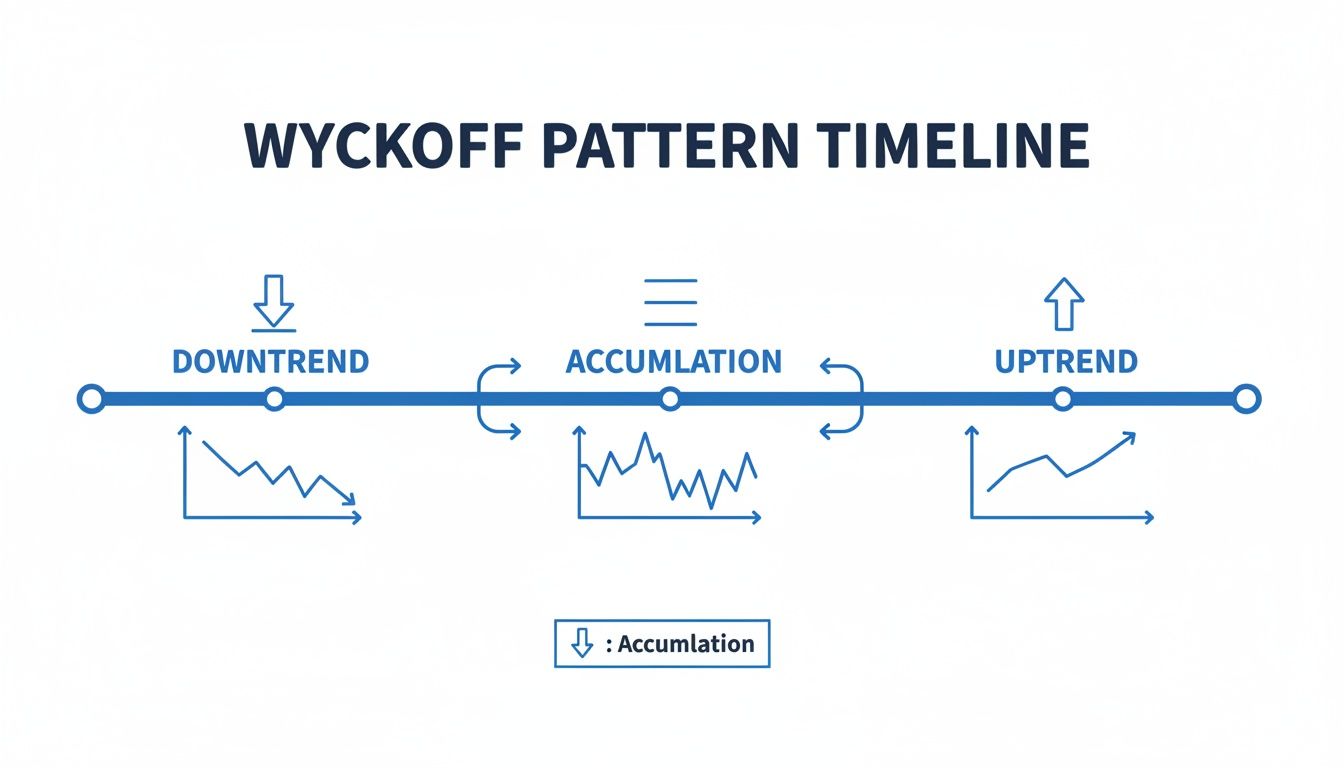
This visual drives home an important point: accumulation isn't just a random sideways chop. It's a purposeful basing period that sets the stage for a major price markup.
Phase A: Stopping the Downtrend
Phase A gives us the first real evidence that the prior downtrend is running out of gas. After a long period of selling, the market starts showing signs of exhaustion. This is when early institutional interest begins to soak up the aggressive selling pressure.
This initial stage is defined by a few key events you can spot on a chart:
- Preliminary Support (PS): This is the first time buyers step in with any conviction after a long slide. It’s often marked by a noticeable pop in volume and a small price bounce, signaling that some demand is finally present. It’s a warning shot, not the end of the battle.
- Selling Climax (SC): This is the most dramatic point of the downtrend—the moment of peak panic. Prices plummet on extremely high volume as retail traders finally throw in the towel. But that same massive volume is a huge clue: it means large institutions are aggressively buying all the shares being dumped by the panicked sellers.
- Automatic Rally (AR): After the intense pressure of the SC, supply is temporarily exhausted. This vacuum allows prices to rebound sharply, often on their own momentum. The high of this rally is important, as it helps define the upper boundary of the trading range that will form.
- Secondary Test (ST): Price will then fall from the AR to retest the area of the Selling Climax. The key here is that this retest must happen on significantly lower volume than the SC. This is your confirmation that the heavy selling pressure has been absorbed.
Phase B: Building the Cause
Phase B is where the real, gritty work of accumulation happens. This is often the longest and most frustrating phase of the entire Wyckoff accumulation pattern. Here, institutions methodically absorb shares inside a well-defined trading range, bounded by the SC (support) and the AR (resistance).
The whole point of Phase B is to acquire as many shares as possible without driving the price up. The price action can look choppy and directionless, shaking out impatient traders who are looking for a quick move. During this phase, you’ll see multiple tests of both the support and resistance levels of the range, further proving that supply is drying up.
The Wyckoff principle of "Cause and Effect" is born in Phase B. The longer and wider the accumulation base (the cause), the more powerful the potential uptrend (the effect).
Phase C: The Final Test
Phase C is the pivotal moment. It's a final, decisive shakeout to make absolutely sure all significant selling pressure is gone before the real move up begins. This phase contains one of the most famous events in Wyckoff analysis: the Spring.
A Spring is a deliberate price move below the established support of the trading range. It has three main purposes:
- To Trap Sellers: It fools traders into thinking the downtrend is back on, baiting them into opening short positions.
- To Shake Out Weak Holders: It triggers the stop-loss orders of weak longs who bought inside the range.
- To Create a Final Buying Opportunity: It allows institutions to scoop up a final large block of shares at a discount.
A true Spring is marked by a sharp drop below support followed by a quick recovery back into the range. The volume on the break can be high or low, but the rally back into the range must show strength. An even better sign is a successful low-volume retest of the Spring's low—it's powerful confirmation that supply has been fully absorbed.
Phase D: Confirmation of Strength
With the final test out of the way, Phase D signals that demand is now firmly in control. The stock starts showing consistent signs of strength as it moves from the bottom of the trading range toward the top.
This phase is marked by a series of higher highs and higher lows within the range. Two key events define Phase D:
- Sign of Strength (SOS): This is a significant rally that breaks above the trading range's resistance, usually on increased volume and widening price spreads. It's a clear signal that buyers are taking over.
- Last Point of Support (LPS): After an SOS, the price will often pull back to test the old resistance level, which should now act as new support. This pullback needs to happen on lower volume, confirming that sellers are no longer a threat. This LPS often provides a fantastic, high-probability entry point for traders.
Phase E: The Markup
At last, Phase E is the reward for all the previous work. The stock has left the trading range for good, and a clear uptrend is established. Demand is in total command, and the path of least resistance is now upward.
During this phase, the public and trend-following traders finally take notice of the new uptrend, providing more fuel for the rally. Pullbacks are shallow and are met with eager buying. The markup continues until a new distribution pattern begins to form at a much higher price level, starting the entire Wyckoff cycle all over again.
Using Volume to Confirm Your Analysis

If price action tells you the story of the market, volume is its emotional tone. It's the conviction, the panic, the effort. Without it, you're only getting half the narrative. For Wyckoff traders, the interplay between price and volume is the engine that drives every single decision, confirming whether the "smart money" is truly taking control.
Every phase of the Wyckoff accumulation pattern leaves a distinct volume signature. Once you learn to read these signatures, you can easily tell the difference between genuine institutional buying and simple market noise. It's what separates a calculated, data-backed trade from a pure guess.
Think of volume as the effort behind a price move. A big jump in price on thin volume is suspicious—like a cheer from an empty stadium. But a dramatic price drop on massive, climactic volume? That tells a powerful story of transfer from weak hands to strong ones.
Reading the Volume Signatures in Each Phase
Let's break down the specific volume characteristics you should expect to see at key moments within the accumulation structure. This is how you validate what the price chart is telling you.
A classic mistake is seeing a huge volume spike on a sharp down-move and immediately thinking it's bearish. In the context of a Selling Climax (SC), nothing could be further from the truth.
- Selling Climax (SC): This event must happen on extremely high, climactic volume. This surge is the peak of public panic selling, which is met with aggressive buying from institutions absorbing all that supply.
- Secondary Test (ST): When the price revisits the low of the SC, volume should be noticeably lower. This is your first real clue that the intense selling pressure is drying up.
- Tests in Phase B: As the stock chops around in the trading range, any tests of the support level should occur on diminishing volume. This shows supply is being quietly mopped up.
Analyzing volume is like performing forensics on a chart. High volume reveals where the big players made their move. Low volume shows where they've successfully taken control by eliminating any opposing pressure.
Volume During the Transition to Markup
As the pattern shifts gears from consolidation to a new uptrend, the volume story changes. The focus is no longer on absorbing supply; it's about demonstrating clear demand. This is your final confirmation that the bulls are ready to run.
The key here is to look for expanding volume on rallies and contracting volume on pullbacks. It's the textbook signature of a healthy, demand-driven trend. If you want a deeper dive, check out our trading with volume for a modern guide to market analysis.
Here’s what to watch for in the later stages:
- The Spring (Phase C): If this shakeout below support happens on high volume, price needs to snap back above the support level almost immediately to be valid. An even better sign? A Spring on low volume, which tells you there was hardly any supply left to shake out in the first place.
- Sign of Strength (SOS): The rally that finally breaks out of the trading range must occur on expanding volume and wide price spreads. This is pure conviction—strong, undeniable demand.
- Last Point of Support (LPS): After the SOS, the first pullback should be on light, drying-up volume. This is your last all-clear signal that supply is no longer a threat.
Modern market data backs this up. Take Apple Inc. on the H4 timeframe between June and November 2023, where a textbook Wyckoff sequence formed. The Selling Climax lined up perfectly with a sharp price drop and a huge spike in volume as smart money absorbed shares. Quantitatively, volume during key rallies often surges 20-40% above the daily average, confirming that powerful buying interest is present.
Ultimately, price tells you what happened. Volume tells you how important it was. You absolutely need both to master the Wyckoff accumulation pattern.
Finding Wyckoff Accumulation on Real Charts
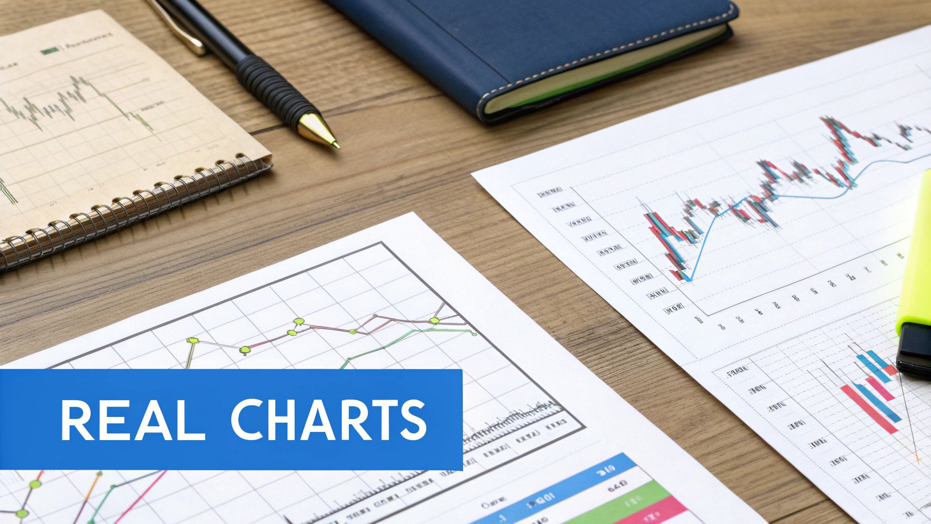
The textbook schematics give us the blueprint, but the real test is spotting these patterns in the wild. The Wyckoff accumulation pattern isn't just theory; it's a structure that pops up time and again on the charts of major companies right before they launch into powerful, multi-year bull runs.
Studying historical charts is how you train your eyes to recognize the key events and volume signatures as they unfold. This is the bridge from abstract knowledge to a practical, money-making skill. The phases we've covered—from the Selling Climax to the Sign of Strength—aren't just lines on a diagram. They are the footprints of real institutional behavior.
Seeing these patterns on household names like Microsoft and Cisco really drives home how powerful this framework is. It proves that the core principles of supply and demand, as mapped out by Wyckoff, are timeless.
The Microsoft Example: A Multi-Year Cause
One of the most legendary examples of Wyckoff accumulation is the chart of Microsoft (MSFT). After its spectacular run in the late 1990s, the stock went into a deep sleep, consolidating sideways for years.
Most people wrote it off as "dead money." But looking at it through a Wyckoff lens, you see a classic, massive accumulation campaign. That long, boring trading range was the "cause" being built for an enormous future "effect."
This historical context is everything. Between 1999 and 2014, tech giants like Microsoft and Cisco settled into extended trading ranges that perfectly fit the Wyckoff model. Microsoft, for instance, drifted sideways for roughly 15 years after its 1999 peak. That chart showed all the classic hallmarks: multiple tests of support and resistance, huge volume spikes at the lows (the Selling Climax), and a final breakout that kicked off the markup phase. For a deeper dive into this case study, check out the analysis on StockCharts.com.
A common mistake is to dismiss long, sideways markets as uninteresting. For a Wyckoff trader, these are the most interesting periods of all, as they often represent enormous institutional campaigns building the foundation for the next major trend.
Annotating a Real Chart, Step by Step
Let's walk through how you'd actually identify this on a chart. Imagine you're watching a stock that's been beaten down and is finally starting to look like it's finding a floor.
Here’s a practical checklist to follow:
- Identify Phase A: Look for the first hints that the downtrend is running out of steam. Pinpoint the Preliminary Support (PS), the dramatic Selling Climax (SC) on a massive volume spike, and the knee-jerk Automatic Rally (AR) that follows. These three points establish the initial boundaries of your trading range.
- Analyze Phase B: Now, watch the action inside this new range. Do you see the price revisit the support level set by the SC? Crucially, does volume dry up on those tests? That's your sign that selling pressure is being absorbed.
- Spot the Phase C Test: This is the moment of truth. Watch for that decisive shakeout—the Spring—where the price briefly dips below the range's support. Check the volume. A Spring on low volume is a massive tell that sellers are exhausted. Then, look for a low-volume Test of that Spring's low to confirm it.
- Confirm Phase D: The tide should be turning now. You're looking for a clear Sign of Strength (SOS), where the price rallies convincingly toward the top of the range on expanding volume. Watch for the pullback to a Last Point of Support (LPS) on lighter volume. This is often a prime entry point.
- Witness Phase E: Finally, confirm the Markup. The stock should leave the trading range for good. Watch to see if pullbacks now hold above the old resistance level, which has flipped into new support.
By methodically walking through these steps on historical charts, you build the muscle memory needed to spot these setups as they form. This process turns you from a passive chart-gazer into an active analyst, ready to see what the smart money is doing.
Building a Wyckoff Trading Strategy
Spotting a Wyckoff accumulation pattern is one thing. Actually trading it is a whole different ballgame. This is where theory gets put to the test, and your analysis has to transform into a repeatable process with hard-and-fast rules for entry, exit, and risk.
Without a plan, you're just a spectator.
The real beauty of the Wyckoff method is that it hands you specific, high-probability moments to get into the market. These aren't just hunches; they're calculated entries that signal the "smart money" has finally wrestled control away from sellers. We're going to zero in on the most reliable setups that pop up in Phases C and D, right when institutional buying becomes undeniable.
Patience is a trader's best friend here. The long, choppy grind of Phase B is designed to wear you out and shake your confidence. Your job isn’t to trade that noise—it’s to wait for the crystal-clear signals that eventually emerge. Acting with conviction at these key moments is what separates the pros from the crowd.
Prime Entry Point 1: The Spring Test
The Spring in Phase C is the ultimate shakeout, designed to trick the herd into selling right at the bottom. While some aggressive traders try to buy the Spring as it happens, a much safer approach is to wait for the Test. A successful, low-volume test of the Spring's low is a massive confirmation that the sellers are finally tapped out.
This setup offers a fantastic risk-to-reward ratio.
- Entry Criteria: Go long as the price moves back above the high of that low-volume Test candle. This confirms that buyers have stepped in to defend the level with force.
- Stop-Loss Placement: Tuck your stop-loss just below the absolute low of the Spring. This gives your trade some breathing room while defining exactly where your idea is wrong.
- Initial Profit Target: Your first take-profit area should be the resistance level formed by the Automatic Rally (AR) at the top of the trading range.
Prime Entry Point 2: The Last Point of Support
The Last Point of Support (LPS) is arguably the classic Wyckoff entry. It shows up in Phase D after a Sign of Strength (SOS) has already punched through a key resistance level inside the range. The LPS is the first small pullback after that show of force, proving that buyers are now defending new, higher ground.
This entry feels less like trying to catch a falling knife and more like hopping on an already accelerating train. It’s perfect for traders who need to see confirmation before putting capital to work.
- Entry Criteria: Enter a long position as the price pulls back and finds support. The key is seeing volume dry up significantly on the dip, which tells you there’s no real selling pressure left.
- Stop-Loss Placement: A logical stop goes just below the low of the LPS pullback. For a wider stop, you can place it below the most recent swing low created during the SOS rally.
- Initial Profit Target: Since the price is already flexing its muscles, you can start looking beyond the old trading range. A common technique is to project the height of the range upward from the breakout point to estimate a target.
Trading a Wyckoff accumulation pattern requires a dual mindset. You need the patience of a sniper during the long consolidation of Phase B, waiting for the perfect moment. Then, you need the conviction of an infantry soldier to act decisively when the setup appears in Phases C and D.
Managing Risk and Setting Targets
Disciplined risk management is non-negotiable. Proper position sizing ensures that no single trade can wreck your account. A solid rule of thumb is to risk no more than 1-2% of your trading capital on any given setup.
Once you're in the trade and it's moving your way, you can manage it by trailing your stop-loss under each new, higher swing low. This technique lets you lock in profits while still giving the new uptrend space to run.
For setting more ambitious profit targets, many Wyckoffians turn to an old-school tool: Point and Figure (PnF) charts.
PnF charts are used to measure the "cause" built up during Phase B to project a potential "effect"—a price target for the markup. By counting the horizontal columns in the accumulation base, traders can generate data-driven price objectives that often prove to be remarkably accurate. This gives you a methodical way to estimate just how far the markup phase might go, helping you stay in a winning trade for much longer.
Common Questions About Wyckoff Accumulation
As you start putting Wyckoff into practice, you'll inevitably run into some tricky spots. The method is deep, and real-world charts rarely look as clean as the textbook diagrams. This section tackles some of the most common questions head-on, helping you clear up the gray areas and trade the Wyckoff accumulation pattern with a lot more confidence.
Think of this as your field guide for those "what if" moments. Nailing these distinctions is often what separates a frustrating analysis from a profitable one.
What Is the Difference Between Accumulation and Re-Accumulation?
This is a huge one, and getting it right is crucial. The patterns might look similar on a chart, but where they appear in the bigger trend changes everything.
- Accumulation: This happens at the end of a long, painful downtrend. It's the market hitting the brakes. The whole point of this pattern is to stop the bleeding, shake out the last of the panicked sellers, and quietly transfer their shares to institutional hands. This is what forms a major market bottom and kicks off a brand new bull market.
- Re-accumulation: This pattern shows up as a pause or a sideways chop during an already established uptrend. It’s a breather. Think of it as a high-level base where smart money that missed the first big move—or wants to add to their winning positions—soaks up shares from early profit-takers. After this, the next leg up begins.
The bottom line? Accumulation marks the start of a bull market. Re-accumulation is a continuation pattern that lets the trend keep running.
Recognizing re-accumulation is key to staying with a winning trend. Countless traders cash out during these pauses, thinking the run is over, only to watch the stock launch higher without them.
Does the Wyckoff Pattern Work on All Timeframes?
Yes, absolutely. The principles of supply and demand that drive the Wyckoff accumulation pattern are universal forces in any market. This makes the pattern fractal—you'll see the same structures playing out on a 5-minute chart as you do on a weekly chart.
You can spot and trade an accumulation schematic on an intraday chart for a quick scalp or find one on a weekly chart to plan a multi-year investment.
But the timeframe dramatically changes the implications. A longer timeframe, like a daily or weekly chart, means a much larger "cause" is being built. As Wyckoff's Law of Cause and Effect tells us, a base that forms over many months will likely lead to a markup that lasts for months or even years. An accumulation pattern on a 15-minute chart, on the other hand, will produce a much shorter pop.
What Happens If an Accumulation Pattern Fails?
Patterns fail. It’s a simple, unavoidable reality of trading, and you have to be ready for it. A failed accumulation happens when the price, instead of breaking out into a markup, breaks down decisively below key support levels like the Selling Climax or the Spring low.
This is a clear signal that supply has overpowered demand and the sellers are still firmly in charge. There simply wasn't enough institutional buying to absorb all the selling pressure, and the path of least resistance is still down.
This is exactly why solid risk management is non-negotiable.
- Your Stop-Loss Is Your Safety Net: Always place a hard stop-loss just below a critical structural low, like the low of the Spring. If the pattern breaks, you take a small, controlled loss and live to trade another day.
- A Failed Pattern Is Information: A breakdown from an accumulation range isn't just a failed trade; it's valuable market feedback. It might even be the start of a distribution pattern, signaling much lower prices to come. It tells you to step aside from any long ideas and perhaps even start looking for short setups.
Ready to stop guessing and start seeing what the smart money is doing? ChartsWatcher provides the powerful, real-time scanning and charting tools you need to spot the Wyckoff accumulation pattern as it forms. Build custom screens, set precise alerts for key Wyckoff events, and find high-probability setups before the rest of the market. Take control of your analysis by visiting https://chartswatcher.com today.
