A Trader's Guide to the 200 Week Moving Average
When you’re navigating the vast, often chaotic ocean of the financial markets, you need an anchor—a reliable tool that cuts through the daily noise and keeps you focused on the bigger picture. The 200-week moving average is that tool.
In simple terms, it's the average closing price of an asset over the last 200 weeks, which is nearly four years of data. By smoothing out almost four years of price action, it filters out the short-term market chatter and reveals the true, underlying trend. It's the definitive line in the sand that often separates a long-term bull market from a bear market.
Your North Star for Navigating Market Cycles

Imagine you're the captain of a massive cargo ship. Getting distracted by every small wave or gust of wind could throw you completely off course. Daily price swings and breathless news headlines are those waves. The 200-week moving average is your compass, your North Star, guiding you toward your ultimate destination.
This is why institutional investors and veteran traders watch it so closely. It provides a clear, strategic view of an asset's long-term health, painting a picture of the prevailing tide rather than reacting to every minor market tremor.
Let's break down the core attributes of this indicator.
The 200 Week Moving Average At a Glance
The table below offers a quick summary of what the 200 WMA is all about and why it matters so much in long-term strategy.
| Attribute | Description and Significance |
|---|---|
| Time Frame | 200 Weeks (approximately 4 years) |
| Indicator Type | Long-term trend-following, lagging indicator |
| Primary Use | Identifies the major, underlying market trend |
| Calculation | Simple average of the closing prices over the last 200 weeks |
| Bull Market Signal | Price is trading consistently above the 200 WMA |
| Bear Market Signal | Price is trading consistently below the 200 WMA |
| Key Function | Acts as a dynamic level of long-term support or resistance |
As you can see, its purpose is straightforward: to provide a stable, long-term reference point for making high-level strategic decisions.
A Line in the Sand
More than just a technical tool, the 200 WMA has become a major psychological benchmark for the entire market. It’s the unofficial dividing line between a healthy, long-term uptrend and a worrying, sustained downtrend.
This simple line on a chart helps traders answer some of the most critical questions:
- Is the primary trend still intact? If the price stays above a rising 200 WMA, the long-term outlook is generally considered bullish.
- Is this a dip to buy or a warning to sell? A pullback to the 200 WMA during an uptrend can be a classic buying opportunity. A clean break below it, however, could signal a major trend reversal.
- Should I be aggressive or defensive? Trading above the line often encourages a more aggressive, risk-on approach. Trading below it demands caution and defensive positioning.
By smoothing out nearly four years of price action, the 200-week moving average gives you a stable reference point. It helps you avoid emotional reactions to short-term volatility and focus on what truly matters: the major, underlying market cycle.
Setting the Stage for Success
Getting a handle on this indicator is fundamental to building any robust, long-term trading strategy. It’s not about predicting every market wiggle but about aligning your actions with the dominant, powerful trend.
When an asset is trading above this line, the wind is at your back. When it falls below, you’re sailing directly into a headwind.
In the next sections, we’ll dive into how this indicator is calculated, look at its historical significance with real-world chart examples, and map out some actionable strategies you can start using. Mastering the 200-week moving average means equipping yourself with a guide that has stood the test of time, helping traders navigate through calm seas and turbulent storms alike.
How the 200 Week Moving Average Is Calculated
You don't need a math degree to get your head around the 200 week moving average. Its power actually comes from its simplicity. At its heart, the calculation is just a straightforward average that boils down nearly four years of market action into one clean, meaningful line on your chart.
The logic is basic: the indicator adds up the closing price from each of the last 200 weeks and then divides the total by 200. Boom. That's it. The result gives you the average closing price over that massive timeframe.
Thankfully, you'll never have to do this by hand. Any modern charting platform like ChartsWatcher does the heavy lifting for you instantly. Your job isn’t to be a human calculator—it's to understand why this simple process creates such a formidable tool for analyzing long-term trends. If you're curious about the nuts and bolts of different types, feel free to dive into our complete guide on how to calculate moving averages for trading.
Why the 200 Week Period Is So Effective
It's the 200-week lookback period that gives this indicator its legendary status. A 50-week moving average is useful for gauging intermediate trends, sure, but it can still get knocked around by sharp corrections or sucker rallies in a bear market. The 200 WMA is a different beast entirely.
By smoothing out data over such a long haul, it effectively tunes out all the market "noise." This includes things like:
- Quarterly earnings drama that sends a stock flying or diving for a few days.
- Sudden geopolitical events that spark short-lived panic selling.
- Minor pullbacks and corrections that are just a healthy part of any long-term uptrend.
This big-picture view is precisely what makes it the ultimate benchmark for defining major bull and bear markets. It moves slowly and deliberately, only changing course when there's a real, sustained shift in the market's underlying tide.
The real power of the 200-week moving average isn't just its level, but its slope. The direction of the line provides a second layer of critical information about the market's underlying momentum and health.
Reading the Slope for Deeper Insights
Just knowing if the price is above or below the line is only half the battle. The direction of the moving average itself tells you so much more about the market's health. A smart trader learns to read the slope to get a more nuanced feel for what’s really going on.
You'll typically see one of three scenarios:
- Rising Slope: An upward-trending 200 WMA is the classic sign of a strong, healthy bull market. It tells you that, on average, prices have been grinding higher for the better part of four years.
- Falling Slope: When the line starts pointing down, it's a clear red flag. This signals a deepening bear market where the long-term trend has definitively turned negative.
- Flat Slope: A flattening line often means the market is stuck in a big consolidation phase. It's a period of indecision where neither the bulls nor the bears have the upper hand.
By putting it all together—where the price is relative to the line and which way the line is sloping—you can make far more informed decisions. It adds a crucial layer of context, helping you stay on the right side of the market's most powerful, long-term currents.
Why This Indicator Matters for Major Market Indices
When it comes to the big players—the S&P 500, the Dow, the Nasdaq—the 200 week moving average isn't just another line on a chart. It’s a historical battleground. Think of it as the ultimate line in the sand where the market's biggest long-term conflicts between bulls and bears have been fought and decided. Its importance stretches far beyond day-to-day trading; it's practically a barometer for the health of the entire economy.
When a major index crosses this line, it’s not just a technical event; it often makes front-page news. That’s because the pros—fund managers, institutions, and seasoned traders—see a sustained break below the 200 WMA as a fundamental 'regime change.' It's a signal that the market's underlying mood has shifted from optimistic growth to defensive preservation.
A Tale of Two Crises
History gives us the clearest picture of its power. Just look at how it behaved during two of the most dramatic market events of the 21st century.
First, let's rewind to the 2008 Global Financial Crisis. As the crisis unfolded, the S&P 500 didn't just dip below its 200 week moving average; it crashed clean through it and stayed down for months. This wasn't a minor correction. That break was the confirmation that a severe, long-term downturn was in full swing—the start of a brutal bear market that vaporized trillions in value.
Now, contrast that with the 2020 COVID-19 crash. As global panic took hold, the S&P 500 fell with breathtaking speed. But where did it find its footing? Right at the 200 WMA. While the break was sharp, the index clawed its way back above that line almost immediately. For traders who understood its significance, this was the signal that the long-term uptrend was still alive and kicking. It was a generational buying opportunity.
A weekly close below the 200 WMA on a major index is often treated as a major warning sign by institutional players. It frequently triggers a shift in strategy, prompting traders to tighten risk controls and reduce their overall market exposure until the trend shows signs of stabilizing.
The Dividing Line Between Eras
Because the 200 week moving average covers roughly four years of price data, it has a long and storied history of separating deep bear-market pain from durable, long-lasting recoveries. For the big stock indices, its slope and the price's position relative to it can define entire market eras.
Take the 2008–2009 crisis again. The S&P 500 spent months trading decisively below its 200-week line. All told, the index plunged about 57% from its peak in October 2007 to its low in March 2009. The moving average itself turned sharply lower, confirming a major cyclical bear market was in control. But once the price reclaimed that average in mid-2009, it kicked off a bull market that ran for nearly 11 years, delivering returns far above the historical average. You can learn more about how market data defines these historic trends from the analysts at StreetStats.
We saw this pattern play out again during the COVID-19 shock in March 2020. The S&P 500’s collapse stopped right around its 200-week line before roaring back. From that low, the index more than doubled over the next 18 months, all while staying firmly above that critical support level.
Why It's a Psychological Benchmark
So, why does it work so well? Part of its power comes from a self-fulfilling prophecy.
So many market participants are watching it—from hedge fund managers in New York to retail investors at home—that their collective actions reinforce its importance. When a rising market pulls back to the line, buyers step in. When a falling market breaks below it, sellers pile on. This mass reaction turns the line into a real-world support and resistance level.
It’s also an anchor in a sea of volatility. Shorter-term averages get tossed around by daily news and noise, but the 200 week moving average is slow and deliberate. It only starts to turn when a true, powerful, and sustained shift in the market's direction has taken hold. This reliability is exactly why it remains a cornerstone of long-term analysis, helping investors tell the difference between a temporary storm and a fundamental change in the climate.
Actionable Trading Strategies You Can Use Today
Okay, theory is one thing, but putting the 200-week moving average to work is where it really starts to click. Let's move from concepts to concrete strategies you can spot on the charts right away. These methods are designed to be logical and effective for anyone with a long-term mindset.
The first strategy treats the 200 WMA less like a line and more like a dynamic zone of opportunity. It’s all about context and reaction.
Strategy One: The Dynamic Support and Resistance Zone
Think of the 200-week moving average as a major gravitational force. In a healthy, long-term bull market, prices can get ahead of themselves and then pull back. This moving average often acts as the "floor"—a powerful support level where buyers waiting on the sidelines finally see value and step in.
This dynamic creates clear, actionable entry points for patient investors.
- Buying the Dip: When a quality stock in a confirmed uptrend pulls back to touch its 200 WMA, it often signals a high-probability buying opportunity. This isn't about catching a falling knife; it's about adding to a strong asset at a long-term value area.
- Recognizing a Breakdown: On the flip side, if a stock in a downtrend rallies up to a declining 200 WMA and gets rejected, it confirms the bears are still in control. A stock that cleanly breaks below its 200 WMA after riding above it for a long time is a major red flag that the primary trend has shifted.
The chart below shows how this dynamic plays out in major market cycles for the S&P 500, illustrating the crisis, support, and recovery phases.
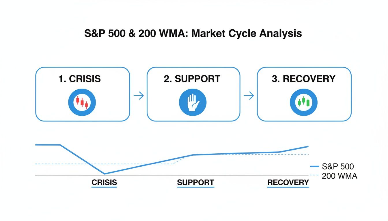
You can clearly see the 200 WMA acting as a critical support level during market stress, often marking the turning point from crisis back to recovery.
Strategy Two: The Long-Term Trend Filter
This second strategy is even simpler. It acts as a guiding rule for your entire portfolio. The goal is to keep you on the right side of the market's biggest moves by using the 200-week moving average as a binary filter. The rule is dead simple: align your bias with the trend.
The Rule of the Filter: If the price is trading above a rising 200 WMA, your bias should be bullish. Focus on finding long positions. If the price is trading below a declining 200 WMA, your bias should be bearish or, at a minimum, defensive.
This approach helps prevent two of the biggest mistakes traders make: fighting a powerful trend and overtrading in a hostile market. It gives you a simple "yes/no" answer to the most important question: "Is the wind at my back right now?"
Here’s how to apply it:
- Bullish Conditions (Price > 200 WMA): In this environment, you have the green light. Actively look for buying opportunities, like pullbacks to support or breakouts to new highs. Your confidence in long positions should be much higher.
- Bearish Conditions (Price < 200 WMA): When the asset is below this line, it's time to play defense. That means avoiding new long positions, tightening stop-losses on any existing longs, and protecting your capital above all else.
This isn't about perfectly timing tops and bottoms. It’s about participating in the market’s strongest uptrends and stepping aside during its most dangerous downtrends—a discipline that is absolutely key to long-term success.
Of course, a solid trend filter is just one piece of the puzzle. Many traders layer other techniques on top to generate returns. For example, some learn how to sell covered calls for consistent income to make money from stocks they already own. By combining trend-following rules with other strategies, you can build a more robust and resilient investment approach.
Identifying Key Inflection Points in Stocks and ETFs
While the 200-week moving average is a titan for judging the health of major market indices, its real power for individual traders is in applying it to specific stocks and ETFs. This is where you shift from a bird's-eye market view to spotting precise, actionable opportunities. It helps you pinpoint those make-or-break moments where a long-term trend is either about to resume or completely fall apart.
For any given stock, this long-term average acts like a major structural boundary. Think of it as the dividing line separating fundamentally sound companies in an uptrend from those stuck in a prolonged period of distress. When a stock consistently trades above its rising 200 WMA, it’s a clear sign of incredible long-term strength and unwavering investor confidence.
On the flip side, a sustained break below this line often signals something far more serious than a temporary dip. It can point to a fundamental shift in the company's outlook or its sector's health, serving as a loud warning that the path of least resistance has turned south.
Spotting Pivots on Real Charts
A perfect case study is the Russell 2000 ETF (IWM), which is the go-to benchmark for U.S. small-cap stocks. Back in a well-documented 2022 analysis, IWM was locked in a fierce battle right around its 200-week moving average. After a brief dip below this critical level was sharply bought up, technicians were watching closely, noting that sustained weekly closes below it would confirm a much deeper bear market for small caps.
This kind of behavior isn't just limited to small caps. You’ll see it time and time again on individual stocks and sector ETFs. The 200‑week moving average often marks structurally important support or resistance that can define the trading landscape for months, even quarters. We've seen this dynamic play out on large-cap benchmarks too, where the average has repeatedly served as a launchpad after big drawdowns. For traders, this historical precedent is invaluable for building high-conviction trade ideas. You can find more analysis on how this played out for the IWM on StockCharts.com.
The interaction with the 200 WMA is a test of an asset's long-term character. A decisive bounce from this level can signal renewed momentum and a prime entry point, while a failure to hold it confirms a significant bearish shift.
This lets you quickly categorize potential investments. Is a stock just pulling back to a major value zone, or is it breaking down into a new bearish regime? The 200 WMA gives you the context to make that call.
Building Powerful Screens with ChartsWatcher
Going from chart analysis to a list of actionable trade ideas is where a powerful scanner like ChartsWatcher becomes your secret weapon. Instead of manually flipping through hundreds of charts, you can build a dynamic screen to surface high-probability candidates in seconds. It’s all about automating the discovery process so you can focus your attention where it really matters.
Let's say you want to find strong stocks pulling back to a potential support zone. You can create a custom screen with just a few rules to generate a highly focused watchlist.
Example Screen Configuration:
- Condition 1: Price is within 3% of its 200-week moving average.
- Condition 2: The 200-week moving average itself is rising (has a positive slope).
- Condition 3: The stock is part of a major index, like the S&P 500, to filter for quality.
- Condition 4: Average daily volume is above 500,000 shares to ensure liquidity.
This simple set of rules instantly gives you a list of fundamentally strong companies that are currently testing their long-term trend line. This isn't just some random assortment of stocks; it's a curated list of potential trend-continuation or major reversal plays. From there, you can do your deep-dive analysis on a handful of names instead of trying to boil the ocean. A systematic approach like this transforms the 200-week moving average from a passive line on a chart into an active tool for generating opportunities.
Why It Acts as a Mean Reversion Magnet for Bitcoin

In the wild, often chaotic world of cryptocurrency, the 200-week moving average serves a surprisingly calm and grounding role. For an asset like Bitcoin, famous for its face-melting rallies and stomach-churning crashes, this indicator acts like a powerful "mean reversion magnet." Think of it as the ultimate anchor; no matter how far the price strays, it has historically shown a powerful tendency to gravitate back toward this line over time.
This isn't just a coincidence—it's a reflection of core market behavior. Despite all the speculation, Bitcoin has maintained a clear, long-term uptrend since its inception, and the 200 WMA is essentially the historical baseline of that trend. When prices go parabolic, they eventually become overextended, and a pullback to the average becomes more and more likely. On the flip side, when prices collapse in a bear market, they eventually hit a point of deep value relative to this long-term average, which is exactly when patient, long-term investors start paying attention. For a deeper look at this concept, it's worth understanding mean reversion strategies.
A Historical Floor for Bear Markets
If you look back through Bitcoin’s entire history, the area around its 200 WMA has consistently screamed "maximum financial opportunity." Time and again, it has marked the absolute floor of major bear markets, offering up incredible buying zones for anyone with a multi-year time horizon.
This isn't unique to crypto, but Bitcoin is a fantastic case study. The 200-week moving average has statistically behaved as a “mean-reversion magnet” for many long-term uptrending assets. Bitcoin has spent only a tiny fraction of its life trading below this line, with nearly all of its major cycle lows forming right around it. The subsequent rallies from these zones have been legendary, often producing gains of several hundred percent, even after brutal 70–80% drawdowns from previous all-time highs. Our own guide on developing a mean reversion strategy dives into more of the data behind this phenomenon.
Decoding Market Sentiment with the Bitcoin Heatmap
To truly bring this dynamic to life, traders often use tools like the "Bitcoin 200-week heatmap." This clever visualization transforms the simple moving average line into a sophisticated gauge of market sentiment and overall valuation.
The heatmap colors the 200 WMA based on how quickly it's rising or falling, giving you an immediate visual cue about market conditions. It’s a simple way to see if the market is dangerously overheated or deeply undervalued.
The color-coding is pretty intuitive:
- Red and Orange Zones: When the moving average is accelerating upwards at a blistering pace, the heatmap glows red. This signals a frothy, speculative market that has often preceded major cycle tops.
- Blue and Purple Zones: When the slope of the 200 WMA flattens out or the price is trading near it, the map cools down to blue or purple. Historically, these zones have pinpointed periods of deep value and have been the best long-term buying opportunities.
This approach turns a basic technical indicator into a powerful framework for managing risk and spotting cycle bottoms in one of the most volatile assets on the planet. It gives you a data-driven way to keep your head straight when the rest of the market is losing theirs to fear and greed.
Common Questions About the 200-Week Moving Average
Even after getting the hang of a new tool, a few questions always pop up. It's totally normal. Let's tackle some of the most common ones I hear to make sure you're crystal clear on how to use the 200-week moving average.
Think of this as a quick-reference guide to sharpen your understanding and build the confidence to put this indicator to work.
Is the 200-Week or 200-Day Moving Average Better?
This is a classic question, and it’s a crucial one. The short answer? Neither is "better." They just do completely different jobs. It's like comparing a telescope to a microscope—both are incredibly powerful, but you wouldn't use one to do the other's job.
-
The 200-Day Moving Average (DMA): This indicator gives you a view of roughly nine months of trading. It's the sweet spot for identifying intermediate-term trends and is a favorite among swing traders. It’s quicker to react to market shifts than its weekly cousin but can get you chopped up with false signals when the market is going nowhere.
-
The 200-Week Moving Average (WMA): This is the ultimate long-term lens, smoothing out nearly four years of price action. It’s the go-to for long-term investors and position traders who want to see the massive, overarching trend and tune out all the short-term noise.
So, the choice really boils down to your own trading style and time horizon. But for spotting the primary, multi-year market cycle? The 200-week moving average is the undisputed champ.
What Kinds of Assets Does It Work Best For?
The 200-week moving average really shines when you apply it to assets that have a history of clear, long-term trends and plenty of trading volume.
It’s most effective with:
- Major Market Indices like the S&P 500 or Nasdaq 100. Here, it acts as a vital barometer for the health of the entire market.
- Large-Cap Stocks with solid fundamentals. It helps you see past the quarterly earnings drama and focus on the long-term growth story.
- Broad Sector ETFs, which are perfect for identifying which parts of the economy are in a long-term uptrend or downtrend.
- Trending Cryptocurrencies like Bitcoin, where it has historically served as a major support level, often signaling cycle bottoms.
On the flip side, it’s not the right tool for assets that are stuck in a range or for highly speculative, low-volume stocks. In those cases, the price action is often too erratic and isn't driven by a sustained, underlying trend.
Key Takeaway: The 200 WMA is a trend-following indicator at its core. Its power is directly tied to the strength and consistency of the trend in whatever you're analyzing.
Can I Combine It With Other Indicators?
Absolutely—and you definitely should. While the 200-week moving average is a beast, it’s still a lagging indicator. It tells you what has happened, not what will happen. Pairing it with other tools adds layers of confirmation and depth to your analysis.
For example, try matching it up with a momentum oscillator like the Relative Strength Index (RSI). Imagine a stock pulls back to its 200 WMA, and at the same time, the weekly RSI drops into "oversold" territory (usually below 30). That combination gives you a much higher-conviction signal that a bounce could be coming. It's about stacking the odds in your favor.
Ready to stop staring at charts all day and start building powerful, automated screens? ChartsWatcher gives you the tools to find high-probability setups using the 200-week moving average and hundreds of other criteria. Take control of your trading and start your free trial today.
