A Trader's Guide to the 200 Day Moving Average
The 200-day moving average is one of the most-watched technical indicators on the planet. It simply shows the average closing price of a stock over the last 200 trading days, smoothing out the daily noise to give you a clear, long-term trendline. Many traders, myself included, see it as the definitive line in the sand separating a healthy bull market from a dangerous bear market.
Why the 200-Day Moving Average Matters

Think of the 200-day moving average (DMA) as the market's long-term compass. For big institutional funds and professional traders, this indicator is often the unofficial line that dictates major strategic shifts. Its real power comes from filtering out the day-to-day "noise"—news headlines, knee-jerk reactions, and minor pullbacks—to reveal an asset's true momentum.
This long-term perspective is exactly why it carries so much weight. Shorter-term indicators can get you whipsawed by fleeting sentiment, but the 200 DMA is slow and steady. For a stock to cross this line, it requires sustained buying or selling pressure, which often signals a real, fundamental shift in how the market values that asset.
A Self-Fulfilling Prophecy
One of the big reasons the 200 DMA works so well is simply because everyone is watching it. Hedge funds, algorithmic trading systems, and individual investors all have their eyes glued to this level. This collective focus creates a powerful self-fulfilling prophecy, turning the line into a key psychological battleground.
When a stock pulls back to its 200 DMA from above, you'll often see buyers step in, viewing it as a prime area to get in on a strong name. On the flip side, when a stock breaks below it, that same line frequently becomes a stubborn ceiling of resistance, with sellers emerging to defend the new downtrend.
Key Takeaway: I've learned to think of the 200 DMA less as a precise line and more as a dynamic zone of support and resistance. It represents the market's consensus on a stock's long-term value, and decisive moves through this zone are often what trigger major buy or sell decisions.
The 200-day moving average is a cornerstone of professional technical analysis. For those looking to dive even deeper, an advanced finance investment analyst AI agent can be a great tool for exploring its complex applications.
The Data-Backed Edge
This isn't just chart folklore; there's hard data backing up the importance of the 200 DMA. Time and again, the performance of major indices like the S&P 500 shows a clear divergence based on whether it's trading above or below this long-term average. It's a simple, robust trend filter that has held up for decades.
For instance, multiple studies on the S&P 500's history show a massive performance gap. One study reported annualized returns of roughly ~10.8% when the index was trading above its 200-day Simple Moving Average (SMA). Compare that to a standard buy-and-hold return of about 7.5% over the same period. Using a longer average like the 200-day also means fewer trend shifts, which helps cut down on trading costs and the frustration of false signals you get with shorter averages. This statistical edge is precisely why so many professional traders make it a core part of their analysis.
The table below breaks down some common signals you'll see around the 200 DMA and what they might mean for your trading strategy.
Decoding 200 DMA Signals
| Signal | What It Suggests | Potential Trader Action |
|---|---|---|
| Price > 200 DMA | The asset is in a long-term uptrend. | Look for buy-the-dip opportunities or trend-following entries. |
| Price < 200 DMA | The asset is in a long-term downtrend. | Avoid long positions; consider short-selling strategies or stay on the sidelines. |
| Price Bounces off 200 DMA | The moving average is acting as strong support (in an uptrend) or resistance (in a downtrend). | A bounce confirms the trend's strength. Could be a low-risk entry point. |
| Price Slices Through 200 DMA | A significant shift in trend may be underway. High volume adds confirmation. | Wait for a retest to confirm the break. A break below is bearish; a break above is bullish. |
| 200 DMA is Sloping Up | The long-term momentum is bullish. | Reinforces a bullish bias. Focus on buying strength. |
| 200 DMA is Sloping Down | The long-term momentum is bearish. | Reinforces a bearish bias. Focus on selling rallies. |
Remember, these are general guidelines, not guarantees. The 200 DMA is most powerful when used alongside other indicators and a solid understanding of the overall market context.
Alright, let's get that 200-day moving average set up in your ChartsWatcher workspace. Theory is one thing, but putting this indicator into practice is where you really start to see its power. We're not just throwing a line on a chart; we're building a foundational piece of your long-term analysis.
The first move is simple. Pull up a stock chart, click the "Indicators" button, and type in "Moving Average." Once you select it, a line will pop onto your chart. It's probably a short-term default, so now we need to tune it.
Dialing in the Indicator for a Clear Read
Head into the indicator's settings. You'll see an input for "Length." This is the key. Change whatever is in there—usually a 9 or 20—to 200. This tells the software to look back across the last 200 trading days, giving us that big-picture trendline.
Next, you'll see a setting for "Type," which is almost always a Simple Moving Average (SMA) by default. You could change it to an Exponential Moving Average (EMA), but for this purpose, don't. The 200 SMA is the industry gold standard for a reason.
An SMA treats every price point in the last 200 days equally. This makes it a smooth, stable line that doesn't get faked out by short-term price drama. The EMA, in contrast, gives more weight to recent prices, making it jumpy and prone to "whipsaw" signals that can get you into trouble.
When you're trying to nail down the market's true, underlying direction, the slow-and-steady nature of the 200 SMA is a feature, not a bug. It cuts through the noise and forces you to pay attention only when a major, sustained trend shift is happening.
The last tweak is visual, but it's just as important. I always set my 200 DMA to a bright, bold yellow. Why? Because I want it to be the most obvious thing on my screen, no matter the chart or timeframe. You can't afford to waste even a second trying to figure out where that critical line is. Make it pop.
Building Your Go-To Analysis Layout
A single indicator is a start, but a well-designed layout is a complete system. Once the 200 DMA is configured, the real pro move is to build an entire analysis workspace around it. This saves you from the tedious task of setting up your charts every single time you log in.
Here's my personal go-to layout that I save in ChartsWatcher:
- The 200 DMA: This is my non-negotiable trend filter.
- Volume Profile: Lets me spot high and low-volume areas that often act as support and resistance.
- Relative Strength Index (RSI): Helps me gauge if a stock is getting overbought or oversold as it pulls back toward the 200 DMA.
This combination gives me a 360-degree view. In one glance, I see the long-term trend, critical price zones, and the current momentum.
After you've got these indicators arranged just how you like them, use the "Save Layout" feature in ChartsWatcher. Give it a name you'll remember, like "200 DMA Trend."
The platform also makes it easy to layer multiple criteria to build highly specific scans, as you can see here.
This is how you turn a simple indicator into a robust trading system. By saving your layout, you can instantly apply a consistent analytical framework to any stock you pull up. That consistency is what helps you spot recurring patterns and build a disciplined trading routine. You make the tool work for you, not the other way around.
Finding Actionable Setups with 200 DMA Scans
Once you have the 200-day moving average on your charts, the real fun begins. Manually flipping through hundreds of charts is a surefire way to burn out. This is where the real power of a tool like ChartsWatcher comes in—hunting for specific, high-probability setups around this key indicator.
Instead of waiting for opportunities to stumble across your screen, we're going to build a system that brings them directly to you. The goal is to move from passive chart-gazing to active, systematic opportunity discovery. We’ll create scanners that act like a tireless analyst, sifting through the entire market in seconds to find stocks behaving in very specific ways relative to their 200 DMA.
Building Your First Bullish Scan: The Crossover with Volume
One of the most classic bullish signals you'll ever find is a stock crossing above its 200 DMA, especially when it happens with a big surge in volume. This combination is a huge tell. It often suggests that institutional buyers are stepping in with conviction, potentially kicking off a new major uptrend.
A stock simply drifting over the line is interesting, but a powerful, decisive move on heavy volume? That's actionable.
Here’s how you can build this exact scan in ChartsWatcher:
- Price Action: Set a filter for the stock's closing price to have crossed above the 200-day simple moving average.
- Volume Confirmation: Add a condition that today's volume is greater than 2 times its 50-day average volume. This is crucial—it ensures the move has real muscle behind it.
- Liquidity Filter: To steer clear of thinly traded, volatile names, add a filter for a minimum average daily volume of 500,000 shares.
This simple scan will instantly serve up a curated list of stocks showing significant signs of a potential trend reversal or a powerful continuation. Instead of a noisy feed, you get a focused watchlist of names demonstrating real strength. You can even layer in more criteria, like those we cover in our guide to building a gap up stock screener.
Identifying Bounces and Support Holds
Here’s another powerful setup: a stock in a confirmed uptrend pulls back to its 200 DMA and finds support. This "buy the dip" opportunity is a favorite among trend-followers because it offers a potentially low-risk entry into an established market leader. The key is to find stocks that touch or get very close to the 200 DMA and then bounce off it decisively.
To build a scan for this scenario, you'd look for:
- Price above 200 DMA: First, confirm the stock is in a long-term uptrend by making sure its price is generally trading above the 200 DMA.
- Proximity to the MA: Set a condition where the stock's low of the day is within 1% of the 200 DMA. This finds the stocks testing that key level.
- Reversal Action: Look for a close that is significantly higher than the day's low, which shows that buyers stepped in to defend that level.
This setup works so well because it aligns your entry with an area where institutional demand is visibly present. The 200 DMA acts as a clear line in the sand. A bounce confirms the trend is intact, while a break below gives you a very clear, unemotional signal to cut the trade.
Of course, before you start building scans, you have to get the indicator on your chart. The workflow is pretty straightforward.
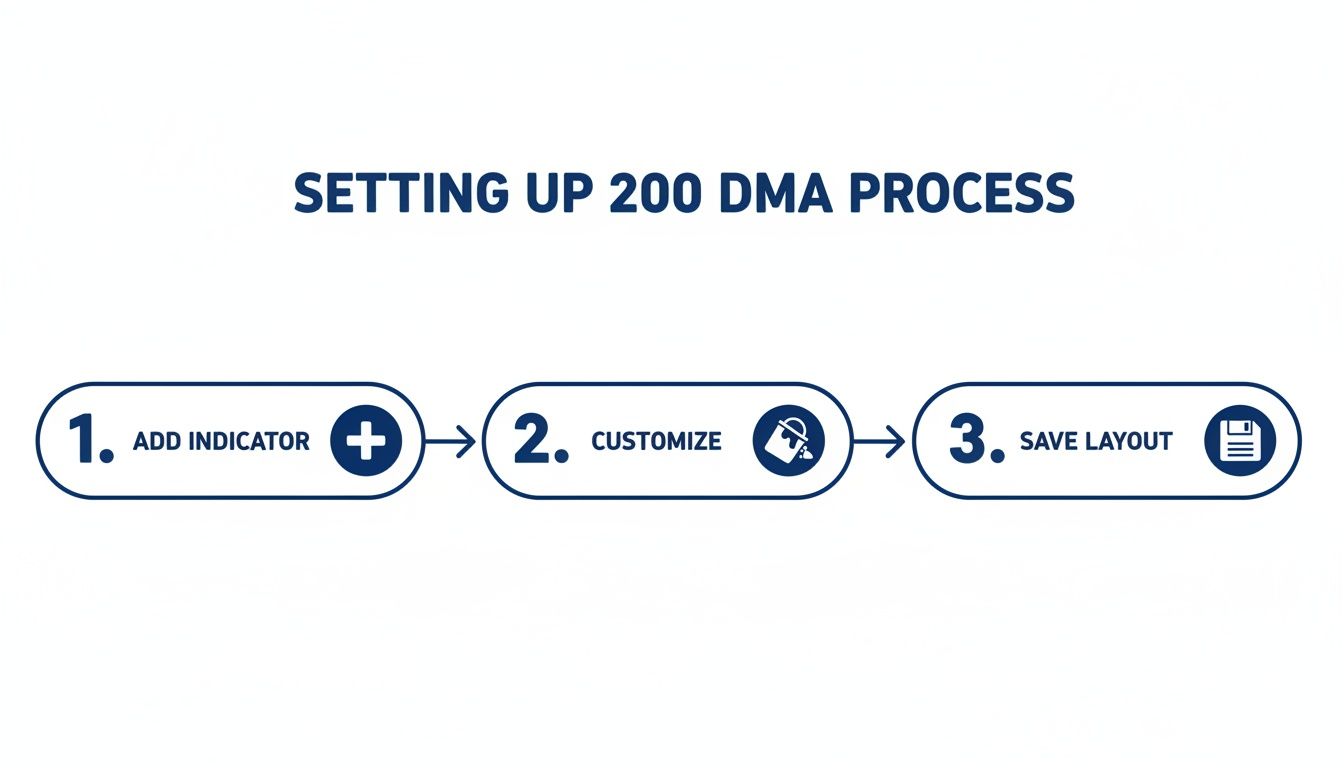
This process flow just highlights the simple but crucial steps: add the indicator, customize it to your liking, and save the layout so it’s ready for you every time.
Gauging Trend Strength with Slope
Not all uptrends are created equal. A stock just drifting sideways above its 200 DMA is a world away from one with a steeply ascending moving average. The slope of the 200 DMA itself is a powerful indicator of momentum. A sharply rising slope signals a strong, sustained buying trend that institutions are piling into.
In ChartsWatcher, you can create a scan to find stocks with the strongest momentum by filtering for the slope of the 200 DMA. You could, for example, build a scan that only returns stocks where the 200 DMA has risen by at least 15% over the last 3 months. This immediately filters your universe down to the market's true leaders.
This is where things get really interesting. Imagine running the "bounce off the 200 DMA" scan, but only on stocks that also appear on your "strong slope" list. Now you're not just buying a dip; you're buying a dip in one of the market's most powerful uptrends. This multi-layered approach is how you separate the A+ setups from all the noise.
Analyzing Market Health with Breadth Indicators
Analyzing a single stock chart is critical, but the best traders know when to zoom out and check the market's tide. A rising tide lifts all boats, and a falling one can sink even the sturdiest ship. This is where we can elevate our analysis, using the 200-day moving average not just for one stock, but as a powerful gauge for the entire market's health.
Instead of just staring at the S&P 500 index chart, we’re going to peek under the hood. Is a rally being driven by broad participation from hundreds of stocks, or is it just a few mega-cap names dragging the index higher? The answer tells you everything about the health and durability of a trend. This concept is called market breadth.
Building a Market Health Dashboard
Inside ChartsWatcher, you can build a custom toplist that acts as a real-time health gauge for the market. The goal is to track a simple but profound metric: the percentage of S&P 500 stocks currently trading above their 200 DMA. It's one of my personal go-to breadth indicators because it’s just so clear and effective.
To do this, you'd create a scan of the entire S&P 500 universe and simply count how many stocks are trading above their 200-day simple moving average. The platform can display this as a percentage, giving you an instant snapshot of the market's internals.
This single number provides crucial context. If the S&P 500 is hitting new highs but only 35% of its components are above their 200 DMA, that’s a major red flag. It signals a weak, narrow rally that lacks broad support and could easily reverse. On the flip side, if the index is climbing and 80% of stocks are participating, you're looking at a robust, healthy bull market.
Trader's Insight: Think of this breadth metric as an early warning system. I've seen many market tops form where the major indexes continued to inch higher while this internal health indicator began to deteriorate for weeks. It's a classic divergence that signals underlying weakness long before it's obvious on a standard price chart.
Decoding the Breadth Data
Market breadth, measured by the percentage of stocks above their 200 DMA, gives you a clear, numerical signal of market-wide strength. Historically, when this reading for the S&P 500 climbs above 70%, it points to a rally with broad participation and lower risk. In contrast, a reading below 30% often coincides with the tough, choppy conditions of a bear market. You can explore more historical data on these market breadth levels at macromicro.me.
Here’s a practical way to interpret these readings to adjust your own risk exposure.
Interpreting Market Breadth
This table provides a simple framework for gauging market sentiment based on how many stocks are in a long-term uptrend.
| Percent of Stocks Above 200 DMA | Market Health Signal | What It Means for Traders |
|---|---|---|
| Above 75% | Strong & Broad Uptrend | The market is healthy. It's a good environment for aggressive trend-following and buying dips. |
| 50% - 75% | Healthy Uptrend | The bull market has solid footing. Most stocks are participating. A bullish bias is warranted. |
| 30% - 50% | Choppy & Selective Market | The market is in transition. Conditions are tricky, favoring stock-picking over broad index exposure. |
| Below 30% | Confirmed Downtrend | The market is weak. It's time to be defensive, raise cash, or focus on short-selling strategies. |
Using this data-driven approach helps remove emotion from your decisions and gives you an objective framework for assessing risk. We cover this topic in more detail in our guide to market breadth signals.
Scanning for Major Trend Shifts
Beyond just tracking percentages, we can also use the 200 DMA to scan for two of the most famous long-term signals in technical analysis: the Golden Cross and the Death Cross. These patterns flag a major potential shift in a stock's long-term direction.
-
Golden Cross (Bullish): This happens when the shorter-term 50-day moving average crosses above the longer-term 200-day moving average. It suggests that shorter-term momentum is strengthening and could be kicking off a new long-term uptrend.
-
Death Cross (Bearish): This is the opposite. The 50-day moving average crosses below the 200-day moving average, signaling that recent price action is weak and a major long-term downtrend may be starting.
You can easily build scans in ChartsWatcher to alert you the moment an index or a stock experiences one of these crosses. While they are lagging indicators, their power lies in confirming that a significant, and potentially durable, shift in the primary trend is underway. This helps you align your strategy with the market's dominant long-term flow.
Putting Your Strategy to the Test with Backtesting
An idea is just an idea until you can prove it with data. All the scans and chart setups we've built are really just hypotheses. Now, it's time to put on our lab coats and use historical data to see if our theories about the 200-day moving average actually hold up.
This is where backtesting comes in. It’s the process of running your trading strategy on past data to see how it would have performed. We're not trying to predict the future—that's a fool's errand. Instead, we're trying to understand our strategy's personality: its strengths, weaknesses, and just how much risk it carries. It’s the only way to go from simply looking at an indicator to building a real, data-driven trading system.

Designing a Simple 200 DMA Backtest
Let's fire up ChartsWatcher and run a simulation on one of the most classic trend-following strategies out there. We’ll keep the rules dead simple to get a clear performance baseline before we start adding any bells and whistles.
Here’s the core logic for our first test:
- Universe: We'll test this on a basket of 20 large-cap tech stocks, like AAPL, MSFT, and NVDA.
- Timeframe: Let's look at the last five years of daily price data.
- Buy Signal: Go long when a stock’s price closes above its 200-day simple moving average.
- Sell Signal: Get out when the stock’s price closes below its 200-day simple moving average.
This is a straightforward system designed to keep us in during major uptrends and move us to cash during ugly downtrends. Of course, crunching this much historical data requires solid time series data management to ensure the results are accurate.
My Two Cents: The point of this first backtest isn't to discover a perfect, money-printing machine. It's to establish a benchmark. We have to find out if this basic idea has any merit at all before we waste a single minute trying to refine it.
What the Backtest Results Are Really Telling You
Once the simulation is done, ChartsWatcher will spit out a detailed performance report. It's tempting to stare at the total profit number, but seasoned traders know the real story is in the risk and consistency metrics.
These are the data points I always check first:
- Total Return: The headline number, sure, but it's just the start. It doesn't tell you anything about the ride.
- Win Rate: The percentage of trades that made money. Don't be fooled by this one—a strategy with a 40% win rate can be wildly profitable if the winners are much bigger than the losers.
- Max Drawdown: This one is critical. It shows the biggest hit your account would have taken from a peak. A strategy that returns 20% a year but has a 50% drawdown is probably too gut-wrenching for most people to trade in real life.
- Profit Factor: This is the gross profit divided by the gross loss. Anything over 1.0 is profitable, but I really like to see something above 2.0 for a strategy to be considered robust.
Let's say our test shows a positive total return, but a max drawdown of 45% and a win rate of just 35%. What does that tell us? It suggests the strategy is good at catching big trends but gets chopped to pieces by many small losses ("whipsaws") and can lead to painful drawdowns. The core idea works, but it needs a lot of work before it's tradable. That right there is an invaluable, data-driven insight.
From Data to Smarter Risk Management
This is where the magic happens. The backtest results give us concrete data to build our risk management rules.
For example, if the data shows that stocks in our test frequently dipped 5-7% below the 200 DMA before roaring back, we might decide to set our initial stop-loss at 8% below our entry. This simple rule, based on historical behavior, helps prevent us from getting shaken out by normal market noise.
Backtesting lets you quantify a strategy's behavior. You stop guessing where to put a stop-loss and start using historical data to make an informed decision. This is how you transform a pattern on a chart into a complete trading system with defined rules for entry, exit, and—most importantly—risk control.
Of course. Here is the rewritten section, crafted to sound like an experienced human expert and aligned with the provided style guide.
Common Questions About the 200-Day Moving Average
Even after you get the hang of using the 200-day moving average, some questions pop up time and time again. Let's walk through a few of the most common ones I hear from traders, because getting these details right can save you from some classic, costly mistakes.
Should I Use the 200-Day SMA or EMA?
When you’re trying to nail down the long-term, primary trend, the 200-day Simple Moving Average (SMA) is the undisputed industry standard. There's a good reason for this. It gives equal weight to all 200 days of closing prices, creating a smooth, stable line that's tough to fool with short-term market noise.
The Exponential Moving Average (EMA), on the other hand, puts more emphasis on recent prices. While that makes it more responsive—great for short-term strategies—that same sensitivity can cause it to jump the gun over a long 200-day period. You end up with premature signals and frustrating "whipsaws" that chop up your account.
My Take: Stick with the 200 SMA for identifying the big-picture trend. The EMA has its place, but the SMA's slow, steady nature is exactly what makes it the go-to for gauging the market's true direction.
What Are the Main Weaknesses of the 200 DMA?
No indicator is a silver bullet, and the 200 DMA is no exception. It has two big weaknesses you absolutely have to respect. First off, it’s a lagging indicator. By its very nature, it's based on 200 days of past data. That means by the time price makes a decisive cross, a huge chunk of the move has already happened.
Second, the 200 DMA becomes almost useless in choppy, sideways markets. When a stock is just bouncing around in a range with no real trend, the price will crisscross the moving average over and over again. This just generates a string of confusing, money-losing signals.
Here's how I deal with these flaws:
- Always look for confirmation. A 200 DMA cross on its own is not a signal. I want to see a surge in volume on the breakout or a momentum indicator like the RSI breaking out with it.
- Check the market context. If a stock has been grinding sideways for months, the 200 DMA will be flat and meaningless. It really shines when a stock is in a clear, established trend.
Can Day Traders Use the 200-Day Moving Average?
Absolutely, but not for picking entries and exits on a 5-minute chart. That's a rookie mistake. The line moves way too slowly for that. Instead, smart day traders use the 200 DMA on the daily chart to set their bias for the entire day.
Think of it as setting your "rules of engagement" before the opening bell.
- Stock is above its 200 DMA on the daily? Okay, today I'm a bull. I’ll only be hunting for long setups on my intraday charts. This puts the powerful long-term tailwind at my back.
- Stock is below its 200 DMA on the daily? Now I'm a bear. I’ll focus exclusively on finding short-selling opportunities, betting with the dominant downtrend.
This simple filter keeps you from "fighting the tape"—like trying to catch a tiny bounce in a stock that's in a freefall. The 200 DMA acts as your high-level guide, dramatically improving your odds by making sure your short-term trades are flowing with the primary market current.
Ready to stop hunting for charts and start finding actionable setups? ChartsWatcher provides the powerful scanning, backtesting, and charting tools you need to build a robust trading system around the 200-day moving average. Start your free trial today and take control of your market analysis.
