What Is Market Breadth A Guide to Trading Signals
Market breadth is a powerful tool for looking under the market’s hood. Think of it like a headcount during a military advance: while an index like the S&P 500 tells you how the generals are doing, breadth tells you if the soldiers are actually following them into battle.
What Is Market Breadth Really Telling You

Imagine an army general declares a massive victory. From a distance, it looks like a huge win. But what if you found out that only a few elite units pushed forward while the rest of the troops were retreating, exhausted, or just sitting on the sidelines? That’s the exact situation market breadth helps you spot in the stock market.
The big indexes we see on the news—the S&P 500, the Nasdaq 100—are usually driven by headlines. Because they're market-cap weighted, a handful of giants like Apple or Microsoft can drag the whole index up, painting a misleadingly rosy picture of market health.
A rising index with poor market breadth is like a beautiful house with a cracked foundation. It looks great on the surface, but structural weakness lurks underneath, posing a significant risk of collapse.
Beyond the Headline Numbers
Market breadth is like an X-ray for the market, revealing the true strength or weakness of a trend. It helps you answer the critical questions that index prices alone can't:
- How broad is the participation? Are most stocks joining the party, or is the rally being propped up by a select few?
- Is this trend for real? A rally with wide support across many stocks and sectors is far more likely to last. One driven by a few names is fragile.
- Are there any warning signs? Weakening breadth while the market is still rising is a classic red flag. It often shows up right before a correction or a full-blown reversal.
For instance, if the S&P 500 hits a new all-time high but more stocks are hitting new 52-week lows than new highs, that’s a major divergence. The generals are charging ahead, but the army is falling behind. This internal weakness suggests the uptrend is losing steam and shouldn't be trusted.
While breadth focuses on the number of participating stocks, you can also explore our guide on what is market depth to understand the volume and liquidity behind the price levels.
Strong vs Weak Market Breadth At a Glance
Getting a feel for the difference between a healthy, broad-based move and an unhealthy, narrow one is absolutely key. The table below breaks down the core differences. A market with strong breadth shows real conviction, while weak breadth is a sign of a fragile, concentrated trend that could fall apart at any moment.
| Characteristic | Strong Market Breadth (Healthy) | Weak Market Breadth (Unhealthy) |
|---|---|---|
| Participation | A large majority of stocks are moving in the same direction as the index. | A small group of mega-cap stocks is driving the index's performance. |
| Trend Health | The trend is considered sustainable and backed by broad market conviction. | The trend is vulnerable and at risk of a sharp reversal if leaders falter. |
| Confirmation | Breadth indicators and the price index move in sync, confirming the trend. | Breadth indicators diverge from the price index, creating a warning signal. |
| Investor Outlook | Bullish and confident, as gains are spread across multiple sectors. | Cautious and skeptical, as the market's foundation appears narrow. |
By analyzing these simple characteristics, you can quickly tell if a market rally is a genuine, institutionally-backed move or just a fragile illusion. This insight is what elevates your analysis from simply watching prices to truly understanding the market’s underlying dynamics.
Why Market breadth Is Your Early Warning System
Think of market breadth as the engine light on your trading dashboard. While the car—let’s say, a major index like the S&P 500—seems to be cruising along just fine, breadth indicators can start flashing red. They warn you about trouble under the hood long before the engine actually sputters and dies.
This is exactly why paying attention to market breadth is so critical. It uncovers the dangerous disconnects between what a headline index is doing and what the majority of stocks are actually doing. These divergences are often the earliest, most reliable signs that a strong trend is running out of gas.
Spotting Divergence: The Ultimate Red Flag
A divergence is when the price of an index and a breadth indicator start moving in opposite directions. It's the market’s version of saying one thing while doing another, and it’s a signal you should never, ever ignore.
You’ll typically run into two kinds of divergence:
- Bearish Divergence: The market index punches up to a new high, but the breadth indicator can't keep up and makes a lower high. This is a classic sign of exhaustion, suggesting fewer and fewer stocks are participating in the rally.
- Bullish Divergence: The market index drops to a new low, but the breadth indicator refuses to follow, carving out a higher low instead. This tells you that even though the index looks weak, the selling pressure is easing up underneath the surface.
This isn't just theory; it has a long history of calling major market tops. A perfect example is the run-up to the dot-com bubble bursting. In March 2000, the S&P 500 hit an all-time high, but the NYSE Advance-Decline (A/D) line had already started rolling over. This glaring negative divergence showed that while the index was climbing, fewer stocks were advancing with it.
It was a huge warning sign that the rally was dangerously concentrated in a handful of big tech names and was incredibly fragile. This internal rot preceded a collapse that wiped out nearly 50% of the S&P 500's value by October 2002. You can learn more about how technicians use the A/D line as a quantitative warning sign on litefinance.org.
A divergence is a powerful clue that the market's outward strength is just a facade. It’s your chance to see the internal weakness before the price itself breaks down, giving you a massive edge.
From Warning Light to Actionable Insight
Seeing a divergence is the first step. Knowing how to act on it is what separates disciplined traders from the crowd. When you spot a bearish divergence, it doesn't mean you should blindly short the market. Instead, it’s a signal to get cautious and play defense.
Here’s how to translate these warnings into smart, tactical decisions:
- Tighten Your Stops: If you're holding long positions, a bearish divergence is your cue to raise stop-loss orders. The weakening participation dramatically increases the risk of a sudden reversal, and you want to lock in profits.
- Hold Off on New Longs: This is not the time to be a hero and initiate new bullish positions. The risk-to-reward is terrible when you know the market's foundation is shaky.
- Look for Confirmation: Wait for other technical indicators or chart patterns to confirm the weakness. A break of a key support level or a bearish moving average crossover could be the final piece of the puzzle before you consider a short.
By treating market breadth as your personal early warning system, you can stop reacting to market crashes and start anticipating them. It empowers you to protect your capital when a trend is losing steam and position yourself for the next big move with far more confidence.
The Essential Market Breadth Indicators Explained
Now that you know why market breadth is your secret weapon for checking a trend's health, let's open the toolkit. Think of these indicators as different diagnostic instruments, each designed to inspect a specific part of the market's internal engine. Don't worry about the complex formulas for a minute; what matters is knowing what each tool tells you and when to pull it out.
By getting comfortable with a few key indicators, you can build a much richer, multi-dimensional view of market participation. This stops you from getting tunnel vision on a single data point and instead helps you see what the "army of stocks" is really doing.
The Advance-Decline Line (A/D Line)
The Advance-Decline (A/D) Line is the absolute cornerstone of breadth analysis. It's a simple but incredibly powerful cumulative indicator that keeps a running tally of the net number of advancing stocks versus declining ones each day.
Here's the gist of it:
- How it works: Every day, you take the number of advancing stocks and subtract the number of declining stocks. You add this net number (which can be positive or negative) to the previous day's total.
- What it tells you: A rising A/D Line confirms a healthy, broad-based uptrend. A falling A/D Line, on the other hand, signals that more stocks are losing ground than gaining—a clear sign of weakness.
The most critical signal the A/D Line gives is divergence. If the S&P 500 is grinding out new highs but the A/D Line is failing to do the same, it's a massive red flag. It tells you the rally is getting thin and losing support from the broader market.
New Highs-New Lows Indicator
While the A/D Line tracks daily back-and-forth, the New Highs-New Lows (NH-NL) indicator measures market leadership and conviction. It gets straight to the point, comparing the number of stocks hitting fresh 52-week highs to those tumbling to 52-week lows.
A healthy bull market should have a constant, expanding list of stocks making new highs. When the number of new lows starts to creep up and overtake the new highs—even while the main index is still chugging along—it's a sign that weakness and fear are spreading beneath the surface.
The flowchart below visualizes this exact scenario, showing how a breadth divergence acts as a powerful early warning for a potential market reversal.
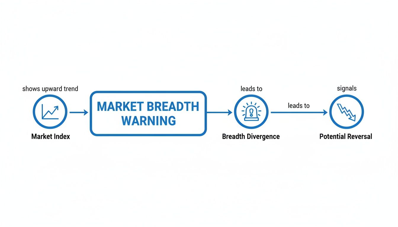
This graphic perfectly illustrates how an index can keep climbing while the underlying participation starts to fade, creating a divergence that often comes before a significant correction.
Up-Down Volume Ratio
Price tells you what's happening, but volume reveals the conviction behind the moves. The Up/Down Volume Ratio adds this crucial layer to our analysis by comparing the total trading volume of advancing stocks to the total volume of declining stocks.
A ratio above 1.0 means more volume is powering rising stocks, a clear bullish sign. A ratio below 1.0 suggests selling pressure is in control. A really high reading, like a 9-to-1 upside volume day, can signal a "breadth thrust"—a powerful sign that buyers are initiating positions with force.
By looking at volume, this indicator helps you tell the difference between a quiet, low-participation rally and one being driven by strong institutional conviction. It measures the enthusiasm of the crowd, not just the headcount.
The McClellan Oscillator and Summation Index
For traders who like momentum, there’s the McClellan Oscillator. It takes the raw A/D data and smooths it out, creating an oscillator that fluctuates above and below a zero line.
- Readings above zero point to bullish breadth momentum.
- Readings below zero suggest bearish breadth momentum is taking hold.
- Extreme readings (like above +100 or below -100) can flag short-term overbought or oversold conditions in the market's internals.
The McClellan Summation Index is just a running total of the Oscillator's daily values. This gives you a much longer-term perspective on breadth, making it better for spotting major trend shifts rather than just quick swings.
These indicators aren't just abstract concepts; they are vital tools for peering under the market's hood. While breadth tells you about participation, you might also want to check out our guide on the top market sentiment indicators to understand the crowd's emotional state.
Choosing the right combination of these indicators will equip you to spot trend weakness long before it shows up in the price of your favorite index.
Comparing Key Market Breadth Indicators
To make it easier to choose the right tool for the job, here's a quick rundown of the main indicators, what they measure, and the primary signal to watch for.
| Indicator | What It Measures | Primary Signal |
|---|---|---|
| Advance-Decline (A/D) Line | The cumulative difference between advancing and declining stocks. | Divergence from the major index (e.g., S&P 500). |
| New Highs-New Lows (NH-NL) | The number of stocks making 52-week highs vs. 52-week lows. | Expansion or contraction of new highs. |
| Up/Down Volume Ratio | The ratio of volume in advancing stocks to volume in declining stocks. | Ratios significantly above or below 1.0; extreme "thrust" signals. |
| McClellan Oscillator | The momentum of the advance-decline data (short-term). | Crossovers above/below the zero line; overbought/oversold levels. |
| McClellan Summation Index | The cumulative sum of the McClellan Oscillator (long-term). | Changes in the long-term trend direction of the index. |
Each of these tools provides a unique angle on the market's health. By using them together, you can build a more robust and reliable picture of whether a trend is built on a solid foundation or on shaky ground.
How to Read Market Breadth Signals Like a Pro
Having the right market breadth indicators is one thing, but knowing how to interpret their language is where the real edge comes from. You need to learn what they’re whispering about the market’s true intentions. This isn't just about looking at a chart; it's about reading the story it tells.
The whole practice boils down to two key concepts: confirmation and divergence. Think of them as traffic signals for your trading. Confirmation is the green light, telling you the index and its underlying stocks are marching in sync. Divergence is that flashing red light—a critical warning that something under the surface isn't right.
Confirmation: The Green Light for Trend Health
Confirmation is simple but incredibly powerful. It's what you see when a breadth indicator is moving in the same direction as the market index. When the S&P 500 is printing new highs and the Advance-Decline (A/D) Line is right there with it, making new highs too, that's confirmation.
This signal gives you confidence that the trend is healthy and has legs. It shows the generals (the index) and the soldiers (the individual stocks) are all marching in lockstep.
- In an uptrend: A rising index backed by a rising A/D Line, more new highs, or strong up-volume ratios confirms genuine bullish conviction.
- In a downtrend: A falling index accompanied by a plunging A/D Line and expanding new lows confirms that the selling is broad-based and serious.
When you see confirmation, it generally means you can trust the primary trend. It’s a signal to stick with your strategy, whether that’s holding long positions in a rally or staying defensive during a sell-off.
Divergence: The Critical Red Flag
Divergence is where market breadth analysis truly shines, acting as an early warning system. It happens when the index and the breadth indicator are telling you two completely different stories. This disagreement is often the first sign that a strong trend is losing its internal steam and becoming vulnerable to a reversal.
Divergence is the market’s poker tell. The index might be bluffing with a new high, but weak breadth reveals its poor hand, telling you the rally lacks broad support and conviction.
This is especially critical in today's market, where a handful of mega-cap stocks can easily drag an index higher while the rest of the market struggles. We saw this play out between 2010 and 2020; the S&P 500's incredible run was heavily skewed by a small group of giants. While the index soared, breadth indicators sometimes showed that fewer and fewer stocks were actually participating—a clear sign of narrow and fragile leadership. You can get more insights into how narrow leadership creates market risk on corporatefinanceinstitute.com.
Let’s break down the two main types of divergence you need to have on your radar.
Identifying Bearish Divergence
A bearish divergence is one of the most reliable warnings that a bull run is getting exhausted. You can spot it when:
- A major index like the S&P 500 or Nasdaq 100 pushes to a new price high.
- At the same time, a breadth indicator like the A/D Line or the New Highs-New Lows indicator fails to make a new high, instead carving out a lower high.
This tells you that even though the headline number looks great, the rally is running on fumes. Fewer stocks are providing the strength to keep climbing. When leadership thins out like this, the risk of a sharp pullback or reversal increases dramatically. Seeing this pattern is a clear signal to tighten your stop-losses and think twice before chasing new long positions.
Identifying Bullish Divergence
A bullish divergence is the mirror image, and it often provides the first clue that a nasty downtrend is close to burning itself out. This pattern emerges when:
- A major index drops to a new price low, making it look like sellers are still firmly in control.
- Simultaneously, a breadth indicator forms a higher low, refusing to confirm the new weakness in price.
This subtle disagreement signals that the selling pressure is starting to dry up. Even as the index hits rock bottom, fewer stocks are following it down. The internal bleeding has started to slow, suggesting the "army" of stocks is quietly building a base. This is often the first sign that buyers are beginning to step in, setting the stage for a potential market bottom and a new leg up.
Putting Market Breadth to Work in ChartsWatcher
Alright, theory is great, but making money with it is what actually counts. Let's get our hands dirty and walk through how to apply this knowledge directly inside the ChartsWatcher platform. We're moving beyond the concepts now and into the practical side of things—how to set up your charts, scans, and alerts to find real, actionable trading ideas.
By layering breadth indicators right on top of your price charts, you turn abstract numbers into clear visual signals. This is the bridge between knowing what market breadth is and using it to make smarter decisions.
Let's dive in and set up your first breadth chart.
Adding the Advance-Decline Line to Your Chart
The first, most fundamental step is to overlay the Advance-Decline (A/D) Line onto a major index chart, like the S&P 500. This simple combination immediately gives you a baseline for comparing the index's price action with the market's underlying participation.
Here’s the step-by-step process:
- Open a Chart: Pull up a chart of a major index. A good starting point is always SPY, the S&P 500 ETF.
- Add Indicator: Head over to the indicator library within ChartsWatcher.
- Search for Breadth: Type "Advance-Decline Line" in the search box. You'll see a few options for different exchanges (NYSE, Nasdaq, etc.). For analyzing the S&P 500, the NYSE A/D Line is the gold standard.
- Apply to Chart: Just click to add it, and it will appear in a separate pane right below your main price chart.
Just like that, you can instantly see if the "soldiers" are in sync with the "generals." A rising S&P 500 backed by a rising A/D line is a healthy, confirmed trend. This simple setup is your new foundation for spotting those powerful divergences we talked about.
Building Scans and Alerts for Breadth Events
Looking at charts is one thing, but getting a tap on the shoulder when something important happens is a game-changer. ChartsWatcher lets you build custom scans and alerts to automatically flag key breadth conditions. No more staring at the screen all day waiting for a setup to appear.
Here is a chart from ChartsWatcher showing a customized dashboard, which can be configured to track key breadth indicators and toplists in real-time.
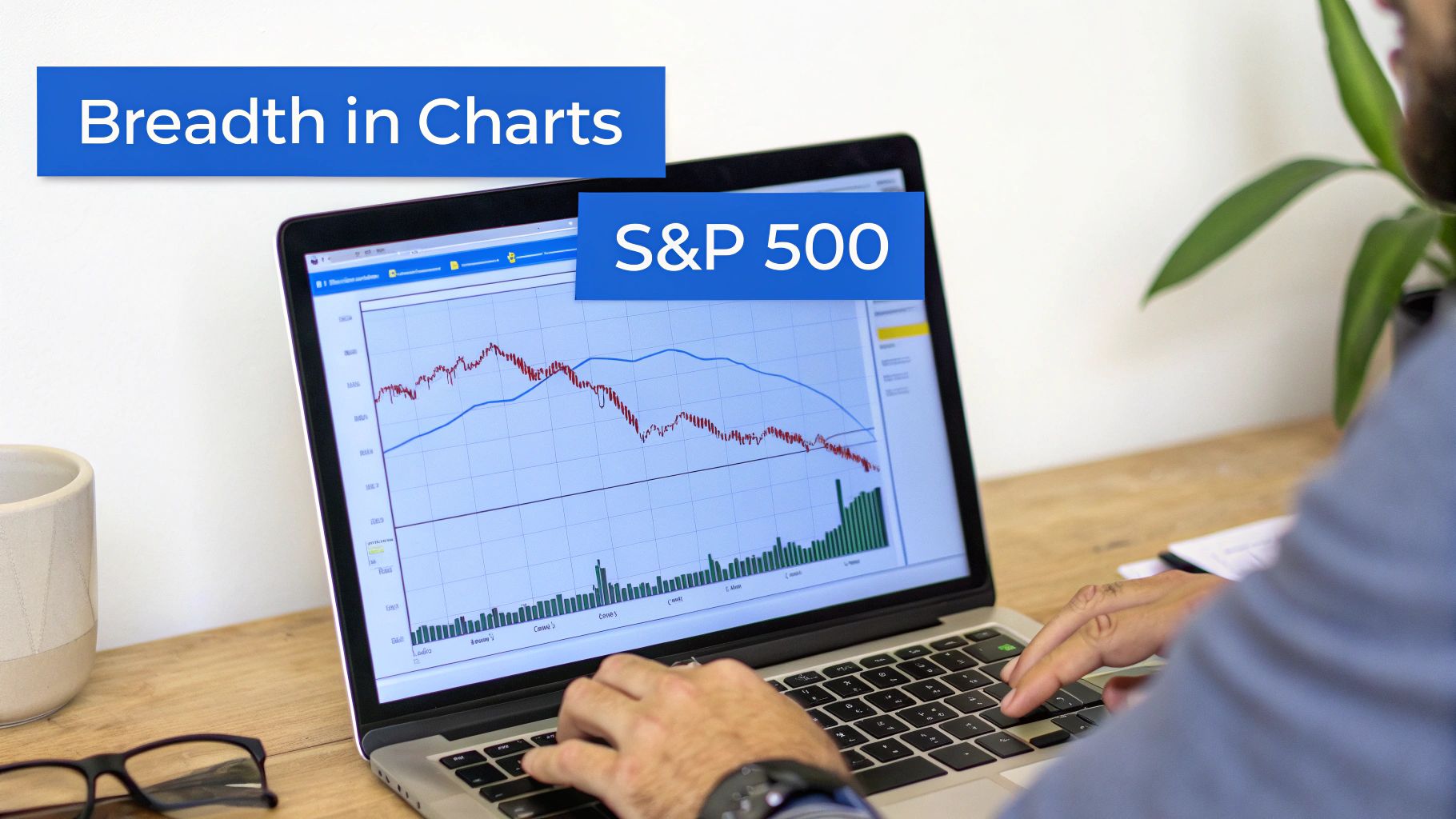
This kind of dashboard helps you keep a pulse on breadth metrics across different watchlists, letting you quickly spot where strength or weakness is bubbling up.
For example, you can create a simple scan to find stocks with improving internal strength.
Pro Tip: Set up an alert for when the percentage of S&P 500 stocks trading above their 50-day moving average crosses above 60%. This often signals a shift toward a healthier, more sustainable market uptrend.
You could also create an alert for a "breadth thrust" event, like when the NYSE Up/Down Volume Ratio explodes past a 9-to-1 reading. These extreme bursts of buying pressure often mark the beginning of powerful new rallies, and an automated alert ensures you're ready to act right at the point of ignition.
Backtesting a Simple Breadth Strategy
Finally, to build real confidence in any strategy, you have to test it. Using the backtesting tools in ChartsWatcher, you can see how a strategy based on breadth signals would have performed in the past. It’s the ultimate reality check.
A straightforward strategy might be to buy the S&P 500 when the McClellan Oscillator crosses above the zero line and sell when it dips back below.
By running a backtest, you can get hard data on historical performance. This data-driven validation is crucial for refining your rules, managing risk properly, and ultimately, trading with more conviction. Moving from theory to this kind of practical application is the final step in truly mastering market breadth.
Common Pitfalls When Using Breadth Indicators
Market breadth is a fantastic diagnostic tool, but it's not a crystal ball. And frankly, treating it like one is the fastest way to get yourself into trouble. If you want to use breadth analysis the right way, you have to be brutally honest about its limitations and the common traps traders fall into.
One of the most common mistakes I see is traders getting fixated on a single indicator. The Advance-Decline Line might flash a bearish divergence, but if Up/Down Volume is still looking strong and New Highs are expanding, what does that really tell you? The signal is mixed at best. Breadth indicators are most powerful when they're all singing the same tune.
Think of breadth indicators as a panel of expert consultants. You wouldn't bet the farm based on one consultant's opinion, right? You listen to all of them to get the full picture before you make a move.
Another classic error is ignoring price action for confirmation. A divergence is just a warning, not a green light to trade. Acting on a bearish breadth divergence before the price actually breaks a key support level is just jumping the gun. It can lead to some painful losses if the primary trend decides to kick back in.
Mismatched Tools and Short-Term Noise
There's a more subtle pitfall that can be just as damaging: using the wrong tool for the job. For instance, applying NYSE breadth data to analyze the Nasdaq 100 is a fundamental mismatch. The NYSE is full of industrial, financial, and old-school value companies, while the Nasdaq is overwhelmingly tech and growth. You can't mix and match—each index has its own internal engine, and you need the corresponding breadth data for an accurate reading.
It's also incredibly easy to get shaken out by short-term noise. Breadth data can get choppy from one day to the next. A single weak session doesn't mean a bull market is rolling over. The real, actionable signals are the patterns that build up over weeks and months.
To keep yourself out of trouble, stick to a few best practices:
- Always Seek Confirmation: Use price action and other technical indicators to back up what breadth is telling you. Never, ever trade on a breadth signal alone.
- Use a Multi-Indicator Approach: Look for agreement across several breadth tools (like the A/D Line, NH-NL, and Volume Ratios) to build a much stronger case for a market turn.
- Match Your Index: Make sure your breadth indicator corresponds to the index you're analyzing. Use NYSE breadth for the S&P 500 and Nasdaq breadth for the Nasdaq 100.
- Focus on the Trend: Give more weight to longer-term divergences and persistent patterns. This helps filter out the meaningless day-to-day market chatter.
By understanding what market breadth can't do, you can avoid costly mistakes. This balanced view lets you build it into a solid, reliable trading strategy instead of chasing it like a magic bullet.
Your Market Breadth Questions Answered
As you start weaving breadth analysis into your trading routine, some practical questions are bound to pop up. Let's tackle some of the most common ones head-on to help you apply these tools with more confidence.
How Often Should I Check Market Breadth Indicators?
There's no single right answer here—it really comes down to your trading style. You need to match the frequency of your analysis to your time horizon.
- For Day Traders: You're living in the now, so you need to be watching breadth in real-time. Intraday gauges like the Advance-Decline Issues and Up/Down Volume ($ADD, $TICK) are your best friends for spotting moment-to-moment shifts in sentiment. A sudden dive in these can be the first warning sign of an impending intraday reversal.
- For Swing Traders (holding for days to weeks): A check-in at the end of each day is usually plenty. Your focus should be on the daily Advance-Decline Line, New Highs-New Lows, and the McClellan Oscillator. What you're looking for are divergences or confirmations that build up over several days.
- For Long-Term Investors (holding for months to years): A weekly review will serve you just fine. Pulling up weekly charts for indicators like the McClellan Summation Index helps you see the major, long-term tides in the market's health while filtering out all the distracting daily noise.
Can Market Breadth Be Used For Individual Stocks?
In short, no. By its very nature, market breadth is about the collective—the entire index or exchange. The whole point is to measure the health of the market "army," not the performance of a single "soldier."
You simply can't calculate an Advance-Decline Line for one stock like Apple (AAPL). But that doesn't mean breadth is useless for stock pickers. Far from it. You use the broader market context to inform your decisions on individual names.
Think about it this way: if you see a nasty bearish divergence building in the Nasdaq 100's breadth while AAPL is ripping to new highs, that’s a major red flag. It tells you the generals are charging ahead, but the troops aren't following. That kind of weak participation makes AAPL's rally incredibly vulnerable.
This context is everything. Strong market breadth is like a tailwind for your stock picks, making good setups even better. Weak breadth is a headwind that can cause even the most perfect-looking breakout to fail.
Which Breadth Indicator Is The Best?
This is a classic question, but there's no magic bullet. The truth is, there is no single "best" indicator. The most effective traders use a handful of them together to get a complete picture.
Each indicator gives you a slightly different angle on the market's internal strength. Relying on just one is like a doctor trying to diagnose a patient by only taking their temperature—you're missing crucial information. A smart doctor also checks blood pressure, listens to the heart, and runs other tests.
A fantastic starting trio to get a well-rounded view includes:
- The Advance-Decline Line: Gives you the big-picture trend of participation.
- New Highs-New Lows: Shows you the strength of market leadership and conviction.
- Up/Down Volume Ratio: Measures the fuel—the enthusiasm and force—behind market moves.
When you see a signal confirmed across these different dimensions, you can act with much greater conviction. This layered approach is your best defense against getting faked out by false signals.
Ready to stop guessing and start analyzing the market's true health? ChartsWatcher provides all the advanced breadth indicators, custom scanning, and backtesting tools you need to spot divergences and confirmations like a pro. Take control of your trading analysis and get started today at chartswatcher.com.
