A Trader's Guide to Intraday Chart Pattern Mastery
Think of the daily stock market action as a story unfolding minute by minute. The constant tug-of-war between buyers and sellers isn't just random noise; it's the dialogue, the action, and the plot of that story. An intraday chart pattern is simply a recurring scene—a visual footprint of this battle that hints at what might happen next.
Learning to spot these patterns is like learning to read the market’s language.
This guide will teach you how to interpret that story, focusing on the fast-paced world where day traders operate: the 1-minute, 5-minute, and 15-minute charts. On these timeframes, patterns form and play out quickly, creating opportunities for traders who are prepared to act.
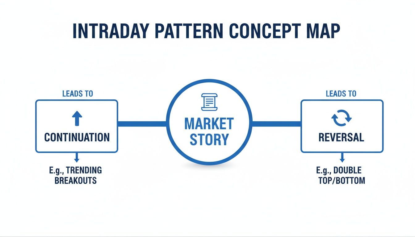
The Two Fundamental Plot Lines
Just like any good story, the market's narrative tends to follow a few core themes. In intraday trading, there are two fundamental "plot lines" you absolutely have to know. Think of them as the two main things that can happen to a character in a book: they either keep going on their current path or they make a dramatic turn.
- Continuation Patterns: These patterns signal that a trend is just taking a breather before it likely pushes on in the same direction. It's the market's equivalent of a character pausing to catch their breath before continuing a long climb.
- Reversal Patterns: These suggest a trend is running out of gas and a major plot twist could be coming. This is the moment a stock that's been falling all morning might finally find a bottom and turn around.
When you learn to spot these formations, you're no longer just staring at squiggly lines. You're reading the underlying story of supply and demand. This is the bedrock of making smarter, more confident trading decisions.
Our goal here is to go way beyond just memorizing shapes. We’ll dig into the psychology behind why these patterns form and, crucially, how to tell a real signal from a fakeout.
By the end, you'll have a solid framework for finding high-probability setups and managing your risk. Forget trying to predict the future; successful day trading is about reacting to the story the chart is telling you right now.
How to Spot Momentum with Continuation Patterns
Continuation patterns are the market’s way of hitting the pause button. They signal that a trend is likely just taking a quick breather before getting back on track.
Think of it like a pit stop in a race. The car pulls over for a moment, but the clear intention is to rejoin the pack and keep moving in the same direction. Learning to spot these pauses is a core skill for finding a high-probability intraday chart pattern.
These formations show up when buyers and sellers find a temporary balance. After a big price move, some traders are cashing out and taking profits, while new traders are jumping in, causing the price to churn sideways for a bit. If the original momentum is still strong, this consolidation usually ends with a breakout that follows the initial trend.
The market really only tells two kinds of stories: either the current trend is continuing, or it's about to reverse. Continuation patterns are all about the first story.
As you can see, a continuation pattern is just a trending market taking a structured pause before its next leg up or down.
The Anatomy of a Bull Flag
The Bull Flag is one of the most classic and dependable continuation patterns you'll find. It shows up in the middle of a strong uptrend and looks exactly like its name suggests: a flagpole followed by a small, rectangular flag.
Its structure is simple and has two distinct parts:
- The Flagpole: This is a sharp, nearly vertical surge in price that happens on high volume. It’s the initial explosion of buying pressure and shows powerful momentum.
- The Flag: Right after the flagpole, the price consolidates into a gently downward-sloping channel or rectangle. Volume should dry up here, which tells you the sellers don't have much conviction.
The pattern completes when the price breaks above the flag's upper trendline, ideally with a big spike in volume. That's your signal that buyers have regrouped and are ready to push prices higher.
Identifying the Bearish Pennant
The Bearish Pennant is the mirror image of a bull flag, and it signals that a downtrend is likely to continue. It forms after a sharp drop in price, representing a brief pause before sellers take control again.
Just like its bullish cousin, it has two key components:
- The Flagpole: A steep, sudden price drop on heavy volume. This shows strong selling conviction.
- The Pennant: A short consolidation where the price forms a small, symmetrical triangle. The trendlines squeeze together, showing that volatility is shrinking as the market coils up for its next move.
The breakout is confirmed when the price slices below the pennant's lower trendline, preferably with a surge in selling volume. This is your cue that the pause is over and the downtrend is back on.
Key Takeaway: For both flags and pennants, the consolidation phase has to be quick and clean. If it gets long and choppy, it’s a warning sign that the original momentum might be gone, and the pattern is probably invalid.
The Power of the Ascending Triangle
While flags and pennants are quick little pauses, the Ascending Triangle is a slightly longer consolidation that screams bullish intent. It forms when buyers are relentlessly testing a clear horizontal resistance level.
Here’s what to look for:
- Flat Resistance: A horizontal line connecting a series of swing highs. This is the ceiling that sellers are defending.
- Rising Support: An upward-sloping trendline connecting a series of higher lows. This shows buyers are getting more aggressive, stepping in sooner on every little dip.
This structure tells a clear story: sellers are holding firm at a specific price, but buyers are slowly gaining ground. The price gets squeezed between these two lines until it's forced to break out—usually to the upside. When the price finally punches through that horizontal resistance, it confirms the buyers have won the battle.
To really get a feel for the forces driving these moves, diving into a solid Momentum Guide can give you a much deeper understanding of what’s happening under the surface.
Identifying the Turning Tide with Reversal Patterns
While continuation patterns are like a brief pause in a marathon, reversal patterns are the market's emergency flares. They signal that a trend is running out of gas and might be about to pull a U-turn.
Think of it as the first cracks appearing in a dam. The pressure is building, and the structure holding the current price trend is starting to give way. Spotting an intraday chart pattern like this is really about reading crowd psychology—it’s the moment when the conviction of buyers (in an uptrend) or sellers (in a downtrend) starts to crumble, and the other side gains the upper hand.
Learning to spot these formations can help you get out of a winning trade before it goes south, or jump into a brand-new trend right as it’s getting started.

The Head and Shoulders Pattern
The Head and Shoulders is one of the classic—and most powerful—bearish reversal patterns out there. It usually shows up at the peak of an uptrend and tells a clear story of bullish momentum hitting a wall.
Here’s the anatomy of the pattern:
- Left Shoulder: A strong price peak forms on high volume, followed by a minor dip.
- Head: The price rallies again, pushing to a new high, but often on lighter volume. This is a big red flag that conviction is fading.
- Right Shoulder: A third rally attempt falls short of the head, creating a lower peak. This tells you the buyers are just about spent.
- Neckline: This is a support line drawn connecting the low points between the shoulders and the head.
The reversal is only confirmed when the price breaks decisively below the neckline. That breakdown is your trigger, signaling that sellers have officially taken control. Traders often project a price target equal to the distance from the head down to the neckline.
The Double Top and Double Bottom
Simpler but just as potent, you'll see Double Top and Double Bottom patterns everywhere on intraday charts. These "M" and "W" shaped formations signal a potential trend change with very clear rules.
- Double Top (The "M" Shape): A bearish pattern. The price hits a resistance level, pulls back, then tries to rally back to that same resistance level but gets rejected. A breakdown below the support level created by that middle pullback confirms the pattern.
- Double Bottom (The "W" Shape): A bullish pattern. Here, the price finds a floor, bounces, falls back to test that same support level again, and holds firm. The reversal is confirmed once the price breaks above the resistance formed by the middle peak.
Patience is everything when trading these patterns. A classic rookie mistake is jumping the gun before the price confirms the reversal by breaking that key support or resistance level. Always wait for confirmation.
And these aren't just squiggles on a chart; their effectiveness has been studied. Foundational research that computationally validated key patterns found that inverse head and shoulders patterns had projected 73% hit rates for bullish reversals after a neckline breakout. You can check out more data-driven insights on how these classics perform in today's markets on Dukascopy.
Wedges: Rising and Falling
Wedges show a trend that’s losing momentum as the price range tightens. Unlike triangles (which are usually continuation patterns), wedges often signal the end of the road for the current trend. They’re formed by two converging trendlines that are both sloped in the same direction.
- Rising Wedge: This is a bearish reversal pattern. It forms during an uptrend when both support and resistance lines are pointing up, but the support line is steeper. This "squeezing" action shows buyers are losing steam, and it often resolves with a sharp breakdown below the support line.
- Falling Wedge: This is a bullish reversal pattern. It appears in a downtrend when both trendlines are pointing down, but the resistance line is steeper. This signals that sellers are losing their grip, often leading to a powerful breakout to the upside.
The key to trading a wedge is waiting for the price to break out of the converging lines. Volume is your lie detector here—a big surge in volume on the breakout adds a ton of credibility to the reversal signal.
For a deeper dive into the nuances of these formations, our comprehensive guide on how to master reversal chart patterns for profitable trades is a great next step.
Validating Patterns Beyond Their Shape
Spotting a picture-perfect intraday chart pattern feels great, but hold on—that’s just step one. A textbook shape is totally meaningless without some serious backup. Acting on the shape alone is like hearing a hot stock tip from a stranger; it's a surefire way to make some costly mistakes. This is where you put on your market detective hat and validate every single setup before risking a dollar.
To build a high-probability case for any trade, you need to look beyond the lines on the chart and hunt for evidence from three crucial sources. Think of them as the three pillars of a solid trade: Volume, Time, and Context. Without these, you're pretty much trading blind.
Volume: The Ultimate Lie Detector
Volume is the fuel that moves prices. It tells you how many shares are changing hands and, more importantly, reveals the conviction behind a move. A breakout might look explosive, but if it happens on weak volume, that's a massive red flag waving right in your face.
Imagine a crowd. A breakout on huge volume is like the entire crowd suddenly sprinting in one direction—it signals strong, widespread agreement and is far more likely to keep going. On the other hand, a breakout on thin volume is like one person starting to jog; it has no real power behind it and can fizzle out in seconds.
Here’s how to use it:
- Confirmation: A real breakout from any pattern—whether it’s a bull flag or a double bottom—needs a significant spike in volume. Look for at least 1.5x to 2x the recent average volume to show that the big players are getting involved.
- Divergence: As a reversal pattern like a Head and Shoulders forms, you might see volume getting weaker on each new peak. That divergence is a huge tell, suggesting the trend is running out of gas before the price even breaks down.
Time: The Element of Confluence
The second pillar is time. When and where a pattern shows up across different timeframes gives you critical clues about its strength. Not all 5-minute patterns are created equal, and this is where most new traders get burned.
One of the most powerful techniques here is multi-timeframe analysis. It’s simple: check the trend on a higher timeframe before you even think about trading a pattern on a lower one. For instance, if you spot a gorgeous bullish flag on a 5-minute chart, your first move should be to zoom out to the hourly chart.
If the hourly chart is in a strong, established uptrend, your 5-minute pattern is flowing with the market's current. But if that hourly chart is in a nosedive? Your 5-minute buy signal is a low-probability gamble because you’re trying to swim against a powerful tide.
This simple check aligns your trade with the bigger picture and can single-handedly save you from countless "head fake" moves and frustrating losses.
Context: The Broader Market Picture
Finally, no chart pattern exists in a vacuum. Its real power is massively influenced by the overall market context. You have to know what the broader market is doing, how the stock's sector is performing, and if any big news is about to drop.
Think about these layers of context:
- Overall Market Direction: Is the S&P 500 having a monster green day or is it bleeding out? Trying to trade a bullish pattern is a whole lot easier when a rising tide is lifting all boats.
- Sector Strength: Is your stock in a sector that's on fire for the day? If tech stocks are ripping higher, a bullish setup in a tech name has a much better shot at working out.
- Indicator Confluence: Technical indicators can provide that final piece of the puzzle. Does the Relative Strength Index (RSI) confirm the breakout by moving out of overbought or oversold territory? Is the price smashing through a key moving average at the same time?
When you combine a clean pattern with a surge in volume, get alignment across timeframes, and have a supportive market context, you've officially built a high-probability trading setup. You’ve graduated from being a simple pattern spotter to a strategic trader.
Automating Your Search with a Stock Scanner
Let's be honest: manually flipping through hundreds of charts to find a decent setup is a losing game. It’s not just tedious; it's impossible. You might stumble upon a perfect intraday chart pattern on one stock, but you'll have missed a dozen better opportunities while you were looking. This is where you let technology do the heavy lifting, so you can focus on trading, not searching.
Think of a stock scanner as a team of tireless analysts working for you around the clock. Instead of searching for a needle in a haystack, you simply tell the scanner what kind of needle you're looking for, and it brings every single one to you in real-time. This completely flips the script, moving you from the grunt work of finding patterns to the high-value skill of analyzing them.
Building Your Custom Intraday Scan
Creating a powerful scan isn't about writing complex code. It's about translating the visual rules of a pattern into a set of logical filters a computer can understand. This process lets you keep an eye on the entire market for setups that fit your exact criteria.
Let's build a real-world example. Say we want to find a classic Bull Flag on a 5-minute chart, a textbook bullish continuation pattern. Here’s what the scan filters might look like:
- Timeframe: Set it to 5-minute charts. Simple enough.
- Price Action (The Flagpole): Filter for stocks that have jumped at least 3% in the last 10 candles. This catches that initial, explosive move.
- Consolidation (The Flag): Now, look for stocks that have pulled back no more than 30% of that initial run-up over the next 3-5 candles. This defines the tight consolidation we want to see.
- Volume Filter: This is critical. Require the current 5-minute volume to be at least 2x the 20-period average volume. This is our breakout confirmation.
With just a few rules, you've instantly filtered thousands of stocks down to a handful of actionable candidates that match your strategy perfectly. To dive deeper into the nuts and bolts of this, check out our trader's guide to real-time stock scanning.
Configuring Dynamic Alerts for Entry
Finding a pattern is only half the battle. You have to pounce at the right moment. Dynamic alerts are your personal trigger system, notifying you the instant a key price level breaks so you never miss an entry because you were looking at the wrong screen.
For instance, once your scan flags a stock forming a bull flag, you can set a price-level alert just a few cents above the flag's upper trendline. The second the price punches through, you get an instant ping on your desktop or phone.
This isn't just a convenience—it's a massive strategic advantage. Automated alerts free you from the emotional trap of staring at a chart, waiting for something to happen, and allow you to execute your plan with mechanical precision.
Here’s how an automated scan looks when it identifies a Bull Flag, sending the alert right to your desktop and phone.
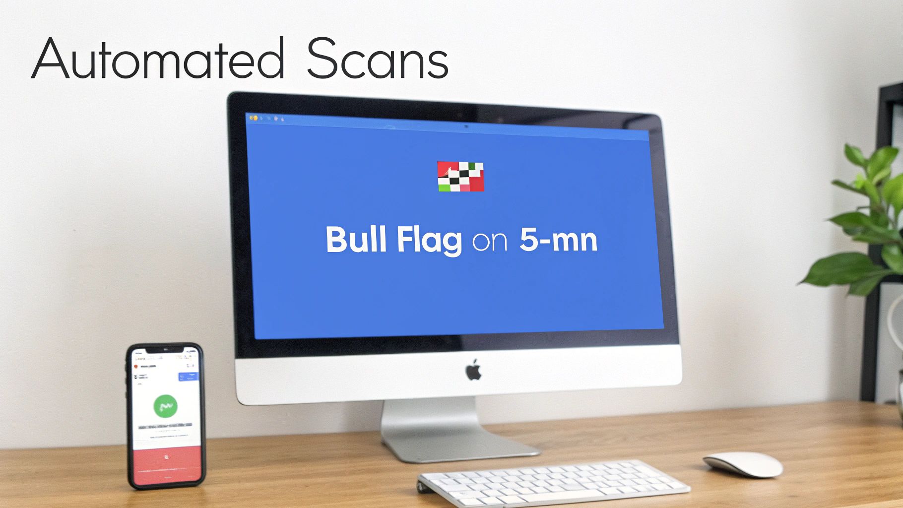
This kind of synchronized alert means you can act on a confirmed pattern whether you're at your main trading station or just keeping an eye on things remotely.
Validating Your Strategy with Backtesting
So you’ve built a great scan for Bull Flags. But how do you know if it actually has a statistical edge? Guessing is a recipe for disaster in trading. This is where backtesting becomes your most important tool. A good scanner will let you run your new scan rules against historical market data.
By backtesting, you get answers to the most critical questions before you risk a single dollar of your capital:
- Win Rate: What percentage of the time did this pattern actually lead to a profitable trade?
- Profit Factor: How did the winning trades stack up against the losing ones?
- Maximum Drawdown: What was the strategy's worst-ever losing streak?
This historical analysis turns your trading from a game of hope into a business of probabilities. It gives you the hard data you need to tweak your filters, optimize your entry rules, and trade with the confidence that comes from knowing your strategy is backed by data, not just a gut feeling.
Building Your Intraday Trading Plan
Spotting a validated intraday chart pattern is a great start, but honestly, it's only half the battle. The real gap between a pattern spotter and a consistently profitable trader is a rock-solid, non-negotiable plan for every single trade you take.
This is where you stop just observing the market and start engaging with it like a professional. A good plan isn't about hoping a pattern plays out; it's about knowing exactly how you'll act, what you'll risk, and where you'll get out—no matter what happens. Flawless execution is the goal.
Risk Management: The Foundation
Before you even dream about entry triggers, you have to nail down your risk management. Think of these rules as the guardrails that protect your capital and keep you in the game for the long haul. Without them, even the most beautiful patterns will eventually blow up your account.
Your risk plan must have crystal-clear definitions for:
- Position Sizing: Never, ever risk more than a small, fixed percentage of your account on a single trade. Most pros stick to 1% to 2%. This means you calculate your share size based on your stop-loss distance, not just a random number that "feels" right.
- Risk-to-Reward Ratio (R:R): Only enter trades where the potential reward is significantly bigger than the risk. A minimum R:R of 1:2 is a professional standard. In plain English, you should be aiming to make at least twice what you stand to lose.
A trader’s long-term success isn’t defined by their biggest wins, but by how well they manage their inevitable losses. Flawless execution of a risk-first plan is the only path to consistency.
Quick Strategy Templates
Once your risk rules are set in stone, you can build specific templates for your favorite setups. Here are a couple of practical examples to get you started.
Template 1: Bullish Flag Breakout
This strategy is all about catching that next burst of momentum after a brief pause.
- Entry Trigger: Go long once a 5-minute candle closes decisively above the flag’s upper trendline. No jumping the gun.
- Stop-Loss Placement: Tuck your initial stop-loss just below the low of the flag pattern itself.
- Profit Targets: Your first profit target (Target 1) should be at a distance equal to the height of the flagpole, measured up from the breakout point.
Template 2: Bearish Head and Shoulders Breakdown
This plan is built to capitalize on a confirmed trend reversal to the downside.
- Entry Trigger: Enter a short position as soon as the price breaks and closes below the neckline support.
- Stop-Loss Placement: Place your stop-loss just above the high of the right shoulder. This is your line in the sand.
- Profit Targets: The primary target is the distance from the top of the head down to the neckline, projected downward from where the price broke down.
Frequently Asked Questions
When you're in the trenches trading intraday, theory quickly turns into practical questions. Let's tackle some of the most common ones that come up.
What Is the Most Reliable Intraday Chart Pattern for Beginners?
If you're just starting out, patterns like flags and triangles are a great place to focus. Think of them as the market taking a quick breath. Their structure is usually pretty clear: you have a strong, obvious move, followed by a tight little consolidation period. This makes them easier to spot and build a simple trading plan around.
But here's the thing: reliability isn't really about the pattern itself. It's all about how you validate it. Even the most textbook-perfect flag can fall apart. The setups you can truly depend on are the ones that get a big thumbs-up from a surge in trading volume and make sense in the context of the broader market's direction.
How Do I Avoid False Breakouts?
Ah, the false breakout—every day trader's nemesis. Dodging them is all about patience and looking for confirmation. It's a game of layers.
First, don't jump the gun on the initial price poke. Wait for a candle to fully close beyond the breakout level. This simple act of patience filters out a huge number of fake-outs.
Next, a real breakout should feel powerful, and that power shows up in the volume. Look for a noticeable spike. If volume is weak, the move probably is, too. Finally, you can add another layer of evidence with an indicator like the RSI. Seeing the RSI move out of an overbought or oversold zone can help confirm the breakout has real momentum behind it.
Can I Use These Patterns on Any Stock?
Technically, these patterns can show up on any chart, but that doesn't mean you should trade them everywhere. They work best on stocks with high liquidity and a ton of daily trading volume.
Why? Because liquidity means the pattern reflects genuine sentiment from thousands of traders, not just the whims of one or two big players. Trading an illiquid, thinly traded stock is a recipe for disaster—you'll get hit with wide spreads and chaotic price action, making it nearly impossible to execute a clean trade, even with a perfect pattern. Stick to the liquid, mid-to-large-cap stocks that are "in play" for the day.
Stop searching and start analyzing. With ChartsWatcher, you can build custom scans and real-time alerts for the exact patterns you trade, giving you an immediate edge in the market. Find your next high-probability setup at https://chartswatcher.com.
