A Trader's Guide to Charts for Technical Analysis
Technical analysis charts are, quite simply, visual maps of an asset's price journey over time. For a trader, they are the single most important tool in the kit. They cut through the noise of raw market data, turning a complex stream of numbers into something we can actually interpret—the ongoing battle between buyers and sellers. Getting good at reading these charts is the foundation of every informed trading decision you'll ever make.
Reading the Market's Story Through Charts
Think of a chart as the market's native language. Every line, bar, or candlestick is a word, and stringing them together tells a story about supply, demand, and raw human emotion. A skilled musician doesn't just learn one instrument; they master several to create a rich tapestry of sound. In the same way, a professional trader learns to read multiple chart types to see the market from every possible angle. This guide won't just give you dictionary definitions; we're diving into how the pros actually use these tools.
Before you can build a winning strategy, you have to learn how to read market charts like a pro. It's the first real step.
The Foundation of Modern Analysis
Using charts to figure out markets is anything but new; its roots go deep. Formal technical charting really started over a century ago with Charles Dow's work in the early 1900s, which gave us the core idea that markets move in trends. You can see this play out dramatically on long-term charts of major indexes. Historical data on the S&P 500, for example, shows massive, multi-decade bull runs like the one after WWII or the incredible rally from 2009 to 2021.
Of course, these same charts show the brutal drawdowns, too, like the staggering 89% peak-to-trough collapse of the Dow during the 1929–1932 crash. You can see these trends for yourself by digging into historical stock market chart archives.
Why Charts Are a Trader's Toolkit
Charts are far more than just a history lesson; they are active, practical tools for making decisions right now. They help traders nail several critical tasks:
- Identify Market Trends: Instantly see if a market is trending up, down, or just chopping sideways.
- Spot Key Price Levels: Pinpoint the exact support and resistance zones where price is likely to react.
- Visualize Momentum: Get an immediate feel for the strength or weakness behind a price move.
- Recognize Repetitive Patterns: Identify classic formations that often signal a trend will either reverse or continue.
By translating raw numbers into a visual narrative, charts for technical analysis empower traders to interpret market psychology, manage risk, and identify high-probability opportunities with greater clarity and confidence.
Understanding the Core Chart Types
Think of the different charts for technical analysis as lenses for a camera. Each one captures the market's price action, but with a unique focus and level of detail. Picking the right one boils down to what you’re trying to see. To get started on the right foot, we'll break down the three most fundamental types: the line chart, the bar chart, and the candlestick chart.
Getting these core types down is your first real step toward reading the complex language of the market. Each one answers a different set of questions, helping you piece together the full story of what an asset is doing and why.
The Line Chart: Your Wide-Angle Lens
The line chart is the simplest of them all. It just connects a series of single data points—usually the closing price—over time. It’s like a wide-angle shot, smoothing out all the minor bumps and jitters to give you a clean, uncluttered view of the main trend. You won’t see the day-to-day volatility, but you will see the big picture.
Its main job is to answer one question: What’s the general direction? For long-term investors or anyone needing a quick-and-dirty look at historical performance, the line chart is perfect. It cuts through the noise and shows you the path of least resistance.
This is a great way to visualize how charts are the battlefield where buyers, sellers, and market psychology all collide.
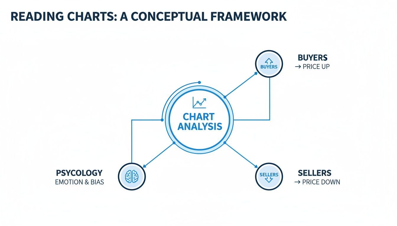
As you can see, a chart is the central point where the forces of buying and selling pressure meet, all driven by trader psychology.
The Bar Chart: Zooming In for Detail
If the line chart is your wide-angle lens, the bar chart is your zoom. It brings crucial details into focus by showing not just the close, but the open, high, low, and close (OHLC) for each period. This gives you a much richer picture of the price action packed into that timeframe.
Each "bar" is a vertical line with two small horizontal marks poking out from the sides:
- The very top of the bar shows the highest price traded.
- The very bottom of the bar shows the lowest price traded.
- The small hash mark on the left is the opening price.
- The small hash mark on the right is the closing price.
By looking at the bar's height and where the open and close sit, a trader can start to get a feel for volatility and momentum. It's a huge upgrade in information without making the chart a total mess.
The Candlestick Chart: High-Definition Analysis
The candlestick chart is the high-definition lens. It gives you the same OHLC data as a bar chart but presents it in a far more visual and intuitive way. Candlesticks have been around since 18th-century Japan, and there's a good reason they are the default on almost every modern trading platform: they make market sentiment instantly readable.
A candlestick has two main parts: the body and the wicks (also called shadows).
- The Body: This is the thick part, showing the range between the open and close price. It’s usually colored green (or white) if the close was higher than the open, and red (or black) if the close was lower.
- The Wicks: These are the thin lines sticking out from the top and bottom of the body. They show the absolute high and low prices hit during that period.
The real magic of candlestick charts is their ability to tell the story of the battle between buyers and sellers in a single glance. A long green body screams strong buying pressure, while a long red body shows that sellers were in complete control.
This visual immediacy is what makes candlestick charts a game-changer for active traders. You can spot potential reversals, gauge momentum, and identify key patterns without having to squint.
For a deeper dive into reading these powerful visuals, check out our complete guide on how to understand candlestick charts.
Comparison of Core Chart Types
To help you decide which chart to pull up, here's a quick side-by-side comparison of the three fundamental types we've just covered. Each has its place, and knowing their strengths and weaknesses is key to effective analysis.
| Chart Type | Information Displayed | Best For | Key Limitation |
|---|---|---|---|
| Line Chart | Single data point per period (usually the close) | Identifying long-term trends and getting a quick, high-level overview. | Hides all intraday volatility and price gaps. |
| Bar Chart | Open, High, Low, and Close (OHLC) | Analyzing volatility and price ranges within a specific period. | Less visually intuitive for quickly gauging bullish or bearish pressure. |
| Candlestick Chart | Open, High, Low, and Close (OHLC) | Spotting short-term patterns and instantly reading market sentiment. | Can sometimes create "noise" that distracts from the bigger picture trend. |
Ultimately, starting with these three core charts gives you a versatile toolkit for almost any kind of market analysis. As you gain experience, you'll develop a feel for which one to use in different situations.
Using Advanced Charts to Filter Market Noise

If you've ever felt like your charts are screaming at you with conflicting signals, you're not alone. Market noise—those minor, insignificant price wiggles—can easily obscure the true trend. This is where advanced chart types like Heikin-Ashi, Renko, and Point & Figure come in.
Think of them as different lenses for viewing price action. Each one filters out the distracting noise by focusing only on what matters: meaningful price moves. They don't just show you what happened; they help you see what's actually happening.
- Heikin-Ashi acts like noise-canceling headphones for your chart, smoothing out volatility to reveal the underlying trend.
- Renko builds a chart with uniform "bricks," ignoring time and only plotting significant price changes.
- Point & Figure takes this even further, completely removing time and focusing solely on major price reversals.
Heikin-Ashi Charts for Smoother Trends
Heikin-Ashi charts are a trader's best friend for riding trends. By averaging price data from the current and prior periods, they produce candles that paint a much clearer picture of market momentum. This helps you avoid getting shaken out of a good trade by a random price spike.
A long string of solid green bars? That's your signal of sustained buying pressure. A series of red bars tells you sellers are firmly in control. This visual clarity is why so many trend-followers swear by them.
“Heikin-Ashi gives me the confidence to ride trends without getting faked out by every little pullback,” says one veteran trader I know.
Inside ChartsWatcher, a great setup is to pull up a Heikin-Ashi chart right next to a standard candlestick chart. This lets you confirm trend strength before you pull the trigger. Pro tip: set up an alert for a candle color change to get an early warning of a potential reversal.
Renko Charts to Highlight Support and Resistance
Renko charts are all about structure. They are built with uniform bricks, and a new brick only forms after the price has moved a predetermined amount. Time is completely irrelevant here.
Imagine you're building a wall with Legos. You only add a new brick once you've reached a certain height. Renko charts work the same way, which makes critical support and resistance levels pop right off the screen. You stop seeing the distracting, minor pullbacks and start seeing the real battlefield.
- In ChartsWatcher, configure your brick size to align with the asset's Average True Range (ATR).
- Always pair Renko charts with a volume filter to make sure a breakout has real power behind it.
- Use the backtesting feature to find the optimal brick size for your specific asset and strategy.
Swing traders love Renko because it provides incredibly straightforward signals. A new brick forming above a clear resistance line is a simple, actionable buy signal. These charts work especially well in noisy markets like forex and commodities.
Point & Figure Charts for Pure Price Action
For the ultimate purist, there's the Point & Figure (P&F) chart. This classic method ditches time and ticks entirely, plotting only significant price reversals. A column of X's shows an uptrend, and a column of O's shows a downtrend. A new column only begins when the price reverses by a specific amount.
What you're left with is pure supply and demand. P&F charts are phenomenal for spotting long-term trends and identifying major breakouts. Classic patterns like triangles or double bottoms are so visually obvious they practically jump out at you.
- Start by setting your box size and reversal amount in ChartsWatcher based on the asset's volatility.
- A breakout above a prior column of X's is a classic buy signal. A breakdown below a column of O's is your cue to sell.
- P&F charts also offer built-in price targets. The width of a consolidation pattern can be used to project how far the next move might go.
When you see a double-top breakout on a P&F chart, it often signals the start of a massive move. These patterns help you define your risk and set logical stop-loss levels with incredible clarity.
“Point & Figure cuts through all the clutter. It forces you to focus on the major turning points in price, which is where the real money is made,” an institutional analyst recently noted.
The real power comes from combining these views. Confirm a Renko brick breakout with a stable Heikin-Ashi color, then check your P&F chart in ChartsWatcher to see if it aligns with a major pattern breakout. That’s how you build a high-conviction trade setup.
| Chart Type | Primary Filter | Best Used When | Setup Tip in ChartsWatcher |
|---|---|---|---|
| Heikin-Ashi | Volatility smoothing | Riding clear, established trends | Side-by-side with candlesticks; set alerts on color changes |
| Renko | Fixed price movements | Identifying key support & resistance | Match brick size to the Average True Range (ATR) |
| Point & Figure | Price reversals only | Spotting long-term breakouts | Customize box size and reversal settings to the asset |
By adding these advanced charts to your arsenal, you can filter out over 70% of minor price fluctuations. You stop reacting to noise and start trading the genuine trend.
Workflow Tips for Professional Traders
A pro's workflow is all about efficiency. Start your day by loading pre-configured layouts in ChartsWatcher. One screen might have a Renko chart for market structure, another with Heikin-Ashi for trend confirmation, and a third with P&F for pattern validation.
Automate your analysis by setting smart alerts. Get a notification when a Heikin-Ashi candle flips color, a new Renko brick breaks a key level, or a P&F column breaks out. This keeps you on top of opportunities without being chained to your desk.
- Use the backtesting tools to validate your chart settings across different markets and timeframes.
- Export your configurations so you can easily replicate your perfect setup on any machine.
- Don't underestimate aesthetics. Adjust your screen themes to make signals stand out, especially if you work in low-light conditions.
By weaving these tools into your daily routine, you move from just looking at data to interpreting actionable intelligence. These charts become your allies, helping you trade with more clarity, confidence, and a much sharper edge.
Choosing the Right Timeframe for Your Strategy
A perfectly analyzed chart is worthless if you’re looking at it through the wrong lens. That lens is your timeframe, and it dictates the entire context of your trading. An asset can look like a screaming buy on the weekly chart but a total disaster on a 5-minute chart.
This isn’t just a minor detail; aligning your timeframe with your trading style is absolutely fundamental. It's how you see the signals that matter to you while filtering out all the distracting noise that doesn't.
Think of your chosen timeframe like the magnification on a microscope. A long-term investor is using low power (weekly or monthly charts) to see the big, overarching trends. A day trader, on the other hand, needs to crank up the magnification (1-minute or 5-minute charts) to spot the tiny, fleeting opportunities that exist only for a few hours.
Matching Timeframes to Trading Styles
Picking the wrong timeframe is like trying to find a specific street address using a map of the entire world. You’re in the right ballpark, but you don’t have nearly enough detail to make a move. The first step is simple: match your chart's duration to how long you plan to hold your trades.
- Scalpers (Seconds to Minutes): These are the high-frequency traders of the market, hunting for tiny profits on a massive volume of trades. They live and breathe on tick charts and 1-minute charts, where every small price move is a potential trade.
- Day Traders (Minutes to Hours): Day traders aim to be flat by the end of the session, meaning all positions are closed. They primarily rely on 5-minute, 15-minute, and 1-hour charts to find trends and setups that will play out within that single trading day.
- Swing Traders (Days to Weeks): The goal here is to capture the larger "swings" in the market that unfold over several days or weeks. The go-to charts are the 4-hour and daily, which provide a clear view of momentum without the intraday chop.
- Position Traders/Investors (Weeks to Years): These are the long-haul players focused on the big picture. They use weekly and monthly charts to identify and ride major, long-term trends, paying little attention to the daily ups and downs.
The Power of Multiple Timeframe Analysis
Here’s a secret that separates the pros from the amateurs: they never rely on just one timeframe. Instead, they use a technique called multiple timeframe analysis (MTA) to get a complete, 3D view of the market.
The idea is brilliantly simple. You use a higher timeframe to establish the dominant, overarching trend, then zoom into a lower timeframe to pinpoint your exact entry and exit.
This top-down approach dramatically stacks the odds in your favor. It’s like a general surveying the entire battlefield from a hilltop (the higher timeframe) before the soldier on the ground picks their specific target (the lower timeframe). You’re making sure you’re always swimming with the current, not fighting against it.
By using a higher timeframe to define the trend and a lower timeframe to time your entry, you align your trade with the path of least resistance. This simple technique can dramatically improve your win rate and help you avoid trading against powerful underlying momentum.
A Swing Trader's Workflow in Action
Let's walk through a real-world example of how a swing trader might use MTA inside ChartsWatcher to build a high-conviction setup. Their mission is to catch a move that lasts several days.
Step 1: The Weekly Chart (The Big Picture) First up, they load the weekly chart. They aren't looking for an entry signal here at all. The only question they need to answer is, "What's the primary trend?" They see the stock has been grinding higher for months, consistently staying above its 50-week moving average. The verdict is clear: this is an uptrend, so they should only be looking for buy setups.
Step 2: The Daily Chart (The Setup) Next, they drill down to the daily chart. Here, they notice the stock has pulled back over the last week—a classic correction within a larger uptrend. The price is now approaching a key support level that also lines up with its 20-day moving average. This is the setup—a potential low-risk entry zone that aligns perfectly with the main trend.
Step 3: The 4-Hour Chart (The Entry Trigger) Finally, they zoom in one last time to the 4-hour chart to find their entry trigger. They're not buying just yet. They are patiently waiting for the chart to give them a clear signal that the sellers are exhausted and buyers are stepping back in. This might be a bullish candlestick pattern, like a hammer or a bullish engulfing bar, forming right at that support level. The moment they see that confirmation, they enter the trade and place their stop-loss just below the recent swing low.
This methodical, top-down process ensures every trade is aligned across multiple timeframes. The trader has confirmed that the market's long-term, medium-term, and short-term biases are all pointing in the same direction before putting a single dollar at risk. That kind of discipline is a hallmark of consistently profitable trading.
Enhancing Your Charts with Indicators and Patterns
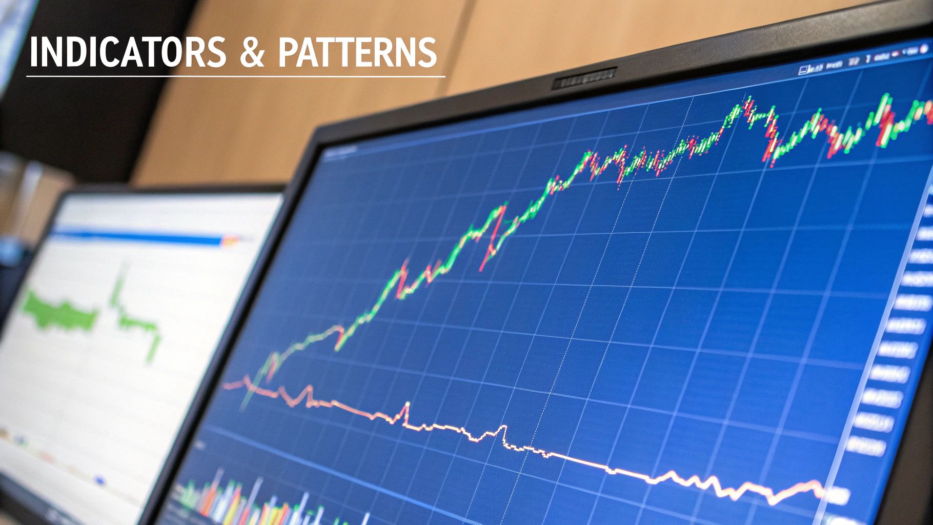
If your chart is the canvas, then technical indicators and patterns are the paint. They bring color, depth, and context to the raw price data, turning a simple historical record into a rich picture of market dynamics. While you can trade with a naked chart, layering these tools on top is how you build a complete, robust system.
This isn't about cluttering your screen with dozens of squiggly lines. It's about strategically picking a few complementary tools that work together to confirm signals, manage risk, and shine a spotlight on high-probability setups. A balanced toolkit is absolutely essential for making sense of the complex movements on charts for technical analysis.
The trick is to pick indicators that answer different questions about the market's behavior. By grouping them by function, you avoid redundant signals and create a clear, multi-faceted view of price action.
Building Your Indicator Toolkit
Think of your indicator set like assembling a team of specialists. You wouldn't hire three experts who all do the exact same job. You want a balanced group, with each member bringing a unique perspective to the table. Most pros build their systems around three core types of indicators.
-
Trend-Following Indicators (The Navigator): Tools like Moving Averages (MAs) are your compass. They smooth out the noise to show you the market's primary direction, telling you whether you should be looking for buying or selling opportunities.
-
Momentum Oscillators (The Speedometer): Indicators like the Relative Strength Index (RSI) or MACD measure the speed and strength behind price moves. They help you see if a trend is losing steam or just getting started, and they're great for spotting overbought or oversold conditions.
-
Volatility Indicators (The Risk Manager): Tools such as Bollinger Bands measure the market's pulse. They expand when things get wild and contract when the market is calm, giving you crucial insight into potential breakouts and helping you set smarter stop-loss levels.
A classic rookie mistake is loading up on multiple indicators from the same category—like running three different momentum oscillators. This just creates redundant signals and leads to "analysis paralysis." A much better approach is to pick one trusted tool from each category for a well-rounded view.
For a deeper dive into these essential tools, check out our guide where we've got all the top technical analysis indicators explained.
Decoding the Psychology of Chart Patterns
While indicators are based on math, chart patterns are pure market psychology in visual form. They show the collective fear, greed, and indecision of traders playing out at critical price levels. Learning to spot these formations is like learning to read the market's body language.
These aren't just random shapes; they are the footprints left behind by the battle between supply and demand. Recognizing them gives you a massive edge in predicting the next likely move.
Some of the most foundational patterns include:
- Head and Shoulders: A classic reversal pattern that signals a potential end to an uptrend. It represents a final, failed push by buyers before sellers finally take control.
- Double Tops and Bottoms: These "M" and "W" shaped patterns show that the market tried—and failed—twice to break through a key resistance or support level. This often points to weakening momentum and a potential trend change.
- Triangles (Ascending, Descending, Symmetrical): These formations show a period of consolidation where buyers and sellers are in a temporary stalemate. The direction of the eventual breakout often signals that the prior trend is about to resume.
The Power of Confluence
The real magic happens when you combine indicators and patterns to find confluence. Confluence is when multiple, independent analysis tools all point to the same conclusion, creating a high-probability trading signal that you can act on with confidence.
Picture this: a stock in a long-term uptrend (confirmed by its 200-day moving average) pulls back to a key support level. Right at that level, a bullish "Double Bottom" pattern forms on the daily chart. At the exact same time, the RSI indicator starts to climb out of oversold territory.
That is a powerful confluence signal. You have a trend indicator, a classic chart pattern, and a momentum oscillator all screaming "buy." This layered approach helps filter out the noise and dramatically improves the quality of your trade setups—which is the ultimate goal when using charts for technical analysis.
Trading Charts: Your Questions Answered
Even after getting the basics down, traders usually have a few lingering questions about how to really use charts day-to-day. Let's tackle some of the most common ones I hear, clearing up the confusion so you can get back to focusing on the market.
Which Chart Is Best for a Beginner in Technical Analysis?
When you're just starting out, keep it simple. A Line chart is the perfect entry point. It cuts through all the noise by only plotting closing prices, which makes seeing the overall trend a breeze. You won't get bogged down in data you don't need yet.
That said, your goal should be to move over to Candlestick charts as soon as you feel comfortable. They strike the best balance between providing enough detail without being overwhelming. The color and shape of every single candle tell a story about market psychology—who's winning the battle between buyers and sellers—which is pure gold for a developing trader.
How Do I Avoid Analysis Paralysis with So Many Chart Options?
This is a classic trap, and a dangerous one. The solution isn't to find the "perfect" combination of tools, but to build a simple, repeatable trading plan you can stick to. Don't try to use everything at once.
- Stick to one or two chart types you know inside and out. For most people, that’s a daily Candlestick chart for the big picture.
- Limit your indicators. Pick a maximum of three that don't tell you the same thing (maybe one for trend, one for momentum, and one for volatility).
- Define your rules before you trade. Know exactly what signal means "enter," "exit," or "cut my losses" before you even open your platform.
The goal isn't complexity; it's clarity. A simple system that you can execute with discipline will always outperform a complicated one that makes you hesitate.
Is Technical Analysis Reliable or Just a Self-Fulfilling Prophecy?
Ah, the age-old debate. The truth is, it’s a bit of both. There's definitely a self-fulfilling prophecy element at play—when millions of traders see the same head-and-shoulders pattern and react, they help make the pattern play out.
But the real power of technical analysis is how it visualizes market psychology. Charts are just a graphical representation of the collective fear and greed of everyone in the market. Those major support and resistance levels aren't random lines; they're price zones where a huge battle between buyers and sellers took place before. By using charts for technical analysis to manage risk and spot high-probability setups—instead of as a crystal ball—you can find a real, sustainable edge.
Can I Use Technical Analysis Charts for Long-Term Investing?
Absolutely. It’s a huge misconception that technical analysis is only for high-frequency day traders. In reality, it’s an incredibly powerful tool for long-term investors. Analyzing weekly or monthly charts can give you a massive advantage.
For instance, an investor using a long-term moving average on a weekly chart can easily spot the primary trend of a stock. This helps them time their entries during pullbacks and get an early warning sign when a major trend might be breaking down. It's the perfect complement to fundamental analysis, adding that crucial layer of timing and market sentiment so you don't end up buying a great company right before a 50% crash.
Ready to elevate your market analysis? ChartsWatcher provides the advanced tools you need to build professional, multi-chart layouts, set custom alerts, and backtest your strategies with precision. Stop reacting to the market and start anticipating it. Explore your edge at https://chartswatcher.com.
