A Guide to Day Trading Technical Indicators
When you're staring at a day trading chart, all those jagged lines and flashing numbers can feel like pure chaos. This is where technical indicators come in—they're the tools that help you cut through the noise.
Think of them less like a crystal ball and more like a car's dashboard. They won't tell you exactly what’s around the next corner, but they translate the engine's raw data—price, volume, and momentum—into gauges you can actually read and use to make smarter decisions.
How To Read The Market With Technical Indicators
In the fast-paced world of day trading, your success hinges on making quick, informed calls. Technical indicators are what give you that edge. They act like a sophisticated weather forecast for the market; while they can't guarantee a sunny day, they give you the data to anticipate what’s coming and make trades with a higher probability of success.

Without them, it’s easy to get caught up in the emotional rollercoaster of every minor price tick. Indicators provide an objective lens, helping you see the bigger picture and answer the critical questions every trader faces: Is this trend for real? Is it running out of steam? Is now the time to get in or get out?
Decoding Market Behavior
At their core, indicators are designed to simplify complex price action into a clear, visual format. They help you spot patterns, signals, and potential turning points that are often invisible on a standard price chart alone. This art of interpretation is the foundation of technical analysis.
If you're just getting started, our guide on https://chartswatcher.com/pages/blog/technical-analysis-for-beginners-essential-chart-guide is a great place to build that foundation.
Of course, using indicators effectively means you need to know how to read a chart in the first place. For a solid primer on that, check out this guide on How to Read Crypto Charts: A Trader's Essential Guide—the principles apply across markets.
The real secret isn't finding one "perfect" indicator that never fails. The magic happens when you learn how different indicators work together to paint a complete, multi-dimensional picture of what the market is doing.
Core Categories of Day Trading Indicators
To build a solid trading strategy, it helps to understand that not all indicators do the same job. They generally fall into a few key categories, each measuring a specific piece of the market puzzle.
Here's a quick breakdown of the main types you'll encounter.
| Indicator Category | What It Measures | Common Examples |
|---|---|---|
| Trend | The primary direction of the market (up, down, or sideways). | Moving Averages, MACD |
| Momentum | The speed and strength behind price movements. | RSI, Stochastic Oscillator |
| Volatility | The size of price swings and market stability. | Bollinger Bands, ATR |
| Volume | The amount of trading activity, used to confirm trend strength. | On-Balance Volume (OBV) |
Understanding what each category tells you is the first step toward building a trading system that fits your style.
Throughout this guide, we're going to dive deep into the most effective indicators from each of these groups. By the end, you'll have the knowledge to start putting together a powerful and personalized trading toolkit.
Riding the Wave: How to Identify Market Direction with Trend Indicators
You’ve probably heard one of the oldest sayings in finance: “The trend is your friend.” It’s repeated so often because it’s true. For a day trader, figuring out the market's primary direction is the first, most critical step toward finding a decent trade.
Trend-following indicators are the tools built for this exact job.
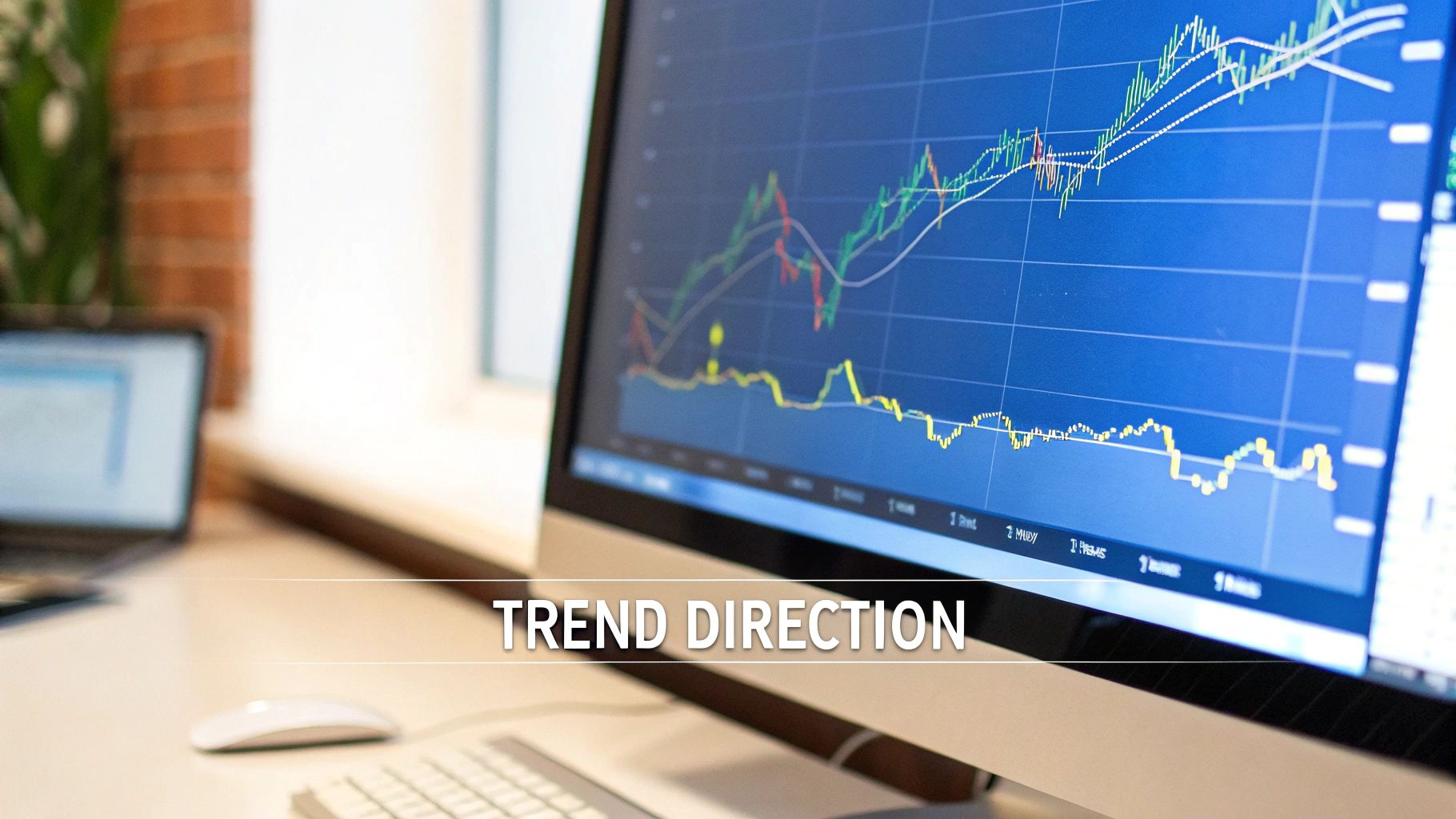
They help you answer the big question: Is the price generally heading up, down, or just chopping sideways? By filtering out the chaotic, minute-to-minute market “noise,” these indicators reveal the underlying current. Trading with the trend is like swimming with the river's current; fighting it is exhausting and rarely ends well.
Moving Averages: The Foundation of Trend Analysis
The most fundamental trend tool out there is the Moving Average (MA). Think of it as a way to smooth out a jagged and confusing price chart. It simply calculates the average price of an asset over a set number of periods, plotting a single, flowing line that makes the true trend much easier to spot.
There are two main flavors of Moving Averages every trader needs to get comfortable with:
- Simple Moving Average (SMA): This is the most straightforward version. A 20-period SMA, for instance, just adds up the closing prices of the last 20 candles and divides by 20. Every price point in the period gets the same weight. It’s simple and effective.
- Exponential Moving Average (EMA): The EMA is a bit quicker on its feet. It places more mathematical importance on the most recent prices, which makes it react faster to new information. Because of this, day traders often lean on EMAs to get earlier signals of a potential trend change.
The real magic happens when you see how the price interacts with these lines. Is the price consistently staying above a key moving average like the 50-period EMA? That’s a strong clue you’re in an uptrend. If it’s stuck below the MA, you’re likely in a downtrend.
Using Moving Average Crossovers for Entry Signals
One of the most popular strategies involves watching for crossovers. This is when a shorter-term MA crosses over or under a longer-term one, often flagging a potential shift in momentum.
You’ve probably heard of the "Golden Cross"—that's when a short-term MA (like the 50-day) crosses above a long-term one (like the 200-day). It’s widely seen as a major bullish signal. The opposite, a "Death Cross," is a classic bearish warning.
For day traders on much faster charts, common pairs like the 9-period EMA and the 21-period EMA are popular. When the 9 crosses above the 21, it can signal a potential long entry. When it crosses below, it might be time to look for a short.
But here’s the catch: MAs are lagging indicators. They are built using past prices, so they will always be a step behind what’s happening right now. This is their biggest weakness, especially in sideways or “ranging” markets where they can generate a ton of confusing, false signals.
Adding Nuance with the MACD Indicator
To get a more dynamic read on both trend and momentum, traders often pull up the Moving Average Convergence Divergence (MACD). This tool takes the moving average concept to the next level by measuring the relationship between two different EMAs.
The MACD has three main parts you need to know:
- The MACD Line: This is the engine of the indicator. It's calculated by subtracting the 26-period EMA from the 12-period EMA.
- The Signal Line: This is just a 9-period EMA of the MACD Line. Think of it as a smoothed-out, slower version of the MACD line, designed to generate trade signals.
- The Histogram: This is the visual part. It simply shows you the distance between the MACD Line and the Signal Line. When the histogram bars are above the zero line, it means bullish momentum is picking up. When they’re below zero, bearish momentum is building.
The most common way to use the MACD is, you guessed it, a crossover. When the faster MACD Line crosses above the slower Signal Line, it’s a bullish signal. When it crosses below, it’s bearish. Because the MACD already has momentum baked into its formula, these signals are often considered more timely than a simple MA crossover.
This is where you can start building a real trading system. By combining a long-term MA to define the overall trend with MACD crossovers to time your entries, you get a much more robust approach. For example, a smart trader might decide to only take a bullish MACD crossover signal if the price is already trading above the 50-period EMA, using one indicator to confirm the other.
Gauging Market Momentum with Oscillators
While trend indicators show you which way the market is generally heading, momentum indicators—or oscillators—are like the tachometer on your car's dashboard. They measure the speed and strength behind price moves, telling you if a trend is accelerating or starting to run out of gas.
Think about it: a car can be moving forward (the trend), but if the engine is screaming in the red zone, you know it can’t keep that pace up forever. Oscillators help you spot these moments of exhaustion in the market. They flash warning signs for potential overbought or oversold conditions that often pop up right before a pullback or a full-blown reversal.
For a day trader, timing is everything, and these tools are indispensable for getting your entries and exits right. By seeing when momentum is peaking or bottoming out, you can avoid the classic mistake of jumping into a trend just as it's about to die.
The Relative Strength Index (RSI) Explained
One of the most popular and reliable oscillators out there is the Relative Strength Index (RSI). Developed by the legendary J. Welles Wilder, the RSI boils down the speed and change of price movements into a simple scale that bounces between 0 and 100.
At its core, the RSI compares the size of recent gains to recent losses over a set time frame, which is most commonly 14 periods (whether that's 14 minutes, hours, or days).
This gives you a few clear, actionable levels to keep an eye on:
- Overbought: A reading above 70 is your heads-up that things are getting a little too hot. It doesn't mean you should blindly hit the sell button, but it's a solid warning that bullish momentum is stretched thin and the asset could be due for a cool-down.
- Oversold: On the flip side, a reading below 30 is considered oversold. This suggests the sellers might be running out of steam, and the price could be coiled for a bounce.
As a day trader, these zones are your bread and butter. If a stock you're in is ripping higher but its RSI pushes above 70 or even 80, that’s a signal. You might tighten your stop-loss or even peel off some profits, anticipating a short-term dip is on the way.
Uncovering Hidden Clues with RSI Divergence
Beyond those basic overbought and oversold levels, the RSI's real magic comes from spotting divergence. This happens when the price of a stock is heading one way, but the RSI is quietly moving in the opposite direction. It’s a powerful clue that the momentum underneath the surface no longer backs the price trend.
You'll want to watch for two main types:
- Bearish Divergence: The stock’s price grinds out a new higher high, but the RSI makes a lower high. This is a massive red flag. It tells you the buying power is fading, and a reversal to the downside could be just around the corner.
- Bullish Divergence: The stock’s price drops to a new lower low, but the RSI carves out a higher low. This suggests that even though the price looks weak, the selling pressure is actually easing up. A bounce or a complete trend change could be next.
Divergence is one of the most powerful leading signals a day trader has. It's like the market is tipping its hand, showing you the conviction behind a move is weakening before the price actually rolls over.
Introducing the Stochastic Oscillator
Another old-school favorite is the Stochastic Oscillator. The name sounds a bit intimidating, but its job is simple: it compares where a stock’s price closed to its overall price range over a certain period. The logic behind it is that in a healthy uptrend, prices tend to close near their highs, and in a downtrend, they tend to close near their lows.
Just like the RSI, the Stochastic is plotted on a scale from 0 to 100.
- Readings above 80 are considered overbought.
- Readings below 20 are considered oversold.
So, what makes it different? The Stochastic is generally faster and more sensitive than the RSI. This means it will give you more frequent overbought and oversold signals, which can be a double-edged sword for day traders. Sure, it can point to more trading opportunities, but it can also generate more false signals, especially when the market is choppy and going nowhere.
The reliability of these classic day trading technical indicators isn't just folklore. Over 100 years of backtesting on the Dow Jones Industrial Average shows that tools like the RSI have held up remarkably well. In fact, the 14-day Relative Strength Index hit a 79.4% win rate in historical tests. While no single indicator is a magic bullet, this data confirms their value. To dive deeper, you can read the full research on technical indicator performance.
The real skill comes from combining oscillators with other tools. A smart trader doesn't just short a stock because the RSI is over 70. They wait for more evidence. Maybe they see a bearish RSI divergence forming right as the price hits a key resistance level or bumps up against a long-term moving average. That "confluence" of signals creates a much higher-probability setup, stacking the odds in your favor.
Using Volatility Indicators to Manage Risk
Volatility is the lifeblood of day trading. Think of it as the market's "energy"—it's what creates the price swings you need to actually turn a profit. But where there’s energy, there's always risk. Volatility indicators are designed to measure these fluctuations, giving you a critical tool to manage your exposure and adapt your strategy to the market's current mood.
Without a handle on volatility, you're flying blind. You might set your stop-loss too tight and get knocked out of a good trade by normal market noise, or you could underestimate a breakout and miss a huge move. These tools help you quantify the market's choppiness so you can make smarter, more calculated decisions.
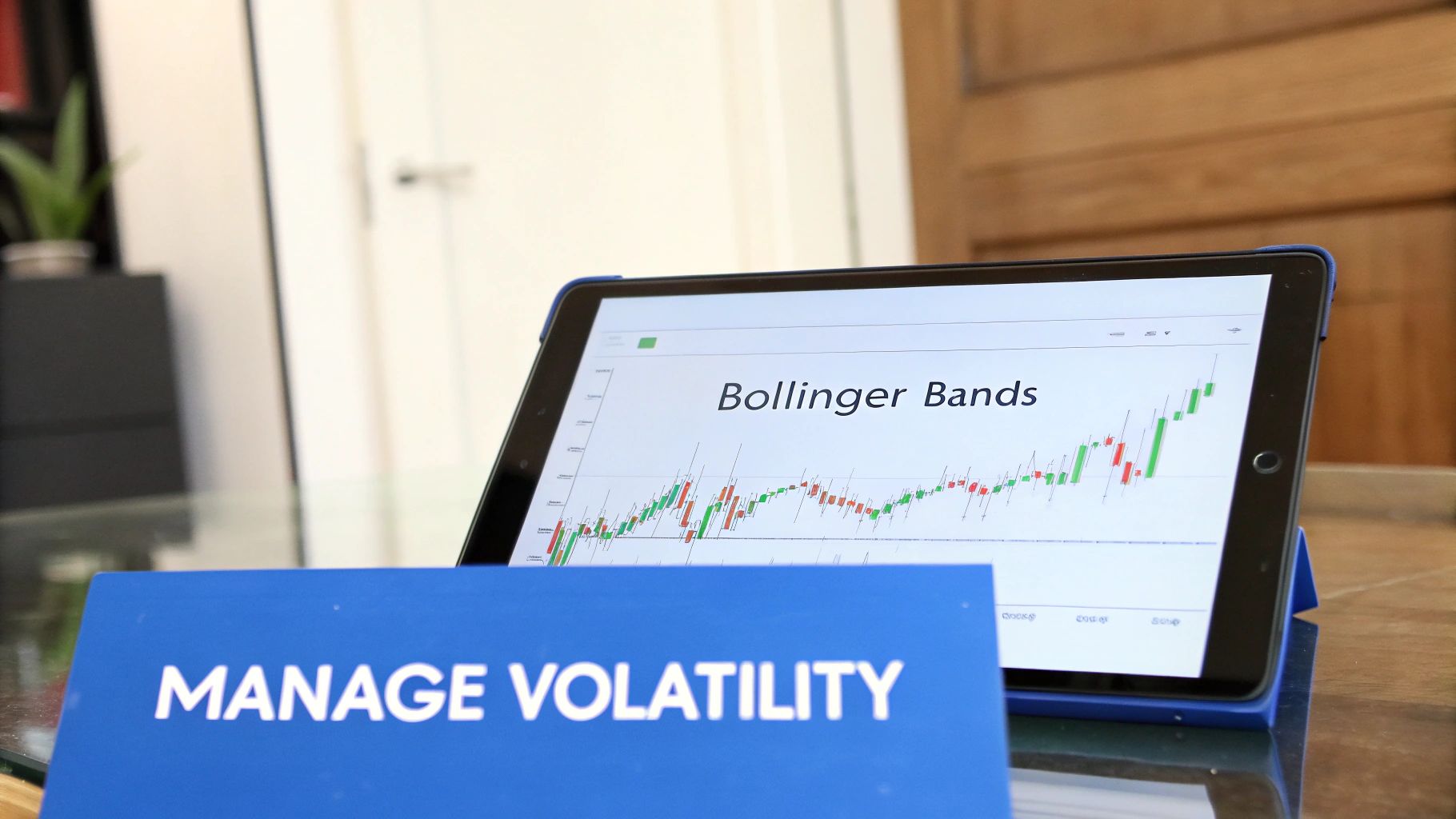
Reading the Flow with Bollinger Bands
One of the most popular day trading technical indicators for measuring volatility is Bollinger Bands. I like to think of them as the banks of a river, where the price is the water flowing between them.
This indicator is actually pretty simple, consisting of three lines plotted right on your price chart:
- A Middle Band: This is just a 20-period simple moving average (SMA), which gives you a baseline for the intermediate-term trend.
- An Upper Band: This line is typically set two standard deviations above the middle band.
- A Lower Band: You guessed it—this one is set two standard deviations below the middle band.
The real magic of Bollinger Bands comes from watching the distance between the upper and lower bands—the "riverbanks."
When the market is quiet, the bands tighten up, creating a narrow channel. This is known as a "squeeze." But when volatility explodes, the bands expand dramatically, signaling that a significant price move could be just around the corner.
This expansion and contraction gives traders two main signals to watch for:
- Breakout Trades: A squeeze often happens right before a big move. When the price finally breaks out of that tight consolidation, it can be a powerful entry signal.
- Reversion Trades: The bands can also act as dynamic support and resistance levels. If the price touches the upper band, it might be overextended and due for a pullback. A touch of the lower band could signal it's oversold and ready for a bounce.
By watching how these bands tighten and expand, you get a clear visual of the market's current state, helping you anticipate the potential range of price action.
Setting Smarter Stops with Historical Volatility
While Bollinger Bands are great for seeing volatility in real-time, another key metric helps traders manage risk with more precision: Historical Volatility (HV). This indicator looks back at past price action to calculate how much a stock typically moves over a specific period.
Why does this matter? It's all about setting smarter stop-loss orders. A classic rookie mistake is using a fixed stop-loss—say, 1%—on every single trade. But a 1% stop on a sleepy utility stock is a completely different beast than a 1% stop on a notoriously wild tech stock, especially around an earnings announcement.
Historical volatility is calculated using the standard deviation of an asset's prices, relying entirely on past data to inform the present. For example, during earnings season for S&P 500 companies, a stock’s 10-day historical volatility can easily jump from its usual 15–20% range to over 40%. This is actionable data. A day trader watching a major company during its earnings release might widen their stop-loss by 2–3% to account for these historically bigger swings. It's a survival tactic, especially when statistics show 40% of day traders quit within a month.
By understanding how much an asset typically fluctuates, you can set a stop-loss that is wide enough to avoid getting shaken out by random noise but tight enough to protect your capital from a true trend reversal. Another fantastic tool for this is the Average True Range, and you can learn how to use the ATR indicator in our detailed guide.
Putting It All Together: Combining Indicators into a Real Strategy
Trying to trade with just one indicator is a bit like driving a car by only looking at the speedometer. Sure, you know how fast you're going, but you have no idea what direction you're headed, what the traffic looks like, or if there's a red light up ahead. The best day traders don't put all their faith in a single tool; they build a system where different, non-correlated indicators work in concert to build a strong case for a trade.
This powerful concept is called confluence. It’s the simple idea of waiting for multiple, independent signals to all point in the same direction. When your trend indicator, your momentum oscillator, and your volatility tool all agree, your confidence in that trade setup skyrockets. Think of it as your ultimate filter for cutting through market noise and spotting the A+ opportunities.
Building Your Indicator Toolkit
The trick to building an effective strategy is to avoid redundancy. Slapping two oscillators on your chart, like an RSI and a Stochastic, is pointless—they're both measuring momentum and will usually just tell you the same thing twice. The real magic happens when you layer indicators from different categories to get a complete, 360-degree view of the market.
A classic, well-balanced combo for day traders often pulls one tool from each of our core groups:
- Trend Indicator (The 'What'): This sets the scene and tells you the market's primary direction. The 50-period Exponential Moving Average (EMA) is a fantastic workhorse here. Your rule could be dead simple: only look for buys when the price is above the 50 EMA, and only look for sells when it's below.
- Momentum Indicator (The 'When'): This is all about timing your entry. The Relative Strength Index (RSI) is perfect for identifying pullbacks within that established trend. In a strong uptrend, you can patiently wait for the RSI to dip into oversold territory (below 30) to pinpoint a prime buying opportunity.
- Volatility Indicator (The 'Where'): This helps you manage the trade by setting logical targets and stops. Bollinger Bands are brilliant for this because they create dynamic price boundaries. The upper band becomes a natural take-profit target in an uptrend, while the lower band can act as a profit target in a downtrend.
This simple stack creates a logical, step-by-step workflow for every trade. The EMA tells you which way to swim, the RSI tells you when to jump in, and the Bollinger Bands show you where the edge of the pool is.
A Practical Trading Strategy in Action
Let’s walk through how this trio of day trading technical indicators works in the real world. Imagine you're watching a stock on a 5-minute chart.
Step 1: Identify the Primary Trend
First things first, you check the 50-period EMA. The stock’s price is holding comfortably above the line, and the EMA itself is angling upwards. That's your green light—the market is clearly in an uptrend. Based on your rules, you are now a buyer only. All sell signals from other indicators are ignored.
Step 2: Wait for the Ideal Entry Signal
Next, you look down at your 14-period RSI. The stock has been on a tear, but it's now pulling back toward the 50 EMA. As the price dips, you see the RSI value drop below the 30 level, flagging an oversold condition. This is the sweet spot: a moment of temporary weakness inside a much larger, powerful uptrend.
Confluence is your greatest ally. In this scenario, you have a strong primary uptrend confirmed by the EMA and a perfectly timed oversold signal from the RSI. The two signals together create a much more compelling entry than either one would alone.
Step 3: Define Your Exit Plan
With two solid confirmations, you pull the trigger and enter a long position. Now, how do you manage the trade? You turn to your Bollinger Bands. You can set your initial profit target right at the upper Bollinger Band, as this often acts as a magnet and a natural ceiling for price bounces. For your stop-loss, you might tuck it just below the recent swing low or slightly beneath the 50 EMA, giving the trade room to work without exposing you to a massive loss.
This systematic process turns trading from a gut-feeling gamble into a disciplined, repeatable game plan. You have clear, objective rules for your entry, your exit, and your risk management, all driven by the synergy of different day trading technical indicators. By combining your tools, you stop guessing and start building a strong, evidence-based case for every single trade you take.
Common Mistakes to Avoid with Technical Indicators
Technical indicators are powerful tools, but they aren't a magic wand that prints money. I've seen countless new traders fall into a few predictable traps that can be seriously costly. Getting a handle on these common mistakes is the first step to using indicators as they're intended: as aids for your decision-making, not a crutch.
The number one trap is analysis paralysis. This is what happens when you plaster your chart with five different oscillators, three moving averages, and a handful of other gadgets. Your screen turns into a Jackson Pollock painting of conflicting signals—one indicator is screaming "buy" while another is flashing "sell"—and you're left completely frozen, unable to pull the trigger on anything.
The whole point of using technical indicators is to find clarity, not create confusion. A cluttered chart leads to a cluttered mind, and that almost always leads to bad trades.
Trust me on this: sticking to two or three carefully chosen, non-correlated indicators is way more effective than trying to use ten at once.
Over-Relying on Default Settings
Another classic rookie error is just rolling with the default settings for every indicator. That standard 14-period RSI or 20-period Bollinger Band? It was designed as a generic starting point, not some universal law of trading. Every asset and every timeframe has its own unique rhythm and personality.
Think about it. A crazy volatile tech stock jumping around on a 1-minute chart is a completely different beast than a slow-moving utility stock on a daily chart. Seasoned traders know you have to tweak your indicator settings to match the behavior of whatever you're trading. Spend some time testing different periods to see what actually captures the price action for your specific market.
The infographic below breaks down a simple, disciplined process that helps keep your strategy from getting overcomplicated.
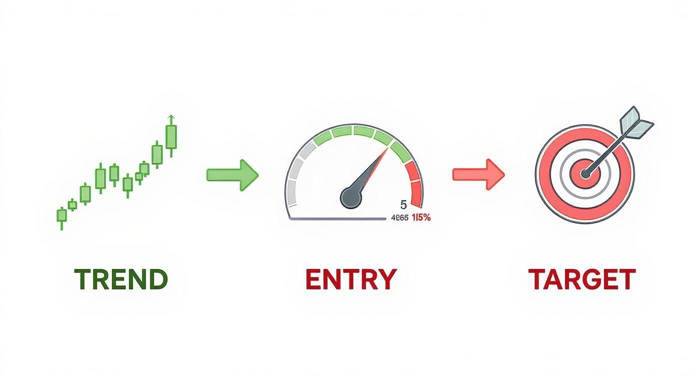
This visual shows a logical flow: first, confirm the overall trend. Second, pinpoint your entry. Third, set a clear target for taking profits.
Ignoring the Bigger Picture
This is probably the most dangerous mistake of all: treating your technical indicators like they exist in a vacuum. A picture-perfect bullish setup on your chart means absolutely nothing if the Fed suddenly announces an unexpected interest rate hike. The real world of fundamental news can—and will—run right over your technical patterns in a heartbeat.
You have to stay aware of what's happening outside your charts. Ignoring major news, earnings reports, or big shifts in market sentiment is a surefire way to get blindsided.
To steer clear of these pitfalls, focus on three core principles:
- Keep It Simple: Pick a small, effective toolkit of indicators you know inside and out. Don't add a new one unless it tells you something unique your current setup is missing.
- Test and Adapt: Don't be scared to adjust those indicator settings. Use backtesting to see which parameters worked best for a specific stock in the past. What works for one market won't necessarily work for another.
- Stay Informed: Always keep the fundamental context in mind. Know when major economic data is coming out and have a plan for how it might impact your trades. Technicals work best when they're paired with a solid grasp of the overall market environment.
By making a conscious effort to avoid these common errors, you can transform technical indicators from a source of frustration into a powerful part of a consistent, disciplined trading approach.
Stop drowning in data and start finding clear signals. ChartsWatcher provides a fully customizable platform to build, test, and execute your trading strategies with precision. Scan the market, set custom alerts, and organize your charts exactly how you want. Take control of your trading and discover your edge at https://chartswatcher.com.
