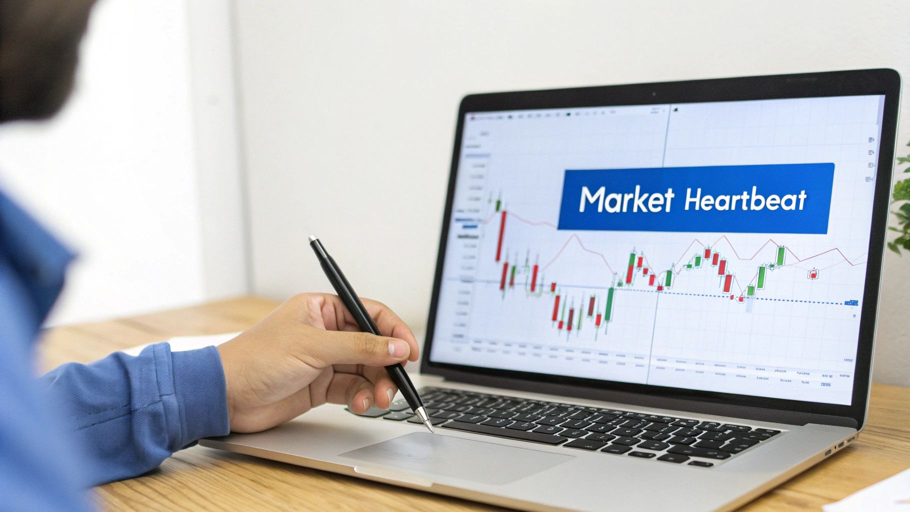
Understanding Candlestick Charts A Trader's Guide
If you want to understand the market, you have to learn its language. Candlestick charts are exactly that—a visual language that turns streams of price data into an intuitive story about the tug-of-war between buyers and sellers.
These charts cut through the noise to show you who is winning the battle for control over an asset's price in real-time. It’s a powerful way to get a quick read on market sentiment and see where things might be headed next.
Decoding the Language of the Market
Think of a candlestick chart as the market's heartbeat. Instead of a simple line connecting closing prices, each candle tells a complete story for any period you choose—a minute, an hour, a day, or even a week. This incredible depth of information is why they’ve been a cornerstone of technical analysis for centuries.
And they really have been around for a while. The story begins in the bustling rice markets of 18th-century Japan with a legendary trader named Munehisa Homma. By the 1750s, he had reportedly built a fortune that would be worth over $100 billion today. How? By using his innovative charts to capture not just price, but the raw emotions driving the markets.
Why Candlesticks Matter to Modern Traders
That same principle gives traders a critical edge today. Each and every candle tells a story of conflict and resolution between the buyers (bulls) and sellers (bears). Once you learn to read these little stories, you can start anticipating major market shifts with much greater clarity.
Mastering candlestick analysis gives you a few key advantages:
- Immediate Sentiment Analysis: A quick glance tells you if bullish or bearish pressure dominated the session.
- Reversal and Continuation Signals: Specific patterns can flag when a trend is losing steam or just getting started.
- Sharper Decision Making: Combining patterns with other indicators creates a much stronger basis for entering or exiting trades.
By translating price action into a visual format, candlestick charts allow traders to gauge market psychology in real-time, providing a significant advantage over methods that only show a closing price.
This isn't just for stocks, either. The same principles apply across different markets. For a deeper look at how these concepts work in the world of digital assets, check out this a comprehensive guide on how to read crypto charts.
Now, let's break down what makes up a single candle.
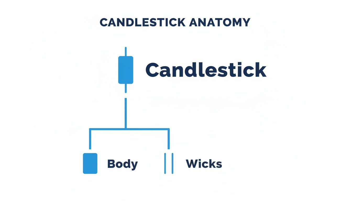
To really get a feel for candlestick charts, you have to start by looking at just one candle. Think of each one as its own little story—a snapshot of the tug-of-war between buyers and sellers over a specific chunk of time. Once you know how to read its parts, you can decode the market's mood and momentum in a single glance.
The thick, rectangular part of the candle is its body. This is the main event, showing you the real price movement between where the session opened and where it closed. The color tells you the winner instantly: a green (or white) body means the price closed higher than it opened, a decisive victory for the bulls. A red (or black) body means the price closed lower, putting the bears firmly in control.
The size of that body matters, too. A long green body screams strong, confident buying pressure from start to finish. A long red one shows aggressive selling that never let up. Short bodies, on the other hand, signal a stalemate or a period of consolidation where neither side could really make a move.
Wicks Tell the Rest of the Story
Sticking out from the top and bottom of the body are the thin lines we call wicks (some traders call them shadows or tails). These are critical because they show the full emotional range of the session—the absolute highest and lowest prices hit before the dust settled. They mark the territory where one side tried to push the price but was beaten back.
A long upper wick, for example, paints a vivid picture. It tells you that buyers started out strong and pushed the price way up, but then sellers slammed the door, driving the price back down before the session ended. It’s the sign of a failed rally, suggesting the buyers might be running out of steam.
Likewise, a long lower wick shows that sellers initially had their way, pushing the price down hard. But then buyers came roaring back, defending that lower level and pushing the price up from its lows. This hints that buyers are stepping in when prices get cheap, possibly forming a floor.
The body of a candle tells you who won the battle. The wicks tell you where the fiercest fighting happened and which side was forced into retreat. That context is everything when you're trying to guess the next move.
Here's how to put the body and wicks together for deeper insights:
- Long Upper Wick, Small Body: Buyers tried to rally but got smacked down. This signals heavy selling pressure from above.
- Long Lower Wick, Small Body: Sellers tried to tank the price but were overpowered by buyers. This shows strong support from below.
- Long Body, Short Wicks: Pure conviction. One side dominated the session from nearly the open to the close with little opposition.
How Timeframes Change the Narrative
One of the most important concepts to grasp is the timeframe. Every single candle represents the price action over a specific period you choose, and changing that period can completely change the story the chart is telling.
Think about it this way: you're looking at a daily chart of a stock. Each candle represents one full trading day—its open, high, low, and close. Now, zoom into a 5-minute chart. That one daily candle suddenly shatters into 288 individual 5-minute candles (in a 24-hour market). A nice, smooth uptrend on the daily chart might actually be a series of intense battles, sharp pullbacks, and mini-reversals on the 5-minute view.
This is exactly why you have to match your chart's timeframe to your trading style. A long-term investor might stick to daily or weekly charts to see the big picture and ignore the intraday "noise." But a day trader lives and breathes on the 1-minute and 5-minute charts, where those tiny, rapid movements are their bread and butter. Choosing the right lens is the first, most crucial step to making sense of it all.
Reading the Narrative of Candlestick Patterns
Once you understand what a single candle is telling you, the real fun begins. Now we can zoom out and see how multiple candles interact with each other. This is where the true art of chart reading comes into play.
Think of it this way: if individual candles are words, patterns are the sentences and paragraphs. They string together to tell the full story of what the market is thinking and where it might be headed next.
Powerful Single Candle Signals
Some of the most powerful signals you'll ever see on a chart come from just one candle. These are the market's exclamation points. They signal a dramatic pause, a potential reversal, or a moment of overwhelming force. Their simplicity is their strength, giving you a quick, clean snapshot of market sentiment.
Here are three foundational single-candle patterns every trader should know by heart:
- The Doji: This is the ultimate symbol of a stalemate. A Doji forms when the opening and closing prices are almost identical, leaving a tiny (or nonexistent) body. It looks like a cross or a plus sign and tells us one simple thing: neither buyers nor sellers could win the session. It's pure indecision.
- The Hammer: Look for this one at the bottom of a downtrend. The Hammer is a classic bullish reversal signal. It has a small body up top with a long lower wick that's at least twice the size of the body. The story here is that sellers tried to push the price down hard, but buyers stormed back in, rejecting those lower prices and closing the session strong.
- The Marubozu: This is the polar opposite of a Doji—it’s a candle of pure conviction. A Marubozu is a long, solid candle with no wicks at all. This means the price opened at one extreme and closed at the other. A green Marubozu screams that buyers were in total control from start to finish, while a red one shows absolute seller dominance.
This quick visual shows how the body and wicks come together to form these powerful signals. Understanding these basic components is the key to seeing why patterns like the Hammer and Marubozu tell such compelling stories.
Uncovering Market Reversals
Reversal patterns are the signals traders get most excited about, and for good reason. They act as an early warning that the current trend is running out of steam and the other side is about to take over. Spotting one of these can give you a massive edge in positioning for the next big move.
One of the most classic reversal signals is the Engulfing pattern. This two-candle formation is a crystal-clear picture of a power shift.
- A Bullish Engulfing pattern pops up at the end of a downtrend. You’ll see a small red candle followed by a huge green candle that completely "engulfs" the body of the one before it. This is a clear sign that buyers have stepped in with overwhelming force.
- A Bearish Engulfing is its evil twin, appearing at the top of an uptrend. A large red candle completely swallows the prior small green candle, signaling that sellers have hijacked momentum and are driving prices down.
The psychology here is what makes the Engulfing pattern so potent. It's not just a change in price; it’s a sudden, violent shift in sentiment that completely invalidates the previous trend.
Another must-know reversal is the Morning Star. This is a three-candle bullish pattern that signals a bottom may be in. It starts with a long red candle, followed by a small-bodied candle (like a Doji) that gaps down, and finishes with a strong green candle. This formation shows that selling pressure is exhausted, indecision took over, and now the buyers are firmly back in control.
For a deeper dive, check out our guide on the 7 candlestick reversal patterns every trader should know.
Identifying Trend Continuation
Not every pattern is a dramatic U-turn. Sometimes, the market just needs to catch its breath. Continuation patterns signal that the market is taking a brief pause before resuming its current trend. These are just as valuable, as they can give you the confidence to hold a winning trade or find a low-risk entry to jump on board.
A common bullish continuation pattern is the Three White Soldiers. This formation consists of three consecutive long-bodied green candles, each opening within the previous candle's body and closing higher. It’s a sign of steady, persistent buying pressure that confirms an uptrend's strength.
Its bearish counterpart is the Three Black Crows. This pattern features three long red candles in a row, each closing lower than the last. It signals strong, sustained selling pressure and suggests a downtrend has more room to run.
Common Candlestick Patterns Cheat Sheet
To really get a handle on this, it helps to see these patterns side-by-side. This table breaks down the key differences in what reversal and continuation patterns are telling you about the market's mindset.
| Pattern Name | Type | Psychology Indicated | Visual Description |
|---|---|---|---|
| Engulfing | Reversal | A sudden, overwhelming power shift between buyers and sellers. | A large candle's body completely covers the prior candle's body. |
| Hammer | Reversal | Buyers strongly rejected lower prices after a seller push. | Small body at the top, long lower wick (at least 2x the body). |
| Morning Star | Reversal | Selling pressure is exhausted, followed by indecision, then a buyer takeover. | A long red candle, a small gapped-down candle, a strong green candle. |
| Three White Soldiers | Continuation | Steady and persistent buying pressure is confirming the uptrend. | Three consecutive long green candles, each closing progressively higher. |
| Three Black Crows | Continuation | Strong, sustained selling pressure confirms the downtrend. | Three consecutive long red candles, each closing progressively lower. |
By learning to distinguish between patterns that signal a change versus those that confirm the current path, you elevate your trading. You stop just seeing shapes and start reading the story of the market—understanding the tug-of-war between bulls and bears and making smarter decisions because of it.
Putting Patterns into Context for Smarter Trades
Spotting a candlestick pattern on a chart is a great start, but it's really just one piece of the puzzle. A Bullish Engulfing pattern in a vacuum is just a shape; the market environment around that shape is what can turn it into a high-probability trade. This is the secret the pros know: context separates market noise from real opportunity.
Truly reading the charts means you have to go beyond just memorizing patterns. You have to learn to size up each one based on the bigger picture. By layering in a few key pieces of information, you can dramatically boost the reliability of your signals and, just as importantly, filter out the duds.
This skill is what separates amateurs from seasoned pros. Instead of jumping on every pattern that pops up, you’ll learn to ask the right questions. What's the volume telling me? Where does this pattern fit in the overall trend? Is it showing up at a price level that actually matters?
Using Volume to Confirm Strength
Imagine hearing a cheer from a sports stadium. If it's just one person, you'd probably ignore it. But if 100,000 fans roar all at once, you know something big just happened. Volume is the crowd noise of the market—it tells you how much conviction is behind a price move.
A powerful candlestick pattern, like a Hammer or an Engulfing, becomes so much more meaningful when it forms on a spike in trading volume.
- High Volume on a Reversal: When a bullish reversal pattern shows up on high volume, it’s a strong signal that a wave of buyers just jumped in aggressively. That gives the potential reversal a ton of credibility.
- Low Volume on a Continuation: On the flip side, if you see a continuation pattern on weak or drying-up volume, it could be a warning sign. The trend might be running out of gas and getting vulnerable.
Volume is the fuel for price action. A candlestick pattern points to a potential move, but a surge in volume confirms that the market is putting its money where its mouth is.
Always glance at the volume bar that lines up with your pattern. A big increase validates the signal, while lackluster volume should make you hit the pause button. It's a simple check that acts as a powerful filter against false starts.
Respecting the Prevailing Market Trend
One of the classic mistakes traders make is trying to "catch a falling knife"—buying a bullish reversal pattern right in the middle of a screaming downtrend. While reversal patterns can signal a change in direction, their reliability goes through the roof when they align with the bigger picture.
Think of the primary trend as a powerful river current. A single reversal pattern is like a small boat trying to turn against it. It might work, but the odds are seriously stacked against it.
A much smarter way to play it is to use patterns that work with the current:
- Figure Out the Primary Trend: Use something simple like moving averages or just look at the price action on a higher timeframe (like a daily chart) to see which way the river is flowing.
- Look for Continuation Patterns: In a strong uptrend, continuation patterns like Three White Soldiers are high-probability setups to hop on board the existing move.
- Use Reversals on Pullbacks: A bullish reversal like a Hammer is at its most powerful when it appears during a small dip within a larger uptrend. It signals that the pullback is likely over and the main trend is about to kick back in.
The Power of Support and Resistance Levels
The third, and maybe most critical, piece of the puzzle is location, location, location. A candlestick pattern’s meaning changes completely depending on where it shows up on the chart. Key support and resistance levels are the battlegrounds where the market makes its biggest decisions.
Support is a price level where buyers have historically shown up in force, causing the price to bounce. Resistance is the opposite—a ceiling where sellers have consistently taken over and stopped rallies in their tracks.
When a bullish reversal pattern like a Morning Star forms right on a major support level, its predictive power is amplified tenfold. It’s not just a pattern anymore; it’s a signal that buyers are defending a historically important price zone. Likewise, a Bearish Engulfing at a stubborn resistance level is a potent sign that sellers are reasserting control where they’ve won before. A pattern that appears randomly in the middle of a price range just doesn't carry the same weight.
Applying Your Knowledge with ChartsWatcher

Knowing what a candlestick pattern means is one thing. Systematically finding those patterns in a sea of thousands of stocks is a completely different ballgame. This is where theory hits the pavement.
Instead of bleary-eyed, manual chart-flipping, you can build a powerful, repeatable system to do the heavy lifting for you. This frees you up to focus on what really matters: analysis and execution. The goal is to stop hunting for setups and let the setups come to you.
Building Your Automated Candlestick Screener
First things first, you need to translate your trading rules into a set of filters. Think of a screener as your personal market detective, tirelessly scanning the entire market to flag only the stocks that meet your exact criteria. You're no longer just watching the market; you're actively hunting for specific opportunities.
Let's say you're looking for a classic bullish reversal. Your checklist might look like this:
- The Pattern: A Bullish Engulfing candle on the daily chart.
- The Trend: The stock is trading above its 50-day moving average to confirm it's in a broader uptrend.
- The Confirmation: Volume on the engulfing day is at least 150% of its 20-day average. This shows conviction.
- The Liquidity: It has to trade an average of 500,000 shares a day so you can get in and out easily.
With a tool like ChartsWatcher, you combine these rules into a single custom scan. Just like that, the platform automatically brings you a clean list of stocks that meet your precise, multi-layered criteria. You can start building your own scans right now on the ChartsWatcher stock scanner page.
Creating Real-Time Alerts for Timely Action
A screener is great for finding setups that exist right now, but what about the ones that are just about to form? That's where alerts become your best friend. Instead of being chained to your desk, you can get a notification the second your conditions are met.
Imagine setting an alert for when a stock's price hits a key support level and prints a Hammer candle at the same time. When that perfect confluence of events happens, you get pinged. Now you can analyze the setup in real-time, without having to stare at the chart all day long.
An alert system bridges the gap between analysis and action. It ensures you never miss a potential setup just because you were looking away, turning your trading plan into a proactive strategy that works for you 24/7.
This kind of automated vigilance is a massive edge in fast-moving markets, where good setups can appear and disappear in a matter of minutes.
Backtesting Your Strategies to Build Confidence
So you think your Bullish Engulfing strategy is a winner. How can you be sure? The only way to find out without putting real money on the line is through backtesting. This means running your screener rules on historical data to see how they would have performed in the past.
A solid backtest can answer the questions that separate professional traders from amateurs:
- What was the actual historical win rate for this strategy?
- What was the average profit per trade versus the average loss?
- How did it hold up in different market conditions, like a roaring bull market versus a nasty bear market?
By digging into this performance data, you can fine-tune your rules, dial in your risk management, and build unshakable confidence in your trading plan. You’re no longer just trading on a hunch that a pattern works; you're operating with historical data that validates its edge. This is how you shift from guesswork to a truly data-driven approach.
Avoiding Common Trading Pitfalls
Learning to spot candlestick patterns is a huge step forward, but honestly, it’s only half the battle. The real path to consistent trading is paved with disciplined execution, and this is where so many aspiring traders stumble. A classic mistake is jumping on every single pattern that pops up on a chart, treating each one like a guaranteed lottery ticket.
That kind of thinking quickly leads to overtrading and a whole lot of emotional decisions. True skill with candlesticks isn't just about spotting patterns—it's about knowing which ones to ignore. Without checking the bigger picture, like the overall market trend or confirming volume, even a textbook Hammer can fall flat, turning a great-looking setup into a frustrating loss.
Cultivating a Professional Mindset
Here's something every professional trader knows: your first job is to protect your capital. Always. That means you never, ever enter a trade without a clear plan for what to do if you’re wrong. Risk management isn't just a friendly suggestion; it's the absolute bedrock of a sustainable trading career.
Stick to these core principles like glue:
- Define Your Exit: Before you even click the "buy" button, know the exact price where you'll cut your losses. For a bullish reversal pattern, a logical spot for your stop-loss is just a tick below the low of the signal candle.
- Set Profit Targets: Decide where you plan to take profits before the trade is live. This is what keeps greed from turning a solid winner into a painful loser.
- Wait for Confirmation: Don't jump the gun. Let the candle after the pattern close, showing some movement in your favor, before you commit real money.
It's easy to get overwhelmed by all the data on your screen. When that happens, many traders freeze up, a pitfall known as analysis paralysis. Learning how to overcome analysis paralysis is critical for making clear-headed, timely decisions.
A trader's primary job is not to be right on every trade, but to manage risk effectively. A successful trading plan accepts small, manageable losses as a necessary cost of doing business while aiming for larger, impactful wins.
Avoiding the Siren Song of Quick Profits
At the end of the day, long-term success in trading comes from consistency, not from chasing a few home-run trades. Think of each pattern you find as just one piece of a much larger puzzle. The goal isn’t to find a single perfect signal; it’s to build a systematic approach that gives you a slight edge over hundreds of trades.
This means you have to fight the urge to trade out of boredom or FOMO (fear of missing out). A disciplined trader knows that sometimes, the best trade is no trade at all. When you combine sharp pattern recognition with an even sharper risk management framework, you start building the habits that lead to a long and successful career in the markets.
Frequently Asked Questions
Let’s tackle some of the most common questions that pop up when traders start digging into candlestick patterns. Getting these concepts straight is key to building a solid foundation for your analysis.
Do Candlestick Patterns Work in Every Market?
Yes, absolutely. The underlying psychology of fear and greed that drives price action is universal, which means candlestick patterns show up in stocks, forex, crypto—you name it.
That said, their reliability isn't a one-size-fits-all deal. A pattern's effectiveness can vary depending on a market's unique personality, like its volatility or who's trading it (institutions vs. retail). This is why you must backtest your strategies on the specific asset you plan to trade. Find out which patterns have historically worked best in that environment.
What Is the Most Accurate Candlestick Pattern?
There's no magic bullet pattern that's 100% accurate, but if you had to pick a couple of heavy hitters, the Bullish Engulfing and Bearish Engulfing patterns are right at the top.
Their power lies in how visually obvious they are. An engulfing candle shows a complete and total reversal of power in a single period—one side didn't just win, it dominated. That decisive shift in sentiment is what makes it such a strong potential reversal signal.
Should I Use Candlesticks Alone?
Relying only on candlestick patterns is one of the biggest traps new traders fall into. Think of them as a starting point—an initial clue—but never the whole story. To build a robust trading plan, you need to bring in other tools for confirmation.
- Volume: A reversal pattern that forms on a huge spike in volume is far more convincing than one that appears on weak volume. High volume means conviction.
- Support/Resistance: A classic bullish pattern appearing right at a major support level? That’s a high-probability setup. The same pattern floating in the middle of nowhere carries much less weight.
- Moving Averages: These are great for confirming that a pattern aligns with the bigger picture. A bullish reversal pattern is much more reliable if the price is already bouncing off a key moving average.
Bottom line: Use candlesticks to spot a potential opportunity, then use other indicators to confirm it's an opportunity worth taking.
Ready to stop hunting for setups and let them come to you? ChartsWatcher provides the powerful screening and alerting tools you need to turn your knowledge into a repeatable trading system. Start building your custom scans today at https://chartswatcher.com.
