Understanding a Candlestick Chart for Better Trading
Think of a candlestick chart as the market's own visual language. Each and every candle tells a detailed story about the tug-of-war between buyers and sellers over a specific period. Getting a handle on these charts is the first real step toward making smarter, more confident trading decisions.
How to Start Reading the Market's Story
At first glance, a candlestick chart can look pretty intimidating. But all it really is is a visual representation of price movement over time. Just think of each individual candlestick as a short chapter in the market's ongoing saga. Once you learn to read these chapters, you can start to piece together the bigger picture—the trends, the potential reversals, and the overall mood of the market. This guide is here to get you started on that journey.
Before we jump into the complex patterns, it’s worth knowing where these charts came from. They aren't some modern digital creation; they actually date all the way back to 18th-century Japan. A legendary rice trader named Muneisa Homma developed them, realizing that market prices were driven not just by supply and demand, but by the raw emotions of traders. This psychological element is baked right into the design.
What Makes Candlesticks So Powerful?
So, why have traders stuck with these charts for centuries? It's simple: they pack an incredible amount of information into one easy-to-read shape. A basic line chart just gives you the closing price, but a single candlestick gives you a much richer, multi-dimensional view of what actually happened.
This depth helps traders quickly size up several critical factors:
- Market Sentiment: The candle’s color and size give you an instant read on whether the buyers (bulls) or sellers (bears) were in charge.
- Volatility: The total height of the candle, including its wicks, is a clear visual cue for how much the price swung around.
- Key Price Levels: Candlesticks spell out the four most important data points for any period: the open, high, low, and close.
- Potential Reversals: Certain shapes and combinations can act as early warning signs that a trend is running out of gas or about to flip.
A candlestick chart is more than just data points on a screen. It’s a graphical story of human emotion, capturing the endless struggle between fear and greed that moves financial markets. Understanding that is half the battle.
This guide will walk you through these concepts one step at a time, starting with the anatomy of a single candle before moving on to the powerful patterns they create together. If you're looking to build a broader foundation in trading, the VTrader Academy is an excellent resource to check out alongside this guide. By the time we're done, you'll have the core knowledge to start reading the market's story for yourself.
Breaking Down a Single Candlestick
To really get a feel for a candlestick chart, you have to start with its most basic building block: a single candle. Think of each one as a snapshot, a quick story about the tug-of-war between buyers and sellers over a specific slice of time. Whether that's one minute or one day, every candle tells you everything you need to know using just four key pieces of data.
At its core, a candlestick packs in four crucial price points for any given period: the open, high, low, and close—often just called OHLC. Each candle is made of a thick part, the body, and two thin lines sticking out, called wicks (or shadows). The body shows the distance between the open and close, while the wicks show you just how high and low the price swung during that time. You can get a deeper dive into the basics by reading more about candlestick charts and their components.
This image breaks down the anatomy perfectly, showing how the body and wicks come together to paint a picture of the market's action.
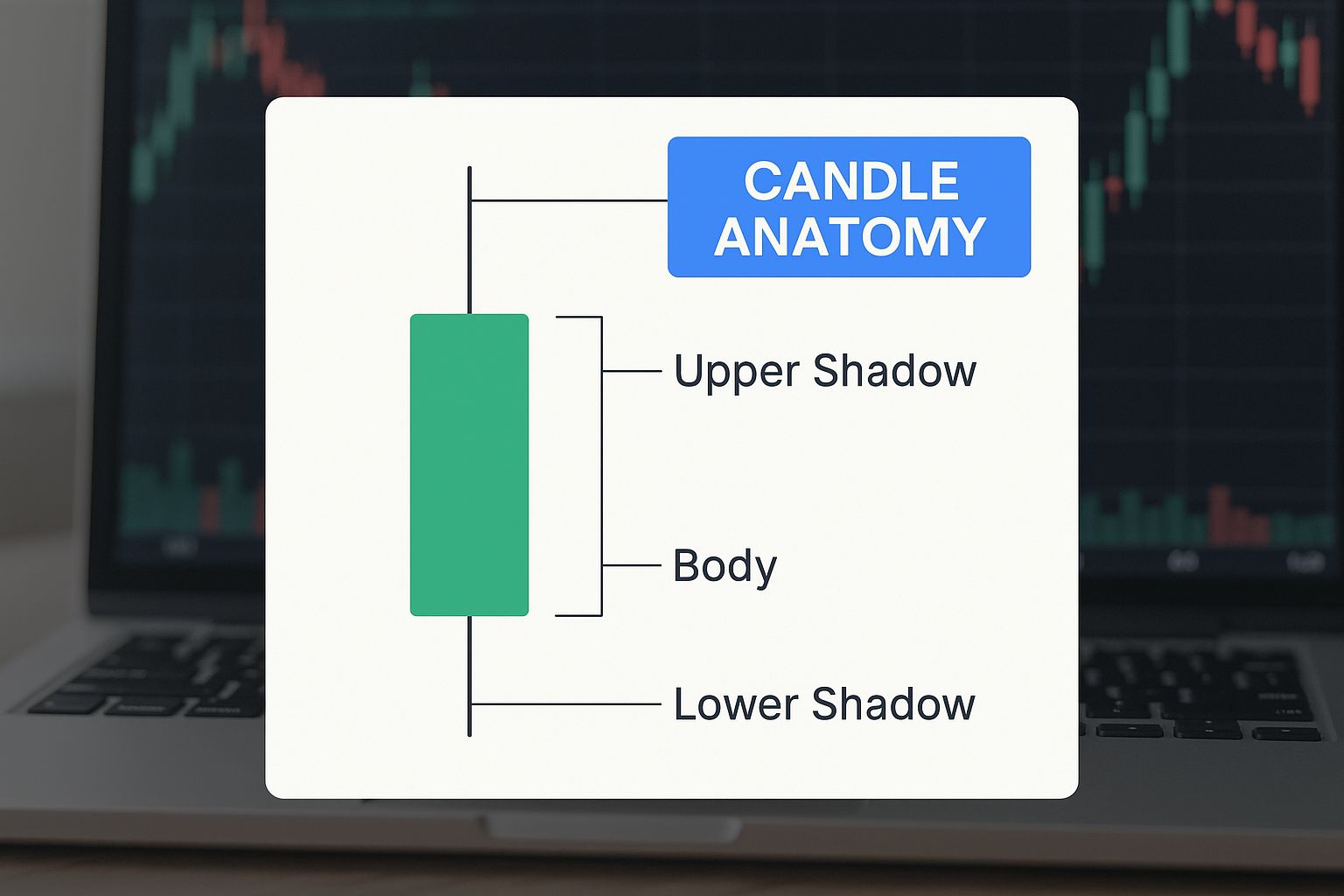
As you can see, the shape and color give you an instant read on the market's story for that session.
So, let's break down what each of these visual cues is telling you.
What Each Part of a Candlestick Tells You
| Component | What It Shows | Market Interpretation |
|---|---|---|
| Real Body | The range between the open and close price. | A long body shows strong momentum; a short body signals consolidation or indecision. |
| Body Color | The direction of the price movement. | Green (or white) is bullish (close > open); Red (or black) is bearish (close < open). |
| Upper Wick | The highest price reached during the period. | Shows the peak of buying pressure before sellers stepped in. |
| Lower Wick | The lowest price reached during the period. | Shows the bottom of selling pressure before buyers took over. |
This table gives you a quick reference, but the real magic happens when you start combining these elements to read the market's mood.
The Story Told by the Candle's Body
The "real body" is that thick, rectangular part, and it's the first thing your eyes should jump to. It’s a dead-simple visual of how much ground was gained or lost between the open and the close.
-
Color Is Direction: A green (or white) candle means the closing price was higher than the opening price. We call this a bullish candle—buyers were in charge. A red (or black) candle means the close was lower than the open, making it a bearish candle where sellers had the upper hand.
-
Size Is Conviction: The length of the body tells you how strong that buying or selling pressure was. A long green body screams aggressive buying and powerful bullish momentum. On the flip side, a long red body points to heavy selling and solid bearish control.
What about short bodies? They signal a lack of commitment from either side, hinting that the market might be taking a breather or is unsure where to go next.
Decoding the Wicks or Shadows
Sticking out from the top and bottom of the body are the wicks (also called shadows or tails). These thin lines show the extreme highs and lows the asset hit during the period—the price points beyond where it opened and closed. This is where the story of the struggle unfolds.
The upper wick shows the highest point the price reached before sellers managed to push it back down. The lower wick marks the lowest point before buyers jumped in and drove it back up.
The length of the wicks compared to the body can tell you a ton about market psychology. Long wicks often suggest a potential reversal because they show one side made a big push but was ultimately rejected by the other.
For instance, a candle with a tiny body and a long upper wick tells you that buyers tried to rally but got smacked down by sellers. That rejection at a higher price can be a pretty bearish signal. Inversely, a long lower wick shows sellers pushed the price way down, but buyers fought back with a vengeance—a possible sign of bullish strength returning.
Putting It All Together: A Practical Example
Let’s turn a single daily candle into a clear story. Imagine you spot a long green candle with a tiny upper wick and a long lower wick. What happened that day?
- The Open: The day began at a certain price.
- The Low: At first, sellers took control, driving the price down significantly. This created that long lower wick.
- The Turnaround: Buyers stormed in, not just wiping out the morning’s losses but pushing the price way past the open.
- The High and Close: The price topped out for the day and closed right near that peak, leaving behind a long green body and a stubby little upper wick.
That single candle tells a powerful story of an early sell-off that was brutally rejected by buyers, who then ran the show for the rest of the day. It’s a crystal-clear sign of bullish strength, suggesting market sentiment has shifted firmly in the buyers' favor. Understanding this kind of narrative is the first real step toward using candlesticks to make smarter trading decisions.
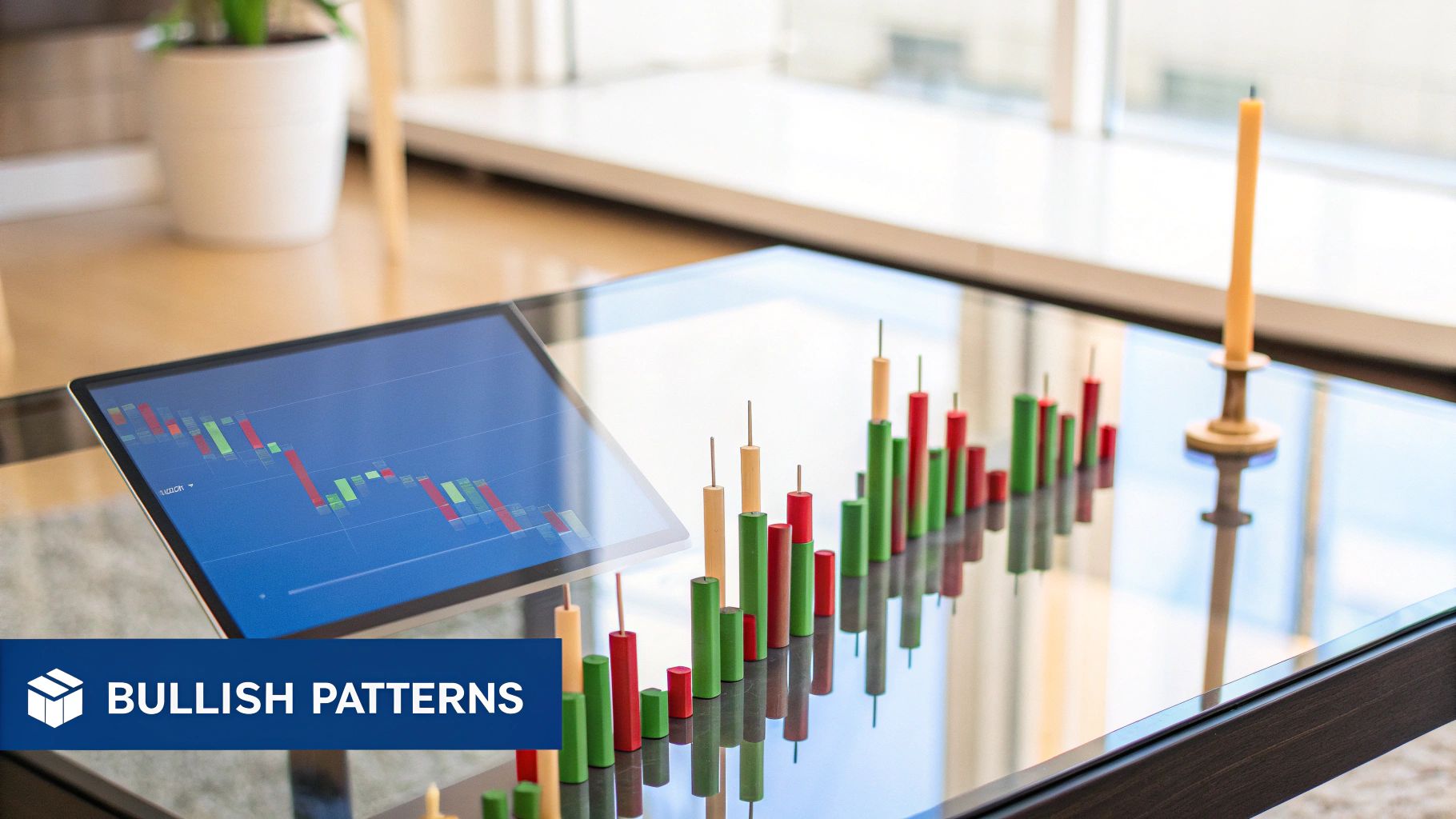
Spotting Foundational Candlestick Patterns
Now that you know how to read a single candle, we can start putting them together to see the stories they tell. Think of these individual candles as the basic vocabulary of the market. Some are so powerful they can signal a major shift in momentum all on their own.
This is your visual library for these core, single-candle patterns. We'll look at candles that scream indecision, hint that a bottom is forming, or warn that a top is just around the corner. Getting these down is the first real step toward developing that trader's intuition for reading the market's subtle cues.
The Doji: A Sign of Market Indecision
The Doji is probably the most famous single candlestick pattern out there, and for good reason. It looks like a cross or a plus sign, and it tells a crystal-clear story: a complete standoff between buyers and sellers.
A Doji forms when the open and close prices are nearly identical, which leaves it with a paper-thin (or nonexistent) body. The long wicks show that both bulls and bears made their moves during the session, pushing the price around. But by the closing bell, neither side could land a knockout punch. It's a moment of pure equilibrium—the market is just pausing to catch its breath.
A Doji popping up after a long, powerful trend is a major warning sign. It suggests the dominant force—buyers in an uptrend or sellers in a downtrend—is running out of gas. A reversal could be right around the corner.
Now, a Doji by itself isn't a signal to jump into a trade. Think of it more like a yellow flag in a race. It’s telling you to pay close attention because something might be about to change. Context is everything. A Doji in a choppy, sideways market doesn't mean much, but one at the absolute peak of a month-long rally? That's a different story entirely.
The Hammer: A Potential Bullish Reversal
When you spot a Hammer at the bottom of a downtrend, it’s a powerful sign that the bulls are waking up. The pattern looks just like its name: a short body at the top with a long lower wick that should be at least twice the length of the body. There’s almost no upper wick at all.
The story behind the Hammer is one of bullish grit:
- Sellers are in charge: The session opens, and sellers immediately push the price down, continuing the established downtrend.
- Buyers show up to fight: At the session's low, a huge wave of buying pressure suddenly appears out of nowhere.
- A powerful finish: Buyers completely overwhelm the sellers, driving the price all the way back up to close near where it opened.
This candle literally looks like the market is "hammering out" a bottom. It's a visual confirmation that despite the initial panic selling, buyers stepped in with enough conviction to reject those lower prices and stage a serious comeback.
Of course, combining these single-candle patterns with multi-candle formations can create even stronger signals. For instance, you can master the engulfing candlestick pattern for profits to add another powerful tool to your arsenal.
The Shooting Star: A Potential Bearish Reversal
The Shooting Star is the Hammer's evil twin. It's a bearish pattern that shows up at the top of an uptrend, signaling that the rally might be over.
It has the same shape as a Hammer, just flipped upside down: a small body at the bottom, a long upper wick, and almost no lower wick.
The psychology here is the complete opposite of the Hammer:
- The market is in a clear uptrend, and buyers push prices even higher at the open, creating a new session high.
- But at that peak, sellers emerge with overwhelming force, completely rejecting the higher prices.
- The selling is so intense it drives the price all the way back down, forcing it to close near its opening price.
The candle looks like a star falling from the sky, leaving a fiery trail behind it. That long upper wick is a picture of pure rejection. It shows that the bulls' attempt to push higher was decisively shut down, suggesting sellers are starting to take the wheel. Like any pattern, a Shooting Star is most powerful when it's confirmed by the next candle, like a long red candle that closes even lower.
Spotting Powerful Reversal and Continuation Patterns
While a single candle gives you a quick snapshot of market sentiment, the real stories are told by groups of candles working together. These formations can signal that a trend is either about to reverse course entirely or just pausing before continuing its run. Learning to read a candlestick chart at this level means learning to spot these critical patterns as they form.
Think of these patterns in two main buckets: reversal patterns and continuation patterns. Reversal patterns suggest a trend is running out of gas and might be ready to turn around. Continuation patterns, on the other hand, tell you that an existing trend is likely to keep going after a quick breather. Knowing the difference is crucial for anticipating the market's next big move.
But here’s a critical point: where a pattern appears on the chart is just as important as the pattern itself. A strong reversal signal popping up at a major support or resistance level carries a ton more weight than one that forms in the middle of a random price swing. Context is everything.
Spotting Major Trend Reversals
Reversal patterns are the market’s way of waving a red flag. They signal that the current trend is being challenged, and control might be about to shift from buyers to sellers (or vice versa). These are often the signals traders hunt for when looking to get into a new trend early.
One of the most classic and reliable reversal formations is the Engulfing pattern. This two-candle pattern is a powerful visual of one side completely overwhelming the other.
-
Bullish Engulfing Pattern: You'll find this at the bottom of a downtrend. It kicks off with a small red (bearish) candle, followed by a large green (bullish) candle that completely "engulfs" the body of the first one. It’s a story of sellers being in charge, only for buyers to rush in with such force that they not only erased the sellers' progress but pushed the price much higher.
-
Bearish Engulfing Pattern: The opposite scenario plays out at the top of an uptrend. A small green candle is followed by a massive red candle that swallows it whole. This tells you that buying momentum has fizzled out and sellers have taken over with overwhelming strength, signaling a potential top.
The psychology here is pretty clear—a sudden and decisive power shift has just happened. The bigger that engulfing candle is, the more significant the reversal signal.
A study of the Japanese Nikkei 225 found that using candlestick patterns like the Engulfing pattern can significantly boost the accuracy of market predictions when combined with other analytical models. This reinforces the idea that these are not random shapes but statistically relevant market signals.
Another powerful reversal pattern is the Morning Star. This is a three-candle bullish pattern that often marks a bottom. It starts with a long red candle, followed by a small-bodied candle (like a Doji) that gaps down, and finishes with a strong green candle. This formation shows a clear transition from bearish control, to indecision, and finally to bullish dominance—a complete U-turn in sentiment. Its bearish cousin, the Evening Star, signals a potential top in the exact same way, just inverted.
Recognizing Trend Continuation Patterns
Not every pause in the market means a reversal is coming. Sometimes, a trend just needs to catch its breath before resuming its journey. That’s where continuation patterns come in. They help you tell the difference between a temporary pullback and a full-blown trend change, keeping you in a strong move.
A perfect example is the Rising Three Methods pattern. This is a bullish continuation pattern that shows just how resilient a trend can be.
Here’s how it plays out:
- A long green candle appears, confirming a strong uptrend.
- It’s followed by three small red candles that trade down but stay within the range of that first big candle. This is just a period of minor profit-taking or consolidation.
- Finally, a second long green candle shows up, closing above the high of the first candle and completely wiping out the small pullback.
This pattern proves that even though sellers tried to mount a challenge, the buyers never lost control and are now ready to push prices even higher. The bearish version, known as the Falling Three Methods, signals that a downtrend is likely to continue. By spotting these formations, you can avoid getting shaken out of a profitable trade during a minor consolidation.
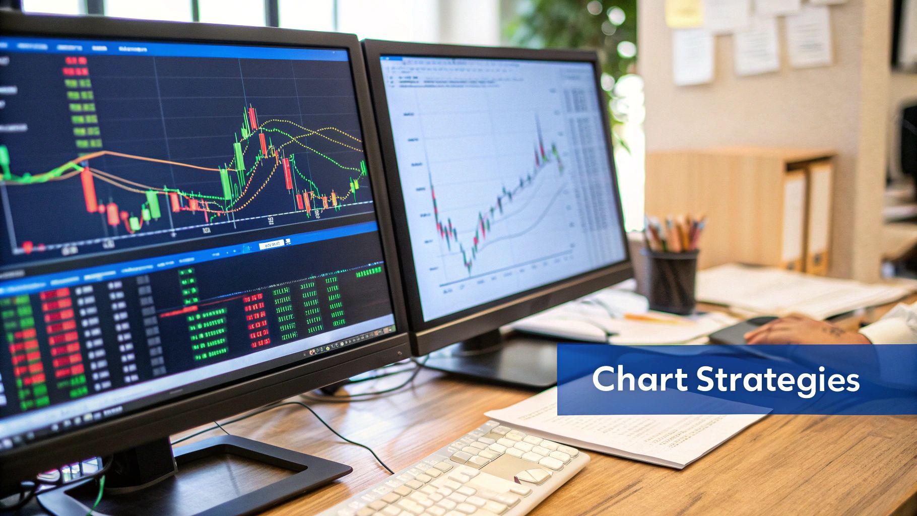
Putting It All Together on a Real Chart
Theory is one thing, but the real magic happens when you pull up a live chart and see these patterns play out in real time. This is where we connect the dots between knowing what a candle is and understanding what it means. Let's walk through a common scenario to see how individual candles build a story.
Picture a stock that's been on a tear for weeks, with big, confident green candles pushing it higher and higher. Then, right at the peak of the rally, a Shooting Star pops up. As we know, this candle is a red flag. It’s the market’s way of saying that buyers tried to push prices up, but sellers swatted them back down.
A classic rookie mistake is to see that one candle and immediately hit the sell button. But experienced traders know better. One candle is a clue, not a conclusion. You need more evidence.
Build Your Case with Confirmation
After that Shooting Star appears, the smart move is to simply wait. See what happens next. Does the next candle close lower, proving the sellers are taking control? Or does another strong green candle appear, telling you the Shooting Star was just a blip and the uptrend is still on? This patience is what separates gambling from trading.
Let's say the very next candle is a long, angry red one that closes way below the Shooting Star's body. Now we’re talking. That single warning sign has just been confirmed. You're beginning to build a trading thesis—a solid reason to believe the price is about to head south.
A candlestick pattern without context is just a pretty shape. But a pattern at a key price level that gets confirmed by the next candle? That's a high-probability trading signal.
From here, you can start layering in other evidence to strengthen your case. One of the most powerful tools you can use with candlesticks is trading volume.
Why Volume is Your Best Friend
Think of volume as the fuel behind a price move. It tells you how many shares were traded during that candle's formation. A big price move on high volume has conviction. A move on low volume is flimsy and untrustworthy.
Let’s go back to our example:
- The Shooting Star: Did that reversal candle form on a huge spike in volume? If so, it means a ton of traders were involved in that rejection of higher prices. That makes the signal much more powerful.
- The Confirmation Candle: Did that big red follow-up candle also have high volume? This would show that sellers are now jumping in with force, adding serious weight to your bearish argument.
Combining candlestick patterns with volume analysis is a game-changer. You go from just spotting shapes to understanding the force behind the moves. High volume on a reversal pattern often signals that the big institutional players are involved, and that's usually what you need for a trend to really get going.
To dig deeper, our full guide on https://chartswatcher.com/pages/blog/how-to-read-stock-charts-the-complete-guide-for-beginner-investors covers this and other key concepts for new investors.
Avoiding the Most Common Traps
Putting it all together is a methodical process. It's not about frantically hunting for patterns; it's about reading the market's story.
Here are a few common mistakes to watch out for:
- Fighting the Trend: A bullish reversal pattern is much more likely to fail if the stock is in a massive, long-term downtrend. Always check the bigger picture first.
- Seeing What You Want to See: Don't force a pattern. If you have to squint and tilt your head to decide if that's really a Hammer, it probably isn't a strong signal. The best patterns are obvious.
- Trading Without a Plan: Before you enter a trade based on a pattern, you need to know exactly where you’ll get out—both to take profits and, more importantly, to cut your losses if you're wrong.
By analyzing the trend, spotting a pattern, waiting for confirmation, and checking the volume, you build a robust, multi-layered trading thesis. This disciplined approach is the key to using candlestick charts effectively and making the leap from a novice to an informed analyst.
Your Candlestick Chart Questions, Answered
As you start digging into candlestick charts, a few questions are bound to come up. It happens to everyone. Think of this final section as a quick Q&A to clear up the most common sticking points traders run into. The goal here is to give you straight, clear answers that cement what you've learned and get you ready for real-world analysis.
How Reliable Are Candlestick Patterns, Really?
Candlestick patterns are all about probabilities, not crystal balls. Their reliability shoots way up when you factor in the market context. A bullish Hammer pattern at a major support level after a long slide down? That’s a big deal. The same Hammer popping up randomly in choppy, sideways action? Not so much.
The real key is to never rely on a single pattern alone. A professional approach means using patterns as just one part of your overall trading plan. This plan absolutely must include trend analysis, a look at volume for confirmation, and good old-fashioned risk management.
No single candlestick pattern guarantees an outcome. Treat them as strong hints about market psychology—your job is to find other clues that back up the story the candles are telling.
What’s the Best Time Frame for Analysis?
There’s no magic answer here. The "best" time frame is completely tied to your personal trading style and what you're trying to accomplish.
Here’s a simple way to think about it:
- Day Traders: If you're in and out of trades within the same day, you'll live on the short-term charts. Think 1-minute, 5-minute, or 15-minute charts.
- Swing Traders: Holding positions for a few days or weeks? You'll get the most value from the daily and 4-hour charts to catch those bigger market moves.
- Long-Term Investors: If you're playing the long game, you’ll be looking at the big picture on weekly or even monthly charts to spot major, long-running trends.
One of the most powerful techniques seasoned traders use is multi-time frame analysis. This is where you use a longer-term chart (like the daily) to figure out the main trend, then zoom into a shorter-term chart (like the hourly) to nail your exact entry and exit points in line with that bigger trend.
Can I Use Candlestick Charts for Any Market?
Absolutely. The beauty of candlestick charting is that it’s universal. Why? Because it’s a visual map of human psychology—that collective dance of fear, greed, and uncertainty that drives every market.
This makes candlestick analysis a killer tool for a huge range of markets:
- Stocks
- Forex (Foreign Exchange)
- Cryptocurrencies
- Commodities (like gold and oil)
Sure, every market has its own personality and quirks, but the stories the candles tell are the same everywhere. The patterns that show a battle between buyers and sellers are just as relevant for Bitcoin as they are for a blue-chip stock.
Should I Trade Based on a Single Candlestick?
Jumping into a trade based on one candle without any other evidence is a recipe for disaster. Seriously. Pro traders almost always wait for confirmation before putting money on the line. Confirmation is just that—extra evidence that supports the signal from the first pattern.
This extra proof can show up in a few ways:
- The Next Candle: The easiest form of confirmation is seeing what the next candle does. A bullish pattern followed by a strong green candle? That’s a much stronger signal.
- Key Technical Levels: A pattern is way more powerful if it forms right at a support or resistance level you’ve already marked on your chart.
- Volume Spikes: A big jump in trading volume alongside a reversal pattern shows real conviction behind the move.
- Indicator Alignment: Other tools, like the Relative Strength Index (RSI) or moving averages, are telling you the same story.
Think of a candlestick pattern as a strong suggestion from the market, not a direct order to trade. Always wait for that extra piece of evidence to stack the odds in your favor.
Ready to stop just looking at charts and start truly understanding them? ChartsWatcher provides the advanced scanning and analysis tools you need to spot high-probability patterns in real-time. Customize your dashboards, set precise alerts, and find your edge.
