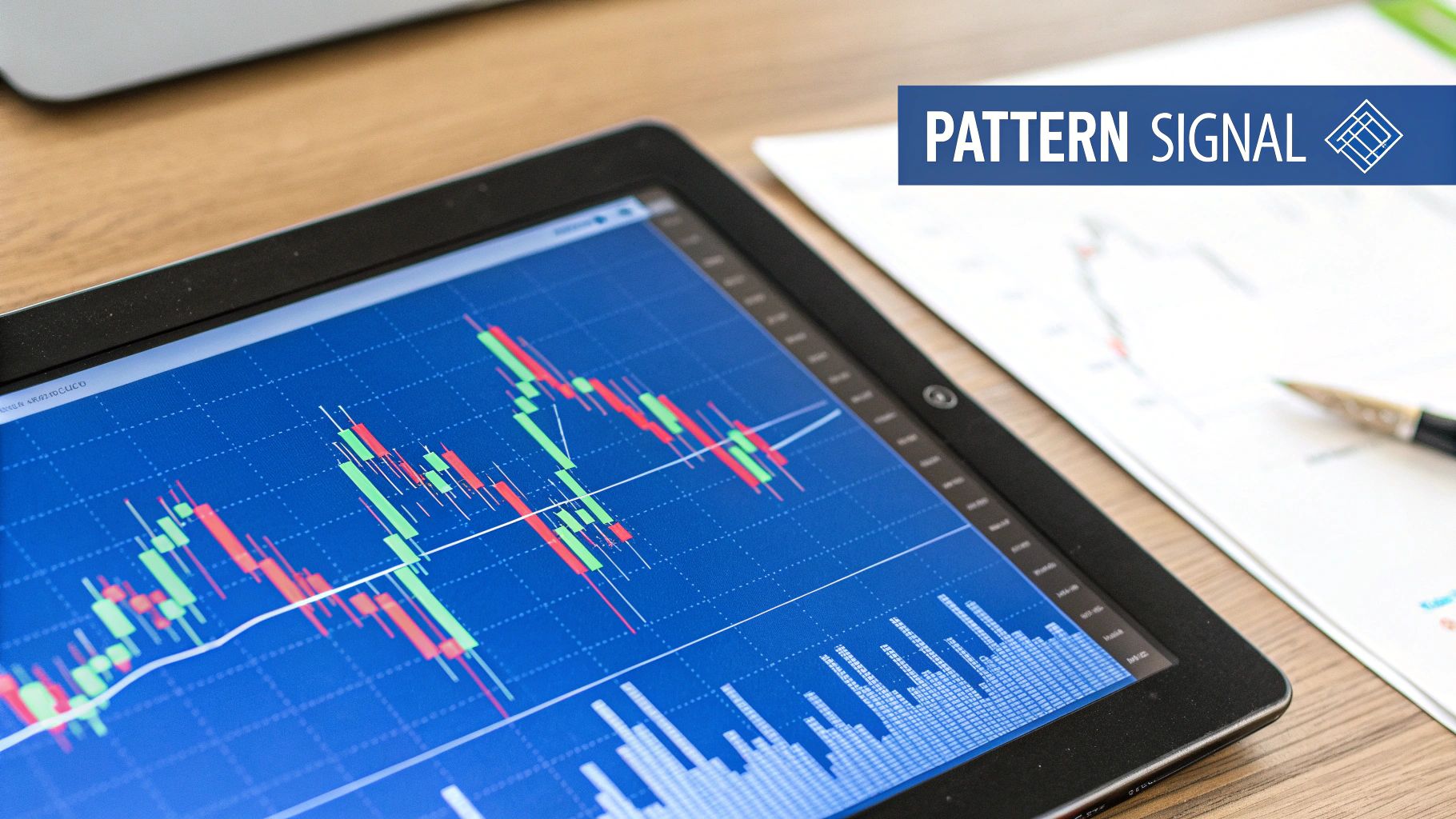
Trading the Rising Wedge Pattern for Maximum Profit
Of all the patterns you'll see on a chart, the rising wedge is one of the most powerful bearish signals you can learn. It's a clear warning that a strong uptrend might be running out of gas.
Think of it like a climber getting tired on a steep hill. They're still moving up, but each step forward covers less ground. That exhaustion is a sign that a fall might be coming.
Understanding The Rising Wedge Pattern

When an asset's price is climbing, it can feel like the bullish momentum will last forever. But experienced traders know that every trend eventually loses steam. The rising wedge is one of the most reliable visual cues that this is happening, making it a critical tool for getting ahead of major market shifts.
The pattern takes shape when the price gets squeezed between two trendlines that are both pointing up. The key is that the lower trendline (support) is steeper than the upper trendline (resistance). This structure shows that while the price is still managing to make higher highs and higher lows, the gains are getting smaller and smaller. It’s a classic sign of weakening buying pressure.
To help you spot this pattern in the wild, here’s a quick guide to its main features and what they mean.
Rising Wedge Pattern Quick Identification Guide
| Characteristic | Description | What It Indicates |
|---|---|---|
| Price Action | The price forms higher highs and higher lows, but the upward moves become shorter. | The bulls are still in control, but their strength is clearly fading. |
| Trendlines | Two ascending lines (support and resistance) squeeze closer together. | Buying pressure is weakening, and the market is becoming unstable. |
| Volume | Trading volume tends to decrease as the wedge pattern forms. | Fewer market participants are willing to buy at these higher prices. |
| Breakout | The pattern is confirmed when the price breaks decisively below the support line. | The bears have officially taken over, and a downtrend is likely to begin. |
This table gives you a solid checklist, but the real magic is in understanding the story the pattern tells.
The Psychology Behind The Bearish Reversal
At its heart, the rising wedge shows a battle between weakening bulls and bears who are just starting to gain strength. The bulls are still pushing the price up, but their energy is fading—you can see it in the shrinking price swings and, often, in lower trading volume.
This creates an unstable situation just waiting for a bearish takeover.
Statistically, this pattern's bearish signal is often confirmed by volume declining by 20% to 40% as it forms. This drop-off in participation is a huge red flag that the buying conviction is gone.
Ultimately, the rising wedge is an early warning system. It tells the story of a market that's losing its upward drive. Recognizing it gives you a chance to protect profits from a long position you're already in or to prepare for a new short-selling opportunity. It's a must-know formation for anyone serious about chart analysis.
If you want to build on this, a great next step is to explore our comprehensive guide on technical analysis indicators explained to see how the rising wedge fits into a broader trading strategy.
How to Identify a Rising Wedge on Any Chart
Spotting a rising wedge on a chart isn't just a technical exercise; it's a skill that can give you a real edge. This pattern is a flashing yellow light, warning that a bullish run might be running out of gas. But its real power comes from knowing exactly what to look for. At its heart, the rising wedge tells a story of a market losing steam, and that story is written in two key trendlines.
The first step is to connect the dots, literally. You’re looking for a period where the price is consolidating—still grinding out higher highs and higher lows, but with less and less enthusiasm. This squeezing action creates the distinct upward-pointing wedge or cone shape.
The Two Critical Trendlines
The whole structure of a rising wedge hinges on the relationship between its support and resistance lines. It’s not enough for them to just point up and get closer together. The angle of each line is what truly gives the game away and signals that something is wrong under the hood.
-
The Support Line (Lower): This is the line you draw by connecting the series of higher lows. In a proper rising wedge, this support line has a steeper upward slope. Think of it this way: buyers are still coming in, but they're having to pay aggressively higher prices to keep the rally going, creating a very unstable foundation.
-
The Resistance Line (Upper): You'll draw this line by connecting the series of higher highs. Notice how it has a flatter, less aggressive slope. This is the most important clue. It shows that each new peak is a smaller victory than the last. The buying power just isn't there to push prices significantly higher anymore.
Key Takeaway: The visual tension between the steep support line and the flatter resistance line is the signature of a rising wedge. It’s a market visibly struggling to stay in the air, making it a prime candidate for a bearish reversal.
Validating the Pattern Structure
A couple of highs and lows that look like they're converging isn't enough. To trade this with confidence, the pattern needs to be well-defined. As a rule of thumb, you want to identify at least five touchpoints in total—three touches on one trendline and two on the other.
This simple rule helps filter out random price noise and confirms you're looking at a genuine shift in market structure. For instance, seeing three distinct peaks hitting resistance and two clear troughs bouncing off support gives you a much higher degree of confidence that the pattern is real.
The final, and arguably most important, piece of the puzzle is declining volume. As the rising wedge develops and the price range tightens, trading volume should be drying up. This is a massive confirmation signal.
A drop in volume shows that fewer and fewer people are participating in the uptrend. The enthusiasm is gone; the market is going up on fumes. When you see those converging trendlines, five or more touchpoints, and shrinking volume, you've found a high-probability rising wedge. A downward breakout could be right around the corner.
Rising Wedge vs Falling Wedge Explained
It’s an easy and often costly mistake to confuse the bearish rising wedge with its bullish twin, the falling wedge. Both patterns are defined by converging trendlines, but they tell completely opposite stories about where the market might be heading next. Getting them straight is critical for making the right call.
Think of it like this: a rising wedge is like a balloon being slowly and dangerously overinflated. The pressure builds and builds until it simply can't hold anymore, leading to a sudden pop—a sharp downward breakout. A falling wedge, on the other hand, is like a spring being compressed. The more it gets pushed down, the more potential energy it stores up for a powerful release to the upside.
This infographic hammers home the bearish nature of the rising wedge, highlighting two key statistics every trader should know.
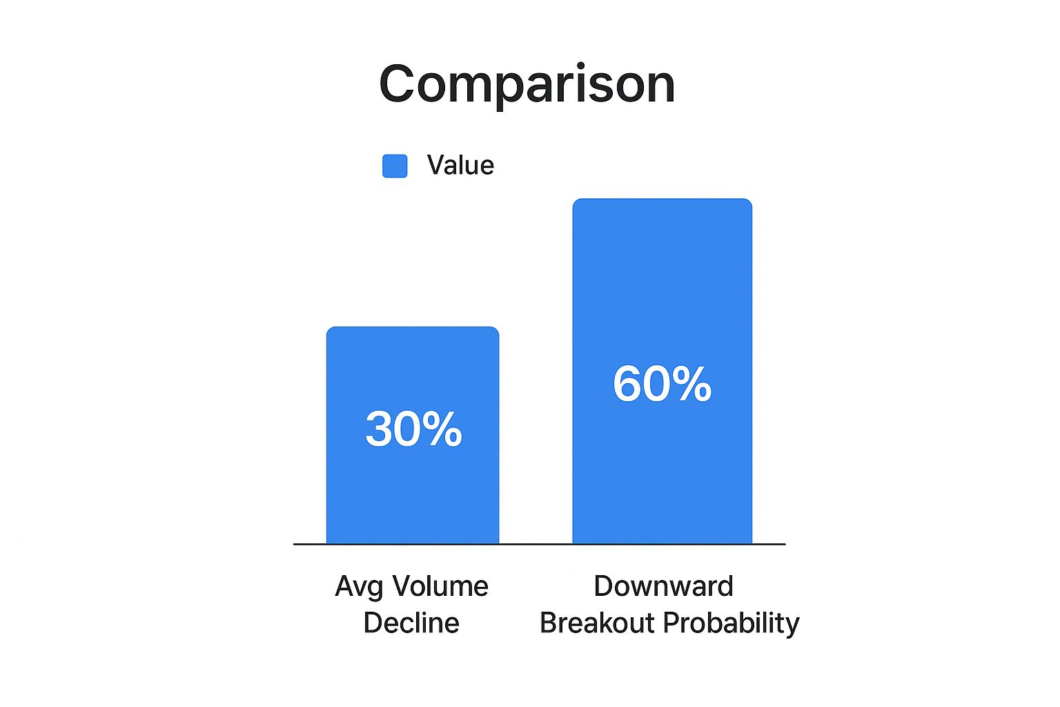
As the visualization clearly shows, volume tends to dry up by about 30% as the pattern forms. This waning participation sets the stage for a downward breakout, which happens roughly 60% of the time.
Key Structural Differences
The most obvious difference between the two is how they look on a chart. The rising wedge slants upward, signaling that an uptrend might be running out of steam. In contrast, the falling wedge points downward, often appearing at the end of a downtrend and hinting at a bullish reversal.
Here's a simple mental shortcut: wedges almost always break out in the opposite direction of their slope. An upward-slanting wedge breaks down, and a downward-slanting wedge breaks up. Keep that in mind, and you'll instantly know which is which during live trading.
To make the distinction crystal clear, it helps to see their core features side-by-side. I’ve put together this table to help you build a solid mental model for telling these two critical patterns apart.
Rising Wedge vs. Falling Wedge: A Comparative Analysis
This table directly compares the defining characteristics of the rising wedge and falling wedge. Mastering these differences will keep you from misreading the market's signals and making the wrong move.
| Feature | Rising Wedge (Bearish) | Falling Wedge (Bullish) |
|---|---|---|
| Trend Direction | Slopes upward, forming during an uptrend. | Slopes downward, forming during a downtrend. |
| Market Signal | Bearish Reversal. Indicates a likely move down. | Bullish Reversal. Indicates a likely move up. |
| Volume Trend | Volume typically decreases as the pattern forms. | Volume typically decreases as the pattern forms. |
| Breakout Direction | Price breaks below the lower support line. | Price breaks above the upper resistance line. |
| Trader Action | Prepare for a potential short (sell) position. | Prepare for a potential long (buy) position. |
By internalizing these unique traits, you’ll be much better prepared to act on the specific story each pattern is telling you, ensuring your strategy aligns with the most probable outcome.
Actionable Strategies for Trading the Rising Wedge

Spotting a rising wedge on a chart is a great start, but turning that pattern into profit takes a solid, repeatable plan. This is where theory meets the road. It's all about defining your entry, stop-loss, and profit targets before you even think about placing a trade.
Every trader has a different appetite for risk, so there’s no single "best" way to trade the breakdown. Instead, we have a few battle-tested approaches. Let's walk through three distinct strategies—aggressive, conservative, and confirmation-based—so you can pick the one that fits your personal style. The one thing they all have in common? Disciplined risk management. That’s the real secret to staying in the game long-term.
Strategy 1: The Aggressive Entry
This one is for the traders who want to get into the move as early as possible and are comfortable taking on a bit more risk to do it. The goal here is simple: capture the maximum initial burst of downward momentum that often follows a rising wedge breakdown.
- Entry Trigger: You enter a short position the moment the price closes below the lower support trendline on your chosen timeframe. No waiting around for extra proof—the break of the line is your signal.
- Stop-Loss Placement: Tuck your stop-loss just above the most recent swing high created inside the wedge. This keeps your potential loss tight if the breakdown fizzles out and turns into a fake-out.
- Profit Target: The classic method is to measure the height of the wedge at its widest point. Then, project that distance down from where the price broke support. This gives you a logical first target for taking profits.
Strategy 2: The Conservative Retest
If you're the kind of trader who prefers more certainty and you're willing to give up a little bit of the initial profit for a higher-probability setup, this is your strategy. This method involves waiting for the market to prove that the old support level has flipped into new resistance.
Key Insight: It’s incredibly common for the price to rally back up and "retest" a broken support level from underneath. When the price hits that old support line and gets rejected, it’s a powerful confirmation that the sellers are now firmly in control.
Here’s how you play it:
- Wait for the Breakdown: Just like the aggressive method, the first step is to see a price close clearly below the wedge's lower support line.
- Wait for the Retest: This is the key. Don't jump in right away. You need to patiently wait for the price to bounce back up and touch that broken trendline.
- Entry Trigger: Enter your short position only after the price is rejected at this retest, confirming it as new resistance.
- Stop-Loss and Profit Target: Your stop-loss can be placed just above the high of that retest. The profit target is the same as before: project the height of the wedge downward from the initial breakdown point.
Strategy 3: The Indicator-Confirmed Entry
This is a hybrid approach, blending the pattern’s raw price action with a technical indicator for an extra layer of validation. It’s perfect for traders who like to have a few different tools confirming the same story. An oscillator like the Relative Strength Index (RSI) works beautifully here.
For instance, you could wait for the RSI to give you a bearish signal, like crossing below a key level (such as 50) or breaking its own uptrend. This signals that momentum has officially flipped to the downside, perfectly aligning with the price breaking down from the rising wedge pattern.
In the forex markets, this pattern is a consistent performer. Backtests on major pairs like EUR/USD show that rising wedges form in roughly 5% to 7% of uptrends. When they break down, the average move is between 50 to 150 pips—a very significant opportunity. You can find more of these kinds of forex pattern statistics on LiteFinance.org.
Real-World Examples of the Rising Wedge
Theory is great, but nothing builds trading confidence like seeing a pattern play out in the wild. When you move from textbook diagrams to actual charts, those abstract lines suddenly become real opportunities and tangible risks. Let's dig into how the rising wedge has shown up in stocks, forex, and crypto markets.
Watching these case studies helps you see the pattern’s entire lifecycle unfold. You'll see the initial formation during an uptrend, that tell-tale drop in volume, the decisive breakdown, and the price drop that follows. It's the bridge between knowing what a rising wedge is and understanding how to trade it.
Case Study: The 2020 Bitcoin Breakdown
The crypto market is famous for its dramatic price action, making it a perfect place to spot technical patterns. Bitcoin, in particular, gave us a textbook example of a rising wedge back in early 2020.
On February 21, 2020, Bitcoin had just finished a strong rally and was forming a clear rising wedge on its daily chart. The price was hovering near $9,500, and the pattern was screaming that a bearish breakout was likely. Analysts at the time saw a potential drop toward $6,800—a 28% decline—if the wedge's support line broke. As you can see by looking at the Bitcoin daily news from that period on statoperator.com, the market did exactly that.
Breaking Down the Pattern's Life Cycle
Let's dissect that Bitcoin example to see the key stages every trader should be watching for:
- Formation: After a strong uptrend, the price started making higher highs and higher lows, but each new peak was less enthusiastic than the last. The lower support trendline was clearly steeper than the upper resistance line, pinching the price into that classic wedge shape.
- Volume Decline: As the pattern got tighter, trading volume started to dry up. This was a massive red flag. It showed the buying pressure that had fueled the rally was running out of steam.
- The Breakdown: Confirmation came when the price sliced right through the lower support trendline. This move was met with a huge spike in selling volume, a clear signal that the bears were now in charge.
- Price Decline: Sure enough, the price fell hard, eventually hitting the projected targets and proving the pattern's predictive power.
Trader's Insight: These real-world examples drive home a crucial lesson. A rising wedge doesn’t just predict a reversal; it tells a story of market exhaustion. When you see the plot points—fading volume and converging trendlines—it’s your cue to get ready for the final act.
Getting a handle on this pattern is a huge step, but it's just one of many formations that can signal a major market turn. To expand your trading arsenal, check out our guide on the 8 day trading chart patterns every trader should know.
Common Questions About the Rising Wedge Pattern
Even after you get a good handle on the rising wedge, a few questions always seem to pop up. It's totally normal. Getting these points ironed out is what builds the confidence to act when you see one of these patterns unfolding on a live chart.
Let's clear the air on some of the most common questions traders have.
Is a Rising Wedge Always Bearish?
This is the big one, and for good reason. While the rising wedge is overwhelmingly a bearish reversal pattern, it's never a 100% guarantee. Nothing in trading is. In very rare cases, a surprise news event or an unexpected tidal wave of buying pressure can send the price breaking out to the upside.
When that happens, the bearish setup is completely off the table. The pattern just became a continuation of the uptrend.
This is exactly why patience is a trader's superpower. You have to wait for a confirmed breakdown—a solid candle close below that lower support line—before you even think about hitting the sell button. Jumping the gun isn't trading; it's just gambling.
Key Takeaway: Think of the rising wedge as a high-probability bearish setup, but not an infallible one. Always let the market tip its hand with a confirmed breakdown before you commit your capital.
How Reliable Is the Rising Wedge Pattern?
The rising wedge is considered one of the more dependable patterns out there. But its reliability goes through the roof when you stop treating it like a signal in a vacuum. No single pattern or indicator is a magic bullet, and the rising wedge is much more powerful when you find other clues that back up its story.
It’s like building a case for a trade. The pattern is your main piece of evidence, but you want a few more witnesses to be sure.
Look for these confirming factors:
- Decreasing Volume: As the wedge tightens, a clear drop-off in trading volume is a huge red flag for the bulls. It strongly suggests the uptrend is running out of steam and conviction.
- Bearish Divergence: This is a classic. Pull up an oscillator like the RSI or MACD. If the price is grinding out higher highs while your indicator is making lower highs, that's bearish divergence. It's a powerful sign that the underlying momentum is fading fast.
Always look for these supporting signals and, no matter how good the setup looks, protect yourself with disciplined risk management.
What Timeframe Is Best for Trading This Pattern?
One of the coolest things about the rising wedge is that it's fractal. That’s just a fancy way of saying it shows up everywhere—from lightning-fast 5-minute charts to slow-and-steady weekly charts.
The "best" timeframe really just comes down to your personal trading style. Are you a day trader, a swing trader, or a long-term investor?
That said, the timeframe absolutely impacts the pattern's significance. A rising wedge that takes months to form on a weekly chart is a much bigger deal than one that pops up on a 15-minute chart. The longer the pattern builds, the more explosive the eventual breakdown is likely to be, often leading to a more significant and lasting downtrend.
Ready to stop searching for patterns manually and start finding them automatically? ChartsWatcher provides powerful scanning tools that can detect formations like the rising wedge across thousands of stocks in real-time. Elevate your trading analysis today with ChartsWatcher.
