Mastering The Supply Demand Zone For Trading
Ever wonder why a stock suddenly reverses course at a specific price level, almost as if it hit an invisible wall? That's often the work of a supply and demand zone.
Think of it as a financial footprint left behind by big institutions. These zones are specific areas on a chart where a massive imbalance between buyers and sellers previously sent prices soaring or tumbling. They act like magnets, often pulling the price back for a second look before another major move.
What Is a Supply Demand Zone in Trading?
At its heart, the concept of a supply and demand zone goes deeper than your typical support and resistance lines. We’re not talking about a single, precise price. Instead, a zone is an entire area where the market's scales tipped dramatically one way or the other.

Imagine a huge ship cutting through calm water—it leaves a powerful wake. A supply or demand zone is just like that wake; the market often gets drawn back into this area of past turbulence.
These zones are the direct result of large institutional orders. When a major bank or hedge fund wants to move a massive position, they can’t just hit "buy" or "sell" all at once. Doing so would send the price through the roof or into the ground instantly. Instead, they carefully accumulate or distribute their shares within a tight price range, creating a pocket of unfilled orders that sits and waits.
The Two Core Zone Types
Getting a handle on the two types of zones is the first real step. Each one represents an opposite market force and hints at very different trading opportunities.
-
Supply Zone (Where Sellers Overwhelmed Buyers): This is an area where selling pressure was so strong it completely smothered any buying interest, causing the price to drop sharply. When the price climbs back to this zone, those leftover sell orders can get triggered, shoving the price back down.
-
Demand Zone (Where Buyers Overwhelmed Sellers): On the flip side, this is an area where buyers came in so aggressively they absorbed all the selling, causing the price to launch upwards. When the price revisits this demand zone, it can activate remaining buy orders, creating a floor and potentially driving the price higher again.
By learning to spot these areas, you're essentially creating a map of where the "smart money" has tipped its hand. This gives you a powerful edge, because you're identifying high-probability locations for future price action.
A supply or demand zone isn't just a historical price level; it's the origin of a powerful imbalance. This distinction is what makes it a forward-looking tool, not just a reactive indicator.
Supply Zone vs Demand Zone At a Glance
To really nail this down, it helps to see the characteristics of supply and demand zones side-by-side. They are essentially mirror images, but being able to instantly recognize their distinct features on a live chart is a foundational trading skill.
Here's a quick cheat sheet to help you distinguish between the two.
| Characteristic | Supply Zone (Where Sellers Dominate) | Demand Zone (Where Buyers Dominate) |
|---|---|---|
| Price Action Origin | Forms at a price peak before a sharp drop. | Forms at a price bottom before a sharp rally. |
| Market Psychology | Represents an excess of sellers and leftover sell orders. | Represents an excess of buyers and leftover buy orders. |
| Trader's Expectation | Acts as a potential ceiling; price may fall upon return. | Acts as a potential floor; price may rise upon return. |
| Common Analogy | An area of "overhead supply" or resistance. | An area of "underlying demand" or support. |
| Visual Cue | A consolidation period followed by a large red candle. | A consolidation period followed by a large green candle. |
While the table offers a great summary, remember that a supply and demand zone is more than just a pattern—it’s a narrative of market forces. It tells you the story of where institutional conviction was strong enough to halt or even reverse a trend.
Mastering how to find and validate these zones is the bedrock of a robust, predictive trading strategy. It lets you anticipate potential turning points with far greater confidence, and this guide will show you exactly how to do it.
The Market Psychology Behind These Zones

To really get the hang of trading with supply and demand zones, you have to look past the squiggly lines on your chart. What you're actually seeing is the result of human and, more importantly, institutional behavior. These zones aren't just random price areas; they’re born from a big problem that major players like banks, hedge funds, and pension funds constantly face.
Imagine you're a fund manager who needs to buy or sell a massive position in a stock. You can't just hit a button for a single, giant order—doing so would send the price through the roof (or into the floor), telegraphing your move to the entire market. That would instantly kill your edge and get you a terrible price.
So what do they do? They have to be stealthy. They build up or offload their positions bit by bit, accumulating or distributing shares within a tight price range. This careful, methodical action creates that "basing" or consolidation area you spot on the chart right before a huge price move.
The Footprints of Unfilled Orders
The real magic behind a supply and demand zone is what happens next. Often, the market rips away from this consolidation area so fast that the institution doesn't have time to fill its entire order. This leaves behind a huge pool of unfilled buy or sell orders just sitting there, waiting for the price to come back.
Think of it like an iceberg. The price action you see is just the tip. Underneath the surface, right where the zone started, is the immense weight of those leftover institutional orders.
A supply and demand zone is essentially a map of institutional intent. It reveals where the "smart money" has left behind a trail of unfilled orders, creating a high-probability area where they are likely to defend their position when the price returns.
This idea completely changes how you see the market. You're not just drawing boxes on a chart anymore. You're pinpointing the exact locations where powerful players have a vested interest in making the price turn around. When price revisits a supply zone, those leftover sell orders kick in, acting as a ceiling. When it drops back to a demand zone, those waiting buy orders become a powerful floor.
Global Forces and Local Zones
This dynamic of institutional order flow has only gotten stronger in our hyper-connected global economy. Before 1800, international trade was less than 10% of the world's economic output. Today, it’s a different world entirely, with exports and imports making up over 50% of global GDP. This means the supply and demand imbalances created by big institutions are now fueled by global capital flows, not just local sentiment. If you're curious, you can learn more about the history of trade and globalization to see how these forces took shape.
Understanding this link gives your analysis another layer of depth. A demand zone in a US stock could be supercharged by buying pressure from international funds, making it that much more reliable.
Demand Zones: A Story of Accumulation
Let's walk through a quick story to make this crystal clear.
- The Goal: A large fund decides it wants to buy 10 million shares of a stock trading around $50. They think its real value is much higher.
- The Accumulation: To avoid spooking the market and driving the price up, they start buying in small chunks—maybe 50,000 shares at a time—between $49.50 and $50.50. This creates the "base" you see on the chart.
- The Breakout: Suddenly, great news hits the stock, and the price shoots to $55 before they can finish their buying program. They only managed to get 7 million of their 10 million shares.
- The Leftovers: Now, there are still 3 million shares' worth of buy orders sitting unfilled in that $49.50-$50.50 range. That area has just become a potent demand zone. When the price eventually drifts back down to that level, those orders are ready and waiting to provide strong buying support, likely kicking off the next rally.
This story of institutional footprints is the core logic that powers every valid supply and demand zone you'll ever find.
How to Confidently Draw Supply and Demand Zones
Theory is great, but moving from concepts to actually drawing zones on a live chart is where the rubber meets the road. At first, it might feel a bit subjective, like you're just guessing where to put the boxes. But there's a repeatable process you can use to take the guesswork out of it and confidently pinpoint these high-probability areas. This isn't about being an artist; it's about systematically finding the footprints left behind by institutional money.
Every supply and demand zone really comes down to two key parts: the base and the leg-out. The base is that period of consolidation or a brief pause in price, which is where the big institutions were quietly loading up on or offloading their positions. The leg-out is the powerful, explosive price move away from that base. That's your signal that a major supply or demand imbalance just happened.
Think of it like a coiled spring. The base is the act of compressing the spring, building up all that potential energy. The leg-out is the moment that spring is finally released, unleashing its energy in a sudden, powerful burst. Your job as a trader is to find where the spring was coiled.
The Anatomy of a Supply and Demand Zone
To draw these zones accurately, you need to get good at spotting the two most common patterns that create them. They are essentially mirror images of each other, each telling a story of either overwhelming selling or buying pressure.
-
Rally-Base-Drop (RBD) for Supply Zones: This pattern is exactly what it sounds like. Price rallies up, pauses to form a consolidation "base," and then drops like a rock. That base area, where sellers soaked up all the buying pressure before taking over, becomes your supply zone.
-
Drop-Base-Rally (DBR) for Demand Zones: This is just the opposite. Price drops down, pauses to create a base, and then rallies aggressively higher. This base, where buyers absorbed all the selling pressure, is now your demand zone.
Sticking to these two patterns simplifies how you identify these critical zones on any chart.
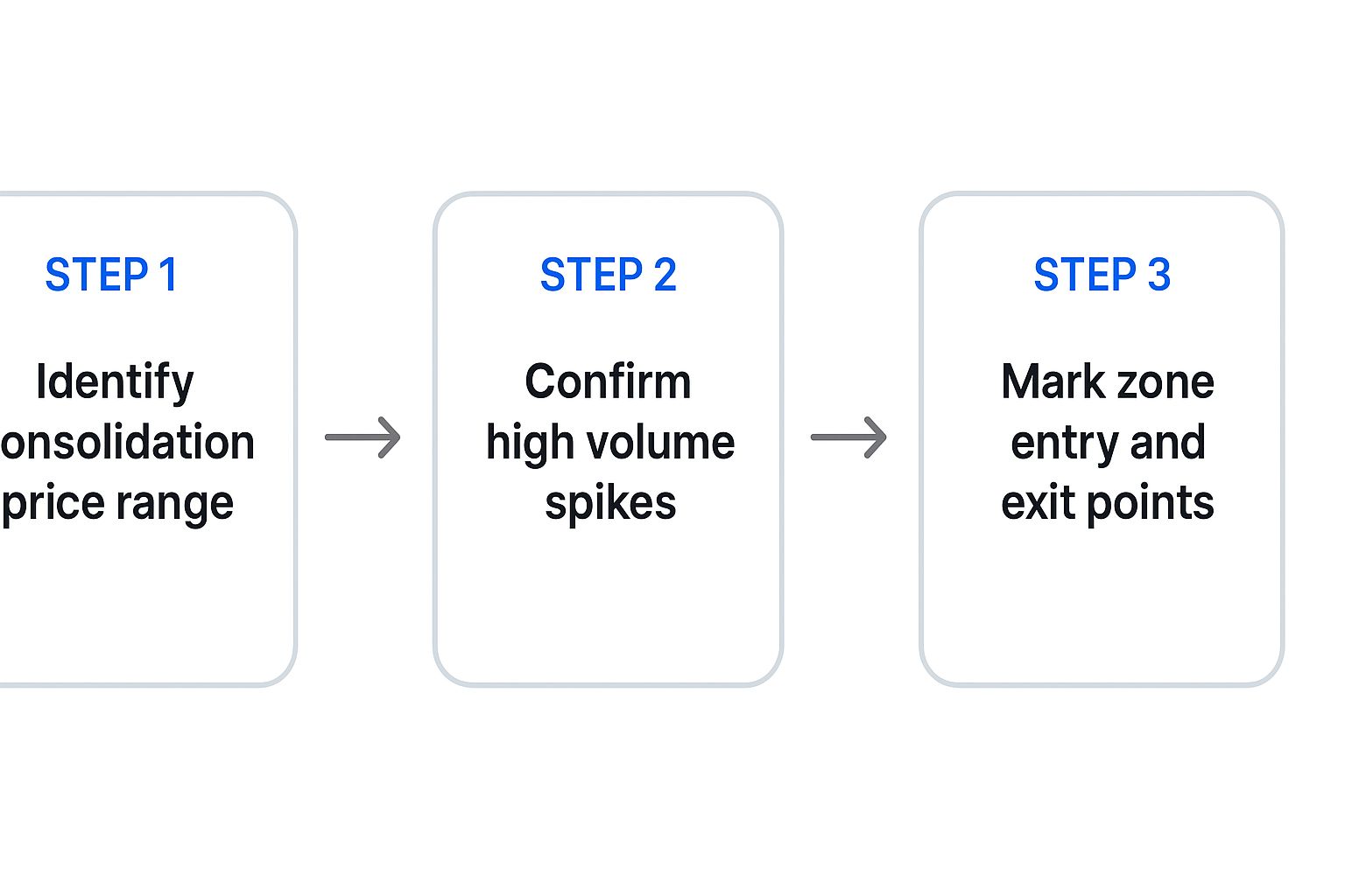
The image above breaks down the process into a simple, three-part flow. It helps you go from just spotting a consolidation to marking a confirmed zone, ensuring you're following a structured method, not just guessing.
A Step-by-Step Guide to Drawing Zones
Alright, let's put this all together into a practical, step-by-step method you can start using right away. This process works on any chart, in any market, and on any timeframe.
-
Identify an Explosive Price Move: First things first, scan your chart for a large, impulsive candle that really stands out from the recent price action. This is often called an Engulfing or Marubozu candle. This powerful move is your "leg-out" and the clearest sign of a major market imbalance.
-
Locate the Originating Base: Once you've found that explosive move, look immediately to its left to find the consolidation area it burst out of. This "base" might be just a single candle or a small cluster of tight-ranging candles that formed right before the big move.
-
Draw the Zone Boundaries: The final step is to outline the zone with a rectangle. You want the zone to cover the entire basing area. For a demand zone, you'll draw the rectangle from the lowest low of the base up to the highest body of the base candles. For a supply zone, you'll draw it from the highest high of the base down to the lowest body.
This annotated chart shows a demand zone being formed and marked in a real-world scenario.
Notice how the demand zone perfectly encapsulates the small basing candles that appeared right before the powerful upward explosion in price. This marked area is now a high-probability spot where we can expect buyers to step in again if the price ever returns to this level.
The strength of the move away from the base is your most important clue. A weak, choppy exit suggests a weak zone, but a fast, powerful exit signifies a strong zone packed with significant unfilled orders.
Consistently applying this method will build your confidence and muscle memory. To really deepen your understanding of how to use these concepts in live markets, you can explore our complete guide to mastering supply and demand trading strategies. This resource digs into more advanced examples and techniques you can integrate into your analysis. By following this structured approach, you turn what looks like random price action into a concrete and actionable trading map.
Separating High-Probability Zones from Traps

Once you start looking for supply and demand zones, you'll see them everywhere. It can get overwhelming, and it points to a critical truth most traders learn the hard way: not all zones are created equal. A lot of them are just noise—weak, low-probability setups that end up being traps for the uninformed.
To trade these levels effectively, you have to get good at telling the powerful, high-probability zones apart from all the fakes. The goal isn’t to trade every single zone you find. It’s to filter aggressively and only take the A+ setups. This means you need to go beyond just spotting zones and learn how to grade the strength of each one.
Grading the Strength of a Zone
Think of yourself as a quality control inspector. Your job is to put every potential zone through a rigorous checklist to decide if it’s worth risking your capital on. The strongest zones, the ones most likely to hold, all tend to share a few distinct characteristics.
By creating a mental checklist, you build a practical framework for evaluating every setup systematically. It’s about taking emotion and guesswork out of the equation and replacing them with a structured, rule-based process.
The most critical factors to look at are the strength of the move away from the zone, how much time price spent at the base, and whether the zone is "fresh."
The Speed of the Exit
The single biggest clue to a zone's strength is how fast and hard price moved away from it. A powerful, explosive exit is a dead giveaway of a massive imbalance between buyers and sellers. It’s the market telling you that institutional orders were so overwhelming that the other side got completely run over.
- Strong Zone: Look for large, impulsive candles (sometimes called "explosive" or "extended range" candles) rocketing away from the base with very little overlap. This shows real urgency and conviction.
- Weak Zone: A weak zone is marked by a choppy, slow, or grinding exit. If price struggles to leave the area, it suggests the supply and demand imbalance wasn't that big of a deal, meaning fewer unfilled orders were likely left behind.
The strength of departure is a direct reflection of the imbalance at the origin. A violent exit from a supply or demand zone is the market screaming that a major power shift has just occurred.
Time Spent at the Base
This one can feel a little counterintuitive at first. You might think a long consolidation would build a stronger base, but it's usually the opposite. The pros want to see a short, tight basing period.
A quick consolidation tells you that the big institutions got their orders filled quickly and efficiently, without much of a fight. A long, drawn-out base, on the other hand, often signals a messy battle between buyers and sellers. This usually means fewer unfilled orders are left behind when price finally makes its move. The best zones often form with just a few tight candles.
Is the Zone Fresh and Untested?
A "fresh" zone is one that price hasn't revisited since it was formed. These are your highest-probability setups, period. Why? Because they hold the maximum number of unfilled institutional orders.
Think of it like a well. Every time price dips back into a zone, it takes some water out. The orders get filled, and the zone weakens. The very first return to a fresh supply demand zone gives you the best odds. A zone might hold for a second test, but its reliability drops sharply with every touch after that. As a rule of thumb, focus your energy on fresh, untested zones.
This principle plays out vividly in the real world, especially in commodity markets. Agricultural markets are a masterclass in raw supply and demand. Data from the World Agricultural Supply and Demand Estimates (WASDE) reports shows exactly how real-world supply gaps drive price. A perfect example was the 2012 U.S. drought. It obliterated corn yields, compressed supply, and sent world corn prices soaring over 50% in less than a year. You can find more on this historical commodity data from the USDA.
Building Your Complete Trading Plan Around Zones
Spotting a quality supply or demand zone is a massive step forward, but let's be honest: an idea isn't a strategy. To trade with the discipline and confidence of a professional, you need a complete plan with crystal-clear rules for every single action you take. This is where we put all the pieces together, moving from just finding a zone to managing a live trade from start to finish.
A solid trading plan is your best defense against emotional decisions and pure guesswork. It forces you to define your entry, your "I was wrong" exit point, and your "I was right" profit target before you ever risk a single dollar. This simple framework is what separates consistent traders from those who just get lucky once in a while.
Choosing Your Entry Technique
So, the price is heading back to a valid zone you've marked. Now what? You have a critical decision to make on how to get into the trade. There are two main approaches, and each one comes with its own set of trade-offs between risk and potential reward.
-
The Aggressive Entry (Limit Orders): This is for the decisive trader. It involves placing a limit order to buy or sell directly inside the zone before the price even gets there. The huge advantage? You can lock in the best possible price, which dramatically boosts your potential risk-to-reward ratio. The risk, of course, is that the zone fails and the price slices right through your entry without a second thought.
-
The Confirmation Entry (Waiting for a Signal): This is the more conservative, patient approach. You wait for the price to actually enter your zone and then show you some proof that it's turning around. This "proof" could be a specific candlestick pattern, like a powerful engulfing bar or a sharp pin bar, confirming that buyers or sellers are indeed stepping up to the plate. You'll get a slightly worse entry price, but your trade has a higher probability of working out because you waited for that extra piece of evidence.
Neither method is universally "better." Aggressive entries are a great fit for traders who chase high reward-to-risk setups and are comfortable with a lower win rate. Confirmation entries are better for those who value a higher win rate, even if it means giving up a bit of potential profit. Your choice should come down to your personal trading style and what lets you sleep at night.
Setting Your Stop Loss and Profit Targets
Your exit strategy is arguably more important than your entry. It's the core of your risk management and the key to staying in the game long-term.
Fortunately, a professional approach to setting a stop loss is both simple and incredibly logical: place it just outside the boundary of your zone.
- For a demand zone (a long trade): Your stop loss goes a few pips or ticks below the zone's lower edge.
- For a supply zone (a short trade): Your stop loss goes a few pips or ticks above the zone's upper edge.
This placement makes perfect sense. If the price breaks completely through the zone, the original reason for the trade—that big imbalance of orders—has just been proven invalid. Time to get out.
The most logical profit target for any supply or demand zone trade is the next opposing zone. If you buy at a demand zone, your target is the first significant supply zone above it. If you sell at a supply zone, your target is the first major demand zone below.
This rule-based approach ensures you are almost always trading with a favorable risk-to-reward ratio. It forces you to cherry-pick trades where the distance to your target is much greater than the distance to your stop. To see how this all fits together, our guide on mastering supply and demand zone trading strategies is an incredibly helpful next step.
Validating Your Trading Plan
Once you've mapped out a potential strategy around these zones, you need to validate it. You can't just assume it works. Learning about options strategy backtesting can help you refine your approach by running your rules against historical data to see how they would have performed.
This process builds immense confidence and helps you iron out any weak spots in your plan before risking real capital. By combining a solid trading plan with historical validation, you build a truly professional-grade system. This is the preparation that allows you to execute trades with discipline, free from the grips of fear and greed.
How ChartsWatcher Automates Zone Detection
Let's be honest: manually scanning dozens of charts for high-quality supply and demand zones is a grind. It's not just incredibly time-consuming, but it’s also easy to make mistakes or second-guess yourself. This is exactly where technology gives you a massive edge, letting you skip hours of screen time and focus only on the A+ setups.
ChartsWatcher was built to handle this entire process for you. Our algorithms are designed to tirelessly scan multiple markets and timeframes, flagging only the zones that meet our strict, pre-defined criteria for strength. It's all about removing the emotional guesswork from your analysis and building a level of consistency that’s nearly impossible to achieve by hand.
Once you get comfortable with automating zone detection, exploring different automated crypto investing strategies can be a logical next step to broaden your approach.
Streamlining Your Analysis
The entire point is to filter out the market noise. Instead of hunting for zones from scratch, you're presented with a clean, actionable list of potential trade setups. This frees you up to spend your time where it counts: validating the high-probability zones the platform has already found for you.
This approach is really just a micro version of the same supply and demand principles that drive massive global markets.
Think about it on a macro scale. When oil production outpaces consumption, what happens? Supply zones form on a global level, leading to huge inventory builds. This is the exact same dynamic we see on price charts, just on a different scale. You can even see how these large-scale imbalances are tracked by major institutions like the IEA. ChartsWatcher simply automates the detection of these critical turning points for your day-to-day trading.
As you start working with supply and demand zones on your charts, you’re bound to run into a few questions. It’s only natural. Getting your head around these common sticking points is the key to trading this concept with real confidence.
Think of this as a quick-reference guide to sharpen your understanding. We'll tackle the most frequent questions traders have when they first start, helping you apply the strategy with more precision.
How Is a Supply Demand Zone Different from Support and Resistance?
This is probably the most common question, and the answer gets to the very heart of the strategy. While they can look similar on a chart, their underlying logic is completely different.
Traditional support and resistance are just historical price levels where the market turned around in the past. They're reactive. A supply demand zone, on the other hand, is the origin of a powerful, imbalance-creating move. It’s the specific area where institutional orders were so overwhelming they left a clear footprint on the chart.
To put it another way, a support or resistance level is like a well-worn path where price just happens to react. A supply or demand zone is the launching pad itself—the source of the explosive move. That's why zones are predictive; they represent a significant pocket of unfilled orders waiting to be triggered.
A broken support or resistance line is just a broken line. But a broken supply or demand zone? That's a major signal that the market's underlying order flow has shifted, often setting up a brand-new trading opportunity.
What Timeframe Is Best for Supply and Demand Zones?
A crucial question. The beauty of this concept is that it’s fractal, meaning it shows up on all timeframes, from the one-minute all the way up to the weekly.
However, not all zones are created equal. Higher timeframe zones—like those on a daily or weekly chart—carry far more weight. Why? Because they represent larger, more significant institutional order flow. A weekly zone was likely formed by billions of dollars, while a 5-minute zone might just be a small, temporary imbalance.
A classic professional approach is to blend multiple timeframes. A trader might spot a powerful weekly demand zone to get a feel for the overall bullish trend, then drop down to a 4-hour or 1-hour chart to find a smaller, more refined demand zone inside it for a precise entry. This is how you align your trade with the big money.
What Happens When a Zone Fails to Hold?
When price slices cleanly through a zone, don't think of it as just a failed trade. It's a powerful piece of information. A broken zone tells you that the supply and demand balance at that level has been completely overwhelmed.
For example, if price smashes right through a supply zone, it means all those trapped sellers have been absorbed. Buyers are now in total control.
Even better, this broken zone often flips its role. A busted supply zone can become fresh demand, and a broken demand zone can become new supply. Traders call these "swap zones" and watch them like a hawk, as they frequently offer high-probability setups when price pulls back to retest them from the other side.
How Many Tests Weaken a Zone?
A "fresh," untouched zone always packs the most punch. Each time price returns to a zone, it's like a bank withdrawal—it consumes some of the unfilled orders waiting there. This makes the zone weaker for the future.
There’s no magic number, but most experienced traders get wary after two or three tests. The real key is to watch how price reacts on each touch. If you see a weak, sluggish bounce from a zone, that's a huge red flag. It’s a sign the zone is running out of gas and probably won't hold on the next visit.
Ready to stop hunting for zones and start trading them? ChartsWatcher automates the entire detection process, scanning multiple markets to deliver high-probability setups directly to you. Start your analysis with ChartsWatcher today.
