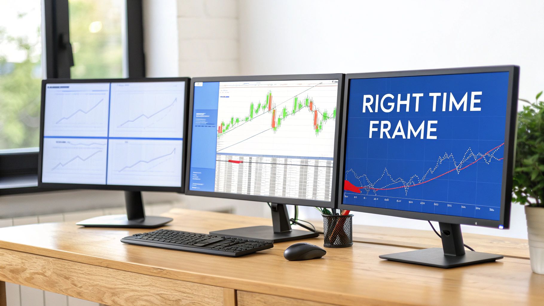
Finding the Best Time Frame for Day Trading
The best time frame for your day trading really boils down to your own strategy, your stomach for risk, and frankly, your personality. There’s no magic bullet here. If you're a high-frequency scalper looking to get in and out of the market in a flash, the 1-minute chart is your playground. On the other hand, momentum traders trying to catch a bigger move often feel more at home on the 5-minute or 15-minute charts.
Ultimately, there’s no single "best" choice—just the one that fits you.
Finding the Right Time Frame for Your Trading Style
Picking a time frame isn't just a technical setting on your chart; it fundamentally shapes your entire trading day. Every chart, from the frantic pace of the 1-minute to the more patient 15-minute, offers a completely different lens on the market. This decision directly impacts how many trades you’ll place, how much stress you'll feel, and how fast you need to be on the trigger.
Think of the shorter time frames, like the 1-minute chart, as looking at the market through a microscope. You see every tiny price tick, which creates a constant stream of opportunities for scalpers who thrive on that kind of action. The catch? This level of detail comes with a ton of "noise"—random price blips that can easily trick you into seeing signals that aren't really there.
Longer time frames like the 5-minute or 15-minute charts zoom out, giving you a clearer picture of the actual trend. They do a much better job of filtering out the market’s minor hiccups, which means the signals you do get tend to be more reliable. This is perfect for traders who want to capture larger, more sustained moves.
When you look at different intraday charts, you start to see distinct patterns. For example, it’s well-known that the first hour after the U.S. market opens is pure chaos—it’s historically the most volatile part of the day, with trading volume often jumping by over 50% compared to the daily average. If you're curious about broader market trends, a resource like TradingEconomics.com offers great macroeconomic data.
The secret is to align your analytical style with your psychological tolerance for risk and speed. A mismatch here is one of the biggest reasons traders burn out and can't find consistency.
To help you figure out where you might fit in, I've put together a quick reference table. Think of it as a starting point to see which time frame might resonate with your trading style before we dive deeper.
Quick Guide to Common Day Trading Time Frames
| Time Frame | Ideal Trader Profile | Typical Trade Frequency | Key Characteristic |
|---|---|---|---|
| 1-Minute | Scalper, High-Frequency | Very High (20+ trades) | Maximum detail and speed |
| 5-Minute | Momentum Trader | High (5-15 trades) | Balanced detail and trend clarity |
| 15-Minute | Intraday Trend Trader | Moderate (2-5 trades) | Clearer trends, less noise |
| 1-Hour | Swing/Position Trader | Low (1-2 trades) | Major intraday trend identification |
This table gives you a bird's-eye view, but the real devil is in the details. Let's break down each of these time frames so you can see exactly what you'd be getting into.
How Volatility Shapes Your Time Frame Choice
Volatility is the fuel for day trading. Without it, prices don't move, and there's no profit to be made. But volatility isn't a constant force; it ebbs and flows throughout the day, and matching your chart’s time frame to the market’s current energy level is a non-negotiable skill.
The market’s pulse typically follows a predictable U-shaped pattern. Activity explodes at the open, quiets down midday in what traders call the "lunchtime lull," and then picks back up into the close. Your choice of time frame needs to mirror these distinct phases.
In the chaotic first hour, when volume and volatility are cranked to the max, shorter time frames like the 1-minute and 5-minute charts are your best friends. They give you a high-definition view of the rapid price swings, making them perfect for grabbing quick momentum plays or trading the knee-jerk reaction to a big news event.
Adapting to Market Energy
On the flip side, trying to use a 1-minute chart during the quiet midday session is usually a recipe for getting chopped to pieces. With low volume, even tiny orders can create big-looking candles, leading to a mess of false signals and frustrating, directionless price action. This is exactly when longer time frames become a strategic advantage.
Switching to a 15-minute chart helps you zoom out and smooth over that midday noise, giving you a much clearer picture of what the real trend is doing. It filters out the insignificant blips, providing more reliable support and resistance levels so you don't get whipsawed by every minor fluctuation. If you want a deeper dive into these mechanics, check out our complete guide on what is market volatility.
The goal is not to find one perfect time frame, but to become a chameleon, adapting your perspective to match the market's current personality—from frantic to calm and back again.
This adaptive approach isn't just theory; it's backed by decades of market data. A look at historical charts of the Dow Jones Industrial Average (DJIA) shows that on highly volatile days, the bulk of the price movement is packed into very small windows, almost always at the open and close. The traders who consistently profit from these sharp moves are the ones using time frames responsive enough to capture those sudden bursts of liquidity and price action.
Practical Scenarios for Time Frame Selection
Let's break down how this looks in the real world.
- Market Open (High Volatility): A stock gaps up on strong earnings. The 1-minute or 5-minute chart is your go-to for playing the initial breakout and riding that first wave of momentum.
- Midday Lull (Low Volatility): That same stock settles into a tight, boring consolidation range. You'd switch to a 15-minute chart to avoid getting faked out by false breakouts and wait for a more decisive, confirmed move.
- News Event (Extreme Volatility): A major economic report hits the wires. The 1-minute chart is essential for navigating the immediate, explosive reaction and scalping a quick profit from the chaos.
By actively switching between time frames based on what the market is giving you, you turn volatility from a threat into an opportunity. You're always making sure you have the right lens for the job.
Comparing 1-Minute vs 5-Minute Charts for Scalping

For scalpers, the debate between the 1-minute and 5-minute chart is everything. This isn't just about picking a random time frame; it’s about aligning your strategy with how you see the market, how you handle pressure, and how quickly you can pull the trigger. Each chart tells a different story, and choosing the right one is critical for success in high-frequency trading.
Think of the 1-minute chart as putting the market under a microscope. It zooms in on every tiny price fluctuation, revealing a constant stream of potential trades. This is where traders with lightning-fast reflexes live, grabbing tiny profits from moves that last mere seconds.
But that extreme granularity is a double-edged sword. The 1-minute chart is notoriously "noisy." It's filled with random, meaningless price ticks that can look like real signals, tempting you to over-trade. It takes serious discipline to operate here without getting chopped up by false moves or emotional decisions.
The 5-Minute Chart: A More Balanced View
In contrast, the 5-minute chart smooths out a lot of that chaos. It still moves fast enough for scalping, but by giving each candle more time to form, the patterns and signals it produces are often far more reliable. This bit of extra context helps you confirm a trend's direction and avoid getting shaken out by minor blips.
This time frame really hits a sweet spot. It’s quick enough to generate plenty of opportunities but slow enough to allow for a moment of analysis before you jump in. If you're just getting your feet wet with high-speed trading, the 5-minute chart is a much more forgiving place to start. For a deeper dive into these tactics, our guide to a scalping trading strategy covers this in more detail.
The core difference is clarity versus quantity. The 1-minute chart offers a massive quantity of raw data and potential trades, while the 5-minute chart provides clearer, more qualified signals at a slightly slower pace.
Let’s walk through a real-world example to see how this plays out.
Example Scenario: Trading an Earnings Announcement
Imagine a hot tech stock just crushed its earnings report, causing the price to gap up big at the market open. Volatility is through the roof.
-
On the 1-Minute Chart: A scalper would be all over the initial momentum burst in the first few minutes. They'd be laser-focused on the immediate price action, aiming to execute multiple small trades in seconds to capture slivers of the surge. It’s pure reaction.
-
On the 5-Minute Chart: A trader here might actually wait for the first 5-minute candle to close. This lets them sidestep the initial violent whipsaw and confirm the direction before entering. Their trade is more calculated, likely lasting 10-20 minutes as they aim for a single, larger profit target on a more established trend.
There’s no "better" choice here—it all comes down to the trader's personality, their strategy, and the specific market setup they're targeting.
To make this even clearer, let's break down how each chart performs in different trading scenarios. This table illustrates which time frame is better suited for specific market conditions and trading goals.
Scenario-Based Comparison: 1-Minute vs. 5-Minute Chart
| Trading Scenario | 1-Minute Chart Suitability | 5-Minute Chart Suitability | Recommendation |
|---|---|---|---|
| High-Impact News | Excellent. Perfectly captures the immediate, explosive reaction. | Good. Helps confirm the initial move, avoiding the first wave of noise. | Use the 1-minute for the initial pop, then switch to the 5-minute for the follow-through trend. |
| Trending Market | Good. Provides many entry points but can lead to premature exits on pullbacks. | Excellent. Offers clearer pullback entries and makes it easier to let winners run. | The 5-minute chart is superior for riding an established, healthy trend. |
| Range-Bound Market | Poor. High noise generates countless false breakout signals that lead to losses. | Moderate. Better for clearly identifying the support and resistance boundaries of the range. | Avoid scalping tight ranges on either chart. It's better to wait for a confirmed breakout on a higher time frame. |
Ultimately, many experienced scalpers use both charts in tandem. They might use the 5-minute chart to identify the broader intraday trend and key support/resistance levels, then drill down to the 1-minute chart to time their entries and exits with precision. This multi-time frame approach often provides the best of both worlds.
When you're ready to move beyond the high-frequency chaos of scalping, the 15-minute and hourly charts are where the real strategic work begins. This is less about speed and more about capturing bigger, more substantial price movements throughout the day.
The 15-minute chart is the perfect middle ground between the noise of scalping and the slow pace of swing trading. It filters out the erratic price action you’d see on a 1-minute or 5-minute chart, giving you cleaner signals and candlestick patterns you can actually trust. On this timeframe, support and resistance levels carry more weight because they represent areas where price has been rejected over a meaningful period.
If your goal is to catch a price swing that plays out over a few hours, the 15-minute chart is your sweet spot. You're not trying to nab every single tick. Instead, you're identifying a developing trend, getting in, and riding it for a decent chunk of the day. This approach means fewer trades, lower stress, and often, more significant wins.
Establishing the Dominant Intraday Bias
While the 15-minute chart is fantastic for execution, the hourly chart is your compass for the day. It’s where you establish the dominant intraday bias. Pure day traders might not place their entries and exits here, but its value in setting your strategic direction is massive. Every single candle on an hourly chart represents a major battle between buyers and sellers, making the trends on this timeframe far more powerful.
Start your day by looking at the hourly chart. You can tell almost instantly if the market is in a clear uptrend, grinding down, or just stuck in a range. This high-level view stops you from fighting the market’s primary momentum—a classic mistake that slowly bleeds trading accounts. For instance, if the hourly is screaming bullish, you know to only hunt for long setups on your 15-minute chart.
A powerful professional technique is using the hourly chart to define your "strike zone" and the 15-minute chart to time your entry. It’s a simple way to enforce discipline and make sure your trades are flowing with the market, not against it.
This top-down analysis keeps you from making impulsive trades based on short-term noise. It forces you to wait patiently for the high-probability setups that align with the bigger picture.
Situational Comparison for Trend Traders
So, when should you use one over the other? Here’s a practical breakdown for different scenarios you'll face as a trend trader.
| Trading Scenario | 15-Minute Chart Suitability | Hourly Chart Suitability | Recommendation |
|---|---|---|---|
| Identifying Intraday Trends | Good. Clearly shows trends building over several hours and filters out the minor chop. | Excellent. Defines the main, most powerful trend for the entire trading session. | Start with the hourly to confirm the day's dominant trend direction. |
| Timing Entries and Exits | Excellent. Gives you clean, reliable entry signals like pullbacks to key levels or moving averages. | Poor. Far too slow for precise day-trading entries. You'll either miss the move or get a terrible risk-reward ratio. | Execute all trades on the 15-minute chart for better timing and risk management. |
| Trading Post-News Volatility | Good. Helps you spot the sustained trend after the initial chaotic news spike dies down. | Moderate. Useful for seeing if the news broke the major trend, but not for trading the event itself. | Wait for the first hourly candle to close after the news to confirm a direction, then hunt for entries on the 15-minute chart. |
At the end of the day, these time frames aren't rivals; they're partners. The hourly chart tells you which way the river is flowing, and the 15-minute chart shows you the best spot to jump in.
Using Multiple Time Frames to Improve Trade Accuracy
You'll rarely find a seasoned trader glued to a single chart. The real edge often comes from what we call multiple time frame analysis (MTFA), a method for syncing your short-term moves with the market's bigger picture. This technique can seriously boost your trade accuracy by making sure you’re swimming with the current, not fighting against it.
The concept is pretty simple: use different charts for different jobs. A longer time frame tells you the dominant trend, a medium one helps find high-probability entry zones, and a short one lets you nail your exact entry and exit. It’s a top-down approach that adds a powerful layer of confirmation to every trade you consider.
A Three-Step Approach to MTFA
Think of it like a general planning a battle. You start with the large map to understand the entire battlefield (the long time frame). Then, you zoom in to pinpoint strategic locations for an attack (the medium time frame). Finally, you give the signal for the precise moment to strike (the short time frame).
This structured process shows you how to set the trend, find an entry, and time your exit.
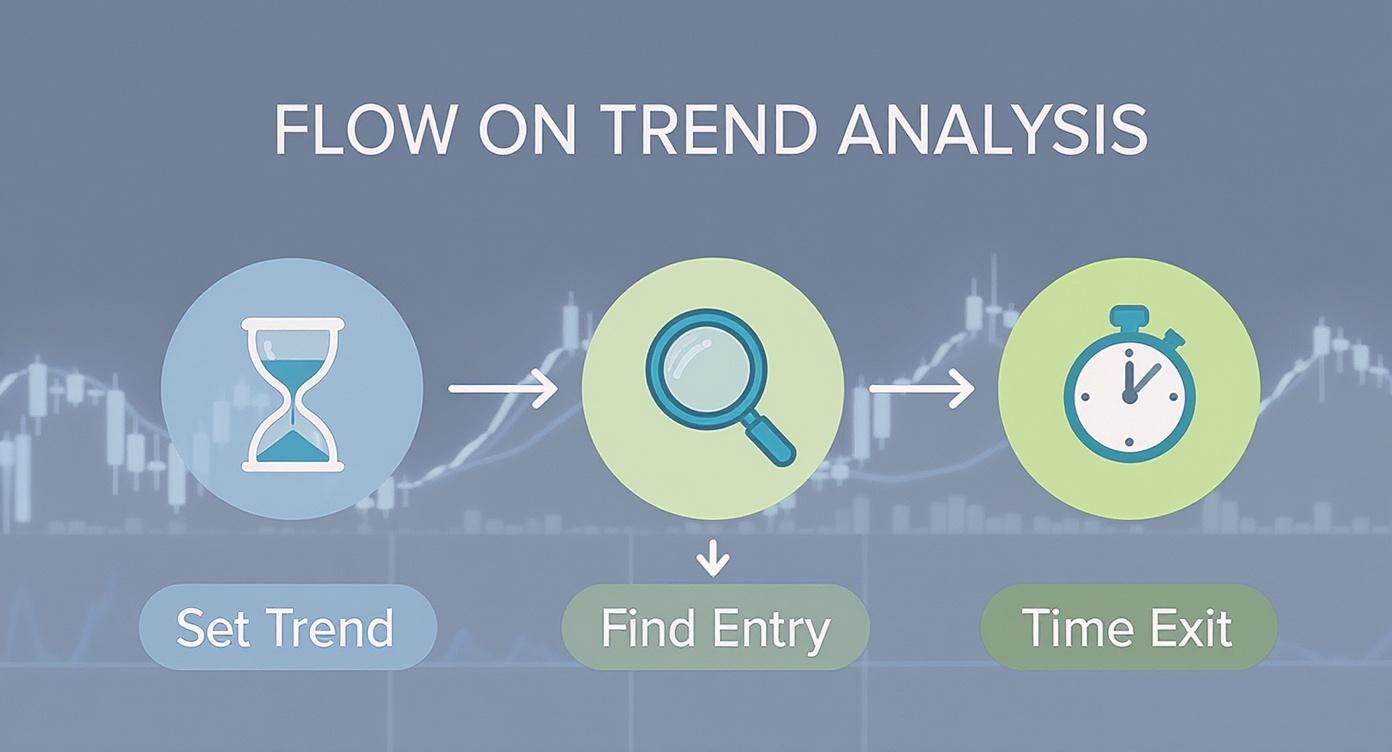
This workflow creates a disciplined, top-down approach that keeps traders from getting whipsawed by short-term market noise.
Here’s how you can put it into practice:
- Step 1 The Trendsetter (Hourly Chart): Start here to figure out the primary intraday trend. Is the market carving out higher highs and higher lows? This is your "macro" view for the day.
- Step 2 The Zone Finder (15-Minute Chart): Next, drop down to the 15-minute chart to spot ideal entry zones. You're looking for pullbacks to key support levels or moving averages that line up with the hourly trend.
- Step 3 The Trigger (5-Minute Chart): Finally, use the 5-minute chart to fine-tune your entry. Wait for a bullish candlestick pattern or a break of a micro-trendline to signal the perfect moment to execute the trade.
Practical Application of MTFA
Let's walk through an example. Say the hourly chart of a stock is showing a clear, powerful uptrend. Knowing this, your game plan for the day becomes simple: you will only look for long (buy) positions. This single rule instantly filters out half of all potential trades, many of which would have been low-probability traps against the trend.
Now, you switch to the 15-minute chart and see the price pulling back to a known support level. You’ve just identified your high-probability "strike zone." But instead of buying right away, you zoom in one last time to the 5-minute chart. The moment you see a bullish engulfing candle form right at that support level, you have your entry signal.
By combining these views, you confirm that the broad market momentum (hourly), the intermediate setup (15-minute), and the immediate price action (5-minute) are all in alignment. This synchronized signal dramatically increases your odds of success.
This method transforms trading from a guessing game into a structured, disciplined process. Most importantly, it prevents you from fighting the dominant market flow—one of the costliest mistakes any day trader can make. Instead of reacting to every little blip on a single chart, you're making calculated decisions based on a confluence of evidence. That’s the hallmark of a professional approach.
There's no magic formula for picking the "best" time frame in day trading. The right answer isn't buried in some trading guru's book; it comes from taking a hard, honest look in the mirror. Your own psychology, how much patience you have (or don't have), and your daily routine will determine whether you'll thrive in the blink-and-you-miss-it world of scalping or do better with a more measured, methodical approach.
Getting this alignment right is everything. If your strategy doesn't click with your personality, you're setting yourself up for failure.
This isn't just talk. Day trading is brutally competitive. A landmark study revealed that a staggering 64% of day traders lost money, with only 36% managing to turn a profit. That's a huge failure rate, and a big reason for it is a mismatch between the trader and their strategy. You can dive deeper into the data on day trading profitability if you want the full picture.
What Kind of Trader Are You?
Let's break down a few common trader archetypes and the time frames that usually suit them. See which one feels like it's describing you.
-
The Scalper: You live for the action. You want constant feedback, immediate results, and you get a buzz from high-pressure situations. Making dozens of split-second decisions is your idea of a good time. For you, the 1-minute chart is home base—it delivers the high-frequency action you're wired for.
-
The Momentum Trader: You still like a fast-paced environment, but you need a bit more context than a scalper. You're hunting for clear, developing moves and have just enough patience to wait for a high-quality setup to form instead of jumping at every little wiggle. The 5-minute chart strikes that perfect balance between speed and clarity.
The goal isn't to force yourself onto a time frame just because someone else is successful with it. The key is to find the one that feels natural and creates the least amount of mental stress. A mismatched time frame is a fast track to frustration and burnout.
- The Intraday Trend Follower: Patience is your virtue. You're more analytical and would much rather take one or two great trades than twenty mediocre ones. Your game is all about spotting the main trend for the day and riding that wave, tuning out all the minor chop along the way. The 15-minute chart is your sweet spot, giving you the cleaner signals and bigger-picture view you need to execute your plan.
Of course. Here is the rewritten section, crafted to sound like an experienced human expert, following all your specific instructions and style examples.
Quick Answers to Common Time Frame Questions
Even after you get the theory down, the real world of live trading throws curveballs. When the pressure is on, practical questions always pop up. Here are some straight-ahead answers to the questions I hear most often from traders trying to nail down their time frames.
Can I Day Trade on a Daily Chart?
In a word, no. Day trading, by its very definition, means you’re in and out of a trade within the same day. A daily chart, where one candle represents an entire trading session, just doesn't move fast enough for that.
Think of the daily chart as your high-level map for identifying the major, overarching trend. It’s perfect for swing trading or longer-term holds, but for executing day trades, you need to zoom way in to an intraday chart.
What's the Go-To Time Frame for Most Traders?
If you had to pick one, the 5-minute chart is probably the most popular kid in the lunchroom. It’s the sweet spot for a lot of active day traders.
It’s cleaner and less frantic than the 1-minute chart’s noise, but it still serves up plenty of solid trade setups throughout the day. Because so many eyes are on it, the key levels and patterns on the 5-minute chart can become a sort of self-fulfilling prophecy, making them more reliable.
Don't just pick a time frame because it's popular. The goal is to find the one that makes the market look clearest to you and fits your strategy. What works for the masses might just be noise for your specific approach.
How Do I Know When to Switch Time Frames?
Knowing when to shift gears is what separates the pros from the rookies. It's all about adapting to the market's current mood. Here are a few dead giveaways that it's time to switch:
- High Volatility: When the market opens or big news drops, things get wild. Drop down to a shorter time frame like the 1-minute or 5-minute chart to get a better handle on the rapid-fire price swings.
- Low Volatility: Stuck in the quiet, choppy midday session? Zoom out to a longer time frame, like the 15-minute. This helps you filter out the meaningless chop and sidestep those frustrating false breakouts.
- Feeling Overwhelmed: If you're feeling stressed, chasing trades, or just clicking buttons, it's a huge red flag. Immediately move up to a longer time frame. It forces you to slow down, breathe, and make more deliberate, patient decisions.
Getting a handle on your charts is a lot easier when you have the right setup. ChartsWatcher gives you a dynamic platform to build custom dashboards, letting you see multiple charts, alerts, and newsfeeds all at once. That kind of clarity is what you need to execute your strategy with confidence. See how you can build a trading desk that fits your style perfectly at https://chartswatcher.com.
