A Trader's Guide to the Double Top in Stocks
A double top is one of the most classic bearish reversal patterns you'll see on a chart. Spotting one early can give you a serious edge. At its core, it looks like the letter 'M' and signals that an uptrend is running out of steam. Think of it as a clear warning that sellers are about to wrestle control from the buyers, often triggering a sharp move down.
What a Double Top Pattern Signals to Traders
Imagine a stock is in a strong rally, like a determined climber scaling a mountain. The price hits a high point—the first peak—but the ascent stalls out. The buyers who were pushing the price up take a profit or simply pause for a breath, causing a pullback. This little retreat carves out a valley, or trough, and establishes a temporary support level.
But the bulls aren't ready to give up just yet. They regroup and make another push, driving the price back up toward that previous high. Here’s the catch: this second attempt often happens on less gas—what traders see as lower trading volume. Our climber is getting tired.
The second climb fails right around the same resistance level as the first peak. This failure is the moment of truth. It tells a story of complete buyer exhaustion. The market tried twice to smash through a price ceiling and got rejected both times.
The Psychology Behind the 'M' Shape
That ‘M’ shape isn't just a random squiggle; it’s a perfect visual of a power shift in market sentiment.
- Peak 1: The initial rally hits a wall of sellers, and optimism gets checked.
- Trough: Some profit-taking creates a dip, but enough buyers are still hopeful and step back in to try again.
- Peak 2: The second push fails, confirming just how strong that resistance level is. This is where conviction among the bulls evaporates. They realize the upward momentum is gone for good.
This repeated failure to make a new high is a massive red flag. It strongly suggests that the supply (selling pressure) is now overwhelming the demand (buying pressure).
The core message of a double top is simple but powerful: The bullish momentum is fading, and the path of least resistance has likely shifted downward.
Setting the Stage for a Reversal
This pattern is a crucial piece of market intelligence. It’s an early warning that the party might be over for the bulls. When you see the key ingredients come together—two clear peaks at a similar price, a trough in between, and revealing volume patterns—you're not just looking at a shape. You're watching the climax of a battle between buyers and sellers.
And when sellers win that battle at the same resistance zone twice, it’s often the prelude to a major trend change. This is the signal that tells savvy traders it's time to switch from a bullish to a bearish mindset.
To make it even clearer, let's break down the essential parts.
This table gives you a quick reference for the key anatomy of the pattern.
Double Top Pattern At-a-Glance
| Component | Description | What It Signals |
|---|---|---|
| First Peak | The highest point of the current uptrend. | Initial strength meets significant resistance. |
| Trough | The pullback after the first peak, forming a support level. | A temporary pause; buyers are still present but sellers are active. |
| Second Peak | A second rally attempt that fails at or near the first peak's level. | Buyer exhaustion and confirmation of strong resistance. |
| Neckline | A horizontal line drawn at the low of the trough. | The critical support level that, if broken, confirms the reversal. |
| Volume | Typically lower on the second peak than on the first. | Fading buying conviction and lack of momentum. |
| Confirmation | A decisive price break below the neckline. | The official signal that sellers have taken control and the reversal is on. |
Each component tells a part of the story. Once that neckline breaks, the story is complete, and the bearish trend is officially underway.
The Anatomy of a High-Probability Double Top
Spotting a high-probability double top in stocks is about more than just seeing an 'M' shape on your chart. To trade it well, you need to read each part of the pattern like a chapter in a story about a battle between buyers and sellers. Think of yourself as a detective at a crime scene—every detail is a clue about what just happened and what’s likely to happen next.
The entire formation rests on four key pillars: the uptrend that came before it, the first peak, the valley in the middle, and the second peak. Each one plays a critical role in signaling that the bulls are losing control. When they all line up just right, you get a powerful, actionable signal that a reversal is brewing.
The Foundation: The Preceding Uptrend
First things first: a double top can't just appear out of nowhere. It gets its power from reversing a strong, established uptrend. So, the absolute first thing you need to see is a clear run-up in price. This trend is proof that buyers have been in charge, pushing the stock higher and higher.
Without that prior move up, the 'M' shape is meaningless. Seeing two peaks in a choppy, sideways market doesn't carry the same weight because there's no real bullish momentum to reverse. The uptrend sets the stage for the drama that’s about to unfold.
This map here shows you exactly how a double top grows out of an uptrend, signals that the buyers are exhausted, and points to a potential reversal.
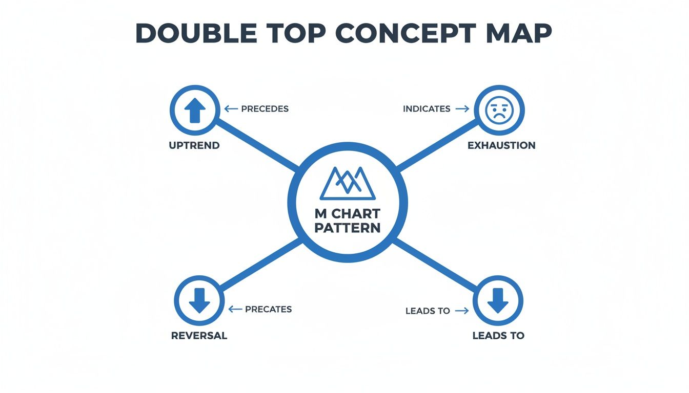
As you can see, the 'M' isn't just a shape; it's the story of a strong upward move running out of steam.
The First Signs of Trouble: The Two Peaks
The first peak is the high point of the uptrend. This is where the buying frenzy finally hits a wall of sellers, and the rally stalls out. It’s important because it establishes a resistance level—a ceiling the price will have to test again.
After hitting that peak, the price pulls back as some bulls decide to cash in their profits. This dip forms a trough, or valley. That little valley creates a temporary support level, which we call the neckline. Keep an eye on that neckline; it's the key to confirming the pattern later.
Now for the moment of truth: the second peak. The bulls gather their strength for one more push to break through the resistance set by the first peak. A true, high-probability double top happens when this second attempt fails right at or just below the level of the first peak. That failure is a massive red flag—it screams that the buyers are officially out of gas.
The inability of the second peak to forge a new high is the most critical clue. It tells you that despite a second effort, the bulls no longer have the strength to continue the uptrend.
The Hidden Clues: Volume and Timing
While the price action tells most of the story, two other clues add crucial confirmation: volume and timing. Paying attention to these details helps you separate the real patterns from the fakeouts.
Trading Volume: Volume is often the ultimate tell. In a textbook double top, the trading volume on the second peak should be noticeably lower than on the first. This drop-off in volume shows that the buyers are losing their enthusiasm and conviction. They're trying to push the price up, but there's just not enough fuel in the tank to make it stick.
Time Between Peaks: How long it takes for the pattern to form also matters.
- Short-Term (Days to Weeks): Patterns that build over a few weeks are pretty common and usually signal short- to medium-term reversals.
- Long-Term (Months): A double top that takes several months to develop is a much bigger deal. It can signal a major, long-lasting shift in the trend.
As a general rule, the more time between the peaks and the deeper the trough, the more significant the potential drop will be once the neckline finally breaks. By dissecting each part—the trend, the peaks, the volume, and the timing—you can build a much more reliable picture of a pending reversal.
How to Confirm the Pattern Before You Trade
Spotting a potential double top is one thing. Knowing when it’s a genuine, tradable signal is where the real skill comes in. Jumping the gun on a pattern that hasn’t fully formed is a classic trap that leads to nothing but frustrating, costly false starts. The key is patience—waiting for the market to give you the all-clear.
Think of the pattern’s neckline as the ultimate line in the sand. This support level, formed at the bottom of the trough between the two peaks, is the bulls' last stand. As long as the price stays above it, the uptrend is still technically alive, even if it's looking weak. The real signal—the one that tells you the sellers have officially won the battle—is a decisive break below this critical support.
That breakdown is the single most important confirmation you can get. It's the market's way of shouting that the old floor has just become the new ceiling.

The Neckline Break: The Ultimate Go Signal
Now, a true confirmation isn't just a tiny dip below the neckline that immediately bounces back. You need to see conviction from the sellers. An ideal breakout candle is long, closes well below the neckline, and—this is crucial—is backed by a noticeable surge in selling volume. That volume spike tells you that a significant number of market participants agree with the new bearish direction.
Without that pop in volume, a neckline break is far less trustworthy. It might just be a shallow dip before buyers step back in. High volume, on the other hand, points to a powerful and genuine shift in market sentiment. This pattern has a solid track record, with historical data suggesting double tops have a success rate of around 70-75% in forecasting a significant move once confirmed.
Adding Layers of Confidence with Indicators
While the neckline break is your primary confirmation, sharp traders always hunt for extra clues to build a stronger case. Using a couple of technical indicators can give you a valuable second opinion, helping you filter out the weaker setups and sidestep those nasty fakeouts.
One of the most powerful secondary signals is bearish divergence. This happens when the stock’s price makes a higher high (or a similar high) on the second peak, but a momentum indicator like the Relative Strength Index (RSI) makes a lower high.
Bearish Divergence Explained: Think of a car trying to accelerate up a hill. The speedometer (the price) shows it's hitting the same top speed as before, but the engine (the RSI) is sputtering and losing power. This mismatch is a huge red flag that the upward momentum is failing internally, long before the car actually starts rolling backward.
This divergence is an early warning that the underlying buying pressure is drying up, even if the price chart hasn't fully rolled over yet. It’s a classic sign that the trend is exhausted and ripe for a reversal.
Other Confirmation Tools to Consider
Beyond divergence, a few other tools can add more weight to your analysis and boost your confidence before you pull the trigger on a trade.
- Moving Averages: Look for the price to crack below a key moving average, like the 50-day, around the same time it breaks the neckline. This acts as another layer of proof that the short- to medium-term trend is turning bearish.
- Trendlines: If the stock was respecting a clear upward-sloping trendline during its rally, a break of that trendline in addition to the neckline break provides powerful, dual confirmation that the reversal is the real deal.
By waiting for that definitive neckline break and cross-referencing it with clues from volume and indicators, you transform the double top from a simple shape on a chart into a high-probability trading setup. For more advanced strategies, check out our trader's guide to double top and double bottom patterns.
Executing Your Trade Plan with Precision
Alright, you've spotted a double top, the neckline is broken, and the pattern is confirmed. This is where the real work begins. Moving from analysis to execution is the moment of truth for any trader, and it's where a clear, disciplined plan makes all the difference.
Identifying a promising double top in stocks is just half the battle. How you actually enter, manage risk, and take profits will ultimately determine whether you win or lose. Without a precise plan, even the most picture-perfect pattern can fall apart. Let's break down how to turn your analysis into deliberate, calculated action.

Choosing Your Entry Point
Once the price slices through the neckline, you’re faced with two main choices for getting into a short position. Your decision really comes down to your personal risk tolerance and trading style. Each approach offers a classic trade-off: get in early with more risk, or wait for confirmation and risk missing the move.
1. The Aggressive Entry: Selling the Breakdown
This is the straightforward approach: you hit the sell button as soon as the price closes decisively below the neckline. Ideally, you want to see this happen on a big spike in selling volume, which tells you other traders are seeing the same thing you are. The huge advantage here is that you're guaranteed to be in the trade if the breakdown is powerful and immediate.
The downside? You’re more exposed to a "fakeout." This is when the price dips below the neckline just long enough to trap aggressive sellers, only to snap right back above it and stop you out. It’s a strategy that prioritizes speed over certainty.
2. The Conservative Entry: Selling the Retest
A more patient trader might wait for the breakdown and then watch for the price to rally back up to the neckline. This move is called a retest, and it’s based on a core principle of technical analysis: what was once support now becomes resistance.
By waiting for a retest, you're looking for proof that sellers are now defending that neckline, treating it as a new ceiling.
This often gives you a much better risk/reward ratio since your entry is closer to your stop-loss. The catch, of course, is that a powerful breakdown might never look back, and you could be left on the sidelines watching the trade run without you.
To make it clearer, here’s a look at how the two strategies stack up.
Double Top Trading Strategy Comparison
Every entry tactic in trading involves a compromise. The aggressive approach prioritizes participation at the cost of higher risk, while the conservative approach prioritizes a better risk/reward setup at the risk of missing the trade entirely. Understanding this trade-off is key.
| Strategy | Entry Point | Pros | Cons |
|---|---|---|---|
| Aggressive | Immediately on a high-volume break of the neckline. | Ensures you catch the move if it's powerful and immediate. | Higher risk of being caught in a false breakout or "whipsaw." |
| Conservative | On a pullback to the neckline after the initial break. | Provides a better entry price and confirms the neckline is now resistance. | Risk of the price dropping without a retest, causing you to miss the trade. |
Ultimately, neither method is universally "better." The right choice depends on market conditions, the specific stock's volatility, and what you're most comfortable with as a trader.
Setting Your Risk Controls and Profit Targets
Once you’re in the trade, your focus immediately shifts to managing risk and planning your exit. A proper stop-loss is your safety net, and a clear price target is how you get paid.
Where to Place Your Stop-Loss
This is your non-negotiable exit if the trade goes sour. For a double top, the most logical spot for a stop-loss is just above the high of the second peak. Why there? Because if the price manages to climb all the way back up and make a new high, the entire bearish structure of the pattern is invalidated. Your trade idea was simply wrong.
Placing your stop here gives the trade room to breathe and avoids getting shaken out by normal market noise, while still defining the exact point where you need to cut your losses.
Calculating the Minimum Profit Target
One of the best things about the double top is that it comes with a built-in method for estimating a profit target. This isn't guesswork; it's a data-driven objective for the trade.
-
Measure the Height: First, calculate the price distance from the highest peak of the pattern down to the neckline. For example, if the peak hits $110 and the neckline is at $100, the pattern's height is $10.
-
Project the Target: Next, subtract that height from the neckline's breakout point. Using our example, you'd project a $10 drop from the $100 neckline, which gives you a minimum price target of $90.
This "measured move" technique gives you a conservative first target. The price can definitely fall much further, but taking some or all of your profits at this level is a disciplined way to lock in gains. By combining a strategic entry, a logical stop, and a calculated target, you can trade the double top pattern with confidence and precision.
Finding Double Top Patterns with ChartsWatcher
Manually hunting for a perfect double top across hundreds of stock charts is like looking for a needle in a haystack. It’s tedious, you get eye strain, and by the time you spot a half-decent setup, the prime entry window has probably slammed shut. This is where you flip the script from being reactive to proactive.
Using a powerful tool like ChartsWatcher lets you build a custom scanner that does all the heavy lifting. Instead of being glued to your screen, you teach the software exactly what to look for. It then sifts through the entire market and serves up only the highest-probability setups, freeing you up to focus on the important stuff: analysis and execution.
Building Your Custom Double Top Scanner
The whole idea is to craft a filter that zeroes in on stocks showing the tell-tale signs of a double top in stocks. Think of it as giving your own personal market watchtower a very specific set of instructions. A well-built scanner will spot these patterns long before they become obvious to the rest of the market.
Here’s a practical, real-world example of how you might set up your filters in ChartsWatcher:
-
Uptrend Filter: First things first, you only want to look at stocks that are already in a solid uptrend. A simple way to do this is to set a filter for stocks trading above their 50-day and 200-day moving averages. This establishes the essential context for a true reversal pattern.
-
Peak Proximity Filter: Next, you tell the scanner to find stocks that recently hit a 52-week high, pulled back, and are now creeping back up toward that same peak. You could create a rule like: "Price is within 2% of its 52-week high for the second time in the last 3 months." This is the core of the double top anatomy.
-
Volume Filter: To add another layer of conviction, you'll want to screen for that classic sign of buyer exhaustion—fading volume. A filter could look for stocks where the average volume over the past 10 days is noticeably lower than the average volume was 3 months ago.
This screenshot gives you a peek at the ChartsWatcher interface, where you can stack multiple conditions to build out your custom scan.
Each one of these filters works in tandem, whittling down thousands of stocks into a short, manageable list of actionable candidates.
Setting Up Real-Time Neckline Break Alerts
Finding a pattern as it’s forming is one thing, but the real magic happens when you get notified the instant it confirms. An alert system is what turns your scanner into a powerful, actionable trading tool. Once your scan identifies potential double top candidates, you can set a specific price alert for each one.
The most critical alert is a simple price-level notification set right at the neckline. The moment a stock slices through that support level, you get an instant ping on your device, empowering you to act immediately.
This simple step completely changes your workflow. No more being chained to your desk, anxiously watching charts. You can go about your day, confident that you won’t miss a critical breakdown. This kind of automated approach ensures you're always ready to execute your plan with precision and discipline.
If you're ready to start building your own custom screens, you can learn more about the ChartsWatcher stock scanner and all its features.
Theory is great, but nothing beats seeing a pattern unfold in the wild. Watching a double top in stocks play out on a live chart is where the real learning happens—it’s how you truly grasp the tug-of-war between buyers and sellers. When you dissect historical examples, you see exactly how the setup, the formation, and the eventual breakdown occur in a real market environment.
This is how you bridge the gap between textbook diagrams and actual trading. It builds the screen-time confidence you need to spot these powerful reversals and, more importantly, act on them. Let's walk through a classic case study to see this pattern in action from start to finish.
A Textbook Case with Amazon (AMZN) in 2018
Don't assume these classic patterns only appear on small-cap charts. Even mega-cap giants like Amazon can carve out a perfect double top, and the one it formed in 2018 was a beaut. After a monster uptrend, the stock's momentum finally started to sputter, tracing out that unmistakable "M" formation that foreshadowed a steep decline.
The setup was as clean as they come. In late 2018, Amazon (AMZN) hammered against the $2,050 level twice in just over a month. The dip between those two peaks found a floor around $1,950, etching out the all-important neckline. The failure at that second peak was the first big warning sign, but the real confirmation was just around the corner.
A hard break below the $1,950 neckline on a surge of selling volume was the trigger. The stock immediately plunged 8% to $1,880 in a matter of days. That was just the opening act. Over the next few months, AMZN would go on to shed over 30% from its double-top highs, proving just how potent this pattern can be. You can learn more about the reliability of this pattern in large-cap stocks.
Deconstructing the AMZN Pattern
Let's pull apart this trade to see how every piece of the puzzle fell into place, giving savvy traders plenty of signals along the way.
- The Uptrend: A massive, multi-month run-up set the stage. Without a strong prior trend, a reversal pattern has no meaning.
- Peak 1 (September): AMZN topped out around $2,050. Sellers showed up for the first time in a while, pushing the price back down.
- The Trough: The pullback found temporary support near $1,950, creating the neckline that would later become the line in the sand.
- Peak 2 (October): Buyers tried to rally back to new highs but were stuffed at the exact same $2,050 resistance. Crucially, the volume on this second push was noticeably lighter than on the first, hinting that the bulls were running out of steam.
- The Neckline Break: The price sliced through $1,950 with authority, and the move was backed by a huge spike in selling volume. This was the definitive "get out" or "get short" signal.
- The Follow-Through: The initial breakdown kicked off a much larger move, with the stock eventually bottoming out below $1,400 months later.
This AMZN example is a powerful reminder: a double top isn't just a shape on a chart. It’s the visual story of a major power shift from buyers to sellers.
By studying real charts like this one, you train your eyes to spot the subtle clues—like that weaker volume on the second peak—that separate a high-probability setup from random market noise. This is the kind of practice that builds the instinct and discipline you need to trade patterns successfully.
A Few Common Questions About the Double Top
Even after you've got the basics down, a few questions always pop up when you're staring at a live chart. Let's tackle some of the most common ones so you can feel confident and act decisively when you spot a potential setup.
Getting these details straight can be the difference between a clean trade and a costly mistake.
What's the Difference Between a Double Top and a Double Bottom?
Think of them as mirror opposites, each telling a completely different story about market sentiment. They're easy to tell apart once you see them.
- A Double Top is your classic bearish reversal pattern. It looks like a capital 'M' and warns that an uptrend might be running out of gas after buyers get rejected twice at the same price ceiling.
- A Double Bottom, on the other hand, is a bullish reversal pattern. It forms a 'W' shape and suggests a downtrend could be over, as sellers tried—and failed—twice to push the price through a key support floor.
Naturally, you trade them in opposite ways. You’re looking to sell or short a confirmed double top, while you’d be looking to buy a confirmed double bottom.
Just How Reliable Is the Double Top Pattern?
No chart pattern is a crystal ball, but the double top is considered one of the more dependable reversal signals in a technical trader's toolkit. Historical analysis often puts its success rate somewhere in the 70-75% range for predicting a meaningful move down.
But here’s the key: its reliability skyrockets when you have confluence. A double top confirmed by a high-volume break of the neckline, a little bearish divergence on your RSI, and a weak broader market is a world away from one that shows up in a vacuum. Context is everything.
What Should I Do If a Double Top Pattern Fails?
It's going to happen. Pattern failures are just part of the game, and this is where solid risk management saves your account. A failure is when the price breaks the neckline, suckering in sellers, only to snap back and trade above it. Or, even more decisively, it just blasts right through the resistance of the two peaks.
This is exactly why your stop-loss is non-negotiable.
If you've placed your stop correctly—usually just a bit above the high of that second peak—it will get you out of the trade with a small, manageable loss. Once that stop is hit, the bearish idea is dead. The best thing you can do is accept it, take the small hit, and start looking for the next opportunity. No second-guessing.
Stop hunting for patterns manually and let ChartsWatcher do the heavy lifting. You can build custom scans to find high-probability double tops and get real-time alerts the second a neckline breaks. Take control of your trading workflow and visit ChartsWatcher to get started.
