A Trader's Guide to Pattern Technical Analysis
Ever stared at a stock chart, watching the price zig and zag, and wondered if there's a hidden language in all that chaos? You're not the only one. The core idea behind pattern technical analysis is that these movements aren't just random noise. They're visual stories of a timeless battle between buyers and sellers, driven by raw fear and greed.
Why Pattern Technical Analysis Still Matters
Think of patterns as the market's body language. Just like a person's folded arms might signal defensiveness, the shapes that form on a chart can give you a read on the market's underlying sentiment. By learning to interpret this language, traders try to spot shifts in supply and demand before they hit the headlines.

The Psychology Behind the Shapes
At its heart, pattern analysis is really just a study of crowd psychology on a massive scale. Human nature, especially when money is on the line, is surprisingly predictable. We tend to react in similar ways over and over, and these reactions create the geometric formations we see on charts.
A few key human behaviors are always at play:
- Herd Mentality: People love to follow the crowd. This collective momentum pushes prices further in an established direction, creating the trends we see.
- Fear of Missing Out (FOMO): We’ve all felt it. This emotion is responsible for those explosive, parabolic price spikes that look great on the way up but are often completely unsustainable, leading to sharp reversal patterns.
- Indecision and Consolidation: When buyers and sellers are locked in a stalemate, neither side able to gain control, the price action coils tighter and tighter. This creates patterns like triangles and rectangles right before the market makes its next big move.
This is why pattern analysis has stuck around for centuries. Its principles were being used in 17th-century Amsterdam and 18th-century Japanese rice trading, proving that markets have always been driven by repetitive human emotions. It was solidified in the 1930s when Ralph Elliott manually analyzed 75 years of market data to identify these recurring waves. If you're interested, you can learn more about the deep history of technical analysis and how it all came together.
Gaining a Statistical Edge
Let's be perfectly clear: pattern technical analysis is not a crystal ball. No pattern, no matter how perfect it looks, can guarantee a specific outcome. Don't fall for that trap.
Instead, think of it as a tool for stacking the odds in your favor. It gives you a framework for identifying high-probability scenarios where the potential reward justifies the risk you're taking.
The goal isn't to be right 100% of the time. The goal is to use patterns to find setups where you have a statistical advantage over the long run.
The process is methodical. You identify a familiar pattern, wait patiently for a key price level to break, and then manage the trade with a predefined stop-loss and profit target. By applying these rules consistently, you shift from pure guesswork to making calculated decisions grounded in historical precedent. In this guide, we'll show you exactly how to read the story the price is telling.
Continuation vs Reversal Patterns Explained
In the world of chart patterns, not all shapes tell the same story. Think of them as traffic signals for your trades. Some give you a green light to expect more of the same, while others flash a bright yellow warning that the trend is about to make a U-turn.
This is the most fundamental distinction in pattern analysis, splitting every formation into one of two families: continuation patterns and reversal patterns.

Getting this right is the first—and most critical—step. It frames your entire trade idea, telling you whether you should be preparing to ride the existing momentum or brace for a major shift in direction. Misjudge this, and you could end up fighting a powerful trend or getting blindsided by a sudden reversal.
Continuation Patterns: The Market Catching Its Breath
Continuation patterns are really just pauses in an established trend.
Imagine a marathon runner who slows down to a jog for a minute to grab some water. They haven't quit the race; they're just consolidating their energy for the next leg. That’s exactly what the market is doing during these formations. The trend is simply catching its breath.
These patterns appear when buyers and sellers find a temporary, short-term balance. They signal that despite the lull in action, the original momentum is still very much alive and will likely resume.
Common examples include:
- Flags and Pennants: These are short, compact patterns that pop up after a sharp, explosive price move. They look like little flags or pennants on a flagpole, representing a brief consolidation before the trend blasts off again.
- Ascending and Descending Triangles: Here, the price coils up like a spring. One side repeatedly tests a flat support or resistance level, while the other side forms a rising or falling trendline, building up pressure for a breakout in the direction of the dominant trend.
- Rectangles (Trading Ranges): This is a classic sideways grind. The price bounces between two parallel levels of support and resistance, showing a period of indecision that usually resolves by continuing the original trend.
Reversal Patterns: Signaling a Change in Direction
If continuation patterns are a quick jog, reversal patterns are a full stop, a screech of tires, and a hard U-turn.
These formations signal that a trend is running out of gas. The dominant force—whether it’s buyers in an uptrend or sellers in a downtrend—is getting exhausted, and the other side is starting to smell blood in the water.
Because it takes a lot more force to reverse the market's direction than to just continue it, these patterns are typically larger and take longer to form. Chart patterns, both for continuation and reversal, are foundational to technical analysis because they visually represent the collective psychology of the market. You can discover a comprehensive guide to chart patterns that digs deeper into these market dynamics.
Reversal patterns represent a significant power shift in the market. They don't just pause the trend; they actively work to end it and send the price moving in the opposite direction.
Key examples of reversal patterns are:
- Head and Shoulders (and Inverse Head and Shoulders): This is one of the most reliable and well-known reversal patterns. It consists of three peaks, with the middle one (the "head") being the highest. It’s a clear sign that an uptrend is losing its structural integrity and is poised to roll over.
- Double Tops and Double Bottoms: These patterns look like the letter "M" (double top) or "W" (double bottom). They tell a simple story: the price tried twice to break through a major support or resistance level and failed both times, strongly suggesting the trend is about to reverse.
To make this distinction crystal clear, here’s a quick-reference table that breaks down the core differences between these two pattern families.
Continuation vs Reversal Patterns at a Glance
| Characteristic | Continuation Patterns | Reversal Patterns |
|---|---|---|
| What It Signals | The current trend is likely to resume after a brief pause. | The current trend is ending, and a new trend in the opposite direction is about to begin. |
| Market Psychology | A temporary stalemate or profit-taking within a strong trend. The dominant side is just resting. | A significant power struggle where the previously weaker side starts to win control. Trend exhaustion. |
| Typical Duration | Shorter-term. They form relatively quickly. | Longer-term. They take more time and volume to form as it requires more effort to reverse a trend. |
| Common Examples (Uptrend) | Bull Flag, Bull Pennant, Ascending Triangle, Bullish Rectangle. | Head and Shoulders, Double Top, Rising Wedge. |
| Common Examples (Downtrend) | Bear Flag, Bear Pennant, Descending Triangle, Bearish Rectangle. | Inverse Head and Shoulders, Double Bottom, Falling Wedge. |
Ultimately, identifying whether a pattern is signaling a pause or a complete U-turn is the first layer of analysis. Once you’ve classified the pattern, you can then move on to the specifics of how to trade it.
Getting to Know the Essential Chart Patterns
Now that you understand the difference between a trend taking a breather and making a full-blown U-turn, it's time to get familiar with the specific shapes that signal these moves. Think of these classic formations as the architecture of market psychology; each one tells a visual story about the ongoing tug-of-war between buyers and sellers.
Let's break down four of the most reliable and common patterns you'll see. We'll dig into how to spot them and, more importantly, what they're telling us about the market's mood.
Head and Shoulders: The Classic Reversal
The Head and Shoulders is probably the most famous reversal pattern out there, often signaling that a strong uptrend is running out of steam. The pattern literally looks like a weakening market—three attempts by buyers to push prices higher, with each push telling a crucial part of the story.
This formation is built from three peaks that all rest on a common support level we call the neckline.
- Left Shoulder: The first peak forms during a healthy uptrend, followed by a small pullback. At this point, the bulls are still clearly in charge.
- Head: Buyers give it one last, powerful shove to a new high. But the move can't hold, and the price falls back more significantly this time, often right back to where the first pullback ended. This is the highest point of the pattern and helps form the neckline.
- Right Shoulder: The bulls try one more time, but the rally is weak and fails to even reach the height of the head. This failure is the key giveaway—the buyers have lost their energy, and sellers are starting to smell blood in the water.
The pattern is officially in play once the price breaks below the neckline, especially if it happens with a spike in volume. That break is the market's way of saying the buyers have lost control and the sellers are now driving.
Double Top and Double Bottom: Hitting a Wall
Double Tops and Double Bottoms are simpler but just as potent. They paint a very clear picture of a trend trying—and failing—to break through a critical price level not once, but twice.
A Double Top looks like the letter "M" and shows up at the end of an uptrend. It's a story of failure: buyers push the price to a high, hit a wall of sellers, and retreat. After a brief dip, they try again to punch through that same resistance level. When they fail a second time, it’s a powerful sign that the sellers at that price are just too strong. Buyer conviction is shattered, and a reversal is often next.
On the flip side, a Double Bottom looks like a "W" and appears after a downtrend. It tells you that a key support level has held firm against two separate waves of selling. This suggests the sellers are exhausted, and buyers are finally stepping in with enough force to defend that price.
The message here is simple but profound: if the market fails twice to break a key level, the odds shift dramatically in favor of a move in the opposite direction. That second failure is the confirmation you're looking for.
Bull Flag: The Powerful Continuation
While reversal patterns signal a big change in direction, continuation patterns are all about the trend taking a quick pause before its next leg up. The Bull Flag is a textbook example you'll see in strong uptrends.
First, you get a sharp, almost vertical price surge—this is the flagpole. After that explosive move, the price settles into a tight, downward-drifting channel that looks like a flag. This isn't weakness; it's the market catching its breath.
Inside that flag, the early bulls are taking some profits off the table while new buyers are lining up, waiting for a chance to get in. The pattern is confirmed when the price breaks out above the flag's upper trendline, signaling that the original uptrend is ready to resume with another burst of momentum. To learn more, check out our guide on essential day trading chart patterns every trader should know.
Ascending Triangle: Building Up Bullish Pressure
The Ascending Triangle is another fantastic continuation pattern that shows bullish pressure coiling up like a spring. It's formed by two clear boundaries: a flat, horizontal resistance level on top and a rising trendline of higher lows underneath.
The story this pattern tells is one of buyers becoming more and more aggressive:
- Sellers are holding the line at a specific price, creating that flat ceiling of resistance.
- But with each little pullback, buyers are stepping in sooner and at higher prices, creating the rising floor of support.
This action squeezes the price into an increasingly tight corner. It’s like shaking a soda can—the pressure just keeps building until something has to give. The breakout usually happens to the upside, right through that flat resistance, as the buyers finally overwhelm the sellers. This pattern is a trader favorite because it gives you a crystal-clear level to watch for the breakout.
Executing Trades Based on Chart Patterns
Spotting a classic pattern on a chart is one of those "aha!" moments for a trader. But this is where the real work begins. Identifying a formation is only half the battle; knowing exactly how to trade it is what separates consistent pros from hopeful chart-gazers. This is where you build the bridge from analysis to action.
A well-formed pattern is like a roadmap. It gives you logical, defensible points for your entry, your protective stop-loss, and your profit target. Without a clear plan for all three, even the most picture-perfect setup can quickly turn into a costly mistake.
This simple flow shows the core steps of turning a pattern into a trade, moving from the initial find to pulling the trigger.
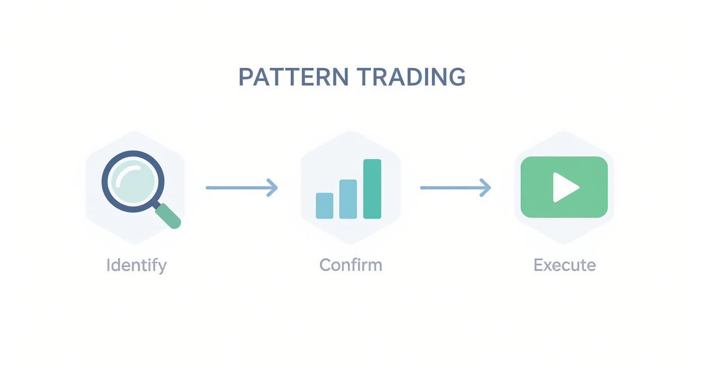
The key here is that pattern trading isn’t just one decision—it’s a structured process. Confirmation is that critical link between seeing a setup and actually putting capital at risk.
Pinpointing Your Entry Trigger
The most common entry signal in pattern technical analysis is the breakout. This is that decisive moment when the price pushes past a key boundary defined by the pattern, like the neckline of a Head and Shoulders or the top trendline of a Bull Flag.
A breakout is the market's way of telling you the psychological battle has been won and a new move is likely starting. For a Bull Flag, you'd typically place a buy order just above the flag's upper resistance line. This way, you only get into the trade after the market proves the pattern has legs by breaking out.
Patience here is crucial. Jumping the gun and entering before a confirmed breakout is a classic rookie error. It’s the easiest way to get caught in a "fakeout," where the price teases a move only to snap back in the opposite direction.
The Role of Volume as Your Ultimate Confirmation
So, how do you tell a real breakout from a fake one? Your most reliable ally is trading volume.
Think of it this way: price is the car, and volume is the gas pedal. A price move without volume is like a car rolling downhill—it has no real power behind it and could stop or reverse at any moment.
A breakout that happens on a big spike in volume—ideally 50% or more above its recent average—is a massive sign of conviction. It tells you that big money, the institutional players, are jumping in. That gives the move a much higher chance of follow-through.
On the flip side, a breakout on weak or declining volume is a major red flag. It suggests there's no real interest behind the move, making it highly likely to fail. Always glance at the volume bars at the bottom of your chart; they add invaluable context to what the price is doing.
Setting Your Protective Stop Loss
No pattern is a sure thing. Even the A+ setups can, and do, fail. That's why your stop-loss is non-negotiable. It's your safety net, the pre-planned exit point that gets you out of a losing trade before it does serious damage to your account.
The great thing about chart patterns is that they often give you obvious, logical places to hide your stop.
- For Long Trades (Bullish Patterns): Place your stop just below a key support level within the pattern. In an Ascending Triangle, that would be just under the rising trendline. For a Double Bottom, it would be a tick below the lowest low of the entire "W" formation.
- For Short Trades (Bearish Patterns): Tuck your stop just above a key resistance level. With a Head and Shoulders top, this would be right above the right shoulder or, after a breakdown, just above the neckline which now acts as resistance.
Setting a smart stop-loss is an art in itself. To dig deeper, check out our complete guide on how to set stop losses for a more detailed look at different techniques.
Calculating Your Profit Target with Measured Moves
Alright, you're in the trade and your stop is in place. The last piece of the puzzle is knowing where to take profits. While you could use a simple risk-to-reward ratio (like aiming for a 2:1 winner), chart patterns offer a more technical method called the measured move.
The concept is surprisingly simple: the height of the pattern itself can be used to project a logical price target.
- Measure the Height: Calculate the distance in price from the highest point to the lowest point of the pattern. For a Head and Shoulders, that’s the distance from the top of the head down to the neckline. For a rectangle, it's simply the height of the range.
- Project from the Breakout: Take that measured height and add it to the breakout point for bullish patterns (or subtract it from the breakdown point for bearish patterns).
This technique gives you an objective, data-driven target based on the volatility contained within the pattern itself. It takes the emotion out of deciding when to exit, which helps you avoid cashing out too early or getting greedy and watching your profits evaporate. It completes your trading plan, giving you a clear path from start to finish.
Avoiding Common Pitfalls in Pattern Trading
Getting good at chart patterns is about more than just memorizing a few shapes. It’s a game of probabilities, and it demands a heavy dose of realism and discipline. The market doesn’t deal in certainties.
Even the most picture-perfect pattern can—and will—fail sometimes. That’s not a sign that patterns don't work. It’s just the market giving you new information. The real trick is to sidestep the mental traps that can turn a statistical edge into a money pit. A pro uses patterns as one tool in a bigger system, never as a crystal ball.
The Dangers of Subjectivity and Confirmation Bias
One of the slipperiest parts of pattern trading is its subjectivity. You can lay out the rules for a Head and Shoulders, but two traders can look at the same chart and see two different things. That flexibility is a double-edged sword because it opens the door to a classic trading sin: confirmation bias.
Confirmation bias is our tendency to see what we want to see. If you’re already bullish on a stock, you’ll start spotting Bull Flags everywhere while conveniently ignoring anything that looks bearish. This leads traders to force trades that aren't really there, trying to cram messy price action into a neat textbook example.
The market couldn't care less about what you think should happen. A disciplined trader waits for the market to prove the pattern with a clear breakout, rather than trying to will the pattern into existence.
This is exactly why you need strict, non-negotiable rules for what makes a pattern valid. Your rules act as a filter against your own emotions. For example, a simple rule like, "I won't enter a trade unless the breakout happens on volume at least 50% above its 20-day average," turns a hunch into a measurable event.
Ignoring the Broader Market Context
Another rookie mistake is getting tunnel vision and analyzing a pattern in total isolation. A beautiful Ascending Triangle on a 15-minute chart doesn’t mean much if the entire market is tanking on major economic news. No pattern exists in a vacuum.
To avoid this, always think in layers:
- Zoom Out: Does the pattern on your short-term chart agree with the bigger trend? A Bull Flag on a 5-minute chart has a much better shot if the daily and weekly charts are already in a strong uptrend.
- Check the Volume: We’ve said it before, but volume is the market's truth serum. A breakout on thin, pathetic volume is one of the fastest ways to get caught in a fakeout.
- Know What's Coming: Is there an earnings report or a Fed announcement on the calendar? High-impact news can shred even the most reliable patterns and create wild, unpredictable swings.
The Myth of 100% Certainty
The single most destructive pitfall is the search for a perfect, can't-lose trading system. It doesn’t exist. Even patterns with a solid track record are all about probabilities.
Research shows that rules based on patterns like bull flags can definitely work, but the data is messy and full of overlapping signals that make it tricky. You can read the full research about pattern searching complexities to get a deeper sense of the challenge.
The professional mindset accepts that taking losses is just part of the cost of doing business. The goal isn’t to dodge every loss; it’s to make sure your winners are bigger than your losers. You get there with disciplined risk management—setting stop-losses, managing your position size, and sticking to your plan.
Once you stop chasing certainty, you can finally start focusing on what actually matters: consistency.
Common Questions About Pattern Technical Analysis
As you start working with patterns, a bunch of questions are bound to pop up. That's totally normal. This is where theory crashes into the reality of the live market, and bridging that gap means getting clear on a few key ideas. Think of this as the practical FAQ every pattern trader asks at some point.
Let's tackle these head-on. Answering them will help lock in the core concepts and give you a much more solid, confident foundation for your trading.
What Is the Most Reliable Chart Pattern for Beginners?
Look, no pattern is ever going to have a 100% success rate. If anyone tells you otherwise, run. For beginners, the best place to start is with patterns that have super clear, well-defined rules. This takes a lot of the initial guesswork out of the equation and helps you build confidence through simple repetition.
With that in mind, two of the best patterns to learn first are:
- The Head and Shoulders (for reversals): The structure is really distinct, and the neckline gives you a crystal-clear breakout level. It's perfect for defining your entry and where to place your stop-loss. Plus, the story it tells—a market losing steam—is pretty intuitive.
- Flags and Triangles (for continuations): You'll see these everywhere. They have obvious trendlines that box in the price, making the consolidation easy to spot. The breakout is often sharp and fast, which gives you immediate feedback on whether the trade is working.
The goal here is to master patterns with obvious trigger points. It simplifies your decision-making and lets you focus on solid execution instead of getting lost in subjective analysis.
How Important Is Volume in Confirming a Breakout?
It's not just important; many pros consider it an essential, non-negotiable confirmation signal.
Think of it this way: Price tells you what is happening, but volume tells you the amount of conviction behind the move. A breakout that happens without a significant spike in volume is a massive red flag.
A breakout on high volume—ideally 50% or more above average—screams that the big institutional players are getting involved. This "big money" is the fuel needed to push the trend forward. On the flip side, a breakout on weak, anemic volume often means there's no real interest. This makes it incredibly vulnerable to failing, a trap commonly known as a "fakeout."
Can I Use Pattern Technical Analysis on Any Timeframe?
Yes, absolutely. One of the coolest things about chart patterns is that they are fractal. This just means the same geometric shapes—your Head and Shoulders, Triangles, and Flags—show up on every single timeframe. It doesn't matter if you're a scalper staring at a 1-minute chart or a long-term investor looking at a weekly chart.
The rules for identifying and trading a pattern are the same across all timeframes. What changes, however, is the significance of that pattern.
A Double Bottom forming on a daily chart is a much bigger deal than one that forms on a 5-minute chart. The pattern on the higher timeframe is going to lead to a much larger and longer-lasting move. So, you have to adjust your expectations for the trade's duration and profit target based on the timeframe you're trading.
Are There Automated Tools to Find Chart Patterns?
Yes, and they’ve become a game-changer for the modern trader. Most good trading platforms and specialized software now offer automated chart pattern recognition scanners. These algorithms churn through thousands of stocks in real-time, flagging potential setups as they form or complete.
Using a scanner can save you a ridiculous amount of time and help you find opportunities across the market you'd never spot on your own. But here's the catch: they're best used as an idea-generation tool, not a replacement for your own brain. It's still on you to manually verify the pattern, check for confirming signals like volume, and make sure the setup aligns with your trading plan before you risk a single dollar.
Stop chasing patterns manually and let technology do the heavy lifting. ChartsWatcher is a powerful stock scanner designed to find high-probability setups across the market in real-time. Customize your screens, backtest your strategies, and get the edge you need. Discover a smarter way to trade at chartswatcher.com.
