A Trader's Guide to Intraday Chart Patterns
Intraday chart patterns are specific shapes that pop up on a stock chart, giving you clues about where the price might be headed within a single trading day.
Think of these patterns as the market's body language. They show the real-time tug-of-war between buyers and sellers on short timeframes, like the 1-minute or 15-minute chart. Getting good at spotting them can give day traders a serious edge.
Learning to Read the Market's Story
Trying to read a chart without understanding patterns is like listening to a conversation in a language you don't speak. At first, it’s just noise. But once you learn the vocabulary and grammar, you start to hear a clear story. Chart patterns are the market’s native tongue, telling a visual tale of supply and demand as it happens.
This guide will teach you how to read that story. We’re going to look beyond the abstract lines and show you how these patterns are really just the footprints of market psychology.
Each formation—every peak, valley, and flatline—reveals something about the collective mindset of traders. You’ll see moments of indecision, surges of confidence, or signs of exhaustion. This isn't just about technical analysis; it's about reading crowd behavior. When you understand why a pattern forms, you gain a much deeper insight into where the price might go next.
Why Intraday Patterns Matter Now
The ability to analyze these short-term squiggles has never been more accessible. Over the last decade, the amount of high-quality intraday stock data has exploded.
Today, traders can pull up data for over 15,700 tickers in tiny intervals, analyzing millions of individual price bars that span more than 15 years of market history. Just the 1-minute data for a single stock can easily exceed 200,000 bars, capturing every twist and turn.
This incredible depth of information gives us a massive playground for studying which intraday patterns actually work, how often they appear, and what their success rates look like. If you're curious about the sheer volume of historical data available, check out platforms like FirstRateData.com.
Before we jump into specific patterns and trading setups, it’s critical to have the fundamentals down. If you're just starting out, make sure you build that foundation by reading our complete guide for beginner investors on how to read stock charts.
Think of intraday chart patterns not as magic formulas but as a way to understand probability. They don't predict the future with 100% certainty. Instead, they highlight moments when the odds might be shifting in your favor, giving you a structured way to manage risk and spot opportunities.
Understanding the Foundations of Chart Patterns

Before you can spot complex intraday chart patterns, you first have to learn their alphabet. Just like a musician needs to master individual notes before they can play a symphony, a trader has to get a grip on the absolute basics of price action. These core components—support, resistance, trendlines, and volume—are the language of the market.
Think of them as the invisible forces that shape every single pattern you'll ever see. They're what show you the constant tug-of-war between the buyers (bulls) and sellers (bears), playing out in real time. Nailing these concepts isn't just a suggestion; it's the mandatory first step to reading charts like a pro.
Support and Resistance: The Battlegrounds of Price
Support and resistance are easily the most fundamental—and powerful—concepts in trading. They mark key price levels where the balance of power between buyers and sellers has historically flipped.
- Support: This is a price level where buyers step in with enough force to halt or reverse a downtrend. Think of it as a floor the price keeps bouncing off of.
- Resistance: This is the polar opposite—a price ceiling where sellers take control, stopping an uptrend in its tracks.
These aren't just arbitrary lines. They represent psychologically important zones where traders have made big decisions in the past. When the price gets close to a known support or resistance level, everyone starts watching, which often creates a self-fulfilling prophecy.
On an intraday chart, these levels can pop up fast around big round numbers (like $50.00) or the session's previous highs and lows. The more times a level is tested and holds, the stronger it becomes.
Trendlines: Defining the Field of Play
If support and resistance are the horizontal battle lines, then trendlines are the diagonal boundaries that show you which way the battle is moving. They frame the "field of play" and reveal the market's dominant momentum.
An uptrend line is drawn by connecting a series of higher lows, essentially acting as a moving support level. As long as the price stays above it, the bulls are in charge. A downtrend line, on the other hand, connects a series of lower highs and acts as moving resistance.
Breaking a key trendline is often one of the earliest clues that momentum is shifting. It’s a heads-up that the current trend might be running out of steam. If you're looking to sharpen your chart-reading skills in general, understanding data visualization best practices can offer some great principles on how to present information clearly.
Volume: The Engine of Market Moves
Volume is the ultimate confirmation tool. It tells you how many shares are changing hands, revealing the conviction—or lack thereof—behind a price move. A chart pattern without the right volume is like a sports car with no engine. It looks impressive, but it’s not going anywhere.
Let's take a breakout, where a stock finally pushes through a key resistance level.
- Low Volume Breakout: If the price breaks out on weak or falling volume, that's a massive red flag. It screams "no conviction" and is often a "false breakout"—a bull trap designed to suck in eager buyers just before the price collapses.
- High Volume Breakout: Now, if that same breakout happens with a huge spike in volume, it shows real commitment from buyers. This confirms genuine interest and makes it much more likely the move will stick.
Once you’ve mastered these four pillars, you'll have the foundation you need to start identifying and trading the more complex intraday patterns we're about to get into.
How to Trade Intraday Continuation Patterns
Some of the best trading opportunities pop up when a strong, established trend decides to take a breather. It’s not a reversal, just a quick pause before the next big push. These pauses carve out shapes on your chart known as continuation patterns, and learning to spot them is like seeing the market inhale before it exhales with force.
We’re going to break down the most common intraday continuation patterns you’ll see: Flags, Pennants, and Triangles. For each one, we'll get into the story it tells about market psychology—that brief standoff between traders taking profits off the table and new traders eagerly waiting to jump in.
Most importantly, you'll walk away with a practical game plan for trading them. We'll cover specific entry triggers, where to place your stop-loss for protection, and how to set profit targets that actually make sense.
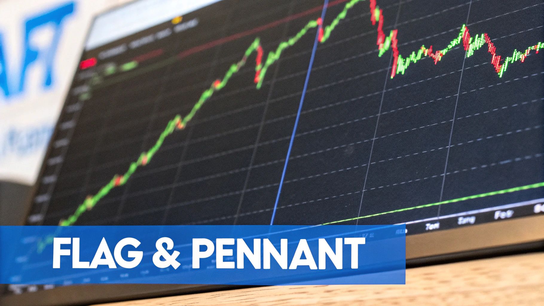
Bull Flags and Bear Flags: The Classic Continuation Signal
Flags are probably the most famous of all continuation patterns. They look just like the name implies: a sharp "flagpole" followed by a small, rectangular "flag."
The flagpole is a near-vertical price surge that happens on a big spike in volume. The flag is the consolidation that follows, where the price drifts slightly against the main trend inside a tight, neat channel. Critically, volume should dry up during this phase. This whole setup shows that after an explosive move, the market is simply catching its breath before the next leg up (or down).
- Bull Flag: You'll find this during a powerful uptrend. The flagpole is a sharp move higher, followed by a gently downward-sloping flag. The trade triggers when the price breaks out above the flag's upper trendline.
- Bear Flag: The mirror image, forming in a sharp downtrend. The flagpole is a steep drop in price, and the flag is a weak, unconvincing drift upward. The real action starts when the price breaks below the flag's lower trendline.
A classic way to trade a flag is to use a measured move. Just measure the height of the flagpole and project that same distance from the point where the price breaks out of the flag. This gives you a solid, logical profit target.
The image below gives you a statistical look at how often these common intraday patterns show up and how reliable they tend to be.
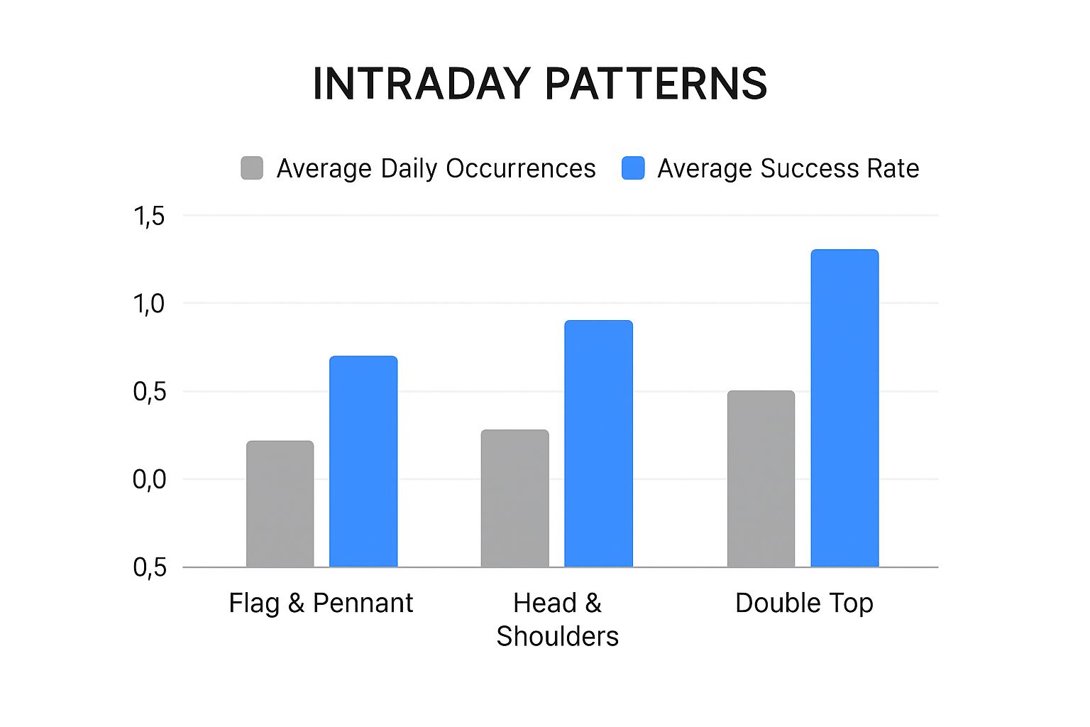
As you can see, flags and pennants are not only frequent but also quite reliable. It's also worth noting that reversal patterns like the Head & Shoulders can be highly effective, even if they don't appear as often.
Pennants: The Coiling Spring of Momentum
Pennants are a close cousin to flags. They also form after a big, sharp price move (the flagpole), but the consolidation phase looks different. Instead of a rectangle, the price coils into a small, symmetrical triangle.
Think of it like a spring being wound tighter and tighter. The energy is building up, getting ready to snap back in the direction of the original trend.
The psychology here is exactly the same as a flag: it’s just a brief pause. But the converging trendlines of the pennant suggest that the period of indecision is resolving much faster. As with a flag, you want to see volume shrink during the pennant's formation and then explode on the breakout.
The key to trading both flags and pennants is the volume signature. You need to see high volume on the pole, low and decreasing volume during the consolidation, and then a massive spike on the breakout. That's the textbook sign of a healthy, high-probability continuation.
Triangles: Symmetrical, Ascending, and Descending
Triangles are powerful consolidation patterns that can lead to huge moves. While they can sometimes signal a reversal, they most often resolve in the direction of the trend that led into them. Let's look at the three main types you'll encounter on intraday charts.
1. Symmetrical Triangle This pattern is created by two converging trendlines—one sloping down and one sloping up. It represents pure, raw indecision. Neither the buyers nor the sellers can get the upper hand, and the price gets squeezed into a tighter and tighter range. The breakout can technically go either way, but smart traders will usually bet on it continuing the prior trend.
2. Ascending Triangle This is a distinctly bullish pattern. It’s defined by a flat, horizontal resistance line at the top and a rising trendline at the bottom. What this tells you is that while sellers are holding the line at a specific price, buyers are getting more aggressive, making a series of higher lows. This constant pressure building up against a fixed ceiling often leads to a powerful breakout to the upside.
3. Descending Triangle This is the bearish counterpart. It has a flat, horizontal support level on the bottom and a descending trendline on top. This shows that buyers are desperately defending a price level, but sellers are growing stronger, creating a series of lower highs. The pressure mounts until the support level finally cracks, usually resulting in a sharp move down.
Studies on the reliability of these classic intraday chart patterns show that success rates can differ. For instance, patterns like the ascending triangle have shown breakout success rates of over 65% when they form within a strong trend and are confirmed by a surge in volume. But in choppy, directionless markets, these same patterns might only work out 40–50% of the time. This just underscores how vital it is to get confirmation and always use disciplined risk management.
To help you keep these straight during live trading, here’s a quick comparison table.
Comparison of Intraday Continuation Patterns
This table summarizes the key characteristics of each pattern, making it easier to identify them on the fly.
| Pattern Type | Typical Shape | Volume Signature | Indication |
|---|---|---|---|
| Flag | A sharp move (pole) followed by a rectangular consolidation. | High on pole, low on flag, high on breakout. | Strong trend continuation after a brief pause. |
| Pennant | A sharp move (pole) followed by a small, symmetrical triangle. | High on pole, low on pennant, high on breakout. | A quick, coiling consolidation before the next move. |
| Ascending Triangle | Flat top resistance with a rising support line. | Tends to decrease, then surges on breakout. | Bullish pressure is building for an upside break. |
| Descending Triangle | Flat bottom support with a falling resistance line. | Tends to decrease, then surges on breakout. | Bearish pressure is building for a downside break. |
Having this mental checklist helps you quickly assess a pattern's validity and trade it with more confidence.
Spotting and Trading Intraday Reversal Patterns
Catching a market turning point in real time is one of the most powerful skills any intraday trader can build. Continuation patterns are great for riding an existing wave, but reversal patterns tell you that wave is about to crash and a new one is forming in the opposite direction.
These formations are gold because they offer you a chance to get in right at the very beginning of a brand-new trend.
In this section, we're going to break down the art of spotting these critical shifts on your charts. We'll go way beyond just memorizing pictures of patterns. Instead, we'll get into the psychology behind them—what these shapes actually tell us about the tug-of-war between buyers and sellers.
You’ll learn the subtle but crucial difference between a genuine reversal and a simple pullback that just shakes people out. Honestly, mastering this one skill is what separates consistently profitable traders from everyone else.
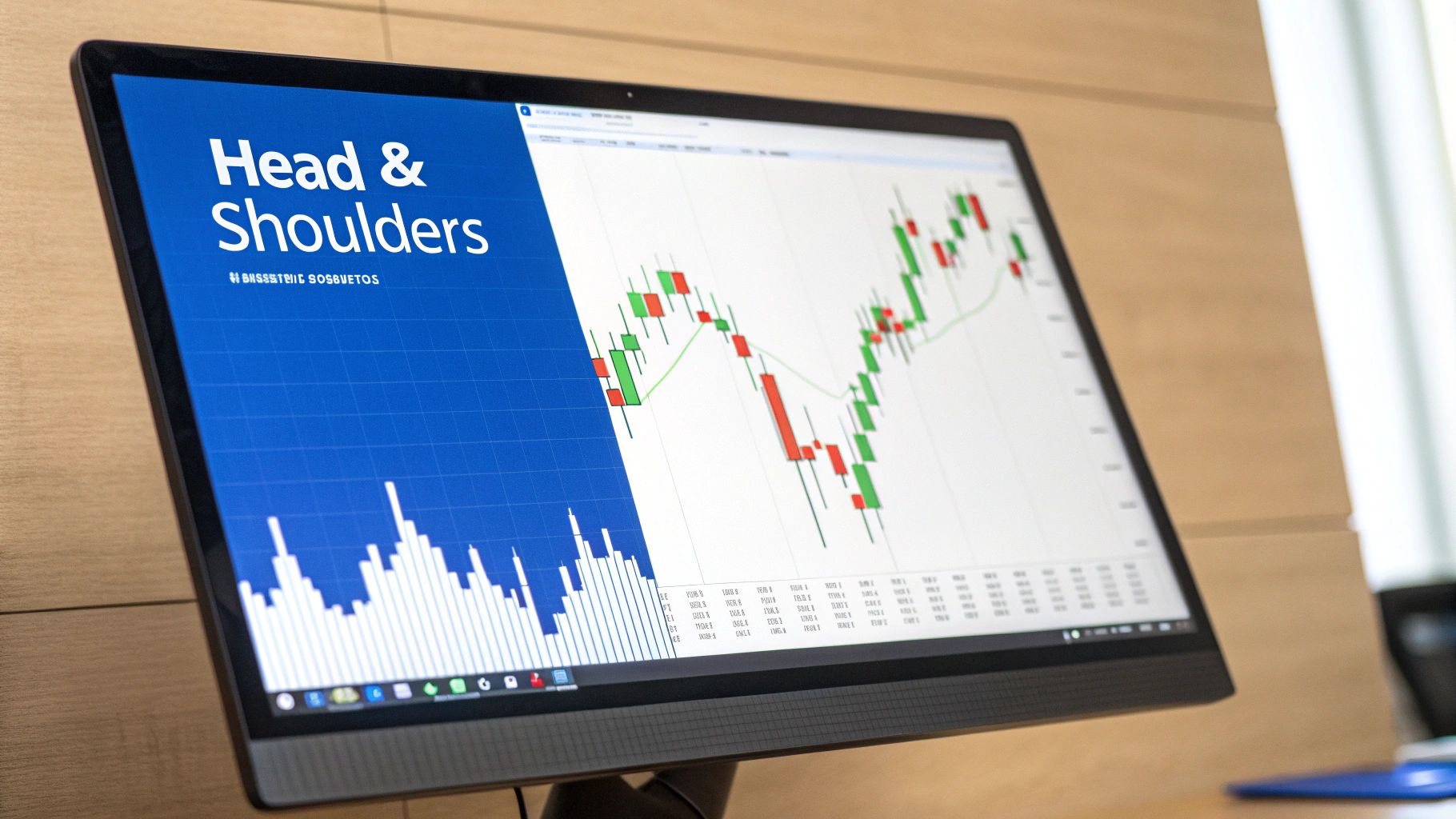
The Head and Shoulders Pattern
The Head and Shoulders is a classic for a reason—it’s one of the most reliable reversal patterns out there. Its name is a perfect description of how it looks on a chart: three peaks, where the middle one (the "head") is the highest, flanked by two lower peaks (the "shoulders").
If you draw a line connecting the lows between these peaks, you get a critical support level called the "neckline."
This pattern tells a story of a dying uptrend.
- Left Shoulder: The initial trend is still chugging along, but the first peak shows some traders are starting to take profits.
- Head: Buyers give it one more big push to a new high, but they can't hold it. The price falls all the way back to the neckline, a major warning sign.
- Right Shoulder: A final, weaker rally attempt fails to even reach the previous high. This signals that the buyers are exhausted.
The real trade trigger happens when the price breaks below the neckline, especially if it’s on a spike in volume. That breakdown is your confirmation that sellers have taken control and the uptrend is officially over. An upside-down version, the "Inverse Head and Shoulders," signals the same thing at the bottom of a downtrend.
Double Tops and Double Bottoms
These patterns are a bit simpler to spot but just as powerful. They represent a clear test of a key price level—a test that ultimately fails and sends the price the other way.
A Double Top looks like a big "M." It forms after a strong uptrend when the price hits a wall of resistance, pulls back, and then rallies one last time to that same level, only to fail again. That second failure is a huge red flag showing that the buyers have run out of steam.
On the flip side, a Double Bottom looks like a "W" and signals a potential bullish reversal. It happens when the price drops to a support level, bounces, and then successfully retests that same support. The sellers' inability to push the price lower on that second attempt shows they're losing their grip and buyers are finally stepping in.
With both Double Tops and Bottoms, keep an eye on volume. For a Double Top, you'll often see lower volume on the second peak compared to the first. This is a subtle clue that the enthusiasm behind the rally is fading, giving you more confidence in the reversal signal.
Rising and Falling Wedges
Wedges are sneaky reversal patterns. They look like triangles, but with one key difference: both trendlines are slanting in the same direction, either up or down. This tells you a trend is losing momentum and is about to snap.
A Rising Wedge is a bearish reversal pattern. It's formed by two converging trendlines that are both pointing upward. While the price is technically still making higher highs and higher lows, each push gets weaker and smaller. The price gets squeezed into the tip of the wedge before it finally breaks down, often with a surprisingly sharp move lower.
A Falling Wedge is its bullish cousin. It’s made of two converging trendlines that are both angled downward. This shows that while sellers are still in charge, they're losing conviction with each new low. When the price finally breaks out above the upper trendline, it can trigger a powerful rally.
Trading Reversal Patterns: A Tactical Approach
Spotting one of these intraday chart patterns is just step one. You need a solid plan to actually trade it.
- Entry Point: Don't jump the gun. Always wait for confirmation. This usually means waiting for the price to break a key level, like the neckline in a Head and Shoulders or the support level in a Double Top. Patience pays.
- Stop-Loss Placement: Place your stop-loss at a logical point that would prove the pattern wrong. For a Head and Shoulders, just above the right shoulder is a good spot. For a Double Top, place it just above the two peaks.
- Profit Target: A common way to set a target is to measure the height of the pattern itself (e.g., from the head down to the neckline) and project that same distance down from the breakout point. This gives you a data-backed target to aim for.
By combining sharp pattern recognition with a clear entry and exit strategy, you can start acting on these powerful market turning points with confidence.
How to Dodge False Breakouts and Sidestep Trading Traps
Spotting a clean intraday chart pattern is the easy part. The real skill is knowing whether you're looking at a genuine opportunity or a costly trap. False breakouts are the bane of every pattern trader's existence, designed to sucker you in right before the price violently snaps back in the other direction.
The market never moves in a vacuum. That perfect-looking bull flag can—and will—fall flat on its face if it forms moments before a major economic news release or during the sleepy, low-volume lunch hour. Getting a feel for this broader context is your first line of defense against these frustrating fake-outs.
This is where you graduate from simply identifying shapes on a chart to managing risk like a professional. It's about learning to demand more proof from the market before you put your hard-earned capital on the line.
Your Best Defense Is Confirmation
A breakout is only as strong as the confirmation behind it. Instead of impulsively jumping on the very first sign of a move, disciplined traders have a checklist. They patiently look for specific clues that validate a pattern’s strength, a process that dramatically filters out weak, unreliable setups.
Here are a few concrete techniques to demand that confirmation:
- The Candle Close Rule: This is non-negotiable. Never, ever trade a breakout while the candle is still wiggling around. You must wait for the candle to close decisively above resistance (for a long) or below support (for a short).
- The Volume Surge: A breakout on weak, anemic volume is a massive red flag waving right in your face. A genuine, committed move is almost always powered by a significant spike in trading activity. It shows conviction.
- The Retest Confirmation: One of the most classic signs of a healthy breakout is the "retest." This is when the price breaks out, pulls back to "kiss" the old resistance level (which should now act as new support), and then continues on its way.
To really get a handle on measuring buying and selling pressure, you need to master the relative volume indicator for better trading. It provides fantastic context for any breakout.
Understand Market Timing and Volatility
The time of day can make or break an intraday pattern. The highest-probability breakouts tend to happen during periods of high liquidity and participation—think the first and last hours of the main trading session. Patterns that form in the midday doldrums are far more likely to fail.
Market context is everything. A flawless pattern forming during a low-volume holiday session should be viewed with extreme suspicion. The "who, what, and when" behind a pattern's formation is just as important as the shape itself.
On top of that, the reliability of any given pattern isn't set in stone. Market behavior shifts, and patterns that worked wonders last year might not be as effective today. For instance, one recent study showed that a once-reliable opening range breakout pattern saw its frequency drop by 12 percentage points in just nine months. It’s a stark reminder that the market is always evolving. You can dig into similar data by reviewing this statistical analysis of trading patterns.
Build a Defensive Mindset
Let's be real: no matter how much confirmation you seek, you will still get caught in false breakouts. It happens to everyone. The key isn't to avoid them entirely (which is impossible) but to have a rock-solid plan for when the market fakes you out.
This means using an intelligent, pre-defined stop-loss on every single trade. Your stop-loss isn't an admission of failure; it’s a non-negotiable business expense that protects your capital from disaster. For a breakout trade, a logical stop might be placed just back inside the broken pattern, ensuring that if the move fails, the loss is small and manageable.
Frequently Asked Questions About Intraday Patterns
When you're in the trenches of day trading, a lot of practical questions pop up. Let's tackle some of the most common ones I hear from traders, so you can move forward with more confidence.
What Is the Best Timeframe for Intraday Patterns?
Honestly, there's no magic number here. The "best" timeframe is the one that fits your style like a glove.
Scalpers, for instance, live on the 1- to 2-minute charts. They're in and out, aiming to capture small, rapid-fire profits from tiny price movements.
But for most day traders, the sweet spot tends to be the 5- and 15-minute charts. These timeframes are popular for a good reason: they filter out a lot of the frantic "noise" you see on a 1-minute chart but still serve up plenty of trading opportunities during the day.
The real key? Try them out. Get a feel for the rhythm of each timeframe and see which one clicks with how fast you think and trade.
How Reliable Are Intraday Chart Patterns?
Think of chart patterns as tools of probability, not crystal balls. Their reliability isn't a fixed number; it changes dramatically based on the market environment.
A perfect bullish flag that forms during a powerful, established uptrend? That’s a high-probability setup. The same pattern appearing in a choppy, directionless market is far less trustworthy. Context is everything.
Success rates can swing wildly, from a coin flip at 40% in bad conditions to over 65% when the stars align. This is exactly why you can't trade on patterns alone. They give you an edge, not a guarantee, so solid risk management is non-negotiable.
Should I Use Indicators with Chart Patterns?
Absolutely. Using indicators to confirm what a chart pattern is telling you is just smart trading. It's like getting a second opinion before making a big decision.
You don't need to clutter your screen, though. A few powerful pairings work wonders:
- RSI Divergence: When the Relative Strength Index (RSI) is showing divergence while a reversal pattern forms, that's a potent signal that the old trend is running out of steam.
- MACD Crossover: A MACD crossover right after a breakout can be a great confirmation that momentum is truly shifting in the direction of the trade.
- Volume: This one is the most important sidekick of all. A breakout that happens on a huge spike in volume is always more believable than one that limps across the line on low volume.
The goal is to find confirmation, not to create confusion. Pick a couple of trusted tools and stick with them.
Ready to stop guessing and start seeing these patterns with clarity? ChartsWatcher provides the powerful scanning and real-time charting tools you need to spot high-probability setups as they happen. Take control of your trading and find your edge today at chartswatcher.com.
